‘This art work is designed by one American artist’ ‘ She is one Chinese designer’ ‘This is one typical Dutch design work’ ‘German style‘… No wonder, nowadays, the introduction of the modern art works is commonly and normally to be started in this way : start with identity defining. It seems like identity is something necessary when we are going to know something new. Does it mean all cultural exists have to find one sense of belonging ? Does it mean the original influence from our mother culture background always take the leadership when our brains start to work?
Globalization is like the invisible hand which is moving the modern world to keep going forward, and the mixture of cultures seems like the direct result of the international moving and communications. Being influenced is different from Copying, but how can we define what is ‘copying‘ and what is ‘being influenced’? Do we have to take the negative attitude when we look at ‘copy’?
Tons of questions may be thought about identity and copy as they have such a close connection with each other. Here, One young artist, He Jing ??? whose art work is ‘Tulip Pyramid‘, introduced her own thinking and reflections
about copy cultures. When we talk about who is she,we may say ‘One Chinese artist’, ‘ The graduate artist from Dutch art academy’ or ‘ He Jing’. Three kinds of introductions may bring three feelings to the public audience,’oh, she is Chinese which means her works must be influenced a lot from her mother cultural background.’ ‘ oh, she was educated by Dutch art education then she may think about art in dutch ways.’ ‘ oh, who is He Jing?’. She noticed these kinds of questions about identities and then she developed a series of research based on the cultural identities questioning( you can find in her website He Jing). As she keeps discovering about her own art identity, she noticed that there is one phenomenon among China nowadays, which is the industrial copying. For those copied products, what is their identity? Seems like those copied things live in a parallel world where is in the gap of two original identities.
When we back to the copying culture, obviously it’s not a Chinese thing only, it’s a common humanity thing. There are so many examples of ancient cultural copying behaviors, which finally created some unique and wonderful works at the end. Delft blue; The Japanese cultural origins from Ancient China and so on. (The Culture of Copy).
As she develops and researched more and more about the copying culture between China and The Netherlands, He Jing finally created these two tulip pyramid which shows the combination of Chinese copy products and Dutch copy cultures. She implies her own education situation with this tulip pyramid-mixture of two original cultures and their copy culture gaps.
As a new freshman who came to a new culture for just one and a half year, what attitude should I always cary with me when I am facing two different cultures everyday? Apparently, the open mind should always be put first place but how can I take the sprit of other cultures without the directly copying?I think the answer is to get the way and the angles of another culture about how they look at the outside world instead of the shallow images or shapes.
Keep in mind about the originals and embrace new cultural influence as much as possible, get their sprits and melt cultures in heart then turn those into new art institutions.
The first indication given to us about this assignment was to select a book based solely on its design. As soon as this information was delivered the first thing that popped into my mind was to find one that would present the most extravagant, out of the box features, so that whatever the next steps to follow would be, the subject matter could not be accused of being boring.
Ironically enough, I chose a book that is inside a box. Which actually was the main reason it outshone its shelf mates, that suddenly looked very serious with their glue bind cover.
Puzzle box by Ines Lechleitner is an artist book released in 2009. I was momentarily skeptical at the functionality of its green gapped cardboard cover —not that it mattered to my eyes, since the pick was based on unconventionality—, or to put it in a way that fits better the central reasoning that led to my choice, maybe the fact that it would present an additional layer to access its content, or remind the feeling of opening a present, would make it more interesting. Soon, the content justified the packaging: it is composed by two books one being the artist’s work where you can find pictures of a group of gorillas in a German zoo and drawings that explain the movements made by the camera. The second one being a response of different authors to the work carried out. Then, two videos were also included — found as a CD in the book— that focus on the gorillas entering and leaving the frame, and finally, a map of the relations between the gorillas’ habitat, the photographs and videos. The box now seemed like a handy support to carry the CD and the map.
You can find the true reasoning behind the design in the author’s website: «Puzzle Box is modeled after ‘Beschäftigungskästen’, which were designed specifically for apes as an interactive occupation and recreation tool. The apes are expected to learn how to manipulate grains inside the box by pushing them from one level to the next in order to gain access to the food.»
This box was inside the gorilla’s location and is recurrently found throughout the images of the book
As I mentioned earlier the book contains a response of different authors to the work. It was captured as a conversation between the artist and the authors. When I finished reading it, I imagined myself participating in that conversation. To get more insight on what the artist had experienced over the period of 5 years in which she developed this project I decided to go to the Amsterdam zoo to elaborate my response.
I quickly began to make associations. The humans standing there encircling the gorillas’ cage while expressing their reactions could be similar to the way the gorillas manipulate the Beschäftigungskästen, both actions are driven by the effect, even if in the first case it might be entertainment and in the latter obtaining some food. It is interesting to consider the sizes of those involved in this equation and the movement of this idea which goes inwards in distance. Us humans look at the cage and touch the glass with our fingers while inside, thegorillas look at the box touching it to get some food. And even taking it further, while manipulating the box the gorillas fell into it, furthering the confinement, satisfying the humans need for entertainment and consumerism now possible through the Puzzle Box in which they lie. Definitely, I noticed how much my perception of the zoo as a place had shifted since I was a child.
There are five polar notions that get emphasized in the book
we/them
open/closed
active/passive
space/movement
In the frame (onscreen)/ out of the frame (offscreen)
The pictures in black and white somehow make stronger the sensation of two different entities separated by distance. The framing delimits the space in a way that makes you wonder what is around, almost as if each picture wasn’t complete or was a piece of a puzzle. It also happens with the video where you would need a 360º panorama to understand the full set. The pace in which the gorillas are depicted is calm, almost uninterested.
In the zoo, once I spent enough time with the gorillas and my brain ended up getting used to the extreme, overwhelming aroma, I was able to truly concentrate on their movements, realizing how much more aware I was becoming of my own. I felt there was a strong relation between this feeling and the fact that the whole work of the artist (the map, the video, the pictures and the drawings) was to know very precisely, almost memorizing, each step and movement of the gorillas knowing what movement it was, which place were they occupying in space, when they did it, all of it systematically. This is also linked to the book’s design that appears to be calculated, calm and neat, using the same typewriter font throughout the book, and clean ‘one-line’ drawings.
Remembering that humans possess in a 98% the same DNA than gorillas I suddenly felt funny imagining my movements being dissected in a book.
Parallel Encyclopedia #2: welcome in Batia Suter’s head and my interpretation of what that might be. She searched, she found and she took, and now she is giving it back. The book turned into an object that spikes my curiosity, and not only because of her collection of curiosities.
The green cover spoke to me. I picked it up and it spoke even louder. I decided to dig further and at one point it made me want to dress in rubber boots, a jacket with too many pockets and a bucket hat and go off to explore the world. And bring a camera.
After Parallel Encyclopedia – an almost black-and-white compilation of her personal archive of seemingly random pictures – Batia Suter made a second volume. An artist’s book poured into an encyclopedia-shaped cast. Where Parallel Encyclopedia number 1 contained strictly black and white imagery, number two also allows specks of colours to seep through the pages.
One might wonder, in a book like this: what did the designer do? It’s Batia Suter’s collection, and her intuition that ordered the pictures. Where did the designer – Roger Willems – drop in? Where did the designer left his mark. Did he had a say and what did he say? Where and if to use colour in this otherwise black and white universe? To use Biotop paper in 90 grams, to give it all a functional feel? To add two red bookmark ribbons?
On might wonder – hidden inside this volume is a parallel world of a parallel world of a parallel world.
One might wander – an encyclopedia of no practical information but visual information, a dreamy answer to an 2000-year old tradition of encyclopedia-making. Another possible answer to this tradition is Wikipedia. Wikipedia suffocates most encyclopedia, but not this one, not Parallel Encyclopedia. This one tells us what Wikipedia can never tell and thank God doesn’t and probably doesn’t even want to. This one is a reference work of the subconscious. Batia Suter’s thematic categories are her own: giving us the suggestion of a story, or not at all – we all make up our stories anyway. She leads us into a great grey and black and white world, different worlds within different worlds, from curiosity to curiosity, from dreams to wonder. She let’s us jump from trees to mountains to griendhout to wolzakverwering • and the wall of Hadrianus; Britannia. From fields to Kirchner to winter to bacteria and giving us a neat visual experience whilst doing it.
Flip.
Page 105.
Workman sprays carbolic powder on a 35-yd long rubbish pile during strike of garbage collectors in London in September 1969. A picture of stacked boats, a woman shopping on the Amsterdam flowermarket. No clue how this works together, but somehow, it works.
Flip.
Page 177.
Verschillende dwarsdoorsnedes van kringsporig hout (es), verspreidporig hout (esdoorn), halfkringsporig hout (kers), mergstralen (eik), mergstralen (tulpenboom), and so on.
Flip.
Page 236.
The moon.
Page 237.
Several spherical objects, mirroring the moon.
Flip.
Page 440.
The entire page is filled with a picture of flowers that remind me of orchids, but apparently are called Odontonia.
Page 441.
The entire page is filled with a picture of geisha girls of the early 1900s. Their kimonos and the plants in the pictures depict flowers that mirror the Odontonia.
Flip.
Page 438.
Several pictures of butterflies, and hands being spread open, resembling butterfly wings.
It’s design is imbedded in it’s content, made to serve this visual feast. Made to serve the hidden narrative. Or the none-existent narrative. It’s not organised in a seemingly logical way, but for Batia Suter, it probably is. She is pretty convincing.
One might wonder – the strays and wanderers, all nicely wrapped in shiny green.
What’s the hand of the artist and what’s the hand of the designer?
They probably used both.
It is a unity of Religion, Science, and Philosophy that combines a variety of belief systems in its search for an underlying universal harmony. Basically, it is everything, therefore you have to be very focused to understand what specific ideas it defends and how is this shown or practiced in art and life in general.
It is also a doctrine of religious philosophy and mysticism (so it isn’t a religion itself), but holds that all religions contain elements of truth.
Theosophical writers hold that there is a deeper spiritual reality and that direct contact with that reality can be established through intuition, meditation, revelation, or some other state transcending normal human consciousness.
Theosophy has influenced many artists among whom were Wassily Kandinsky, Piet Mondrian, Gauguin, Malevich, Gerrit Rietveld (and some others from De Stijl movement) and Pollock too. This beliefs played a crucial role in the work of this artists, whose works were seemed to search for the understanding of spirituality.
All in all, theosophy seeks to integrate perception and thought, the natural world and the spiritual work, science and religion.
How did theosophy influence De Stijl
De Stijl magazine was publishing the group’s design work combined with theoretical writings which also contained mysticism. Members were deeply influenced by theosophy which was also an important part of Bauhaus. You can see that in the way they rejected any form of naturalism in favour of a formal abstraction that connected the movement with Russian Constructivism.
De Stijl group wanted to create a new kind of art, architecture and design in order to raise a disillusioned humanity from the horrors caused by World War 1 and as many artists throughout Europe, they attempted to liberate the arts from tradition. They wanted to change art from individual to ultimate, universal. Their vision was based on deconstructivism – reducing the universe to fundamental elements and forms – the vertical and horizontal lines became the symbols of universal harmony, to which were added primary colours red, blue and yellow along with black, white and gray (considered non-colours). Even if you don’t understand the deeper meaning of theosophy, these are the things you can recognize in artworks of De Stijl movement.
Anyways, members were aiming towards geometrical and technical art which would be an experience as a whole. They were trying to give art a spirit of forms and mystification.
What was important for them was purity in architecture, the absence of organic and personal forms. Like theosophists, members of De Stijl believed in the presence of deeper spiritual reality, whereas a direct contact is established through a state transcending normal human consciousness. They brought a sense of material, intellectual and spiritual unity to art, architecture and design.
Theo van Doesburg’s work related to Neoplasticism – a work from Vilmos Huszar
<
Mondrian as a member of De Stijl
His path to Neoplasticism
Mondrian intensified gradually his expressive manner of painting and began to have a more and more intensive use of colours, that eventually lead him to the need to depict the visible aspects of reality.
From 1908, Mondrian began to work in search for a truly form of painting. The artist came to the conclusion that the pure, intense, inner colours (the primary colours) and a simple manifestation of the line (horizontal and vertical) could help reach an abstract form of art that would be suitable to the spirit of the new modern age.
In 1917, Mondrian and Theo van Doesburg founded the group De Stijl. Mondrian used this magazine as a vehicle for his ideas on art, and it was actually in the magazine where he defined his aims and the term Neoplasticism. Though Mondrian established his only visual manifestation/painting style: Neoplasticism, based on philosophical and moral considerations associated with theosophy, this name was also applied not only for his work, but also for the art that the De Stijl circle practised in the different areas.
The intention would be to use the form and line to reduce the visible reality to its essence. So, in Neoplasticism, all the abstraction is connected with the reality. The elements are displaced from their visible form, but reflected in an abstract dimension.
As Mondrian himself considered:
”As a pure representation of the human mind, art will express itself in an aesthetically purified, that is to say, abstract form. The new plastic idea cannot therefore, take the form of a natural or concrete representation – this new plastic idea will ignore the particulars of appearance, that is to say, natural form and colour. On the contrary it should find its expression in the abstraction of form and colour, that is to say, in the straight line and the clearly defined primary colour.”
Mondrian uses the basic elements of painting: line, form and colour in their purest, most fundamental state, creating compositions with different lines and planes, verticals and horizontals, neutral and primary colours in a universal visual language that everyone could understand intuitively.
Two years later, the architect- designer Gerrit Rietveld joined De Stijl, which had a significant impact on the Neo-plasticists’ ideas and production.
Influenced by theosophy’s ideas, Mondrian reduces all elements to straight lines that cross and form various sized squares and rectangles and restricts the palette to pure neutral primary colors and black, white and grey. This was his proposal to represent the universal order, rather than the physical meaningless world.
Modrian’s texts on Neoplasticism
How is Neoplasticism connected with theosophy?
Piet Mondrian was raised in the protestant church and later on, in 1909, joined the Dutch Theosophical Society, which was one of the main spiritual movements in the Western society at the end of the 19th century. This Society was founded in the United States but quickly spread throughout Europe and had an immediate influence on art, particularly in the Netherlands. In fact this influence was so visible that forty Dutch artists participated in the exposition organized in 1904 in Amsterdam for the Theosophical Society’s International Convention.
From this time on, theosophy was to be a major influence in life and work of Mondrian.
In the journal De Stijl [x], Mondrian published some articles about the influence of Theosophy. In this articles, the artist analyzes the role of traditional art that he considers as a consequence of the lack of harmony inside of man (conflict between matter and spirit) and the imbalance between man and nature. For Mondrian, theosophy was the answer to this imbalance. Theosophy principles could, in his ideas, bring consciousness of the self, and as a result, bring the harmony in this relations.
For him, when the consciousness of individuality or, in other words, the concept of spirit emerges, two conflicts emerge with it. The first one would be the conflict between this individual spirit and his physical body. The second one, as a consequence of the first one, is a confrontation between man and nature, generating a ‘disharmony between man and his surrounding,’ or simply ‘the tragic in life’ as the artist considered.
In this way, we can consider that Neoplastic art arises from the same principal as traditional art does- from the perception of an imbalance inside of man. However, Neoplastic art tries to represent an absolute truth directly: the idea that if the artist represents it, is because he knows it, and not just some partial and accidental truth as traditional art seems to do it.
The aim of Neoplastic art is the representation of the absolute, almost like religion. By reaching this goal, he would be able to help the common man finding his inner balance. How? Modifying the external world to another one capable of bringing some inward balance: by transforming the surrounding environment, he would transform the man itself, and consequentially the society.
“Art –although and end in itself, like religion– is the means through which we can know the universal and contemplate it in plastic form.” (Mondrian, 1918)
Neoplastic art’s objective is to restore in man a balance with his environment, lost when man gains consciousness of his own individuality. Neoplastic art should be dissolved and fused into and with life.
For the artist himself, neoplastic art shouldn’t be limited to painting but rather extends to architecture and urbanism, and in this way make a real change in the environments. Mondrian considered that each artistic disciplines should perform a specific role, and together they should reflect the common harmony of the universe.
Therefore, for Mondrian, painting’s task would be to act as the guide for the rest of the other disciplines and eventually be dissolved, if the task is successful, into architecture, urbanism, life.
We can consider that theosophical beliefs are expressed in Mondrian’s neoplastic work, both, theoretically and concretely, in a constant demand for a true theosophical art.
Art is, in this way, a reflection of the absolute, “the Radiating Center” (as Theosophy calls it), which is the original force, creator of everything (idea that nature and spirit are manifestations of the same original whole: universal/cosmic order).
The artist, thereby, is the “translator” of a higher reality, and his works must repeat the representation of this “Radiating Center”.
Art should reproduce the conflict between opposing elements and the solution for that same conflict. The image of harmony cannot be static, but represented by multiple dialectics: two levels of elements, among which, simultaneous oppositions are produced (line/plane, vertical/horizontal, female/male, color/colorless…) The universal force/cosmic order/ the harmony, is so expressed in the duality between this contrasts.
While searching fot the harmony between opposites, Mondrian aims to help common man access his own inner harmony. By transforming the entire natural environment, the artist would establish the balance and reflect the image of the common origin of all creation: of the absolute. In this balanced environment, the common man can reach his inner equilibrium.
Composition A, Piet Mondrian (1920)
Gerrit Rietveld as another member of De Stijl
He was born in Utrecht in 1888. His father was a cabinet maker and when just a little child, Rietveld joined the family workshop. His apprenticeship was steeped in the traditions of the Arts and Crafts movement which can be seen in his early work (first attempts of furniture design).
In 1911 he opened his first shop in Utrecht and started studying architecture. As many others, he was influenced by Frank Lloyd Wright’s architecture. By 1919 he became a member of De Stijl and became friends with its members Huszar, Theo van Doesburg, Robert van t’Hoff and others.
What influenced Rietveld’s work?
Theosophy played a major role in Mondrian’s art, but since Rietveld was a member of De Stijl too (although he never actually met Mondrian), we can also see the influences of the proclaimed philosophical ideas in his work.
In De Stijl architecture and design, Cubism was again influential but so also were Frank Lloyd Wright’s Prairie House designs, with their asymmetric free-flow of interior and exterior spaces. Despite all that, Rietveld’s ideas were more down to earth and less philosophical that the ones of Mondrian and Doesburg. He didn’t speak frequently about his work. Therefore the interpretation of it is based on the more philosophical tenets of the other De Stijl artists (members were very different considering a way of thinking) and it sometimes seems as if the designer’s voice may have been overshadowed.
Rietveld’s painted Red/Blue chair became the archetype of the movement, it was also the first time that the De Stijl colours, usually used 2D, (on Mondrian and van Doesburg’s paintings) were applied to a three-dimensional object. It was the first major piece of furniture to accord with the movement’s principles – conceived as a spatial composition, conspicuously disregarding comfort, traditional construction techniques and concepts of decoration (built on a series of horizontal and vertical planes, provides a clear expression of the group’s ideas).
Gerrit Rietveld: Red and blue chair
With the Schroder’s house Rietveld created a totally original vocabulary in building construction and in the treatment of interior living space. The complex, asymmetric cubic construction of horizontal and vertical planes and lines encloses and releases space in a three-dimensional equivalent of a Mondrian painting. Linear elements are red, blue, yellow or black; surfaces white or grey.
Gerrit Rietveld: Schroder house
A major effect on Rietveld was also Frank Lloyd Wright’s work who was a functionalist and a part of an International style. The most influential details from his work were the flow he produced between interior and exterior and also the use of verticals and horizontals. You can also see that in Rietveld’s last work, Gerrit Rietveld Academie where glass surfaces are made in a way you can see through the building, therefore it merges with surrounding nature.
Frank Lloyd Wright: Fallingwater Frank Lloyd Wright: Robie house
While quickly recognized as a major contributor to the development of Modernist architecture, interior and furniture design, Rietveld’s later work was largely confined to furniture design. Most known examples are his tubular steel and wood Beugelstoel chair, wooden Zig-Zag chair and wooden Crate chair. Among his other design work was the Netherlands pavilion for the 1954 Venice Biennale and a sculpture pavilion in Arnhem, Holland, built in 1955.
His furniture was designed for a mass production to be available to a large audience, even though at the end is wasn’t mass produced nor standardized – no two versions had the same dimensions.
It’s funny how when you see buildings, you mostly don’t think about the theoretical background of their form. Until we started making this research, we were more focused on functionalist features of buildings and which movement or era they belong too, but now we find ourselves thinking: ” Do this shapes represent some philosophical ideas?”
To conclude …
It’s interesting how the abstraction of Mondrian and Rietveld’s work seems to be so far from theosophical ideas – when you see the chair or a painting you don’t make an instant connection.
Mondrian and Rietveld both seems to try to make art that could reach the majority of people –a painting that would have an universal meaning (Mondrian) and a furniture that would be available for masses (Rietveld) – Art for everyone, art that would make life better. In a way, one can consider it an utopian idea, since the majority of people does not really understand the theosophical thinking … So the question remains: How educated should someone be when experience their art? Or in other words, to what point do you have to be aware of the purpose of the work to have the full experience of it? [x]
Unknown to many, Austria-Hungarian Frederick Kiesler, was one of the 20th century most innovative and peculiar artists. After studying printmaking and painting in Vienna in his twenties his career surged when his controversial stage designs got acclaimed by the art world. In 1923 Kiesler was invited to join the dutch association de Stijl which made him the youngest member of the group. Three years later he and his wife emigrated to America where he amongst other things was chosen to design every aspects of Peggy Guggenheim’s Art of This Century Gallery in New York, 1942. He soon became an artist operating across the ”borders” of the art world, working with painting, architecture and sculpture, usually mixing them in the same project.
During his years of practice Keisler developed his ideas into a philosophy, concerning his conviction that everything is connected and correlate to one and other. Kiesler called it ’correalism’ and defines it as ’the dynamics of continual interaction between people and their natural and technological environment’. Correlations between objects, color, human experience, environment etc, he believed should be considered, since all these aspects and their relationship is part of a spiritual process which will lend meaning to life.
As I understand the essence of Kiesler theory’s is to see the whole picture. When you make a sculpture, also consider where it will stand, in what environment. When you make a painting, imagine the whole room it will be hung in. When you design a house, think not only of the actual architectural features it will acquire but also color, furniture and other ornaments. The art should also be stimulated to connect with society, technology and human emotion.
In the contemporary art scene I believe we now see traces of Kieslers ideas of art and design. Maybe not in their original form, but the essence of them; the fact that art should affect something inside of the viewer, in one way or another bring him or her closer to a more meaningful life. As I see it, contemporary installations which indulge the viewer to become a participant instead, have a tendency to bring that experience.
An excellent example of such an experience is provided by Tomas Saranceno’s immense wire-installation, In Orbit, at the top floor of the K21 museum in Düsseldorf. The visitors are invited to walk in a floating landscape of wires, above a three stories drop. The direct, intense feeling of vertigo from the potential drop, as well as the resilient surface the flexible wires supply, provides a breathtaking experience from the very first step.
The work itself correlate to your every move, by each step you take the ’ground’ shifts under your feet, but also forms a new connection between all the participants. The extreme situation strips you of all previous preconceptions and you are only aware of that very moment, which leads to a unity in the group of participants, since you all share the overwhelming sense of mixed wonder and fright. The sensations stays with you long after you have exited the work and you feel a connection with everyone who have ’felt’ the work.
Another contemporary work which I also feel strongly relates to the theories Kiesler came up with is Mika Rottengberg’s combined installation and video-work for Münster Skulpturprojekte 2017. On a quite busy street in Münster lies an abandoned shop with a old yellow sign and at first you wonder if you even are in the right place since there is nothing else inviting you in. When you enter you realize the inside mirrors the exterior, the shop is deserted; on the shelves there are some left over articles, a fan i slowly moving in a corner and in a second room a couple of giant inflatable pineapple-rings. While you walk around in the shop a sensation of confusion and discomfort slowly creeps upon you, wondering where have you ended up. Then you find the video. In the furthest room a small cinema with about eight chairs is located and the work is screening on a wall.
You get launched into a surreal universe with men in suits crawling through a system of pipes, a woman smashing light bulbs, shops filled to the brim with vegetables/lights/balloons, a woman managing a soups trolley as well as another woman working in a restaurant. After the 20 minutes long movie you realize your emotion have changed drastically and you now are in a comfortable space, physical but especially mentally. The weirdness of Rottengberg’s film leaves you with an urge to discuss what you have seen with other spectators which in turn creates a similar community amongst the group of participants as Saranceno’s installation.
There are numerous more examples of related works which all share the same core idea of bringing something else to the viewer than just a sight (which of course could be nice/radical/emotional etc.).
What the artist provide is a kind of parallel reality in which all aspects of the work have the same significance; the environmental setting, the colors chosen, the techniques and materials used. Which is the same ideas Kiesler wrote about seventy years ago. I think it proves the statement that good ideas are timeless and always can be brought into new light in new times, not only by artists but also by designers, architects and other creative professions. Even though artist today might not think about Kieslers correalism when they work they somehow end up in the field anyway.
As soon as I walked to the exhibition, I was faced with two ‘fountains’ if you can call them so. Lex Pott [x], a Dutch designer, a graduate of the Design Academy Eindhoven, uses UV-light and acidic water to explore the “inner colour’ of materials. First fountain is made out of copper, an element that has a green colour when found in nature,however the colour that I saw was orange due to the outer catalysts that accelerate the change of color. Same thing was happening to the fountain on my left that was made out of brass.
The Preservationist
Although I was never a big fan of Chemistry, the project that dealt with exploration of inner, unseen colours really attracted my attention. The two objects themselves are a marvelous visual as well as inspiring method of working. His project has a very close and even straight-forward connection to the Subject – Patina. By oxidizing the metal, the designer creates a thin layer that variously forms on the surface. Colouring different kinds of metals requires accurate recipes. Pott’s project demonstrates the results of a research on metals and their true colours. By doing such, he reduces the material to its very essence.
The Resplendent
While losing electrons, it seems that the material opens up to the artist and the viewer giving an impression of acquirement of ancient wisdom that was hidden underneath the green surface. I believe that the viewer and the artist have a similar feeling of control evoked by the impression of nature opening its secrets to the human kind.
Lex Pott, True colors Dome / True colors Cone. exh.cat.no.4A/B
Visiting a museum always end for me daydreaming about other artists. Influenced by the atmospheres of the art and people visiting the museum. So I wrote down my observation and daydreams of an artwork in the exhibition of the Kunsthal te Rotterdam.
Cars, motorcycles, egg, hamburger, portraits and colorful vanitas. Walking into a hall full of pictures; was my first reaction of the exhibition of hyperrealism in the Kunsthal te Rotterdam. Coming closer to this images; amazed by the fact that these where paintings.
In front of a painting there was a man saying to his wife; ’Yes, you can really see that this is a painting, because the artist did not paint it perfectly.’ Pointing out all different kind of lines and spots which where not perfect according to him.
My observing of these paintings was also absolutely triggered. How is this possible? Is this a picture painted over? Is it really not a picture? Also searching for spots to confirm that it are paintings.
Rod Penner
Passing all the work I noticed all the American subjects. Especially the landscapes of Rod Penner ; painter. Staring at his work I found it very intriguing how he translated the light so beautiful in these paintings. Every shade, light stripe and reflection he paid attention to. He is not only painting the landscape itself but also the atmosphere that is connected to the landscape. Not only the houses/signs are giving a clue to the American landscapes but also the atmosphere itself is very recognizable.
The beautiful light and atmospheres of Rod Penner reminded me of two photographers ; Gregory Crewdson and Tod Hido.
Tod Hido
Tod Hido is photographing landscape/houses in America. He got a amazing series of photographs called ‘Homes at night. Tod is using long exposure and most of the time the only light source is the light from inside the house. He is also searching for very specific moments and houses that are making this series so great.
Gregory Crewdson
Gregory is photographing cinematic landscapes in small towns of America. He is making beautiful images where he is influencing the light and the scene. It is very interesting how he and his team are building up these scenes and you can see that in his documentary Gregory Crewdson : brief encounters.
Inspired by a day of Kunsthal te Rotterdam Hyperrealism ; 50 years of painting. Exhibition from the 25th of January till the 5th of June 2017.
I felt a sudden burst of nostalgia when this work first caught my eye. It is pretty clear why; this assemblage piece is mainly made out of toys, which are easily connected to the idea of childhood. The work is very colourful, but all the colours are slightly faded. I do not know if this is because of the age of the work, or if he used these slightly faded colours on purpose. Maybe it was the light of the museum.
The work consists of tiny plastic objects, which are partly covered by an orange layer of more plastic material. Two donut-shaped objects are attached to the orange layer. The orange layer reminds me a lot of a life vest. This life vest association gives this layer another layer of (probably unintentional) meaning. The whole assemblage is attached to a piece of wood, which makes it look more like a painting then like an installation. The Stedelijk museum apparently thinks the same, because the work is classified as a painting.
The toys are put in order by their colour, which makes the work almost satisfactory to look at. I start to wonder what kind of objects are hidden underneath the parts that are covered. Where did the artist get these objects from and why did he choose these specific objects? The work reminds me a lot of a dream I used to have as a child; a swimming pool completely filled with toys. I realize that this is the main reason why the work is interesting for me, and why it made me feel nostalgic.
After making up all these associations I looked at the name of the piece. The piece is called Mondrian Secret. And suddenly, the whole work changed. The orange layer is representing the painting, and the toys are the secret insides of a Mondrian painting. The painting is faux, because it hides the true nature of the work.
The creator of this piece is Michael-Angel Cárdenas, a Colombian-Dutch artist. The media he uses varies a lot, from drawings and paintings to video installations and assemblages. He is the most well known for his video work. When he came to the Netherlands in the early sixties, he brought with him a lot of new developments in arts. Art movements like New Realism and Pop Art where not really active in the Netherlands. Important themes in his work are sexuality and his Colombian background. If you want to read and see more of the artist, read this article or watch this catalogue.
Earlier, I wrote a post about Ron Arad’s Concrete Stereo. A similarity between Mondrian Secret and Concrete Stereo is the way the surface is approached; both are covered up or hidden by a different material than the core of the work. In Concrete Stereo, the fragile sound system is hidden by a thick layer of rough concrete, giving the work another meaning and feeling by adding a layer. In the case of Mondrian Secret, the playful toys get hidden away by a layer, that is representing a painting that already exists. In the case of this work, the meaning of the actual Mondrian work its referring to changes.
We associate Mondrian’s work with mathematical precision. Cárdenas’ interpretation hides a layer of playful, colourful plastic toys. The surface of the painting is supposed to represent something that hides the “true nature” of the painting. A bunch of toys and plastic objects, organized in order of the rainbow colours. Put together with the same precision as Mondrian painted.
Gebr.A.R.& P.van der Burg /wood and marble painting examples in color 1876
Supplementary Surface Show Under Construction
20 students of the Rietveld Academy’s Basic Year visited the exhibition “Designing the Surface” organized at the New Institute Rotterdam (2017).
The intriguing aspect of surface, an issue that is generally avoided in a discussion about the context of content, raised our curiosity.
The exhibition and the accompanying publication was inspiring as were other additional exhibits like ‘Screen Savers’ or various shows in adjoining musea.
/FAUX /PATINA /LUSTRE /TEFLON /AGENCY /SLIM
Curious for our reflections on these subject?
Chose an image and click on it.
We assembled this small supplementary research show for you to enjoy.
The photograph of a detail.
The remains of a campfire.
In the right-top-corner an other one:
children making a campfire.
The two images communicate.
Two photographs cut out and put together create a panorama.
Every chapter is an other story.
It’s an artist book.
It intrigues me.
Honesty emanates from it.
It’s pure.
It has this uniqueness that makes you fell in love.
From time to time,
there is a little bit of fragility.
The writings are wobbly.
Pictures are cut here and there they go on top of the other one.
Typewritten text strip are highlighting us.
The book has this very personal attitude. It’s hand made.
It has been made a while ago.
In the 1980’.
I’m a viewer.
I’m entering someone else world.
The title is written by hand.
I cannot read it.
It intrigues me.
I figure it out after a while:
« Midden-Delfland ».
I need to know who did it.
The name of the author is not written anywhere.
Everything is in dutch. I don’t understand.
I decide to go back to where I’ve found it.
The man who works here, in the library is a real passionate.
Of course he knows the artist:
Krijn Giezen: an important early eco-artist from the Netherlands (1939-2011). He started as Assemblage artist in the 60-ties and played an important role in the development of Land-art and Conceptual-art in the 70-ties. Other Eco-artists were Sjoerd Buisman, Herman de Vries, Hans de Vries and Waldo Bien. Eco-art is a collective term for art in which our relationship with the natural world is the main subject. Eco-art is not bound to materials and disciplines, but is bound by the integrity of its message: Eco intends to improve our relationship with the natural world.
Did he also design it ? We don’t know.
He may have collaborated with Hans de Vries.
They did few books together.
The internet is not helping.
Midden-Delfland is a place in the Netherlands, all the pages are related to the place and not the book.
If I want to know more about this book I will have to contact the artists.
Krijn Giezen died some years ago and Hans de Vries is a common name in the Netherlands, also in the artistic field.
I cannot contact them.
Mmmh…
I start to feel the need and the urge to discover more about this book.
Midden-Delfland…Krijn Giezen…Hans de Vries
Midden-Delfland…Krijn Giezen…Hans de Vries
Midden-Delfland…
I should go there !
I should do a trip to Midden-Delfland !
Tuesday i will go to Midden-Delfland,
find more about the place and take some pictures of it.
I woke up too late.
I left the house at 1pm.
My trip to Midden-Delfland is now starting.
I take the tram. Oops. It’s the wrong one. I jump out of the tram.
I see the number 12 (right tram), I run to catch it, take a seat and start reading peacefully.
I’ve got time. I’m supposed to get out at the terminus.
The journey is taking quite a while though. As I decide to find out where I am, I recognize my neighborhood. I had passed the terminus a while ago and was now going in the opposite direction.
I finally arrive at Sloterdijk to catch my train to Delft.
There I will eventually find the bus number 33 that will take me to Midden-Delfland.
I wait.
The bus 33 is the only one which runs every half hour.
It’s now 4:45pm.
The sun will disappear any minute now, but I won’t photograph until I reach Midden-Delfland. ?I will manage with the light there.
As I’m in the bus I see the night slowly arriving.
Never mind if it’s not the right stop, I jump out.
I’m in the countryside. The landscapes are the same all around me.
I’m now walking. I want to discover more.
I have to take a few pictures while I can.
It’s just been 5 minutes that I’ve been walking but the light is now gone, it gave place to the darkness.
I don’t have a flash on my camera.
I’m tracking the streetlights.
This place is scary.
It’s been 15 minutes now and I’m still walking on that same road.
I’m not satisfied by the pictures I’ve been taking so far, they’re boring.
There, I see a church. It’s surrounded by street lights.
I walk in that direction. It’s too dark there, nothing interesting is happening.
That’s it, I’m going home.
I’m thinking “I should have woken up earlier”.
The bus is coming in 2 minutes. I feel lucky.
I’m freezing to death here.
I check in. It sounds like my OV chip-card doesn’t work.
I’m surprised, I’ve just recharge it in Delft station.
I try again.
It doesn’t work.
I don’t have any cash to pay the 5 euros the driver is now asking me for.
He doesn’t accept my Credit Card, I ask him where can I go withdraw.
The bus driver says he is not from here. He doesn’t know where I can withdraw.
He’s now asking me to leave the bus so he can continue his journey.
I leave the bus.
What an asshole !
The next bus is in an hour. In a fucking hour !
I’m freezing.
I’m not going to stay there, static, dying.
I walk, following the road I came from.
Everything is dark around me.
The only houses I see are very far.
Everything is just fields and ships.
I can’t believe the guy left me.
I’m shocked.
I’m thinking “And what if I get raped ?”
A human is passing by.
Hallelujah.
He looks at me like I’m crazy when I tell him I want to walk to Delft.
That city is 10 kilometers away.
The bus stop is just near.
I didn’t see it because it’s just a pole.
The next bus is coming in 45 minutes. ?
This time I will get in and won’t get out before Delft.
I wait.
I’m standing.
I hate to wait standing.
I start to sing, and dance to get warmer.
It’s so cold out there.
I’ve just been waiting 5 minutes; but I can’t. I can’t wait anymore.
I’m hitchhiking.
I raise my thumb.
People are looking at me weird.
It’s been 10 minutes that my thumb is raised.
Nobody has stopped.
I’m starting to think I’m going to die here.
Maybe it’s because of the cap.
Or maybe it’s the big scarf that I’m wearing around my head.
I decide to let go of the cap.
Even without it no one is stopping.
I’m still singing and dancing but now some tears of despair are running down my cheeks.
Oh my god, Oh my god !
Yes !
Someone stopped !
He doesn’t look creepy at all !
I’m so happy right now.
The guy is even going to Delft !
I’m so happy right now !
We start a small talk.
He is quite surprised that I come from France so I tell him the story about me studying at Gerrit Rietveld Academie and my project about Midden-Delfland.
He understands better now.
He grew up here, in Midden-Delflandd.
Today he was visiting his parents.
He had never heard of Krijn Giezen nor Hans de Vries.
I ask him a bit about this place where he grew up.
What was it like to be a kid in Midden Delfland in the 90’s ?
First I learn that Midden-Delfland is a commune composed of three villages.
There are three schools.
Everyone knows each other.
It’s a quite safe place to live in.
He tells me that it’s a privilege to be raised and/or live there:
It’s close to the beach (45 minutes biking),
It’s close to the city ((Delft) if you don’t miss the bus!)
The guy really seemed to have enjoyed his childhood.
While he keeps telling me about the joy of living in a village I was just thinking “HELL NO!”
I couldn’t picture myself living there.
And here we were: Delft’s train station.
I was released.
In 1 hour and 37 minutes I will be back at my place.
I made a book about Midden-Delfland.
Landschap : een impressie van het landschap Midden-Delfland winter 1983-84 door Krijn Giezen: wonen werken en rekreëren. /Rietveld library catalogue no : giez 2
Never Odd Or Even (2005), Mariana Castillo Deball, Revolver Publishing
Scanning through all the possible titles in the list, I landed on something I recognised: ‘Never Odd Or Even’, by Mariana Castillo Deball (M.C.D.) I found myself attracted to it, because it reminded me of an album I used to listen to a lot when I was younger. Initially, I really didn’t like the front cover’s typography, but when I flipped it open, I found myself very confused about the way the book was structured. When I inspected the other pages, I decided this would be my book of choice. I thought the back cover and inside looked very interesting and beautiful, but I didn’t understand why it looked the way it did, what purpose it served, if it even had any.
When I started looking online, I could only find a lot of information about the second volume, but the first volume only gave me two not very detailed links, one to the art foundation’s website and one to the publisher’s website. It became clear to me that it was a ‘book’ made up out of dust covers. It was some kind of art publication. The fact that it was sheets of paper specifically designed to protect books, protected by a layer of plastic seemed absurd and quite funny to me. Even though my main attraction was the construction of it, there are a lot of different styles of graphic design found throughout, which I found to be quite interesting, both together and on their own.
First, I indexed all the individual pages of my copy as follows. By doing this, it became clear to me that there is a discrepancy between the number of covers that are contained in my copy and what the publisher advertises. My copy only accounts for as much as twenty-two covers, whereas it should have been twenty-three. This number includes the outer cover, following the counting system of the second volume. Otherwise, there are two pages missing. Also, none of the books in this list exist in reality. They seem to do what art is known to do: imitate life. The publication kind of looks like an exhibition in itself and it actually is almost some sort of catalogue of the actual exhibition it is part of. I can’t support this factoid with photographic evidence, as there are no accounts to be found on the web. The exhibition seems to have taken place before museums, artists, or audiences started to upload any documentation on the web, but based on what is available online for the second volume, the before mentioned seems highly probable.
So there were two minor design mysteries: it is unclear why the publication is formatted the way it is, but it is also unknown what the content of 1/23 of its totality is.
Could this missing piece hold the key to unravelling this mystery? Highly unlikely, but it remains a point of curiosity nonetheless.
To understand Volume I (2005) with as little information as there is available, we must resort to looking at Volume II (2011). With six years separating the two, there are some differences, but integrally they appear to carry the same concept — it’s a series and not two separate works after all. Volume II has some colour prints and more ‘pages’. Although I admit that I don’t know the exact way the exhibition was held in 2005, I think it’s not unreasonable to assume it was very much similar to how it was handled with the second one. To get a better idea of how it would interact with space, here you can have a look at the press release and photo album for the exhibition at the Grimmuseum in 2011.
Never Odd Or Even at the Grimmuseum (2011)
Never Odd Or Even is a collection of dust covers for non-existing books and in the exhibition, the contents of these non-existing books are explored and theorised about, in works and performances that use text as their primary medium..
In an interview, Manuel Raeder has made clear that the outer cover’s typography has been designed by the artist herself — based on Tangram puzzle shapes — and the pages were done by the artists she invited to participate in this collaborative work. The latter being pretty clear just by reading the flap of the outer cover. Finding out about the inspiration for the type made me appreciate it a bit more. The collaboration apparently also extended into the exhibition surrounding the publication, working together on shaping how the public experiences the work. The second volume was published through Raeder’s publishing house ‘Bom Dia Boa Tarde Boa Noite’.
I contacted Raeder, with regards to the missing page, who worked on Never Odd Or Even together with M.C.D. I was really happy to see that he was very quick to respond. However, he didn’t readily have the information on hand, so he told me he’d forward my question to some others. I didn’t contact M.C.D., as she doesn’t seem to have any contact information freely available.
When I inspected some pictures from the Brno 2016 exhibition, I noticed that not only did they exhibit the first volume of the work, but that the missing cover was actually squarely visible.
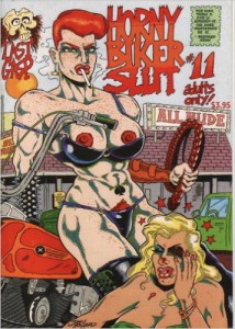
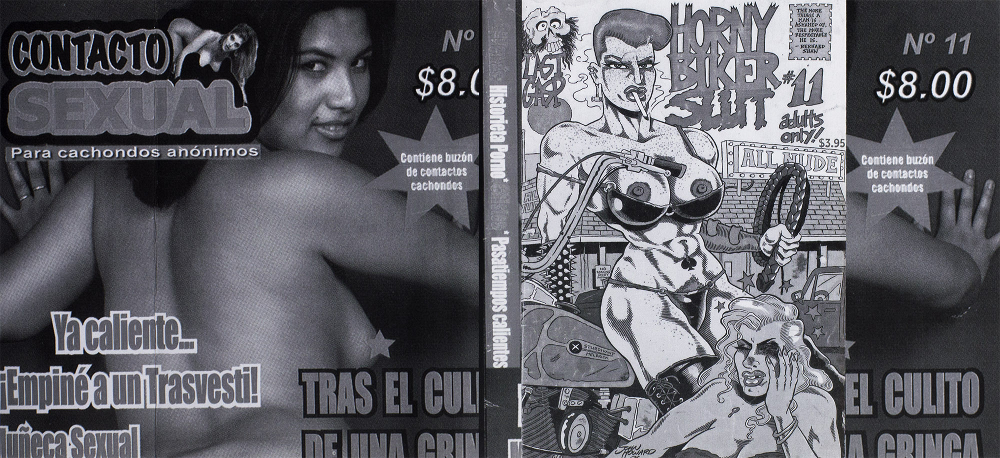
After doing a bit of C.S.I.-style zooming and enhancing, the title of the page appears to be a comic-book cover, titled ‘Horny Biker Slut #11’. This quirky title and cartoon imagery could make sense of the reason why someone decided to steal it from my copy, however inexcusable it may be. But there is one thing a bit strange about this particular cover. When I googled it, it actually exists and you can purchase it from Amazon for $19.99 + shipping. The fact that this title actually exists in real life makes it different from all the other titles, creating a whole new question altogether.
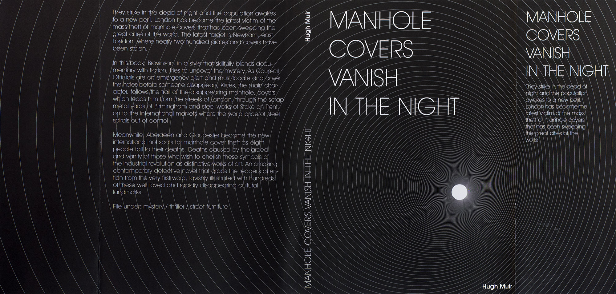
By this time, Mrs Schryen (someone working for Studio Manuel Raeder) got back to me. She informed me that there were in fact two covers missing; the above mentioned Horny Biker Slut #11, as well as one titled ‘Manhole covers vanish in the night’, which looking back on the Brno pictures, was also squarely visible.
I previously stated the Horny Biker Slut #11 cover existed in real life, but in the full publication version you can see above, it looks to be collaged together with the 11th issue of ‘Contacto Sexual’ on the back and both flaps, and something called ‘Histoire Porno’ along the spine. The other cover appears to reference, word for word, an article from the Guardian, dating back to 2004.
The fact that there is a second cover missing from our library’s copy means that the two volumes seem to be inconsistent in their numbering. The first one doesn’t count the outside cover as a ‘page’ and the second one does.
Never Odd Or Even at the Grimmuseum (2011)
The artists involved in this project don’t seem to be concerned with consistency, correctness, nor the concrete.
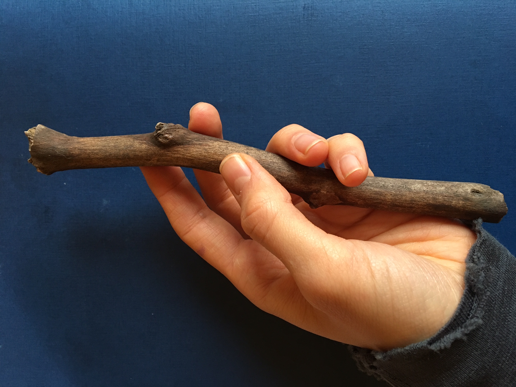
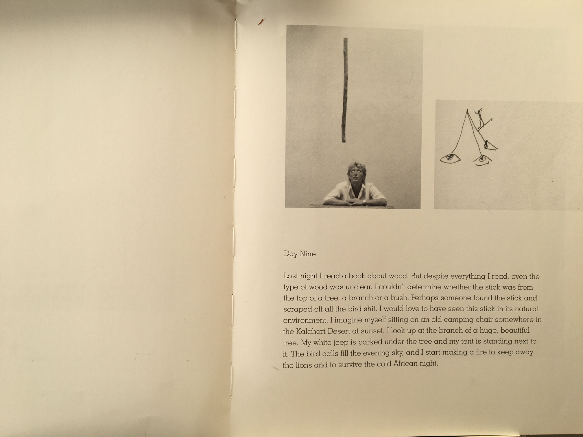
A thin book. A plastic waterproof cover. A present clear light blue. Frames on a wall, nature and figures of humans standing on their own interfering with a wooden stick. Throughout the book the wooden stick is working like a tracer holding the pieces of the book together.
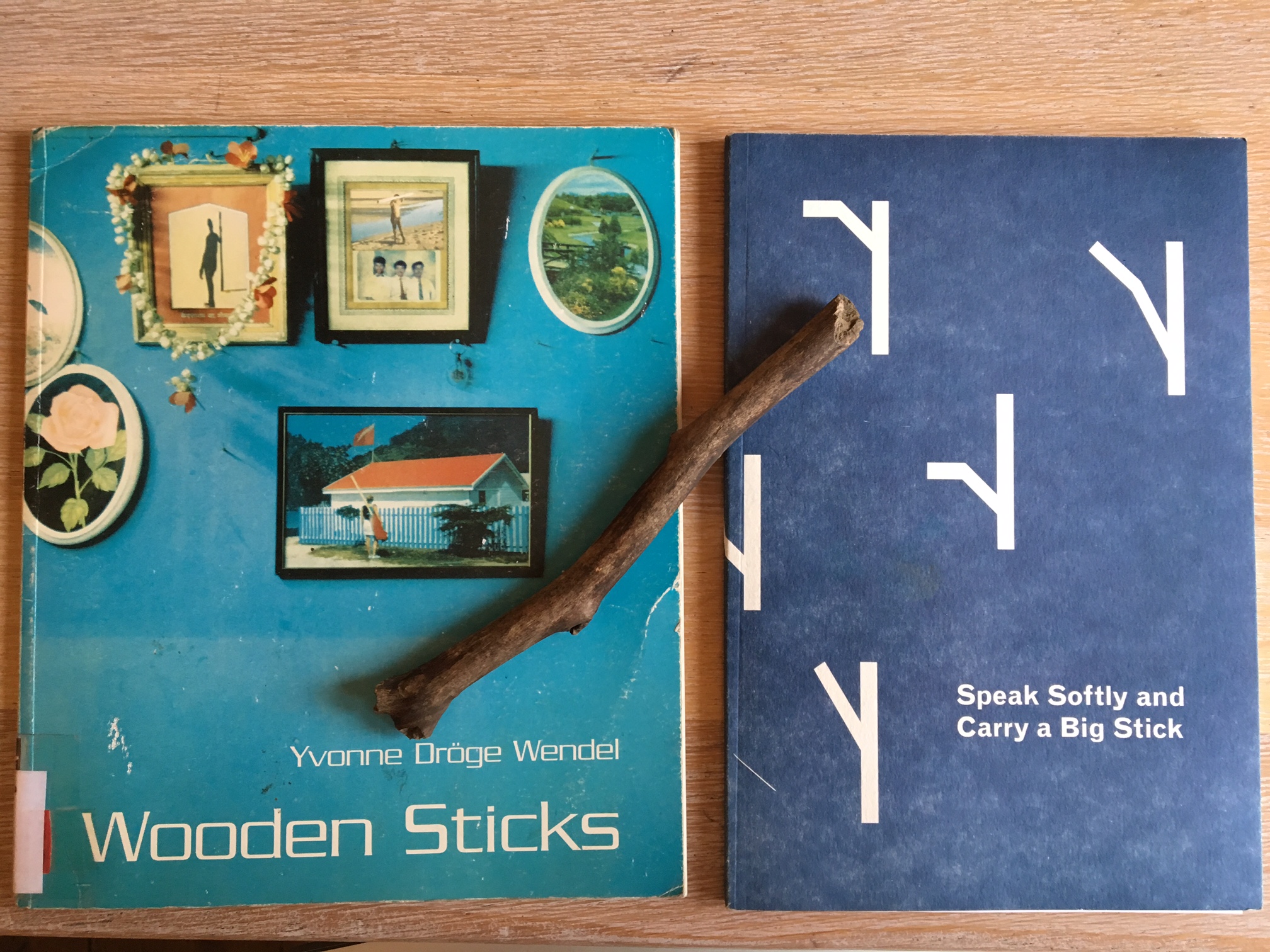
I found it in the middle of the long list of choices, a list with new books for the library of the Gerrit Rietveld academie. This book might be new in the library, but was made in 1996. The book was made after Yvonne Dröge Wendels’s work and exhibition “Wooden sticks” at Witte de With in 1995. It is self-published and designed in collaboration with Jan Geerts. He happen to be nowhere to find on the world wide web which makes me wonder if he even works as a graphic designer? Maybe he was simply a good friend helping out with a simple set-up for the book to be printed and manifested as an object on its own.
I got curious with the look of the tittle “Wooden sticks” simple and effective, the two oo’s next to w, the emotions and memories wood evokes and the sticks connected to it made me wonder what was inside. So I took the book out from the shelf. At first glance, to be honest, I did not like the look of it, why is it plastic? Why this fond? Peculiar blue. Naah.. its not me, but I then flipped through and the pages had the perfect flip through, where you don’t miss a page doing it, and I fell for the instant feeling of development in intensity as I flipped it in my hands. Two chapters. The first, text, b/w simple documents of her process – where she construct an experimental set-up- through which she approach the object of a wooden stick in different ways- it shows her different perspectives, postures, gestures, moods over the time of thirteen days. Second chapter, a colorful and intense rough collage of different art historical, archeological, anthropological descriptions of sticks. Its a book of how-to, but not with conclusions and clear answers.
There is a very present feeling of not being modern in its design, hit by nostalgia it reminded me of books from my childhood. The bendy softness, yet solid presence, not fragile though light and the simpleness of the design. My first thoughts about the graphic design was, “It’s like the pages are pre-made templates ready to be filled out with words and images of your choice.”
A simple book with a sense of layers and depth in context.
Turning my head towards Ms Dröge Wendel.
Yvonne Dröge Wendel happen to be in my very close vicinity as she is the head of Fine Art department at the very same academy as me and the library where I found her book.
But she’s a busy teacher and artist at this moment, not to reach.
Where to go.
Library.
“Oh you like wooden sticks? We just got this one”‘
A brand new soft paper dark blue cover with what I assumed to be graphic-designed sticks. Is there any link besides the look and the theme?
The book is made by Alex Zakkas, a designer and artist who happen to be at his final year of DOG-time at the very same school as me, the library and Wendel, the Gerrit Rietveld Academie. And one of his very starting point was indeed the work “Wooden sticks” by Ms Dröge Wendel.
We meet.
Being in contact with a book called Wooden sticks about wooden sticks and their different uses I unconsciously started seeing them everywhere on my walks and ended up with one in my bag the last month.
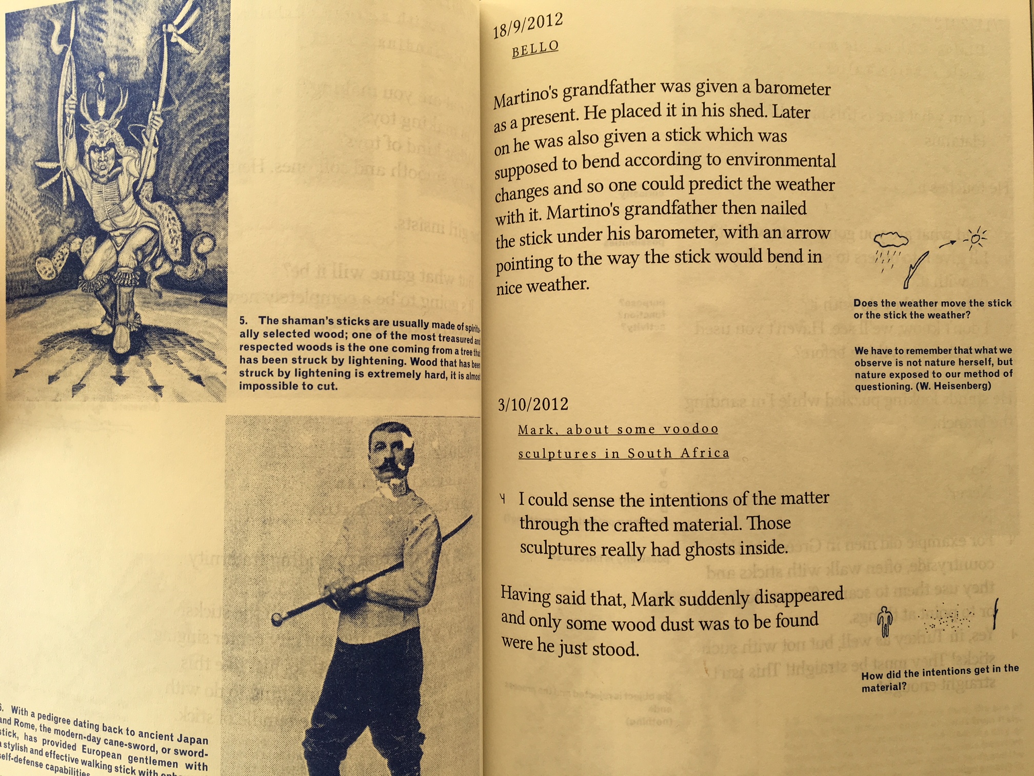
Alex Zakkas made this book in close relation with his good friend, the designer Martino Moradi. Its the compilation of his one year residency work. It didn’t start as a book-project but was made within the last two months of his residency at T.U.Delft Institute of Positive Design, a Phd. world of design as he puts it. And he tells me that he feels the precense of that academic design world very much in the way the book is designed, in contrast to Wendel’s book.
It works with black as the main colour, blue as the more reflective colour (for his sidenotes/drawings) and three very glossy spreads of colour images to break it up. Every text is played graphically with, as a direct responce to the content. The presence of the graphic design is clear, it constanly works as a support for Zakkas research upon the object of the wooden stick. In contrast to Wendel’s project, Zakkas interest was to look as closely as possible at the process of transforming raw material(including found objects, such s the sticks) into man-made artefacts and to collect insights on how a designer’s intentions condition a range of possible interpretations. “as triggers(or restrictions) for subjective associations, the specific materiality and varied tactile qualities which I introduced on sticks became an important aspect of my research process” – Alex Zakkas.
It becomes very clear to me as we speak, how Yvonne on the other hand, more than designing, decided rather to let it be as it is/was. As she treated the sticks as “a place of meaning; a thing with ‘just enough qualities’ she seems to treat her book the same way. No extra. A very welcoming and unpretentious effect upon me as the reader. Open for me to read and fill out the space myself. Filled with space around the simple text and images. Space to think and wonder
Its two ways of playing. Both with clear choices. A reminder that layers in the design can add meaningful and playful insight to the work. But letting it stand raw gives space for reflection in another sense.
when putting Dröge Wendel’s and Zakka’s books up against each other…
There are very clear links to Wendels book and work, conscious and unconsciously as Zakkas puts it, when asked.
As my starting point was the development of intensity in Dröge Wendels book, I decided to make a visual and simple illustration of the different approach to the design of these books, the way they develop when I read through them with my eyes, mind and feelings.
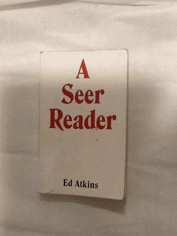
I was trying to find a book in the library with a design which excited me; something I’d like to write about. I chose to pick up A Seer Reader for the assertive, bold cover design it boasted. By using red, white and black, the colour contrast is stark, the combination connoting power. The font type replicates typical, 70’s typography, with its sweeping thickness and curvy motion; it asserts a confidence. A shallow indent delicately engraves ‘A Seer Reader’, indicating the importance of the books title, over the authors name. The ‘A’ starting the title, leads a triangular shape centering attention to the middle of the page. Every element to the cover designed by Zack Group, makes for an eye-catching, attention-grabbing book. The cover enticed me to open the book, and discover what inspired me to chose A Seer Reader for my investigation on design. Surprisingly my analysis wasn’t the result of my initial drawing to the cover, (and therefore comes without credit to the books designer,) but moreover to the author, Ed Atkins.
I discovered that every page of the A Seer Reader was adorned with dancing doodles; playful, printed, pen-style drawings dangle from the words, interrupt the verses and sulk in the far corners of the pages. There are tiny squiggles, illustrations, and symbols referencing or resembling punctuation. The doodles appeared to me, to specifically elude each poem with unique visual imagery. I decided I’d like to discover why they were designed in the way they are. I’ll investigate the context the book is published within, and therefore the content of A Seer Reader. Focusing on the style of the font used for the doodles, their arrangement on the page, and the choice of imagery, I’ll analyze specific examples from the book in attempt to explain why the doodles are designed in this way.
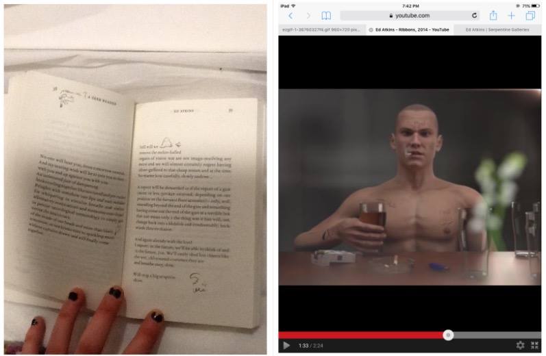
A Seer Reader was published for Ed Aitkin’s solo exhibition in Serpentine Gallery during 2014. Working predominantly with video and language, Ed Atkin’s visual art is inspired by the poetry he wrote for A Seer Reader. Ed atkin’s solo at Serpentine consisting of sound works, text instillation and images revolves around a multi-screen video instillation named Ribbons, where Atkins attempts to emphasise questions concerning the relationship between real life and virtual concepts, objects and environments. He explains that his videos are a ‘…kind of poetry of their own’.’ ‘…interested in previously literary-theoretical concerns about seeing and reading, interpretation of metaphor, figuration and literality.’ He uses CGI to literalise what was once only possible in metaphor.
In Ribbons he creates a surrogate character resembling his own physical appearance in a haunting online replication of a life. Atkins intends to ‘re embody’ himself as a possibility of what we may become in an paradoxical way of spreading a message that we need to focus on developing a more powerful mortal life. Through this high tech HD animation he ironically uses his medium to do exactly the opposite by creating a virtual world.
The character developed by Atkins is a young white male, wearing a bald
head and an action man body adorned with tattoos, he has a habit for drinking alcohol and smoking cigarettes. His appearance and his humanly habits reflect somebody stereotypically disapproved of, in today’s society. Atkin’s concern for the world we exist within, is evident in the design of the tattoos enscribed on the skin of his surrogate, Dave. Desperate phrases like ‘love please’ and ‘bankrupt’ are scrawled onto his skin to illustrate his story of conflict. They physically demonstrate the feelings Dave would have as a human, but as a virtual delegate, his being is absent from. On his skin; they’re positioned outside the human nervous system. I think this indicates a detachment from the animations human intimacy with himself.
After studying the videos Atkins produced for his solo exhibition, I noticed similarities in style between the doodles illustrating A Seer Reader, and the tattoo’s scrawled on Dave’s skin. It now became evident to me, that considering the importance of what the drawings suggest in his video work, the way they are designed in A Seer Reader will also have a special significance to the ideas Atkins questions in his work.
I’m curious as to why the doodles appear in the font style they do. They are printed on the paper in a scrawly handwriting in a biro or sometimes with a bold marker
The independent, physical and primally instinctive movement of writing with a pen in ones hand, is raw and natural to the intellectual human being society knows today. Atkin’s uses the soon disappearing practice of writing by hand, to convey the humanly emotions of himself, or anybody in our society today, onto the virtual future we face (the skin of Dave). Therefore the font design that distinguishes the poetry in A Seer Reader, from the handwriting doodles can be compared to the contrast between Daves cgi skin and his tattoos.
The poetry is written in a serif font type, commonly used in literature of today, its appropriate for clear messages to encourage the reader to focus on the content of text. It may be used to help develop the trust of the modern target audience, which is important if they are to value Atkins’ poems as high literature. By choosing a serif font which was developed digitally, Atkins paradoxically hints at what the digital world has already done to change the way our brains work, to raise questions regarding our future and technology. There is a confident, official level of professionalism created by digitally produced font, totally un-emotionless and un-personal for the reader of today. Its in these respects that the I relate the choice of serif font to Atkins virtual surrogate replica of a human. Both the poetry in sensible, digital serif font and the pinky rendered skin of the CGI Dave is tormented whilst illustrated by a real humans handwriting scribbles. The choice for handwriting therefore poses a conflict between some of the characteristic, fundamental elements of human development regarding language in the mortal world, (a practice at threat of,) the human’s of our virtual future; a product of our current society.
By using handwriting the design of the doodles appears uniquely personal; autobiographical. Atkins uses his own style of taking notes to project his personal concerns with society onto his surrogate; he plays with his ego, flipping himself into his virtual identity blanketed by his naked, surplus and mortal emotions Through his CGI in Ribbons. In A Seer Reader the intimacy created between the reader and Atkins, through his use of highly personal handwriting, implies the doodles are like entries to a diary, personal thoughts belonging to the artist. The doodles style in handwriting therefore allows us to understand Atkin’s truly distressed feelings towards our existence in the future he insights, in the mostly raw, open and honest way.
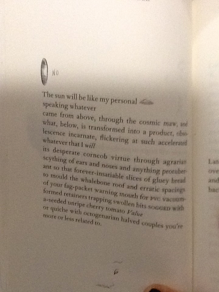
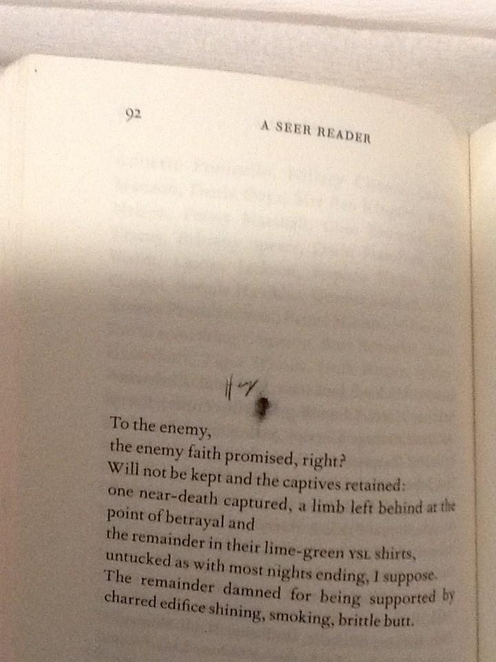
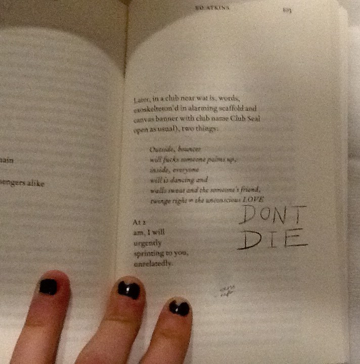
A consolidation thoughts form from Atkin’s head; the handwriting translates a universal language of emotion, in how each word is formed from the authors hand to the paper. The handwriting helps to illustrate Atkin’s feelings as he writes, and emotionally connects with each specific word. For example on page 92 of A Seer Reader, Atkins poem stabs at capitalism and using a current slang, (another characteristic typical to a human of our time,) he makes a metaphor for our choking industries; ‘butthole’.
He illustrates with a pencil sketch of a butthole, labelled with more slang; ‘hey’. He adopts a loose, scrawly joined up handwriting to do so. It feels fluid, creating a casual, relaxed visual effect which allows the readers feel comfortable to laugh, as he playfully mocks the sincerity behind his poetry. By contrast the choice in design regarding capital letters, a larger size font to the majority of the doodles and sharp points determining the end of letters, suggest aesthetics which relate to an irrational state of urgent, abrasive, human panic.
Page 103 in the handwriting ‘DONT DIE.’
Capital letters accentuate importance, taught in the grammar of the languages in our society, showing Atkin’s thoughts which should shout from the page. These features of the handwriting style show how Ed Atkin’s conveys different emotions through the doodles design, he plays with his readers to elude how he feels as the artist.
The design regarding the placement of the illustrations on each page and they’re relationship with the text arrangement is also of interest to me. The doodles are very specifically positioned, creating a new design and rendering a unique layout on each page. The notes are cheerful, their haphazardness and impermanence in position creates a youthful energy of its own. Many harass the text, dangling from the words, interrupting them like a vandalised high school text book decorated by an excited teenage rule-breaker. Upon flicking through the book I think Atkins creates a chaotic feel with the arrangement of the doodles. Maybe he does this in an attempt to question the power which our mortal life (represented by the emotive tattoos / doodles he writes by hand,) has, over the possibility of a virtual future (what his poetry represents). An issue presently discussed within his poetry, as well as what he represents with his surrogate Dave in Ribbons. Chaos raises concern to me, and suggests Atkins might be trying to raise awareness of his issues with the future and society today, through fear.
On some pages it appears the design regarding the placement of doodles serves purely for illustrational purposes. For example on page 86 a smiley mouth and a big floppy tongue curve and grin around the word ‘mouth.’
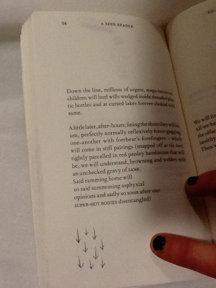
The positioning of the doodle presents a clear visual anecdote of the text, as its placed directly next to the words, the reader sees them together creating imagery. The poem on page 94 begins with ‘down the line.’ Directly beneath at the end of the poem and the lowest point on the page is an illustration of 9 arrows pointing downwards.
Again this provides a clear illustration of the text, but it also speaks of itself and the symbol is close to the bottom of the page, it feels they are going down as well as ‘being’ ‘down’.
I’m curious to understand if there is a relationship between the way the doodles are used for illustrational purposes which seem therefore to be in harmony with the poetry, and the concepts which lie behind Atkins exhibition at serpentine which A Seer Reader was published for. Despite the chaos of the doodles, and the lively energy they carry as they appear in different places for each poem, they do help the reader take their imagination further in their illustrative quality. If the handwriting doodles refer to issues regarding mortal life, and the poetry talks on the concern for the virtual future, then Atkins could be showing the bond between the illustrations of his thoughts, and his poetry. As one where he symbolizes how mortal life still has power to change the effect of the virtual world or what is to be of the future, as the illustrations aid the text.
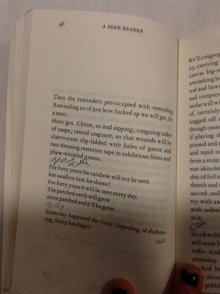
The discourse structure (involving the positioning of illustrations with relation to the poetry,) may be designed as it is in A Seer Reader to give stage directions to the reader. It creates a similar discourse structure within the poem to that of a script. On page 46 Atkins places the handwriting scribble ‘nausea,’ in a new verse, in line with the direction the poem would be read in.
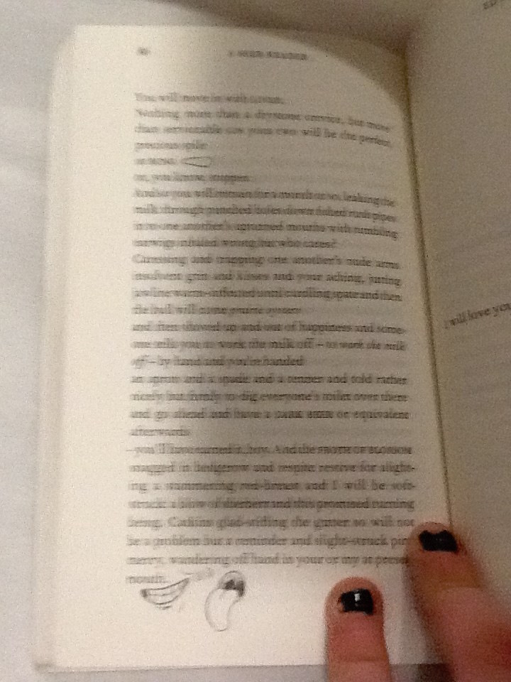
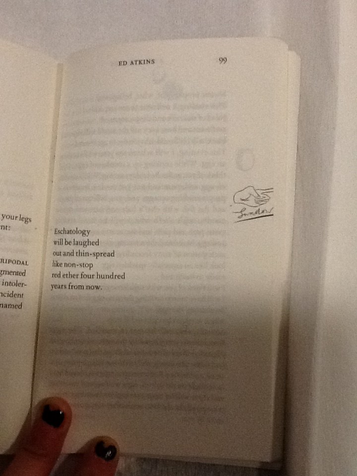
Atkins allows these direct assertions of feelings to stand as lines by theirselves. They appear significant and with a different font (in scrawny pen,) they contrast to the rest of the poem, they work as powerful instructions. With their own space they order the reader to feel something. They also give relief to the poetry; a breath between verses to give time for the reader to reflect, to feel, before continuing to read. When looking at page 99 a short, six line poem is centred to the left of the page, so the text lays closest the core of the book.
A poem which torments human’s obsession with eschatology, with disregard and humour. A slap-stick illustration of a hand, labelled ‘swallow,’ underneath, sits directly in line with the verses on the opposite side of the page. Aligned with the poem on a vertical axis, its clear the text and illustration are to be read one after the other; they have a connection, although they are separate because they imply a direction; a change of action. The illustration is cut right to the edge of the paper, giving the impression there is something to reveal on the next page. Its likely that after reading this grave poem, which makes dark humour about the possibilities of our future, the space allows the text and the reader to breathe. I think Atkins wants the reader to digest the words of this poem, look to the right and ‘move on,’ indicated by the encouraging instruction of a pointing finger to turn the page. In this case the positioning of the doodles may be used as a order to feel an emotion like a stage direction, or to initiate a direction.
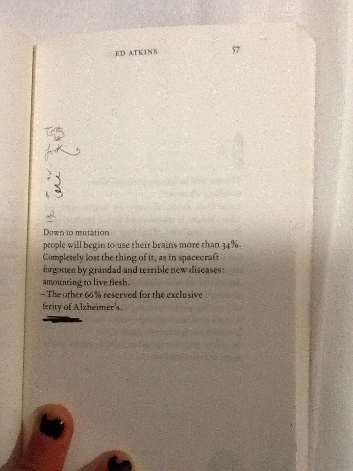
Some doodles intimately relate to words in the poems. On page 57 a bold marker is used to underline the final verse in the poem, this draws attention to it and marks the line with importance.
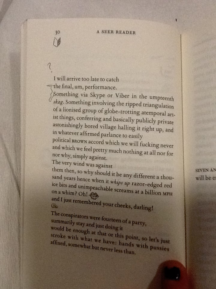
On page 30, the two opening words, which start verses following each other, are connected with a squiggle.
When joined they spell the phrase ‘the something.’ Making a new verse within the poem. This statement also exists on the page now without relation to its context in the poem without the joining squiggle. This draws emphasis to the phrase and creates layers within the poetry.
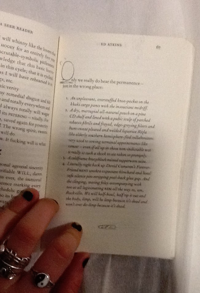
In some cases the positioning of the handwriting squiggles make them a part of the poem, although they contribute letters in a different style to the rest of the poetry in its serif font. On page 67 the poem begins using letters O the handwriting style, to begin the first words of following verses.
The size of the squiggly letter is obese to the rest of the text, it helps to compose a bold and grand opening word. This is a common design in a lot of literature, Atkins makes a reference to it in his own style in an impish attempt to add intellectual value to his poetry through his page design. The choice to have these in the doodle style instead of the serif font refers to the power the doodles have over the poetry on the page, as they refer to the dying practice of handwriting as a symbol signature of our mortal lives in society today.
I’d like to find out why Atkins chose to use this specific imagery, for his doodles. Many of the symbols he uses look similar to punctuation, commas, full stops, brackets. His choice to use marks in A Seer Reader and for the tattoos in his video, which are similar to punctuation, gives a further clue that not only the handwriting is being used as a symbol of our mortal life today. There are other reoccurring themes within his imagery, including hands, eyes, penis’ and delicately sketched vaginas. All parts of the human body. Atkins decision to design his illustrations using this imagery, again, references mortal
life and current society which he discusses along with his thoughts about the future in his poetry.
By investigating Ed Atkins process as an artist, focussing primarily on his exhibition at Serpentine Gallery 2014, and more specifically the video work Ribbons, I have come to various conclusions about why the doodles which intrigued me into investigating the design of A Seer Reader, are designed in the way they are. The handwriting style the doodles are written in, connotes natural human thought patterns, unstable emotions and ultimately the questions the author presents. Handwriting also serves as a symbol for language and writing in which could represent the typical medium used and developed throughout our human age. It therefore creates a tension with the computer generated font type used for the poetry, which might suggest the virtual future which Atkins discusses, as a running theme to his work. The doodles appear in totally different positions throughout the book, on each page. I therefore discovered various different reasons for the design of their arrangement. They can be placed intimately within contact of the poems, to draw attention to specific words or phrases, or to illustrate an idea directly which shows how human knowledge can still be useful for bettering the future, when considering the broader context of his practice. They can be placed in a location on the page which will give a direction to read in or indicate that one should stop reading to feel something. The placement of the doodles when they create letters which integrate directly with the poem, connate high literature as Atkins desires his writings to be read with sincerity as he discusses deep issues surrounding our society and regarding the future. Finally the chaotic feel created by the different placement of doodles on each page questions the urgency of the issues the handwriting stands for; the mortal world and its conflict with the virtual world of the future. To end my investigation I discovered that the imagery Atkins uses in the design of his doodles references English punctuation, and the human body. Again it links directly with his exhibition and his proposal of questions regarding our existence in the society we live in today, and its relation with the virtual future.
“A Flexible History of Fluxus Facts & Fictions”(2004) is a series of memories by artist Emmett Williams. He presents these memories through collages. On the left-hand pages a historical picture is shown. On the right-had pages his own work is shown. His own work consists of either a historical picture of something that he has made or a picture of a work made by someone else mixed with his own trademark drawings. Often he uses the same drawings.
The most important “additive” is a small, brightly colored human figure. It is present on nearly all pages. These small humanoids appear to be Williams’ trademark drawing, almost like a signature. They appear and re-appear almost in all of his own works, but also in almost every text about him. I fail to discover an origin. It seems to be a quick drawing that simply stuck around. The work it is most featured in is “Twenty-one Proposals For the Stained-glass Windows of the Fluxus Cathedral “. This work shows a variety of sketches for lead-pressed windows. About these drawings Williams says: “All these funny little people, who are they, where do they come from, and where are they going? I don’t think they are self-portraits, although they do creep into a lot of my works. They have been keeping me company as far back as I can remember, even as a child, ever-present doodles dancing in and out of a kind of automatic drawing.”
The second most present drawing is that of a round head, reminiscent of Mayan imagery, sticking out his tongue. This image is one of the main symbols of Fluxus. It is first featured on the Fluxus-manifesto. It seems well used by not only Emmett Williams, but also other artists, where it functions as a symbol for Fluxus. I cannot find any sources for the meaning of the symbol. It might be random, which would fit the Fluxus movement.
The left-hand pages are the historical ones. They keep up the appearance of being informative. But often they lack interesting information or they are just not complete. They give you just enough information to become curious, but they never deliver.
Another choice within the of the book, which strikes me as odd, are the page numbers. Only the works of Williams are marked. And the table of contents only reflect those pages. The historical documents and pictures are not registered. And thus are difficult to re-find. This makes me wonder with what goal or reason this book was made. It’s hard for me to believe that its original set-up is that of an overview of Fluxus-art. The numbering makes me feel like the book is a the consequence of the arrogance and nostalgia of a has-been artist. “Look, I was part of this important movement” Williams screams at me through his book.
Emmett Williams gives me the impression of being an artist wit low technical ability. In his many collaborations he appears to offer no more than the concept. Even so with this book. For the last three-or-so books he has worked on, he collaborated with his wife, Ann Nöel. I feel that somewhere in this mixing of artistries the book suffered. Ann Noel’s books are well composed and often interestingly designed, with a lot of thought to spacing.
Fluxus, or any movement that presents themselves as performative and playful, is something that triggers me. Often though, the joyful and exciting aspects of such movements are not translated well into other mediums. As is the case with this book.When I picked it up for the very first time, a sense of anticipation took hold of my body. “A Fluxus book, by a Fluxus author” I thought “will be as lively, as I imagine the period to be”. But the opposite is true. The very strict character of the design of the book (left historical, right his own work) creates a limited set of rules. A set of rules that is never broken within the book. They make the book, after the first bunch of pages, a very boring read. Ofcourse, in the book, information is presented. This information gives you an insight in the events and people that were the Fluxus-movement. But because of the dull choices in design, the information gets lost, or in the best cases, makes you want to read other books.
I’ve looked up other works by Emmett Williams that were meant to last and not be for the moment, like a performance. Besides his acts he also wrote concrete or visual poetry. These poems are simple but effective. They show a small idea, well executed. They often deal with the personification of language versus language being something abstract. It can be powerful in this way and expertly exert the feeling of Fluxus. Emmett Williams shows that he knows what spacing your words can do. He shows that he thinks about how a page should be divided. So why did he give up in “A Flexible History of Fluxus Facts & Fictions”?
What is it with Fluxus, Dada and other movements that burn so brightly, but are so sad to recollect? Maybe it is the fleeting quality of such movements. On the side of the theater school it states “Art is a deed in time”. I feel this is true for all performative art forms and everything related to or commenting on performative art forms. The art “happened’ then, with the performance. Every attempt to recreate it is a way to hold on and futile. Fluxus is like an ex-lover. We should let go. Factual (or fictional) descriptions of Fluxus meetings leave me silent with awe, burning with envy and somber with historical awareness. I was not there! And I will never will be.
A flexible history of Fluxus facts & fictions /Rietveld library catalogue no : 706.8 flux 2
.. Those kinds of worlds that swallow you whole, the worlds where time stand still and you forget your body. It doesn’t have to be an intellectual or logic world. The worlds you discover in your childhood was often better – more fantastic. Maybe because children’s mind are not so constricted. I loved to emerge myself in books and movies. Now in our world of massive possibilities of streaming we have a free choice of worlds. Who doesn’t love Game of Thrones? I might be a bit more into those kind of worlds than the average, so I was really pleased to find another little world in Clair Verkoyens works. I saw a design work of hers in the exhibition “Dream out loud” at the Stedelijk Museum. Three ceramic bowls with three-dimensional worlds added on. The idea of creating new worlds are an interesting possibility that, for me at least, feels like the work leaves the idea of design and move towards something that looks more like an art concept.
She uses a generic 3D software program to make the animated landscapes and the little creatures “making” it. She is creating the landscapes with shapes and then deleting the solid part so only the lines are left. The landscapes on the bowls exhibited at the Stedelijk Museum are made with a collage technic, where Clair Verkoyen samples and merges her 3D animation together and make the universe.
As to the question why does this little universe belong on ceramics the answer is, that it maybe does not? It seems nevertheless that it has been a natural process of her design career to this point, working first with 2D, then 3D and shifting from photoshop to 3D animation. In connection to Clair Verkoyen’s work the Stedelijk Museum presents, as exhibition text, the history of the Dutch tradition of importing ceramics from China. And it is true that Clair Verkoyen bought the ceramics in China but it was more because of fascination of material rather than a nod to history.
I have seen more post-internet art works around for the last couple of years, and for me Clair Verkoyen has used some of the same technics of working – creating worlds – (besides the obvious: that the work made by/on the computer program). Why does post-internet artist make utopian worlds? I have seen a work by Cécile B. Evans named “What the heart wants”. It is an animation about the connection between human and technology. Her world is set in a futuristic, sterile and a bit barren world where human and technology has merge so much that it is hard to find out what is what.
Ed Atkins work has esthetically similarities to Cécile B. Evans’s work because the formal presentation (screens/projection) and something else I can’t put my finger on. I perceive Ed Atkins animation works differently, he creates a narrative or a statement and the world he creates somehow implied. And that is the thing about making animation, it has to be created from a blank screen. Because of the digital medium these artists uses it to open up a new platform to show there art. Serpentine Galleries has a website connected too their gallery this opens up fore another art form ‘Net Art’.
The differences between ‘Post-Internet Art'[x] and ‘Net Art'[x], is that in Postinternet it is able to be both online and offline. Where ‘Net Art’ only exists online. In the depth of the internet you can be friends with AGNES at the interactive part of the webpage of Serpentine Galleries.
AGNES is made by Cécile B. Evans. I have visited AGNES several times during this writing assignment and mostly she follows a pattern but one time she encouraged me to think about the idea of herself and showed me a place where I could learn to write HTML code.
Cécile B. Evans seems captivated by the though of involving others in process of her work. At the exhibition “What the heart wants” Cécile B. Evans had created a part named: “Working On What the Heart Wants”. Here she shows how the animation/movie was made through chatroom bits, pieces and conversations between her and her programmer. Somehow it a very natural nextstep because all of us have a computer so in principal we can all make our own world and what is more important is that everybody can access it. Public art on the internet makes the definition of art even wider. And raises the question: Can the game SIM’s (as an example) be art? It’s interactive like AGNES and it is a world where you create houses and relationships.
All this research made me realize that the worlds created by Clair Verkoyen, Cécile B. Evans and Ed Adkins in whatever medium they work in are very complex and speaks to the observers fantasy. Nothing is given and more observations opens up new layers of experiences. I love being emerged into those kinds of worlds I find in art, literature and movies.
Being able to make worlds is a specific kind of magic.
Within a era where design industry has been mostly focusing on how-to-reach at quickest the largest market possible by basically allowing marketing and communication departments to take the lead and most companies are sales-increasing-oriented, there’s a figure I’ve been admiring a lot for a certain capability to break this kind of mechanisms. Dutch designer Hella Jongerius has been an attentive observer of the industrial production process and its weaknesses and I could think of her as a designer capable to give the design industry a remarkable, somehow playful response.
Chicle Project, material experiment for The Nature Conservancy, 2009
By having a broad look here and there to her work, I could figure out that the strength of her designs lies in their between-state for both caring about details and imperfections and still being able to fit into an industrial production rhythm. In her work I see some sort of generosity which looks up back to the past (not just to appropriate herself – as most designers nowadays would do – of principles such as authenticity and sustainability) by giving it a further value as a result of her never-ending research around life and ”afterlife” of objects. What strikes me about Jongerius’ design approach is that she pushes design to an almost imperceptible limit which oscillates towards an artistic process. Hers seems to me closer to an art-related way of processing research, brain storming, sketching ideas and projects themselves starting as sketches, always caring about some imperfection which can emerge through unexpectedly magic come outs. This is at least what it means dealing with handicrafts. Something that she has discovered already in the 90s when giving the design industry imperfection as an answer. Concerning to Jongerius, design should firstly be communicative. This is what design is about. Its function lies mainly in its communicative power which can be measured at different levels of meaning. Even ugliness can be very a strong means of communication. Since handicrafts primarily deal with the impossibility to produce perfect finished products, she has considered it as her own vehicle to face the anonymous perfection that industry has been producing for more than a century. In most of her works, she is been playing with the imagination of the user, by creating fore ex. a ”frog table” which is basically a frog seating at the table itself and a question which comes along with that is: why do we need imagination for (a specific) utility? isn’t use already enough?
Frog Table [Natura Design Magistra] 2009
According to the Dutch designer, there is a persistent prejudice concerning the essential difference, drastic separation between designs that are made to be purely functional and expressive designs which are able to tell stories which go beyond themselves as objects.
Once again the function of design has assumed new meanings and contents. It cannot be formulated strictly depending on terms of use or comfort.
Sometimes the core signifier of design can actually be its paradoxical non-functionality > animal bowls < a project started in 2004 for which Jongerius is been selecting different pieces ouf of the Porcelain Manufacturer Collection of Nymphenburg – as a celebration of age-old crafts and treasures found within the Nymphenburg archive, in Germany.
Bowl with hare / Bowl with fawn / Bowl with hippopotamus
Some other aspects that I really appreciate about Hella Jongerius’ work are the experimentation with the more diverse materials and her deep passion for colours I feel somehow very close to.
In 2009 she’s been leading a project for The Nature Conservancy [x]. In this particular project Jongerius is been experimenting with the natural material of chicle, derived from the rain forests of Mexico. The project itself consisted of a group of internationally renowned designers who have been participating, initiated by the American Nature Conservancy, an organization which strives to protect sustainable materials for use in contemporary art, design and architecture. The results of the project were shown for the first time at the Cooper-Hewitt National Design Museum in New York.
For this project Jongerius has created – within a palette of six colours typical of Nepalese yarns – Kilim rugs which have been hand woven from special Tibetan wool from Argali – a wild sheep breed that resides in the Himalayan mountains. The yarns themselves have been hand spun by local weavers, and their naturally faded colours and irregular character lend each rug a truly individual appeal. Each rug incorporates several design details, including a hand-embroidered area with silk yarn – a reference to an old tradition of repairing the rugs. The fringes are braided, a practice that also refers to an old custom in Nepal – this for its decorative appeal.
There are some many things which should be told about Hella Jongerius, that comes almost difficult to make a choice ouf of the huge amount of her research. Jongerius has been the Art Director for colours and materials at Vitra for many years, during which she has developed Vitra Colour & Material Library together with a quite recent book ‘I don’t have a favourite colour’ which basically refers to the establishment and +further development of an intelligent system of colours’, materials and textiles that make it easy to create inspiring environments in offices, homes and public spaces. It is definitely an interesting book since the Dutch designer has been illustrating her method of research and the application of its results to the Vitra product portfolio.
Jongerius way of dealing with the design experience is very fascinating for me since I’ve always felt quite far away from the design process, very related to super appealing – almost perfectly finished products.
Her installation/selection within the textile archive of KLM company for Dream Out Loud exhibition at the Stedelijk has been so inspiring for me. It confirmed me further my pre-existing love for textile matter. It immediately brought me to a sort of aesthetics that I personally feel pretty much related to. By reading part of her book Misfit and her .Manifesto. Beyond The New written together with Louise Schouwenberg so many exciting questions came up – concerning the contemporary era – where are we going to? design/art? this over exploited back to the roots feeling and the over flooded quantity of emerging designers. What can design add to the world of plenty? and What is functionality in the here and now?
With this article I will try to provide the reader a good insight into the Situationist Times that were published between 1st of May 1962 and the Fall 1967 during the Situationist movement [ x /y ].
First of all, about the woman behind these tremendously enriching compendia:
Her name is Jacqueline de Jong, she is a dutch graphic designer, artist and sculptor, born in 1939 in Hengelo to Jewish parents.
She encountered Asger Jorn in 1959 in London, which will lead to a very significant liaison and finally to her entrance into the Situationist International.
1960, when she entered the movement she then started to participate in conferences at the Central Committee and was the representative of Holland – in the same year she received a postcard with the message :”Now all of Holland belongs to you.”[z]
This stamped her membership of the SI where she remained active until 1962, when in the same year the German and Scandinavian Situationists saw expulsion by Guy Debord due to a long-standing friction between the aesthetic and political aspects. Because of her solidarity with the German Situationist Gruppe SPUR, she was expelled/ resigned in Febuary 1962.
As the division between the Debord circle and the German and Scandinavian Situationists widened, De Jong stayed impartial.
Her vision was to produce an international, completely free and multicultural magazine based on the most creative Situationist ideas.
De Jong’s major inspiration stemmed from the late 1920s magazinei10 International Revue published and edited by the anarchist Arthur Lehning between 1927-1929, it featured contributions from Schwitters, Moholy-Nagy, Bloch, Kandinsky and many others. The new approaches to typography and graphic design apart from the interest in radical political views were so compelling and intriguingly in synch with the aesthetic sensibilities of the avant-garde with which she traveled.
For her the idea of a magazine with content made up of an wide-array of artists and intellectuals beyond aesthetic and geographical constraints was appealing and aided her in attempts to find new ways of disseminating the Situationist ideology.
“How it started was getting thrown out of the Situationist movement. I had already announced that I was going to make an English — multi-language, but English language sort of magazine in 1960 in Brussels. And it was because of the French — Internationale Situationniste — I said : let’s make an English one. […]
There was SPUR — as a German one, a French, I.S., but no English language magazine for the Internationale Situationniste. So that was my suggestion, and I had bought i10, I think, a year before. And it was the most interesting magazine, I mean also in typography, I’d ever seen. […]”
The first two issues speak a very similar visual language, with drawings and articles. The first issue she started with the whole SPUR trial while they were on trial in Germany for blasphemy and pornography — she published the whole court process in this issue, including the so-called dirty pictures and blasphemic texts.
They would travel to places and protocol their results of applying Situationist tactics as détournement and dérive.
The following issues are quite different, as De Jong found herself very captivated by the concept of topology, she would compile visual information and material in a very meticulous research on various subjects, with the highly diverse contributions in form of highly informative texts – also in different languages, or even various languages in one cohesive article.
The issue that started this whole idea of compiling visual material throughout time and culture was the third issue — the British Issue which she entirely by herself edited and published.
Apart from few highly interesting and profound texts by Anton Ehrenzweig, Max Bucaille and Georges Hay this issue mostly concentrated on the ‘Typologoy of Knots’.
De Jong did not intend to make a series of issues with topological content, but what happened was that she solely recognized the topological pattern that was developing, but where she drew inspiration for the Issue #3 was from walking the Gotland labyrinths.
She described her experience:
I don’t really remember why I took the idea of labyrinths. It might have been because we went to the Gotland. We walked into the labyrinth there. And out. That’s the problem. Into a labyrinth is one thing, but getting out of it.. but there’s always a system to it. […]
Which led her to publishing this extraordinary content on labyrinths, she asked the people in her network, such as her former history professor Jaffé and Aldo van Eyck to write an article on this subject. Simultaneously Peter Schat and Lodewijk de Boer changed the name of their opera from ‘The Paradise Bird’ to ‘Labyrint’.
Issue #5 provided an enormous amount of visual and verbal content on ‘Rings and Chains’, which was the logical development of sequences, and again people were asked to contribute to this specific subject.
But this was also the starting point of the publishing and distributions to take a critical turn. Jorn had to sell some of his paintings for the publishing to take place, there were problems with the printing office after which they relocated to Copenhagen for Issue #5.
This cohesive way of content focusing on a certain topological subject started turning into a maniacal hunt for De Jong, she initially wanted to do an issue on Wheels, but due to certain other coincidental situations she changed her course, this time inspired by Walasse Ting‘s One Cent Life she advanced to compiling a very visually different issue, which will finally lead to being the last one.
One Cent Life was a book featuring lithographs and screenprints contributed by artists such as Pierre Alechinsky, Karel Appel, Asger Jorn, Roy Liechtenstein, Allan Kaprow, Andy Warhol, and many more. “Lots of things were happening, actually at the American Center. Happenings were starting. Yoko Ono came and we were all very much involved in movements that got more and more international. We did some things like parties and exhibitions, and I mean really working together, having enourmous shows together and I mean it became lively, it became really something important.
JACQUELINE DE JONG : THE SITUATIONIST TIMES #6

FACSIMILE 1962-67, CURATED BY JOHAN KUGELBERG, PUBLISHED BY BOO-HOORAY NYC, 2012

Rietveld Library no: 700.2 jon 1
I wanted to show this spirit in a printed way. […] I wanted to do something cheap, but beautiful, and perfect. I said I could make a Parisian One Cent Life, and very cheap, if all the artists do the same colors, the same size, and it’s the size of the Situationist Times. […]”
She went to a lithographer, and many artists were asked to work on this issue, come four times to the printer and make four colors. What also was part of her considerations was the fact that this issue was meant to cover the costs of the next issue, she didn’t want to depend on Jorn selling his paintings.
It was published finally, and it was unique. It was shown at La Hune, which was a bookshop for art and it peaked its distribution, unfortunately to very complicated and shady reasons the publishing of The Situationist Times was put to a halt by outside circumstances which I find very tragic in that sense.
I feel like she could have gone on with this process of working with collaboraters and contributors from all different backgrounds specialized in a certain field and enriched society with this knowledge made accessible to the reader in such a visually magnificient way – if it wasn’t for those outside circumstances that she had little control of.
But then again I wonder if exactly the way things turned out created the emphasis of this compilation of knowledge and visual manifestation of that time’s zeitgeist, giving it more significance, but also compelling me to wonder about the what ifs, or what would an issue on a different topic that I personally find quite interesting have been like? Because I find it quite striking in her way of compiling especially the topological issues, she crossed borders and cultures and time, which really caught my interest, and I almost want to argue that it was accidental because in a way she possibly just wanted to provide the most accurate and rich information on a certain topic with contributions from other people she dragged into this quest.
In that sense, her ambitious hard work and struggles to give us this content and share it with the world and people like us from a different time and mental state is solely, and tremendously enriching, but highly questionable if these were aspects of her consideration. The way I perceived it she solely wanted to share something of the present in the present, but in such an eager and energetic way that I can feel the literal energy of De Jong when I flip through the pages of each issue, the dedication and meticulous arrangement.
I highly advise the reader to go to the library of our academy and let the visual language speak to you. I derived profound inspiration from it – the way of the arrangement and editing, visually as written, concomitant the content itself as well of course.
The International Situationist Times facsimilé edition at Rietveld Library cat.no. 700.2 jon 1
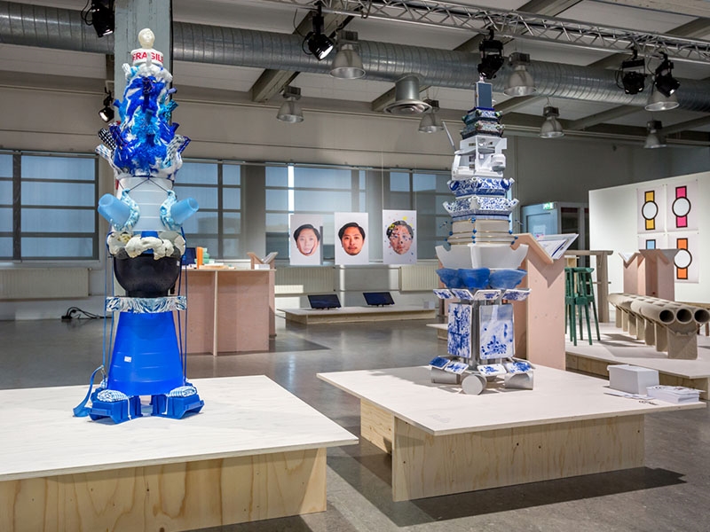
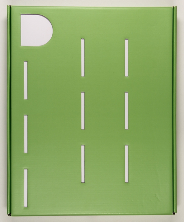
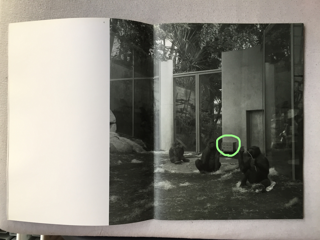
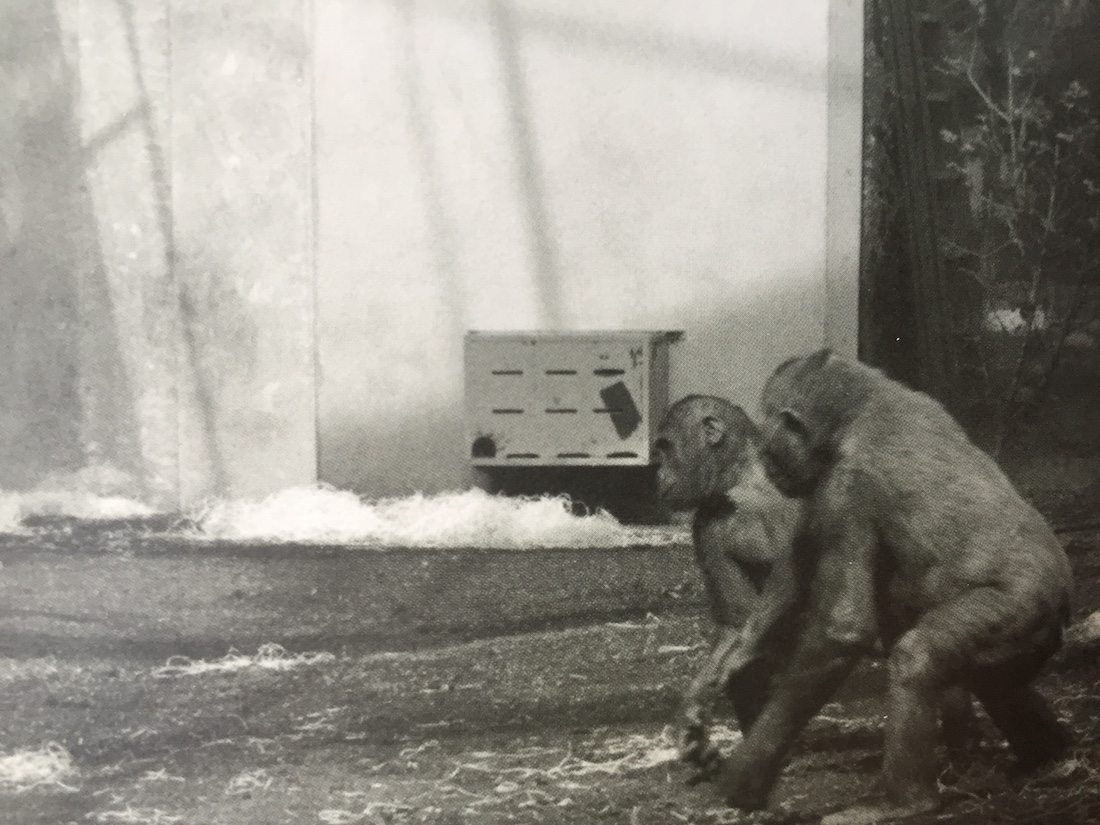

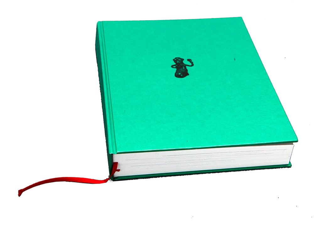

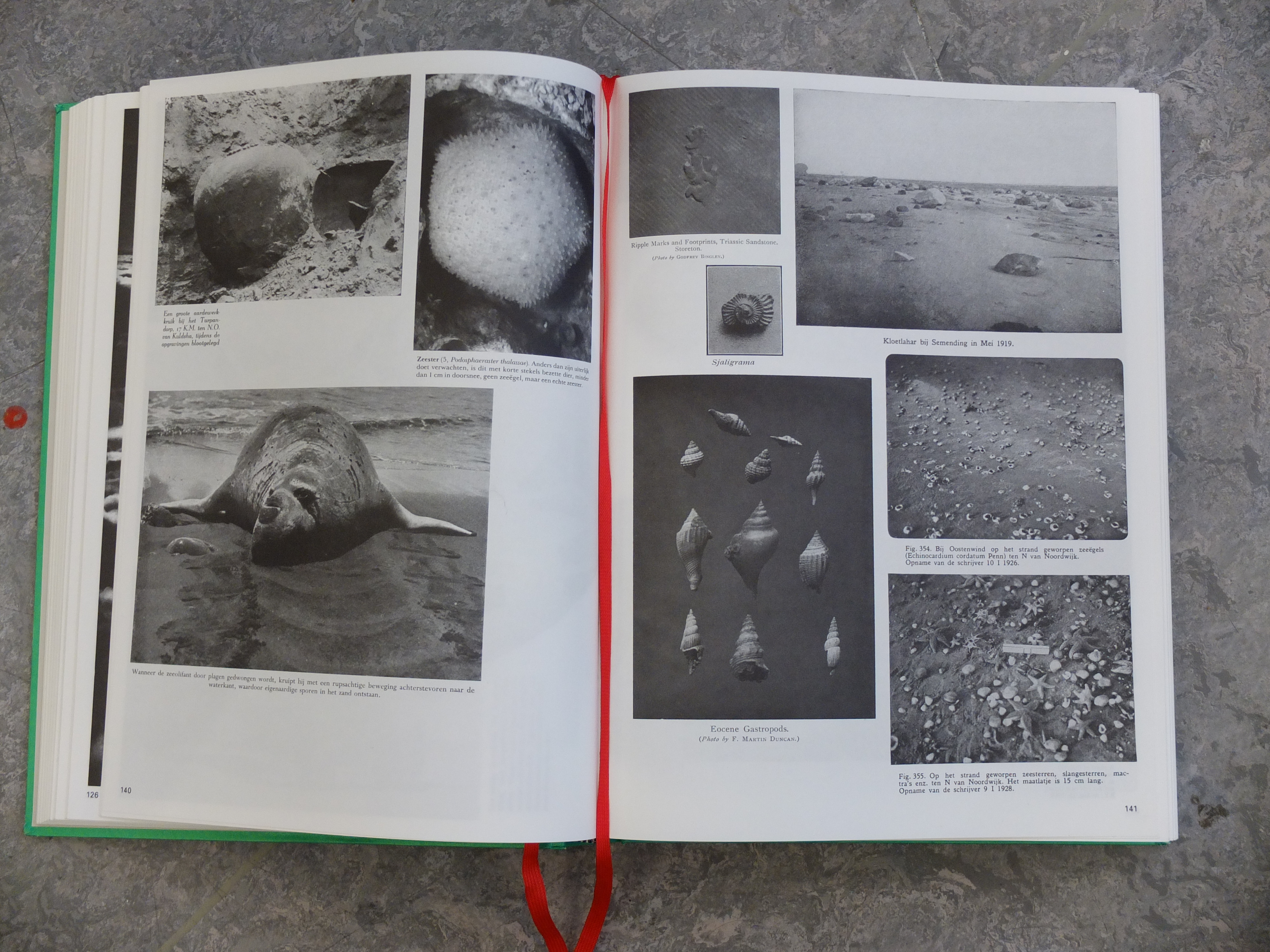
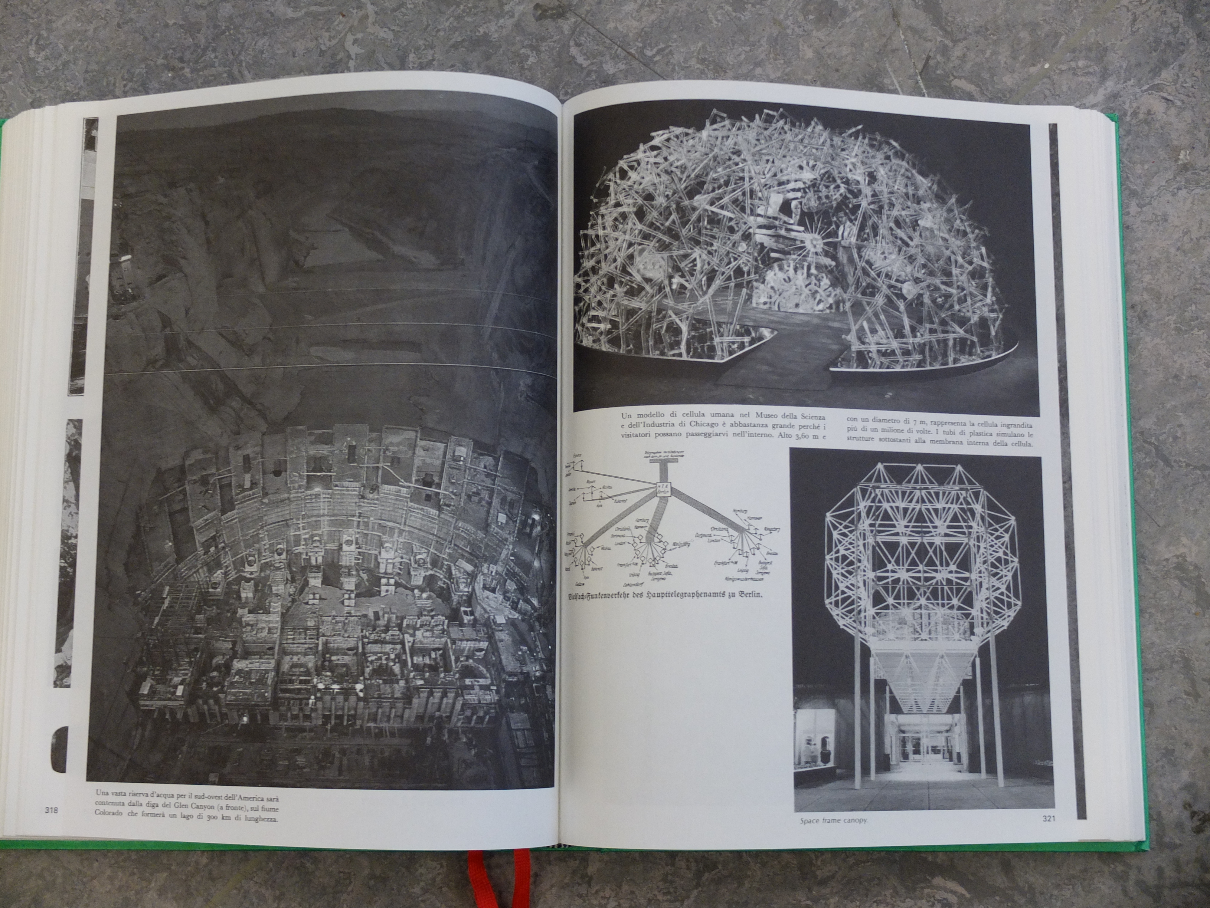
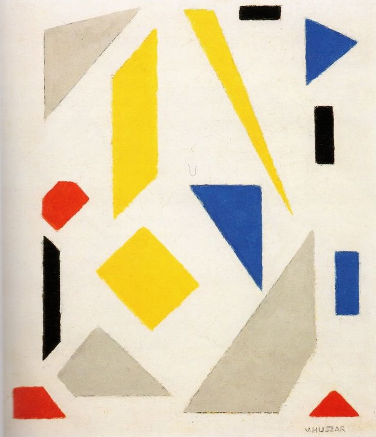


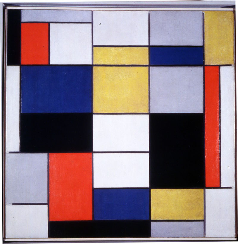


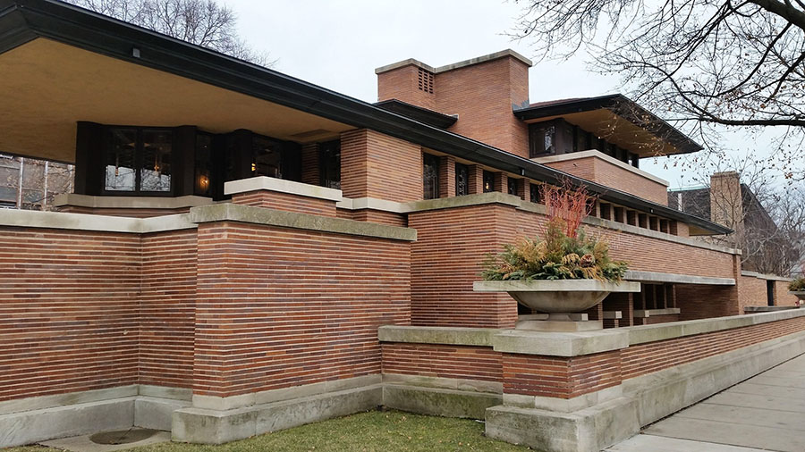
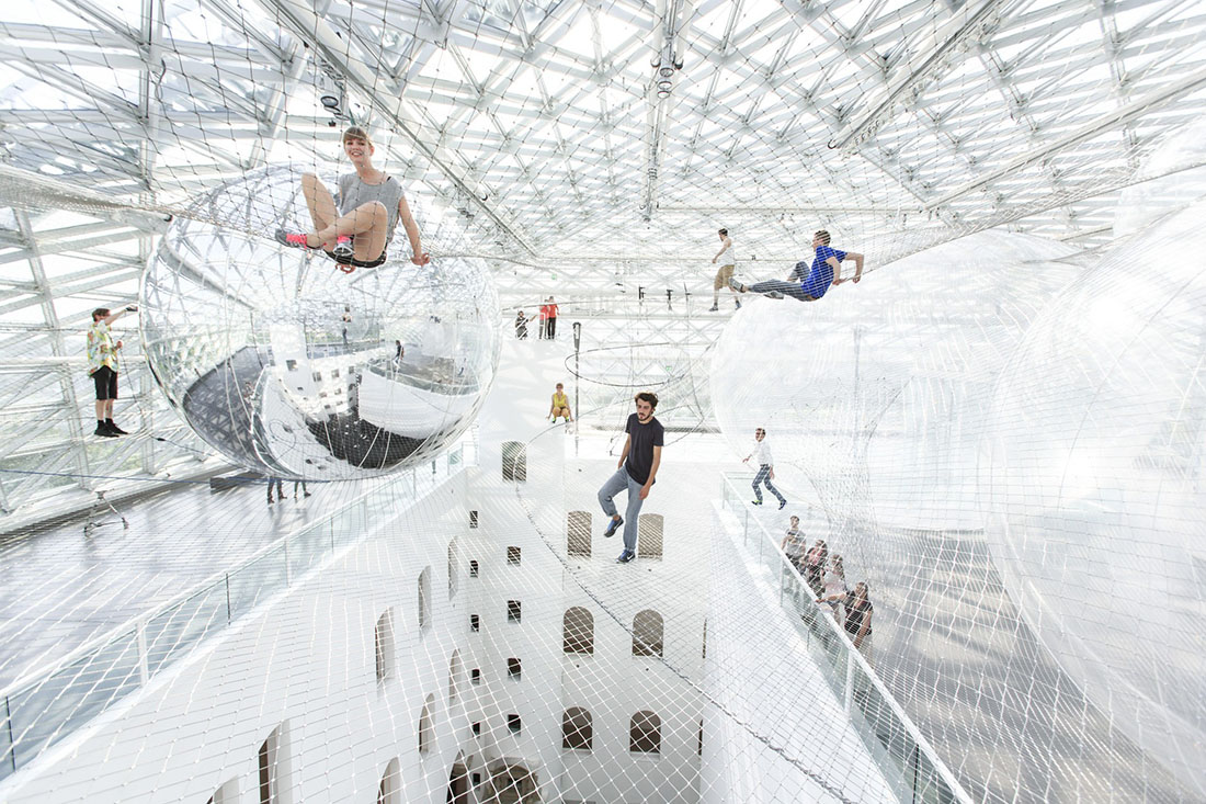
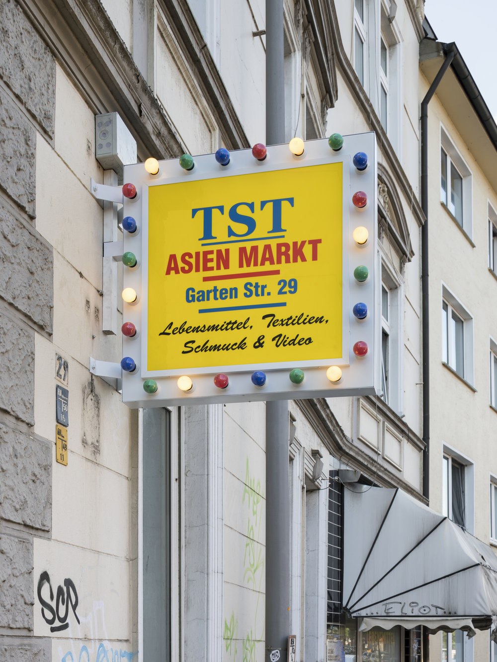
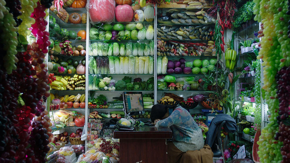
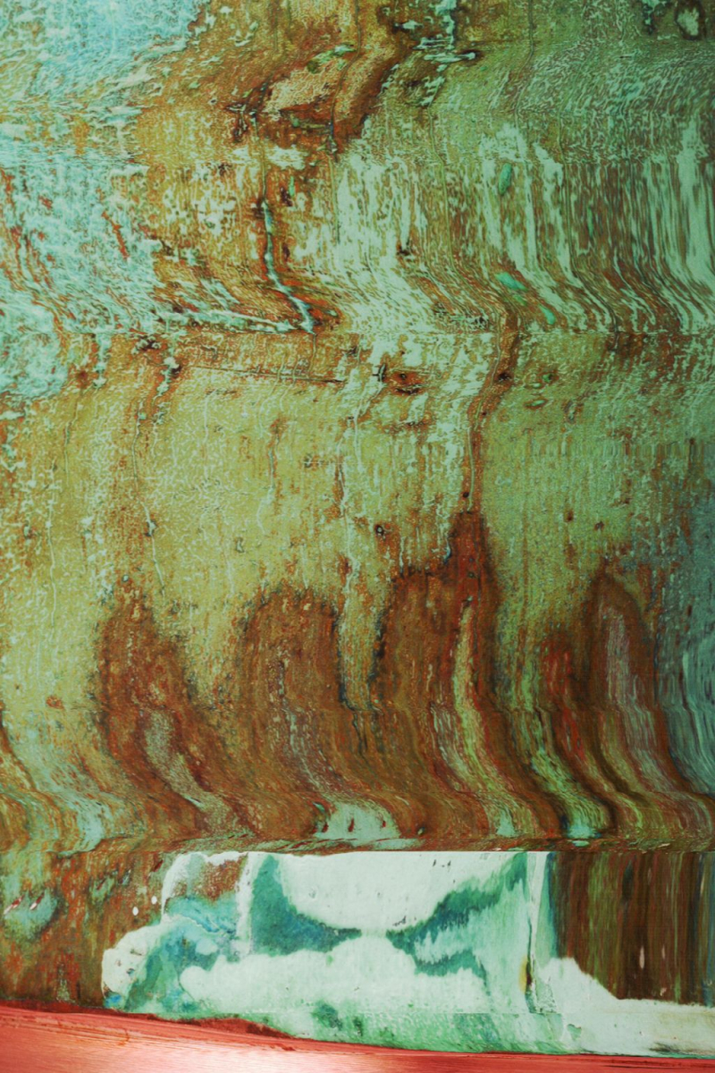
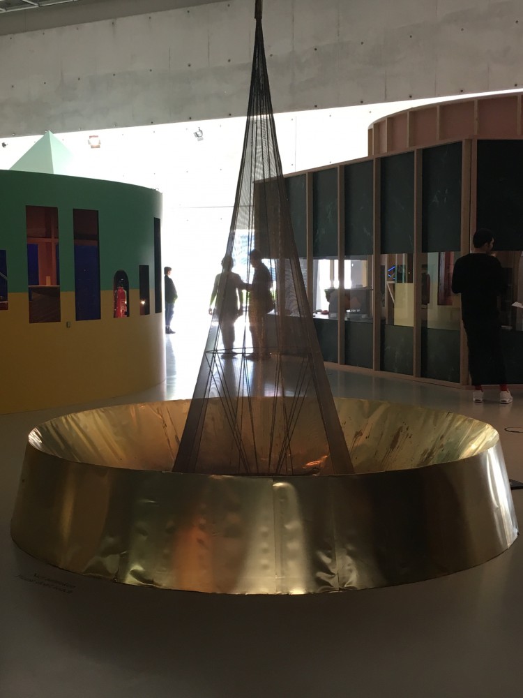
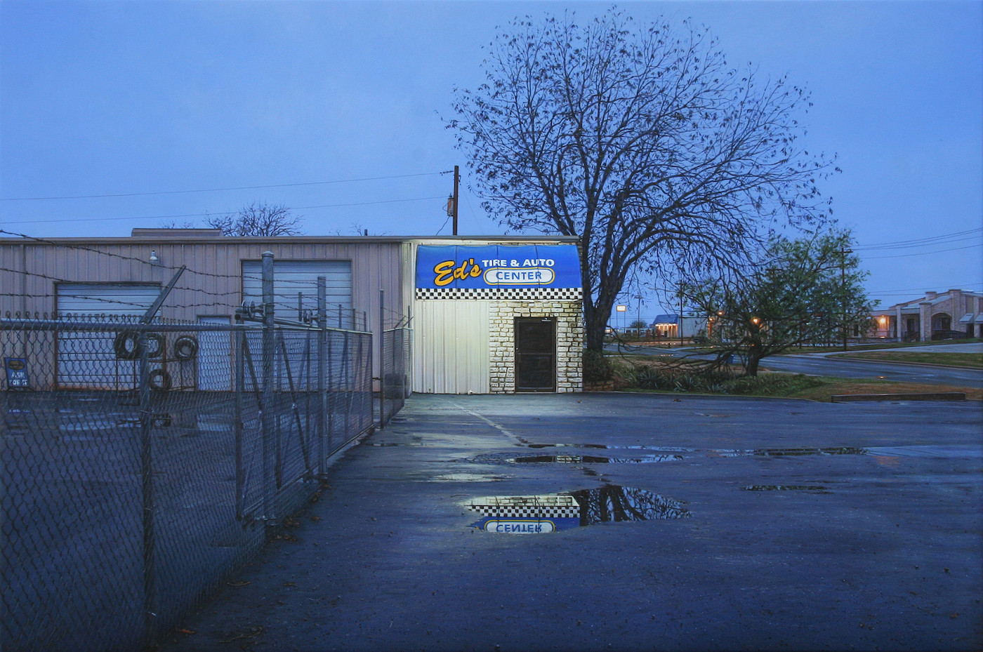
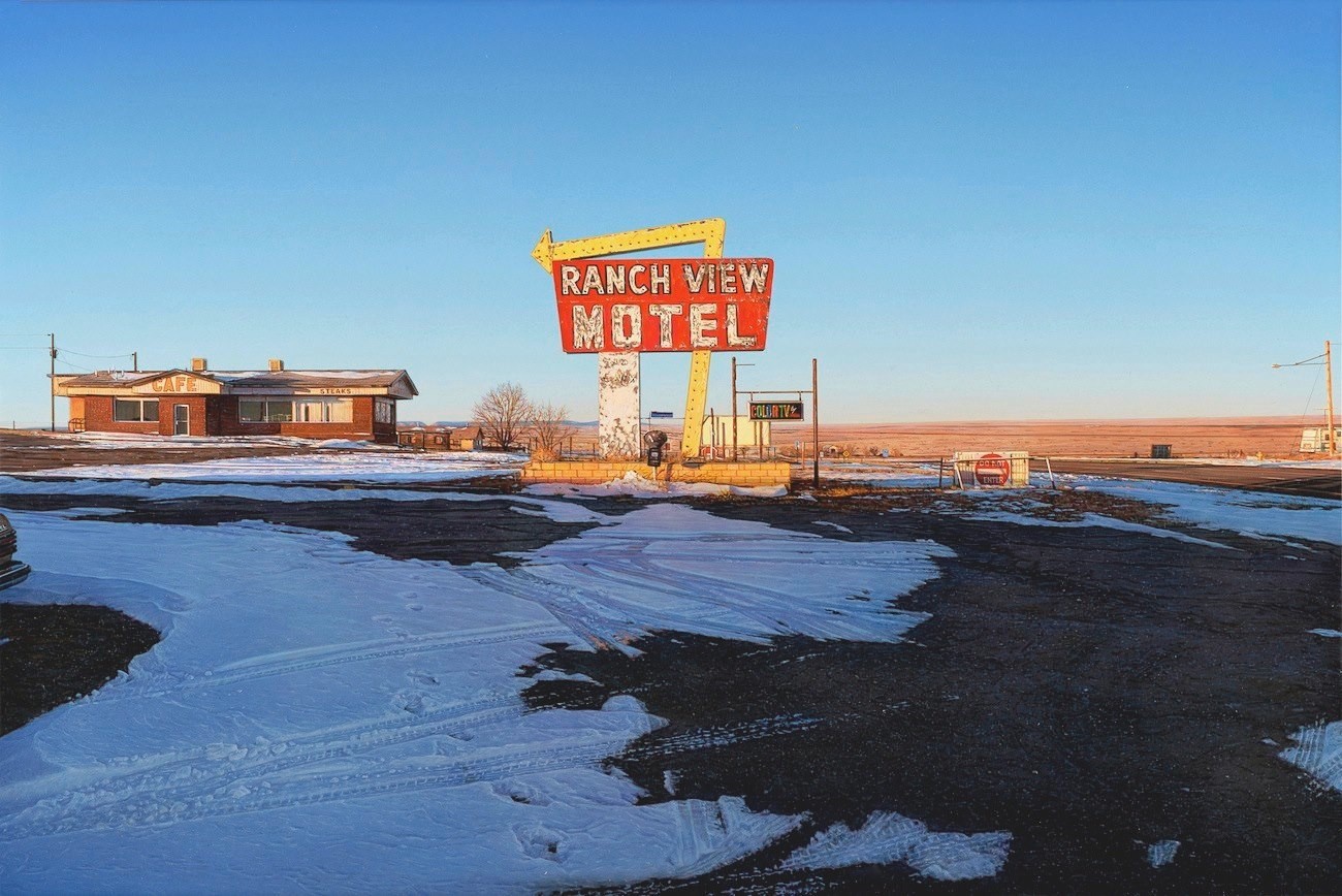
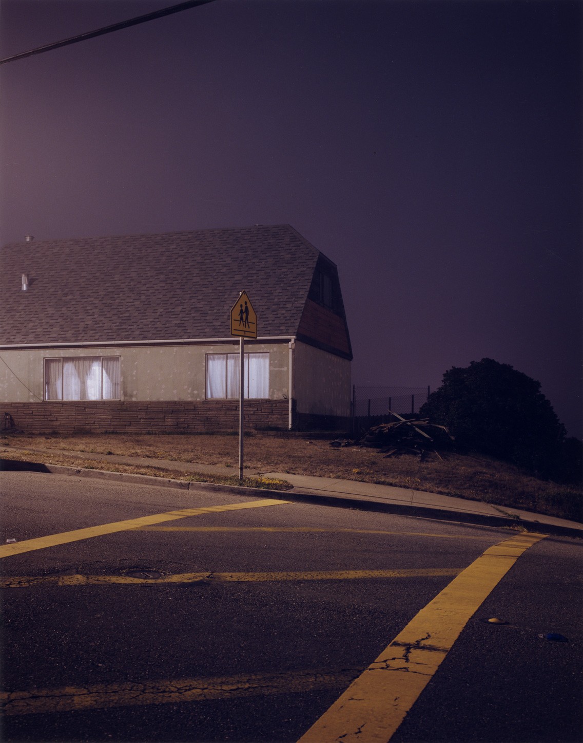
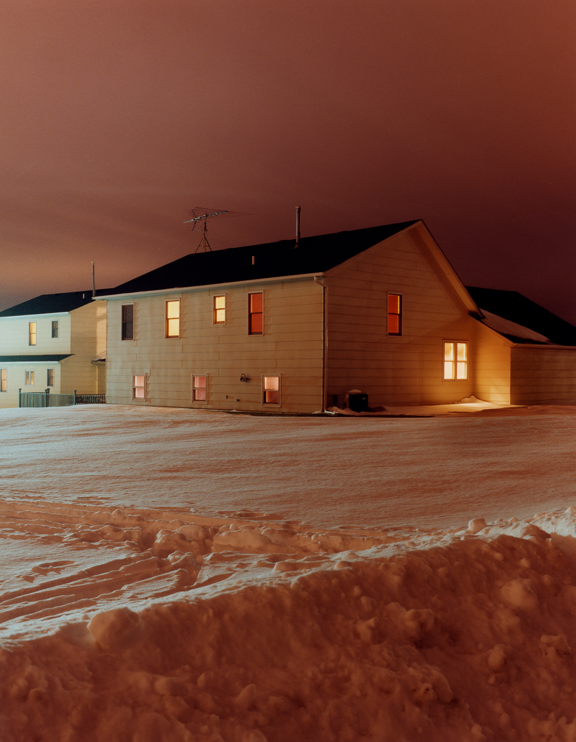
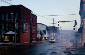
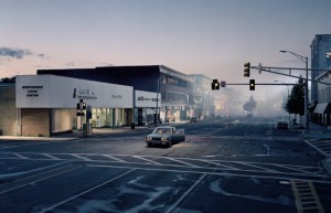
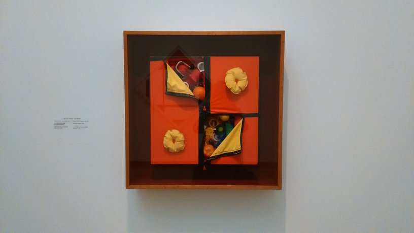
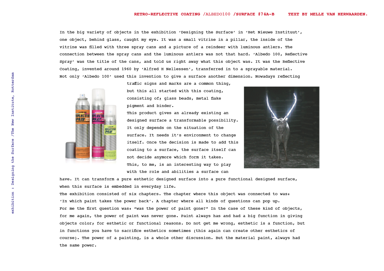
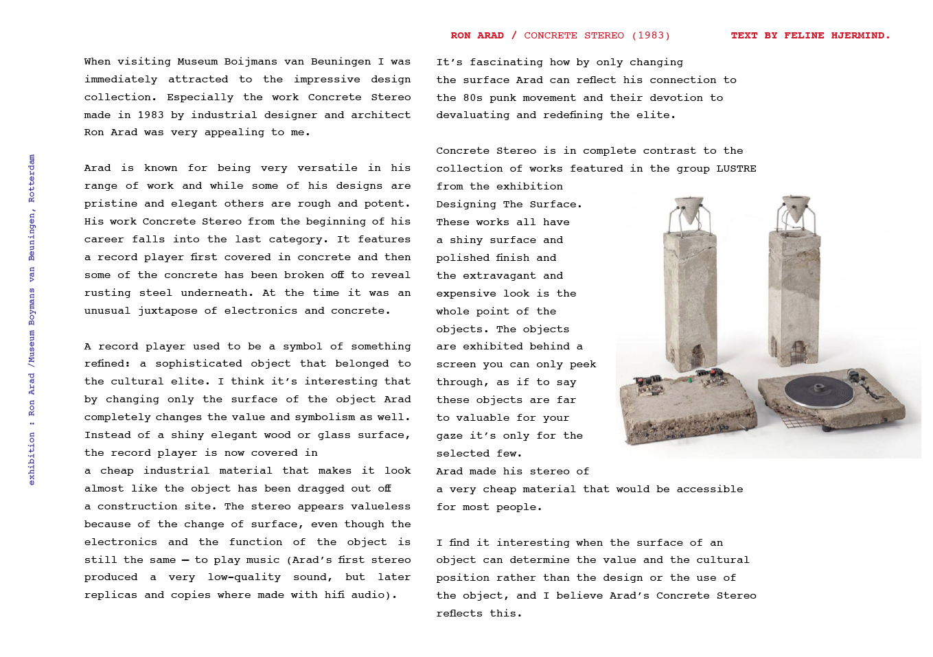


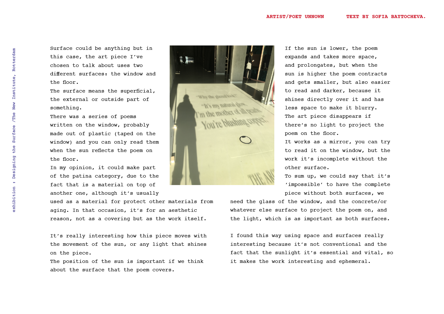
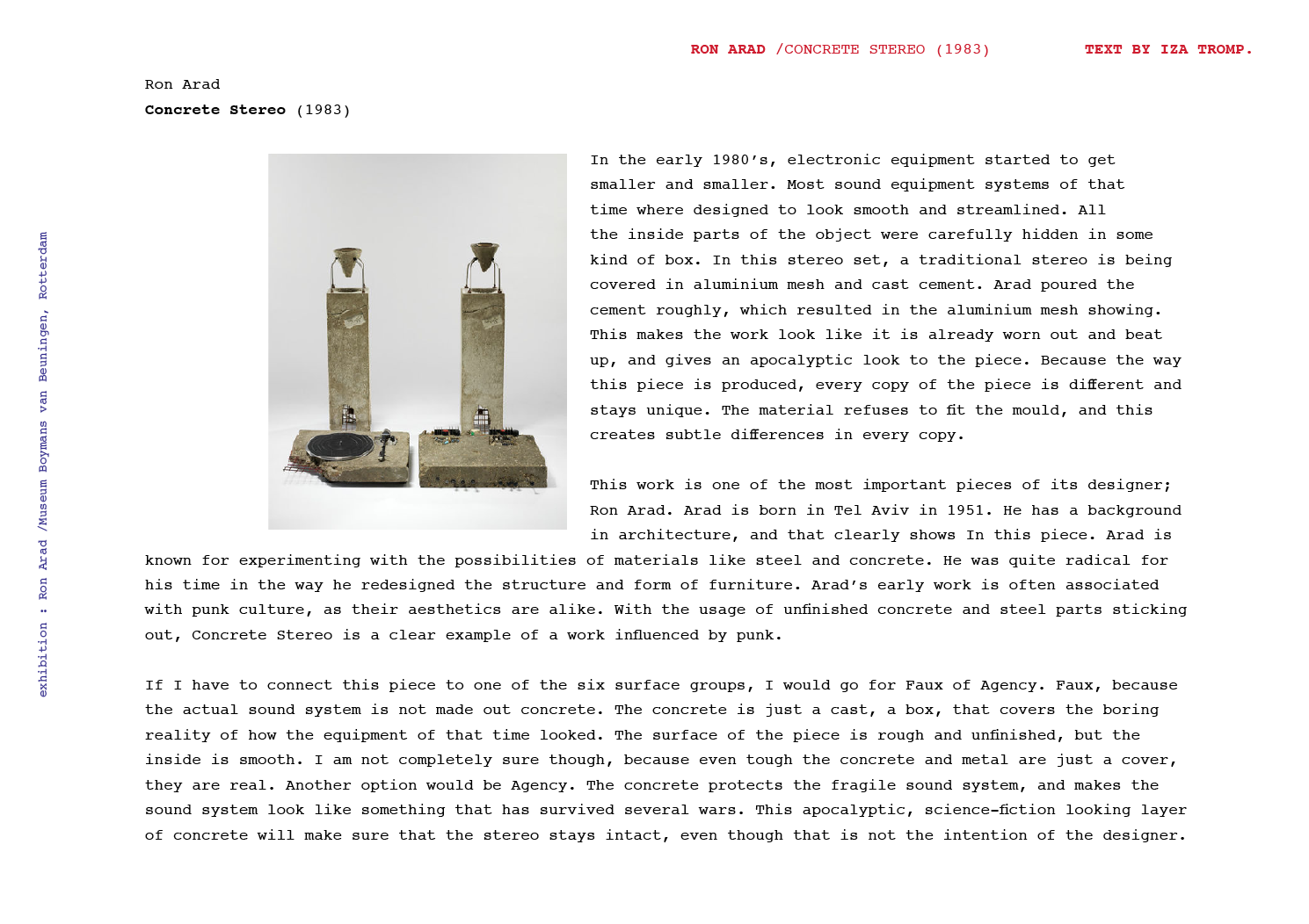
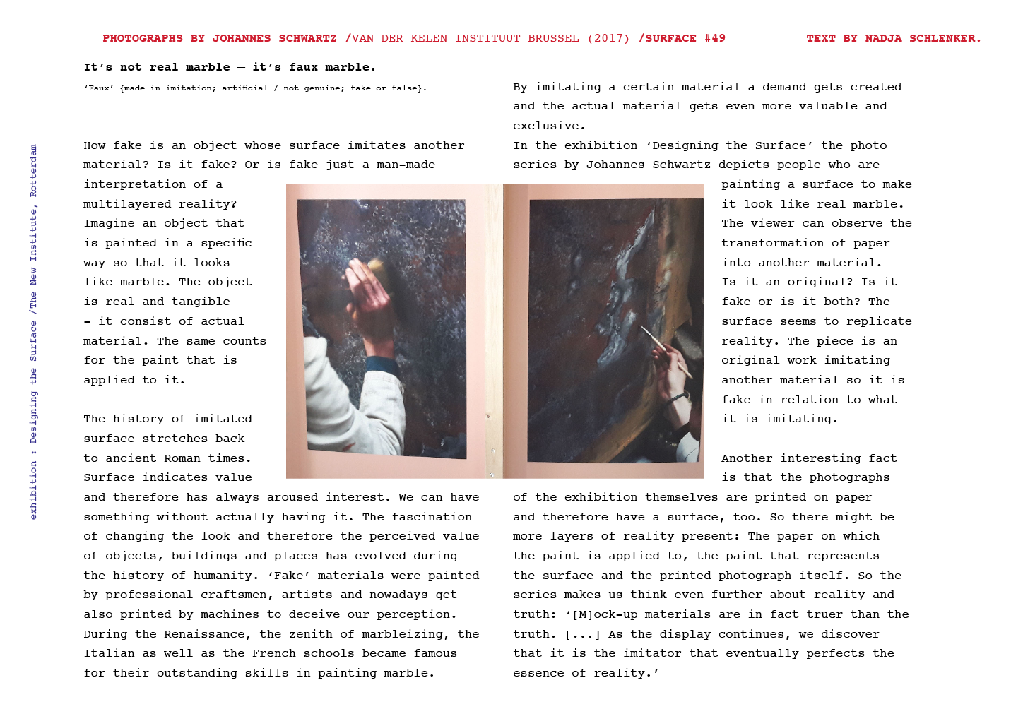
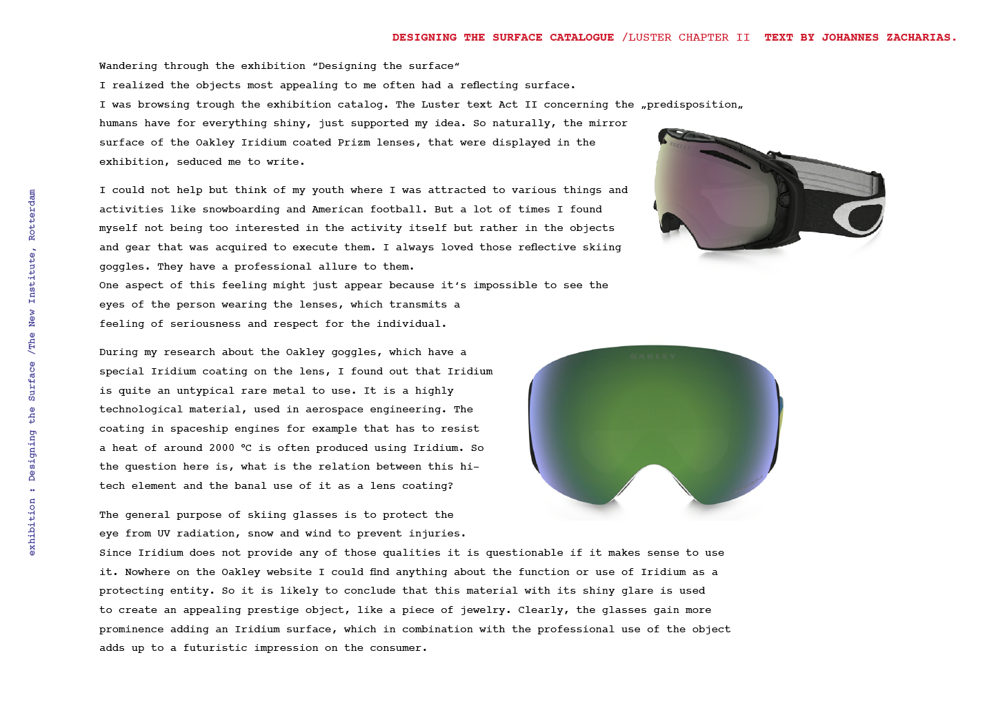
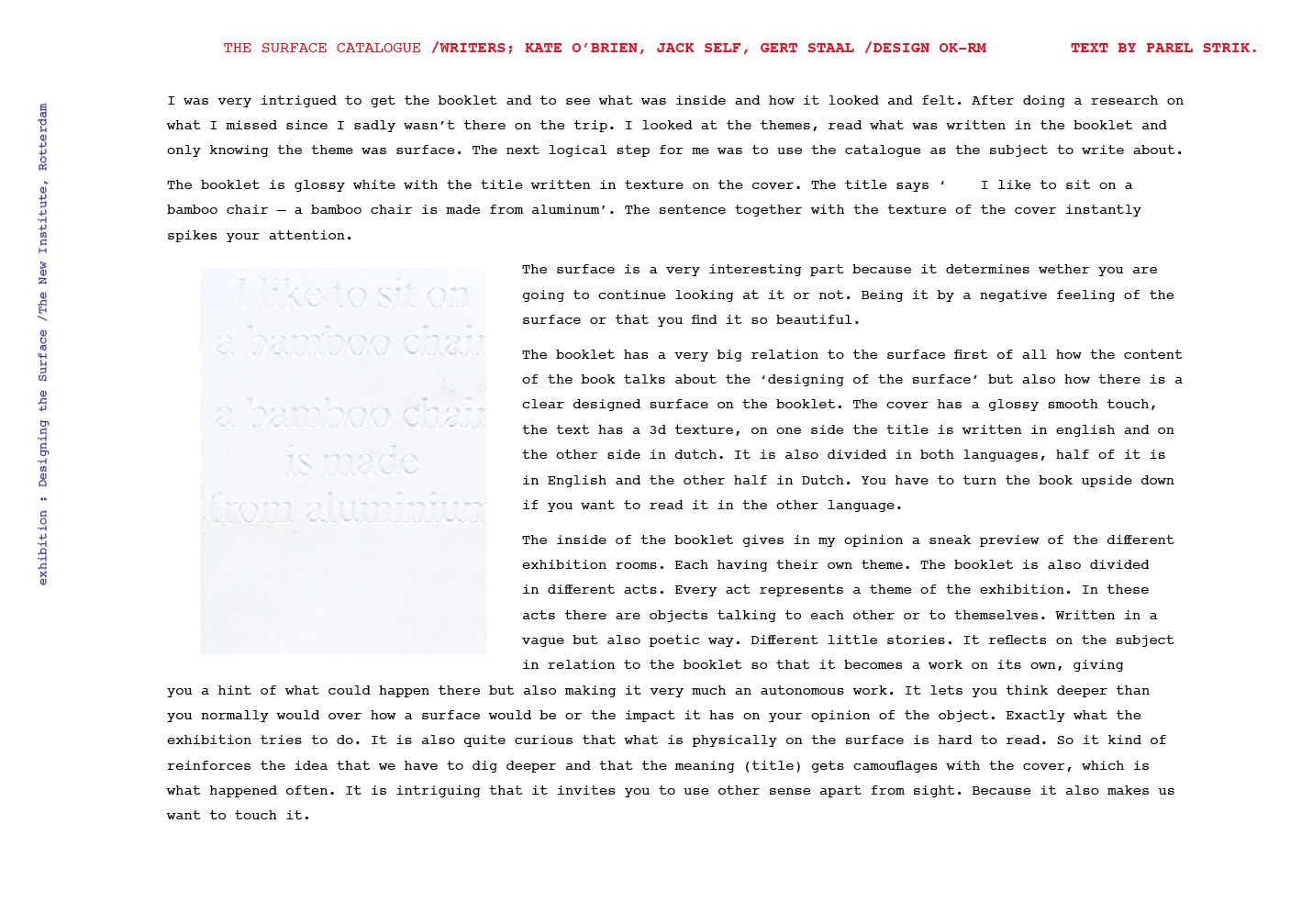

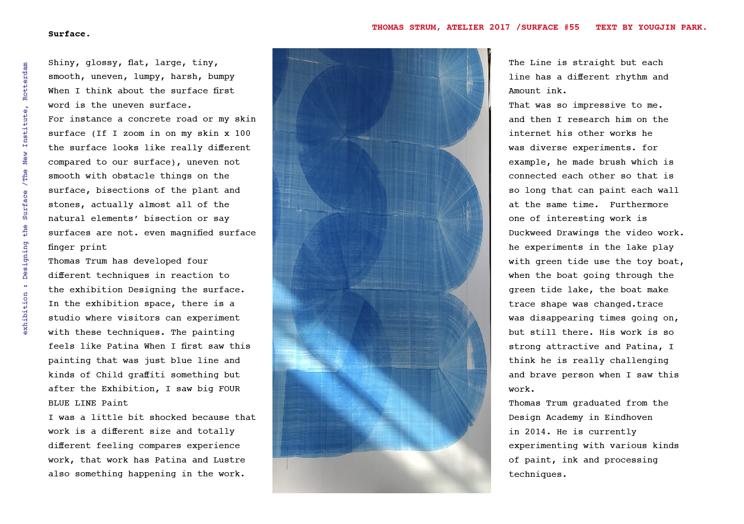
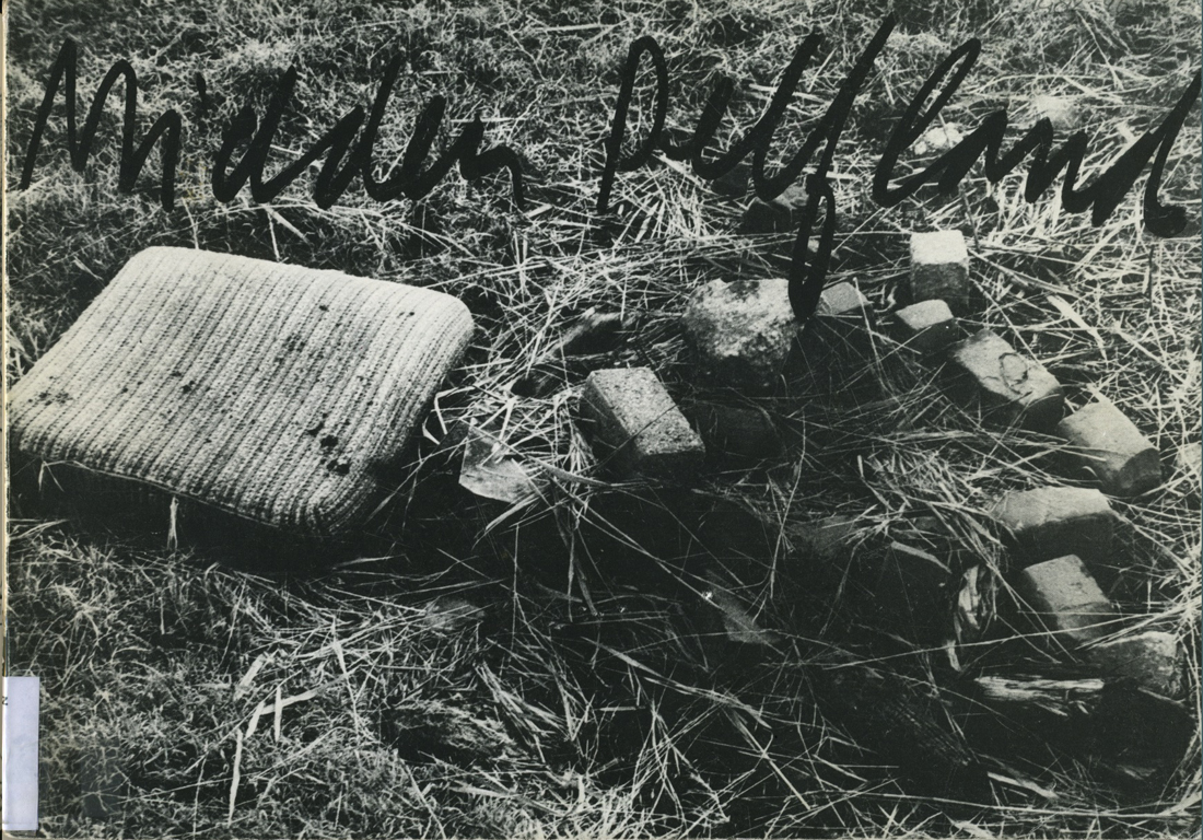
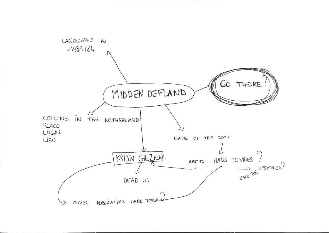
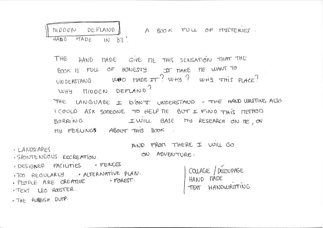
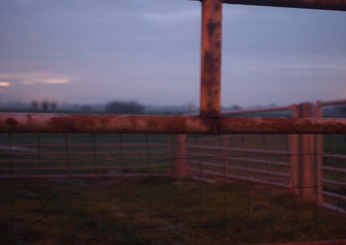
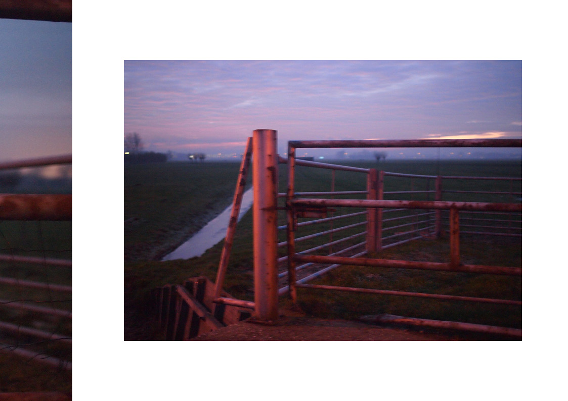
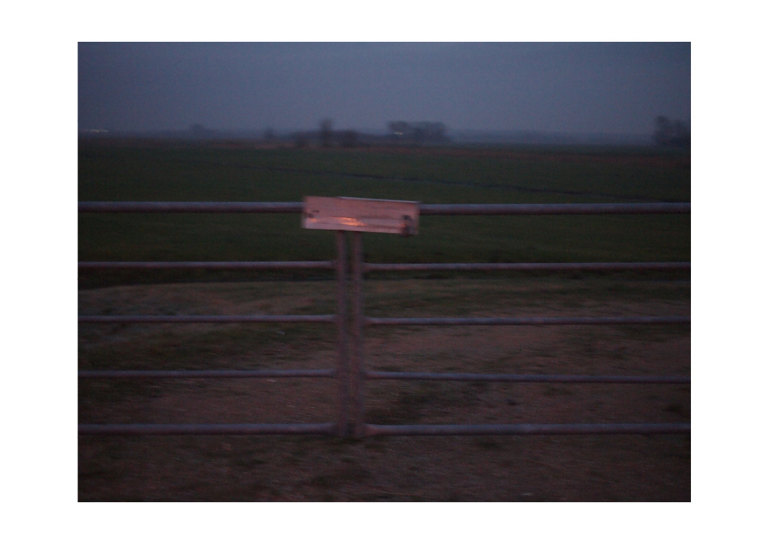
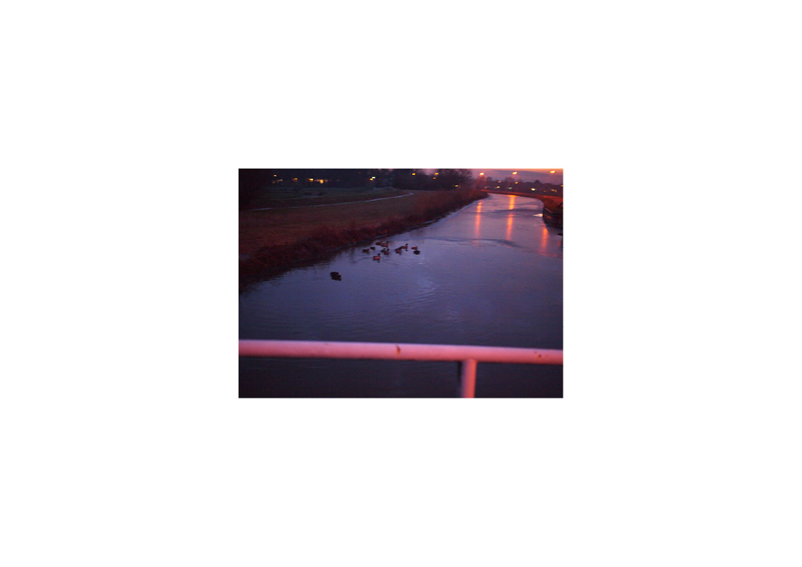
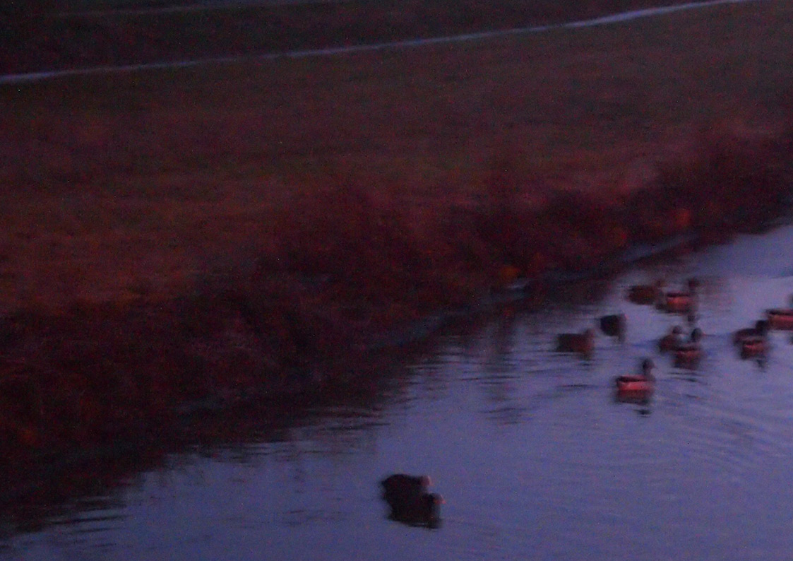

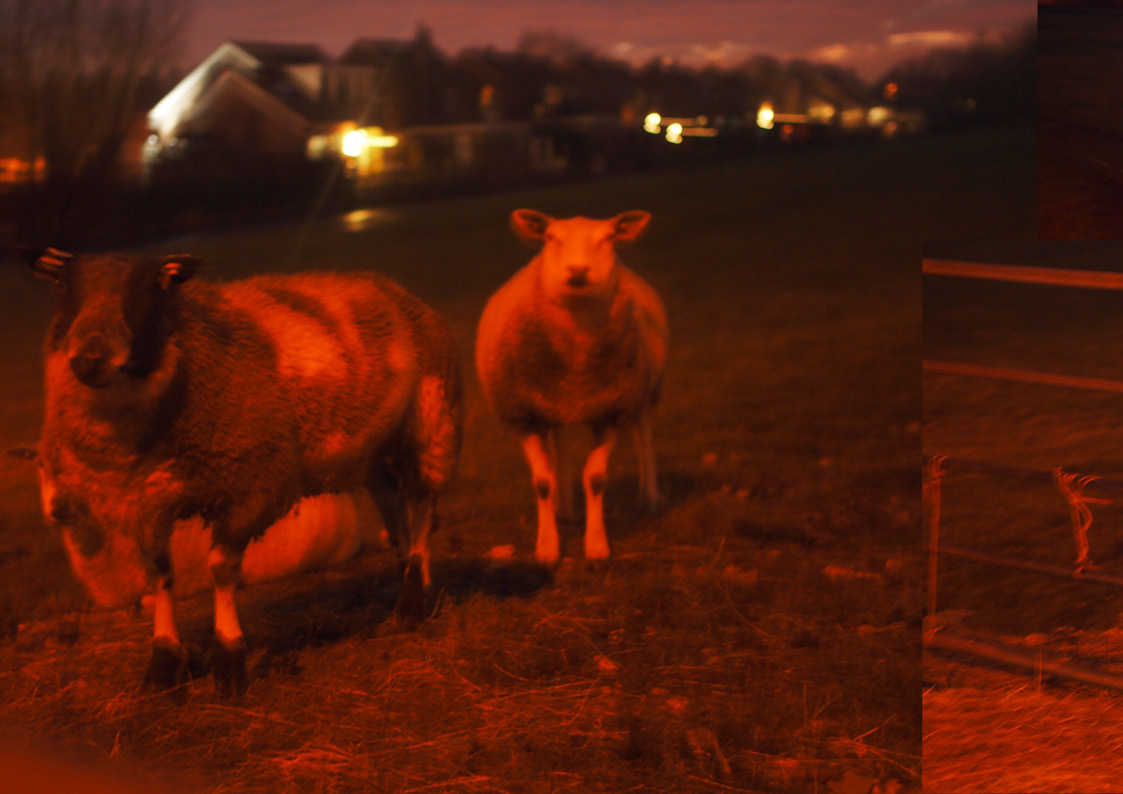
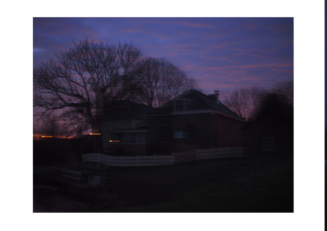


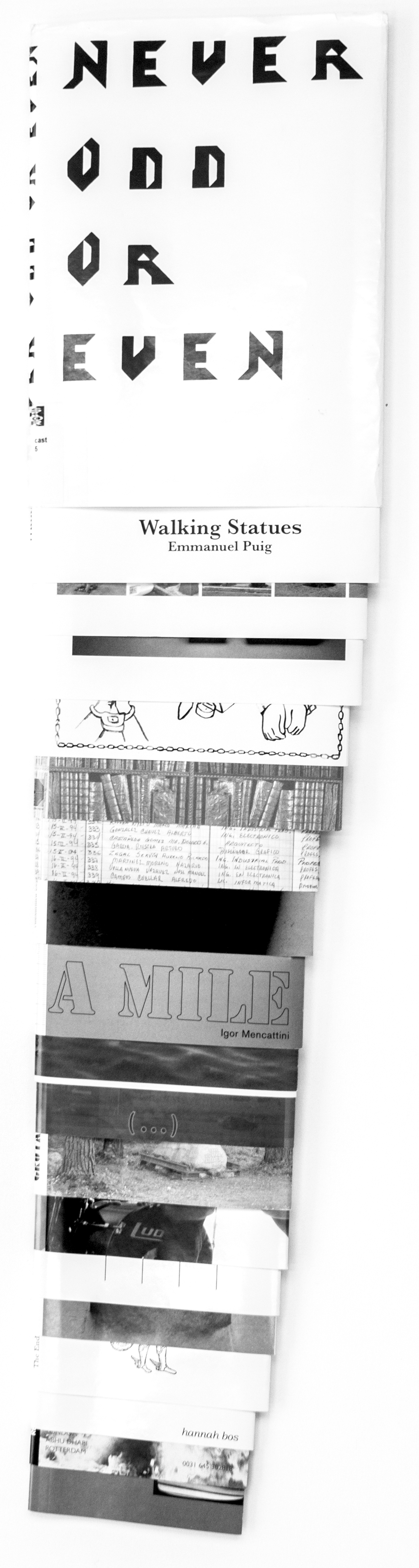
")
")