The human being is qualified as « homo sapiens », the man who knows and « homo faber », the man who makes. « Homo ludens » is the man at play.
So i decided to find out more about Constant Nieuwenhuy’s « homo ludens » and the context.
We are in the period after the second world war, everything is destroyed and has to be rebuilt. Constant had an utopian vision of how we could re invent our world, and for him it was a real possibility. We had to forget how we did thing in the past (traditions, routines, processes, plans…) and create a new world from dust, that he called « New Babylon ».
The people of the « New Babylon » world are called the « homo ludens ». He insisted on the importance of play. Something joyful, pleasant and adventurous in our daily lives. People could transform, recreate our environment according to their new needs. Everyone could use his creativity as he wished. Art would exist as part of our day-to-day existence, everyone would be an artist. He puts the human in the centre of everything. Mobility is another key dimension because it was getting easier to travel across the world. Constant saw the new babylonians as a new race of nomads with unlimited freedom to decide about the appearance of their surroundings.
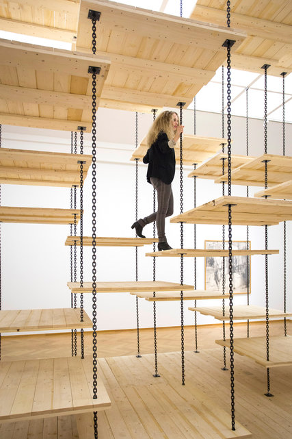
I think this staircase is the perfect representation of Constant’s idea of « homo ludens ». The stair’s principal function is no more the useful part of it, to go up and down. The amusement of going up and down is what it is about. It isn’t the most practical staircase but when you go up or down, you have fun.
The opposite of this new concept of a « ludic society » is the society we are in now, a « utilitarian society ». A society based on the exploitation of the human being’s capacity for work in any kind of domain. « Utility » is the principal criteria of a man for his activity. The creative man can only claim his right on rare occasions.
The « ludic society » on the contrary is freed from repetitive production work. It would be a « classless society » with no more hierarchy. A society were individuals developed and discovered their own creativity with others. Constantly at play, an uninterrupted process of creation and re creation.
Equality and freedom between everyone is the principle of social justice. Freedom depends not only on the social structure but also on productivity. Supposing we are in a world where people create daily, if there is no production then this society doesn’t work. Productivity depends on technology. The new technologies we discover every year give us new ways of doing things, more possibilities, more freedom for the « homo ludens » to play with.
With theses new possibilities people innovate, make something new, re do, renew, rebuild, restore, transform, change… This is in effect the role of a designer but in this world there wouldn’t be any constraints.
These innovations can be used in all kinds of activities. For instance, Constant imagined that air conditioning in « New Babylon » does not only serve to recreate, as in a « utilitarian society » an « ideal » climate but also to make it possible to vary the ambiance to the greatest possible degree.
Technology and innovation enable creativity. For example, we can now bring to reality what was a simple 2D image on a computer. There are many kinds of innovations but I think that artificial intelligence (see also : 7 trends for artificial intelligence in 2016 ) is going to be the major innovation that will have an impact on our society and really affect our creativity in the future.
Imagine a world where « homo ludens » would be able to have artificial intelligence (AI) assistants. You could not really make the difference with a human. They would have all the data of the world in their system and would use « deep learning » .
« Deep learning » is different learning methods where the AI has advanced audio and visual analysis skills (facial recognition, voice recognition, computer vision…). They would be able to modify their attitude based on the past, they learn. If you are a bit curious about this subject I advise you to watch the tv series « Westworld ».
With all this data and advanced technology IA assistants could give to « homo ludens » a different perspective about their production and bring real technical and practical support instantly. It would be similar to the character « Jarvis » in Iron Man. What is interesting about this AI is that it is invisible.
Artificial intelligence and « homo ludens » could work well together but AI can be dangerous if it is not well controlled.
Constant Anton Nieuwenhuys (21 July 1920 – 1 August 2005)
After the end of the war the housing problem in the Netherlands was the ‘number one enemy’. In the early 50s Nieuwenhuys was seeking for new pathways in which art could contribute to reconstruction of the post war Europe. He envisioned an art that was at once “lyrical in its means and social in its very nature” (1956). That period of time was crucial for Constant.
After the Cobra period, Constant Nieuwenhuys’ work becomes more abstract. It develops more and more towards spatial experimentation and architecture. He starts to study architecture with the books of Aldo van Eyck. During that period Constant comes up with the question of how the construction of a city contributes to the quality of life. He starts to realize how the modern structures that surround us influence us. Before that, in the Cobra time he focuses on collective art and rejects individual art, now he goes even further by striving for a synthesis of arts. He tries to break the boundaries between art professions like painting, sculpting, architecture and technology, he feels like they need to be eradicated. In this period of time Constant is searching for artists with the same views as him; he works together with architects like Gerrit Rietveld, Aldo van Eyck and Stephen Gilbert.
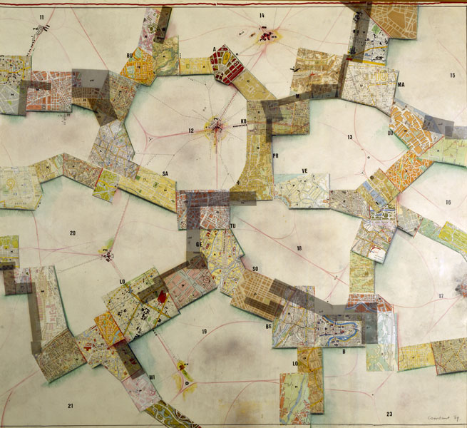
(Symbolic Representation of New Babylon), 1969.
The exhibition “Constant. Space + Colour. From CoBrA to New Babylon” at the Cobra Museum in Amstelveen, showed that development of Constant’s work.
Constant worked together with many different artist during his life and was not afraid to experiment with his style and way to approach his work. He both painted, made sculptures and made graphic work. It was very clear when you walked through the exhibition at the Cobra museum that his main approach have been space and colour during his lifetime. Constant’s development from Cobra to New Babylon was told by a narrative and you were guided through the exhibition that represented both his avant-garde experimenting paintings and his urban architectural sculpture work.
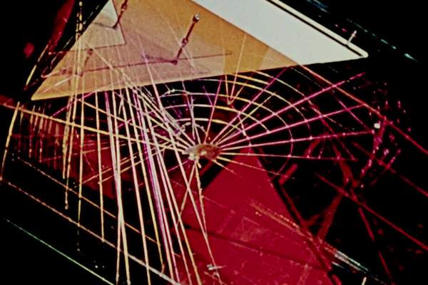
Shown at the exhibition was this one video installation called Gyromorphosis which is made by Hyman ‘Hy’ Hirsh. Most of the works in the exhibition were presented live as maquettes whereas Gyromorphosis was the only digital piece that displayed the New Babylon ideas not by Constant himself, which was attention grabbing. Hirsh was born in Pennsylvania in October of 1911 and was an American photographer and experimental filmmaker. He was also one of the first filmmakers to use electronic imaginary. From looking at more of Hirsh’ work it is possible to make a conclusion that he treated films as malleable objects by constantly editing and re-editing them, mostly using live music instead of pre-recorded soundtracks. Hirsh did in fact dedicate himself to working with the describing form as seen in his other works. In Gyromorphosis,which he made while staying in Amsterdam, Hirsch strives to display the kinetic qualities of the New Babylon structures of Constant Nieuwenhuys. One by one he puts parts of the structures in motion and films the details with colored lighting having them overlap each other, appear and disappear. He creates a sensation of acceleration and suspense suggested by the work itself. He uses music from the Modern Jazz Quartet which becomes a great part of the piece; rough and blunt shapes together with very soft sound creates a great contrast that is hard to miss.
Gyromorphosis, 1954
Hirsh works with the describing form, which is a way to represent the weight and space of sculptural form on film.”To realize this aim I have put into motion, one by one, pieces of the sculpture and, with colorued lighting, filmed them in various detail, overlaying the images on the film as they appear and disappear. In this way, I have hoped to produce senstation of accelaration and suspension which are suggested to me by the sculpture itself.”, says Hirsh. (note by Joost Rekveld). It is a way to describe in moving images what is fundamentally still. You might say that a sculpture is described by the space around it, described by the the experience or the touch. The moving image places the viewer in another position and remove the viewer from the direct and individual experience. The individual sense of the material, surface and environment that you experience during a first hand encounter with a sculptural form is now in the describing form framed through the lens of a filmmaker. It’s a document caught in another time and scape than the one you experience yourself in front of the actual sculpture. It is in the tension between these two states that avant-garde filmmakers, and the artists themselves, have brought their singular and experimental approaches to filming form. Another artists, who actually have worked with dynamic videos of this kind as well was László Moholy-Nagy, who while working at Denham studios created kinetic sculptures and abstract light effects. Artists present new ways of using the moving image to offer other and different perspectives on sculptural form.
Spending a lot of time thinking about the principal behind the idea of putting Hirsh’ work in the New Babylon we have decided to look for a direct search of answers (contacting the curator of the exhibition). Thanks to Laura Stamps, modern arts curator at the Gemeente Museum The Hague we got a clear answer. She explained to us that the exhibition was not only consisting of the works Constant has made in the specific time of the New Babylon but also his steps towards it, for example there is a whole room dedicated to the time frame of Nieuwenhuys being a part of the Cobra movement, and another one dedicated to Constant’s research of the ‘synthesis of arts’. Mentioning all of the previous periods and having a separate space for them in the exhibition plays a very important role because that is what influences the development and new ideas and methods of working, which will eventually lead to the creation of the New Babylon project. Then alongside the artworks the curator chose to show a selection of of documentary material (pictures, collages, flyers, correspondence and films). Laura has mentioned that for her ‘Gyromorphosis’ also functions as a sort of documentary material because it is a film in which the artworks of Constant play a lead role. Hy Hirsh is the maker but the film is obviously a collaboration between the two. The way the film is made – it gives you a psychedelic, new age feel – reflects the time that it was made in very well. The curator has integrated this film (as well as other documentary material) because it gives you a feeling against what background New Babylon was created.
To summarize this research, it is important to mention that the pathway of an artist is a very important factor of his work as whole. Constant Nieuwenhuys in this case, going from Cobra to the New Babylon, which stylistically are so different from each other, are still tightly connected. Collaborations with others, Hy Hirsh for example, also plays a big role in the whole process, giving it the needed documentary aspect.
Détournement is a technique. Détournement is a style. Détournement is a tool.
To really understand the concept of this tool, first we have to get to know it’s origins.
When we speak about détournement, the first and the most important figure we have to mention is Guy Debord.
Debord was a Marxist theorist; writer and filmmaker who is mostly known for his activity and leading membership of the Situationist International ( SI ).
In 1950, at the age of 19, Debord joined an avant-garde movement called Letterism, led by Isidore Isou. After two years Debord splits off and creates a radical group, the Letterist International.
Shortly after this collective of rebel artists and theorists was founded ( 1952 ) , détournement was claimed by this certain group.
The very first publication ( and description ) we can find on their desires; announced by Guy Debord and Gil J Wolman in 1956, was the ‘ A User’s Guide to Détournement ‘ .
After we did these very basic studies on the genesis of our subject, we can go deeper in search of the meaning and, so to say, the use of détournement.
Every movement, every new style claims current things and situations to change. They all have the same purpose: leave the old, the used behind and create, express something new. In our case Guy Debord’s movement was a very radical, even revolutionary way of changing the meaning of art, or better, the production of it. Debord and the situationists all agreed on the fact that art could no longer stay a chic, luxurious, high class production. Rather they believed and strived for art to have a deeper, educational input. They broke down the walls of the classical and the bourgeois way of looking at and creating art by taking different elements of already existing works and transforming them into something new, to express another meaning. These changes don’t necessarily have to be drastic or aggressive. The point of it is to change a small component but then with this small detour, changing the overall expression and audience. They mainly aimed political situations and circles, but only in a peaceful and respectful way.
A very important figure and example in this case would be Asger Jorn. Jorn was a really good friend of Debord, therefore he was highly inspired and led by the situationist concept, styles and ideas. In his paintings series called The ‘Defigurations’ , we can clearly explore the idea of détournement. His works are mainly driven by political issues and his frustration with established structures and authorities within society.
Another well known example is Marcel Duchamp’s L.H.O.O.Q. where he simply adds a moustache on Mona Lisa. With this small adjustment which first looks funny and sarcastic, Duchamp changes the whole meaning of the original Mona Lisa, that presents a laid back, carefree woman, but with this detour he presents the restlessness of the women’s sexuality.
At this point i find it more important to come up with more recent examples for détournement.
Let’s say you go to a restaurant, you get a piece of toast and a strawberry. Then you take a bite of this strawberry and you realise that it is actually a tomato. This is a concoction by the radical Star Chef Grant Achatz called ‘ strawberry / tomato ‘ . His cuisine is amazingly revolutionary as he transfers every simple ingredient into something more, something different. With this, he presents the meaning of modern cooking on a new level that is more of a performance or art than just making food for the guests. The food itself loses its meaning, it becomes the show, the whole experience. He takes a simple vegetable a normal herb or an ordinary ingredient but then the way he cuts, boils, combines them he creates tastes, techniques and culinary styles that we have never experienced before.
Another very important figure and illustration from our daily life is Banksy. We are not quite certain if Banksy is one person or a group of revolutionary artists, but the works we find and see under Banksy’s name are carrying the biggest recent political and social issues from these days.
In our case Banksy (…) could be one of the best examples how détournement works. In these works we can find well known images of current situations, famous moments and people, companies and figures. The way Banksy transforms these pieces, irrevocably opens our eyes on actual problems in our society, on existing and known political debates. The only small detour Banksy has, is that the way it’s propaganda exists might be more aggressive or intense by publishing them on public places, than the basics of détournement were created.
However, we face an important and interesting question now. What if we detour détournement? How far can détournement go? How can or should we divide it from anarchy?
Or maybe peaceful propaganda is not enough at all these days anymore…?!
I assume it might not be. I believe that nowadays within such an aggressive society, political parties and their choices; we have to fight the “rival” with clear, harsh and rebel tools.
So answering our questions: it is almost a mandatory for us artists and philosophers and writers, comedians, journalists or simple working class people and for all medium that is capable of, to take the peaceful elements of détournement to a next, advanced level. We do have to go further and show our dislike or disagreement, even if it has to cross laws and politeness, for the sake of change and recognition. We have to apply effective and more powerful tools to our ideas and requirements for them to be realised.
Unsorted, disarranged, unorganised library, full of elements placed according to different components, which have an order or perhaps do not have it at all, just existing in an unrestricted randomness. Which ironically speaking could actually be seen as the same thing, since a lack of order is also an order in itself. Chaos with a clear beginning and ending kind of like a bad book. What exactly did I find there…? Big books, small books, orange, white, shiny, mat, hard, soft, precious, forgotten, books that are filled with content, wedding books. Books of a specific nature, books that are about nothing at all, ones that wait for attention and ones nobody cares about. Art books, design, educational, pointless, and sharp and blunt, basically all you can find in a library. I was asked to find a solution for the lack of structure in their position on the shelf. So the primary question that I am asking myself is; what is the point of doing it at all? Of course the obvious reason would be the easy access to the content, otherwise lost in the madness of disorganisation. However, I still struggle to understand why to bother ourselves with creating this specific order, if in the end it is still the same amount of books in the same space? Somehow I think this action is irrelevant, especially if we put so much effort into creating a puzzle that can be made in an infinite amount of ways… according to any system that a specific person would find attractive or interesting (depth weight, etc).
In the name of captivation and curiously-provocative passage, I am trying to crack this system of easy predictable result, which in my opinion is rather obvious to foresee if you limit yourself by the boundary of an actual shelf. Instead of doing that I would rather step out of this radius. The concept that I tried to create is aiming to expand the perspective on how we view the book. What is a book actually? In short, it is a box of content pocket size captured by the single pages glued together, now isn’t that somehow equal to the very idea of a book shelf, in which many different books are aligned in the same way as the pages, however this time at a larger scale of information? Somehow I believe it is possible to see these systems as parallel ones. If a thousand books make a library; then, so to a thousand pages, and further, a book can also be seen as a pocket size bibliotheca.
The establishment of the fact that from now on, one copy can stand on its own, gives me the possibility of putting in on a pedestal and seeing it as something autonomous, in other words, let’s give the books the space that they deserve. There is no reason why they should be kept together in one place since in the end it’s just creating a bigger chaos. Let us treat books as unique objects instead of piling them on top of each other. As absurd as this sounds, to create an order you have to separate everything from each other and never put them back together again.
For my next step, I have chosen ten books from the shelf that I eventually turned into their own autonomous libraries, spread all over the city; one book for one building. I did this by searching for the places that seemed to me as the right environments for the books. The main question that I had to ask myself, is how do I decide what aspect of the book should be the main criteria for the location, the physicality or the content. Not to leave it too vague, by physicality I mean the literal materiality of the book and where it could fit in the space of a building, so in the end it seems as the space was designed for the book and not reversed. In this case of preciseness, the dilemma of leaving the content out of the picture was not so disturbing anymore. However, after I found the main foundation that would determine the way of approach, I decided to take it further and only use the fore edge of the books (opposite side to the spine), which presents it as more of an anonymous object rather than a work.
The result of this practice was the creation on ten completely autonomous bibliothecas, in ten different buildings. This created a situation in which a book stopped being a book, but rather a body living in perfect symbiosis with the surrounding environment.
Some people hate it, some people love it, and some people just don’t care. Our assignment was to find a new way to organize a couple of hundred books. I myself see organizing as something relaxing, and as something that should clear your head. Like a game, organizing is a puzzle. Making everything right and finding the perfect place for every little lost piece.
But what about objects and books that are hard to place somewhere? Books that look insignificant. How can you make them fit in? When I was scanning through all the books in the library, a nude colored book caught my eye, the cover didn’t give me any clues what it was about. There were no letters on the cover and no pictures. The way it was standing there made it look very lost in this big pile of loud and screaming books. All the books looked like they wanted to catch your eye and get the most attention. But this book didn’t seem to care that no one would ever take it out. Like a shy girl that always sits in the back of the class. But being shy and not wanting to be seen doesn’t mean that you don’t deserve some attention from time to time.
Games are a good way to make an interactive system for books, books have so many aspects that you can play with. Titles; the name of the Author; the year and of course the publisher. And even a book with nothing on the cover can have so much aspects that you can play with. All these aspects reminded me of the dots on domino dices. But instead of connecting the dots on the dices, you can also connect the titles, authors or the aspects of the book that for you has the most value. Then I remembered this game that I used to play when I was little, me and my dad would sit in the sun and play this game endlessly to help me learn how to spell words. He would start with a word and then I would come up with a new word, the first letter of this new word had to be the last letter of his previous word.
MONKEYS – SAUNA – ARTWORK
It is not a new fact that we like these kind of games, the oldest confirmed written mention of dominoes in China comes from the Former Events in Wulin (i.e. the capital Hangzhou) written by the Yuan Dynasty (1271–1368) author Zhou Mi (1232–1298), who listed “pupai” (gambling plaques or dominoes) as well as dice as items sold by peddlers during the reign of Emperor Xiaozong of Song (r. 1162–1189). This shows that the human being has always enjoyed making connections between things and objects. These games survived and renewed itself for centuries. I don’t think we will ever get bored of them.
With the domino and word games in mind I started with just connecting the titles of all the book on one of the shelves, this shelve consisted out of 49 book. After trying to find the perfect way of connecting them I found out that when i would only just play with the titles I would only be able to give a spot to half of the books, the other 25 were waste and would never find a place. Where would these books go? Would no one ever read them again? Or was there a clear solution.
What if you would see the library as one big puzzle of domino dices. Those dices don’t just have one connection point but they have three. Of course this system could also be applied on the books.
Here you see what happens when you don’t just give them one connection point but as many connection points as they allow you to make, all the dices start to create a new pattern and once you take one dice out you can put it back after at a new spot where there is no dice yet. It is a constantly changing pattern of organization.
For example I would take a book out which is about Van Gogh and the person before me thought the date of publication was very important, I will find the book at the point where the date is coupled to a different date, after reading this book and getting to know it better I decide that I personally find the Author much more important than the date, so when I would put it back in the book matrix I would find the perfect point where I can couple the first letter of the Authors name to a previous book. But of course there are maybe different things on the cover which have the most value to you, maybe it is the color, or what is showing on the cover, or maybe its even a little sticker that no one noticed before.
This way of organizing creates an opening of looking at books in completely new way. It is no longer seen in this known way of ordering them on category, subject, artist or country. This gives you the opportunity to make new connections between books and their covers. By getting rid of books shelves and opening up a space for a more playful way of organizing.
Making new connections helps you realize that there are always new possibilities in things that we already know so well. We tend to get bored or tired of things that never change, and there is only one way to avoid that boredom, to have a system that will change forever and that tells a lot about what is important.
In ‘Can Forgery be Appropriation Art and Vice-Versa? (bachelor’s thesis Art & Design, Gerrit Rietveld Academie), François Girard-Meunier questions and tries to compare the processes of two seemingly similar forms of “copying” artworks and ask on which terms they could be considered as their opposite.
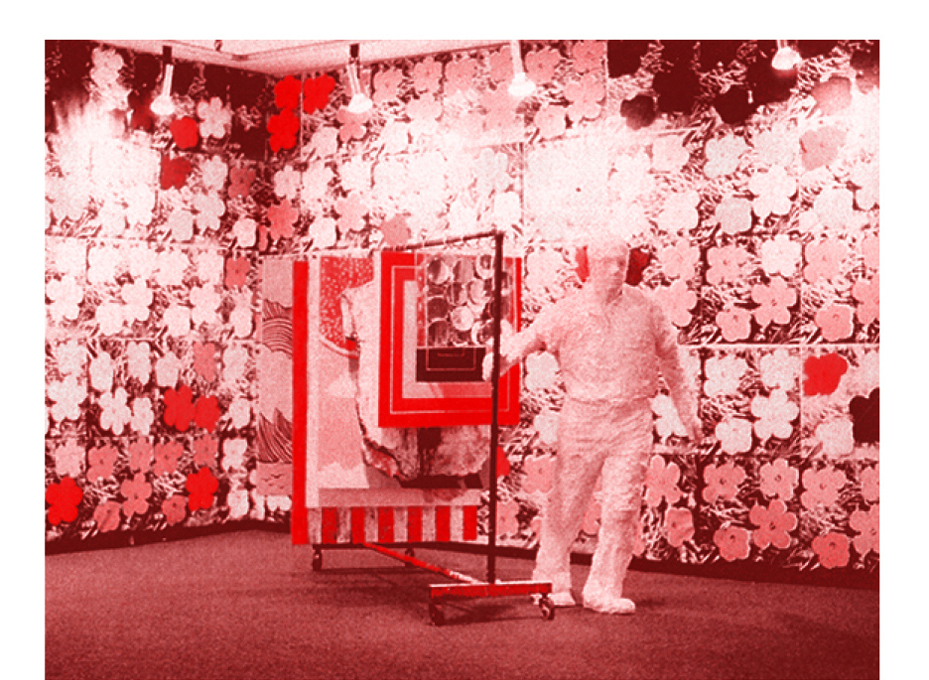
7th Avenue Garment Rack with Warhol Flowers (1965) Elaine Sturtevant
The act of copying has multiple connotations depending on the cultures and eras on which it is performed. It can be a proof of mastery and an honest tribute (esp. in China), a mandatory step (from emulation to creation) towards producing genuine artworks or, as we know it, an underlying statement of looser value (lack of originality, usurpation of the original).
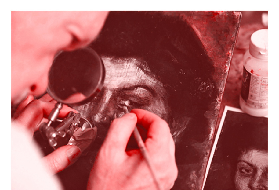
Mark A. Landis
A forgery is a specific type of copy that tries to conceal its origin and passes as the original. An appropriation is a type of copy which clearly states that its author takes over an authored form and makes it his own while retaining the properties (and embracing) that links the copy to its predecessor. One can see the two practices as illegitimate and legitimate opposites.
We value experiences with artworks (or life experiences in general) with different criteria. Sight is one of the most impactful stimuli of the human kind, so aren’t we surprised by believing what we see?
Which leads us to the hypothetical confusion of seeing two images which might look exactly the same, while having contexts, meanings and intentions which are obviously divergent.
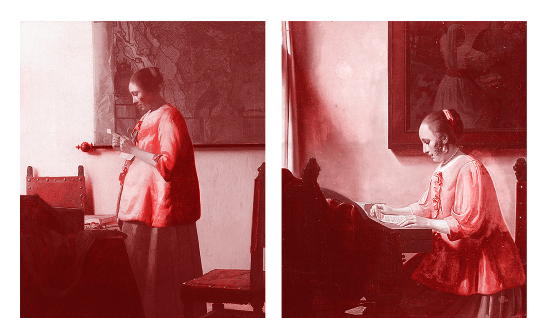
Left: Woman in Blue Reading a Letter (c. 1663) Johannes Vermeer, Right: Woman Reading Music (1935-40) Han van Meegeren)
This essay takes takes as source material works of famous forgers (Elmyr de Hory, Han van Meegeren…) and early Appropriation Artists (Elaine Sturtevant, Mike Bidlo…) and seek to figure out what makes a work of art a work of art in terms of attitudes, discursive frameworks and intentions. The two practices are looked at with the magnifying glass of their opposite’s framework, to see if by stretching any definition they could be thought differently.
download this thesis “Can Forgery be Appropriation Art and Vice-Versa?”If what differentiates an art forger from an appropriation artist is a matter of intention, then on which terms one could become the other?
Library, spines facing you, from every direction. The opaqueness of all this knowledge is overwhelming to put it mildly – your head spins of confusion. The environment breathes an air of calmness, yet great anticipation, as if the myriads of hardbound works of literature and art are eagerly yearning to reveal their insides.
You stand still indecisively – you feel yourself on the narrow interface between on the one hand panic like running down the narrow corridor, to the door, halfway collapsing onto the floor and dying, and on the other hand siting down, indulging yourself in every publication that catches your eye, never leaving.
You regain your grip on reality. You see a bright yellow rectangle in front of you. You reach for it and you look at the front cover.
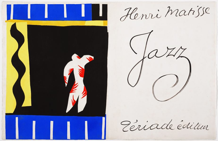
You look at the cover for a solid minute. You like the bright yellow colour and the sturdiness of the cardboard. You look at the image on the cover. Primary colours have always fascinated you immensely. The blue night, the black figure, the yellow stars, and above all the tiny Red Dot as a heart. You are intrigued – you know of this man, Henri Matisse. In your head appear images of bright coloured faces and dancers, composed with mildly crude yet incredibly accurate brush strokes. You also like jazz, and wonder what this book could be about. Filled with curiosity you open it.
That’s it. You’re taking this one.
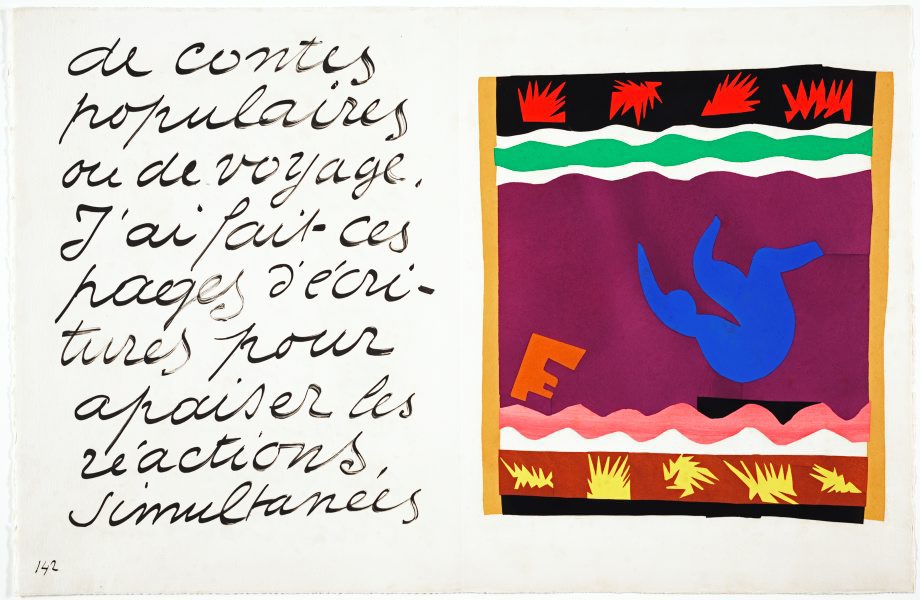
What appears to be a great and interesting book, turns out to be – according to knowledge that you have newly obtained – merely a small, relatively unimpressive excerpt from the original Jazz. Published in German, this small yellow book is actually a book within a book. A book about a book. The middle set of pages are reduced size copies of all images of Jazz. A ten-page introduction preceeds it; succeeding are German translations and a timeline of Matisse’s life. The design of the yellow book is not very striking – minimalist but conservative, done by the publisher. Judging from the looks, the middle part – the excerpt from the original Jazz – is by far the most exciting.
The original is a thick pack of folded paper, twice as wide and twice as high as the yellow booklet you have found in the library.Twenty colour prints, of which fifteen that span two-page spreads are included in the unbound book, together with seventy pages of huge, handwritten cursive text in French.
Marveling at the bright and bursting colours you wonder – How? Why? What does it all mean? You want to find out everything about this book, so you start researching and reading, to learn more about how this artwork came to be. As you learn more and more you suddenly find yourself 74 years in the past, in the south of France.
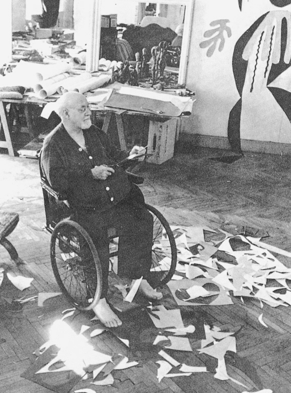
You are now Henri Matisse. It is the summer of 1941, and you are 72 years old. You are living in a suburb of Nice, and you own a nice house with a flowery garden, a big studio and a personal assistant. The gods of health have not been benevolent to you – you were diagnosed with abdominal cancer a few months back, and though doctors have removed the tumour, you suffered from serious complications. You have been on the brink of death for a while, and since then you’ve been only slowly improving. Standing is possible but laborious, so you prefer to lay down on your bed.
You have tried to pick up painting again, but it is tiring and difficult, and virtually impossible from a laying-down position. Thus, the ultra-creative human being you are, you have invented alternative methods of creating colourful expressions of expressionist effervescence: the cut-out method. Simple but very effective: cut-out pieces of paper, laid on top of each other to create compositions. You have used this technique before when making paintings, but only as an aid to perfect the lay-out, never as a means to an end. Your assistant dyes paper with pure, unmixed gouache and you use scissors to cut them into any shape you want. Easy and less labor-intensive than painting, you really like this method.
You feel that scissors carry way more feeling for line than a pencil or brush ever will. You feel so much more improvisational and spontaneous, and your life after your near-death state feels like an artistic renaissance. You feel like cutting out people, and flowers and trees. Flowers are so amazing to make, since the natural world is not hindered by preconceptions of classical art. As you once famously said:
Full of inspiration, you start to create one, two, twenty collages. You write handwritten text, loosely accompanying the themes of the collages. The text is very big because you feel it is necessary in order to be in a decorative relationship with the colour prints. Your publisher likes the book and wants to print it: 100 copies without text and 250 ‘deluxe’ copies with text. The copies are printed by brushing paint over metal stencils made in the shape of the cut-outs. The paint is the exact same gouache used to dye the paper, so the copies are highly accurate in shape and colour.
Page from Jazz: Le Toboggan (The Sled)
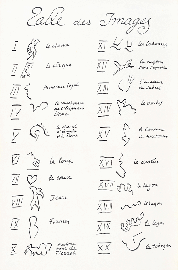
The collages depict circus scenes, stories, myths, abstract shapes and personal experiences, in vivid colours and an uninhibited style. The cover displays one of your first collages, the clown, and the title of the book: Jazz. You chose this title because you like jazz, and you think there are parallels with the music on the basis of your unbounded, improvisational and innovative way of working. You consider the previous title, le cirque, not inclusive enough for all the themes the book discusses. In the front of the book you include a ‘table of contents’, an overview of all the collages, with individual titles.
Front and back cover of Jazz
Table of Contents of Jazz
The book is received as a wide success and it kick-starts a new stylistic era: the next 12 years, until your death, you will work on more cut-outs. You like the works you have made, though you doubt the artistic quality of the book – you think that the best way of presenting these collages is in their original form: loose pieces of paper, laying on a table in your studio, playful and vulnerable to any gust of wind.
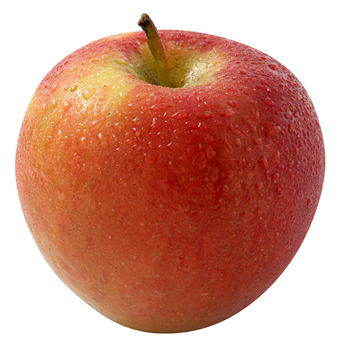
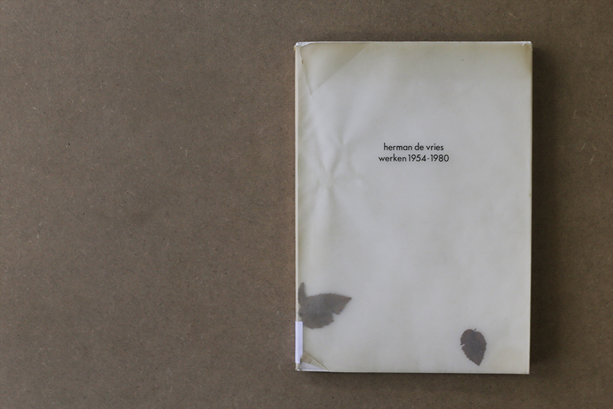
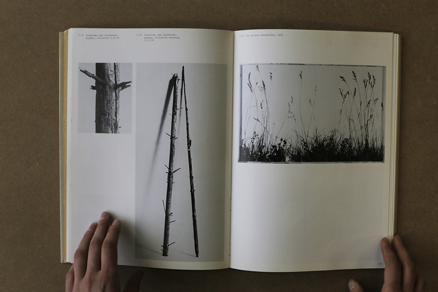
choosing a book without paying attention to the content is like picking an apple based on its skin and form. you never know if the consistence and the taste is reflected by its surface but still you choose it, thinking that the appearance echoes what you want to find inside. this intuitive and impulsive choosing process based on your assimilation faculty, knowledge and cultural education, needs to be done without concession. avoiding everything that incorporates elements which make you doubt is a way to find the precise object that fits your taste. this process can be long but it makes you swim fast through objects and, at the end, allows you to find the right fruit, in which the design and the content are reflecting each other, the materialisation of your desire. this search technique lead me to an old fashioned catalogue issued for an exhibition of herman de vries at the groninger museum in groningen, the netherlands. the book was published in 1980 by the museum itself and is entitled, like the exhibition, “herman de vries, werken 1954-1980”. the design of the book is made by “std suurling treffers designers”. they also came from gronigen and they were, at this time, the graphic designers of the museum. alongside of working for the museum and being independent designers they were also working at the minerva art academy. nowadays the studio doesn’t exist anymore.
speaking about the design of the catalogue, the cover appears fragile and at the same time raw, ruff and powerful. the delicate aspect of the book comes from two different components. firstly, the paper used as a protection for the book itself is created by two layers of recycled transparent paper. the weight of times altered the colour of the paper into different shades of beige and adds an antique aesthetic to the object. secondly, in-between this two layers of tracing papers, two real leaves drift with the rhythm of the reader turning the pages. on the website of herman de vries it is said that they came from a western tree called acer campester. strangely the copy from the gerrit rietveld library contains different ones, looking like the leaves of an elm tree, which is really common in the netherlands. we will probably never know, if the artist himself puts different types or if someone lost the original ones and exchanged them. these natural elements encapsulated into the cover protection remind on the origin of paper, namely trees and leaves, and point out that these objects, made for human use, were, first off all, living matter.
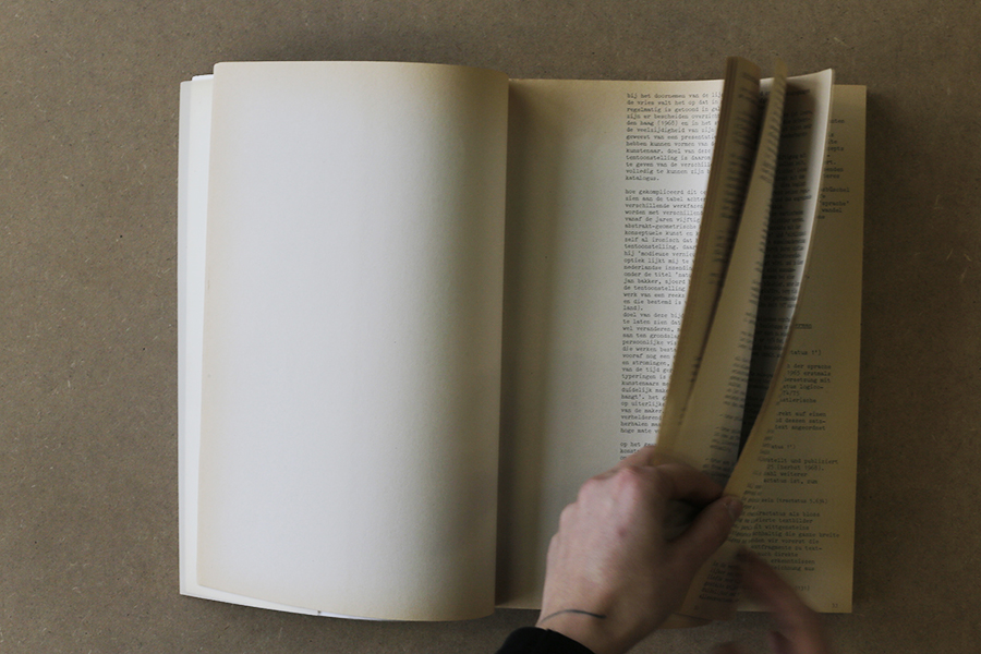
the cover reveals another radical choice: the absence of capital letters. this vacancy occurs in the whole book. most of the time, attributed to the bauhaus ideology of typography, this non-use of capitals could represent the honest approach of the artist herman de vries in his work and his aim to represent nature in it’s purest and simplest form. the first part of the the book, introduced by the director of the groninger museum, frank haks, is mostly composed of texts, essays and poetry by and about herman de vries. the designers chose to create the layout using the aesthetics of a type machine, therefore making use of the typography “courier”. looking at the work of herman de vries, this decision resonates his visual language. the paper being used is another example. it is brown, natural and rough. the second part of the book focuses on showing images of his art works. alongside to this change the paper changes as well. becoming more neutral, it gives the the work all the space needed for expressing itself.
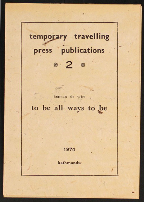
on the back cover, a curious detail pops up: a red stamp saying “all”. it is hard to understand its visual appearance for different reasons, mainly because it is the first time that we see colour. in addition, the size and the disposition are not fitting with the layout either, they are more strictly constructed. during the research about the artist i came across a video which fulfilled my curiositiy. presenting his exhibition for the biennial of venice, where he was representing the netherlands, herman de vries showed an old mantra printed on a booklet in 1974 in katmandu. the sentence “to be all ways to be” is written in big letters inside of it, the typography and the size are exactly the same as in the book.
considering the design of this book, it makes a good example for a successful reflection and interaction between the graphic designers and the artist. in this case, herman de vries took part in the making process, adding some characteristics of his own work to the cover. the catalogue therefore got a handcrafted look and gives the impression to handle something rare and authentic. the aesthetic choice demonstrate the graphics designer’s respect for the artist and merge the book with the world of de vries. a bridge is created, giving the book the aura of an artwork.
Saying if you like a book or not, is easy.
I am not talking about the content of a book, but the object itself.
When you hold it in your hands, you can feel it. Do you want to open it? Do you want to browse through it? Do you like the texture? Do you feel comfortable? Or do you simply like to hold it?
Most of the time you don’t need to ask yourself these questions.
I was in the library, only one book really appealed to me in this way.
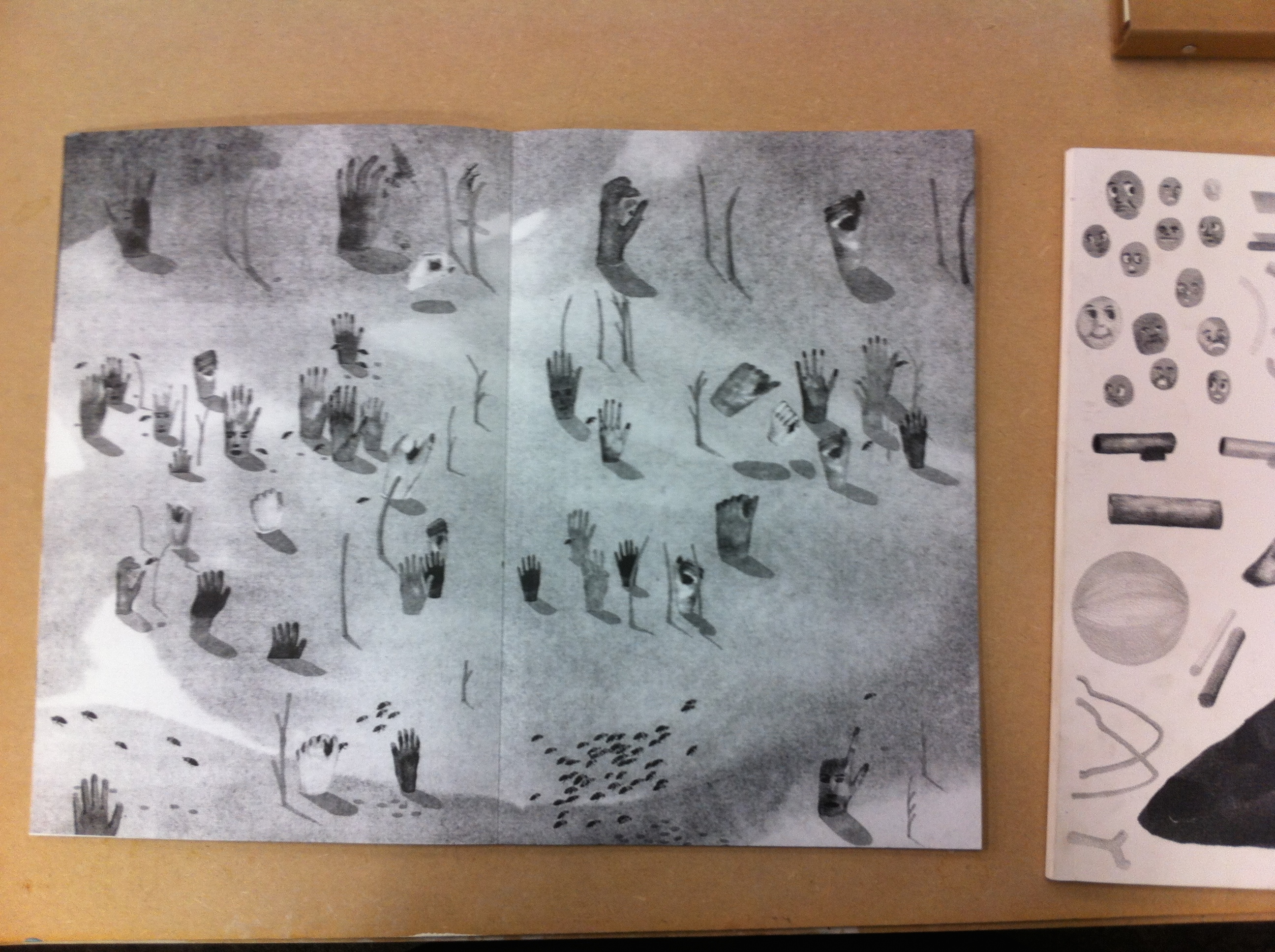
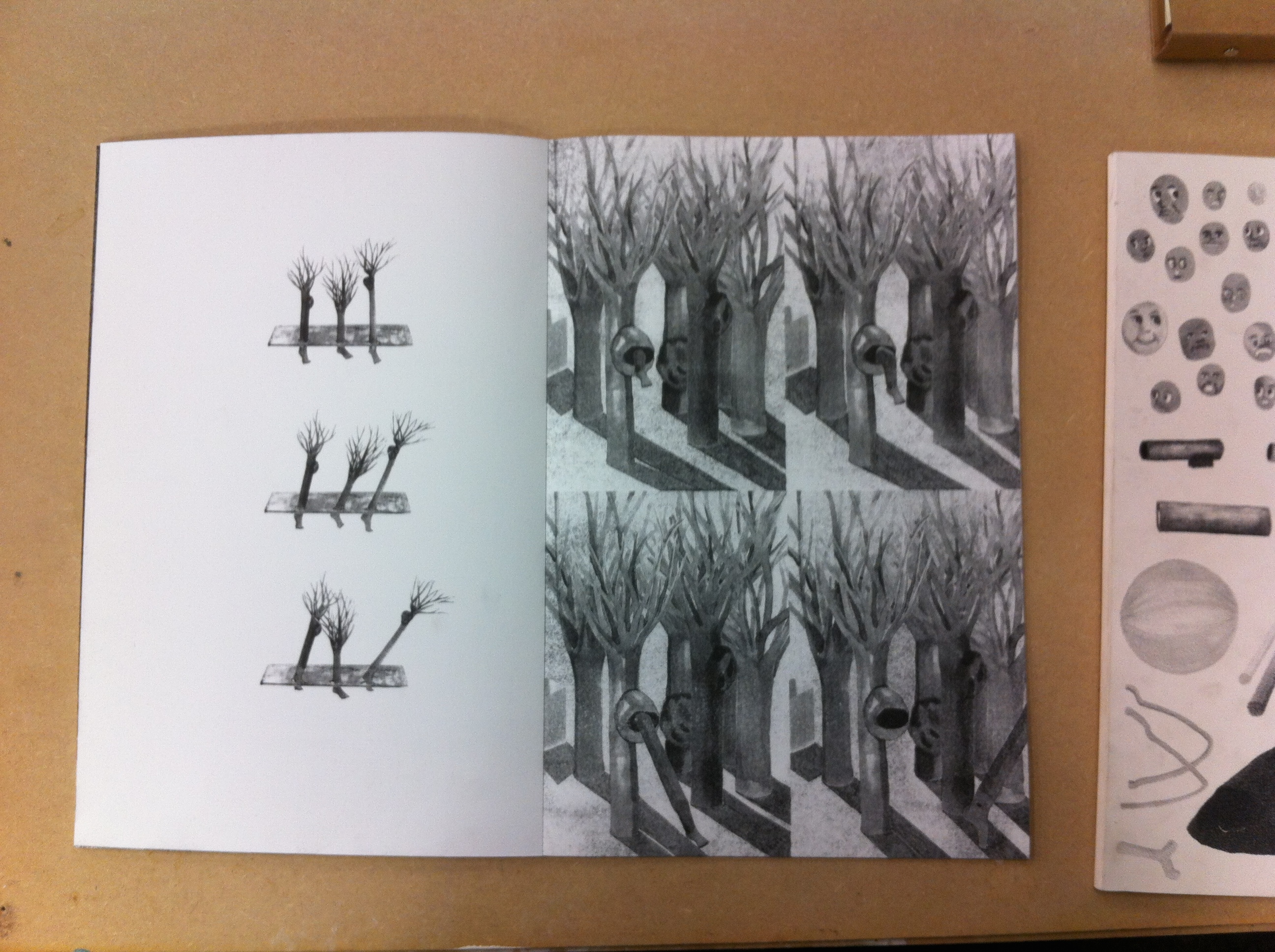
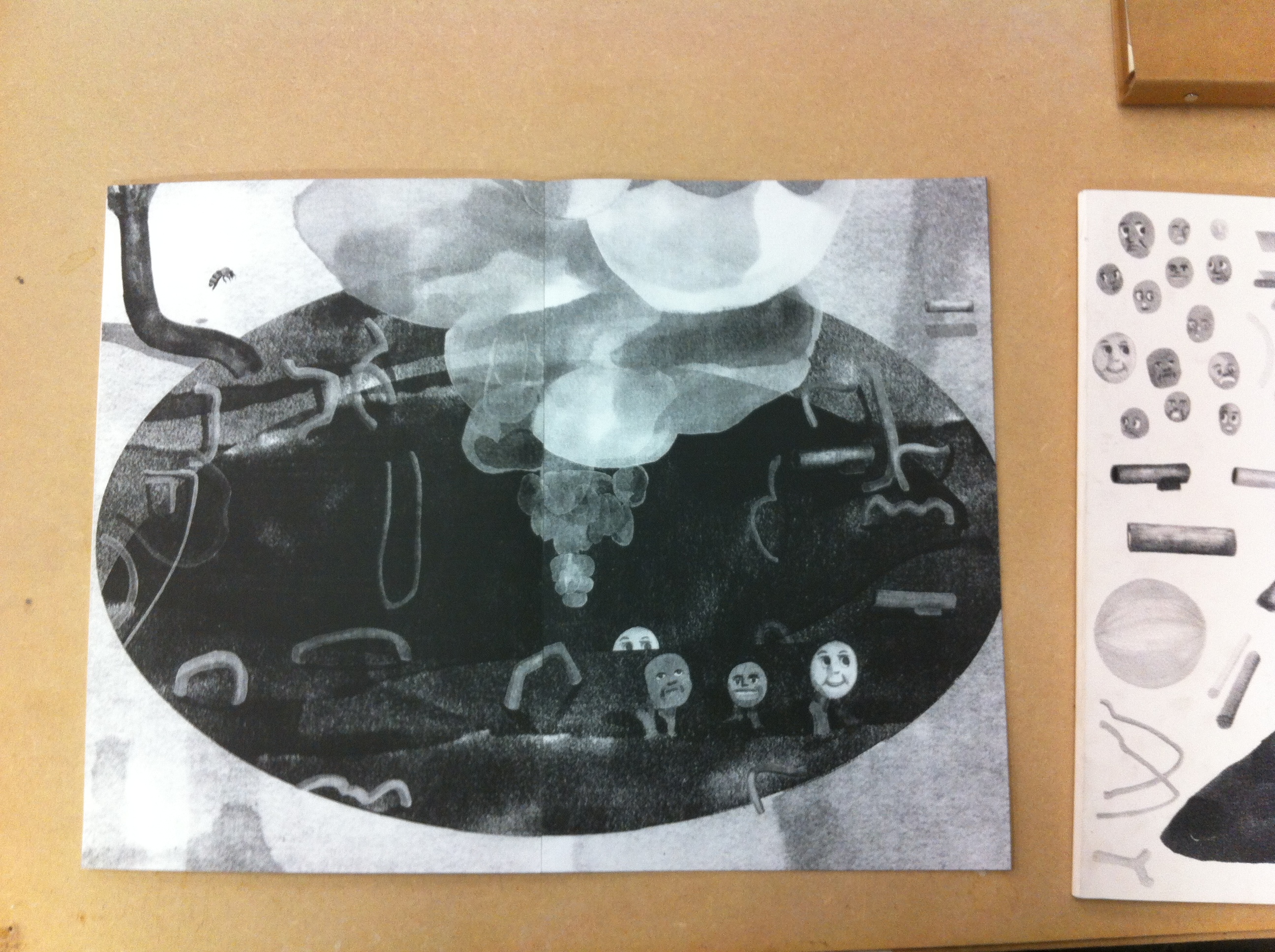
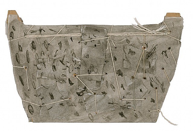
Imagine a big book, not thick; fine, approximately the size of A3. You can’t open it directly. You need to remove its white cardboard sleeve, printed with small drawings. Now touch the pages. They are made of a strong, mat and smooth paper. The binding is glued, and almost invisible. All your attention is directed to the black and white drawings. Moreover, you can see some gap between the pages. I like those imperfections, and its mysterious aspect. No text, no title. Only a story about hands, bees, mountains and animated trees going through 34 pages, full-bleed risograph printed. By the way, should we consider the front and back covers as pages of this book? I have no idea. I should just ask it to the author.
Author or artist?
After a long moment I found a discrete hand-written name in the left bottom of the back cover : Marion Molle. Marion told me she graduated from the VAV department last year 2015.
I should send her an email, after which i will tell you more.
Before sending an email, I need her address. I search on google Marion Molle. the first link is her website, you should go and have a look :
I thought maybe I will find some information about her project. After I scrolling over all her projects, I finally find her book. There is no caption, only photos. I look at the section info, and get her address. Email sent. I asked for further information about her work, with a catchy sentence « tell me more ».
2 days after, she told me a lot more.
Her principe is quite unconventional and not that easy, but I will try to explain it to you as accurately as possible. To start with, here is the recipe she used to make this nice book you cannot resist opening when you are at the library.
At the really first beginning, she drew some separate elements with an alcohol-based ink marker on a white background. Then she scanned and associated them to make new compositions. She has some ideas about how they could interact, but she didn’t need to think about it before working on photoshop, which gave her new possibilities. Afterward, she printed the images and draw over again, to add shadows for instance. This way, she compares her small first drawings as ‘puppets’ that she combined to discover unexpected associations. To end up, she scanned them a second and last time, and print the news images with the risograph, which flattens the images and gives the sensation of an unique layer. In this printed technique, you can only work with one color layer at the time, and furthermore, the result is constituted of huge ammont of minuscule dots. That is one of the reason she chose risograph :
she was now able to give a new texture and appearance to her drawings (among other reasons of course, as the price, risograph printing is way more cheaper than laser printing method).
This way, her complete work has been guided by the technique of the risograph printing. For instance she wanted to have the biggest book as possible, but the risograph allows to print on a A3 maximum. This fact explain also the binding, as she couldn’t print two pages on a same format.
Moreover, she didn’t want to give up with those independent elements. She first thought about making another book. But she made up her mind and used them for the cover of the book. So that when you grab it, you have this collection of images appearing as a foretaste of the unknown story hidden inside, ‘enveloping the book with its ingredients’, (as you can see on the very first picture).
By the way, remember, this mysterious aspect comes from the fact the book doesn’t have a title. Actually, it has a title, but not a textual one.
__ .’ ‘. _/__) . .
This is the title. You may ask why, me too. In fact, she found weird to feel obliged to add some text to a book. Therefore this following of punctuation marks was the solution to her problem. But in case she needs to give it a title, she calls it ‘bee book’.
After that, I asked her some question about the meaning of the story. Her really first intention was to conceive a book for children about bees. The insects would have made absurdist ‘tasks’ in a world organized in a way as our human society but with a complete different logic. She would refer to this human aspect, using human body parts’ shapes (that what may explain the hands and the faces). But finally, she tried to make the narrative interpretation of the story, as free as possible, trying to activate the reader’s imagination. This way, she considers the end of the book likewise the beginning of the story.
After two long messages in which she answered to each of my questions, the discussion seems ended. However I remember that I forgot to ask her one more questions : “are you an author or an artist, or even a designer?” I send her another email, but I have no news. I hope one day I will be able to tell you the answers.
For the moment, go to the library and have a look, it is worth it
Rietveld library catalog no : graduation publication 2015
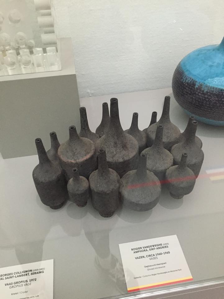
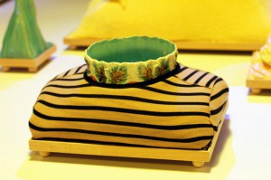
The composition of the ceramic vases Belgian artist Rogier Vandeweghe and vases Dutch artist Jan de Rooden.
subscription
Firstly, I’d love to explain why I’ve chosen ceramic vases for this essay. I imagine how the fingers are buried in soft brown slimy mass when I am thinking about creating a vase. I remember a few stories associated with clay from childhood. I grew up in a village. I loved poking around in the mud, but I had a special passion for the mud formed after rain on the roadway. Vehicles in the village – trucks, and the land under the wheels was pressed carefully because of heavy machine. As a soft mass, it was very pleasant to touch. Mud was becoming really strong as soon as it started to dry. I loved to do the round cakes of this manure. A day after i used to threw them on the floor and watch them breaking into pieces. This is the first thing I imagine when I’m thinking about ceramics. It seems to me very important to understand people, what events have affected them, how their personalities formed. An artwork produced by the artist containes all the information about his life, sensibility, condition. That’s why I’d love to highlight some events in the biography of Rogier Vanderwede and Jan de Rooden.
Born in 1923, he was the youngest son in the family. They moved a few years later to Beernem. From 17 to 23 years old, he studied at the Art Academy in Ghenthe. In the year of 1974 he was followed by a short internship at Joost Maréchal. In 1948 Rogier formed a business with his elder brother on the basis of fathers larger company. Their studio was named ‘Perignem (Latin for “through the fire”). In 1954 he married in the Church of St.Anne in Bruges on Maryanna Pyck (the collection vase that i chose called: Rogier Vandeweghe en Maryanna Pyck). Maryanna worked since 1952 as a ceramics painter at Perignem. As soon as regular production was established, Rogier decided to change direction towards a more modern product. The cautious, rather conservative attitude of Laurent and especially of Cecile Roets, which is in complete contrast with the radical and total renewal sought by Rogier, are the direct cause of the rupture between the two brothers in the summer of 1956. In 1957, Rogier Vandeweghe didn’t pay much attention to make his first ceramic production. In some cases, his wife Myranna Pyck painted the initials “RVDW”, eventually adding “Sint Andries”, with cold enamel after the firing. Soon however, Rogier adds this mark with glaze. In 1960, the workshop is named “AMPHORA».
Jan de Rooden Born in Nijmegen in 1931. When he was 5 years old his mother died. From 6 to 14 years old, he was admitted to Elementary School of the Heilig Landstichting. The landscape around us formed a beautiful country to grow up in. “In November 1944 I left home for the Passionist monastery in Mook September 1952 I became novice in the Passionist monastery in Pey, but after nine months I left the novitiate forever. Ultimately I could not reconcile myself with life in a monastery. I found that life too cut off, too safe and too well-provided for. ” As autodidact he started working in the studio of ceramist Lucie Q. Bakker in Amsterdam in 1956, and in 1958 started his own studio with Johnny Rolf with whom he later married.
Rogier was studying in artistic school and Jan at theological collage. But the story of the two artists is like when they meet their women and begin to follow their way.
I feel a similar sense when i am looking at the vase, I find something natural in that. Vases Jan de Rooden remind me about the forest, the surface of the vase is like a bark of a tree overgrown with moss and seabed, shells overgrown with silt. Vases Rogier Vandeweghe remind me of the mycelium, or forest spirits, or rocks. I like that he used black clay, I’ve got a association with caves and coal mining. From vases is completely different. Jan de Rooden used a simple sealed form. It gives a sense of confidence and stability, which in combination with glazing, creates the effect of natural stone. Rogier Vandeweghe several vases connects one composition and shape of these vases is like a bottle, but shorter, with a thin neck and a narrowing nizu.eta composition looks like a beehive. The Rogier Vandeweghe vase can be used rather only as an object, and the Jan vase may well accommodate some flowers.
In conclusion I would say that the facilities are beautiful.
The world opened a new window in 1844, when the public entered “French Industrial Exposition” in Paris. Quickly afterwards, various large public exhibitions were held in different parts of Europe. In 1851, the first-considered International Exposition was held in London called “Great Exhibition of the Works of Industry of All Nations”. A new platform was born, where art, science and technology from different countries were brought together.
In the process of the development of the platform, the pavilions became a tool to improve the image of each country from 1988. A study called “Expo 2000 Hanover in Numbers” by Tjaco Walvis showed that 73% of the countries at Expo 2000 were primarily interested in improving their national image. The world fairs had evolved into big vehicles for national branding.
“In the desert of life the wise person travels by caravan, while the fool prefers to travel alone”, (African proverb)
As the importance of the pavilions’ look grew, the budget grew with it.
At Expo 2000 Hanover, the average investment pr. pavilion was €12 million: A budget that made governments doubt their participation since the benefits were often assumed to outweigh the costs.
In a world today, where branding is a key asset: Is it possible for the artwork to stay as strong and sensuous to the audience? Does the creation of a salable layer (that has to be considered and assessed) leave the message behind? When a world fair tries to destroy the line between exhibition and exposition, is it possible to make both’ part equal?
Creating a community inside of the world fairs figurative walls is interesting. But at the same time, I’m constantly aware of the galleries’ need to sell. Does art lose its artistic value if it has to be salable? And does the price affect the experience of art?
CHART ART FAIR had its debut in Copenhagen 3 years ago. A Danish offer of how a world fair could look like. The CHART director Simon Friese wants to establish an international art platform for the Nordic region: “The ambition to do CHART in the first place was actually to make a platform that had the curatorial level to be able to attract an international audience coming here (…)”
But in the crowd, I feel like the gallery presentations convey get lost. The event has been located the same place all three years: Kunsthal Charlottenborg. In the 17th century surroundings, the location won’t disappoint you, but in the big spaces I feel an enormous distance between the art pieces and me as a viewer.
Before you are invited indoor, you can see advertising on display in different shops around town. Large video installations were put in shops as a warm-up before the fair this August. But every shop they have chosen had a specific status and price range. The locations were obviously chosen to attract an audience with a high income: because the buying of a ticket is only a small part of the money that’s exchanged inside the fair’s walls. If you’re interested in ownership, you can take the matter up with the gallery owner you can find next to every stand. Gallery owners you also can meet in the lounge section solely for specific members of the art world. (Some transported in limousines).
But why do I care? Do I want to play a role in the social club of the arts? Even though CHART is a new-born, the number of viewers has increased with 50% the past two year. Apparently, there are a lot of people, on national and international ground, who are interested in a Nordic art platform. Simon Friese and Denmark’s most famous gallery owners are those men who rule the roost, since they decide the selection of the approx. 28 galleries which are participating.
World’s Fairs are great scenarios to enlighten upcoming art and new ideas. The first telephone by Alexander Graham Bell was shown at Centennial Exposition in 1876. And the infrared touch panels were finally presented to the public at the 1982 World’s Fair in Knoxville, Tennessee, after 40 years of research. A lot of people, including myself, imagine the World’s Fairs to be like in the 1950’s, but the medium has changed.
In the old days, the rich would cross the sea to see the wonders firsthand, but the internet put an end to that. “I don’t know today how a World’s Fair can be viable, because everybody has a camera in their pocket,” says Louise Weinberg, World’s Fair Archive Manager at the Queens Museum. With everybody having art from each corner of the world in their pocket, you don’t need to go to foreign countries. With the internet, the outcome of World’s Fairs has been a massive slump.
Is CHART trying to transform art into a trade again? At Kunsthal Charlottenborg, the artwork or art “actions” seem like entertainment you can quickly pass without being further included. Is that the intention of the yearly event? And then I cannot not think about; are artists meant to serve the rich?
Rei Kawakubo is a Japanese fashion designer. She first studied fine arts and literature at Keio university but then later thaught herself how to design and started making clothes under the label Comme des Garcons. In 1973 she incorporated it as a company. Soon Comme des Garcons became a label preferred by the Avant-garde. Kawakubo designes clothes with a modus operandi more familiar to conceptual art than to fashion.
Rei Kawakubo
and Yohji Yamamoto,
1983
During the 1980s, her garments were primarily in black, dark grey or white but later more colors were added. The materials were often draped around the body and featured frayed, unfinished edges along with holes and a general asymmetrical shapes. Comme des Garcons is often referred as anti-fashion with their austere, deconstructed garments and the focus is more on the three-dimensionality of shapes and not so much on the surface and finish. By all these means Kawakubos designs challenges the traditional notions of beauty in fashion.
Rei Kawabuko, 1997
In 1997 the spring/summer collection was an ironic commentary on female vanity and advertisements for cleavage enhancing bras and figure sculpting thights. These designs suggest that the mind no longer need to submit itself to the dictates of conventional notions of beauty, but it is free to find it where it will. Also that beauty may not reside in the places what our culture suggests but more in our own imagination.
What is beautiful doesn’t have to be pretty
– Rei Kawakubo
Working together with other professionals like photographers and architects their approach in fashion is very collective. Kawakubo wants to be involved in all aspects of her business like photography, graphic design etc.
Ensemble
Rai Kawabuko
1997
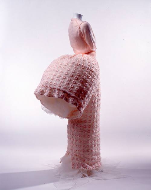
Ensemble is a top and a skirt from collection Body Meets Dress, Dress Meets Body. It is made of cheesecloth stapled together in layers of pattern sections. The sculptural silhouette and the complex piling reflects Japanese ideas about the garment, which is seen as a construction in space. Here the garment is an autonomous sculptural object and it is no longer dependent on the shape of the human body.
This garment was part of a exhibition in Booijmans museum under a theme: Tabula Rasa. I think Kawakubos design fits quite well to the theme because she has been quite groundbreaking in her field by challenging the traditional idea of beauty in fashion.
2. Constant Nieuwenhuys
Constant Nieuwenhuys (1920 Amsterdam – 2005 Utrecht), also known as Constant is dutch. He is a painter but he touched other fields such as sculpture, music and, what interests us, theory and architecture.
His brother Jan Nieuwenhuys, who was born a year after him also became
an artist and their paths are closely related as they founded together with Corneille, Asger Jorn, Karel Appel and others the Experimentele Groep in Holland in 1948. It is important to mention that all those people then took part to the CoBrA movement which we all know and which was a period when Constant painted a lot and a lot of beautiful paintings.
Constant took part to the theorizing of CoBrA. In Wikipedia I found his theory resumed to six points, I translate it here.
– Realism is the negation of reality
– Who denies hapiness on Earth denies Art
– No good painting without great pleasure
– Civilization admits the beautiful to excuse the ugly
– The best painting is the one reason cannot admit
– Imagination is the way to know reality
After CoBrA, he briefly joined the revolutionary Art movement International Situationist (from 1958 to 1960), led by Guy Debord, between others. Asger Jorn was there as well. This part of his life is really important to understand his work New Babylone.
The International Situationists were influenced by Marxist thinking and wanted to end the class society and the merchandise dictatorship. Their thinking is well explained in the book Society of Spectacle Guy Debord wrote in 1967. Guy Debord is an important character to understand New Babylon because in 1956, he theorizes the Derive in his text La theorie de la derive.
One or several people experiencing the Derive are renouncing, for a laps of time more or less important, to the reasons to move and to act they generally know…
– Guy Debord, Theorie de la derive, 1956
Image used for the cover of one of Society of Spectacle editions
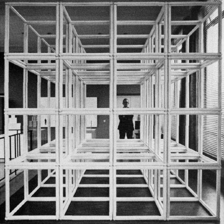
New Babylone was supposed to be called Deriville. It is a utopian city in which the defaults of capitalism (and of society of spectacle) does not exist anymore. In this sens, it fits very well in the Tabula Rasa theme.
Constant NieuwenhuysNew Babylone 1966
3. Tabula Rasa
Even though the history and works of Constant and Kawakubo aren’t similar, they work in different fields, different puposes and connections are hard to find, we see that in those both particular works, some interesting aspects can be joined.
The first aspect is the use of architecture thinking for works that are not only architectural. Kawakubo, in Ensemble, thinks the garment as a construction in space, which means that she works with the object but also with the void it creates. Ensemble is a garment created using architecture.
Constant tries to build an utopian city, he has no choice but using architecture (he also made some beautiful models of New Baby- lone). The sketch we are talking about can also be seen as a piece of Art because the city was never built, it was only a big project that, I think, even Constant himself did not think he would see become real. New Babylon is a piece of Art using architecture.
The second aspect is related to the idea of Tabula Rasa. As we saw, Constant relation to it is quite obvious, he wants to built a new city for a new kind of human. In other words start everything again.
Kawakubo, in her garment, tries to challenge our traditionnal idea of beauty and to find new aesthetic values. We saw in Ensemble that the garment becomes autonomous from the body form an can be seen as a sculpture too.
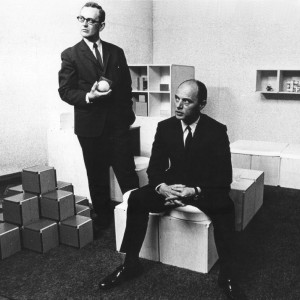
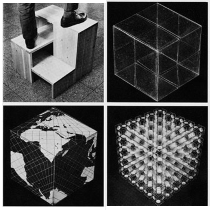
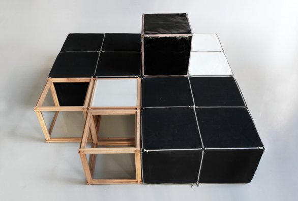
Jan Slothouber is a Dutch architect and designer who often teamed up with his colleague William Graatsma who had the same background. We could also call them artists… Indeed, their status isn’t so clear. They both have been trained as architects working for the DSM (Dutch State Mines) in which they had the kind of privileged position to be very free in their buildings and creations. This way they could develop their interest : cubic constructions.
Considering the art movement of the time (i.e Cobra) as too elitist,they were much more interested to work with CUBE a simple, basic and humble shape, easy to reach for everybody. Also, working with such a basic and geometrical shape opens a lot of possibility and a much bigger diversity of work than an already complicated shape, usable only in a certain context.
According to this view on the Art Scene, they liked also to qualify themselves as « anonymous » and to work around social issues. But, they became famous when the Stedelijk Museum asked them to do an exhibition called Four Sides: Size, Shape, Colour, Letter (Vier Kanten: maat, vorm, kleur, letter). From this exhibition started a big enthusiasm around them, including lots of exhibitions and presentations, such as the Venice Biennial from 1970. [x]
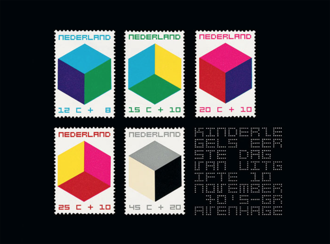
Starting this period they built the Centre for Cubic Constructions (CCC) for which they are very famous. But a few years later, when they’ve been asked to design stamps in favor of children charity, and they used their now famous style to give those stamps value, a lot of people were very skeptic regarding this choice : Slothouber and Graatsma were indeed judged too « avant grade » not accessible enough for the average people. Which is exactly for what they were fighting against.
RICHARD ARTSCHWAGER
Richard Artschwager is an American sculptor and painter. He Studied Science and Mathematics. After studying he worked as a cabinet-maker. He got to be pretty successful with his furniture untill his studio and all his contents was destroyed by a fire in 1958. After this he started to work more as an artist, this was in the time that abstract expressionism influenced the arts.[x]
After the 60’s his work is mostly pop- minimal- and conceptual art.
His work had a dichotomy between painting and sculpture, abstraction and representation, industrial manufacture and hand craftsmanship. The works are on one side sculptures and on the other hand pictures of objects. His craftsmanship for making furniture enabled him to make artworks with an identity and function that brings subject materiality, form and space into a balanced combination. Artschwager experimented with basic forms and materials, for example in his work Handle (1962), a handrail shaped in to a frame. The work is simultaneously pictorial and sculptural. Via an utilitarian and aesthetic approach he creates works that emphasize space.
In 1963 Artschwager starts to work with Formica, a new material, synthetic laminate, which was used a lot in furniture making because it was cheap and resilience. Artschwager: “It was Formica which touched it off. Formica, the great ugly material. the horror of the age, which i came to like suddenly because i was sick of looking at all this beautiful wood.” For Artschwager the Formica is a picture of a piece of wood. If you take that and make something out of it, than you have an object. But its a picture of something at the same time, its an object. By covering box-shaped plates with Formica in different colours and textures he creates a composition of domestic objects. In this way he pushes a painting in to three dimensions. mirror/mirror – table/table (1964) and later on triptych II (1967)
SCALE
This research is about the differences between art and design, we compare an artist and a design couple that both had their artworks in the exhibition ‘Setting the Scene’ at the Boijmans van Beuningen Museum. Both of our artists/designers shared the room themed by scale. To which extent is this the right theme to connect them to?
Scaling down is used in architecture to present large designs for building projects in a manageable format, as a floor plan or a scale model. Design and art also use scale models as way of crystallizing and communicating ideas and research. They can be used to experiment freely with form, scale, material, and details – after all a model does not always have to have a ratio of one to one in the real world.
Scaling up or down need not always be a practical solution; it may be and end in itself. A functional object can be made dysfunctional by enlarging it, reducing it or making it from unconventional material. Deviating from the human scale changes an object’s relationship with the human body. And if you enlarge a recognizable pattern far enough it transforms into an abstract structure of its own accord. The surrounding space is also a factor: you see things fundamentally differently when you see them from a distance or stand very close to the object. Scale changes one’s view of things.
CONNECTION WITH SCALE
We think that in Artschwagers work scale isn’t a central point. The alienating effect of modifying scale, is something that Arschwager achieves via material and playing with assumptions. The way he works is different but the result has similar aspects. The work in the exhibition, Counter III, is probably the only work that has a different proportion, but we think his works more relate to form and space. A form that is recognizable for his works is the cube, which is a central shape as well in the works of Slothouwer en Graatsma, our artists relate more in form than in scale. Indeed they’re using the cube for its simplicity and thus the diversity of composition it offers. Slothouber and Graatsma are then able to play endlessly with scale. The cube can be the piece in itself, as well as an essential element (like an atom) to build a bigger form not necessarily with a cube shape. The cube can be the final object or the substance of the object.
There is a clear difference shown between art and design that also matches the common view on this distinction, the works of the artist are not for use even though they look like in first sight, the works of the designer are based on shapes that are not immidiatly recognisble as domestic objects.
Lie van der Werf • Gaetano Pesce Green Street Chair 1984
Gaetano Pesce (1939) was an Italian architect and product designer who reconciled his interests in the fine arts with design in the 1960’s. Pesce, like many of his fellow contemporaries associated with Radical Design, sought design solutions that did not conform to the standardized forms associated with mass manufacture and mass consumption. His works challenge the commonly known concept of a chair, playing with the border of sculpture and objects of daily life that belong to the design world. Pesce continued to play a prominent role in progressive design circles over the following decades, placing greater emphasis on architecture in the 1990s. His multi- and interdisciplinary work known for experimenting with new materials and resin, which has become his signature material, was celebrated in an exhibition at the Centre Georges Pompidou in Paris in 1996.
Lie van der Werff (1962) graduated in 1992 at the Royal Academy of Arts in Rotterdam and in 1994 at the Rijksacademie in Amsterdam. She was part of a group of sculptors that brought back the figurative in art and started using natural materials again. Recognizable shapes from animals and humans were reintroduced. This went against the sculptures made at that time, when sculptures mostly consisted from abstract and geometric forms made from industrial materials. Van der Werff makes use of the fictive story behind textile and applies her findings to her imaginary animals. Next to textile she also uses wood and clay to translate her ideas into reality. Looking at her work on her website, her work seems highly theatrical. She is a bit as an Alice in Wonderland, who wears dresses that are too small and hangs out with fictive animals.
Form
How often do we stop and think about the hook we hang our coat on, or the knife we use to butter our bread? Our daily life is a succession of assumptions and presuppositions. We are not always aware of the multitude of shapes and objects we surround ourselves with day in and day out.
Form and function are seamlessly linked in our minds: trousers belong on our legs and a door hinges vertically, not horizontally. By contrast, when an artist or designer alters the form of such an easily recognizable everyday object, takes something away or changes the context in which it functions, the ingrained meaning of the object is subverted.
We started our research based on the connection made by the Boijmans van Beuningen Museum. In the exhibition of Setting the Scene the following questions were asked: What are the differences between design and the visual arts? And how far apart are they?
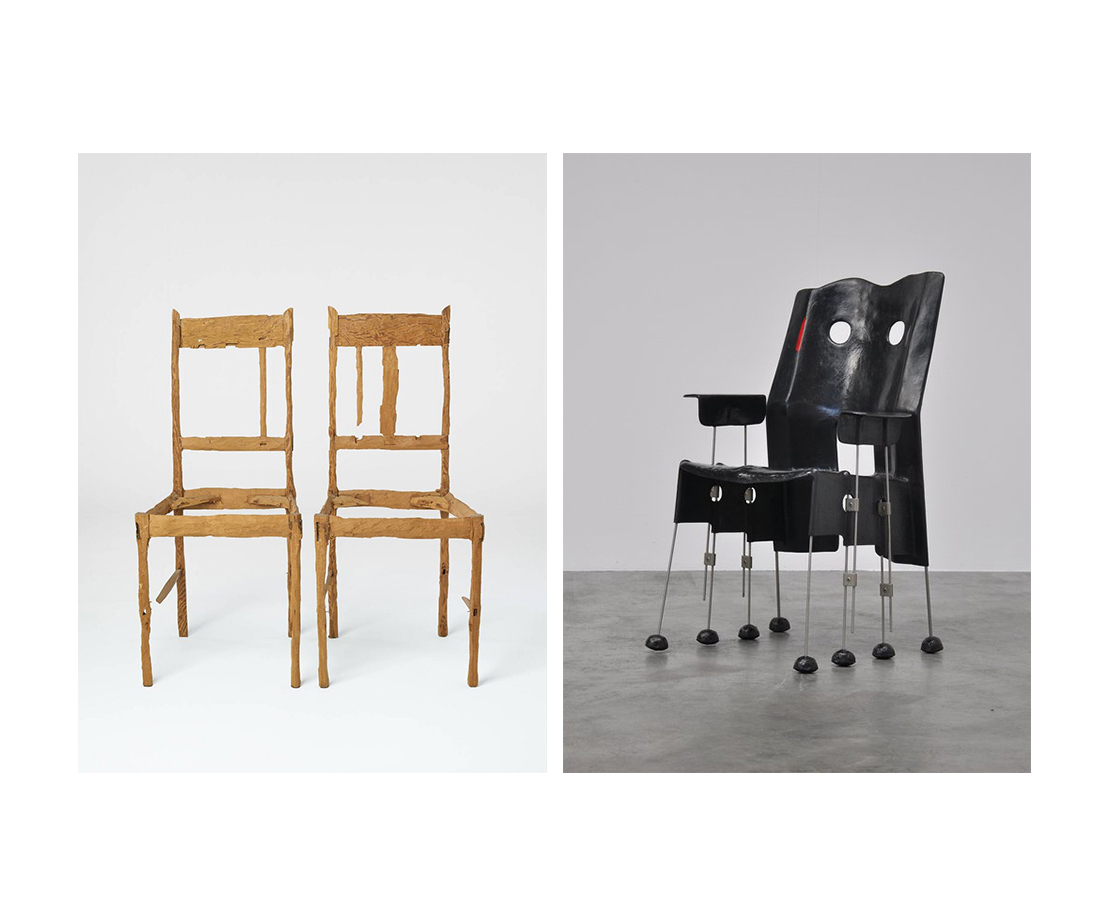
When we walked into the theme room assigned to us at the museum, we quite quickly chose our subject of interest. In the room we saw a chair that looked like a sculpture and two chairs that looked exactly like chairs but weren’t meant to sit on. We were immediately interested in this combination between the work of Gaetano Pesce (designer) and Lie van der Werff (artist).
There was something interesting about the chair from Pesce, because although we clearly saw that it was a chair, it looked very sculptural. Nevertheless you could see that the user was taken into consideration, there was no doubt where to sit. But material wise the designer was working on the boundaries of design. The eight thin legs under the seat of the chair almost made it look mechanical, almost like it could walk. The fine arts approach of the material (metal, glass fiber and polyester) lifts the chair from being ‚just another designed chair’. This Green Street chair is a result of Pesce’s research of the chair-ness within the chair.
In this exhibition under this theme, the chair makes perfect sense. Pesce’s chair raises the question of how far can you go with the idea of a chair?When is something still recognizable as a chair?
Looking at the chairs of Van der Werff that caught our attention, on the contrary, there are no undefined shapes involved. She used the archetype of a chair and without obeying the rules of design, she transformed it into a dysfunctional object. By processing the wood in her own way she made the chairs unable to sit on, changing them into sculptures. Through the processing she changes the design object into personal sculptures, changing their history, giving them a story and (probably) makes the viewer wonder what happened and to whom they belonged to. Van der Werff’s chairs raise the question of how long can you chop before the chair collapses? How long can you chop until the chair is not a chair anymore? When does it lose its original identity? How can another form arise through transforming an object? But looking at her work in general, these chairs are the only possible work of her oeuvre that would fit this theme.
The work of Pesce and Van der Werff are as far apart as can be, not only looking at the chairs they made. They are not from the same time, not from the same country, not from the same discipline and never use the same materials or even use a concept that is alike. She is a lover of natural materials and colors, lives in her imaginary world and uses herself as part of her art. He, with a love for bright colors, is always looking how far he can go with materials and shapes to disten himself and his work from reality, while keeping it playful. We have to conclude that she only fits this Form theme with these chairs she made in 1992, whereas he would fit the theme with more chairs of his hand, whilst the theme of the room is also the research in his work.
So when the function is taken away, we can apply only the idea of the contemplative concept of an object. Where does design become fine arts? And where does fine arts become design? Should the distinction still be made? To keep the answer as applied to the now as possible, we can talk from our own position as art students. We are from a generation of designers and fine artists that graduate at the Gerrit Rietveld Academy with a diploma that doesn’t make a distinction between the two practices. So the fact that it is changing inside the art schools means that the distinction will disappear more and more in the future. So, let’s mingle.
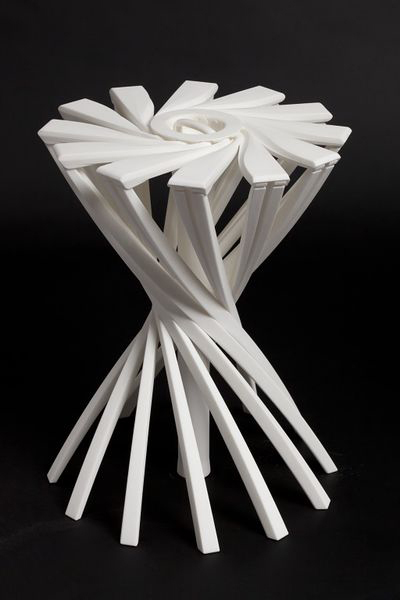
«Innovation can’t be found in the drawing of an object but in the use that is made of technology, materials, techniques. Technology has no interest for its image, but it is interesting for the service it offers. Its image must disappear, melt into the object. Technology is at the service of the result : price, lightness, comfort…» Patrick Jouin
OneShot.MGX is a 3D-printed stool designed by the french designer Partick Jouin in 2004.This stool was manufactured using the 3D printing technique. Born in the mid 1980s, 3D printing, more formally known as additive manufacturing, was used at this time for visual prototyping. But some companies soon realized that the technology had the potential to do more than just producing prototypes. In 2003, .MGX by Materialise was founded and they invited world-class designers to experiment with this new technique and come up with novel products that were only possible with this new technology. Patrick Jouin was one of them and created on this occasion two chairs, a table and this stool.
I consider this item as one of the the most relevant among the Stedelijk’s design collection. Innovative, surprising, light, handy, delicate, subtile… it satisfies all the expectations that we have from a stool. You can take it anywhere easily, store it in a cupboard, in a car, in a bag. This object is in harmony with Patrick Jouin’s philosophy if we believe his words : «The objects we draw today are more discrete. They are more «affectuous». Discrete friends. They don’t tell less, they simply do it more slowly. It’s like homeopathy. They diffuse rather than they speak.» I discovered Patrick at the same time as his product during the exhibition and I think he has a clear mind about what is going on in design nowadays. He created his own agency in 1998 after some years at Philippe Strack’s agency. His style is often qualified as discrete.
Patrick Jouin is really interested in experimenting new technologies. In an interview about rapid prototyping, P.J. said «The distance in between the creation, the drawing, and the final object was very short. It was like a sketch which is coming alive and taking shape in 3D. I know that every time in the history of design, when there is a new technology, there is always a new aesthetic.»
«Industrial production requires a radical conversion : we must start from the function of the object and possibilities of the machine. The limited performance of the craft production allowed sometimes the realization of original or richly decorated forms. Production by the machine, in series, needs a simplification of manufacturing’s forms and processes.» Willem Sandberg wrote these words around 1970 in a catalogue about the german designer Wilhelm Wagenfeld. Should we consider this way of thinking as still relevant nowadays ? New technologies such as 3D printing make these ideas a bit old-fashioned. I am not saying that this aesthetic is over, but 3D printing doesn’t undergo the same rules as the more industrial technique. Patrick Jouin said : «There are so many aspects, undiscovered yet, it is a new way to think how an object can be made.»
In his book Fabricated : The New World of 3D Printing, Cornell University researcher Hod Lipson describes ten of the underlying principles fundamental to 3D printing. The first principle he notes is that «manufacturing complexity is free». Unlike traditional manufacturing processes, where extra complexity requires a more expensive mold with more parts, there is no penalty with 3D printing when an object is made more complex. On the contrary, in some cases there may even be a benefit. With 3D printing, designers and artists can explore new kinds of highly complex and intricate forms that would have been impossible to realize with traditional techniques, and these come at no extra cost. It is a proverbial candy store of new formal possibilities, resulting in a new design language that is baroque and often eclectic.
«Just because you can, doesn’t mean you have to». It is true that there is a risk of overuse, a risk that it becomes too much. What should designers do now that complexity is not a problem anymore. Designers are still in the early stages of the search for aesthetic in 3D printing. Many of the experiment we see today may appear outdated in ten years, but they are playing an important role in paving the way. With an increasing number of designers, artists, and makers gaining access to 3D printing, a mature formal language will develop over time, uniting and exploiting the full potential of the technology’s aesthetic powers.
«…people often proclaims grand ideas, things that are just after all, the qualities expected about an object. What an object owes us.» Patrick Jouin
Many studios and companies are working on developing this technique. In Amsterdam, we have the 3D Print Canal House, the first 3D-printed house. It also acts as an exhibition and interactive research center for 3D-printed architecture and related areas, such as material recycling, policy making, and smart electricity grids. The 3D Print Canal House has been printed on-site with the KamerMaker, a shipping container that has been converted into a giant 3D printer.
An aspect of 3D printing that I find particularly interesting is the way you share a product. The designer creates a file that could basically be printed anywhere by any 3D printer (if the printer is able to do so), but then a question appears, how is he going to sell it ? In a shop as a finished object or on internet/in a shop as a file still ?
What will make him choose a certain option ? If you decide to sell for example your 3D printed vases in a shop, you will propose to the public a definite object, with definite colors, materials and price. These choices will be of course part of your research and of course as a designer you know better than anyone the nice colors, but you don’t give to the buyer many possibilities. Eventually you could print ten times the same vase with each time different materials and/or colors, but then you take the risk that some of them might not be successful. You might have eventually planned everything with a marketing analyze or something else, but I am sure that 3D printing could be exploited in a much better way. In this way, the 3D print is not highlighted.
Imagine that you sell the product on your website. The vase that you created has a definite shape, but no colors for the moment, it is still a neutral file, just a shape. Then you put it online and decide the price of it. You could also suggests some colors or materials, without saying that one is better than another. The customer will be free now to print the vase as he wants. There is no risk of overproduction in this case and there is also an attractive aspect for the customer. He might feel involved in the project and enjoy the fact of being part of the creative process. I talked about the price previously and I think this aspect is also interesting to discuss. How would you fix a price ? If the customer want to print it at home, you would sell a file only, so the customer will print and pay the material by himself. What is the value of it ? Is it in terms of technical innovation or complexity ? Or in terms of originality ? 3D printing could also lead to personal (home) creations and lead to the disappearance of designers. Of course, there will always be designers, but they could be at stake. For sure, this solution is possible only if a great number a person would have 3D printer at home, and it is still not the case, but it may happen soon. We can already see this kind of website where you have the possibility to create your own product.
I am also wondering about reproduction, re-appropriation and protection. How can you protect a product from reproduction or re-appropriation ? How could you recognize an original from the copie ? You could not.
The last possibility that I find personally the most interesting nowadays is to have your own 3D design/print shop. Imagine that you have your design studio that is at the same time a production place. You keep into the studio a selection of the products, accompanied by suggestions of colors and materials. Customers would come into the shop and ask for the vase 3D printed in red and blue plastic with maybe some adjustements. The nice thing is that you have then a real contact with the buyer, you can advice them, keep them informed and help them. You can imagine many things with 3D printing. It could provide a solution to over-production and consumption.
For example, companies could provide 3D files that allows you to print the piece of your machine that is broken instead of ordering it and get it from the other side of the world. You would just have to print it. For sure, the materials that you use to print will not come alone, but I think it could help. There are many other subjects to discuss, so if you are interested in 3D printing, you should have a look at this conference about the environmental impact of 3D printing that was given on December 13th 2013.
A lot of people are active in 3D printing research. This is the case of Dr. Behrokh Khoshnevis of the University of Southern California which has been developing since 1998 a layered manufacturing process called Contour Crafting, in which cement or concrete is pumped through a nozzle connected to a computer-controlled crane or gantry. This draws the contours of the largescale structure to be built layer by layer.
3D printing with Lunar soil by Foster + Partners[x]
Enrico Dini also, a passionate Italian inventor, has teamed up with the European Space Agency and the architects Foster+Partners to test the feasibility of a 3D-printed permanent moon bases built out of moondust. Contour Crafting is also aiming for the moon in a partnership the NASA. Give the significant challenges of scaling up 3D printing machinery to encompass an entire building, many concluded that, for the time being, the most pragmatic approach is to fabricate constructions in sections and then to stack these sections on-site.
Finally, if you are interested, I link you to some studios who realized some really nice project with 3D printing technique. I hope you enjoyed this article.
A model is initially an object whose purpose is either to represent the real world or to be translated into the real world, in short the model can be a copy of reality or reality a copy of the model. The main difference is in terms of scale. Usually the model is a miniature of reality. But what more can it be? When we look at a toy car and a car, what do we see? Is the toy car just a replica of the car in a tiny scale? It is hard to analyze such a thing but I think that there is a huge difference triggered by (but not exclusively) the change of scale. When the toy car is made, it has no longer the same purpose as the car does. A child playing with it might as well imagine it just as real as the car and drive it around with his fingers, or see it in a whole new world, making it fly away, fist-fight and dance Rock n’ Roll. The new scale for things sometimes creates a new meaning for them above representation, a new reality even if they are seemingly the same object in different sizes.
sketch model of van Gogh Museum, Amsterdam by Gerrit Rietveld [object: SM]
In 1963-1964, the furniture designer and architect Gerrit Rietveld (1888-1964) designs the Amsterdam Van Gogh Museum. In 1964 the architect dies before the project is finished. The building is completed by his partners J. Van Dillen and J. Van Tricht, and the construction was concluded in 1973. The model exposed in the design collection of the Stedelijk was produced by Gerrit Rietveld in those first two years. It is a sketchy model made of wood, paper, cardboard and glass. The final building is close but does not respect this concept, with a unified color of brick and very little white (from front).
I present this piece for multiple reasons. First, because in my personal taste, I prefer this version from the finished one. Rich in contrast between black and white rectangles overlapping each other, the building has the balanced complexity of the Rietveld style although the shapes which compose it stay simple and limited (only colors: white, black and blue) which gives sobriety to the building. When we look at the final museum’s front view, the unity in brick color makes the building lose its striking composition at first sight, for the overlapping rectangles melt into each other. The second reason why I chose this model is because of the way it was made, without any connection to the building itself. I see in between the other models of the museum [x], well built, detailed and clean; something of a stain. On a dirty piece of wood on which we can see quick pencil sketches for the display, an irregular, clumsy, and worn little building is erected. The colors are simply indicated by a rapid and un-precise use of color pencils ( blue and black). The materials used are cheap, and if we try we might not even find one horizontal or vertical line. And yet it is beautiful, marrying complexity and simplicity in form and color, with a rich diversity of cheap materials. Its cheapness gives it a poetic and rough authentic aspect, we see that it was handmade.
This may remind us of James Castle’s sown cardboard sculptures, which are made of scrap which gives them strength, or Bill Traylor’s choice (and no choice) of using cheap surfaces like cardboard for his paintings.
The model is in addition to this, very close to the final version. That sketchy but precise model shows the talent of Gerrit Rietveld as an architect, like the lines of a great draftsman. Its clumsiness along with the use of paper, lightly put together and slight curved, gives a feeling of fragility and tenderness which contrasts with the strongly built shapes of Rietveld’s buildings or the roughness of the materials.
I love this model because –to me– it is not a model anymore but a sculpture that contrasts with what we usually see, giving a new idea of his work and of what a model can be, even though it was not intended to become a piece of art. A model can be seen in ways that exceed its limits as a technical object.
A perfect embodiment of this idea is seen in the Tim Burton film Beetlejuice. The movie takes place in a small town and specifically in a house on top of a hill overlooking the town. In the opening scene (link here and here for the end with spider) a fake areal shot of the town is taken on a model of the town one of the main characters has built. We are tricked into believing that we are flying over a forest to finally overlook the whole town, then fly over and across it all the way to the house on top of the hill. Although it is possible to see that the scene is really shot on a model, the illusion is strong, and we are astonished to see a real spider (this time) which seems to be the size of a hippo, climb over the roof and be picked up by a real (gigantic) hand. What this illusion does is it gives life to the model, it gives it a new reality, and this is proved later on in the movie when we discover that the model has an “inhabitant”. When the protagonists are changed to the scale of the model, (in this scene) they come to its graveyard to dig up the main antagonist, Beetlejuice. In this case, the change of scale from real world to model is more than representation, the real world and the model are entangled, mingled into each other, whilst the two are different, the real world and the new world of the model. The model can open a whole new world for our imagination to create, a transcendental realm full of fire, wonder, and dragons.
From my visit to the exhibition ‘The Future of Fashion is now’ at Boijmans the installation from the artist CC stays strongest in my mind. It was a large installation where the main part was a wooden structure that reached the ceiling. The structure formed few shelves that were full of multicolored sculptural mountains. For me it clearly stood out from the tailor dummies and hanging cloths that were around. On one side of the structure were hanging four lighted-up squares that showed a man’s face, hands and feet.
When I started to research CC as an artist I found out that he is formerly a hat designer. Known as Christophe Coppens or The Mad Hatter from the Country of Surreal Art and Comic Books, Belgium. CC is now living and working in Los Angeles.
His career as a hat designer started when he was only 21 years old. In May 2012 he decided to make an end to that career, he closed his business and became a full time artist after 21 years of designing. He had been producing art work together with the designing but came to the conclusion that he could no longer combine the two. As he said:
“You can’t be a good artist with the mentality of a fashion designer. And I didn’t succeed at being a part-time artist.”[x]
It was surely a hard decision for him but an important one as he didn’t want to get lost in the design world where he had to distinguish between how things should be and how they have to be. Staying there he couldn’t be himself and use all the creativity he bears.
Coppens started making the mountain sculptures one week before closing his business. The first mountain developed during a lesson he took from the ceramic artist Mister Hugo Meert. Soon he made another one and then more and more. Perhaps the mountain shape was natural for him when working with the ceramic after all these years of hat designing. Considering the shape of hats may often be compered to mountains. As he moved to Los Angeles all the mountains around the city and the different shades of colours during different day light had an effect on him. He could surely relate that beauty to his work.
The first mountains were made out of ceramic. Later he started using his old clothes to make the mountains after noticing that all his clothes were linked to the person he was before becoming a full-time artist. The clothes were literally costumes for the outwards person he showed in interviews as a hat designer. It wasn’t Christophe Coppens himself. It didn’t fit him anymore he said, figuratively speaking. He also used some of his old furniture for the sculptural mountains. It became some kind of capsule of his past.
His first exhibition after becoming ‘fulltime artist’ showed his mountain sculptures and was called Everything Is Local, Landscape part 1. It was exhibited in Boijmans Museum in Rotterdam [x]. It was an emotional landscape that kept a hold on to the past at the same time as it looked at the future with joy.
The exhibition immediately attracted a lot of attention, especially in his home country’s press. The Belgian magazine Standaard gave him three stars of five and published an article with the title: Hoedje af voor Coppens (Hats off for Coppens).
Later he made and showed the work called The Hills Are Alive: Landscape part 2. It was exhibited in Tokyo and was livelier than his first one. Full of mountains each with it’s own personality he related Landscape part 2 to the shops he used to have full of hats [x].
His installation for the exhibition ‘The Future of Fashion is now’ at Boijmans Museum in Rotterdam is a collection from both Landscape part 1 and Landscape part 2. There he puts together mountains from the two exhibitions making up the current exhibition that he calls Landscape part 3.
It’s interesting how the mountains are mounted on wooden stands that may be references to theater stages. I get the feeling that the stands help the mountains to reach higher and then not only physically but also mentally. It becomes more of a showpiece then something that could be practical, just as his hats.
All these years of hat designing might have been necessary for the work CC is making today. Now as he is using materials from his past and the memory of who he was before, recycling it to make new art. These are memories that he is ready to put aside but at the same time still wants to enjoy and keep in reach. Probably the lighted-up squares from Landscape Part 3 demonstrate this closure or some kind of a burial of his former carrier. The location of the squares indicates that the man is being crucified and the man is believably his own former identity. It therefore seems that CC is finally ready to say goodbye to his former identity as a hat designer, or what? Will we maybe see his resurrection in his next exhibition?
Tips from CC: Enjoy the present and wear sun screen [x],