Skip to Content Skip to Search Go to Top Navigation Go to Side Menu


"ceramics" Category


Not all boys dream of being kings, not all girls dream of being queens


Sunday, May 26, 2013

 
The intimacy of Grayson Perry´s drawings and the DIY characteristic
of punk and queer movements


The first time I came across Grayson Perry´s work happened on the same week I had a discussion with my classmates regarding minorities and the quantity of women inside the art academies X how many of them do we actually see in contemporary art galleries and museums.
Not only for briefly getting to know his beautiful works, but I was mostly glad to hear he was a successful and Turner Prize winner artist who also happened to be a transvestite. He made it out there despite for his choice of appearance or behavior and above all: his body of work does speak about all of these matters in a very subjective and personal way.
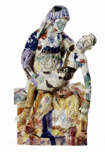
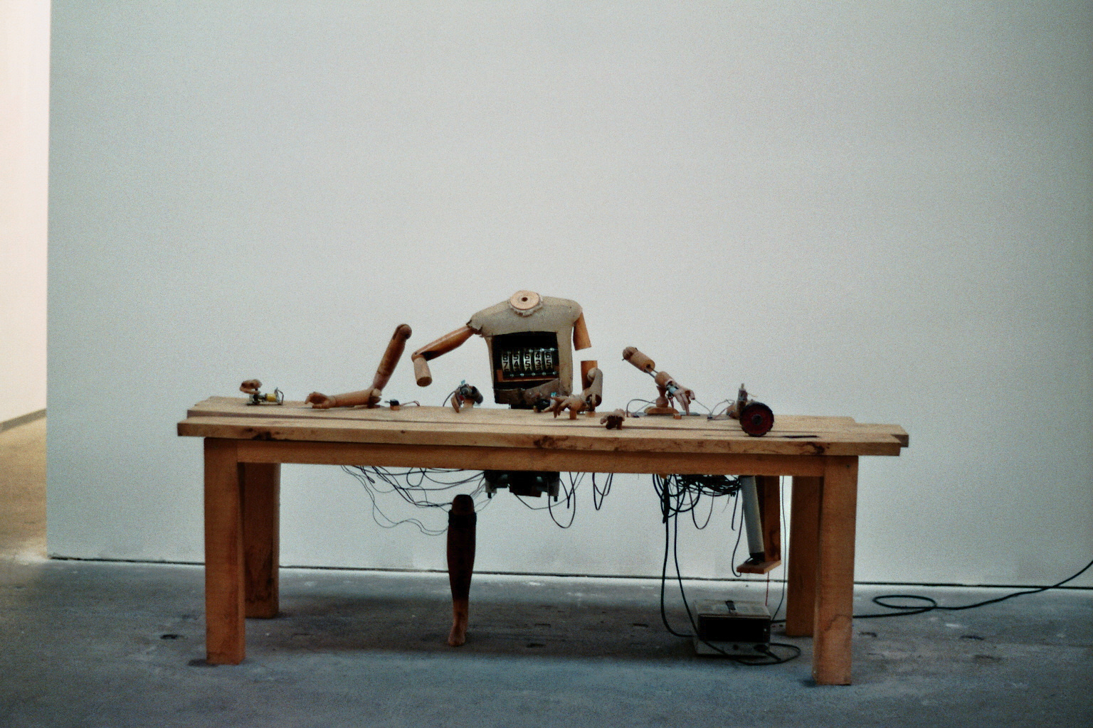
I hadn´t thought or researched much more about Perry until I visited the Hand Made exhibition at the Boijmans van Beuningen museum in Rotterdam with the Foundation Year. For my surprise the centrepiece of the exhibition was The Tomb of the Unknown Craftsman, by Grayson Perry.

The Tomb of the Unknown Craftsman is a tomb in the shape of a ship, which has been cast in iron, a floating reliquary that is forever earthbound. This, he says, is the tomb of the unknown craftsman, dedicated to the many thousands of artists over the centuries whose work survives but whose names will never be known. The political and whimsical aspects of the work promptly awakened my curiosity and interest in his art, so I decided to start researching about him.

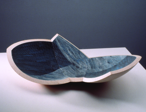
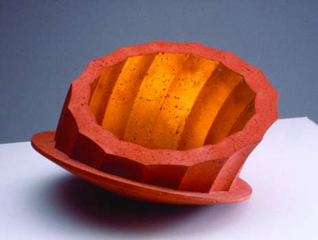
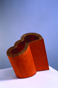
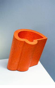
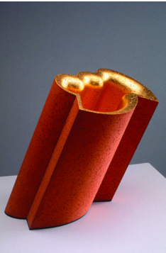
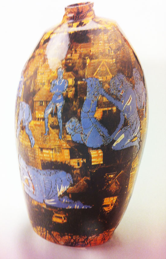
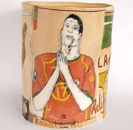
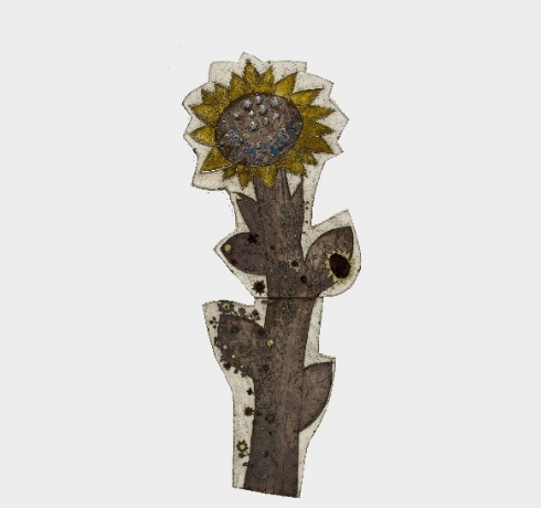
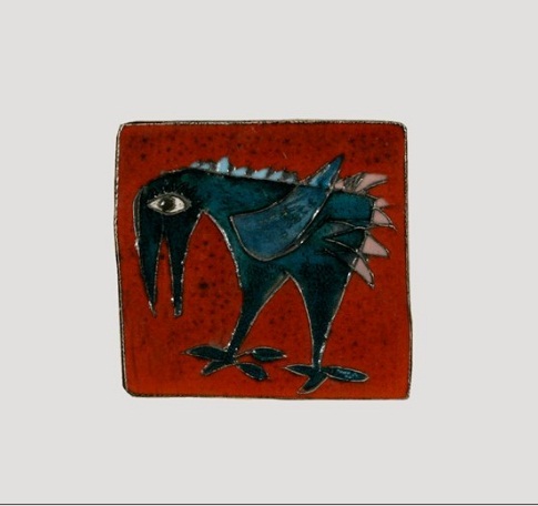
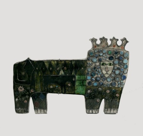
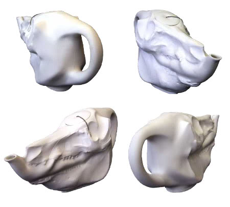
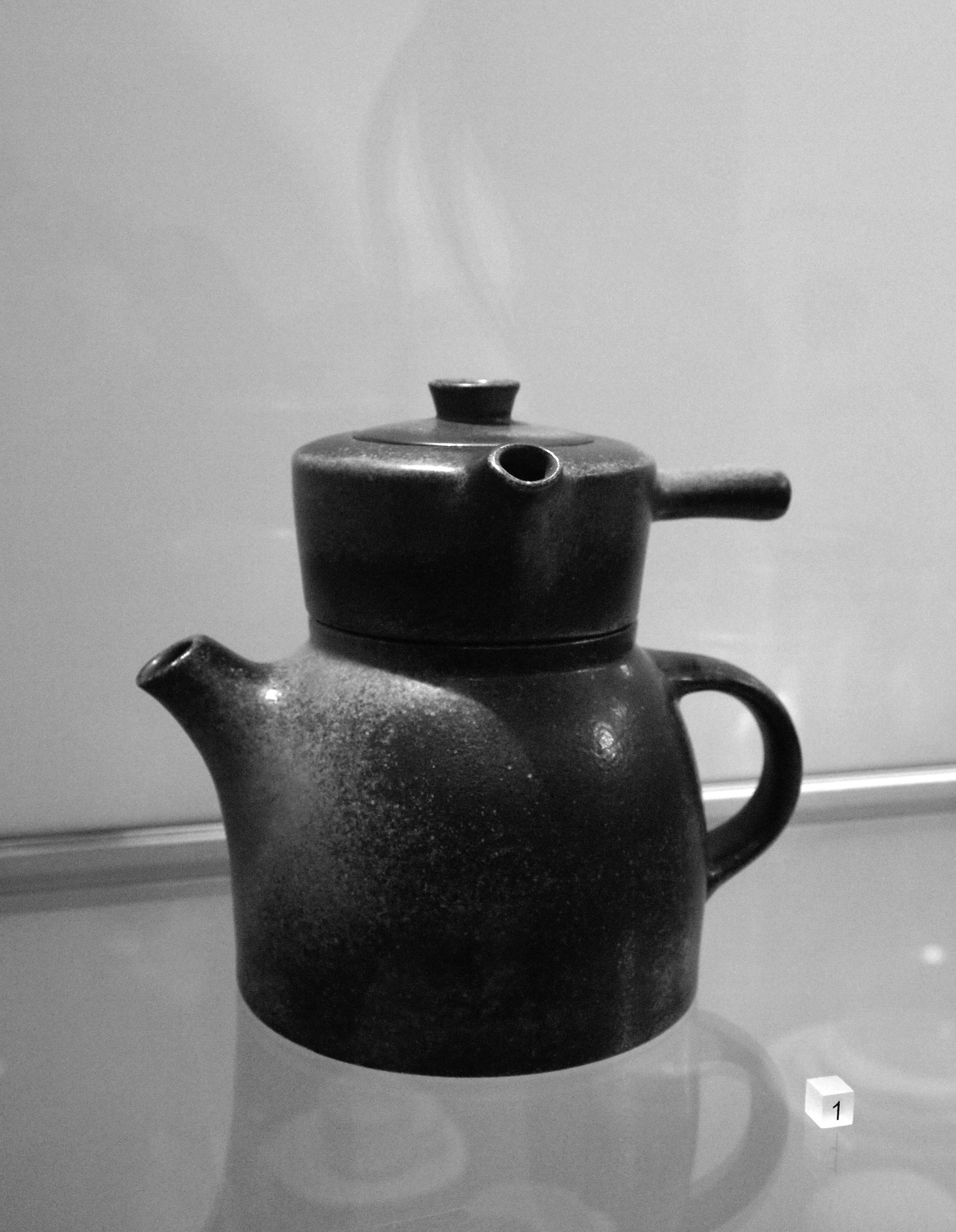
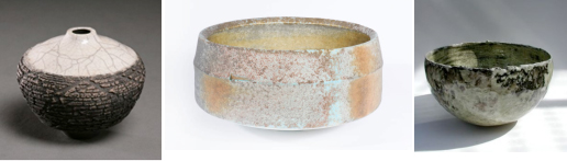
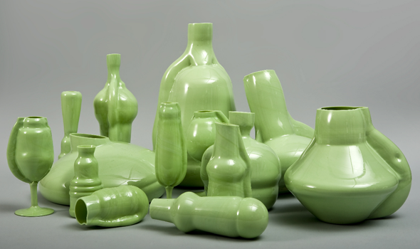
Perry is mainly known for his ceramic pottery and tapestry, where he combines classical forms with his drawings and sketches. The drawings have a strongly autobiographical aspect, often depicting himself as Claire, his feminine alter-ego, and his teddy bear, Alan Measles, as a representation of the father figure, always providing comfort and affection. Many of his works picture sexually explicit content and for that reason they have been raising harsh criticism among art critics. But Perry habitually portrays the life of the working class as well as inciting discussions about minorities, sexuality, class and race. He has said, “I like the whole iconography of pottery. It hasn’t got any big pretensions to being great public works of art, and no matter how brash a statement I make, on a pot it will always have certain humility… For me the shape has to be classical invisible: then you’ve got a base that people can understand”.

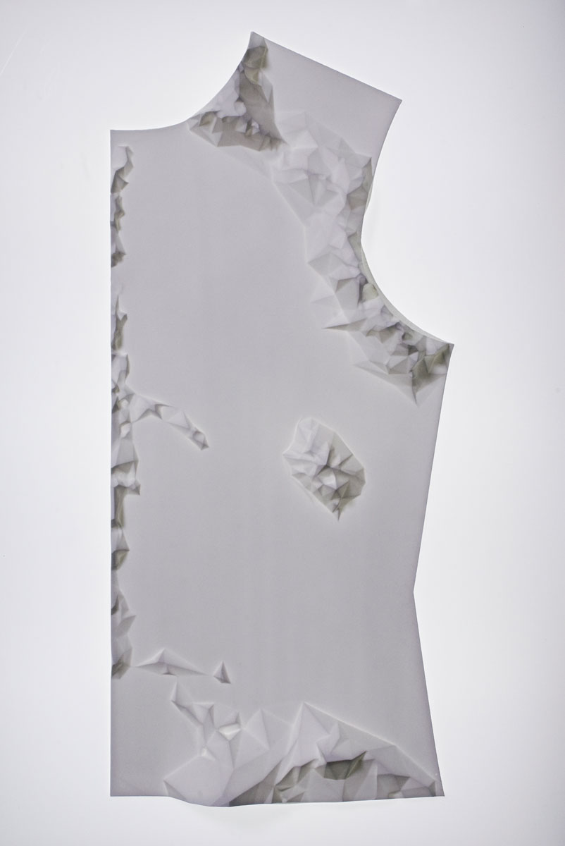
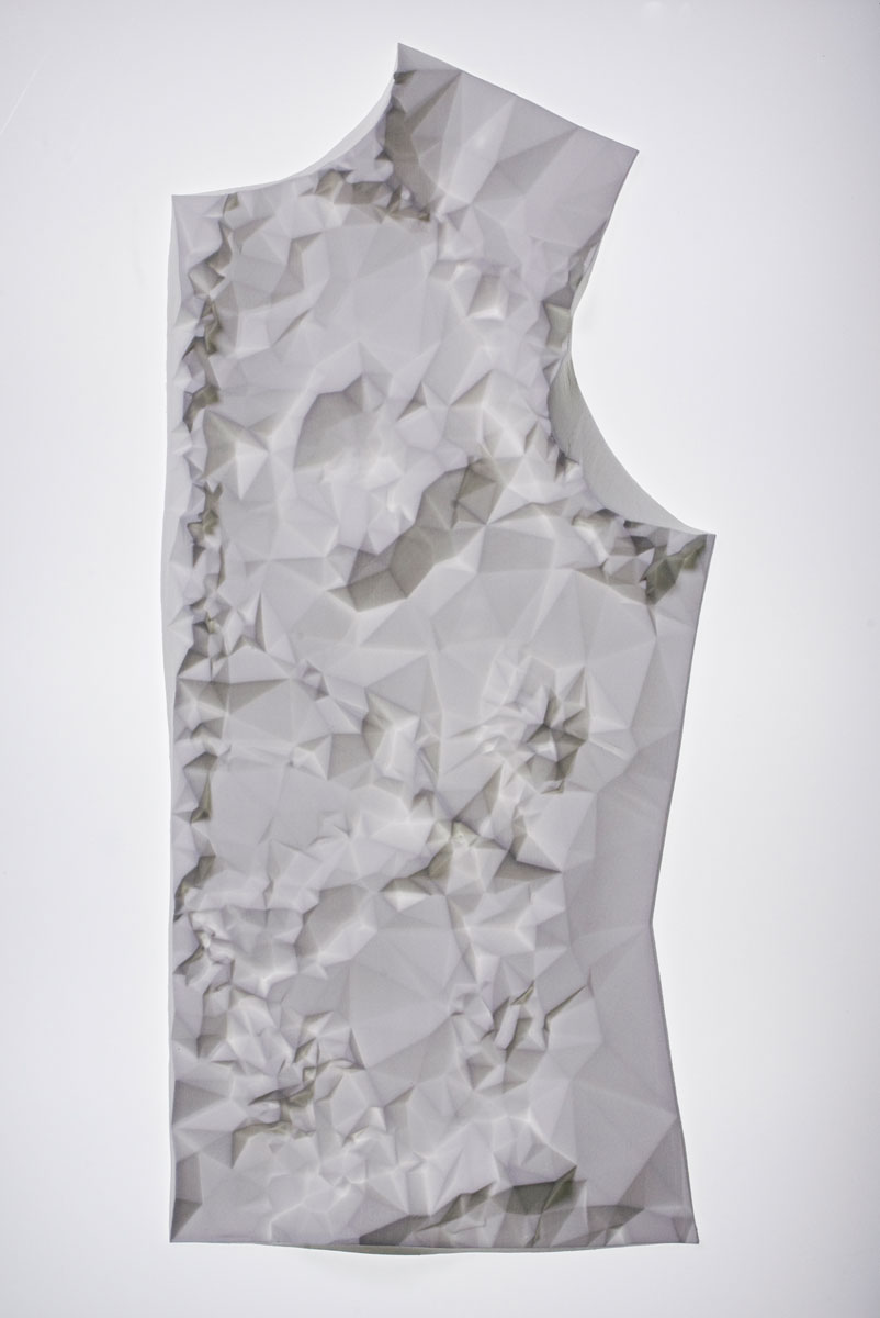
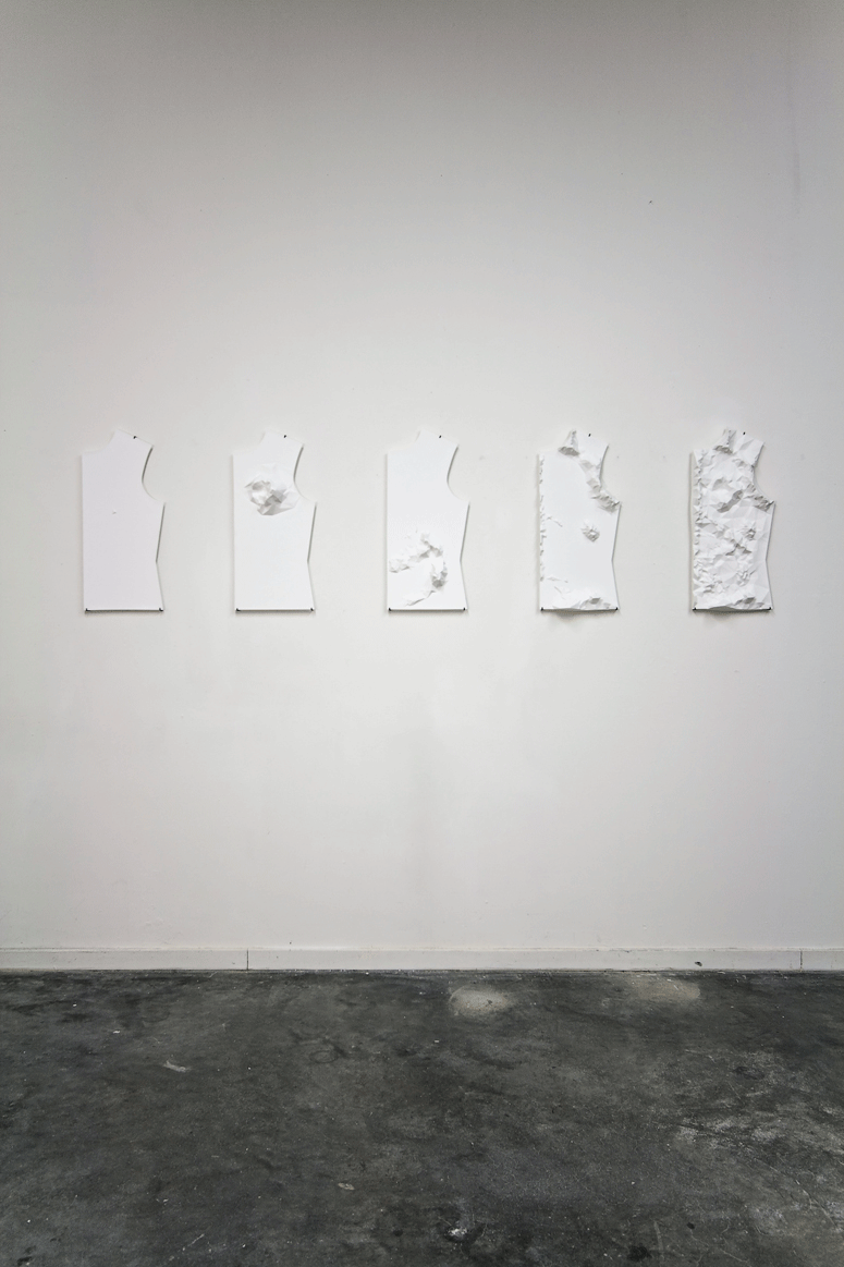
Looking closely to the drawings on the pottery and trying to understand what they wish to communicate I could not help but think that their guerrilla-like motto and storytelling elements reminded me of the punk zines and the DIY (do it yourself) aesthetic of the punk and queer movements. In my mind, the way Perry uses the form of traditional vases as a free base and platform for the materialization of his thoughts immediately related to the intimacy and freedom of speech of the hand made booklets.
The hand made zines played a very important role in the punk movement in the late 1970s. Through the making of a zine one could express his own or a group´s principles and spread the word while being able to escape from the control of the publishing companies and media. In my opinion the exceptionally underground aspect of it is what provided the freedom necessary for the makers to loosen up from any possible apprehension regarding public judgment in order to feel welcome to express their most genuine political thoughts. I can recognize this very same bravery and freedom of speech in Perry´s drawings.

For Perry art should be able to communicate to the public and not only to the high-class art related intellectual minority. He also reflects on crafts as a form of art and in an interview to the Victoria and Albert Museum in London, he mentions that craft and art are greatly linked and that is actually one great thing about it. Craft by definition is something that can be taught to someone else, you can teach someone how to throw a pot and they can become as good at it as you. Whereas art is very much linked to an individual vision and it´s not necessarily something that can be taught. One can be derivative and take up someone elses vision but he won´t ever become that person.
Perry calls himself an artist and craftsman and he makes use of crafts as a solid and clear base for his art, a base that becomes a tool for the expression and carriage of his message.
Not surprised I discovered Perry was involved in the Chelmsford punk scene in the late 1970s, he lived in squatted houses and at some point shared a house with the pop singer and transvestite Boy George, who became an inspiration for him. He is also the father of Flo, a 21 years old girl, and the husband of the author and psychotherapist Philippa Perry.

PIETER STOCKMANS THE GUY WHO FELL IN THE PORCELAIN


Saturday, May 25, 2013


Could craft be seen as art, or the other way round? Is it even possible to combine these two?
According to the broad work of Piet Stockmans, the answer seems to be clear. 

Pieter Stockmans is a well experienced ceramist, born in 1940. He worked for the Royal Mosa Maastricht, taught at the art academy Genk and the Design Academy at Eindhoven. From 1989 he started to work as a freelancer, which he is still doing these days. Al the work he makes, is a signature for himself. Piet is devoted to his work, and this devotion/passion is what brought him to the level he is working on now, you could almost say he is obsessed with the material so he knows the qualities of it. He searches for the essence, the edge in his designs, in material, and in function of the object after this, the material became the way of expressing himself. He thinks from the possibilities that the china is giving him. Not only the possibilities, but also limitations are an inspiration.


His tableware is an experience, its light, thin, sophisticated, fragile, beautiful, elegant, clean and minimalistic. A cup becomes something more than just a holder for your drinks, as soon as you touch it, you feel the fragility, and the almost sharp edge on your lips. Next to his spotless tableware he also has other projects, he exposes his work in several museum, does projects for public spaces, he designed the tableware for the prince of Monaco for instance, he sells fabricated works in stores and still does handmade. Just recently he cooperated with star restaurants and master-chefs. This collaboration was very valuable for both of the parties. The plate should be a compliment to the dish, it should replenish each other. Instead of just being an tasteful dish and a nice designed plate. These two things come and work together. With this kind of corporation you clearly can see that Piet changed the approach, of something we take for granted as an everyday routine, into a certain appreciation.


Is Piet Stockmans an artist, a designer or an ceramist? And according to the Boymans van Beuningen ‘handmade’ exposition, what is his relation to that? 

He strives for authenticity in his work, that is of main importance and also he tries not to loose himself in the technical advantages of nowadays so we can label him as authentic. What is it, that his work expresses. Piet is searching for new possibilities and challenges which is important. His approach towards his own work is very artistic. It becomes autonomous. What I found also interesting about it, is that how far can you go if we talk about art and design. With his tableware, is it not art because it has a proper function? Does art have a function? In his philosophy comes forward his way of dealing with a process or way of thinking. In which, hopefully, we all can recognize ourselves.


His philosophy,

“Creation is founded on doing, not thinking;
the act of making, brings forth ideas which in their turn give rise to other ideas;
gradually, along the way, strange as it may seem, decisive choices are made.
Like the automatism of the plowing farmer,
or the habit of prayer,
or the recital of mantras,
or else the repetition of an everyday gesture.
It is a search for simplicity, for calm, for physical well-being.”
Piet Stockmans 


For the outside world it can be hard to define the work of Piet, because you can organize his work in three parts, artistic, craft and industrial. For Piet himself those lines are thinner then we are experiencing it, he is continuously moving between them without any distinction from each other. The things is when he is designing for an tableware project it can inspire him for any kind of new work: the evidence that each part is closely related. I think we have to take in account what the artist is trying to say with his works, what is the purpose? What is the thought behind it? What is the artist willing to express? And last but not least how does Piet think about it himself? He says, “I am a designer,  because doing one artwork doesn’t make you an artist” which is true. I find this a modest profiling. In case of Piet Stockmans, I think if we not divide his work in several segments, and see it as one, Piet is in my eyes definitely an artist, and also a designer and also a ceramist.


http://www.pietstockmans.com/


Interview Piet Stockmans (in Dutch)

Correction on my explanatory letter


Friday, May 24, 2013

Dear Frank,

I’m terribly sorry to bother you again, but after reading a copy of the last letter that I’ve sent you I felt I had no choice. I realized that by only sending you pictures of the works from the Shift and Progression series, I was kind of disproving the point I tried to make. It started making sense, a bit too much sense if you ask me.

When you look at the objects from this series next to each other, of course you will see a gradual shift and progression, providing the thing with some sort of concept (although I wouldn’t call it a strong one). Also I realized that this title could be applied to nearly all of his work.Anyhow, I’m supplying you with some additional images of Smith’s work. Now from different periods of his career, so the ‘designer of shapes’ thing I told you about will be more clear.

I hope that now you can see my point a little clearer, and that I don’t change my mind again too soon.

Regards,
Giel

Explanatory letter on my Shift and Progression


Thursday, May 23, 2013

Dear Frank,

It seems to me that a short while ago we had a small misunderstanding about my feelings for the work Shift and Progression no.3 by Martin Smith. I’m writing you this letter, hoping to get things straight again, making you understand what it is that made my thoughts about the object shift, and made my initial liking for the object progress towards great annoyance.

At first I praised the work and to your question of why I liked it, I answered: “It’s the ungraspable nature of the thing, it seems to radiate from the inside through clever use of material and reflection, it almost seems a mystical object.” At the time of writing it was probably how I really felt, but at this present moment it’s nearly impossible for me to recapture that feeling.

A lot of my initial feeling probably had to do with the context I first encountered the work in. On the Hand Made exhibition it was one of the few objects that managed to attract my attention for a substantial period of time. It was mostly because I didn’t really get what I was looking at. Not many other objects managed to do that, a few examples: a cardboard owl, a ceramic owl, a table of which one of the legs is a frog made out of epoxy, I guess you get the picture. And don’t get me wrong, it is not that I was in no way attracted to any of the things in the exhibition, but the attraction was only visual. With this object I felt, there would be something more to it. But how wrong did I turn out to be.

After I started searching for Martin Smith on the internet, I soon hit a dead end. Apart from his personal website, and a mentioning of him as being a professor on the Royal College of Art in London, there was nothing to be found. His personal website showed a range of works, all ceramic. Browsing through all this, I soon felt I might’ve been wrong.

All his works definitely show his great skill in ceramic techniques, but never did I encounter a real surprise. He seems to work in series, every few years he changes the color of his clay, or adds another material to it, but that’s it. Series and series of basically the same type of object but slightly different. The first impression I had of Shift and Progression, that there had to be ‘something more’ to it than meets the eye, was definitely proved wrong. The website did offer me a quite brief description of his practice, namely: “an ongoing investigation of the formal language of the vessel and the way that it can both contain a space and define a place.”

What exactly was meant by this, I could only guess. Well I did get the formal part. Most certainly, when talking about form, he is exploring the possibilities of the materials he’s working with. But ‘contain space and defining a place’ really annoyed me. Any object can define a place. When placing a banana in a white room, it both contains space, and defines the room as the room with the banana in it. Put another object next to it, and both of them do the same. It didn’t seem to make much sense to me, just an attempt to put a fancy label on what he likes to do and is good at, working in clay.

Then, somewhat desperate I went to the library of the Stedelijk Museum. All they had was an 80 page book, which offered me a brief description of the mans life, and a lot of pictures of ceramic objects I had just seen on the internet. The only thing that I found out there, that seemed to be of any importance, was his interest in exact sciences, and the fact that he first studied to be a geography teacher. This, at least, could explain a bit about the impersonal and calculated works I had seen. But still made me wonder, what did it do in the museum, and why at an design exhibition?
It is possible to say that Smith is a designer of shapes, of course. These shapes, according to the book I found on him, are often the result of mathematic calculations. Also the chemical processes, for things as the glazing and ‘what happens when and at what temperature’ during baking, are approached in a very scientific manner. Even in his earlier period, where he made raku vases and bowls, he would calculate everything so precisely that the surprises that happen during baking, which are a important characteristic the technique, were reduced to a minimum. So the guy kind of struck me as a scientist, and even though the worlds of science and art aren’t that far apart, it’s just not the stuff that manages to interest me.

Then I decided to send the man an e-mail, hoping that he could explain me a bit more about his work, and light that once existing spark again. I asked him what he wanted to evoke with his viewers, what was meant by ‘containing space and defining place’, and whether he as well felt his work belonged in this Hand Made design-exhibition. But the man never cared to answer.

So in short, it was the cold approach and one-sidedness as I experienced throughout his entire body of work, really put me off. Even Shift and Progression now seemed devoid of any interesting aspect I found in it at first. All of the work seemed to me nothing more then just empty vessels, meant only to show off the technical skill of the artist.

Well, I hope this gave you a little more insight in my personal relation to the object and the gradual evolution it was subjected to.

Regards,
Giel

P.S.: I included a few pictures to prove my point. Also one of the  cardboardowl and of the epoxyfrog I told you about, just for fun!


Storytelling as a craft


Thursday, March 28, 2013

Grayson Perry is an English artist and his work is really broad. He makes vases, videos, documentaries, graphic novels and curator. He made Claire – his alter-ego – into an icon. Together with fashion students he designed incredible creations for Claire.

At the exhibition I saw this work: Strangely Familiar, which is a vase with pornographic images within the background images of the suburbs. Not something you immediately connect with pottery, that’s what makes it so interesting to look at. The vases itself tells a story, the vase serves as a stage, Although they have this fragile look they tell radical stories.


In England it produced strong reactions. Many critics didn’t take his work serious, it is primarily the form he choose that was shocking. Ceramics and decorations have a reverential status in England. Associated with good taste, educated public. What Grayson Perry tells us with his vases is the opposite of what we like to see as civilized or good taste. We would like to see ourselves as civilized people in Western society, but he shows us that we in essential aren’t civilized people at all.

Stedelijk catalogue

I really don’t understand that they make such a problem about the images on the vases. You have to see it in the context. I think it just makes it stronger. It seem they only focus on the vases, they threat it very narrow minded if you ask me.


(more…)

Culture mixing and the living-room memories I’ve never had


Friday, March 8, 2013

In my quest to choose an object to research out of the current display of design at the Stedelijk Musem I initially thought I would go against my instincts. I thought small, delicate, rational. I even went as far as to write a full research on “small, delicate, rational” but after I was done I couldn’t go to sleep. Needless to say, my roots got the best of me and I ended up being hunted down by the work of Philip Eglin. To give a little background Eglin is an alumni of the Royal College of Art in London and he is specialized in ceramics.

The work in question is entitled “Virgin and dead Christ” and it was made in 1998. The decade it was made in is so well embedded in it in fact that it has on one side Hugh Grant’s ’95 mugshot. Instinctually I wanted to know a bit more about the motivation for such a detail, and Mr. Eglin obliged me with a reply (in the age of rapid fire communication, artists apparently are kind enough to answer the curious):


Something as dated as this reference could now sound obsolete (in fact, it is assumed as dated), but in my view it’s delightfully reminiscent of the time when I was a kid and also of Romanian style of ceramics that I grew up with – not in the traditional sense, but in the purely kitsch one.

Easy to say that ceramics was never considered art in the country I come from. It’s purpose was either utilitarian (dishes, cups, etc), traditional (folkloric patterns) or of display on a smaller scale (think grandma’s living room, on a shelf).

My most prominent memory of ceramics is in fact the last one of the above since throughout communist times (until 1989) in Eastern Europe and even well after (old habits die hard) it was a custom to gift and later to show off in your vitrine figurines which made no connection to the surroundings of your living room and which were hidden behind glass for purely functional reasons (it saves on a lot of dusting hours). I suspect this was done because of the need to be sorrounded by beauty, but given the lack of education on the subject, never a true understanding of how to handle and consume said beauty.

The most common subjects which found their way into Romanian living-rooms were porcelains (named “bibelouri”, from the French “bibelot” or English “trinket” – which stands for ornament) of: random French couples dressed a la 17th century, random curved ladies in provocative poses, ballerinas large and small, peasants male and female, mythological figures, horses, peeing little boys, Christ and Madonna figures, dogs, chicken, weasels, bunnies and other furries.

The list was peculiar but standard. The objects, always poorly made, did not have any other redeeming qualities either than a striving for beauty and having been made of materials more delicate than plastic.

These tiny sculptures were never displayed as individual pieces, but crammed together. So, you would always see a bizarre Noah’s ark of larger than life dogs next to ballerinas and in a 17th century French setting in a 20th century Eastern European living room.


Seeing Philip Eglin’s work in the Stedelijk museum only later brought on the realization that I was, in front of “Virgin and Dead Christ”, catapulted back into a Romanian living room. The work screams contemporary through it’s eclectic mix of features on the two characters and patterns on their surface, but it also comes to me as a commentary against cleanliness and the rationality of Dutch design.

There is no reason, everything seems to have been pushed together against it’s will. The theme speaks of centuries of reinterpretation, during which the Madonna has been turned on all of it’s sides, so much so that now it’s impossible to have just one view of what the scene should look like. The subject has been done and done to death. Maybe that is why if it is to be done again it can only be done with a sly humour and a stamp of Hugh Grant’s face on it’s side. No longer can we look at it in reverence. The relation that we have with the image goes beyond “no judgement”, it’s also somehow pop culture in itself.

There are inspirations in Eglin’s work which are easily traceable” Northern Gothic religious woodcarvings, Chinese porcelain, English ceramics, contemporary packaging, popular culture. There is also a lot of humor as his later work (porcelains of the Pope, footbal teams etc) would go on to suggest.

Choosing Eglin has been for me an exercise in respecting my roots and disregarding the fact that they are not clean, solid, elegant ones, but messy and irreverent. After all, there is in design enough proof of cleanliness. A little chaos is therefore needed as well.

In retrospect the choice was also motivated personally by the stubbornness of both my parents to have a house lacking in ornaments. While I was familiar with the norm for Romanian living-room displays, I never did have any small ornaments, only one large library filled with books and records. In those small figurines as in Eglin’s work, I contaminated myself with a nostalgia for a time which I never truly lived, but only observed from a distance.
 

Stedelijk Design Show 2012 /Future Highlights


Tuesday, November 27, 2012

17 Rietveld's Foundation Year students visited the "Stedelijk Collection Higlights /Design" in the newly opened Stedelijk Museum. Marveling at some masterpieces of Interbellum design or surprised –a little further– by the Scandinavian design some of us know so well from our grandparents homes, we arrived at the last part of this "Depot Salon" wondering what a 2012 selection of Design could be.
Researching contemporary design we composed the "2012 Supplementary" which we present in this post. From the exhibit "Stedelijk Collection Higlights /Design" we all selected a personal best and made it the focus of the researches published as part of the project "Design-in-the-Stedelijk"


‘Houses that were never built’


Monday, November 26, 2012

Big surface, loads of items, colors, shapes, sizes, functions of the works. I could choose any of them, but the one which attract my attention, was a ‘thing- simple, white colored, hidden in the corner of the Scandinavian design room. I wasn’t sure what the thing is. It wasn’t a painting, it wasn’t an installation or a 3-dimensional glazed porcelain. As I found later, on the artist’s website, it is one of the  ‘ A B S T R A C T  M O D U L A R  P I E C E S ’


Let’s say something about the artist. It is Rut Bryk, born in 1916 died 1999, married to Tapio Wirkkala whose work is also in the exhibition. She is primarily known for her ceramic art works. On her website we can read: ‘The works of her first figurative phase are wall pieces depicting still life’s, architectural motifs, mythological themes, plants and birds’.  I have to say that I’d rather find them naive, the colors which are used there as well as the forms.


But even in those ‘naive’ works like in The Lion, we can notice the style that she’s developed later in the  works, that I was so impressed by.

Soon after that peroid we can notice, some change in Bryk’s works, in the late 60’. ‘She began to produce large architectural ceramic wall pieces composed of numerous differently shaped and coloured modules’. The White Mountain, the work I found in the Stedelijk, was made in 1977.  The modular works, had similar shape and form, but the game of colors gives us a feeling that each of them is telling you a different story. When I was checking her works for this research I realized that those simple mosaic-like works, will open up only with time. The more time you spend with them, the more you understand and appreciate them.

Viewing her works, suddenly I had the ‘Lego idea’ in my mind (just her ‘Lego style’ contains only white blocks). Don’t you believe that the structure of her works and the Lego picture look alike?

right: phase 16 LEGO 'Archtecture series' Farnsworth house designed by Mies van de Rohe between 1945-51 / left: City (Oy Arabia Ab, 1957) This work was on show at the Milan triennial of 1960 and it was given the American Institute of Decorators Award in 1962. The piece consists of hundreds of tiles and cubes of different size and colour.[x]


But from other hand, don’t you have a feeling that she is bringing the spirit of constructivism in her works? Or maybe the character of the modern architecture? This can be the point, because Rut Bryk, was dreaming of becoming an architect, she was even accepted at the Helsinki University of Technology. But finally she ended up studying graphic design. She expressed her sorrow and disappointed about this in her diary: ‘The biggest wish of my life was not realized. All the beautiful houses that I had built were only castles in the air…

I find her modular-works as big architecture scale models, or maybe urban structures, interpreted by female nicety. They all look so delicate. It’s very interesting that you can compare the works to massive architectural structures.

Another idea which popped-up in my mind, while I was comparing her initial works with those huge wall porcelain structures, was the motto Mies van der Rohe used to believe in: ‘Less is more’. In my opinion it is a proper comment on her art pieces. The more ‘minimalistic‘ her works were becoming,  the richer they were. Thinking about Mies, I Googled his works and thought that we could again make some comparison:


And this is how I actually see the Bryk’s works;

Graphic design, ceramic skills and the plan of becoming an architect, which never came true- became EVERYTHING for her. Those three elements decided about her life, works, life decisions. She could let her dreams live free in her works. I’m very happy that I’ve chosen this piece of work. The simple and minimalistic white, 3D structure gave me a chance to make so many interpretations of it. And this is what I like the best about art the freedom of finding my own way to understand the work.

Wieki Somers invites your fantasy – Listen to your eyes.


Monday, November 26, 2012

“A porcelain pig’s skull is a teapot. The tea cosy is made of rat’s fur. Imagine that bourgeois ritual moment, when tea is ready with several people already gathered around the small table. And than the furry animal skull lands. A delicious shock, a clash of contradictory thoughts. Horror and delight, celebration and menace. And while your friends silently wonder what kind of tea this might be and how it will taste, there is a moment in which the tasty and the unsavory, harm and delight, can no longer be distinguished.”


The High Tea Pot, designed by Wieki Somers in 2003, is presented in the Stedelijk Museum along with the story above. This storytelling is an important element in Somer’s design [x]. She has her own studio since 2003, and can be considered as a part of the second generation of Dutch designers who gained international reputation. Whereas the previous generation was focused mainly on the conceptual ideas, this new movement revalues the aesthetic element. Her works always contain a narrative element. She doesn’t like objects which are completely finished, to smooth, to ‘design-like’. Because, as she states; “in that case you can’t continue the story, you can’t get your fantasy going and can’t put anything of your own in it”. That is the reason why she attempts to design her products in such a way that the user can dream away. Like a story in a book can have an open ending.

She works on intuition, according to the question she wants to rise. She sees a story in her surroundings, designs a piece, and again creates a story. She makes people create their own stories. And so did I. My story started as soon as I saw this piece the first time. So therefore I have decided to make my research a visual story rather than merely factual text. I will guide you along my own associative journey.

Listen to your eyes.


I got a memory flash of a room I’ve been in. A medieval castle in Vianden, Luxembourg. It was autumn, windy and I must have been eight years old. The smell was humid, and came from the old wet bricks through the flaked off plaster on the walls. The candlelight was dimmed, as so was the sound of the thousands of feet which once walked the tiled floor. The large robust wooden table in the middle of the room was apparently meant to display how the previous kings of this castle had their rich meals. Therefore the table had an overload of fake food. Stuffed wild game lay on the stable. Glassy eyes of swines stared lifeless. Meat of the surrounding forest took their position of being decoration seriously. Some sporadic fake apples painted in a gold cover.

A display of luxury, covered in a thin layer of grey dust, the dust of the stories happened here.


It reminded me of other displays of dead animals, especially these two pieces I saw when visiting the Verbeke Foundation in Antwerp. It shows a typing dead hare. The dead animal is turned into a machine by a human hand. Think of words as ephemeral, fragile, organic, rattail.  Wieki Somers does the same, she turns it into a pig’s skull an object of use, with a functional purpose.


When talking about dead animals, roadkills popped up in my mind. How damaged and used their bodies lie ruffled up at the side of the road. With their wet fur stuck together in the dirt they look gaunt..


Then, think of fur as a luxurious product. Think of the ‘bourgeois ritual of having high teas’. The ability to afford luxurious products. Arrogance and superiority of wealth. To place ourselves above others, above animal living, degrade them to a decorative coat.


As I got deeper into the matter, and after I had associations relating to the Hight Tea Pot itself (the material), I thought of a spherical scenery in which it could fit. Sinister, wicked, fairy-tales with a dark twist. Images from movies as the Adams family, Tim Burton’s Vincent Price, and Lemony’s Snicket appeared.


As I sunk in these atmospheres I discovered a fascination I have for this High Tea Pot. Both the materials that Wieki Somers used are ‘cold’, by that I mean the deadness of the animals. But these remaining of different animals become alive again when the hot tea is poured in the pot. Then the skull heats up, the rat fur is warm and touchable. You feel the heat from the inside, like a breathing organism. And so, I stumbled upon Victorian post-mortem photo’s. These photographs portray recently deceased people. Sometimes the person seems deep asleep, or arranged to appear more lifelike, or even together with alive family members. These photographs contain the same weird mix of death and live, cold and warmth.


As a last note I would like to conclude that the High Tea Pot is a narrative object, and creates a room around it. The invitation to make your own stories, was resulting in this path for me. And whereas the starting point for every story is the design object every time, the paths can lead up to total different stories, so therefore there exist a lot of different endings.

Double Tea Pot, Francesca and Richard Mascitti-Lindh


Monday, November 19, 2012

This double teapot in ceramic was designed by Francesca Mascitti-Lindh and Richard Lindh in 1956 in Abruzzes (center of Italia). The Abruzzes is a region in the center of Italy surrounded by mountains.The people there developed a famous art of ceramics, and majolica, which is nowadays exhibited in important museums as the British Museum at Hermitage. Because of the context of isolation created by the mountains during the last centuries, the Abruzzese developed an original and expressive works on metal, ceramics, stone, wood, leather using antic or ethnically patterns. One of the best Italian craftsmen in those materials are still settled there, and many designers from abroad come to work with them.
Francesca Mascitti-Lindh and Richard Lindh, respectively born in 1931 and 1929 in Helsinki, designed this piece in 1956, and made it in Abruzzes, in the Italian cradle of ceramic.
This double teapot has two handles, two different ways to serve tea. One parallel to the body, the other one perpendicular to the body. It is an useful object, adaptable and involving many possibilities. More than a double object, i call it a couple object. To my mind, Francesca Mascitti-Lindh and Richard Lindh choose to put the most important point of the design on the handles, which relate to the hand, the work of hand, related to craftsmen as a tribute to those who made design. From this design emanates nobility and humility. This double teapot calls for a wood table, and not a glass support as used in the Stedelijk exhibition. Its made to honor man’s ability, and what i admire is that the design concept is not taking anything away from its nature and singular shape.


About some days, in America

winter 1967 Los Angeles

R. Brautigan drags feet alone in Los Angeles, sees ugly pot on a window sill, lonely and ugly, takes it back to flat, under coat. the smell of cats pee in the pot. cats living with dying dirty woman. he puts double tea pot on his wood floor, floor spotted with alcohol rounds.  he wrote on it at 3 a.m :

i go to bed in Los Angeles thinking
about you.
pissing a few moments ago
i looked down at penis affectionately.

knowing it has been inside
you twice today make me feel beautiful.


after sleep, he send it in Japanese paper gift to a woman in New York.


1981 – 15 January, West 53rd Street, New York morning.
boiling water thrown on the ice scratching the red Ferrari windshield.

Since 1987 – 8p.m, until now.


Finding any serious information about this work has been as a joke, even in Stedelijk museum, this piece is even not registered in the catalog of the museum’s collection, although it is actually exhibited.
for its inadequate character it deserved to tell about some
family troubles.

Wouter Dam – Unexpected way of working


Monday, November 19, 2012

Organic but still fixed, Simple but far from boring. Soft curved and sharp edges. The not expected material for this fragile form. Not as visible as it should be, standing low and unfortunately not visible from different sides. You would not place this object directly in the design section of the Stedelijk Museum but after research I could surely place it better in its context. After telling people which object I chose a lot of them didn’t remember the piece. A pity because it’s beautiful but also logical because of his hidden position. I couldn’t say directly why I was touched by this object but after some thinking I noticed it refers to my interest for curved forms, layers, shadows, inside and outside and the material clay.

When I started my research. I directly found out that Wouter Dam was a student at the Gerrit Rietveld from 1975 till 1980 what made me directly more motivated and interested for this research. Accompanied and guided by Jan van der Vaart, an influential ceramist for the Netherlands  famous for the new design of the famous tulip vase., Wouter Dam explored shape and volume which he would continue during his career. Unfortunately there is not much more written about this time in the Rietveld Academy. From 1985 onward he was able to make enough money to live from selling his work, allowing him to spend more time in perfecting his technique. His early work gives an impression what his later work will look like. After his first phase of still recognizable vases, the vases started more breaking the symmetry but still suggest a latent ability to contain. In phases of 5 years you see a clearly development, every step is logical coming out of the one before.

Wouter Dam concentrate at the space the works take over. He doesn’t decorate his objects but focus on the form of his ceramics. He begins his abstracts sculptures on the wheel, although you don’t see this in the first glance. First he makes 10 to 12 cylinders which he then cuts open and join together in another way. Sometimes it’s a technical challenge, to make sure that it is perfect but still an example of hand-crafted workmanship. It is hard to stay close to your original creative idea and produce it. Sometimes he put more time in making the correct supports to make it than the actual sculpture itself, but critical for good results. Another technical challenge is finding the perfect stage of hardness to assemble the sculpture from the clay rings.
The colors of his works are soft and sensual chosen to enhance the shape. The colors are slightly added in different layers to find the perfect suiting color for the form and do the most for the light and shade. In his previous periods he uses only one color for his forms but now he sometimes add a little bit of another color too but only support the already existing lines.

What was also interesting for me were the different connections and impressions people made after seeing his work. Some describe it as a forms inflated by air like a sail filled with wind who billow and swell. Others refer it to human forms, feminine forms, popped cocoons or wooden boats crashing in the waves. There isn’t a direct mention. He strives for a vague memory of a real thing, just a hint. There has to be enough room for the viewer to let his imagination run free. That is for me a good reason to explain why this object fits the design section of the Stedelijk Museum. I can see this object refer a vague memory of vases. Vases of his older work but also vases of other artists. Modern times give you more the opportunity to think bigger and extremer than round vases. By putting this object in the design section you give a hint of the period we live in.

His work is mainly bought by collectors and museums sold in private art galleries for all over the world and he is notable popular in Tokyo. I can’t wait for his next steps in progress they don’t look big but for me it is an interesting thing. So I hope to visit on of his galleries soon.

Grayson Perry – Strangely Familiar


Sunday, November 18, 2012


I had walked around the design exhibition of the New Stedelijk for about an hour, when, after rows and rows of Swedish cutleries, german engineering and dutch design homes, my eyes fell on a piece of pottery by an English artist. His name was Grayson Perry and the work was Strangely Familiar, a ceramic vase acquired by the museum in 2000, contrasting quite a bit from the otherwise dutiful and rather dull exhibition. The vase show blue human figures engaged in sadomasochistic sex over a background of British suburbia. A sentence is written upon it: ‘DADDY DON’T HIT ME, MUMMY STOP HIM...’


A few years back I studied archeology at the university of Stockholm, and for me the most inspiring part of the studies was antique art. The evolution of art in the early centuries of history, in Sumeria, Egypt and Greece is a favorite subject of mine. When I see the pottery of this contemporary artist I recall the faces of Achilles and Ajax, playing a game of dice on the black-figure pottery of 6th century BC Greek painter and potter Exekias I saw at the Vatican Museums in Vatican City. Grayson Perry pays heed to this tradition and the images on Strangely Familiar remind me of the bacchanals, and is not far from the courting of young boys, often shown in both black- and red figure pottery painting. His splashing text, as recited above, also goes back to the way Greek painters wrote text on their pottery.

Perry discovered early on that he was of a masochistic nature and at the same time a transvestite, which reflects in a lot of his work. His earlier works where in film, but as the medium failed him he found it more interesting and effective to use ceramics, tapestry, metal-works and other applied art forms. Here the beauty and usefulness of the work hid the underlying layer, which sometimes would be sexual or violent, but always and more importantly a vehicle for criticism; comments on social injustices and hypocrisies. Here I find the explanation of why we find Grayson Perry, the artist, in the design exhibit of the Stedelijk. He is surely an artist, and a well-read one at that, but his works are in the field of applied arts. They are essentially meant to be used and useful, in the same way Greek artist made vases that were commissioned by the wealthy families.

Although this is an interesting distinction, that in fact places Strangely Familiar directly in my path, I don’t think that Perry’s vases will ever be used as such. I believe they are works of art in their own right, and the reason we find them alongside teapots, telephones, Bauhaus and De Stijl is a question of definition, and Perry’s choice to work in traditionally applied art forms.

At the same time it is argued that art and design has moved closer to each other in later years, and that they in some cases are indistinguishable. An artist can easily work as a designer, while a designer successfully creates or uses art in his projects. That this is a later development I realized in the halls of the design exhibit, where the visitor moves through rooms chronologically and thematically ordered to show works of great design. As the rooms become more contemporary, I feel there is a certain shift, from usefulness and immediately perceived function towards less obvious designs, that are more autonomous. It is in this last room I find Strangely Familiar.

I am drawn to it, at first by the likeness to a dear subject of mine, the Greek vases, but then I am intrigued by the subject matter of the vase itself. At this moment I haven’t heard of this artist, but the work speaks volumes about him. When I later read about him in the library, I learn of his life as a cross-dresser, artist and art historian. He has practically become a hold house-name in England, and apart from his own work, he writes books about art and curates shows for museums. In 2002, the Stedelijk held a solo exhibition for him, which in turn made him a Turner Prize-winner the year after. He accepted the prize while in his cross dressing-persona Claire.


Further reading and video:
"The Thomb of the Unknown Craftsman"; Grayson Perry in the British Museum until 26 February 2012
http://www.channel4.com/programmes/in-the-best-possible-taste-grayson-perry/4od


E/MERGING PATTERNS – Khurtova / Bourlanges


Thursday, March 1, 2012

As part of the Foundation Years design-research project “New Energy in Design” based on the 2012 Boymans van Beuningen exhibit, Marie Ilse Bourlanges and Elena Khurtova were invited to present their work and research. As a sequel to an earlier presentation in the program 3 year ago [x], the development in their work over the years and the ambivalent state of design versus art presented the clear and inspiring ‘new energy’ in their work

E/merging patterns, challenges the Normativity of systems: a care for order, from which one can’t withhold (social, cellular or temporal system), and provides an access to an aesthetic of cancer, ‘beyond well and ill’.

The artists study the grouping of cells that emerge as a new system within a normal ‘baseline’ system. By applying the behavior of cancer cells (uncontrolled growth and invasion) as design parameters, Khurtova and Bourlanges offer an experience of the body that begins where the usefulness of healthy bodies ends.

The work consists of a series of 5 bone china cast objects, and depicts a flat garment pattern, in order to give a dry representation of the body. The flat surfaces are distorted with extruded patterns, relating to different organs or inner body systems. Those patterns are generated from detailed 3D mapping of tumor growth, by the use of algorithmic software implementing uncontrolled growth parameters. The obtained structures are manufactured by CNC milling machine, in order to produce mother-molds for plaster molding and precise slip-casting.

Realized at the EKWC, this project merges the material sensitivity of ceramics and the precision of CAD/CAM technology.

5 pieces – 28 x 62 cm – Bone China (ceramics)

2011


nieuwe keramiek – ceramics now


Wednesday, November 30, 2011

‘Being a potter is absurd in modern times’ – this phrase you can find on the first page of Introduction chapter by Alison Britton of ‘The new ceramics’ book published in 1986. The link that I’m searching for in this small visual research is retrospective – how old is the ‘new ceramics’? For those who were born in 1980s and 1990s the quote from Hans Coper that has been written in 1969 may sound extreme but still urgent – ‘Practicing a craft with ambiguous reference to purpose and function one has occasion to face absurdity’.  Still the great amount of ceramic artists throughout the XX and XXI century have been reverting back to the basic shapes and rough finishing, but using the diversity of crafting technologies and visual references from different ages, cultures and geographies – antique Mediterranean, ancient Chinese and Japanese, European of ‘medium tempus’.

My interested to this topic started a couple of year ago with studying and collecting images of ceramics I could find on web. And these examples of pottery or ceramics for my totally ‘know-nothing’ mind were breathtaking and seemed to be so ‘contemporary’ and sophisticated in their simplicity, untidiness and rough beauty.

read the whole research, download pdf:

Bas van Beek – Designing critical design


Friday, January 21, 2011

Bas van Beek, head of the Rietveld Academy Designlab department, teacher and practicing product designer is in almost all interviews and other bio’s described as the bad boy of design in the Netherlands. Not only this nickname as well as the fact that most critics writing about him seem to agree on his position in the field made me interested in Bas van Beek as a person, as a teacher and head of designLAB and most of all as an independent design professional at Archiploitation.

Van Beek's "Royal Rip-Off's"

Van Beek started studying interior-architecture in 1993, studied interior design in 1997, but never finished these studies. Simultaneously he studied interior architecture at the Willem de Kooning Academy from which he graduated in 1998. His final thesis, about a 3D scan of his own faeces as a critic on computer generated architecture, repeatedly sets the tone for most of the critics writing about him. During his studies he did 2 brief internships in Architecture offices. After his graduation Van Beek started his career as an independent design practitioner.

Back then, the Dutch government was supporting starting artists and designers with start-up grands. Putting Van Beek in a position in which he could start to examine what was going on in Dutch Design at that time without direct pressure to design to survive.

(more…)

Dutch Design Profiles


Tuesday, November 23, 2010

Designblog made a new link; to DUTCH DFA (Dutch Design Fashion and Architecture) “video profiles”. Presented at the latest 2010 DDW (Dutch Design Week) these profiles are part of DFA’s 4 years program that aims to strengthen the international position of these design sectors. Do enjoy the short video’s. Check out also Premsela Institute the much more interesting Dutch Platform for Design and Fashion. Have a look at their program of lectures and exhibits and their “pioneers of Industrial Culture Podcast series“.

To celebrate the exhibit Misfit of Hella Jongerius at the Rotterdam Boymans van Beuningen Museum –which we visited with E-group last week– and the kick-off of DesignTheory’s latest focus “The Designer as Artist.….”, based on an article in the 2010 5th issue of Metropolis M

we present . . .

SI Module or total table design


Tuesday, March 23, 2010

SI Module is the portable platform for Applied Arts and Autonomous Design, initiated by Sandberg Institute Applied Arts department.
On a special table a system of modules will be build. The sizes of these modules are variable, depending on the size of works exhibited.
SI Module, was part of Object Rotterdam

three more links inspired by the design fair: Object Rotterdam
1•Odd Designs on Film, 2•Richard Hutten "playing with tradition", 3•Total Table design
The Object Rotterdam excursion was part of the Basic Year "form-lab" workshop


Log in
subscribe