Skip to Content Skip to Search Go to Top Navigation Go to Side Menu


"research" Category


Fashion With a Gold Tread


Wednesday, May 29, 2013

2013. We eat while we walk the dog and call our grandmother at the same time. There’s no time for sitting down. You see, time is money, and definitely not worth spending on a bench in a beautiful park doing nothing – or on repairing an unraveled sweater. It’s easier (and cheaper perhaps) just to buy a new one. But can time be measured in gold? We talk a lot about time over our worn out jackets.


Perhaps a short explanation is needed.

Seven years ago, Saskia van Drimmelen gathered a few people she knew and shipped off to Bulgaria. After eight years of designing clothes for the fashion elite in Paris, she had decided to quit her own (and at that point quite successful) brand, in search of a more fulfilling way of making clothes. In a book about Bulgarian crafts, she had found pictures of needlepoint lace unlike anything she had ever seen before – and so the treasure hunt begun. What started as a research on old fashioned and nearly forgotten techniques, became what today is known as Painted.

They call themselves a hybrid fashion collective. Many people stand behind the name Painted, but in the front seats you find Saskia together with theater director (and also Bulgaria explorer) Margreet Sweerts.
Their latest project is called Golden Joinery. Inspired by an old Japanese tradition where broken ceramics are repaired with golden paint, Saskia and Margreet invite you to repair your ragged clothes with a golden thread. They organize workshops where you can bring your beloved but broken sweater, jacket, dress or pair of jeans, and together you make it as good as – or perhaps even better than – new. And this is the frame of our conversation.


Painted is doing something different. In lack of a better name – perhaps combined with peoples need to categorize everything – Painted and their series of clothes are often referred to as slow fashion. Saskia and Margreet rather (if they really have to give it a name) call it slow clothes. Though many of the ideas behind their brand is compatible with the slow fashion thinking (like the sustainability and the anti buy and throw away mentality) Painted is still doing something different.

They work in the periphery of the fashion world, far away from catwalks, collections and trends (when they were asked to open the Amsterdam International Fashion Week, their answer was a YES with a big BUT – resulting in a room where models practised their tightrope skills, while the audience could walk around and watch).

Painted means spending time on making the clothes. Most of their garments are developed over years, and a normal procedure could be this: One starts making, lets say, a dress. Then leaves it to rest for a while, until somebody else finds the inspiration to continue. The garment grows in the hands of different people, until it’s finished. Nothing is planned or designed to the end, it becomes while it’s being made. All the contributors have something to say, and every piece is different from another.


I asked Saskia and Margreet what they thought making something by hand added to a clothing, and they answered with returning the question; What do I think making something by hand adds to a clothing? I was not capable of giving a straight answer at the time being –  and I’m not sure I am today either. But I know it adds something. Something of value, whatever that means. I know for instance that buying sweaters on a fleamarket and only afterwards realizing that it has been made by somebody’s hands, makes the scoop three times as good. This is of course a quite subjective way of thinking. Perhaps my idea of an old, gray haired and slightly chubby woman, sitting in a rocking chair knitting (I know this is the case only one out of twenty times) makes the sweater even warmer. Or maybe it’s the idea of somebody spending their time doing it that warms?

By the end of our talk, Margreet draws a scenario; If your house was burning, and you could only save what you could carry in your arms – what would it be (and now let’s look beyond computers and smartphones)? After the workshop, thinking about what I would have saved, I realize that this might be what Saskia and Margreet are trying to create in their clothes. A value that goes beyond money. Not just another really beautiful dress – but a garment with something close to affection.

I like to think that time invested in an out dying technique (let’s say a Bulgarian needlepoint lace) or in repairing an unraveled sweater makes it more worth than the machine produced alternative. I mean, time is after all money. Maybe we just haven’t learned to recognise the currency yet.

www.paintedseries.com


Epilog
After attending their workshop, and becoming a part of their secret, golden brand, Margreet and Saskia asked me to add a song to their playlist, a song about something broken or golden. Not that it really has anything to do with anything, but it’s about a broken heart and I felt like it belonged here as well.

Christopher Owens – A Broken Heart


Golden Joinery – a fashion label with focus on the genuine, personal meeting


Friday, May 24, 2013


Quick fashion, one trend after another. Passion for fashion becomes synonymous with renewing yourself and being up to date.

In today’s reality where we consume more than we need, where we meet and communicate through one screen or another and where machines can basically do everything, there are some necessities for experiencing the genuine and personal that cannot be simulated by any kind of machines.

Saskia van Drimmelen has been a fashion designer for two decades, graduating from the fashion Department of Arnhem Academy of Arts. For eight years she had her own brand and followed the fashion markets system with presenting two collections per year. Her collections were selling at leading boutiques such as Colette (Paris), Brown (London) and Van Ravenstein (Amsterdam). Her work was shown and bought by museums all over the world and Adidas asked her to design a sneaker. But along the way her interest and approach changed direction. Together with Margreet Sweerts, theater director, she begun to investigate ways to create more personal, unique, “slow” clothes and in 2007 they started Painted Series – a story in garment. A label with an embrace of handmade as opposed to mass production. They travelled to places where almost forgotten knowledge of craftwork still was practiced. To Bulgaria where women knew the tradition of making needlepoint and from the Assiniboine tribe in Northern America they learned about beadery. Collaborations started with different people involved to make the slowly ever-growing collection, like a bands repertoire. The collection is not bound to a season or trends.

The starting point for Saskia and Margreet were beautiful antique family garments from Bulgaria that had been inherited through generations and added to in each led. The pieces carried a story and a soul that inspired the duo to create garments with the same idea of letting designers and artisans traditional techniques contribute. As a result the collaboration creates a personal, unique, delicate piece of clothes that carries a story, tradition and a close relationship to its creators.

With the quote from Leonard Cohen “There is a crack in everything, that’s how the light gets in” the Painted present their latest project Golden Joinery. Often when we repair broken things we do it with intention to hide it and make it as if new. An alternative “broken is better than new” aesthetic – that it actually can add value and the symbolic aspects – fascinates the fashion collective. With the passion for imperfect love they invite me for a workshop where clothes that are broken or stained can be repaired with a golden scar. The inspiration came from the Japanese tradition of repairing broken ceramics with golden paint, a technique called Kintsugi. The invitation is to bring a piece of clothes that you hold dearly and that is defect, to a workshop and repair it with the same idea as Kintsugi, with golden thread or patches of golden textile. The clothes breath new life by sharing the joy of making with the traditional techniques and an important aspect is the experience and the interaction. The participants are contributing to a new brand that slowly will arise.


 Gintsugi on a Seigan's Ido shape tea bowl [source]

In Painted’s studio in the west of Amsterdam, four women came together with the originators of Golden Joinery and their brought broken beloved clothes wear. For a couple of hours we took a break from our duties and sat down to repair and to meet. I brought for myself a “new” but long looked for, perfectly worn out second hand leather jacket. The seams on the inside were completely trashed, the lining material was sticking out every time I put it on. I healed it with golden thread and the jacket slowly held together again. The golden thread gives me the feeling that it will hold forever. Knowing that, I will walk around with the golden thread on the inside, towards my body giving the feeling of a secret. If the jacket opens you might glimpse some shimmer and if you ever heard about Golden Joinery you will know the deal.


The people that come to the workshop are now a part of a new slowly arising brand. The logo, a small golden ellipse, that Saskia stitched on the left inside of my jacket is shining like a beetle and makes me a part of the ever-growing Golden Joinery. The event and the knowledge that more people have been joining the same thing –and you might spot the signs on the street–, makes it a bit special. My relationship to this jacket is now closer, like a friend that I supported. I haven’t known the friend for a long time but some you get close to quicker and some events can enhance this intimacy. This definitely did.


Apart from Amsterdam, Painted will give the workshop Golden Joinery to enrich garments in Maastricht, New York, Wrightwood, Ahmedabad, Eindhoven, Paris and Mallorca.

Poster No. 524 The Deconstruction of the Contemporary Poster


Sunday, November 11, 2012

For three months, Rianne Petter and René Put (teacher at Graphic Design) collected posters hung throughout the city of Amsterdam, a total of 523 different posters. They carefully studied and deconstructed this collection according to their most important features, researched certain elements such as text, image, color and composition, isolated and then reconstructed them to create new images. Poster No.524 makes clear how a creative research process works, and is designed so that more generalized meanings about posters and visual culture are made visible. Jeroen Boomgaard and Jouke Kleerebezem’s texts both deepen and contextualize Petter and Put’s individualistic approach, while at the same time exploring the historical meaning of posters in public space (including a history of poster design since 1900) [x]

The book > Poster No. 524 < presents their researches, revealing how a creative process unfolds, how art operates in public spaces and how one goes about creating a visual identity.

Material related to the project will be on display at the Rietveld library from Monday Nov. 26th till Dec. 5th /2012. The project was developed at the Research Group Art and Public Space at the Gerrit Rietveld Academie and the book is published by Valiz. They pursued this research with the support of a grant from Fonds BKVB.

Hey Hole!


Thursday, May 31, 2012


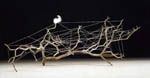
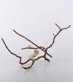
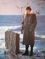
The project I singled out from the NAI treasure collection is called 15 MILES INTO THE EARTH by Hendrik Wijdeveld.

Wijdeveld situated his 1944 design for an international geological research centre in a shaft in the earth at a depth of 15 miles. Designed during the harsh winter of 1944 and 1945 at the tail end of the Second World War when food and supplies were scarce, this project is a plea for international collaboration and for putting science and technology to a peaceful use. At that point in time, little was known of the earth’s deeper strata. Wijdeveld foresaw new discoveries, an ‘uranium age’. At the same time, the project is a ‘world theater’. With a ritual scene taking place at the base of the shaft, he depicts the world coming into being as the primordial force of nature and man’s creative power collide in an explosive display of energy.

Hendricus Theodorus Wijdeveld (1885-1987) considers himself as director with the world as a total theatre, a stage for his designs: he is architect, editor-in-chief, and typographer of the journal ‘Wendingen’, as well as a designer of books, theatrical stage sets and costumes, furniture and utensils. The most famous example is the huge People’s Theatre in the Vondelpark in Amsterdam in the shape of an enormous vagina, the national park Amsterdam-Zandvoort, a number of enormous high-rise projects and “Plan the Impossible”, like this extraordinary proposal dating from 1944, involving boring a 25 kilometre deep shaft deep into the earth, and a plan to hem in the existing city with a ring of towers. The towers would not only act as dramatic landmarks but would set a resolute boundary to urban growth. He took advantage of his experience in theater design to stage a new landscape and evoke collective experiences.
Several architects such as Brandon Mosley, Rick Gooding and Douglas Darden have based their utopias in the underground. The novel Journey to the Centre of the Earth by Jules Verne digs into the depths of the prehistory of the globe. Furthermore many modern and contemporary artists worked with the concept of the hole, in primis Anish Kapoor seems to be almost obsessed by it.

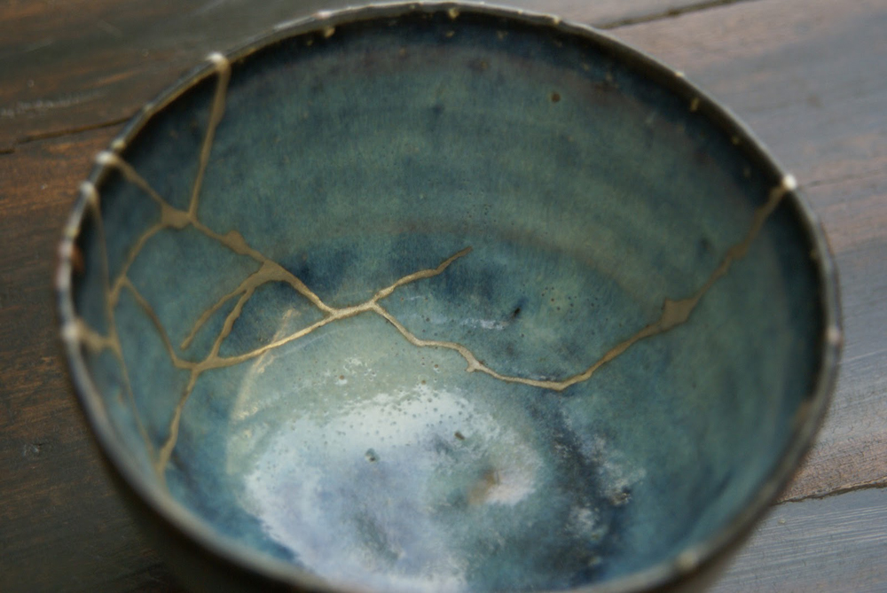
hole (hõ?) noun 1. opening into or through a thing 2. hollow place, as a pit or cave (a deep place in a body of water; trout holes) 3. underground habitation, burrow 4. flaw, fault 5. the shallow cup into which the ball is played in golf; a part of a golf course from the tee to the putting green 6. shabby or dingy place 7. awkward position. [middle English, from old English hol (from neuter of hol, adjective, hollow) & holh; Old High German hol, adjective, hollow and perhaps to Old English helan, to conceal; first known use: before 12th century] 1. I have a hole in my sock 2. He fixed the hole in the roof 3. There is a mouse hole in the wall 4. The dog dug a deep hole 5. Her putt rolled right into the hole 6. She made a birdie on the seventh hole 7. The course has 18 hole synonims perforation; gap; flaw; weakness; burrow; aperture; orifice antonyms bulge, camber, convexity, jut, projection, protrusion, protuberance rhymes with hole bole, boll, bowl, coal, cole, dole, droll, foal, goal, knoll, Kohl, kohl, mole, ole, pole, poll, prole, role, roll, scroll […]

‘A hole?’ the rock chewer grunted. ‘No, not a hole,’ said the will-o’-the-wisp despairingly. ‘A hole, after all, is something. This is nothing at all’. (Ende)

Holes are an interesting case-study for ontologists and epistemologists. Naive, untutored descriptions of the world treat holes as objects of reference, on a par with ordinary material objects. Hole representations – no matter whether veridical – appear to be commonplace in human cognition. Not only do people have the impression of seeing holes; they also form a corresponding concept, which is normally lexicalised as a noun in ordinary languages. Some languages even discriminate different types of hole, distinguishing e.g. between inner cavities and see-through perforations. Moreover, data from developmental psychology confirm that infants are able to perceive, count, and track holes just as easily as they perceive, count, and track paradigm material objects such as cookies and tins. These facts do not prove that holes and material objects are on equal psychological footing, let alone on equal metaphysical footing. But they indicate that the concept of a hole is of significant salience in the common-sense picture of the world, specifically of the spatio-temporal world. If holes are entities of a kind, then, they appear to be spatio-temporal particulars, like cookies and tins and unlike numbers or moral values. They appear to have a determinate shape, a size, and a location. (‘These things have birthplaces and histories. They can change, and things can happen to them’, Hofstadter & Dennett) On the other hand, if holes are particulars, then they are sui generis particulars. For holes appear to be immaterial – they seem to be made of nothing, if anything is.
For example: 1. It is difficult to explain how holes can in fact be perceived. If perception is grounded on causation, as Locke urged, and if causality has to do with materiality, then immaterial bodies cannot be the source of any causal flow. So a causal theory of perception would not apply to holes. Our impression of perceiving holes would then be a sort of systematic illusion, on pain of rejecting causal accounts of perception. (On the other hand, if one accepts that absences can be causally efficacious, then a causal account could maintain that we truly perceive holes) 2. It is difficult to specify identity criteria for holes – more difficult than for ordinary material objects. Being immaterial, we cannot account for the identity of a hole via the identity of any constituting stuff. But neither can we rely on the identity conditions of its material “host” (the stuff around the hole), for we can imagine changing the host, partly or wholly, without affecting the hole. And we cannot rely on the identity conditions of its “guest” (the stuff inside it), for it would seem that we can empty a hole of whatever might partially or fully occupy it and leave the hole intact.3. It is difficult to assess the explanatory relevance of holes. Arguably, whenever a physical interaction can be explained by appeal to the concept of a hole, a matching explanation can be offered invoking only material objects and their properties. (That water flowed out of the bucket is explained by a number of facts about water fluidity, combined with an accurate account of the physical and geometric conditions of the bucket.) Aren’t these latter explanations enough? Further problems arise from the ambiguous status of holes in figure-ground displays. Thus, for example, though it appears that the shape of holes can be recognized by humans as accurately as the shape of ordinary objects, the area visually enclosed by a hole typically belongs to the background of the host, and there is evidence to the effect that background regions are not represented as having shapes. So what would the shape of a hole be, if any?

These difficulties – along with some form of horror vacui – may lead a philosopher to favor ontological parsimony over naive realism about holes.
A number of options are available: [A] One could hold that holes do not exist at all, arguing that all truths about holes boil down to truths about holed objects. This calls for a systematic way of paraphrasing every hole-committing sentence by means of a sentence that does not refer to or quantify over holes. For instance, the phrase ‘There is a hole in…’ can be treated as a mere grammatical variant of the shape predicate ‘… is holed’, or of the predicate ‘… has a hole-surrounding part’. (Challenge: Can a language be envisaged that contains all the necessary predicates? Can every hole-referring noun-phrase be de-nominalized? Compare: ‘The hole in the tooth was smaller than the dentist’s finest probe’) [B] One could hold that holes do exist, but they are not the immaterial entities they seem to be: they are, like anything else, material beings, which is to say qualified portions of space-time. There would be nothing peculiar about such portions as opposed to any others that we would not normally think of as being occupied by ordinary material objects, just as there would be nothing more problematic, in principle, in determining under what conditions a certain portion counts as a hole than there is in determining under what conditions it counts as a dog, a statue, or whatnot. (What if there were truly unqualified portions of space-time, in this or some other possible world? Would there be truly immaterial entities inhabiting such portions, and would holes be among them?) [C] One could also hold that holes are ordinary material beings: they are neither more nor less than superficial parts of what, on the naive view, are their material hosts. For every hole there is a hole-surround; for every hole-surround there is a hole. On this conception, the hole-surround is the hole. (Challenge: This calls for an account of the altered meaning of certain predicates or prepositions. What would ‘inside’ and ‘outside’ mean? What would it mean to ‘enlarge’ a hole?) [D] Alternatively, one could hold that holes are “negative” parts of their material hosts. On this account, a donut would be a sort of hybrid mereological aggregate – the mereological sum of a positive pie together with the negative bit in the middle. (Again, this calls for an account of the altered meaning of certain modes of speech. For instance, making a hole would amount to adding a part, and changing an object to get rid of a hole would mean to remove a part, contrary to ordinary usage.) [E] Yet another possibility is to treat holes as “disturbances” of some sort. On this view, a hole is to be found in some object (its “medium”) in the same sense in which a knot may be found in a rope or a wrinkle in a carpet. (The metaphysical status of such entities, however, calls for refinements.)
On the other hand, the possibility remains of taking holes at face value. Any such effort would have to account to the effect that holes are sui generis, immaterial particulars – but also for a number of additional peculiarities. Among others: [a] Holes are localized at – but not identical with – regions of space. (Holes can move, as happens anytime you move a piece of Emmenthal cheese; regions of space cannot.) [b] Holes are ontologically parasitic: they are always in something else and cannot exist in isolation. (‘There is no such thing as a hole by itself’) [c] Holes are fillable. (You don’t destroy a hole by filling it up. You don’t create a new hole by removing the filling.) [d] Holes are mereologically structured. (They have parts and can bear part-whole relations to one another, though not to their hosts.) [e] Holes are topologically assorted. (Superficial hollows are distinguished from internal cavities; straight perforations are distinguished from knotted tunnels.) Holes are puzzling creatures.
Black Holes appear to be the origin of the Universe, and vaginas the cradle of life.
 

Quality over Quantity?


Monday, February 27, 2012

In the fashion industry the topic of sustainability and eco-friendliness has not been on the top of the priority list one might say. Trends change every season, and to stay in style you are expected to renew your wardrobe at least twice per year. High-end designers are now launching even more than two collections a year, you have the so-called pre-fall and resort collections as well as the biannual summer and winter. Chain stores are introducing new collections as often as every six weeks. At the same time as this is happening, fashion is getting cheaper and cheaper.  The high-street brands keep pushing prices lower by producing their clothes in countries that are known for using child labor and having extremely poor working conditions. The materials used are usually of very bad quality, which is probably also produced in an unethical way. So with facts like these you don’t have to be the sharpest tool in the shed to see that this is not a very sustainable approach

(more…)

LINETO


Monday, March 7, 2011

Since the start of our Design Theory/Research course about typedesign, graphic design, foundries, fonts
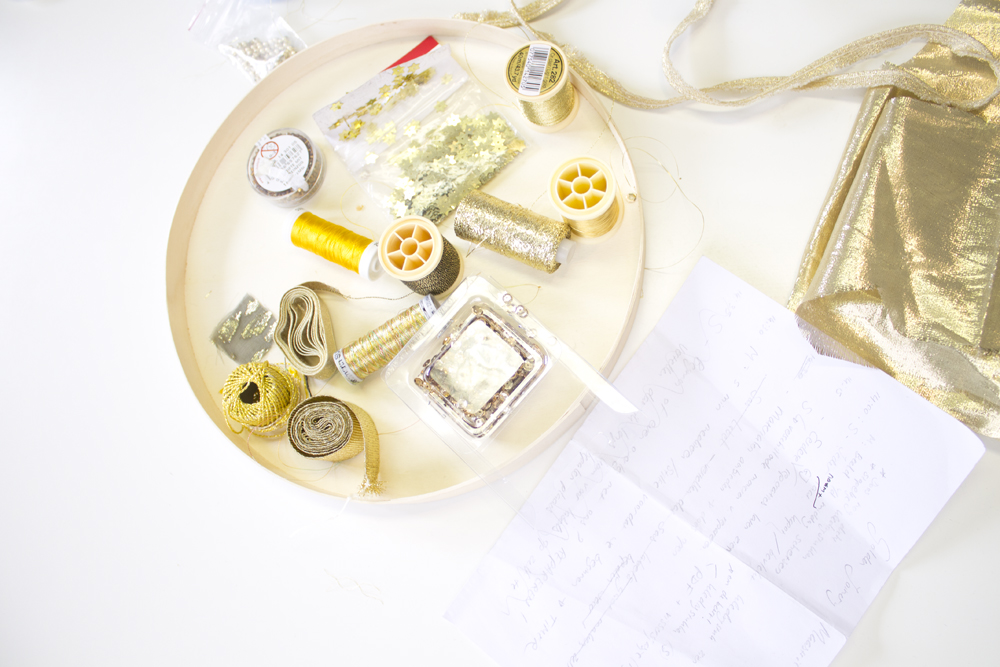
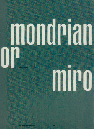
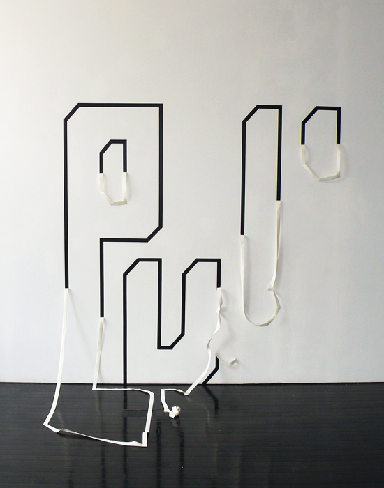
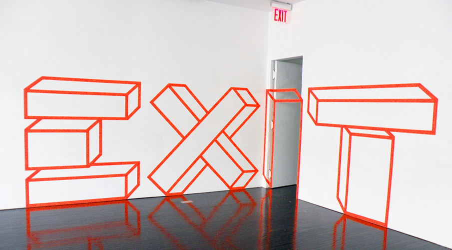
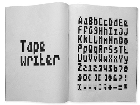
, typefaces etc. we have had a look into a, for me unknown but, very interesting world.

This research will be about Lineto which is a foundry that these days sells there Lineto fonts, like replica, via their website and they have type-designers who publish their own fonts through Lineto. We will further explore the similarities between type design, graphic design and art.

My research question will start us out with some history to get a grip on all the different terms that are used to find out what Lineto actually does. For me starting out as a rookie I’m trying to grasp the meaning of this all. This is an interesting step that can also help you in understanding this world on its own. After that we will dive further into the question what the similarities are between type design, graphic design and art.

A type-foundry is a company that designs typefaces. Typefoundries used to sell their typefaces made out of wood or metal and matrices that were used for line-casting machines like Linotype and Monotype. This is such a time consuming and expensive process that when the computer started to be used it was replaced by digital type which is mostly used today.

Now to first get some terms straightened out. The term typeface is often mistaken or used for font. The two terms had more clear meanings before the start of desktop publishing but faded. What the difference between font and typeface is is that a font points out a specific member of a type family like roman or boldface, while typeface shows a consistent visual style which can be a family.

Back to Lineto, Lineto sprung up into existence in 1993 right at the time when the computer started to get used extensively in people’s daily lives. The foundries in this computer age where called digital type foundries which accumulate and distribute typefaces as digitized fonts created by type-designers.

Typefoundries always had used catalogues that were updated every year but since the digital type came in to the scene it was almost impossible for a foundry to make a catalogue looking at the amount of types that were created and distributed.

This way of working was embraced by Lineto and five years after starting their business Cornel Windlin and Stephan Müller the founders of Lineto jointly set up Lineto.com to distribute their own typefaces through the internet. They also invited a number of other designers to publish their fonts alongside theirs.

If you look at the fonts on Lineto.com you start to wonder what the difference is between type design, graphic design and art. There are differences between the three but there is also a very strong cohering similarity which you can’t deny and this I find an interesting discovery.

Starting out with describing graphic design you see that it is a creative process which involves a client who provides the work and then there is a producer, printer, programmer or signmaker of some sort. At the end of the process the result is used to bring across a specific message to the viewer.

In art you see that it is also very much a creative process which brings across a specific message but usually addressing different issues but the principle is most definitely the same.

For a type designer it is the art of designing typefaces. Where the typeface is one or more fonts designed with a certain unity. The function that their end product is used for is also about getting a message across to an audience, a better description of it is that it is a tool for bringing across a message to the viewer.
So everyone of the professions that are described above is about visualizing an idea concept or bringing across an idea or thought or a tool for doing so. Type is so rooted in our system and culture that we cannot escape from its grip, there are always fundamental links rooted at the core of it all. Looking at it in this way I think can open up your mind to look at type in a new and different way as an artist.

Turned to the grid


Monday, March 7, 2011

#####Turned to the grid#####

(Wim Crouwel)

When walking through the main entrance of the Stedelijk Museum Amsterdam towards the coatroom one quickly notices the array of poster prints papered to the subwalls of the main stairs to the second level. These prints are from past exhibitions and many are made by the functionalist designer Wim Crouwel. When Willem Sandberg (director of the SM and did most graphic work) retired in 1962 Crouwel took the job and designed many from ’64 until 1984.


Stedelijk Museum Amsterdam, Wim Crouwel Shapes of Colour exhibition
c Jean Pierre Jans Photography poster 1966, Contemporary Art museum poster 1971

Mondriaan or Miro 1958 (Letterpress), Vormgevers in SM, Hiroshima 1957

Wim Crouwel (Groningen, 1928) studied Visual Arts at the Academie Minerva in Groningen from 1946 until 1949. There he became acquainted with ‘The Ploeg’ artist collective that was established in 1918. His father was a block maker and perhaps this made the transition towards typeface design very logical. He Continued as an abstract painter with the ‘Creatie’ (Creation group) he joined the Amsterdam School of Art and Design evening courses and the Liga Nieuw Beelden (1954, co-created the Manifesto in 1955). The Liga was a group of urban designers making demonstrative exhibitions.

(more…)

Cup or be Cupped : Designlab project


Wednesday, January 26, 2011

The aim of this project was to get introduced with the several methods of design research. This 3 week project took place under the supervision of Sophie Krier and Cynthia Hathaway. Because of the short time span in which the course took place, the schedule was packed full of activities, making it an intense first experience.

The case of this project was all about cups. We were to become cup professionals, gain the uttermost expertise in the world of the cup.

Presenting work

(more…)

Considerations on the matter of drawing.


Sunday, October 3, 2010

What is drawing? Is it possible to define it as one of the basic way of expression of mankind? I think so. And as a so elementary medium it is also possibly the most versatile. That’s why I’m so fascinated by this powerful medium, I guess.

The sign traced on the ground, at first, and then on rock, paper and many other materials is the most immediate gesture, which remains for the future. It is something that survives the moment it is done, it’s time itself expressed, and gives the possibility of a general overlook on the process of tracing, and therefore of thoughts. As an expression of time it’s the best medium to communicate something of that moment, every idea, process, image. The zeitgeist of a precise moment. Applying the drawing process in history, humanity had described itself for millenniums, and the language didn’t replace this medium, and overpassed its power.

There’s a book who in which this process appears evident, a book who inspired these considerations: “The New Yorker Album of Drawings 1925-1975” by Penguin Books (ISBN 0140049681). It is a collection of cartoons from the famous american magazine, all the cartoons from several artists, Saul Steinberg, William Steig, Richard Taylor, Peter Arno, Charles Barsotti, Geoge Booth, Barney Tobey, James Thurber and Charles Saxon among others, that contributed to its celebrity and authoritativeness. Many designers and artists worked and keep on working for the magazine, expressing by cartoons the daily facts, the ideas they had and their considerations on every topic that comes into their mind. The book as a powerful archive of human activity, a window open on a huge part of social, cultural, politic context of our times.

idea - gesture - sign

Through a closer look to its cartoons it is possible to spot many of the concepts i’ve mentioned in the first lines of this essay. For instance, this cartoon by Steinberg, in its essentiality, holds the articulated concept of the idea that becomes gesture and then sign, being able to disclose its nature. It happens, as in this case, that the sign itself tells much more than a thousand words. In fact, I won’t spend more words on this concept.

i say flower, what you get?

But drawing is also subjective, being the expression of a singularity. In this cartoon the dancing girl expresses something through her gesture (which, in this case, don’t concretizes itself into a sign), but every one of her class mates gets a different concept from the one she feels. It’s clear that, so as in tracing sign everyone puts something of him/herself, in acknowledging it the viewer puts what is part of his/her experience of the world. This causes the fact that drawing as a medium is also very personal, and even if is possible to state that there are not good drawers and bad drawers (the sign is not objective, but reflects the exact image of the drawer), is also possible to say that a good drawing, on the field of expression, is the one that communicates in the best way the concept that inspired it, and the purest it is, the better the idea goes straight into the viewer.

drawing is a personal and a collective processConsidering the history, thou, the drawing had always been the way to describe the zeitgeist of a period, through the widest range of expressions. Is it personal or or collective, then? Is it the personal expression of a singularity or the collective depiction of a society? I think that it is both, depending on the scales we can consider drawing, as the process that turns the expression of a singularity into a depiction of a society is also a collective process.

Another question. The culture influences the art of drawing and drawing itself builds consciousness and culture. Is there a good use we can make of it?

more police lines, please!

Rietveld > lib. cat. no: 738.8 new

The Pearl Chain Principle


Sunday, September 19, 2010

Just as the academical year came to an end, at the most busy moment of the year, there was again a grand expo at Gallery Ra in Amsterdam.‘
Manon van Kouswijk, ‘Hanging Around’, The Pearl Chain Principle’

[22 Mai- 19 juin 2010].

Manon van Kouswijk has been Head of the Jewelry Department of Rietveld Academy the past three years. This exhibit was like a farewell present by her, after leaving the academy for a new chapter in her life and carreer abroad.
For all who missed that show there is still the book with the same name ‘Manon van Kouswijk, ‘Hanging Around’. And what a beautifull publication it became. With the help of graphic designers NiessenendeVries [#] and photographer Uta Eisenreich [#] a new pearl was added to her neckless of exquisite publications on her work and research process. Only 500 copies so go to the Rietveld library and have a look. The book not only gives a genuine and autonomous look on her work, it also presents her associative search into the subject of pearls and chains as a subject. An inside look into her working process as we came to know from her in former publications

. . .“Within my work I focuss on the value and meaning that everyday objects represent to us.
I am interested in actions and rituals in which these objects take part, like finding, buying, collecting, receiving and giving. In the works I visualise aspects of their function, of use and wear, and of associations that are connected with them.
The archetypical object serves as a starting point in this process; the outcome and appearance of the work is diverse and ranges from jewellery, cutlery, tableware and textiles to works in paper.
The making process I view as a way of making things visible rather than designing; I stay quite close to the objects in a sense that I work with the materials and techniques that the archetypes I start from have been made with.
The multi- disciplinary approach is essential to my practice. It results in functional designs as well as limited editions of art work, that are all derived from the same sources of inspiration. [#]

. . . “My graduation project at the Rietveld academy in 1995 was based on my interest for classical pieces of jewellery, like in this case the pearl necklace. I was intrigued by its rigid and aloof character and felt very tempted to attack it in such a way that other aspects then just its perfectness became more visible.
To achieve this I used the specific characteristics of the necklace, like the severe order of the pearls and the knots that both separate them, but also hold them in place to make a series of alterations to the piece.
One of them was a transparent bar of soap, containing a strand of pearls that slowly comes out the more the soap has been used up. The necklace is born from the soap like a pearl from a shell. [#]

quotes from Manon van Kouswijk

[#] look also for her former 2007 publication Lepidoptera Domestica

Shield and Shelter


Thursday, July 15, 2010


enclosureflevoparkbath-etching

intuitive fear spaces


Architectorial anxiety.
Can I design a space that uses my experience of fear to design the perfect safe zone? How can I shape a space which gives one freedom and privacy but which is not enclosed?

Shields and Shelter is a design for the grounds of the public bath – Flevoparkbad [link] – in Amsterdam. For the Rietveld graduation exhibition 2010, I realized a 1:1 detail of my design on the lawn behind the Rietveld Academy.

Kristin_Mauer1

above : a 1:1 detail of my Flevoparkbad design on the lawn behind the Rietveld Academy.


In Shields and Shelter I applied step by step the guidelines that I have developed to achieve safe and comfortable zones using my own fear experiences. These guidelines involve architectural concepts like shielding and view, shadow and light, flexibility versus rigidity. The perfect safe zone to me is a flexible space which gives one freedom and privacy but which is not enclosed. As basis for the design drawings I used an aerial photo from Google Earth of Flevoparkbad. From each towel, I constructed lines of sight from 120° angle views. Through shading these 120° triangles a map emerges with different degrees of surveillance. The darker the area, the more views. At the darkest areas the view must be blocked. Therefore I developed shields, which can be slided along rails that follow the lines of sight. This allows the bathers to adjust their exposure to others according to their own wishes.

kristin_slide8

kristin_slide7kristin_slide16
IMG_4897

tracing the 'feel' zones and the emotion lines and reproducing them in a real situation.


From the jury rapport : Kristin Maurer’s installation outside is a whole new interpretation of space. Space can be created by shadows as well as materials. This is what struck our jury-members. Next to this the technical realization of the work is stunning and therefore our members of the jury wanted to celebrate this piece of work.


etchings at graduation show Kristin_Mauer3

ICE-etching

The etchings in the thesis, presented as part of the graduation show, are ground plans of remembered fear spaces. A scheme of lines of sight in train, Kristin Maurer, 2009 [etching]


Pdf-icon Download thesis: Architectural anxiety. the perfect safe zone
 

Visual associations starting from Munari’s “how to draw a tree”


Wednesday, June 2, 2010

EVOLUTION = CREATION = BLIND POWER


Tuesday, June 1, 2010

In my case rules always bring a lot of variations. I observe it a long time because my way of working usually include one or more rules. Sometimes because I pick the rule but most of the time they are visible when work is finished. They reflect my present situation and feeling but for that certain amount of time they become rules and then variation of creating is visible.

It is not random that I found how this rules are already involved in me and I have no problem with it because rule is just a strong word- meaning most of the time something destructive but there is theory in biology which can very easily prove how rules are from the beginning a part of life and that they provide never ending variations of everything we are surrounded by.

Charles Darwin introduced us to his theory of evolution in 1859 with his book On the Origin of Species.

This theory is based on several rules which explain that it is working :

1, In nature of biological species exists variability and is partly hereditary

2, In this variation there must exist some species which are more and some which are less adapted to the condition of environment where they live

3, Species which are more adapted have bigger possibility to create descendants. And when this process is repeated for a longer time then certain type in certain environment will spread and this is called = blind power

4, Everything alive has last universal common ancestor

Example for a blind power is very simple:

Imagine that you are walking some field and you come across a stone, what do you think of is that ok is a stone and it was here or somewhere around from the begun, but now imagine you found a watch.Probably you take it and observe it, you check if it works, you find out that is a machine which measures a time, you see from which kind of parts it is made so it is sure for you that there had to be someone who designed it someone we call watch-maker. Existence of watch prove an existence of watch-maker. But this is the thing which Darwin challenged.He is tried to say that watch can exist without watch-maker.

The choice of nature can be called something like a blind watch-maker – he get some parts of watches separately and one by one he makes a watch from it.The thing is that he doesn’t know that he is making a watch.

Darwin was a very big observant and had a big possibility to travel around the world what makes him very rich of the materials he could used for his theory.

Another example of his theory which nicely explain also how rules of environment included food,weather… influence variability in this planet is his observing of birds- finches in the islands where he found out that they differ depending on what surround them and especially what differ is their beak – tool for eating. The reason is that finches split all over the different islands and by evolution they adapted themselves to the world around them and its rules.

Evolution begins with the first life in this planet and thats for me also where the creation begins and where the rules are always present and there is nothing wrong with it. The word freedom would never exist and would never have such a powerful meaning without the word restriction = laws.

To finish I choose the last part of Darwin’s book On the Origin of Species:

“It is interesting to contemplate a tangled bank, clothed with many plants

of many kinds, with birds singing on the bushes, with various insects

flitting about, and with worms crawling through the damp earth, and to

reflect that these elaborately constructed forms, so different from each

other, and dependent upon each other in so complex a manner, have all been

produced by laws acting around us.  These laws, taken in the largest sense,

being Growth with reproduction; Inheritance which is almost implied by

reproduction; Variability from the indirect and direct action of the

conditions of life, and from use and disuse; a Ratio of Increase so high as

to lead to a Struggle for Life, and as a consequence to Natural Selection,

entailing Divergence of Character and the Extinction of less improved

forms.  Thus, from the war of nature, from famine and death, the most

exalted object which we are capable of conceiving, namely, the production

of the higher animals, directly follows.  There is grandeur in this view of

life, with its several powers, having been originally breathed by the

Creator into a few forms or into one; and that, whilst this planet has gone

circling on according to the fixed law of gravity, from so simple a

beginning endless forms most beautiful and most wonderful have been, and

are being evolved.”


Italian Music for Movies


Tuesday, June 1, 2010

- click on image to download this research pdf -


- also read 'There are rules behind complex and organic circumstances [x] -


The Design of Our Reality


Tuesday, June 1, 2010

Perceiving Reality. Every experience that can be had is a probability within our consciousness. Our experience is created in the Mind and is always 1/10 of a second delayed from reality. This delay is attributed to the processing time frame that occurs in the brain. When we visually perceive our environment, the photoreceptor neurons in the retina collect the light (frequencies) and send signals to a network of neurons that then generate electrical impulses that go to the brain. The brain then processes those impulses and gives information about what we are seeing to the self-aware experiencer, the conscious Mind.

"Visual pathway through the Eye" / "Visual pathways in the human brain" (more…)

Formalistic relations


Tuesday, June 1, 2010

We are constantly surrounded by image, object and words.

Between them exist a relation. The table is picked in relation to the chairs, or painting in relation to your couch, if you are that type of person. But anyhow the relation between them are there, some more interesting than others. The type of relation I investigate is only based on the formalistic aspects. Not the symbolic meaning, morals, etc. Many questions then arise, in terms of relation. Such as: Is there a different relation between object and image, then between object and word?  The following, is a short research, investigation into these relations, which could help to understand our surroundings better.

Object in relation to image

In this example we clearly see that the image and object work together. But why do the do that? First of all, it has a lot to do with scale, the zoom, by this I mean the way we approach the image and object. And the scale between them, distance, you have to get close to see a small clip, and even closer to see the photograph. The clip is outside, and you look into or inside the photograph. The height of the photograph is almost same as the clip. The most visible shadow in the photo is similar to the clips shadow and
the vertical relief or outstanding line one the border of the clip is related to the out standing part of the cement in the photograph.
Also they both are related by text. The same type of visual text, giving information, date, product and name.

What is also interesting in the notion of object in relation to image is: the fact that when we look at something physical, which we have touched or been engaged with in our past. We have the memory how it feels to touch, its weight or surface. So by placing image of boxers in action wearing boxing gloves, with a pair of tomatos next to the image, we at once start to make a connection. Where boxing is about hitting flesh. The tomato in a way becomes both a relation to the flesh, (the inside and out side) and a connection to the red boxing gloves. So the tomatos and the image that is so far away from being connected subjectively, are strongly connected in a formalities way. Here the size also counts a great deal, I would say that the size of the gloves with inn the image, should match the size of the real size tomato’s. And another strong connection here is that the gloves and the tomato shine or reflect light in same way.

Word in relation to an image of an object

Here the word juice does not have any relation to the boat wreck in the meaning of subject. The distance in subject makes us more aware of the their formal relation, the way juice is written. By hand, not mechanical. The letters which do not have hard edges, resemble the form of a wooden boat. The repetition of the word clearly relates to the  way the boat is constructed, where the wood repeats it self, not as complete repetition, but according to the form of the boat. Which is also why the repetition of the words occurs. Not printed, but hand written.

Word in relation to object

In daily products, such as the milk carton we find the relation between the “typeface” that says milk, and the milk carton as an object. We find that some typefaces work better than others. The typeface we see here is chosen after the form of the carton. It has hard corners and ninety degree angels.

Entities with in a whole

With this example we must imagine all this lying on a table. The stone is the only thing that is not a flat representation. The connections that becomes relevant here are many.  The images to the left are pictures taken by rain at night, holding the camera straight at the sky, the flashlight lightens up the rain drops. This related to the stone which is standing out of the table and is an object that can be touched. The fact that there is two relates to time. The blackness of the images suggest an act of looking into. The breast of the beautiful woman packed in black, relate to all other entities. Such as weight of the stone. Related to the the x-ray of a foot through the stone, Woman flesh, bone, stone, x-ray, look into, etc..

Clearly we can read alot into the relations between these four entities. But this as an example, or this as an research, makes us, aware of the importance, the possibilities, and what a good combination of images could lead to.

Research will be continued.


Duct-tape


Tuesday, June 1, 2010

In April we had a lecture from Ayumi Higuchi. The lecture was about her essay in which she investigates the impact rules have or can have on the process of cause and effect in the creative process.

To give us a visual example how the rules work, Ayumi let us make trees out of duct-tape.

Although it was not the goal of the workshop, it was really nice to see how quickly you could make a beautifull installation with tape. This inspired me to search more about tape and the artist who work with it.

Quick history

Duct-tape was developed during World War II in 1942. It’s a water resistant sealing tape with a standard width of 48 mm. It was used to repair military equipment quickly, including jeeps, firearms and aircrafts, because of it’s strength and it’s water resistand quality.

The original name is duct-tape but the soldiers in World War II changed it into duck-tape because the word duct-tape was to simular to the name for the cotton fabric they used for tents and rain clothing.

After the war soldiers returned home and took the duct-tape with them, to use it around the house. Since then it serves all kinds of perpuses. In the 1970’s duct-tape even made it’s introduction into spaceflights. When the square carbon dioxide filters from Apollo 13 failed, they used duct-tape to fix it.

This saved the lives of the three astrounauts on board.

Over the years duct-tape became a very popular product. People are making items out of duct-tape or decorate objects with it. You even have a lot of websites with information about how to make stuff out of duct-tape, and movies on youtube with instructions how to make it. Like this movie, that shows how to make youre one wallet out of duct-tape.

Increased interest in creating these novelty and fashion pieces has given rise to designer duct-tape handbags, wallets, belts etc.

Not only designers are interested in duct-tape. Also a lot of artist use it.

Click here for more of these installations.


Aaksh Nihilani

Also a lot of graphic designers use duct-tape. Within typography it even got a new name: Tapography. (also used for typography made out ofcasette tapes )

Artist Aaksh Nihilani is one of the artist who works a lot with tape. For the Arario Gallery in New-York he made three installations with duct-tape.

His explanation about the works:

“Since the show was titled Paraphrase, I took the opportunity to get into some tekst, tapography. I did ubiquitous words that we all encounter in our daily travels, especially as a New Yorker, but I wanted my paraphrase of the words to be aesthetically ‘better ‘than their original. So the words pull, push, and exit are all written out in tape, as well as simultaneously being shown acted out, or about to be (as in the exit piece). They were all a little bigger then human scale so as to more objectify their viewer rather than the usual other way around. I think these installations were particularly succesful because they stayed true to the site specific nature of the wordk that got me the show in the first place (i.e. Using the gallery’s door hinge to complete some of my lines), but also took on new levels of content in the figuration of the letters, and new concepts/processes of using the tape to express qualities like peeling and falling”


Autobahn

An other example of a tapografic experiment is tapewriter bu Autobahn. It is developed during a seminar by Richard van der Laken and Eric Wie, and later developed until a type specimin.

Tapewriter is a typeface that gets it’s form from the fence of a soccer-cage. The width of a role duct-tape is exactly the same as the room between two bars of the fences from thes cages. The thought behind this font is that any one who ones a role of ducttape can share their thoughts with the rest of the world.

Tapewriter showes that you can write with anything and that any surface can become your paper.

More information and the total typefase you can find on the website of autobahn.


Experiments with Duct-tape

Inspired by this all I started to experiment with duct-tape myself.  My first experiment was just to write something on the wall with tape.

After that I wanted to create a 3-d effect into space, wich I achieved to tape tekst to my window an fotograph it with the outside landscape:

In my last experiment I really wanted to go 3-d. So I made lines with yellow tape in the air and made letters with black tape in it. It creates

a very interesting effect because it looks different from each side. As you can see on the picture below and the title picture.


Log in
subscribe