Skip to Content Skip to Search Go to Top Navigation Go to Side Menu


"photography" Category


A Photograph Revolution


Sunday, October 19, 2014


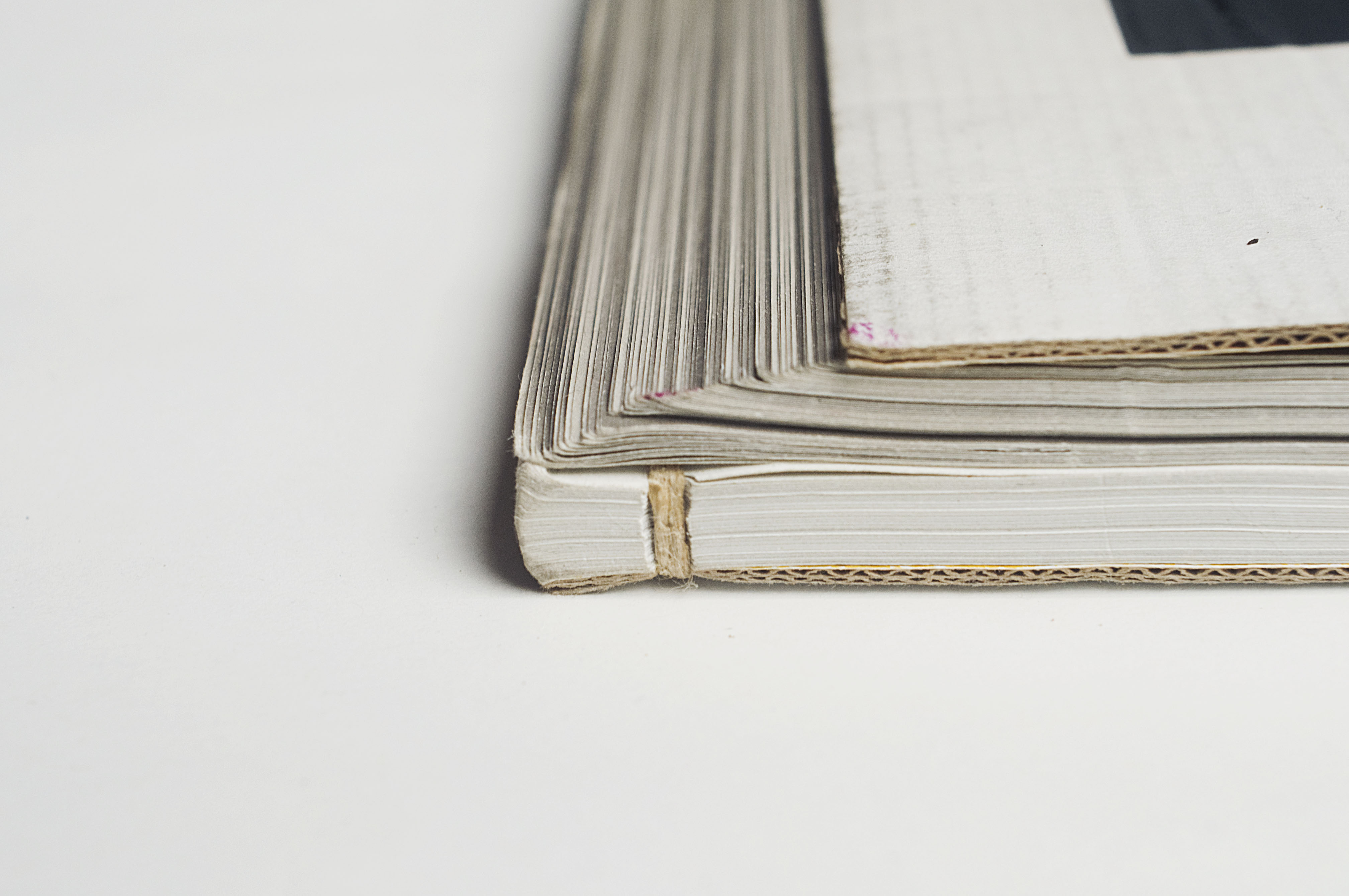
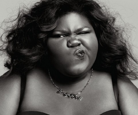
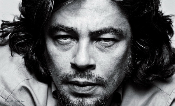
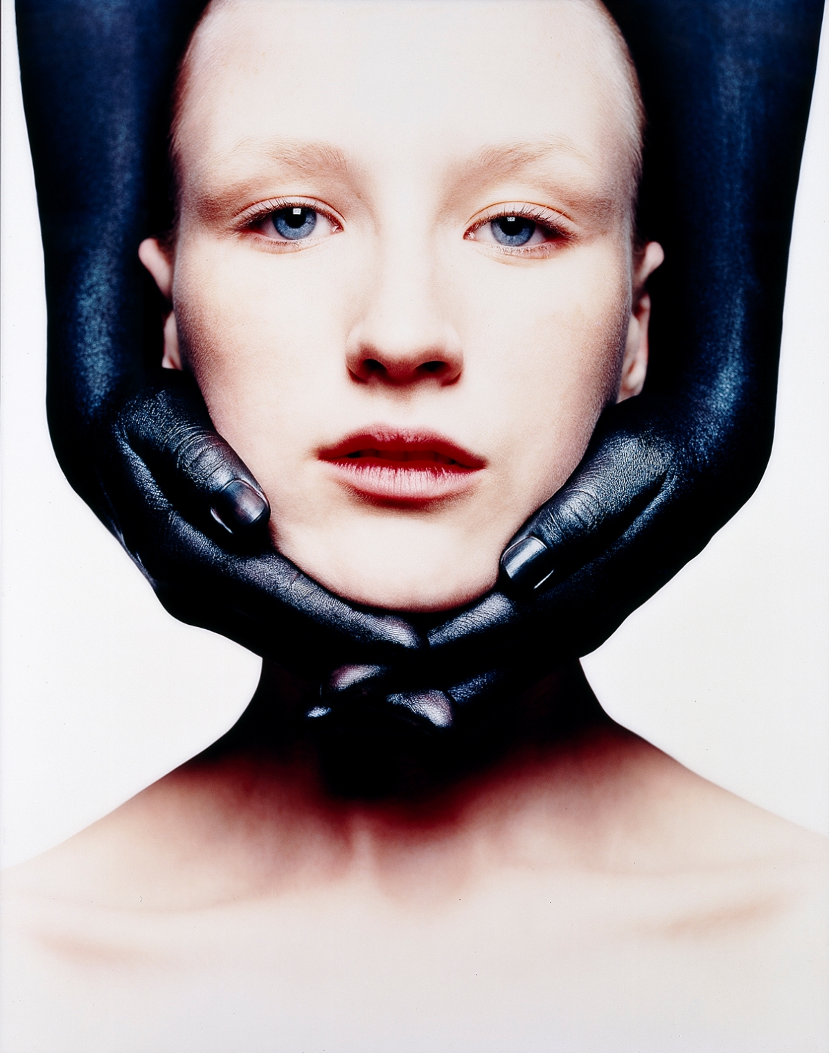
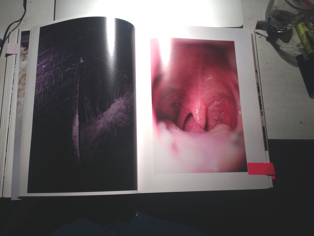
Among all of the recent books in the Rietveld Academie library, Boy Politics particularly appealed to me for its very peculiar aspect and design. It is a bit damaged and looks very breakable which gives it a feeling of preciousness, emphasized by the fact that it is a unique copy. At first I had decided to go see what it looked like because the title was very evocative to me and seemed like a topic I would want to read about. I am interested in the theme of gender and particularly male domination in different cultures and have often questioned it in my work last year in my art school in France. The boy figure, what is expected from a boy and how deeply these expectations and behaviors are attached to a culture and collective unconsciousness.

This book was my first glimpse of the tip of the iceberg that are Marc Roig Blesa and Rogier Delfos’ collaborative projects.


BoyPolitics_h900

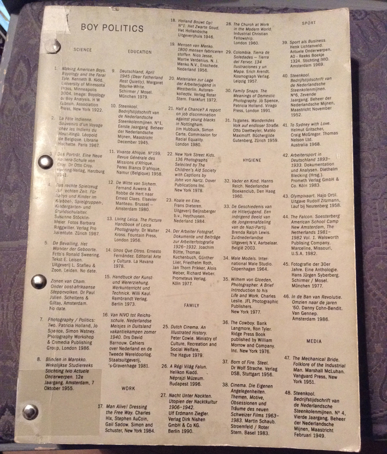
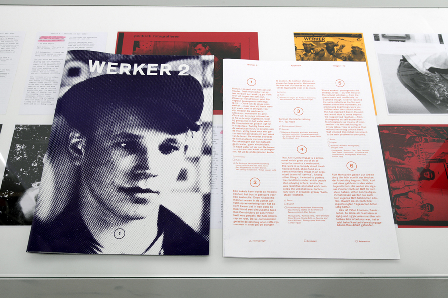
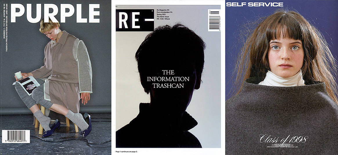
Boy Politics, Marc Roig Blesa and Rogier Delfos


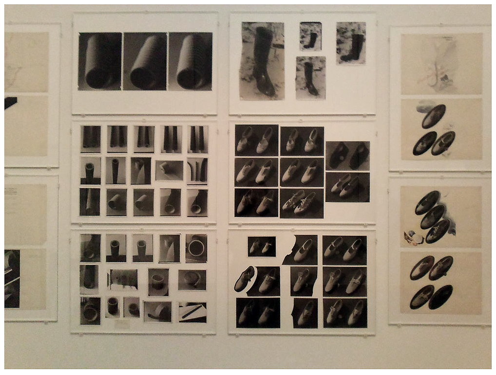
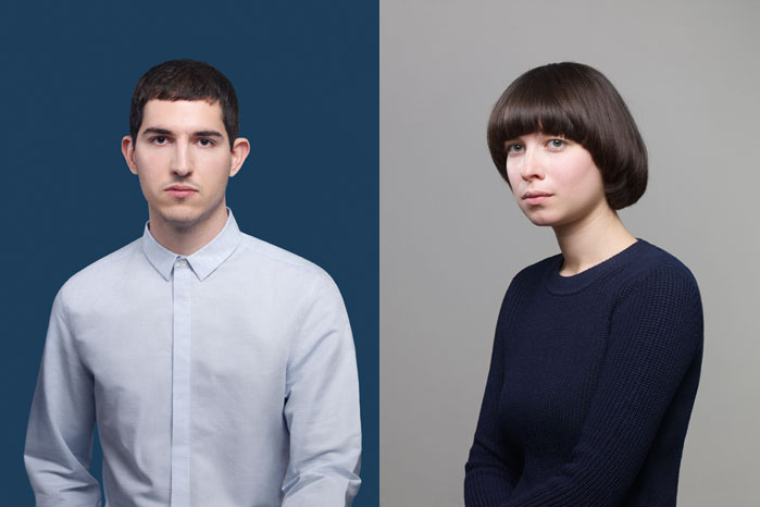
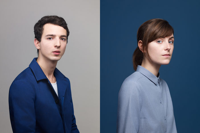
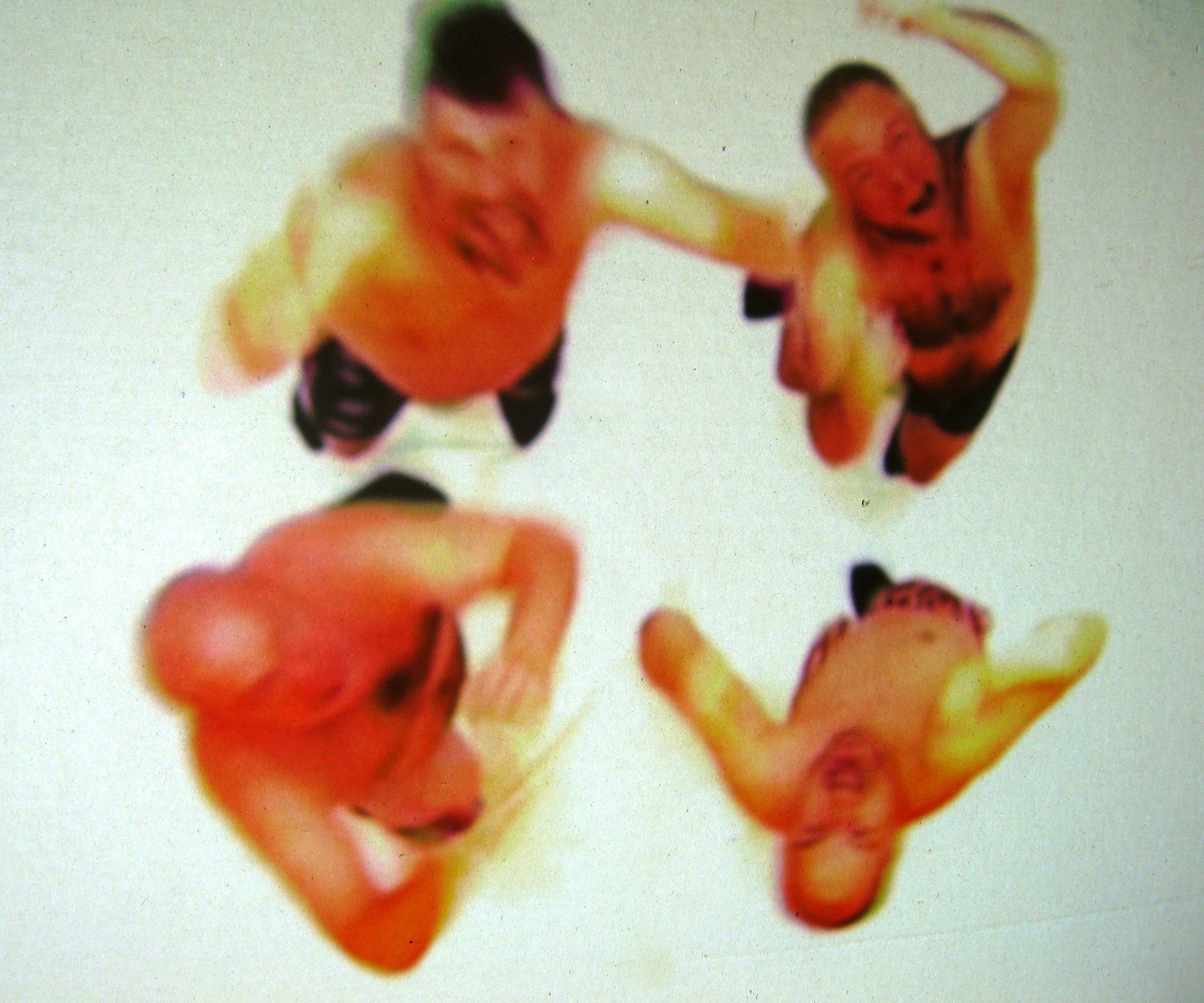
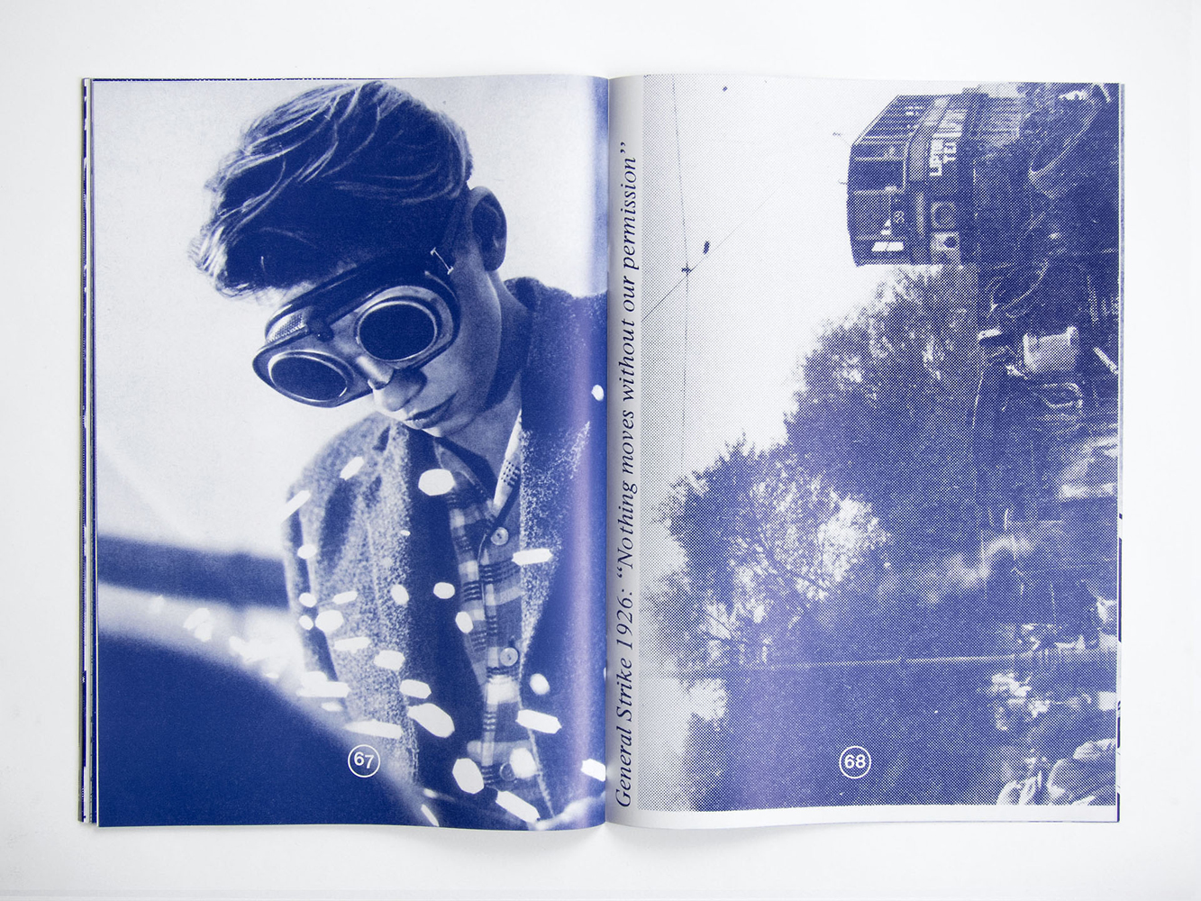
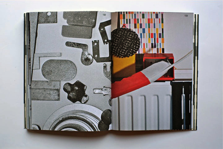
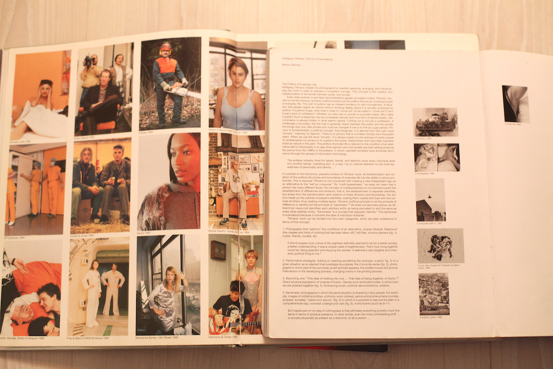
Marc Roig Blesa and Rogier Delfos are two former students of the Gerrit Rietveld Academie. Both graduated in 2009 ; Blesa from VAV and Delfos from graphic design. They have been working together ever since between Barcelona and Amsterdam. From 14/05/13 to 07/06/13 they held an exhibition at Rietveld library where they exposed a selection of Blesa’s secondhand books in a window display, opened at a certain page. It was a mute and powerful visual essay of the figure of the boy throughout images from the 1920’s to the 1990’s. Later on, two other former students of the Academie (Anton Stuckhard and Andrea Sergio) designed Boy Politics, a book that archives this exhibition in a very efficient manner that, to my opinion, is really coherent to the way Blesa and Delfos work. Without any fuss, they encapsulated the spirit of what was the starting point of a larger project that Blesa and Delfos have been working on ever since : « Werker ».


Boypolitics1


Werker magazine is a long term project and concept that asks many questions and got more and more complex over time. There are 8 different werker projects but usually more than one edition by project.

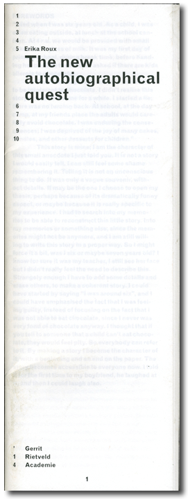
The artists define them as « contextual publications about photography and labor that inquire into the possibility of formulating a contemporary representation of work » They are all mute analysis of a situation that they try to depict in a most objective manner as possible. They are often the following or addition to an event (exhibition, lecture…) like for Boy Politics. Werker 2, for example, was realized for the exhibition « 1979, A Monument to Radical Instants » in the Virrena Centre de la Imatge of Barcelona (2011), dealing with the issues of daily life in crisis of working class young men. Knowing that photography is the medium that communicates best the essence of a situation, Blesa and Delfos have realized a very accurate observation of several situations.


werker2_h1000


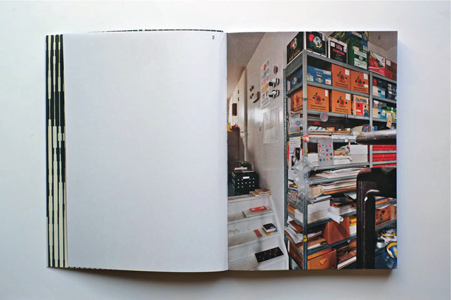
An example of that accuracy is the « Cinema Diary » edition of Werker 6 (that you can find in San Serriffe book store, along with other Werker issues. It is « a collection of photo diaries that reflect on the current working conditions of the youth through self-representation and amateur photography. » It is the summary of a young artist’s (Matthijs Diederiks) side job at a Pathé cinema. In this small book (x) from which the cover is handwritten by Diederiks, you can find an extract of his working contract and meaningfulness in the lost time of a very boring job.


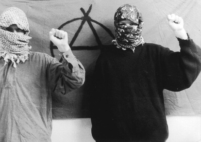
Werker is the story of how graphic design and art meet through photography (amateur photography, secondhand books images, internet pictures…) aiming to deliver a message : Images have power and that power is into the wrong hands, the people must take it back. Blesa and Delfos are indeed strongly politically engaged with revolutionary ambitions.
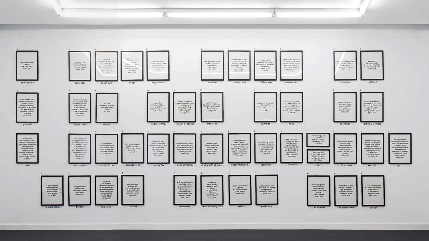
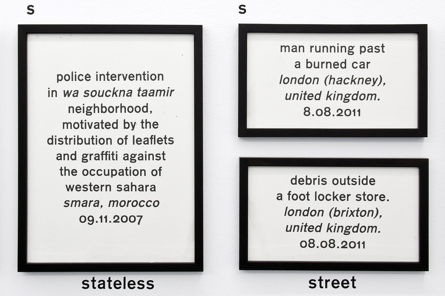
Let’s focus on « Werker 7 : the language of revolution ». This exhibition followed by an edition of newspaper (once with and once without image) was inspired by the words of Ariella Azoulay in a lecture she gave at the museu d’art contemporani de Barcelona in 2011 in which she did an analysis of Egypt’s revolution through images from the internet (you can find her lecture here : x). Werker 7 questions the revolutionary image, the revolutionary language, the role of mass-media in all this and the function carried out by photography in construction of a global revolutionary language. All the images chosen for that project were found on the internet.


Werker7_index_w1500

Werker7_index_zoom1_w1500


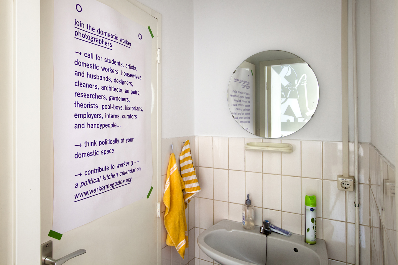
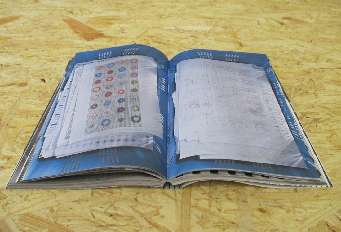
Werker takes its name from the « Worker Photography Movement » :  a group of amateur photographers that appeared in Germany in the 1920’s, following the steps of the first socialist photography experiences in the USSR which extended into the rest of Europe, the USA and Japan. The first group of amateur photographers to use the camera as a tool to fight class-struggle. When I found out about this origin, the work of Blesa and Delfos came clear to me to its full extent. Werker 3 is a « political kitchen calendar » developed within the « grand domestic revolution – user’s manual », a long term living research initiated by casco office for art, design and theory in Utrecht. it is a call for students, artists, domestic workers (and so on) to contribute to the collective gathering of materials. A call for amateur photography as an observation of domestic space. The assignment was « Think politically of your domestic space and contribute to Werker 3 ».


Werker-3_h900


Finally, I found in the « Cinema Diary » an extract from the book Der Arbeiter-Fotograf from Willi Münzenberg (1931) that I thought was very relevant to Delfos and Blesa’s approach, aims and tasks.

« Photography has become an indispensable and outstanding means of propaganda in the revolutionary class struggle. (…) For an illustrated book is easier to read (…) than the lead article of a political daily. Photography works on the human eye (…) the bourgeoisie caters for the mental laziness of the masses and also makes a lot of money. (…) Much more important is the political effect (…) a skillful editor can falsify every photograph into its opposite and can influence the politically naive reader. (…) The revolutionary workers of all countries have to realize these facts very clearly. They have to fight the class enemy with all means. Just as the workers of the Soviet Union have learned to make their own machine-tools (…) the proletarian amateur photographers have to learn to master the camera and to use it correctly in the international class struggle. »

Delfos and Blesa’s aim and ambition : an anti-propaganda revolution guided by photography.

Rietveld library catalog no : roi 1
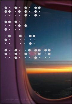
Can one have a conversation with an artist who is no longer living?


Tuesday, October 7, 2014


DIY DIY DIY DIY DIY DIY DIY DIY DIY

front page

 
HOW TO MAKE A CATALOG
 

Sterling Ruby [x] / Robert Mapplethorpe [x]

Designer Rutger Fuchs, living and working in Amsterdam [x] [x]


Prep time: 1-2 months
Cooking time: 2-3 months
Total time: approx. 3-5 months


copies : approx. 1000 [x]


Before you start you need to collect a few people to work with.
Besides that you will need:

–       Corporate identity for Xavier Hufkens [x]

  • Typeface: Swift* by Gerard Unger [x]

–       Pictures of art work/photography

–       Pictures from the exhibition [x]

–       Exhibition notes by Sterling Ruby

–       Essay by Ed Schad

–       Gold coated mirror board (spiegelkarton)

–       Red ink

–       Printing Press


When you have found just the right team you collect all the images and structure them. Arrange them as you would hang the exhibition. Make sure that the pictures correspond to eachother. It is crucial to recreate the dialogue between the works, as seen in the exhibition. (A tip: start out with the photography of Robert Mapplethorpe and make Ruby’s works react to that afterwards – it works for me, but play along until you established the dialogue within.)


Then you add a good portion of graphic skills and mix it all up. When that is done, go through the content once again. Does it give you a feeling of entering the actual exhibition? Does the pictures relate to each other? Is the answer yes, please continue to the following step. If not, please go one step back and rearrange until you are satisfied with the result.


Now comes the difficult part – time to press the cover. Here you will need to add a lot of patience and some overwork. First you start out by printing the red title on the front cover. Print it twice to keep the typeface in place. The material is very easy to damage, so be careful to avoid scratches when you uses the printing machine. When the title is printed on successfully and you are happy with the outcome you let it dry. Leave it to dry for a couple of days to make sure the ink is completely dry. (Tip: try to avoid touching the red ink while drying. It might ruin the cover and you will have to do it over again.)


After this you end up with the final result, which should measure approx. 21,4 cm. broad, 26,4 cm. long and 1 cm. thick. This size will make it more suitable for shipping to collectors, friends etc.


Hope you’re happy with your result – enjoy your catalog!


* Swift (1985) This typeface has proved its worth in corporate identities, magazines and newspapers and occasionally in books — it is a versatile type and can be used in a wide range of circumstances. It is a striking type, with large serifs, large counters and letters that produce a particularly strong horizontal impression. This means that words and lines in Swift are easily distinguished, even where there are large spaces between words, as can occur in newsprint. Swift’s large, robust counters were designed to improve legibility particularly in newspapers. It was designed in the early eighties, when papers were less well printed than they are today, and its special features help it survive on grey, rough paper printed on fast rotary presses. Today it is used more often outside newspapers than in. The current Swift (1995) is an improved version with technical and aesthetic enhancements, and has been expanded into a family of twenty-four variants.


///////////


BONUS INFO

A catalog representing an exhibition [x] of Sterling Ruby (American artist 1972) engaging with the photography of Robert Mapplethorpe (American photographer 1946 – 1989).

“Can one have a conversation with an artist who is no longer living? What is the nature of autobiography and biography? Why is psychoanalyzing Robert Mapplethorpe so compelling?”

These are some of the questions Ruby has been working with towards creating a whole new line of works.

all_rights_reserved_xavier_hufkens4MAPP-522-1980


“In a way, one can say that, while Mapplethorpe captured surface transgressions, Ruby’s response has been to take the inside outside and shove it in our faces.”  [x]


exhibitionSterlingRuby2


The catalog itself catches your eye right away with its reflecting golden cover and the red stained typography in the front. I wanted to figure out why especially this shiny cover caught my attention and found this phrase online:

“We have long been obsessed by shiny objects – from the latest glimmering gold iPhone to the sheen of a pair of high heels. … It is humbling to acknowledge that despite our sophistication and progress as a species, we are still drawn to things that serve our innate needs–in this case, the need for water.” [x]


Rietveld library catalog no : map 6

The different similar.


Tuesday, October 7, 2014

William Eggleston’s Guide.

Photographer: William Eggleston.

Author: John Szarkowski.

_______________________________________

IMG_7218

Brohm Areal.

Book concept: Joachim Brohm

layout, typeset: Heike Nehl_moniteurs, Berlin

_______________________________________


William Eggleston’s Guide is an intriguing photography book. the pictures come from the first one-man show of color photographs ever presented at The Museum of Modern Art, New York, and the Museum’s first publication of color photography. The book i am going to talk about is a reprint of the original from 1976, the books are very similar accept that the new plates have been made from digital scans from William Eggleston’s original 35mm Transparencies.

  The first thing you probably notice is that the book is bound in a textured cover inset with a photograph of a tricycle and stamped with yearbook-style gold lettering. this makes it noticeable when let’s say it’s laying on the table, it is hard to overlook and invites you to open it. The book starts with a essay by John Szarkowski on coloured green pages with thick black letters. After the essay follows the series of 48 photographs from William Eggleston’s home town and surroundings. On every page there is one pictures on the right and a small description on the left. The photographs are completely isolated from each other. The thing that struck me was the placement of the pictures on the page. Although most of them are central placed on the page some of them are placed in such a way that they could continue on the blank paper. Overall the design is a bit bland and not to exciting.

img087

img089

When I was in Germany, I went to the “Museum der bildenden künste leipzig”. In the book store of the museum I came across a book from Joachim Brohm and printed by Steidl called ‘Areal’. This Photography book reminded me of William Eggleston’s Guide, and i immediately saw a connection between the two books, so i bought it. Joachim Brohm undertook a photo-urban project of long-term observation. for roughly a decade, from 1992 to 2002, he took photographs of the same location- on the outskirts of a german city as it was being redeveloped from a 1950’s commercial/industrial district into a gentrified post-industrial services center and living area. In a meditative return, Borhm cartographically captured the premises, their buildings and materials, chronologically documenting the changes and developments during this period. Brohm’s pictorial idiom-characterized by a dissolved center, layering and compositions referring to the continuation of space beyond the picture’s limits-is both documentary and deconstructive. So where ‘William Eggleston’s Guide’ photographs seem too continue on the pages of the book, the photographs in ‘Areal’ refer to the continuation of space.

What I found interesting is the way you can see this in the book design. ‘Areal’ is a very “clean” book with big images of which most are placed in landscape, So you need to turn the book too see them. underneath the images there are numbers existing out of the year the photo is taken followed by to others. In the middle of the book there is a index with a overview of all the  numbers. I like how the two books work together, although there is not a real connection between the two, they feel really similar, content-wise but also design-wise. There is a certain emptiness or void that fill these books, if you open them you get a kind of sad feeling inside but it is hard to figure out what that is. Like a cross between melancholy and sentimental, but not only the photographs give you this impression but the whole design of the books as well.

img123 groot

IMG_7220

IMG_7221

IMG_7224

Rietveld library catalog no : egg 2

Fiction and Non-Fiction


Monday, September 1, 2014

fiction and non-fiction

How fiction and non-fiction communicate with each other has always been at stake in my work. I work with an intimate approach of filming, I am interested in exploring how as an artist or video maker I can relate to my own reality, more precisely to the people from my surroundings. I made few videos that dealt with my family for instance.
In my work Playing the Father, the Son, I tried to reconstruct a story from Marcel Pagnol with my father. Through the process of filming I realized that I was mostly interested by the act of making, the experience of trying to construct a story and the interaction between my father (as the subject of my film) and me (the filmmaker). In the editing I decided to reveal the making of scenes, the “behind the stage” and other conversations that my father and me would have around the fictional dialogues. The characters of the book were mixed with the characters we embody in real life, these two realities were ambiguously confronting.

Screen Shot 2016-11-2372dpi

I am telling my father that I like him through the dialogue of Marius, the character of Pagnol’s play. Play movie on Vimeo

...film still from 'Playing The Father, The Son' ©2014.


Autobiography in its broadest sense

Autobiographies, meaning self-writing, is a genre of the Modern era that emerged in the 18th century, influenced by the humanists ideas and followed by the romantics of the 19th century. At these times, the self and the individual were considered as the center of interest. In its tradition, autobiography was a quite narrow genre reserved for bourgeois, well-educated intellectuals. It was reserved for people having the ability to write, read and considered as being of importance for their time. Through history, as education, this genre become accessible to everyone, from every background in the written form but also in the art field.

The autobiographical project implies notions as authenticity, subjectivity, reality and fiction. We will see in this text that these concepts have been profoundly re-evaluated in the mid 20th century, changing the perception of the world and art.

We can see nowadays a revival of the autobiographical practice with artists as Sophie Calle [x] or Maiwenn [x] that I will refer to in my thesis. Committing themselves to a life narration, incorporating intimacy, personal stories, they take part in the innovation and the contribution of the development of this practice.

In my thesis I like to use the term “autobiography” in its broadest sense, to open it to a genre where art from many disciplines plays with this act of narrating a life story. I like to reconsider the traditional aspect of this practice, question the perception of this tradition and its relevance, to finally think about the necessity nowadays of artists to embark on the autobiographical project.


cover_thesis2_shaded download this thesis by Erika Roux
all rights to this thesis are property of the author © 2014


Didn’t I see this before?


Friday, May 9, 2014

Didn’t I see this before?

dejavu-gif


Have you ever had this strange, but uncertain feeling that you have experienced something before? An overwhelming sense of familiarity? A moment you are not sure if something similar or the exact same thing already happened? Then you belong to the majority of people who have had a déjà vu. Scientists are still unsure how to explain this phenomenon. Some try to link it to memory functions, claiming that familiar events can trigger memories of forgotten information. Some say it’s a more like a “memory check” of our brain: a signal that there is a conflict between what we think we’ve experienced and what we actually did experience.

In a web app I created for iPads you can move along stories told by various images and collages of hands. Sometimes you end up at a point you think you have experienced before. But is it really the same, or does it just familiar? You might just have a déjà vu.

There are other interesting theories as well that try to explain a déjà vu:

Precognition: We have the power of foresight. A déjà vu is the evidence that we are actually able to predict the future.

Reincarnation: We have lived before. A déjà vu is the surfacing of a hidden memory, evidence of a previous existence.

Higher dimension: Our consciousness actually exists outside of our physical bodies in a higher dimension, and when a déjà vu occurs, it’s a brief moment when that separation becomes clear.

Parallel universes: There are other versions of ourselves, living in parallel universes. A déjà vu is a moment we share a memory with an alter ego of another universe.

When browsing through the internet, we often experience this feeling of familiarity. Links and tags create a confusing net of intertwined information, often taking you back to a page you have been before. But because of the information overload we are exposed to, we are often not sure. Maybe you experienced it while surfing through the Design Blog, using the various tags. And you asked yourself, didn’t I see this before?


dejavu-gif

The studio of Karel Martens


Wednesday, January 8, 2014


I had my worries walking around the book shelves in the art book shop San Serriffe. I didn’t know anything about art books how to look at them and how to look at the design.
I skipped though some books but didn’t find them interesting. Then I saw a cover that caught my attention. I didn’t know the artist but I was enchanted by the simplicity of the graphic black-and-white book cover with Japanese text on the side and the title ‘Full color’. The size of the book felt a bit small in my hand, handy and easy to flick through the pages.
I turned the first page and discovered a colorful photo showing a bookshelf filled up with paper rolls and used fruit boxes properly containing more papers. The photo only shows a small part of the room but on the following pages the panorama of the room which turns out to be an art studio is shown. Page by page I was guided into the head of a graphic designer’s studio.


book coverbook-shelves2


It turned out to be the head of the Dutch graphic designer Karel Martens. He is specialized in typography, working with prints and books.

After his studies at the School of Art at Arnhem in 1961, he became a freelance graphic designer.

Since 1977 he has been teaching in graphic design at his old school in Arnhem and at the Jan van Eyck Academie in Maastricht. He is now working as a supervisor at the master-program Werkplaats Typografie [x] together with Armand Mevis. This program is based on practical assignments and self-initiated projects. It also works as a meeting place for graphic designers.


The book ‘Full color’ which is showing Martens’ studio was published on the occasion of the exhibition KM, Ginza graphic gallery in Tokyo in May 2013 [published by Roma Publications].

With the information about the artist and his work I started to look deeper into the book.

The photos by Johannes Schwartz are divided into 4 parts by the graphic designer Julie Peters together with Martens himself.


book2

The first part contains photos from the artists’ studio. They seem to form a long panorama, cut up and organized so you see some parts of a room at one photo and the second part of the room at the next photo. This way of organizing the photos gives you the impression of flashbacks and even more if you already know his work.

The next part is Martens’ archive, collected in boxes from the bookshelves. Here you look directly into the boxes which contain sketches, illustrations and prints of the artist. If you look at the prints you’ll find some of the shapes recognizable. When you flick through the book you get the impression of a system of colors and shapes which are being repeated. An example of that could be the small industrial metal pieces which shapes are to found on some of Marten’s prints. It seems like the editing of the book creates some sort of pattern – just like Marten’s prints.


book2


The third part is a close up of Martens kinetic work with clocks seeing from behind. A study about composition and color, by printing a dot pattern on two glass disks and attaching the disks to the second and minute hands of a clock. The chose of photographing the clocks from behind is again a way to show the process from his work.

The last pages in the book are writings by David Senior and Martens him self. The text is in English and Japanese describing the project around the book and the work of Martens.

One thing I was wondering about was why Martens choose to have a graphic designer on this book when he himself makes books. I asked Johannes Schwartz about that and he told me that the making of this book includes a close co-operation between all 3 artists. This book does not only work as a documentation of an artist. Not only the contents of the book tells about the artist and his work but also the editing is very important.

The result is this fascinating portrait which gives you a good insight knowledge of Martens’ visual language.
If you are curious for more please check one of his other books “Karel Martens: printed matter/drukwerk, 2nd Edition” which contains a big amount of exhibitions, art works and articles he have been taking part in. This book gives you a good insight into Martens’ environment and way of working too.

Rietveld library catalog no: marte 1

cover back

Wolfgang Tillmans : One’s Own Master


Monday, December 9, 2013

Wolfgang Tillmans, (born August 16th, 1968), is, perhaps, known today as one of the most renowned contemporary fine art photographers. He is known as the “documentarian of his generation”, and is much regarded among his peers and contemporaries.

If you have ever encountered Tillmans’ work, whether that might be a single photograph, a spread of his photographs published in a magazine, a book or an installation, the ‘taste’ and presence of the artist himself is inevitable.
It is clear in the presentation of his work, that Tillmans ignores the traditional separation of art exhibited in a gallery from images and ideas conveyed through other forms of publication and presentation, and more importantly is giving equal weight to both.

wolfgang-tillmans-installation-view-serpentine-gallery-london-c

In an interview with Nathan Kernan, Tillmans is reported saying:

“I guess I could have an easier life if I didn’t care so much about all the different manifestations of an image, if I didn’t care about making the prints myself or in my studio, but somehow I see that as being part of my work, and the time spent dealing with a print is also time spent with the work. I understand my work better through this process.”

What stroke me at first as surprising and unusual, was that the artist is designing a book, or better to say is containing his own work, that at first might not have had the intention of being presented in that format. That is actually quite innate to Tillmans.
Through a more dedicated research and engagement with his work I have come to realize that it is quite natural for me to grasp that he, in fact, does design end edit his books himself.

1

1

Concretely, I have found myself acquainted with three of Tillman’s books: Burg, Truth Study Centre and Neue Welt. Burg being the first of the three was published in 1998, and Neue Welt the latest, published in 2012.
All of the three, were published by German publishing house TASCHEN.
Although one might think that having such a big house as TASCHEN publishing your work would almost completely strip you of your creative role in the design of a book, Tillmans stated in an interview [link to full interview], that on the contrary, he has full creative control over the design and content of his books.

The a fore mentioned book, Burg, is a bit larger in format than the latter two, which, on the other hand, incidentally almost completely resemble each other. They were published with the gap of eight years, however if we judge purely by “outside” traits, Truth Study Center and Neue Welt are ‘fraternal’ twin sisters.

5
Unlike Burg, they are both soft-covered and their front cover is completely wrapped with a single photograph, and the author and the title are stated in the same white colored typeface, although the font size of the Truth Study Center is significantly bigger than that of Neue Welt. At the bottom center of the cover states TASCHEN, the publisher.

The spines of the books are, also, both white and use the same typeface, as that of the front cover.

The back cover is, in both cases, a different photograph than that of the front cover.

4

8
In spite of the slight differences, all of the afore mentioned books seem to share the same design principle. They either start or finish with an accompanying essay or an interview on Tillmans and his work, with the text pages being ‘interrupted’ or ‘accompanied’ with smaller scaled images of Tillmans’ work as if to kind of visually demonstrate the written content of the text, that being the case in Burg and Truth Study Center. The two mentioned, as well, end with listings of Tillmans’ biography and curriculum vitae, bibliography and words of acknowledgement and gratitude.
However, the newest of them, Neue Welt seems to have ‘cleaned out’ the ‘unnecessary’

9

information even more, as only the very last page contains publishing information.
What is, also, unique to Neue Welt is that this book has both front and back cover flaps inside which is printed the index of all of the book pages. Except for the pages with the interview, in this book there is not one single spread that does not contain photographic image, from the front to back cover.

6

7
 

Tillmans does not view books as collections/ archives of his work but as exhibition space in themselves. Neue Welt is constructed and should be viewed more as an installation of Tillmans work than a regular book. Whilst browsing through the book (Neue Welt) the white space of the paper becomes equivalent to the white walls of a gallery/ museum. Tillmans designed the book in a same manner he would curate his exhibition. All of the photographs are carefully scaled and placed, not only to be true to the artists style but to give them proper space and interrelation to bring out the best of them and to create a strong work as a whole.

IMG_7458

Interacting with the Neue Welt the holder starts to relate to it and think of it as a sort of portable exhibition.

The way it is designed, the viewer is not only challenged to engage with each singular picture or a narrative that is usually expected in photo-books, but with the connections Tillmans creates between the photographs. Having that in mind, holding his book in your hands feels almost like a privilege. The same kind of privilege one feels when one sees an exhibition of an artist’s work.

IMG_7460

Engaging with these books, for me it was very interesting to see how they become a work of art in itself, through process of design. Although, as a viewer you have the liberty to observe every single image in depth, it is in a way impossible to ignore the whole structure and rhythm of a book as a whole. The artist’s language and modus operandi is inevitable. I ascribe this to the fact that it was the artist himself who designed his books.

IMG_7462

During my studies at the Rietveld Academie, I have myself had the chance to be a designer of my own books, and it was whilst working with the photographic content of my own that I learned how differently does this content work in the medium of a book. The format and structure of a book give the content a new meaning and experience than observing it as single, or even series of photographs printed and pasted on a wall.

I am of the opinion, that it is the artist personal involvement and connection to the content, while designing it that creates this special flavor of the book and it would be interesting to see the direction in which book design would go if more and more artists were designing books on their work themselves.

More on Wolfgang Tillmans and Neue Welt:

http://tillmans.co.uk/

http://www.americansuburbx.com/2013/01/review-wolfgang-tillmans-neue-welt-new-world-2012.html


Rietveld library catalog no: til 3 and til 1

Neue Welt has unfortunately not yet been acquired by the Rietveld Library, but is author's own.

The Blind make the Blind See


Monday, December 9, 2013

When I walked along the bookshelves, trying to find the most interesting book in the entire library (which is quite a task I have to say), the first thing I noticed that I was not able to read the title on the spine of one of the books I was passing. Usually I would just pass by the book, like people pass by signs written in a language they do not understand, besides, I am not interested in books which are not worth adding the title on the spine of the book. It is almost like the designer tries to tell you already that it is not worth it.

Though the title was on the spine of this book and it was in English.

The reason why I could not read the title of the book is because the title is written in braille. Not in the way of feel-able braille but in big and small dots. The dots are printed in silver on purple, reflecting the light in the room which makes it even harder to ‘read’ or recognize the text.

So I decided half consciously, half unconsciously to take the book from the bookshelf to take a closer look at the cover. I reached out to the book and grabbed it from the shelf. Because I am right-handed the first thing of the book I see, when I pull it from between the other books, is the backside. (Provided that it was not placed upside-down or backwards on the bookshelf, which was not the case here.)

Help me, I am blind - cover[3] Help me, I am blind - cover[2] Help me, I am blind - cover


I now realize that it is a pity books are to be read from left to right. Since then the front of the book is on the left side of the cover. Because of this and the fact that the majority of the people is right-handed, you will always see the back of the book first when you get it off a bookshelf. Most books are designed with the thought that you will see the front of the book first and the back last. If you experience the book the other way around, you get answers before you even have questions, causing you not to be interested in looking any further.

So I grabbed the book from the bookshelf with my right hand. Unintentionally already reading the back of the book, which contained both the title, the writer and photographer of the book. So when I turned the book in my hands to the front it already was not a question anymore what this previously so intriguing text in dots on the front of the book meant. Though what I immediately noticed when turning the book in my hands was the nice manageability of it. It has the size of a small purse, a slightly bit smaller than A5 paper format, which makes it very hand-able.

I personally always appreciate this very much in a book. I do not like to read books which are so big you can barely hold them or so small you can not even hold the pages without covering at least a quarter of the page with your thumbs. In my opinion reading a book should be a pleasant and comfortable activity, independent of  the content being pleasant or not. Unless, of course, it was the artists specific intention for the book to be not comfortable or pleasant in its physical appearance.

Help me, I am blind - side.jpg


Another thing I noticed, when turning the book in my hands, was that the cover was filled with one big picture spread over both the front, spine and back, keeping the three connected as one. The picture slightly being out of focus suggests the view of a sunset with an object reminding me of a curtain partly covering the view. Also this raises questions, it being partly unclear about what you are seeing. You can quite clearly recognize the sunset though the object in front is raising questions as ‘what is this object?’ and ‘where are you when this object is in your view?’ The last thing I noticed before actually opening the book was that the sides of the papers were black, matching the dark design of the cover well. The black edges keeps the book together, prevent the book from splitting up in paper en cover.


two-dates

When I opened the book on the first page, I was confronted with two numbers divided by a short horizontal line. When taking a closer look I found out that those two numbers stand for the passing time in the book. The texts in the book start on 12/05/2009 and ends on 08/06/2009 covering 27 days of  the southern hemispheres autumn and the northern hemispheres spring and summer. Every single day in that month is represented in the book. First by one or more pictures than by a text. These pictures (by Heidi Specker) from Australia are given another meaning through the texts (by Theo Deutinger) from Rotterdam.

The Book is build up in such a way that you are first confronted with one or more pictures, allowing you to find your own connection with and between those pictures. All these photos cover a spread, only allowing you to take in one photo at a time. While looking through these photos there is never one clear answer to the question what connects them. Is it a subject? An abstract keyword? Or just the day those pictures were taken?

Take A Quick Look Inside

The groups of pictures are followed by the texts, which always start with the date and the title on top of each other divided by a short horizontal line. All the texts start on the right page, leaving an empty white page on the left. This empty page is very pleasant when going through the book since it allows you a deep breath after those very informative photos. The content of the text seems to be based on the photos without any further knowledge gained from the photographer. They start right from what you see and develop into a more personal description from the writers perspective.

The book ends with the photo from the cover (which turns out to be an airplane window) and the text:

‘For a moment I totally forgot why I am on this Lufthansa flight heading to Frankfurt. Or isn’t it me who is flying? Suddenly I have the feeling that I have never been to Australia at all.’ – 090608, Evidence

In this way Christoph Keller both brings back and abandons the distance between Heidi Specker, the photographer, who was there to experience Australia through making photos and Theo Deutinger, the writer, who experienced Australia through the photos and his texts.
For more information on the designer Christopher Keller have a look at this: [link]

Rietveld library catalog no: spe 1

ART, A LINK TO HISTORY


Monday, December 9, 2013


1979 was the year of victories, revolutions, delusions and cultural innovations; it was the year of the end of the Pol Pot regime in Cambodia, the year of the independence of Catalonia and Basque country, the year of Francis Ford Coppola’s „Apocalypse Now“ and the year of the invention of the IKEA Billy bookshelf.


But why do I all of a sudden care about this particular year? Was that year mentioned in the news lately? Or did something happen in that year that I have a connection to?


The year 1979 got my attention through the “Werker 2” Magazine I found in the “San Serriffe” Bookstore [x] in Amsterdam.


werker2_magazine


Werker 2 – A magazine edition designed by Marc Roig Blesa and Rogier Delfos for the exhibition „1979, A Monument to Radical Instants“ curated by Carles Guerra in 2011 in the Virrena Centre de la Imatge of Barcelona dealing with the issues of daily life in crisis of working class young men.[x]


With photographs and texts selected from secondhand publications – printed enlarged in blue-white – they show us the history of young men at work,  of unemployment and of protests. In the very special way they stage the pictures in the magazine, it becomes very obvious that photography was and is still a medium that communicates the essence of a situation.


Skimming through the pages of the magazine I get roped into the images and texts and I am interested to learn more about the historical context.


Why do these old photographs fascinate me so much that I want to know more about them? And would it be the same if I saw them in an ordinary news paper? What is the link between design / art and history?


A lot of artists or designers are dealing with these kind of questions. In our time, in which everything is well designed and life is getting faster with every new technical invention, our eyes are used to being attracted to things that look nice and are easy to get.


That is why it is getting more and more important that art and design connect with history and trigger people with unusual visual elements into getting interested in whats happening all over the world, about history and its connection to today, since a lot of people don’t even read the newspaper anymore. They don’t bother reading long articles anymore, especially if the layout is unattractive and uninviting.


Not only Marc Roig Blesa and Rogier Delfons are dealing with this issue. Other artists since the post-mordern movement, like Ai Wei Wei, El Anatsui and Allan Sekula who also appears in “Werker 2” magazine, are discussing political events with photographs and philosophical essays.


Such political photographs or artworks have there own language which is mostly stronger than just an article in a news paper, because the artists automatically point out their own view on happenings in a visual way. This brings the topics and concerns closer to the audience. It is often so, that we feel more connected to things as soon as we see that these things bring up emotions in other people to which we can relate.


werker2_magazine3


By zooming into old secondhand publications and combining text with images, the two designers Blesa and Delfos display the line between the different worker-movements during the 20th century. They take us on a journey through history in a very atmospheric manner. This intrigues me. The blue-white colours take away the old notion about the photographs and translate them into a modern design. With this simple „trick“ they show us that history from back then is still fundamental in today’s daily life.


To me, this issue of the “Werker” Magazine makes it very clear that design is very important – if you want to reach people, arouse their interest and trigger their emotions, the layout is very decisive. Don‘t just string together texts, add some pictures and that‘s it. Such a design is outdated in the present media world. But if you present your content in a form which is entertaining and at the same time visually attractive, you will not only attract attention, but also lay a bridge between a interesting topic and an interested audience. I think that Blesa and Delfos have mastered this challenge in their “Werker Magazine”[x] in a very succesful way.


werker2_magazine2

Rietveld library catalog no: magazine

The ideas & steps behind making ‘Haphazard’.


Sunday, December 8, 2013

Analyze a book which is interesting because of its design.
So the book needs to be interesting, apart from the content. I discovered that it is almost impossible just to take a book because of adesign however interesting it may be. The content and design are often so closely connected to each other.

With this book it was different.

The first reason why I took it: the cover.

I had really no idea what the book was all about and I also didn't understand the title. No, I just took this book because of the cover. Between all these 'regular' books, there was this one book with a cover made of cardboard. Cardboard? That seems interesting to me.

René Put [x], the graphic designer of Haphazard, told me that you can not ignore the cover.

‘When you see a book, it starts with the cover.’

‘As a graphic designer, you have to deal with a lot of choices by designing a book. The content and form are in my opinion connected with each other. The content always plays a role. Which material is used by the artist? Which ideas the artist wants to tell with the book?’

cover Haphazard

The manner of binding confused me when I opened the book. The way it is bound, on the right side, gives you the idea that half of the book doesn't need to be seen. That it is a secret, hidden.

‘As a designer I’m always looking for inspiration. Once I had seen an Indian account book, this is a long flat book. The idea of having this pile of papers, folding it into a new object, fitted well with the work of Ellert. Ellert is always looking for the border between 2D and 3D objects.’

‘Someone in Den Haag bounded the book. He made four dummy’s for us. We were really content with the last one, the one as it is now.’

‘They call this a Japanese way of binding. But actually a Japanese binding is different because there are more whole in the cover. There are just two holes in this book cover. Afterwards the book is bound by hand in a system which keeps the pages all together.’

‘This is maybe a funny fact to know. The whole research for the book cover, took the most time but cost also the most money because bookbinding is a handicraft.’

binding Haphazard

I have the idea that there's a link between the paper which is chosen and the work of the artist. The artist, Ellert Haitjema, is working with natural materials and material he has found in the streets. This paper looks like recycled paper. Not glossy, it has a more natural look.

‘It’s always a search to find the right paper. Here we’ve chosen for uncoated paper. In this case it was necessary because not all the pictures were in a good quality. To compensate this problem, it’s always a good idea to use this paper because the effect of the bad quality is less. The pictures become also more an unity when they are from different sizes/qualities, all printed on the same soft paper.’

Haphardize_0034

‘This quality of this picture was not really well. That’s why I doubted to publish this one. In the end, we changed it a lot to get it how it is now. There were to many good arguments to place the photo.’


Isn't it a pity that some pictures on the middle of the page, are folded?

‘The pages are turned and that’s also why they get folded. In this example you can see why, on purpose, we’ve placed some photos in the middle of the page. By folding there will be another image then by seeing the photo on the whole page.’

Band 2 Haphazard band 1 Haphazard

‘The cover and the papers inside the book are folded. What we wanted to create when the book is lying on the table, is that the cardboard will end on the first page inside the book. By folding the book, the paper will move, by moving the paper you get a nice cutting edge.’

snede achterkant Haphazard

‘At the last moment I thought of adding something to the cutting edge, it needed to become an experience in itself for the book. We decided to add five colors of grey, so called PMS colors or Pantone colors. These five different colors are printed on the back of the papers inside the book. Now you can see a nice variation of colors in different grey tones which are an experience for the book in itself.’

grijs verloop achterkant Haphazard

‘This book needed to be an object in itself. Just as the objects which are shown within the book.’

‘The good thing about the picture on the back of the book cover is that it shows how the function of this book changed by using it to carry a plate of glass.’

‘The idea for a photo like this (on the back of the book) occurred while we were designing the book: the book needs to be shown as an object itself. This photo for the cover was a bright idea, thereby the whole book design was completed.’

achterkant Haphazard

What I wondered about, when I took this book out of all the other 'normal' books, was; how is someone making a book like this?

For instance, when you're a graphic designer, what kind of steps do you make during the process of designing such a special book. At first, I thought there was no direct link between the design and content of the book because from the design you couldn't get an idea of the content.

In the end, I know better. When you take a closer look, you see that there's a link, off course, but a subtile one. Graphic Designer René Put let me see what is all necessary by making a book. Which choices need to be taken and which ideas are behind all these steps.

‘In my opinion, you can always go back to the book when it is a good book.’


Rietveld library catalog no: hai 4

OH LA LA I WANT YOU


Monday, May 13, 2013

this time i dont have time for pretty small talk my eyes are hurting i slept i dont know 2 hours been at school drawing and making stuff all day even though im still sick and should be in bed but i cant cause assessments are coming soon. besides i read my last text and even though it was also written over one night i still kind of got ashamed cause it felt so pretentious and i hated this side of me that always pops up (stomp on it!!). so i just wanna find something quick to get this shit done, so what do i write about fine ill write about japan, i like japan, japan is interesting japan is fine. but i forgot to borrow the book of course so i have to make some shit up i guess? or what do i do
or wait i can go into the library online from my laptop at home while laying in bed in my pyjamas eating icecream awesome.
japanjapanjapn what do i find i want something crazy something wild to prove that i’m not boring or pretentious or just to have fun and not think too much while writing i guess now i find this book about araki and i guess that could be something cause i really hate that guy. sexist disgusting fuck. i remember when me and sara did our art coup in gamleby and he was one of our main targets.
here’s what happened: we snuck out early in the morning, completely overexcited and got into the school before everyone else. then we put up the speakers with the music blasting loud, and all the pictures of the most disgusting slimy sexist art ever made rolling in the worst slideshow made in history, BAM on a big screen in the entrance hall. (not that it actually was the worst slideshow made in history, i think rather that it was one of the best slideshow ever produced by humankind. only the pictures were the sleaziest).
it was araki micke berg araki araki anders zorn all these sexist artists (araki) portraying naked passive women as muses, all rolling around in our awesome slideshow to the sound of the most sleaziest sexist singer of them all: ULF LUNDELL.

the song was OH LA LA JAG VILL HA DIG /
 
OH
LA
LA
I WANT YOU
[audio:https://designblog.rietveldacademie.nl/wp-content/uploads/2013/05/Ulf-Lundell-Oh-La-La-Jag-vill-ha-digmp3hamster.net_.mp3|titles=song]
YES THAT’S RIGHT
when the first students entered the school early in the morning they could hear the music and see the flashing lights from faraway. it was like a bomb

and we were invincible

anyway, araki. i still really hate that guy.

Rietveld Library cat.nr: arak 2


Didn’t I see this before?


Thursday, May 9, 2013

Didn’t I see this before?

dejavu-gif


Have you ever had this strange, but uncertain feeling that you have experienced something before? An overwhelming sense of familiarity? A moment you are not sure if something similar or the exact same thing already happened? Then you belong to the majority of people who have had a déjà vu. Scientists are still unsure how to explain this phenomenon. Some try to link it to memory functions, claiming that familiar events can trigger memories of forgotten information. Some say it’s a more like a “memory check” of our brain: a signal that there is a conflict between what we think we’ve experienced and what we actually did experience.

In a web app I created for iPads you can move along stories told by various images and collages of hands. Sometimes you end up at a point you think you have experienced before. But is it really the same, or does it just familiar? You might just have a déjà vu.

When browsing through the internet, we often experience this feeling of familiarity. Links and tags create a confusing net of intertwined information, often taking you back to a page you have been before. But because of the information overload we are exposed to, we are often not sure. Maybe you experienced it while surfing through the Design Blog, using the various tags. And you asked yourself,


Didn’t I see this before?


What does it mean?


Sunday, April 28, 2013

If you start a research without the desire to find anything does the result have any meaning? I think the purpose of this last research was to assemble all the pieces. Find a sense to this sometimes automatic, sometimes random, book hunting. When you are finally looking for the meaning behind your actions, I deeply think you actually limit yourself. Think about looking for the ultimate solution to all your trouble is probably one of the most stressing action. This time I walk around this books with actually no desire to find anything. Your eyes go around with this emotionless sensation toward the object you are looking at. Of course this is an assignment so I tried to respect the rules. Look for the words my other research led me too. I knew before entering this will be pointless.


Them let the meaning behind and let’s act past forward. The art section is now open to me. The first choice I ever did during this assignment is them accessible. And there is actually nothing that I can find today, which match more word in my head. This a book about Jacques-Henri Lartigues. This is a name I for long hear, but I could not related any image to it. And if during the past assignment the purpose was to describe our research, as a results it is here in the content that the sense appear. Why this book sounded interesting to me in the first place is quiet easy to understand. The name remind me of something. The tittle is french as well and probably could be link to some nostalgia i felt them. But if all the element are quiet random and actually boring the content offer an ultimate and unexpected resolution to the research.


Jacques-Henri Lartigues, have been an amateur photograph during all his life. From the age of 8 when his father offer the young boy, his first camera. The desire of taking image never left Lartigue. It is though only as a painter that he was well know during most of his life. The picture stayed a passion. An habits practice and repeat as an amateur. The meaning was kept by himself only.


The black and white image reveal a pure and simple beauty. Because at any moment this poet had no idea of the work he was making. It is as a “Flaneur” that he keep wonder around taking image after image out of the reality. There is nothing else to say from here, my choice might not been issue from the word it should have been, but the results couldn’t be more relevant.

But why to my eyes this is the case is not to explain. I discover trough a random research across words and envy, something I’m really glad to have in my hands. A piece of a life I never knew of. A unique expression of poetry as my eyes can read it.

Rietveld Library cat.nr: 761* lar 2

Paul Schuitema


Sunday, November 18, 2012
When I presented the designer I selected to write about to my teacher, and mentioned the fact that it was difficult to find information about him even at the libraries, he asked me to think of what made me chose Paul Schuitema and not one other of his contemporaries like Moholy-Nagy or Piet Zwart.
Actually the answer is quite simple. When I first entered the exhibition I was very impressed of how the museum chose to present his work, as if it was a work in progress in his studio. The presentation consisted of repetition, cuts, different papers, drawings, different tryouts, and sketches, all very obsessive and concentrated, almost like a mechanical machine.


Of course, all of this made sense immediately as I read that he lived in the time of industrialization and mass production after World War 1 and was inspired and worked with the ideas of the Russian constructivism, the Dutch DeStijl, German Bauhaus and “New Objectivity”. But still, first I was a bit startled. I tried to look for something else because I thought, like my teacher also said, that photography is as such an autonomous medium so in not very many cases it can be seen and understood as design. Than I understood that he uses images as “Applied or Useful Photography” – cutting and organizing them with pieces of text, creating a sort of collage for posters and advertisements – using the techniques and aesthetics of Graphic Design.

I knew he had links with the Bauhaus and the “New Objectivity” movement and I found the names of the other better known designers of his time, but there was nothing mentioned about Paul Schuitema. Finally, after reading about all the theories from Weimar, I found some scanned pages from the english vesion of the book “Visual Organizer”.

Soon I discovered that he was not only a graphic designer, but also a furniture designer, a photographer, and a typographer. He studied Drawing and Figurative painting at the Academie voor  Beeldende Kunsten in Rotterdam. He was a member of Kurt Schwitters’ “Circle of New Designers”. In 1931 he designed the poster for an exhibition at the Stedelijk Museum (which displays names such as  Moholy-Nagy, Herbert Beyer, Karl Teige. Lajos Kassak, Jan Tschichold, Piet Zwart, Cesar Domela and himself) and yet despite the seeming fact that in his time he was a well known advertisement designer, today people seem to have forgotten him.


       Exhibition Poster       Berkel  Berkel


In the early ‘20s he had to perform building-jobs to support himself. This is the moment when he got in contact with the working class. This was soon to be a big influence upon his works. Berkel is mentioned as being the first who gave Schuitema the opportunity to work on graphic design. And here comes the moment when the photographs he uses becomes as important as typography in advertising a product. At first he worked with professional photographers, but because of their ‘artistic’ approach they couldn’t catch the simplicity of the subject as Schuitema wanted it, so he had to learn to use the camera, and all the techniques included, so he could get rid of the decoration and aesthetics and created his own photography.

“If you become more of an expert yourself, and if you are also creative, your work will only get better” Schuitema once said.


  Photography


His contemporaries understood his wish to abandon any form of decoration in his prints, and saw his works becoming as sober and direct as he himself. Schuitema used the spatial effect of text by printing one on top of the other (only san-serif’s), simplicity, asymmetry and contrast such as horizontals, verticals, and diagonals, juxtaposed. Applying narrow, bold, small or big letters, mostly red, black, white, and sometimes blue, colors he managed to create dynamic covers. In relation to this process his images are not only illustrations or symbols or decorations, which accompany texts, but represent an organically linked body of work.

“You sought automatically for unity of text and image. This is also the reason why you printed the letters on the photo, then you got at least one optical occurrence. A red text on a black and white photo, a black text on a red picture.”

Didn’t I see this before?


Wednesday, May 9, 2012

Have you ever had this strange, but uncertain feeling that you have experienced something before? An overwhelming sense of familiarity? A moment you are not sure if something similar or the exact same thing already happened? Then you belong to the majority of people who have had a déjà vu. Scientists are still unsure how to explain this phenomenon. Some try to link it to memory functions, claiming that familiar events can trigger memories of forgotten information. Some say it’s a more like a “memory check” of our brain: a signal that there is a conflict between what we think we’ve experienced and what we actually did experience.

There are other interesting theories as well that try to explain a déjà vu:

Precognition: We have the power of foresight. A déjà vu is the evidence that we are actually able to predict the future.

Reincarnation: We have lived before. A déjà vu is the surfacing of a hidden memory, evidence of a previous existence.

Higher dimension: Our consciousness actually exists outside of our physical bodies in a higher dimension, and when a déjà vu occurs, it’s a brief moment when that separation becomes clear.

Parallel universes: There are other versions of ourselves, living in parallel universes. A déjà vu is a moment we share a memory with an alter ego of another universe.

Precognition: déjà vu is the evidence that we are actually able to predict the future.


Didn’t I see this before?

When browsing through the internet, we often experience this feeling of familiarity. Links and tags create a confusing net of intertwined information, often taking you back to a page you have been before. But because of the information overload we are exposed to, we are often not sure. Maybe you experienced it while surfing through the Design Blog, using the various tags. And you asked yourself, didn’t I see this before?

In a web app I created for iPads you can move along stories told by various images and collages of hands. Sometimes you end up at a point you think you have experienced before. But is it really the same, or does it just familiar? You might just have had a


dejavu-gif

déjà vu.


PUSHING THE LIMITS


Tuesday, April 10, 2012


We didn’t ask the school, we sent Linda (Linda Van Deursen, head of graphic design department, red.) a mail to say what we needed, but yeah after that I don’t think we had any contact with the school again.” Niels smiles.

I’m sitting in the studio of two of the leading fashion photographers in the world, that of Auschka Blommers and Niels Schumm, sipping a coffee that Anuschka made for me.

“Well, it was our idea to use Rietveld students”, Niels explains when I ask them who decided to make the reportage, “It was the Art Director who wanted a street casting and COS was very sceptical to it at first. But it’s always a bit tricky to go out on the streets to find models; they are always staying only for a few days in the country or can’t make it for some other reason. So it was easier for us to pick students from Rietveld. Besides it felt more like a real group, closer to us somehow. We all knew about each other, so that makes it easier to work together.”

What we are talking about is the latest collaboration Anuschka and Niels had with COS, a smaller brand originally an offspring from H&M, with their new lookbook for 2012.

So they started with a casting, asking and selecting fifteen people from the school, of which ten pictures were chosen to be viewed by COS, who then picked out seven of them to be in the magazine.

“But yeah, they see something else than we do” Anuschka explains, “where we see portraits, they see too much blonds. Or too pail skin. Or not enough guys, and so forth.”


I find it interesting that Anuschka and Niels, being former students and employees at the Rietveld, are doing a lookbook for a commercial fashion brand where they make use of Rietveld students without consulting the academy. In this way, Rietveld is portrayed almost as a product, rather than an art school.


But let’s go back a bit. It all started 1996, the year Anuschka Blommers had her end exam show at the Rietveld Academy (Niels graduated a year before). There she met Job van Bennekom, he saw her work and was immediately impressed and wanted her and Niels to come and make a photo series for a new magazine he was working on.

“YOUR work? He saw your work? Here we go again!” Says Niels laughing.

“Ok, our work then”, Anuschka replies smiling. She heard that joke before.

“We’re like a married couple, fighting over little things”, he explains, “not knowing who did what or said what anymore.”

Anuschka and Niels were working more and more together until one day they couldn’t tell who made which pictures anymore.

“It’s ridiculous really, we got to that point were I would help Anuschka set up the light in the studio, and she would hold the camera and take a shot. So which name should it be under the picture? Foto: Anuschka Blommers, Light: Niels Schumm? That didn’t work.”

“So we started to work together as a duo and eventually you forget who did what. You start to believe that you did a lot more than you actually did!” Anuschka fills in.

They are very used to each other, one picks up were the other one is finishing a sentence and they easily slipp into jokes and laughter.

“So anyway, it was Jop who one year later introduced us to Viktor & Rolf for an exhibition some 15 years ago”, Anuschka says.

And that’s where it all started for Anuschka and Niels, they took their first step into the fashion industry and haven’t stepped out of there since then.

“I mean, we were basically doing what we did at the Rietveld, taking pictures of our family and friends, but the only difference now is that they wear big brands like Comme Des Garcons.”

“Then why did you want to do fashion photography?”

“Well we didn’t!” they both respond.


“We didn’t know anything about fashion or clothes or brands. We really had no clue! We just kept doing our thing, but we did it with the models wearing their fashion couture instead.” Niels says.

“We have some influence while taking the picture and printing it in a magazine, but what I find fascinating is that media then picks it up and it can go anywhere, it gets its own life. We don’t know what’s going to happen”, Anuschka explains.

“For instance last year at Queen’s Day, I actually met a woman who sold me one of my first pictures back to me, without knowing! She kept it for 15 years! That is amazing”, Niels says.

But Anuschka and Niels don’t just do portraits and fashion, they have also done work with still life photography, something that Niels was doing a lot in his Rietveld days, whereas Anuschka mostly did portraits back then. When asked what they prefer to do now they tell me that it’s the opposite: when they work separately on private projects Anuschka is the one trying out still life, whereas Niels is doing more portraits.


In their collaborate work they are trying to step away from Photoshop by taking surreal photos of objects floating, or tricking the eye, by only using lights and angles. For instants The Cube was one of the first photos that Niels wanted to make. He got a camera at the age of ten, and it fascinated him then how the perspective changes when you look through the viewfinder, so when you take the picture it never is quite the same as you saw it in reality. This notion he carried with him, he wanted to challenge this illusion by taking a picture with a professional camera, arranging this impossible cube.


“There was actually a young couple at our last exhibition at Foam, where the girl asked the boy; How do they do that?, and the boy answers; Photoshop, of course! We both were like Noooooo!”  Anuschka laughs.

It is fascinating to see how they try to make a real thing look like something that’s not real, like this impossible cube that looks like a cube from one angle and from another angle it’s just pieces of wood. So it’s very much about that, about this non-Photoshop. With little gestures they want to turn around the meaning of the image.


“You should always go back to yourself, and stay true to what you do”, Anuschka says in the end of the interview, smiling vaguely as if she’s possessing a secret that she knows already, and that we all have to discover for ourselves.


” Pure “


Tuesday, April 10, 2012

Approaching the work of Inez van Lamsweerde and Vinoodh Matadin, in contrast with their extremely realistic digital photography reproduction and their vision of the meaning of representation, i begun to ask myself questions on what i could really perceive while facing their works and why. From this idea i ask myself who and how could really possess a neutral analytical capacity, free from cultural influences derived from social background and pattern of thoughts: the answer was children.

Children are ” pure “, meaning free from most external influences in their reasoning, like empty containers ready to be filled with knowledge and information, that can be then used freely in daily socio-cultural relations. From this concept i developed a personal socio-cultural analysis of the possible perception of art by these neutral observers.

I selected from the web four images from the two artists ( picture 1 ),


and then re-elaborated them with different media following my personal taste (that of a student with a analytic approach to the analysis of art work) or simply what’s the picture inspired me (picture 2).

(more…)


Log in
subscribe