Skip to Content Skip to Search Go to Top Navigation Go to Side Menu


"Design in the Stedelijk 1" Category


Stedelijk Design Show 2012 /Future Highlights


Tuesday, November 27, 2012

17 Rietveld's Foundation Year students visited the "Stedelijk Collection Higlights /Design" in the newly opened Stedelijk Museum. Marveling at some masterpieces of Interbellum design or surprised –a little further– by the Scandinavian design some of us know so well from our grandparents homes, we arrived at the last part of this "Depot Salon" wondering what a 2012 selection of Design could be.
Researching contemporary design we composed the "2012 Supplementary" which we present in this post. From the exhibit "Stedelijk Collection Higlights /Design" we all selected a personal best and made it the focus of the researches published as part of the project "Design-in-the-Stedelijk"


‘Houses that were never built’


Monday, November 26, 2012

Big surface, loads of items, colors, shapes, sizes, functions of the works. I could choose any of them, but the one which attract my attention, was a ‘thing- simple, white colored, hidden in the corner of the Scandinavian design room. I wasn’t sure what the thing is. It wasn’t a painting, it wasn’t an installation or a 3-dimensional glazed porcelain. As I found later, on the artist’s website, it is one of the  ‘ A B S T R A C T  M O D U L A R  P I E C E S ’


Let’s say something about the artist. It is Rut Bryk, born in 1916 died 1999, married to Tapio Wirkkala whose work is also in the exhibition. She is primarily known for her ceramic art works. On her website we can read: ‘The works of her first figurative phase are wall pieces depicting still life’s, architectural motifs, mythological themes, plants and birds’.  I have to say that I’d rather find them naive, the colors which are used there as well as the forms.


But even in those ‘naive’ works like in The Lion, we can notice the style that she’s developed later in the  works, that I was so impressed by.

Soon after that peroid we can notice, some change in Bryk’s works, in the late 60’. ‘She began to produce large architectural ceramic wall pieces composed of numerous differently shaped and coloured modules’. The White Mountain, the work I found in the Stedelijk, was made in 1977.  The modular works, had similar shape and form, but the game of colors gives us a feeling that each of them is telling you a different story. When I was checking her works for this research I realized that those simple mosaic-like works, will open up only with time. The more time you spend with them, the more you understand and appreciate them.

Viewing her works, suddenly I had the ‘Lego idea’ in my mind (just her ‘Lego style’ contains only white blocks). Don’t you believe that the structure of her works and the Lego picture look alike?

right: phase 16 LEGO 'Archtecture series' Farnsworth house designed by Mies van de Rohe between 1945-51 / left: City (Oy Arabia Ab, 1957) This work was on show at the Milan triennial of 1960 and it was given the American Institute of Decorators Award in 1962. The piece consists of hundreds of tiles and cubes of different size and colour.[x]


But from other hand, don’t you have a feeling that she is bringing the spirit of constructivism in her works? Or maybe the character of the modern architecture? This can be the point, because Rut Bryk, was dreaming of becoming an architect, she was even accepted at the Helsinki University of Technology. But finally she ended up studying graphic design. She expressed her sorrow and disappointed about this in her diary: ‘The biggest wish of my life was not realized. All the beautiful houses that I had built were only castles in the air…

I find her modular-works as big architecture scale models, or maybe urban structures, interpreted by female nicety. They all look so delicate. It’s very interesting that you can compare the works to massive architectural structures.

Another idea which popped-up in my mind, while I was comparing her initial works with those huge wall porcelain structures, was the motto Mies van der Rohe used to believe in: ‘Less is more’. In my opinion it is a proper comment on her art pieces. The more ‘minimalistic‘ her works were becoming,  the richer they were. Thinking about Mies, I Googled his works and thought that we could again make some comparison:


And this is how I actually see the Bryk’s works;

Graphic design, ceramic skills and the plan of becoming an architect, which never came true- became EVERYTHING for her. Those three elements decided about her life, works, life decisions. She could let her dreams live free in her works. I’m very happy that I’ve chosen this piece of work. The simple and minimalistic white, 3D structure gave me a chance to make so many interpretations of it. And this is what I like the best about art the freedom of finding my own way to understand the work.

Wieki Somers invites your fantasy – Listen to your eyes.


Monday, November 26, 2012

“A porcelain pig’s skull is a teapot. The tea cosy is made of rat’s fur. Imagine that bourgeois ritual moment, when tea is ready with several people already gathered around the small table. And than the furry animal skull lands. A delicious shock, a clash of contradictory thoughts. Horror and delight, celebration and menace. And while your friends silently wonder what kind of tea this might be and how it will taste, there is a moment in which the tasty and the unsavory, harm and delight, can no longer be distinguished.”


The High Tea Pot, designed by Wieki Somers in 2003, is presented in the Stedelijk Museum along with the story above. This storytelling is an important element in Somer’s design [x]. She has her own studio since 2003, and can be considered as a part of the second generation of Dutch designers who gained international reputation. Whereas the previous generation was focused mainly on the conceptual ideas, this new movement revalues the aesthetic element. Her works always contain a narrative element. She doesn’t like objects which are completely finished, to smooth, to ‘design-like’. Because, as she states; “in that case you can’t continue the story, you can’t get your fantasy going and can’t put anything of your own in it”. That is the reason why she attempts to design her products in such a way that the user can dream away. Like a story in a book can have an open ending.

She works on intuition, according to the question she wants to rise. She sees a story in her surroundings, designs a piece, and again creates a story. She makes people create their own stories. And so did I. My story started as soon as I saw this piece the first time. So therefore I have decided to make my research a visual story rather than merely factual text. I will guide you along my own associative journey.

Listen to your eyes.


I got a memory flash of a room I’ve been in. A medieval castle in Vianden, Luxembourg. It was autumn, windy and I must have been eight years old. The smell was humid, and came from the old wet bricks through the flaked off plaster on the walls. The candlelight was dimmed, as so was the sound of the thousands of feet which once walked the tiled floor. The large robust wooden table in the middle of the room was apparently meant to display how the previous kings of this castle had their rich meals. Therefore the table had an overload of fake food. Stuffed wild game lay on the stable. Glassy eyes of swines stared lifeless. Meat of the surrounding forest took their position of being decoration seriously. Some sporadic fake apples painted in a gold cover.

A display of luxury, covered in a thin layer of grey dust, the dust of the stories happened here.


It reminded me of other displays of dead animals, especially these two pieces I saw when visiting the Verbeke Foundation in Antwerp. It shows a typing dead hare. The dead animal is turned into a machine by a human hand. Think of words as ephemeral, fragile, organic, rattail.  Wieki Somers does the same, she turns it into a pig’s skull an object of use, with a functional purpose.


When talking about dead animals, roadkills popped up in my mind. How damaged and used their bodies lie ruffled up at the side of the road. With their wet fur stuck together in the dirt they look gaunt..


Then, think of fur as a luxurious product. Think of the ‘bourgeois ritual of having high teas’. The ability to afford luxurious products. Arrogance and superiority of wealth. To place ourselves above others, above animal living, degrade them to a decorative coat.


As I got deeper into the matter, and after I had associations relating to the Hight Tea Pot itself (the material), I thought of a spherical scenery in which it could fit. Sinister, wicked, fairy-tales with a dark twist. Images from movies as the Adams family, Tim Burton’s Vincent Price, and Lemony’s Snicket appeared.


As I sunk in these atmospheres I discovered a fascination I have for this High Tea Pot. Both the materials that Wieki Somers used are ‘cold’, by that I mean the deadness of the animals. But these remaining of different animals become alive again when the hot tea is poured in the pot. Then the skull heats up, the rat fur is warm and touchable. You feel the heat from the inside, like a breathing organism. And so, I stumbled upon Victorian post-mortem photo’s. These photographs portray recently deceased people. Sometimes the person seems deep asleep, or arranged to appear more lifelike, or even together with alive family members. These photographs contain the same weird mix of death and live, cold and warmth.


As a last note I would like to conclude that the High Tea Pot is a narrative object, and creates a room around it. The invitation to make your own stories, was resulting in this path for me. And whereas the starting point for every story is the design object every time, the paths can lead up to total different stories, so therefore there exist a lot of different endings.

KLOK


Monday, November 26, 2012

When I went to Stedelijk, I walked around design room and I was amazed from many interesting things I saw at one place and I had once again an opportunity to have a look at Gerrit Rietveld works, which I haven’t seen for a while. But by coming back to Jan Eisenloeffel’s Clock, I can honestly tell that after I left the museum, his artwork was still in my head.

The very first time I saw it, I thought “wow”, and than my friend asked me to come to see another thing, some posters, which I don’t even remember right now anymore. The funny thing is, that I think the clock chose me to make a research about it, because it was so extraordinary and unusual that I just could not get out of my head anymore.


It is very important to know some more information about the artist if you want to know more about his works, so here is some information.

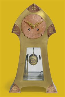
John Wigboldus (Jan) Eisenloeffel was born in Amsterdam in 1876. He was dutch goldsmith, interior designer, jewelery designer, illustrator, silversmith, ceramicist, bookbinding designer, glazier and director of academy. He was educated at the State Normal School for Tick Education in Amsterdam and taught in Russia in 1898 working with enamel and niello. He got the highest award for his clocks with enamel decoration. Anyone who had known Jan Eisenloeffel at the beginning of his career could not have suspected that the same man would make this clock 25 years later. Eisenloeffel began as a reformer committed to ridding the decorative arts of excessive embellishment, pomposity, and the use of precious materials. In practice this meant that he designed simple, honestly constructed products for daily use, including tableware, vases, and lamps in silver and copper, produced in small editions.

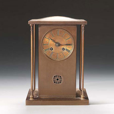
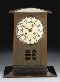
While I was collecting information about Jan Eisenloeffel and his artwork, I found a few of these early clocks designed by him. In my opinion in the beginning of his career he was designing more “clean”, and minimalistic things. Here are some pictures of the clocks he made around 1903-1905.


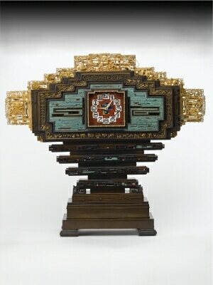
However, around 1908 Eisenloeffel became disenchanted with the possibilities of producing well-made, affordable items for a large public and turned almost exclusively to designing costly one-off pieces. This clock, made especially for the international exposition of modern industrial and decorative arts in Paris in 1925, is an example of this later approach. He wanted to demonstrate that craftsmanship was not a thing of the past. Whereas his tableware was conspicuous in its simplicity, this monumental clock is decorated with a complex scheme of symbols associated with time, such as the signs of the zodiac, and on either side and above the clock face the text is “Geniet den dag, left als de vogelen des hemels en als de lelien des velds”. Which means “Take therefore no thought for the morrow, live like the fowls of the air and as the lilies of the field” [Mathew 6 25-34]. The stepped construction reminds Aztec temples, and the multicolored enamel work was inspired by examples Eisenloeffel had seen in Tsarist Russia and also his inspiration came from Aztec architecture, Chinese motifs, and Celtic letters. Ironically, the dazzling decorative border of this demonstratively ornamented clock bears an engraved inscription derived from the New Testament.


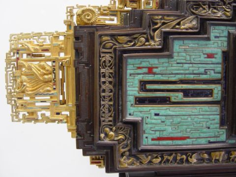
I really found this clock interesting, because it is so detailed and kind of graphic style, that it is not enough to have a look for a second. I was watching this clock for a while and I realized that it asks for even more attention to see all small things and ornaments on it, so I came back even one more time just to get some more ideas and feel the stronger connection. After a while you can see there is some animals on the pattern – swan, dog, cow and a bird, as much as I could see. I am not sure if those things are connected with a clock or not, but I think the only thing which is the same for everyone, doesn’t matter you are human or animal, is time. So, perhaps Eisenloeffel wanted to express that thing, that time for everybody is the same.
Personally I prefer later Eisenloeffel’s style, because he is expressing himself or at least trying to experiment with different materials. He started to use enamel and he did it really succesfully.


Also, I realized that this clock reminds me of my grandmother’s old clock, which has almost the same form, just without ornaments. When I was spending summer in her place, every night, once in an hour I could hear the sound of the clock, for example, if it was midnight, I could hear 12 times of the clock churning, it was so annoying all the time. To get a better view how annoying that was I attached video where you can hear the clock striking eleven times.

Eleven am/pm

But despite this bad experience, I like every single thing in this Eisenloeffel’s clock – color, form, pattern. It is different clock than we are normally used to see.


Miniatures by Sheila Hicks


Sunday, November 25, 2012


(born Hastings, Nebraska, 1934.) Painter, Textile/Fiber/Weaver, Artist.
 
 
At the Stedelijk Design exhibition my attention was quickly drawn to the textile area were a lot of gripping works was exhibited. Most of the items appeared very autonomous and were presented as art displayed in frames, on glass tables or hanging down from the ceiling. Probably the smallest section of pieces (size A4) made of colorful weaved threads caught my attention – they were made by the American artist Sheila Hicks.
It is hard to say what it actually was that dragged me into her small and actually very simply and straightforward made artworks. I had the feeling of looking at a continues (paintless) painting with numerous layers. I was sure that something interesting had to be hidden behind those threads and probably made by a person with a lot of experiences and an interesting background.
The Stedelijk has written an appealing text on the wall about textile as art and how the industrial movement has influenced the textile scene and how the old stereotype that textile work was women’s work has changed through the time.

Sheila’s woven textile pieces are attractive because I neither could categorize the style or the period. Something in them looked familiar but at the same time like something I had never seen before, I consider it like a hybrid of different cultures and nationalities, emphasizing the use of different materials. The way it was presented was also interesting, in small frames, side by side. Very organized and strict but the threads stood out very randomly in a way. I really wonder why Sheila Hicks made these small miniatures and to understand that my research is based on her biography and her history.


Sheila Hicks is educated in Fine Arts at Yale University. She started as a painter and turned her carrier into weaving and working with fibers – from 2 dimensional work to 3 dimensional work. Her miniatures (the ones in the Stedelijk) reflect her past as a painter as you can translate them to weaved paintings. These are works she has done through her whole career, besides that she is well known for her big weaved sculptural installations and wall decorations.


In her studytime one of her professors was Josef Albers, the Bauhaus master who had settled in The United States because of the pressure of the Nazis regime. Albers was the director of the Department of Design and transplanted some of Bauhaus ideals to Yale University that is reflected in a lot of Sheilas earlier work for instance the patterns, her choice of colors and the geometry and abstraction just like the classic impression of Bauhaus.

With Josef Albers [x], Sheila worked in a kind of color laboratory, and did extensive research on materials, plastics, paper, wire and plaster, that could also be one of the resons why she often weave different objects into her work. Since the 1960’s, Sheila trained in the modernistic Bauhaus tradition, as a unique way of mixing autonomous art with the traditional craft of weaving. In an interview she says: “However, when I was at Yale I had exposure to art history. I took ‘Art of Latin America,’ with Dr. George Kubler, and I chose to write about textiles because he had given a lecture showing beautiful old Peruvian mummy bundles.’’ Those textiles, she recounts, made a strong impression on her. She realized she needed to find out how they were made — not just how they looked. “At that point, Albers — Josef Albers — saw me struggling in my painting booth on improvised looms that were not looms; they were just painting stretchers that I used to tie yarns into tension, and he said he would take me home and introduce me to his wife.’’ His wife was Anni Albers [x], who is perhaps the most well-known textile artist from the 20th century. Anni Albers was a former bauhaus student and helped Sheila with a lot of work in the beginning of her carreer. I believe that her past as a painter and her influence from Anni Albers/ Bauhaus tradition could have caused Sheila Hicks  – through her whole carrier – to continually make these small, straight forward, minis/miniatures beside her other work (3 dimensional). Notwithstanding that, Hicks played an important role in the transformation of textile art during the 1960’s. Textile artists changed the dialogue and understanding of textiles as sculptural pieces in addition to two dimensional works.

The story tells that Sheila is always carrying a loom – and every time she has a moment she starts weaving. As written above I find a lot of her miniatures look very ethnic, and that is probably because she has traveled a lot through her live. In the late 50s Sheila went to Chile, Mexico, India and Morocco and worked with different Local Artist. There she was inspired [x] by their weaving techniques, color theory and architecture.


To understand and try to experiment myself (right image above). I found this old loom and tried to weave a miniature my self and totally understood why you can get addicted to weaving. In a way it is very meditative and when you first get a grip on it – it is very uncomplicated and just a pleasure to do.

I also found this book at the Library of the Stedelijk:


A book of Irma Boom called ”Weawing as a methopor” with her collection of her miniatures. The book displays over fifty of Sheilas woven textile pieces
Not that this research should be about Irma Boom, the maker of the book (graphic Design) But she need also a cadeau. The book is amazing beautiful, and present all Hicks miniatures in a very nice way. All the pieces are presented in a beautiful layout – a nice red line through the book (e.g.colours) so you almost feel like looking in someone’s sketch book. The Book stand out very personal. I can only recommend you to go to the library of Stedeljk and check it out and have a look in all the other books. A new book was recently published on her textile installation at the Mint Museum’s Atrium [x]

Sheila Hics miniature is a constantly sidework through her life. I would translate it to weaved diary paintings. It is impressing!!


chewing gum became a jewellery


Saturday, November 24, 2012

I went to the design highlght exhibition of the Stedelijk Museum, there was a lot of design. For example, chairs, textiles, jewellery, lamps, graphics, books etc. Suddenly one small piece of jewellery made me stare for a while. It was Ted Noten’s work which was “Chew your own brooch” 1998. For me his work was visually intriguing compared to the others. Particularly as I’m interested myself in making different things. For instance, clothes that I don’t usually wear. I even collect recycled things in order to rework them. So it reminds me of my interests and that is the reason I’ve chosen his work.

Ted Noten is one of the most influential Dutch jewellery designers working in the Netherlands today [x]. He is known his solid acrylic handbags and a little mouse necklace and brooch which I’ve seen it. When I saw this brooch (chew your own brooch) I thought that it just represented a chewing gum. Unexpectedly, after I research his work, it wasn’t that what I expected. According to him “ I got fascinated by the stains on the streets made by chewing gum that has been spat out. People either look for holes in the pavement to get rid off their gum, or they approach a building and spit it out on the steps before entering. These are places where the density of stains clearly thickens. It made me consider the relevance of such observations to my work as a jewellery maker”.


I was quite impressed and shocked, how he was inspired by stains on the streets made by chewing gum and I simply thought that ideas are always close to your environment as he observed by street. Basically, the process is that he provided you with a piece [X] of gum and then you start out with a thin strip of chewing gum; you chew it into a ball and then the process of shaping and re-shaping starts until it ends.

X] would be delivered to you by post. It’s fantastic to see how the designs become a brooch and each has its own personality of the chewer. This project connects the designer’s role and the role given to the audience.

What is the chewing gum? Basically, Chewing gum is a type of gum made of chicle, a natural latex product, or synthetic rubber known as polyisobutylene. Most chewing gums are considered polymers and they have different types of tasty but after a certain time the tasty always disappears and than you rid off it from your mouth. In my perspective, the chewing gum reminds me of the disposable society and relationship situations. For example, when we need it we spend time with it and after when it no longer necessary we unsparingly abandon it. I was curious Ted Noten thinks the same way with those chewing gums. I read an article about him, which described Ted Noten’s design act as a critique on contemporary life and on the history of jewellery, as well as on the wider context of product design. An interesting part of his work is to challenge convention.

When I looked up other work which he is known for, acrylic cast featuring a little mouse, it reminds me of one of English conceptual artists Damien Hirst. He became famous with a series of artworks in which he presents dead animals. Actually I’ve seen his work in Tate modern in London.

He displayed “The Physical Impossibility of Death in the Mind of Someone Living,” a 14-foot-long glass tank with a shark preserved in formaldehyde. Also he made “spin paintings” created on a spinning circular surface, which are randomly colored circles created by his assistants. It was a slightly different approach compare to Ted Noten. Hirst’s work investigates and challenges our contemporary belief systems. Even if they differ in  approach I found that Damien Hirst and Ted Noten are interacting with the audiences and both their work has a strong symbolic statement in it.

Beautiful Booklets


Friday, November 23, 2012

Willem Sandberg (1897-1984) was the man who made the Stedelijk Museum in Amsterdam what it is today. During his time as director the Stedelijk Museum became one of the most important museums of Modern Art. But not everyone noticed that right away. Sandberg got a lot of criticism during his years as a director. Besides director he is also a typographer, designer and many more things. At the moment a few of his works are shown in the Stedelijk Museum. For example his series of booklets called “Experimenta Typographica”. Later in this blog I will explain more about this piece, but in order to understand that the life of Sandberg must first be explained.

Sandberg was born in Amersfoort, the Netherlands in 1897. He grew up in a wealthy family and his dad wanted him to study law. Sandberg however did not, and so he went to an art academy, the Rijksacademie in Amsterdam. He only studied there for a year because he didn’t find the teachers very inspiring. After this he did several things like visiting different countries, getting married, getting a daughter, taking a course Marxism, getting divorced, studying psychology and getting married again (to someone else). But his most important experiences during those years were the days he worked at a pressroom in Herrliberg. After this he became a graphic designer when he got back in Amsterdam in 1928. In 1936 he got a job as a deputy director of the Stedelijk Museum and started to design posters and catalogues for it.
But then the Second World War came. It was a difficult time for all and so there wasn’t much happening at the museum. Sandberg got involved in several illegal activities such as making fake identity cards. With some help he was able to make cards that looked like they were real. However, with the documents of the registration service it was possible to discover that the cards were in fact fake. A group of artists, including Sandberg, decided to set the register on fire to avoid this. This happened on the 27 of March in 1943. They succeeded to set the place on fire but all the artists were caught en killed later. Except for Sandberg, who was told in time by his wife that the Nazis were coming to search their house for him. Sandberg had to go into hiding for the rest of the wartime

                                                      .

These years were very difficult for him. He had lost all his friends, he was isolated, he had nothing to do and he had to be careful at all times. To prevent himself from going crazy he started to make booklets. In these booklets were illustrations, notes and thoughts. He wrote sentences down that inspired him. It was the only thing that could help him getting through these dark times. Making these booklets isn’t as easy as it seams. Because of the war he had almost no materials to work with. He had to be very creative to keep on producing so he used everything he could get his hands on. He used materials like old newspapers and cardboard, but also cigarette papers. Around this time he started to rip papers in order to create letters, this is a technique he also used in his later work, like the catalogues for the Stedelijk Museum.
He called the series booklets Experimenta Typographica of which some pages are now shown in the Stedelijk Museum. Unfortunately they’re showed behind glass, so there is no opportunity to flip through them. This is reasonable since the booklets are very valuable but it creates a distance between the work and the audience. So it becomes harder for the audience to get the feeling of these booklets. Therefore I advice you: go to the library and ask for the reproduction of the booklets. Only then you’re able to get inspired by it yourself. It’s beautiful how he creates so much with so little materials and a lot of time. This body of work explains why Willem Sandberg is such a remarkable figure. The work shows his creativity and attitude. It sets an example for every artist and shows how to create much with little in difficult times.


Look fantastic


Tuesday, November 20, 2012


The sun is the closest star to planet Earth and both the sun and the stars have been worshiped and represented by humans in various ways for centuries. In Greek mythology Helios was the God of the Sun, the charioteer who drove the Sun across the sky each day. He was a kind god and depicted with a shining aureole. His weakness was his own fire because sometimes it could burn him. Just like the sun.
In 1964 Dieter Rams, Reinhold Weiss, and Dietrich Lubbs designed the Braun Cosmolux HUV 1 sun lamp. Anodised aluminium, enameled steel and plastic combined in a streamline design that could give you an opportunity to attain a glow somewhat different to the one of Helios. With the Cosmolux HUV 1 you could sun bake at anytime without having to go outside in the sun. In western culture tanned skin was used to be associated with the sun-exposed manual labour of the lower-class but has been considered more attractive and healthier since the middle of the 20th century.

The 1960ties was also a period where package holidays to Spain and Italy with flight, transfer and accommodation included, were gaining popularity. In that perspective the Cosmolux HUV 1 could be used to maintain the tan after the holiday or maybe to tan the whole family who could not afford to go on holiday? Advertisements for sun lamps by other brands shows how the whole family including small children are happy while tanning in their home. I would have liked to see some documentation of how one looks like after using the Cosmolux HUV 1, but unfortunately I did not succeed to find any and I don’t dare to try myself.

My own experience with a similar product goes back to my childhood where the mother of one of my friends, had installed a sun bed in her bedroom. We were 3 kids, just managing to squeeze together under the lamp, each with dark goggles covering our eyes.  After 20 minutes or so we would come out all looking more stained than tanned due to the squeezed positions we had been laying in. Only this one time were we allowed to use the sun bed, but I remember the mother looking very tanned for the whole winter.

The year 1964 was also the year that the movie star George Hamilton starred in the movie “Your Cheatin’ Heart”. Whether he has been using the Cosmolux HUV 1 or not is not clear – however he has until today been a representative of the very tanned look. A look that seems to fade in present times as it becomes more and more clear that extreme sunbathing has unhealthy side effects such as skin cancer.

An article published in the “International Journal of Primatology” in 2009: “Facial Skin Coloration Affects Perceived Health of Human Faces” investigate the role of overall skin colour, in determining perceptions of health in Caucasian face photographs. Arguing that redder and yellower skin now has a healthier appearance nowadays in contemporary western culture.  These preferences are linked with higher levels of red oxygenated blood in the skin associated with aerobic fitness and healthy lifestyle and the extreme tanning has changed to be a symbol of not taking care of yourself.

The original function of the sunlamps was far from the George Hamilton and the western world beauty ideals. Going back to the 1890ties the Nobel Prize winning  Faeroese doctor Niels Finsen was investigating what benefit the sun really gave and the effect of light on the skin. He created the first device, an ultraviolet lamp, to generate technically synthesized sunlight resulting in the treatment of patients suffering from a Lupus Vulagaris, a special type of skin tuberculosis. He founded the Finsensinstituttet 1896 at the Rigshospitalet in Copenhagen, Denmark which today hosts the department for cancer research.  Somewhat ironic in the context of it’ s later development and use of UV – lamps.

So the idea of Cosmulux HUV 1 originated from a medical product and was changed in to a household product. Going through the list of Braun designs is also like going through a journey of memories of different lifestyle in the last century.

Today a Cosmulux HUV 1 is for sale on Ebay with bidding starting at US $ 149,99..

anyone?


The Epitome of Art Deco


Monday, November 19, 2012


The Nord Express was a poster designed by Adolphe Mouron Cassandre in 1927 promoting the railway line that ran between Paris and St Petersburg. Although the Nord Express rail line was already thirty years old by the time A.M.Cassandre’s poster was printed, the creation of this glamorous advertisement did not just re-promote the long existing rail line, but expressed and symbolised the excitement, glamor and extravaganse of the art-deco age in which the creator A.M.Cassandre was living.

Adolphe Marie Mouron Cassandre was born in the Ukraine on the 24th of January 1901. As a young man he traveled to Paris where he studied art at Beaux- art. He was extremely talented and shortly after graduating from Art school he was taken in by a printing company and set to work creating his first advertisements posters. Unsatisfied he, along with several other print makers, soon went on to create their own printing company Alliance Graphique. Here Cassandre really shone. He was accredited with creating innovative new graphic techniques, which drew inspiration from contemporary art movements including surrealism, cubism and above all Art Deco. 

"Sur la portes de la lumiere" text by Blaisse Cendras /Bifur typeface /Poster for "Chemin du Fer Nord"

The Nord Express, which hangs in the Stadelijk museum in Amsterdam, was a celebration of the age in which Cassandre was living. In its portrayal it brought style and glamour once again to rail travel. Passengers were not just stepping into any mode of transport, they were entering one that was new and thrilling. It was adventurous, a chance to escape to go to places never before dreamed of by the every day man and woman. The composition of the poster was vital to the impression, and Cassandre, influenced by the likes of Pablo Picaso and Max Ernst, handled and executed this very simply. The track is at eye level giving the impression of the train towering over the viewer, perhaps echoing the designs of groundbreaking high-rise buildings that belonged to the same art deco age. As a viewer you get the sense of the giant locomotive speeding towards you, it is frightening and yet thrilling at the same time, the vivid, vibrant. Colours jump out of the poster giving the image a somehow realistic and exciting feel, echoing the artists genius. Cassandra was well known for his inovative portrayal of moving vehicles and there is no better example of this than in the Nord Express. Sharply angled non-parallel lines disappearing into the distance gives the illusion of great speed, viewers could imagine them selves travelling across countries in only a matter of hours, journeys that may previously have taken weeks. Another version of the Nord Express also hangs in the Stadelijk, it is in my opinion no where near as emotive or as well laid out as the one I have focused on. Cassandre carried on producing posters until the world war two, during which he joined the French Army. Although he carried on producing posters after the war, even dabbling in theatre and costume design, his passion was never the same as it had been in the golden years of the 20’s and 30’s and after struggling with depression he committed suicide in 1968. His most famous works include amongst others the Yves-saint Laurent logo and the ingenious new typeface Peignot.

How ever much of a genius A M Cassandre is, much of the posters appeal for me is the style and the time it was done in makes this poster stand out. It was designed during a time of great hope and prosperity. After the great war people began once again to rebuild there lives which would become bigger and better, more accomplished. Art Deco is the embodiment of these ideals. It promotes the eclectic form associated with elegance, style and modernism. It takes its inspiration from mathematics and geometry, perhaps a representative of people trying to rebuild for a better future. It is this that is so evocative not just in the Nord express but also in many of A M Cassandre’s works, they demonstrate a great feeling of hope, excitement even glamour. People of the time really had a vision of how the future might look like, it was a time of huge invention of enterprise. Art Deco was representative of elegance, functionality and modernity all of which are embodied by A M Cassandre’s Nord Express.


Another version of the Nord Express poster which hangs opposite the original in the Stedelijk museum;


A bunch.


Monday, November 19, 2012

For this research I have chosen a brooch made by Manfred Nisslmüller [x] which is currently being shown in the design exhibition at the Stedelijk Museum, and is a part of their own collection.

Here you can see it on the Stedelijk webside.

Manfred Nisslmüller studied goldsmithing but his work is maybe better suited under the category of visual art than design. Jewelry is still the main focus of his work but now he looks at it from a different view. He investigates and raises questions about the media but wearability is not one of his main considerations. For example, in this work below he uses graphite to make a brooch, ring and a bracelet. But since it is made out of this unusual material the items are way too heavy to be worn.

Let’s turn back to the brooch. What I see at first is not only a brooch like the title suggests, but a bunch of brooches. It is like looking into my own jewelry box at home, all in a mess. A fusion too complicated to untangle before going out so instead of wearing it I let it lie there for ages just to tangle up even more.
But I like the idea of wearing all of your brooches at once. Why only chose one? It seems only to occur to me to wear one piece at a time or at least only a few but never the whole pile. Am I just bragging if I wear my whole collection at once? Is it the same to actually wear the collection tidily placed side by side like an award winning officer or wear it randomly twisted together like trash in the wind. How does the value of a piece of jewelry change by it’s contact with other pieces?

I really like this question of value. This brooch is a mixture of various brooches, cheap junk you could find in a 1 euro shop along with precious metals with natural stones. Somehow, when they get mixed up in a pile like that the value becomes unimportant and not visible. I like the idea of these jewelry becoming equal and becoming one. Their value is equally divided. But does this brooch have less value than one of the fancier brooches incorporated in it, if worn on its own? Is less more or is more less?

Perhaps, in the end the effect is exactly the same.
Jewelry is something made to decorate, to adorn. That is a fact closely examined by Nisslmuller in his work. He investigates the role of jewelry and the word jewelry on it’s own. He has been dancing on the line between jewelry design and visual arts throughout his whole career, constantly becoming more conceptual as he continues to question the media of jewelry making and wearability becomes less and less important.
To him the looks of jewelry, their beauty or ugliness, doesn’t matter that much. The purpose is always the same and it is always accomplished. To him a piece of jewelry can be an object, a situation or a feeling but they all obey the same basic rules – they all adorn.

In 1984 he presented these two suggestions for pieces of jewelry that I really like:

A) Spray both ears with fluorescent lacquer and whistle a melody in intervals.

B) One hears the word “BROOCH” repeated softly from a cassette recorder worn concealed on the body.

As you can see from these two examples his definition of jewelry is very broad. I think he really brings us back to the core of this ancient tradition and keeps on investigating it and questioning it into the infinite.

Manfred Nisslmuller was born in the year 1940 in Wien where he still lives and works. He published a book about his ideas about jewelry called “Uber (und) Schmuck” In which I got my main information about his works and thoughts. This book along with a couple of other books and newspaper articles on Manfred and his work can be found at the Stedelijk Museum library.

Here you can see their website [Stedelijk Museum Amsterdam].

Double Tea Pot, Francesca and Richard Mascitti-Lindh


Monday, November 19, 2012

This double teapot in ceramic was designed by Francesca Mascitti-Lindh and Richard Lindh in 1956 in Abruzzes (center of Italia). The Abruzzes is a region in the center of Italy surrounded by mountains.The people there developed a famous art of ceramics, and majolica, which is nowadays exhibited in important museums as the British Museum at Hermitage. Because of the context of isolation created by the mountains during the last centuries, the Abruzzese developed an original and expressive works on metal, ceramics, stone, wood, leather using antic or ethnically patterns. One of the best Italian craftsmen in those materials are still settled there, and many designers from abroad come to work with them.
Francesca Mascitti-Lindh and Richard Lindh, respectively born in 1931 and 1929 in Helsinki, designed this piece in 1956, and made it in Abruzzes, in the Italian cradle of ceramic.
This double teapot has two handles, two different ways to serve tea. One parallel to the body, the other one perpendicular to the body. It is an useful object, adaptable and involving many possibilities. More than a double object, i call it a couple object. To my mind, Francesca Mascitti-Lindh and Richard Lindh choose to put the most important point of the design on the handles, which relate to the hand, the work of hand, related to craftsmen as a tribute to those who made design. From this design emanates nobility and humility. This double teapot calls for a wood table, and not a glass support as used in the Stedelijk exhibition. Its made to honor man’s ability, and what i admire is that the design concept is not taking anything away from its nature and singular shape.


About some days, in America

winter 1967 Los Angeles

R. Brautigan drags feet alone in Los Angeles, sees ugly pot on a window sill, lonely and ugly, takes it back to flat, under coat. the smell of cats pee in the pot. cats living with dying dirty woman. he puts double tea pot on his wood floor, floor spotted with alcohol rounds.  he wrote on it at 3 a.m :

i go to bed in Los Angeles thinking
about you.
pissing a few moments ago
i looked down at penis affectionately.

knowing it has been inside
you twice today make me feel beautiful.


after sleep, he send it in Japanese paper gift to a woman in New York.


1981 – 15 January, West 53rd Street, New York morning.
boiling water thrown on the ice scratching the red Ferrari windshield.

Since 1987 – 8p.m, until now.


Finding any serious information about this work has been as a joke, even in Stedelijk museum, this piece is even not registered in the catalog of the museum’s collection, although it is actually exhibited.
for its inadequate character it deserved to tell about some
family troubles.

Wouter Dam – Unexpected way of working


Monday, November 19, 2012

Organic but still fixed, Simple but far from boring. Soft curved and sharp edges. The not expected material for this fragile form. Not as visible as it should be, standing low and unfortunately not visible from different sides. You would not place this object directly in the design section of the Stedelijk Museum but after research I could surely place it better in its context. After telling people which object I chose a lot of them didn’t remember the piece. A pity because it’s beautiful but also logical because of his hidden position. I couldn’t say directly why I was touched by this object but after some thinking I noticed it refers to my interest for curved forms, layers, shadows, inside and outside and the material clay.

When I started my research. I directly found out that Wouter Dam was a student at the Gerrit Rietveld from 1975 till 1980 what made me directly more motivated and interested for this research. Accompanied and guided by Jan van der Vaart, an influential ceramist for the Netherlands  famous for the new design of the famous tulip vase., Wouter Dam explored shape and volume which he would continue during his career. Unfortunately there is not much more written about this time in the Rietveld Academy. From 1985 onward he was able to make enough money to live from selling his work, allowing him to spend more time in perfecting his technique. His early work gives an impression what his later work will look like. After his first phase of still recognizable vases, the vases started more breaking the symmetry but still suggest a latent ability to contain. In phases of 5 years you see a clearly development, every step is logical coming out of the one before.

Wouter Dam concentrate at the space the works take over. He doesn’t decorate his objects but focus on the form of his ceramics. He begins his abstracts sculptures on the wheel, although you don’t see this in the first glance. First he makes 10 to 12 cylinders which he then cuts open and join together in another way. Sometimes it’s a technical challenge, to make sure that it is perfect but still an example of hand-crafted workmanship. It is hard to stay close to your original creative idea and produce it. Sometimes he put more time in making the correct supports to make it than the actual sculpture itself, but critical for good results. Another technical challenge is finding the perfect stage of hardness to assemble the sculpture from the clay rings.
The colors of his works are soft and sensual chosen to enhance the shape. The colors are slightly added in different layers to find the perfect suiting color for the form and do the most for the light and shade. In his previous periods he uses only one color for his forms but now he sometimes add a little bit of another color too but only support the already existing lines.

What was also interesting for me were the different connections and impressions people made after seeing his work. Some describe it as a forms inflated by air like a sail filled with wind who billow and swell. Others refer it to human forms, feminine forms, popped cocoons or wooden boats crashing in the waves. There isn’t a direct mention. He strives for a vague memory of a real thing, just a hint. There has to be enough room for the viewer to let his imagination run free. That is for me a good reason to explain why this object fits the design section of the Stedelijk Museum. I can see this object refer a vague memory of vases. Vases of his older work but also vases of other artists. Modern times give you more the opportunity to think bigger and extremer than round vases. By putting this object in the design section you give a hint of the period we live in.

His work is mainly bought by collectors and museums sold in private art galleries for all over the world and he is notable popular in Tokyo. I can’t wait for his next steps in progress they don’t look big but for me it is an interesting thing. So I hope to visit on of his galleries soon.

A vieuw on modern design


Sunday, November 18, 2012

Marcel Wanders and his airborne snotty vase

Scanned from the microscopic specks blown out when humans sneeze, hugely enlarged, and then produced using SLS rapid prototyping technology (dimensions 15x15x15 cm).
This is the description of the airborne snotty vase designed by Marcel Wanders. When I was looking around in the design exhibition of Stedelijk Museum Amsterdam I felt directly connected to its color, shape texture and the energy of the piece. How is that? What attracts me so much with the piece?
I started a research on Marcel Wanders to understand more about his perspective on design and his extraordinary new vision on what the function is of design. Especially his vision is what interests me so much. As a student he was already discussing the ”function” and set-up of design. His view on design is ”a designer should not apply to one’s costumer”. According to Marcel Wanders it is the other way around. He works towards his designs and says it is up to the designers to carry out their vision to this world.
Other students and teachers at that time found his statement/vision not in any way realistic. Still Marcel Wanders was pursuing his dream which made him a autonomous thinker within designs.

”Products can change function, the core is design”

This work (snotty vase) has a autonomous design. The function is not what made the piece, its the concept. The airborne snotty vase is a perfect example of his vision on designs. He shows that he can design according to his vision instead of a method. This points out that Marcel Wanders is able to execute his dreamy perspective on art and design.

For me this piece could also be used differently then only a vase. It could be worn as a piece of jewelery, a pen holder, it could even be a model for a bigger sculpture work. The endless possibility’s of the piece leave a gesture for the observer as well. When I saw the piece at Stedelijk Museum Amsterdam I didn’t think it was a vase. For me it was a free form giving me the possibility to analyze what his vision is about and to give it multiple functions.
Because of this free interpretation the piece shows it could be a solution to have a broader perspective on design and art. It gives new information about the mind of the designer and the need of people to see more then only a constructed piece.
For me this is an important statement. By this way of working and thinking, one creates more interest, personality, and life in art and design.

Observing Marcel Wanders work I can see the need to create one’s own vision, and working with new techniques and materials. This is also what I try to do in my work. When I was learning the craftsmanship of jewelery I applied this new material experiments as well. Working with 3D printed elements and polyurethane to create a new movement within the traditional jewelery scene. Exclusive and provocative designs made my work change the perspective on traditional jewelery. By doing this I have shown my need for change, and my interest in the future.

Another important thing shown in the present time is that we have the ability to design on an another level. Intuition and concept capturs a bigger role in the design process. Craftsmanship occupies another purpose in the piece. Still craftsmanship is important to indicate the value you give to the piece and to reach a certain personality. The possibility to design on another level is what we could use to give more meaning to the piece and to make designs more collaborative with the future perspective of the world.

Marcel Wanders shows in his work this future perspective and combine’s it with craftsmanship. He understands that perfection is not most important anymore. Maybe it is even a small mistake which makes a work personal.

Designs can be made perfectly, everything will be calculated and mistakes are seen before the making has begun this is because of our modern industrial and digital world. It is time to look for other values then perfection. Values you find in a layer which weren’t touched before Marcel Wanders gave his input in design. And this might be a layer we can expand more to keep moving forward and to take more out of modern life with its endless possibility’s.

Paul Schuitema


Sunday, November 18, 2012
When I presented the designer I selected to write about to my teacher, and mentioned the fact that it was difficult to find information about him even at the libraries, he asked me to think of what made me chose Paul Schuitema and not one other of his contemporaries like Moholy-Nagy or Piet Zwart.
Actually the answer is quite simple. When I first entered the exhibition I was very impressed of how the museum chose to present his work, as if it was a work in progress in his studio. The presentation consisted of repetition, cuts, different papers, drawings, different tryouts, and sketches, all very obsessive and concentrated, almost like a mechanical machine.


Of course, all of this made sense immediately as I read that he lived in the time of industrialization and mass production after World War 1 and was inspired and worked with the ideas of the Russian constructivism, the Dutch DeStijl, German Bauhaus and “New Objectivity”. But still, first I was a bit startled. I tried to look for something else because I thought, like my teacher also said, that photography is as such an autonomous medium so in not very many cases it can be seen and understood as design. Than I understood that he uses images as “Applied or Useful Photography” – cutting and organizing them with pieces of text, creating a sort of collage for posters and advertisements – using the techniques and aesthetics of Graphic Design.

I knew he had links with the Bauhaus and the “New Objectivity” movement and I found the names of the other better known designers of his time, but there was nothing mentioned about Paul Schuitema. Finally, after reading about all the theories from Weimar, I found some scanned pages from the english vesion of the book “Visual Organizer”.

Soon I discovered that he was not only a graphic designer, but also a furniture designer, a photographer, and a typographer. He studied Drawing and Figurative painting at the Academie voor  Beeldende Kunsten in Rotterdam. He was a member of Kurt Schwitters’ “Circle of New Designers”. In 1931 he designed the poster for an exhibition at the Stedelijk Museum (which displays names such as  Moholy-Nagy, Herbert Beyer, Karl Teige. Lajos Kassak, Jan Tschichold, Piet Zwart, Cesar Domela and himself) and yet despite the seeming fact that in his time he was a well known advertisement designer, today people seem to have forgotten him.


       Exhibition Poster       Berkel  Berkel


In the early ‘20s he had to perform building-jobs to support himself. This is the moment when he got in contact with the working class. This was soon to be a big influence upon his works. Berkel is mentioned as being the first who gave Schuitema the opportunity to work on graphic design. And here comes the moment when the photographs he uses becomes as important as typography in advertising a product. At first he worked with professional photographers, but because of their ‘artistic’ approach they couldn’t catch the simplicity of the subject as Schuitema wanted it, so he had to learn to use the camera, and all the techniques included, so he could get rid of the decoration and aesthetics and created his own photography.

“If you become more of an expert yourself, and if you are also creative, your work will only get better” Schuitema once said.


  Photography


His contemporaries understood his wish to abandon any form of decoration in his prints, and saw his works becoming as sober and direct as he himself. Schuitema used the spatial effect of text by printing one on top of the other (only san-serif’s), simplicity, asymmetry and contrast such as horizontals, verticals, and diagonals, juxtaposed. Applying narrow, bold, small or big letters, mostly red, black, white, and sometimes blue, colors he managed to create dynamic covers. In relation to this process his images are not only illustrations or symbols or decorations, which accompany texts, but represent an organically linked body of work.

“You sought automatically for unity of text and image. This is also the reason why you printed the letters on the photo, then you got at least one optical occurrence. A red text on a black and white photo, a black text on a red picture.”

Grayson Perry – Strangely Familiar


Sunday, November 18, 2012


I had walked around the design exhibition of the New Stedelijk for about an hour, when, after rows and rows of Swedish cutleries, german engineering and dutch design homes, my eyes fell on a piece of pottery by an English artist. His name was Grayson Perry and the work was Strangely Familiar, a ceramic vase acquired by the museum in 2000, contrasting quite a bit from the otherwise dutiful and rather dull exhibition. The vase show blue human figures engaged in sadomasochistic sex over a background of British suburbia. A sentence is written upon it: ‘DADDY DON’T HIT ME, MUMMY STOP HIM...’


A few years back I studied archeology at the university of Stockholm, and for me the most inspiring part of the studies was antique art. The evolution of art in the early centuries of history, in Sumeria, Egypt and Greece is a favorite subject of mine. When I see the pottery of this contemporary artist I recall the faces of Achilles and Ajax, playing a game of dice on the black-figure pottery of 6th century BC Greek painter and potter Exekias I saw at the Vatican Museums in Vatican City. Grayson Perry pays heed to this tradition and the images on Strangely Familiar remind me of the bacchanals, and is not far from the courting of young boys, often shown in both black- and red figure pottery painting. His splashing text, as recited above, also goes back to the way Greek painters wrote text on their pottery.

Perry discovered early on that he was of a masochistic nature and at the same time a transvestite, which reflects in a lot of his work. His earlier works where in film, but as the medium failed him he found it more interesting and effective to use ceramics, tapestry, metal-works and other applied art forms. Here the beauty and usefulness of the work hid the underlying layer, which sometimes would be sexual or violent, but always and more importantly a vehicle for criticism; comments on social injustices and hypocrisies. Here I find the explanation of why we find Grayson Perry, the artist, in the design exhibit of the Stedelijk. He is surely an artist, and a well-read one at that, but his works are in the field of applied arts. They are essentially meant to be used and useful, in the same way Greek artist made vases that were commissioned by the wealthy families.

Although this is an interesting distinction, that in fact places Strangely Familiar directly in my path, I don’t think that Perry’s vases will ever be used as such. I believe they are works of art in their own right, and the reason we find them alongside teapots, telephones, Bauhaus and De Stijl is a question of definition, and Perry’s choice to work in traditionally applied art forms.

At the same time it is argued that art and design has moved closer to each other in later years, and that they in some cases are indistinguishable. An artist can easily work as a designer, while a designer successfully creates or uses art in his projects. That this is a later development I realized in the halls of the design exhibit, where the visitor moves through rooms chronologically and thematically ordered to show works of great design. As the rooms become more contemporary, I feel there is a certain shift, from usefulness and immediately perceived function towards less obvious designs, that are more autonomous. It is in this last room I find Strangely Familiar.

I am drawn to it, at first by the likeness to a dear subject of mine, the Greek vases, but then I am intrigued by the subject matter of the vase itself. At this moment I haven’t heard of this artist, but the work speaks volumes about him. When I later read about him in the library, I learn of his life as a cross-dresser, artist and art historian. He has practically become a hold house-name in England, and apart from his own work, he writes books about art and curates shows for museums. In 2002, the Stedelijk held a solo exhibition for him, which in turn made him a Turner Prize-winner the year after. He accepted the prize while in his cross dressing-persona Claire.


Further reading and video:
"The Thomb of the Unknown Craftsman"; Grayson Perry in the British Museum until 26 February 2012
http://www.channel4.com/programmes/in-the-best-possible-taste-grayson-perry/4od


Ted Noten’s jewelry piece “A split before imploding”


Sunday, November 18, 2012

Ted Noten (born in 1956) is a Dutch jewellery designer and conceptual artist. His is known for his work of making acrylic handbags containing various symbolic items like stuffed mouse, guns, and fishes.

I choose Ted Noten design, “A split before imploding ” which is one of 6 “jewelry bags” together called “limited edition” from 2007, from. “A split before imploding” is a 30-kilo trolley bag made out of solid acrylic and carries only one item, a trapped perfume bottle (named Flower bomb) made by two fashion designers Viktor and Rolf.

Ted Noten wants to deconstruct our preconceptions of jewelry and wanted to show how jewelry also can be implemented, without connecting it physical to the body. Ted Noten tells us that the trolley bag is a statement of “status and showing off” ….“The Fashion and jewelry worlds are absurd this bag’s 30 kilos -it would be ridiculous to carry”. The artist Marjan Boot also comments that the piece has a commentary toward predominant rise of wealth and the fear of robbery an it being in a trolley bag, tells something about the increased safety in airports and the fear for terror.

I find Ted Noten’s “A split before imploding” interesting because of the visual design itself and the concept of the perfume bottle. This aesthetic of sealed beauty locked-in forever by impervious walls, tells a story about an idea of perfect beauty never to be introduced to the spotted and imperfect world.

Limited edition

The trolley bag is accompany by 5 others jewelry bag in the series Limited edition. They all bear the same “inaccessible” construction of an item being behind a thick layer of acrylic. (a gun, fish etc.)

In Ted Noten’s work you often find some form of rebelliousness when it comes to him and his costumes. I find in his work “Pig bracelet” he made a golden bracelet with a small pig figure wearing a necklace. Giving the nature of this, being jewelry and highly expensive. one must assume that his costumers must have a reasonably good income. Having this in mind and seeing a pig wearing a necklace could indicate an ironic commentary toward his buyers as “rich greedy old woman” who are looking for beauty in all the wrong places.

I would refer this statement also with the trolley. People buying a 30-kilo jewelry trolley with no practical means, could tell a story about the absurdity Ted Noten is trying to reveal.

It seems that Ted Noten is often trying to bring forward the ugliness of mankind and then beautifully wrapping it in cellophane. You can see it in several of his works,  like “Be nice to her, buy her a ring” a project in which clients to the red light district could buy a ring for 2.50 to give to a prostitutes and then hopefully a more respectable relationship between client and prostitute could be established.
This is also seen in “limited edition” where one of the jewelry bags is a real gun inserted in acrylic and the cast like a schoolbag.
This lethal gun represents the dark side of mankind’s destructive behavior and selfish power. But when covered in clear acrylic it distances itself from the lethal projection and becomes a symbol of raw power.

His solid acrylic bag resembles a work I did a couple of years ago. I made out of 500 kg ballistic gel, 2 square boxes containing a flower and a number of bullets shoot in from the side.

In my ballistic gel art piece. I’m trying to show the true competition that takes place during human conception. This is the competition for life. More the over 100.000 sperm fight for their ability to live on, but only one is allowed in, to fertilizer the egg.

The gel is a tissue that to some extends resembles the soft environment that this conception is surrender of, but the gel creates an unbreakable and time free zone where nothing is allowed in.

Also in Ted Noten’s work where this perfume bottles is captured in time and out of reach for anybody outside the hard visible box. I see him as an artist trying to tell a story of his surroundings either if it’s a mouse with a pearl necklace (Turbo princess 1995) or a giant bottle of perfume locked in acrylic. There is always of story about how we human most live with ugliness and beauty side by side.

The weird thing at my grandmas house


Wednesday, November 14, 2012

I remember when I was little, sitting at my grandmothers desk and looking at this funny looking thing.
Ingo Maurer has always been her favorite lamp designer and I really loved looking trough his collection cataloges together with my grandmother , talking about the lamps. But particular bibibi I never really understud.I just couldn‘t make up my mind rather I found it ugly or funny or what exactly the reason was why she bought this lamp in the first place.
Ingo Maurer has so many beautiful designed lamps ( http://www.ingo-maurer.com/products/ )why did she not get the „Zettelz“ lamp or the „comicExplosion“?
Writing about it now makes me start to realize how often I thought about „bibibi“ and how it is still irritating to see the lamp standing on that table. It really is weird , because normally you just get used to certain things standing around in your home ,they melt in with their surrounding and you start to not notice them anymore.
For some reason though after standing on the exact same table for over 15 years this lamp still jumps aggressively into my eyes , almost like a living pet that wants your attention when you come home and wants to say hi and play with me . So for me „bibibi“ really turned into a living bird and gives me a lot. Certainly I still can‘t say I love the design or think it looks pretty and I would never think about getting it for my own apartment. But it makes me happy every time I see it somewhere because it reminds me of my grandmother.So enough personal talk now something about the Lamp and the Designer:
“Bibibi” is a tableligth that reminds the viewer of the appearance of a chicken. The lamp shade is stylistically the body of the bird. It is carried by plastic orange bird legs. A metal wire is extending in the height and at the end of it is a feather attached, which may be the head of the bird. Bibibibi is the tableland made ??by Ingo Maurer definitely pulls the intension of the viewer on it. Ingo Maurer himself is the son of a fisherman and grew up on the island Reichenau in Lake of Constance with four siblings. After an apprenticeship as typesetter, he studied graphic design in Munich, Germany. 1960 Maurer left Germany for the USA, where he worked in New York and San Francisco as a freelance graphic designer. In 1963, he moved back to Germany, and founded Design M, a company developing and manufacturing lamps after his own designs. The company was later renamed to „Ingo Maurer GmbH“. One of his first designs, «Bulb» (1966) has been included in the design collection of the Museum of Modern Art in 1966.
1984 he presented the low-voltage wire system YaYaHo, consisting of two horizontally fixed metal ropes and a series of adjustable lighting elements with halogen bulbs, which became an instant success. Maurer was asked to create special YaYaHo installations for the exhibition „Luminaries je pens a vous“ at Centre Georges Pompadour in Paris, the Villa Medici in Rome, and the Institute Francis d‘Architecture in Paris.
In 1989 Foundation Cartier pour l‘Art Contemporary (Cartier Foundation for Contemporary Art) in Jouy-en-Josas near Paris organized the exhibition „Ingo Maurer: Lumière Hasard Réflexion“. (Ingo Maurer: Light Chance Reflection). For this exhibition, for the first time Maurer created lighting objects and installation which were not meant for serial production.
Since 1989, his design and objects have been presented in a series of exhibitions, including the Stedelijk Museum in Amsterdam (1993). In 2002 the Vitra Design Museum organized Ingo Maurer – Light – Reaching for the Moon, a traveling exhibition with several shows in Europe and in Japan. In 2007 the Cooper Hewitt Museum Cooper-Hewitt National Design Museum in New York presented the exhibition Provoking Magic: Lighting of Ingo Maurer.
Ingo Maurer created many objects using LEDs, the first being the lighting object Bellissima Brutta in 1996. In 2001 he presented a table lamp with LEDs with the name EL.E.Dee. Since 2006, he is also experimenting with organic light-emitting diode (Organic LEDs), presenting two objects in 2006, and a table lamp as limited edition.
Beside the design of lamps for serial production, Ingo Maurer creates and plans light installation for public or private spaces. In Munich, he created light installation at Westfriedhof subway station (1998) and the renovation and lighting concept for Munich Freiheit subway station, to be opened in December 2009. For Issey Miyake he realized an installation for a fashion show in Paris (1999). In 2006 he created lighting objects and installations for the interior of the Atomium the Brussels.
Among his best-known designs are the winged bulb Lucellino (1992), Porca Miseria! (1994),[1] a suspension lamp made with porcelain shards. Since the early 1980s, Maurer works with a team of younger designers and developers.
2011, the redesign for the underground area of the U-Bahn public transport station Marienplatz in Munich, Germany, was awarded to Ingo Maurer together with Allmann Sattler Wappner, with its design placing emphasis on a lighting design that alludes to the Chinese I Ching.

http://www.ingo-maurer.com/products


Log in
subscribe