Skip to Content Skip to Search Go to Top Navigation Go to Side Menu


"public space" Category


Color Harmony?


Wednesday, November 28, 2012

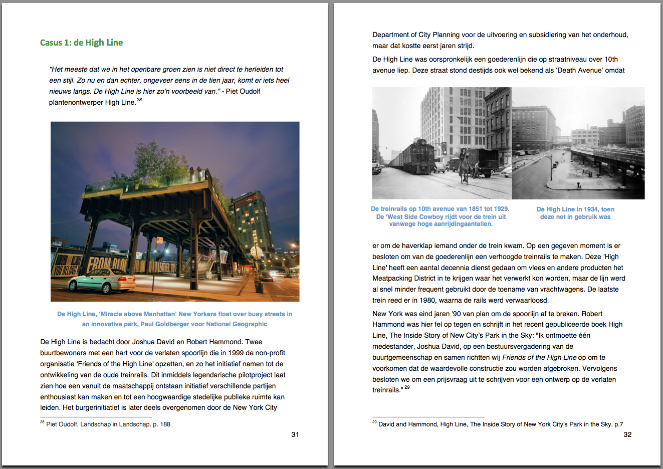
Up to the 1960’s, existing color systems were based on experiments performed in a dark room.

Another method was used to create the Coloroid System. The perception of colors happened by observing colors in compositions within a wide view-field, resembling a more real life situation.

Coloroid is a three-dimensional color space which is related to the CIE color measurement system using its characteristics; hue(A), saturation (T) and luminosity (V). Nowadays we all use these characteristics in Photoshop to make changes in light-intensity, brightness etc.

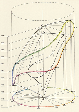
Unique to the Coloroid system is it’s aesthetic value, due to a model based on observation conditions resembling real life. Research also included color preference, biophysical and psychological effects and colors used in different art and architectural periods.  Based on results involving nearly 80,000 people, rules were formed and named the Color Harmony.

With these rules designer software has been developed to create harmonious color groups. 

For me it’s difficult to accept the aesthetic value of this system, as I believe Color Harmony to be subjective. Also this database is created over a period of 50 years with results resembling this time period. Is this the color harmony of the past? Will we have changed our mass Color Harmony- maybe created a love for clashing colors or is Color Harmony the base on which every eye at any time period feels comfortable?

As a start to the research of the aesthetic value, I tried to download some designer software based on the coloroid system. Unfortunately the software is being sold for 199 dollars and as I am not a download for free expert, I gave up the software.

I found more articles on research being held based on the coloroid system and discovered architecture to be a returning subject.

The coloroid system is based on tests resembling a real life situation, how can this system be translated back into the real world?

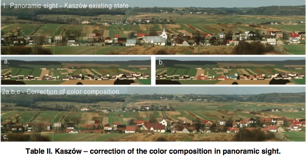
For example: a paper about color in rural architecture and landscape in Poland.  The village is an example of change in architecture over the last 100 years. Color is not longer related to function. New materials are used creating a great diversity in building style, scale and proportion, which resulted in a visual chaos. Only the visual chaos, as the author is describing, is subjective; as I do not agree on the (digital) correction he shows in his paper.

Websites created with software based on the coloroid system are products produced for the mass. Just as architecture is a product produced for the mass. I ask myself, what does my surroundings look like, is it harmonious to me?


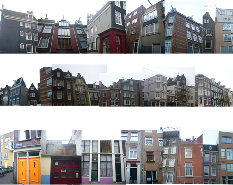
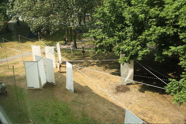
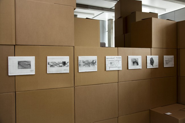
Over a week’s time I take photographs of street views, buildings, my surroundings. I make a collage of the pictures to get an overall view of my personal color harmony.

Only, these buildings are designed by architects. They have already chosen the harmony for the people. They might have based it on the surroundings or decided to create something standing out. So my selection of the surroundings is still based on some other person’s harmony.

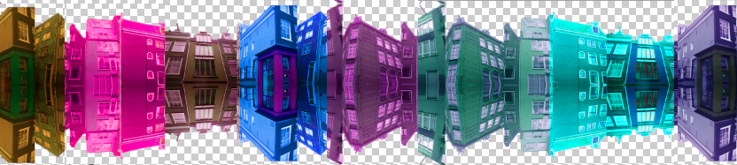
The only way to create my harmony is to change the colors, choose the colors, and even mix the colors by my own hand to be completely harmonious to me.

How do I choose the colors? How do I choose the color composition?

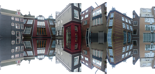
I use the collage as a base to make different color combinations, they will be silkscreen printed on a large roll of paper, all connected. The result is a color line where you can find your harmony, going forward and backwards on the roll.

A idea of what the paper roll will look like in the nearby future. Online version under construction.


A while ago I found this online version of a Chinese handscroll, a panoramic view of the surroundings. Translating this ancient roll back to this our digital age is a amazing connection. So after the screen printing is done, I’m going to create an online-digital-version of my color-line, so we can either manually or digitally scroll to find our harmony.

Cause aren’t we all looking for harmony?

That’s why the silkscreen printed color circle has an intense blue color, the color of twilight. The time of the day where I believe all to be harmonious, where I reflect upon my day, my surroundings-


Typographic Matchmaking in the City and how it gave me an interest in the meaning of type design.


Sunday, November 4, 2012


First I would like to start with an introduction of the project. The typographic matchmaking in the city project, launched by the Khatt Foundation, focuses on typography’s use(d) in place-making within an urban context. It will investigate the way that typography can fuse with urban design to create public spaces with an unique sense of place. Places that attract people because they are pleasurable, involve social encounters and immersion in the sights, sounds and atmosphere of the space.

Trying to bring back the traditional use of typography in the city, five teams of fifteen Arab and fifteen Dutch designers collaborated on creating new bilingual typefaces formed for 3-dimensional/architectural applications. The end results of the projects are five new bilingual typefaces, inspired by both Latin and Arabic script traditions. These typefaces will be applied as poetic narratives in the form of participatory public art, into the public spaces of two cities: Dubai and Amsterdam.

Each team took their inspiration for their typefaces from different sources. Their inspiration, process, brainstorming sessions, early sketches and prototypes are carefully documented [x]. It gives an insight into the thought behind typeface design. A big and complicated challenge in this project –of course– was to create the same visual language and aesthetically corresponding letters (type/font) for two scripts that are structurally very different. One of the five projects is the Kashida. In this project for example, they took inspiration for their typeface from broken pieces of tagliatelle. Kashida became a completely 3-D font, that is, in its result still noticeably coming from the tagliatelle. Here is a program to use Kahshida for your own personal text.
These typefaces are meant to stand out, in contrast to street signs for example, that affect us unconsciously. Eventually, the main goal is to have these typefaces to become part of public space and perhaps even to help create or improve public space.

So far about “matchmaking in the city”. What was more interesting for me, was the fact that for some people typography is a serious and genuine interest, even a passion. For me that is hard to understand. I think typography is something you either love or hate, or to be more subtle, like or don’t like. I can’t “kind of like” the subject, however I can try to get interested, but I will never fall in love with the amazing world of helvetica, verdana and Kashida.

Where did it come from? The urge to design something that has already been designed and been used in currentform for ages; our alphabet, simply how we now it, and once was decided how to write it.
Our alphabet, as we know it know developed from pictographs, that are dated before the 27th century BC, to hieroglyphs, known as the Egyptian writing, to the Phoenicians alphabet (1050 BC), which is first to be composed exclusively of letters and is the earliest alphabet that is directly related to our alphabet now. From this alphabet, the Greek alphabet derived, which in its turn evaluated to the alphabet we use nowadays.

So to make a distinction between the alphabet and typography: An alphabet is a standard set of  letters (basic written symbols or graphemes) which is used to write one or more languages based on the general principle that the letters represent phonemes (basic significant sounds) of the spoken language.”  and “Typography is the art and technique of arranging type in order to make language visible”

There actually is a great distinction to make, and that is, that typography is something that is supposed to be designed, it is design. The alphabet is like the entity of typography.
Typography is about arrangement and appearance. This arrangement involves the combination of point size, line length, line spacing, defining the spaces between groups and pairs of letters.

Why do we feel so eager to arrange and to come back to my previous question; why do we want to design something that is, in itself already a design? What can there be designed out of something that already has specific rules to be followed, in order to be understood? Well, apparently, quite a lot. In fact typography is a way to say something in a text that is already saying something.
Typography gives a text a double meaning and can create awareness on itself. With a type font you can force someone to read, or experience a text in a specific way.

With this conclusion I would like to look back at the Typographic Matchmaking in the City project. A project based on trying to design an experience, rather than a type font. By reading a text in Kashida in the context of, for example, an urban environment, could give you, in a way, a certain experience of the space. A harmony or connection between languages and their role in society creates a consciousness of a multicultural space where everyone can feel welcome.

Because of doing this research I was forced to create an interest, not only for the subject I was given, but also for typography in general. I couldn’t have imagined how important a good designed type font can be and what it can evoke. How much time and energy it takes to design one and most important how it connects to way more than only just “saying something” with letters.
Still typography is something I was not made for, as well as typing with Kashida can only interest me for not more than the sentence: Hi, this is a type font.” surprisingly, over all, that was what I enjoyed the most.


Variations of the Incomplete Cubes 2D, Sol Lewitt


Friday, November 2, 2012

Sol LeWitt  „ Incomplete Open Cubes“:

In the 1960s, Sol LeWitt began to investigate the cube, one of the most basic geometric forms.

He started with the question: If you take an open cube and systematically subtract its parts, how many variations are possible? LeWitt identified a series of 122 unique open cubes with three edges (the minimum number needed to suggest three dimensions) to elven edges.


4D typography in public spaces


Sunday, October 28, 2012

My first contact with 4D typeface was in Casco at Utrecht. The 4D typeface was from Herman Damen and it intrigued me and left some questions behind. After i dived in the subject I found the typeface of Lo Siento. The beautiful designs are however not really used in the public space and not well known by the public’ because of that. Why? Are the 4D typeface not useful in public spaces or are they just not clear enough? In this research I will analyse which kind of way 4D typeface can be an extra supplement in public spaces.

Plan of the research
To find out why 4D typeface it not that much seen in the public spaces I will ask some different questions to help myself in this research.
-what kind of 4D typefaces are already present in public spaces?
-what do people think about 4D typeface? Is it well known?

Examples of 4D typeface in public spaces.
When we think about some known examples of typeface in public space we soon think about logo’s or indication of places (for example in public transport). It’s impossible to miss it on the highway: the Mc Donalds indication. Maybe that’s a part of the success of the logo next to the road; it is recognizable and readable from two directions. But is it also a 4D typeface? The definition of 4D typography: “4D Typography is the result of intersectioning, in an orthogonal way in space, two extrusions of the same character, which allows the spectator to read it from, minimum, two different positions in space.” (Lo Siento, 2012) that means that the Mc Donalds indication next to the road (what is readable from both sides) is a 4D typeface. But of course when the Mc Donalds logo is placed on a wall of a restaurant, this is not the case.
A second example of 4D typeface in public spaces is a place indication, for example a subway. In the Netherlands you see this a lot in the form of a cube with the letter ‘M’ printed on every side. The indication sign is readable from more perspectives (at least four). But… here starts the question: is it allowed to call this a 4D typeface when it is a cube with a printed letter on each side? When you ask me, it isn’t because the indication (the cube itself ) is not a character.


To define that 4D typeface will fit in public space, the opinion of the pubic on these places is important. To find out these opinions I went to Schiphol airport, the library in Middelburg and the railway station Rotterdam Central. Prominent is that a big part of the respondents (above 90%) never heard about 4D typeface. When I showed the 4D typeface of Lo Siento, there were not many people who recognized this way of typography. Of course they did when I showed them a picture of the indication of Mc Donalds. When I asked them about their opinion, a lot of people reacted really positive. Over all they thought that it is a really attractive supplement in public spaces. Eva: “For me it is really appealing. 4D typeface could give the usual (mostly boring) indications a new life.” Next to all these positive reactions there were also some negative points, mostly about the readability. Richard: “This way of designing is much better, nice! But I think it’s not always possible to use 4D typeface. The character ‘R’ is a difficult one, they should be careful with that.”

Ways to put 4D typeface in public spaces
In this research I couldn’t find many examples of 4D typeface, especially not in the public spaces. But the people I interviewed where really positive about it. I think (and the respondents also did) that 4D typeface could be a new supplement in the public spaces. I will give you some examples how we could do it. I hope that this way of typeface will pick up fast in the public spaces. For me this is a big discovery in the typeface.


The Green Apple


Tuesday, October 23, 2012


IMG_0451mirte_redu IMG_0513mirte_redu
How would a park of the future look like, knowing that our cities will keep on growing and keep on getting denser? I tried to answer that question, with the need to experience greenery in busy cities. [Images from graduation show presentation]


In my thesis I try to find an answer to the underlying question: How can green improve an urban living environment? For which in this research I specifically take a look at New York, a metropolis with high density that will keep on growing rapidly over the coming years. NYC plays a leading role in the field of green development. My main question reads: which lessons can be drawn from the innovative green projects in New York City.
To be able to answer my main question, I first took a step back. I did research about what a city actually means, how the process of urbanization took place, which problems it produced and why these issues are considered problems. After this the young trend Landscape Urbanism is studied. These ideas focus on new ways of shaping an urban design, according ‘horizontal landscapes’ instead of ‘vertical building’.

spread_page31-32
De High Line, "Miracle above Manhattan" New Yorkers float over busy streets in an innovative park, Paul Goldberger voor National Geographic.
De High Line is bedacht door Joshua David en Robert Hammond. Twee buurtbewoners met een hart voor de verlaten spoorlijn die in 1999 de non-profit organisatie ?Friends of the High Line' opzetten, en zo het initiatief namen tot de ontwikkeling van de oude treinrails..page 31/32 of thesis


My research consists out of three parts. First the problems of urbanization are analyzed, making use of the created historical context. The pioneers of greener cities will be discussed. Next to this the subject infrastructure, livability on street level and food supply are discussed.
The second chapter shows a series of solutions how green is used to regain peace and space in the city. Also is described how this added greenery could improve the urban ecology at the same time.
The last part focuses on case studies in New York. The research method is based on fieldwork and interviews with related people at the spot. I looked into what kind of influence the projects had on the city and its inhabitants and what examples other cities adopt.

Minolta DSC big model2_redu
I made research models out of ceramics. Like in the final design concept, living plants form the structure in this earlier intuitive models. After keeping them inside over the wintertime the young trees started growing. This experiment shows in smaller scale how growth takes over, allowed to complete the design.


not the excess of people but the lack of green is what threatens the mental health of townspeople“.

With this knowledge the people of New York commit themselves, supported by a strong governmental policy, to make their city greener and more livable. This is what makes the trend that helped the ‘Big Apple’ change into a ‘Green Apple’ so interesting and relevant: The approach both top-down and bottom-up at the same time. This is an innovatory model that fits well within the current economical recession, because the city is not only developed on governmental initiatives and financing but there is also searched for other possibilities and money sources.


Pdf-icon Download this thesis: The Green Apple [dutch language]

The Unadapted City


Saturday, June 2, 2012

Vipcity is a research project of the Belgian bureau for urban planning T.O.P.office Luc Deleu. ‘The Unadapted City’ is a design based urbanist study. Earlier models such as Brikabrak (1998), Dinkytown (1998-99) and Octopus (1999) lead to the latest model Vipcity: an urban plan for 38,000 inhabitants.

According to T.O.P. office life on earth will become a problem because of a lack of space. While most architects and urban planners design spaces for one fixed purpose, T.O.P. office designed basic shapes that could fit for all purposes, to reduce the inefficient use of space in cities today. The basic shapes behave like a sort of skeleton, and can be filled according to the needs of the inhabitants. The only way a city can be adapted to its needs, is when its design is unadapted, still to be customized accordingly. Research lead to some rules in the arrangement of the city.

First, all needs are categorized. The facilities mentioned:
– hotel and catering – social facilities – medical facilities – distribution and Transport – education – universal and commercial services – culture and entertainment – worship – arts and crafts – sports and recreation

Next these facilities can be placed in three categories: structural, zoned and occasional.Structural facilities provide the cities structure.


The transport and distribution facilities are represented in the black oblong shape. It functions as the cities spine, along which the zones are placed (white parts in photo).The zoned facilities, shown as the small colored blocks, can develop by various, uncontrolled within a specific zone.

The facilities are shaped rectangular. This proved to be the most versatile and fitting for every function. The colors represent the different facilities.
Occasional facilities can develop everywhere by individual. By free initiatives that directly answer to a inhabitant needs.

When the needs of the inhabitants change, adjustments can be made on either zoned or occasional facilities. The space or form does not have to be adjusted, only its function, i the image represented by the change of color. Occasional facilities can easily be taken down or moved and affect the cities shape.

This research project by T.O.P. office is highly theoretical and not one of the models is executed. Nevertheless it gives fresh view the construction of the society.

15 miles into the andromeda strain


Thursday, May 31, 2012


>Studio Makkink & Bey<


Tuesday, February 28, 2012


Jurgen bey one of the founder of Makkink and Bey Design studio,graduated from Design Academy Eindhoven and now the director of Sandberg Institute, starts designing from how a person thinks, feels and works. From there he goes and scales up things.

He starts from humans and thats where i feel connected with him and his designs. He works very intuitional. It is not about organizing things and creating solutions. Every disorganization has a specific organization, and the specifics are what interests him.He thinks we should be more specific on what we organize.

It is not about mapping everything and understanding everything and then designing it, for him its about following an intuition and questioning why things are the way they are and let that lead to somewhere where he has not been before.

According to him wanting to think or create something new is bizarre for everything or solution we can possibly dream of does already exist in the world around us. The language is already familiar, When we see things we already recognize. So it is about knowing that language and translating it our way.

Jurgen Bey is aware of the different areas he can dive in to as a designer. He is interested in the context of his designs where usually most designers avoid.

Designing a space so to say instead of the building itself is what Jurgen Bey is interested in. As soon as he touches a space with his things, he owns the space, as he says.

For him its always about being in a specific situation. He designs for specific situations instead of abstract.

Jurgen Bey emphasizes on model world because you have the liberty to do things you want in a model world without being distracted by the questions of reality. It is important to live isolated for a while. You could reach places you haven’t reached before and you become special when you get back to reality. You face the questions of reality when you reach the level you know why you do these things.

He thinks of dutch design as a historical driven design where the craftsmanship matters and is valued. He is fascinated by the future driven design like in the 50s, or now in China where he feels the progress. Its interesting to be completely free from the history and that you are allowed to think completely ahead.

Now designers are interested in making their own machines which can result in factories becoming smaller. You can get products made on demand. For Jurgen Bey its very interesting to watch how the industry will change and the effects it will have on the people and the city.

The whole discipline is growing so fast. The change is fast.  He sees the whole discipline as a sort of olympics where you can choose your own discipline and focus. You cannot do everything well, He does not believe in multidisciplinary  designers.

Industrial design is not about the product but more about how things are made. How the factory would look like how would you go to the factory, how would you work there.

Jurgen Bey creates designs that provokes thinking and discussion.

Jurgen Bey considers himself to be a product designer but i really see him on the line between art and design. This is also where i would like to be, somewhere on the line. Playing with the context and the reality.For me it is not about creating beautiful products that people would like to buy for their houses. It is also not about making money but more about the social context my designs will have in the society. How will they change or adapt to people? It is not something to be planned, but more like a progress that is waiting to be unfolded.

Considering Jurgen Beys description of dutch design, ironically i see myself as a dutch designer even though i am not dutch. I value the history and the craftsmanship. I value the individuality of pieces and am not much into mass production. I don’t think that design is for everybody. I am sure not everybody would like my designs and that is ok. It should be only for the ones who would cherish them.

Looking at learning / Learning to look


Wednesday, April 20, 2011

We relate to an image in context with the place where we see it. Showing scientific images in an art space can be confusing if you don’t know what you’re in for.

It’s a worthwhile contemporary experiment in the sense that science has become an omnipresent part of our reality, and it’s interesting to explore the limits of the meaning and purpose of scientific images.

I can recognize the blown-up images of molecules because I have seen similar ones before or by reading the description. In a place of science, this might not have happened: I stood back and let them sink in, taking a closer look at the abstract forms, realizing: This could be anything. Not knowing how big this thing is in reality, I can imagine it to be anything. Something small zoomed in or a city from a distance. A couple of times, I saw something I would have liked to copy or use, say, as an animation. There’s a fun thing about those images, beckoning me to play. A thing I found funny was how some images could have passed as modern art, had they been painted on canvas.

worms or curly fries?

A different aspect I thought about was the visual properties of nature. Some of these colors were very nice. I wondered if this was an actual attribute of the object or if a pigment had been added by the scientist to make a certain membrane better visible.

In the end, I do believe that scientific images can be put in an art space to enhance the viewer’s flexibility when it comes to the subject. Personally, I found these images very romantic. The devotion of human kind to find their origin developed with them into being and will never fade. Now that’s love!

As the cube became a Box


Sunday, November 21, 2010

Park at Wibautstraat, near Amstel station together with Rietveld architecture, become a starting point for the creation model of new building.

map and inspiration

The Rietveld Schröder House in Utrecht was built in 1924 by Dutch architect Gerrit Rietveld for Mrs. Truus Schröder-Schräder and her three children. Inside there is no static accumulation of rooms, but a dynamic, changeable open zone.

The functionality and rationality of the Rietveld-Schröder house inspired me to create something useful. When I started to think about it and tried to get more information about Rietveld architecture I found a table which gave me the idea to create a box for homeless and students.

Box & environment

Park at Wibautstraat is a perfect place for “Boxes for the homeless and students”. Trees in the park hide “shelter” under their crowns, but the bright colors of boxes make their way through the green “ceiling”. Boxes can be placed anywhere in the park, because they are mobile and each box is attached to a bench. Main functions of the benches are the storage place of cardboard. Yellow bench – for the new cardboard (which serves as a mattress inside the box). Black bench – for used cardboard (which can be used to fuel the fire in fireplace). I chose cardboard because every day in Amsterdam a huge amount of cardboard is released, so that it can be delivered to the place from the special services or concerned public.

(more…)

The least construction


Saturday, November 20, 2010

The most amusing thing in Rietveld’s construction is the combination of the large window, horizontal and vertical lines.

The important factor of Rietveld, which is linking the inside and outside of large window gives not only physical visual effect, but also the feeling that it is as if the space is being expanded in the mind. That is why I thought that the space he made is not fixed, and is flexible in terms of mental and physical condition.

Therefore, the point of my work is expansion and communication of space, and minimization of boundary.

The forest (small park or also called Parool-driehoek) is the only empty space in the area and the only nature.

That is why if people make something artificial there, it should be at the least, and that it should have synergy effect to people who enjoy the only small nature and give the least damage.

That is why I have thought about de architecture. It is construction, but it is a construction with the most open form and it can have form at the least level whenever desired, and if necessary, it can have different size, which was what I wanted. It is because I have always thought that construction makes much break off.

I wanted to make a building with only windows with the most maximized form. It can be glass wall or also a frame without glass. I want to attempt a building which exists as part of the great nature, and not a building with external environment drawn inside. So, a building which exists for nature, and which exists for the people who enjoy the nature, and which has only the least function,

(more…)

Gerrit Rietveld Inspired Winter Park


Wednesday, November 17, 2010

The basis for this project was to design an architectural structure to be placed on a bare piece of land on the Wibautstraat. The piece of land is unique, not only because of its shape, but also because of its proximity to the metro lines, because it includes a hill, and because it is flanked by two bridges, one a major highway to and from the city. The project was to take all of these elements and create a scale model for something that could be placed on this plot. In my case, inspiration came from two different sources. As part of the project, we were required to choose one or two of the buildings designed by Gerrit Rietveld. The second part of my inspiration was to give the structure purpose and thus give me a better idea of the shape it should take.

When we started this project, I immediately thought of a park, due to what is already there: grass, trees and such. However, Amsterdam already has many and lovely outdoor parks and another one is perhaps not necessary. However, there is still no winter park here, nor in most cities, I think. So my plan became to create a sort of building that would function as a winter park, with protection from the elements, but also giving as much of an impression as possible of being outside. The most obvious reference for such a project is the old palaces and winter gardens in London in the 1800s. The other great aspect of those winter and pleasure gardens was that they were really places to meet and to be seen, another aspect I wanted to incorporate. Some of the larger issues with this situation – that the space is not so large, and also that there is so much happening around the surrounding area – would make it difficult to create any sort of intimacy within.

(more…)

Shield and Shelter


Thursday, July 15, 2010


enclosureflevoparkbath-etching

intuitive fear spaces


Architectorial anxiety.
Can I design a space that uses my experience of fear to design the perfect safe zone? How can I shape a space which gives one freedom and privacy but which is not enclosed?

Shields and Shelter is a design for the grounds of the public bath – Flevoparkbad [link] – in Amsterdam. For the Rietveld graduation exhibition 2010, I realized a 1:1 detail of my design on the lawn behind the Rietveld Academy.

Kristin_Mauer1

above : a 1:1 detail of my Flevoparkbad design on the lawn behind the Rietveld Academy.


In Shields and Shelter I applied step by step the guidelines that I have developed to achieve safe and comfortable zones using my own fear experiences. These guidelines involve architectural concepts like shielding and view, shadow and light, flexibility versus rigidity. The perfect safe zone to me is a flexible space which gives one freedom and privacy but which is not enclosed. As basis for the design drawings I used an aerial photo from Google Earth of Flevoparkbad. From each towel, I constructed lines of sight from 120° angle views. Through shading these 120° triangles a map emerges with different degrees of surveillance. The darker the area, the more views. At the darkest areas the view must be blocked. Therefore I developed shields, which can be slided along rails that follow the lines of sight. This allows the bathers to adjust their exposure to others according to their own wishes.

kristin_slide8

kristin_slide7kristin_slide16
IMG_4897

tracing the 'feel' zones and the emotion lines and reproducing them in a real situation.


From the jury rapport : Kristin Maurer’s installation outside is a whole new interpretation of space. Space can be created by shadows as well as materials. This is what struck our jury-members. Next to this the technical realization of the work is stunning and therefore our members of the jury wanted to celebrate this piece of work.


etchings at graduation show Kristin_Mauer3

ICE-etching

The etchings in the thesis, presented as part of the graduation show, are ground plans of remembered fear spaces. A scheme of lines of sight in train, Kristin Maurer, 2009 [etching]


Pdf-icon Download thesis: Architectural anxiety. the perfect safe zone
 

Proun. Street Celebration Design, 1921, Lissitzky


Wednesday, February 3, 2010

In this work you see influences of Design, Fine arts, Architecture and Graphic design.
A nice thing of this work is that the upper drawing can stand on his own, and therefore can be divided in Fine arts. What Lissitzky is doing in the painted photo below, can be compared with design. Almost all his work contains influences of Design, Fine arts, Architecture and Graphic design. For myself I see it back the most in this one.
I really like the composition and colour distribution and how Lissitzky combines the 2D/3D perspective, which makes the drawing much more architectural.
I think the later work of Kandinsky is in some way comparable. I’m talking about elements of composition, colour distribution wise and form contrasts.
What’s fascinating actually is that for example in these paintings ( K1, L1, K2, L2 ) the triangles, (half) circles, stripes and composition have so much in common. While the ideas of their work are so different. Kandinsky combines painting with music, which Lissitzky does with architecture.

What I appreciate is the modern way of exposing his work. I like the way he puts his drawing and his street-exhibition in one frame on the cardboard. And the fact that he paints on the photo. The street celebration design reminds me a bit of graffiti in legal manners. In Graffiti you have multiple meanings of doing it. Some do it for the adrenaline-kick, some for the group or competition feeling, some to show their design skills and others for  political statements or propaganda. This last example is what I see in a part of Lissitzky’s work.

I think it’s interesting to see how he uses his propaganda work in other work but then he integrates his in his autonomous work (proun. street celebration design).

All in all I think it’s a great work and a unique style. I really admire that Lissitzky makes so many different things, and still keeps it in one theme

Applicable to all aspects of daily life


Thursday, January 28, 2010

If I would come across El Lissitzky’s street decorations today, without knowing what they were, or who they were made by, I’d be wary of calling them decorations.

They just look too much like big paintings.

And calling somebody’s painting “decorative” is usually not good for your relationship with the person.

But that’s what interests me so much about his design for street decorations from 1921: It doesn’t look like any type I have seen before.

I’m actually not sure if the decorations would be terribly effective, the street in the photo does not look particularly festive. Lissitzky’s position seems to be not so much about creating objects that fulfill a purpose in the best possible way, but more about having them embody certain (suprematist) ideals.

It seems to me, that in his street decorations, Lissitzky is not looking for the ideal street decoration, but instead applying his ideals to them.

The Suprematists of whom Lissitzky was part, strived for suprematism as “embracing all aspects of the human spirit”  and thought suprematist forms to be applicable to all aspects of daily life. And you can see this when you look at a sample of Lissitzky’s work put together. It seems he really believed that this style, this way of working, could work for anything.

But there is more to these forms than meets the eye, they follow set standards and, if you know how to “read” them, communicate a clear story. A real form-language if you will. Unfortunately I do not speak this language, or know what the paintings mean, but in Lissitsky’s vision it would be omnipresent, and understood by all.

This really interests me,

is the reason the decorations do not work for me that I do not speak Lissitzky’s language?

Or would they, even if communism had worked out and everyone would understand, still miss something of the festiveness that we associate with street decorations?

I am inclined to think the latter

Anitalink


Tuesday, December 8, 2009

My interest in film drove me to write my name on the contact list of “The New Anita/De Nieuwe Anita“, a film theatre/bar in Amsterdam. Ever since I have been receiving almost weekly information about the projected films in “Cinemanita“.

Funny thing is, like I said before, I  have been receiving emails from “Cinemanita” for more than a year already and for some reason, once I began this research, I did not place an immediate relation. It seems like a never ending discovery of unusual connections.

So I went into my gmail to see an email from “Cinemanita” received at 10:05 in the morning today, a few minutes after I posted my last Anita, Color post.

The email begins like this:

—————————————————-

SUNDAY DECEMBER 13

20:30
BLIND CHANCE (PRZYPADEK)  1987
Directed by Krzysztof Kieslowski
122 minutes
In Polish with English subtitles

Film Director Krzysztof Kieslowski is best known for his trilogy

Three Colors (©93/94), but before he headed for France he made some absolutely stunning films in his homeland of Poland. Of all the films he made, many consider ‘Blind Chance‘ to be the best… and some consider it the best of his career.

—————————————————–

“Three Colors”!. Surprised? Actually not.

“De Nieuwe Anita” / “Cinemanita”.
www.denieuweanita.nl Frederik Hendrikstraat 115, Amsterdam, The Netherlands

Imaginary Museum


Monday, November 16, 2009

Amsterdam based Visual artist and archivist Tjebbe van Tijen (1944) works since 1988 under the name Imaginary Museum Projects consisting of regular lectures, performances and publications on subjects like social memory, psycho-geography, media history, mapping of human violence and visual language. Especially interesting in this project are the “Museums in our Minds Scrolls” that he is making. To view the strips of images, he build a special wooden viewing device with handles that one had to turn to scroll through the strips, a manual scroll-bar really.
link to the Imaginary Museum Homepage, or read the interview that Geert Lovink had with him in 2004
In his celebrated book “Le Musée Imaginaire”, Andre Malraux (1901) developped the idea that the world of reproductions forms a “museum without walls a museum in your head. A virtual museum read more:


Continuous Drawing by Tjebbe van Tijen. Photographs with permission of Pieter Boersma. Coll. H. Groenendijk

One of Tjebbe van Tijen first “actions” was “the continuous drawing” organized by him and students of the London ‘Sigma Centre’ in 1967. The “continuous drawing” came out of a Londen sewer and travelled to The Netherlands. Two parallel lines, continuously branching and looping creating organic forms. True streets, onto cabs,in the airplane and thrue Schiphol Airport, over the streets, into the Stedelijkmuseum where it continuous on the stairs, to the terras, covering visitors and statues until it ends as a projection in a smoke filled dome, as if desolving in smoke. This project was initiated by the City of Amsterdam Municipality, Tourist Promotion and various Art Foundations in A’dam and R’dam. Other participants were a.o. Willem Breuker (musician), Theo Botschuijver (industrial designer), Graham Stevens (architect), Pieter Boersma (photographer). His took the initiative for a documentation center on art, technology and society at the Sigma Center and Stedelijk Museum (1967-1969) and was later founder and curator of the Documentation Center of Modern Social Movements at the University Library and International Institute for Social History in Amsterdam

sources: “Actie, werkelijkheid en fictie in de kunst van de jaren ’60 in Nederland” (Action, Reality and Fiction in the art of the sixties)©’79, Mediametic, Gandalf #19 ©’79. imaginary Museum


Log in
subscribe