Skip to Content Skip to Search Go to Top Navigation Go to Side Menu


"social behavior" Category


Object of Curiosity


Thursday, May 14, 2015

When we got an assignment to contact a person that influences and fascinates us I got lost for a moment. There are simply too many people whom I would be curious to meet and ask about their work and inspirations! After a couple of failed email conversations with hard-to-reach professionals I decided to try another way. My inspiration came spontaneous as a follow up of my daily curiosities. I personally find it very stimulating for my own working process to make a step aside from the main route and see what is it there behind the corner because you never know! Following this simple idea I went to a butchery I have been to recently. I already had a short encounter there with a butcher Mike and a video of him slicing slaughtered pig. Therefor we met again and I had a great opportunity to spend some time at the butchery with the best butcher-guide! During that meeting I discovered the world of modern dutch butcher and afterwords continued on searching for the best object i could make to tell the story of this meeting. In the text below you can find all the process steps that led to the creation of the final piece- OBJECT of CURIOSITY.

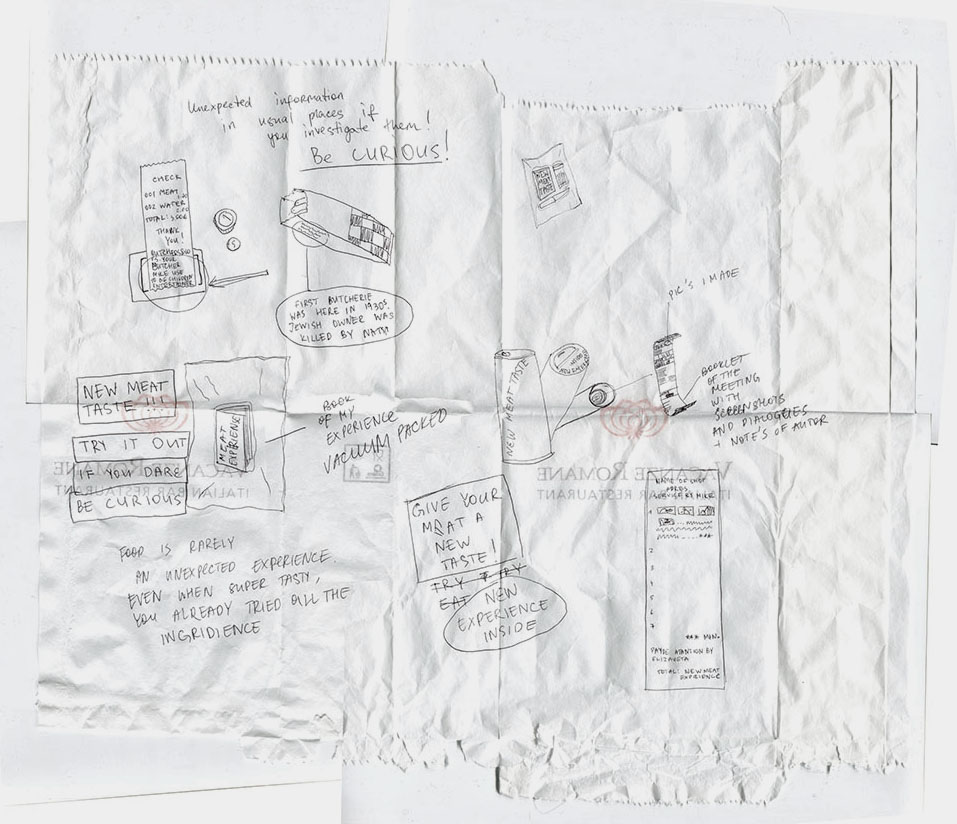
First Reaction: Right after the meeting I decided to quickly summarize what had happened and what material I have now. I had a sticker with all of the information about the pig Mike was slicing and loads of videos documenting almost the whole meeting. I decided to make a list of tags which would describe that meeting.

Sticker from a piece of meat  2tags-about-the-meeting-copy

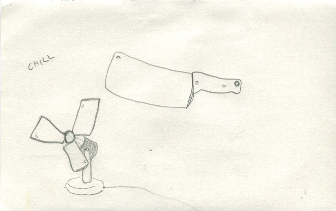
First tryout: My first idea was to make a fan with sharp knifes used as blades. I thought it would be a funny metaphor for the meeting. Chilling plus being dangerous.

First idea fan of knifes


Second tryout: Understanding that the fan idea is too flat I decided to try to make something what the butcher could use. Here is a sketch of some kind of logo/identity proposal.

second idea logo


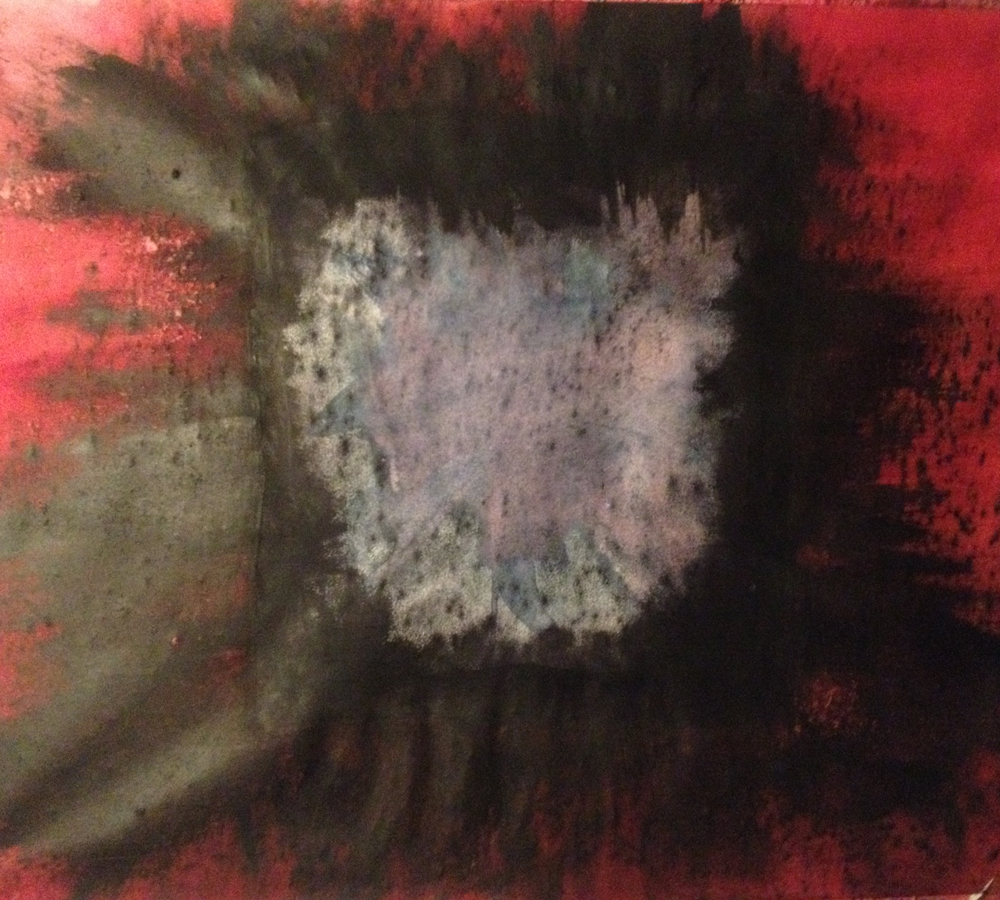
Third tryout: After talking to my teacher and classmates I decided to go away from my direct design solutions and think more about what was my experience like, what made this meeting so special? The experience was unexpected, though the location of the meeting suggested some narratives, and the main conclusion I made was that my own curiosity led my towards this happening. I started sketching to figure out what object can look common but yet carry something surprising in it and trigger peoples curiosity at the same time.

2third-idea-taste-the-curiosity-copy


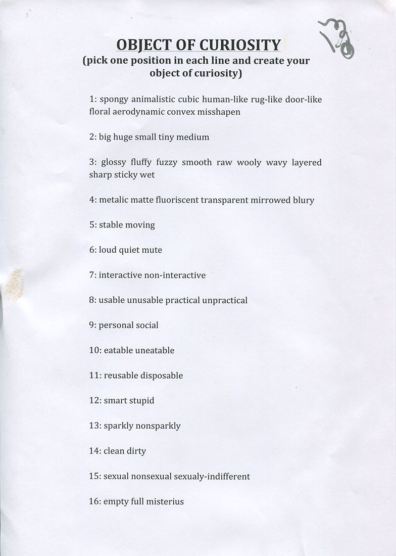
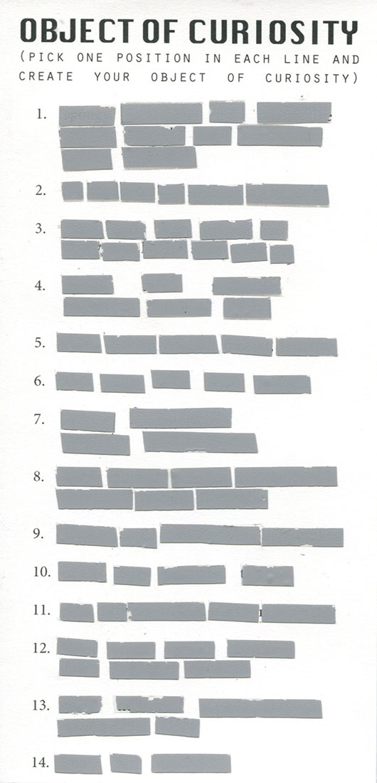
Final idea: To go further I decided to ask my friends in what situations they feel the most curious? Receiving their opinions I understood that all of them were naming the situations where the communication with other people involved. At this point it became obvious for me! That now I want to make something that I can give to others, something that will become something else when used by people. And here came the idea to make some kind of lottery ticket called OBJECT of CURIOSITY. It will help people to create their own Object of Curiosity and at the same time will be object that contains the curiosity in itself. Here is the first version of it.

Final idea- object of curiosity tryout Final idea- object of curiosity tryout 2


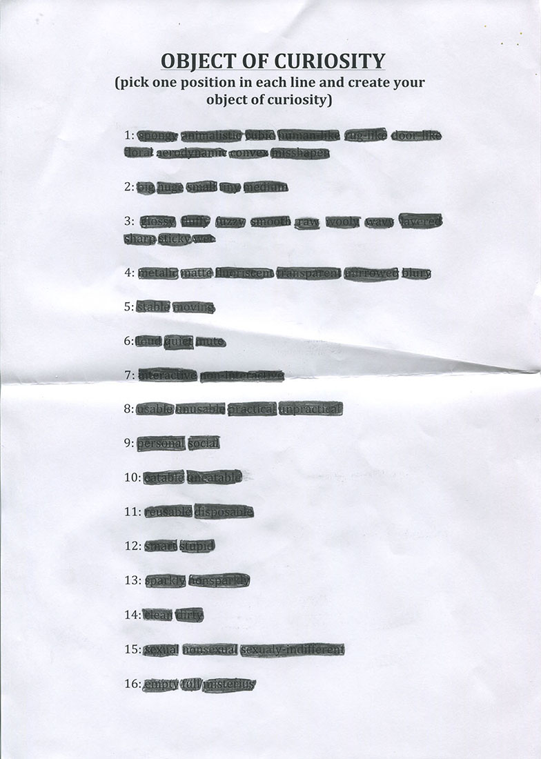
Final design: To make it look more like a lottery ticket I made a design for the object and used special techniques by applying scratchable lines on it.

objectof curiosity final version


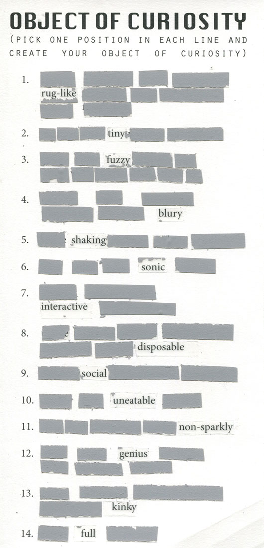
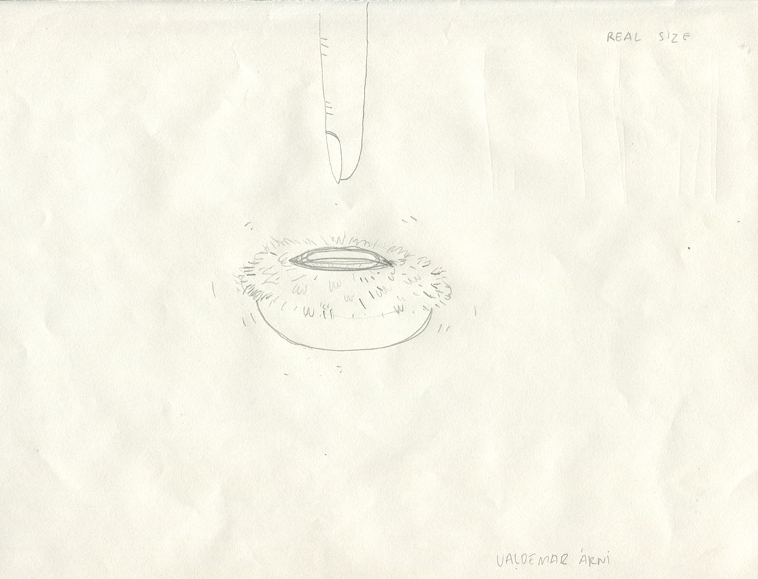
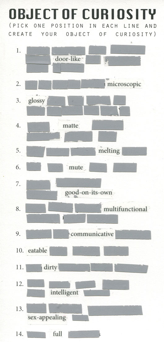
Final move: To finish my project I asked two of my friends to test OBJECT of CURIOSITY and sketch their own Objects of Curiosity. Here below is what came outcome.

object of curiosity used by ValdemarValdemars object of curiosity


object of curiosity used by RubyCURIOSITY-ruby_900


OBJECT of CURIOSITY is a lottery ticket to the greatest trip of your imagination! In this object I tried to combine suspense with excitement, make it open and closed at the same time and, above all, interactive. This is a metaphor for the process of my work and a useful tool for others.


!BE CURIOUS!

#STICKY #SWEET_SMELL #MUSELS #VACUUM #MAFIA #BLOOD #SLAYERS #DELIVERY #FRESHLY_SLICED #HASH #FREEZER_ROOM #SALTED #DRIED #EX-ANIMATOR #GANGS #JEW_BUTCHER_FROM_30s #AIR_CONDITIONER_IN_A_WARDROBE #WINNER_OF_2013 #CLEAN_EVERY_WALL_EVERYDAY #BUBBLES #SHARP_KNIFE-THE_MAIN_RULE #STAB_YOURSELF #CHILL #FAMILY_BUSINESS #CUSTOMERS #BACTERIAS #SALAMI #HOOKS #HAIR_STYLING #VAN_PERSIE #FOOTBALL #DRUNK- AGRESSIVE WOMEN HARASSMENT CHILLED MEAT TO TASTE BETTER #YOUNG_MEAT- NO_TASTE #TEENAGE_MEAT #CUT_CLOSE_TO_THE_BONES

The chair as a subject of slow thought


Saturday, March 28, 2015

This is how I remember my grandfather’s chair. I remember how I used to watch him sit on it. Or, sit in it. The chair was big and my grandfather had then already begun to become tiny. It was as though this chair, with its plumpness, its doubtful green color and its leather cushions pushing into skin, offered him an escape.

Since then I’ve never seen anyone sit and disappear like him.
Maybe people don’t have the time.
Maybe people don’t have the space.
Maybe people don’t have the guts.

_________________________________________________________________________

Human beings are standing beings; our muscles are constantly at work to keep us up, while gravity is constantly pulling us down. Keeping this in mind, sitting seems to be merely a way to discharge these muscles, to compensate for the unnatural posture that is ours as a result of evolution.
It is compensation that shows that even though we’re trying (as we are developing new techniques and exploring new ways of enhancement every day) we have not reached the state of super human yet. We are still in some state where we possess human intelligence, but are trapped in our animal bodies.
To sit is to accept this animal body.

– or is it?

It is easy to speak of only physical aspects in regard to sitting. However, as both the brain and the rest of our body are part of the same nervous system, there is of course a connection between our mind and body; these two influence each other every second of every day.
Having the object ‘chair’ as a framework, I’m interested in how this chair can, being a  specific physical condition, extort or stimulate a specific mental condition. A desk-chair for instance has another mental state as a purpose than a dining chair; there is concentration on the one hand and relaxation on the other.


To explore this, I’ve been sketching chairs I come across lately. By doing so, I aimed to assemble a variety of chairs, carrying a variety of different appearances, to see what the similarities are.

mrs-fast-chairs

As it turns out, the designs of these chairs share quite some similarities (even though the chairs don’t all share the same purpose). You can see that none of them have armrests, for instance. Partly due to this, none of them seem to be ‘heavy’. All of them are quite small and all fitted in the place where I encountered them.

__________________________________________________________________________

I feel like these daily chairs, that I will refer to as fast-chairs, trigger two reactions in us;

Firstly, awareness of one’s surroundings: these chairs are in a way elongations of what is already there, instead of autonomous objects. This stimulates a way of living in which one is always cautiously aware of what is happening around him, and therefore less aware of what is happening within himself. Society tends to distract us from ourselves. As we are being placed in groups everywhere and also forced to function within these groups, we are reminded that it is these surroundings that matter; it is the society around you that you should play your part in.

Secondly, these fast-chairs stimulate fast-thinking: the lack of armrests, the light feel; all of these elements make that these chairs are only shortly used. As we rush through the day, we accept the world we live in and try to give the right answers to it. Who still dares to propose deliberate questions, though? Who still dares to sit alone, and be consumed by existential thoughts? Who still dares to disappear, like my grandfather would?

Considering the second thought, it is interesting to refer to Daniel Kahneman, a psychologist whose book ‘Thinking, fast and slow’, was published in 2011.
In his book, Kahneman distinguishes two systems of thought: “System 1” is fast, instinctive, stereotypical and emotional; “System 2” is slower, more deliberative, more calculating and more logical. System 1 is much more frequently used than System 2, explains Kahneman in the following interview:


As Kahneman distinguishes these models of thinking, you could also distinguish two types of chairs. Type 1 is the fast-chair I mentioned earlier and Type 2 is the slow-chair ; the type of which there are less and less to be seen in our daily routine. This I consider as a scary thing, since the level of critical, individual thinking might follow the way down.

__________________________________________________________________________

It’s in my grandfather’s living room where you can find the slow-chair. Sitting in his chair caused for him the seemingly paradoxical situation where while surrendering his physical control, he gained mental control. Because of its physicallities (pointing towards the plumpness I talked about before), this chair was something autonomous:

It didn’t need my grandfather to sit in it to exist, my grandfather needed this chair to exist.


(more…)

HEAD JEWELRY


Monday, December 1, 2014

Vaclav Cigler is a czech artist mostly known for his pioneering work in glass. Since the 1950s, Cigler has focused on glass sculpture and is still today considered as one of the preeminent artists working in glass. My interest in his work though did not develop from one of his glass sculptures but from an image of a mannequin head wearing a mysterious head jewelry exhibited in Stedelijk Museum.

Head Jewelry by Václav Cigler[x]

The jewelry consists of two galvanised brass circles put together, one that is fitting the circumference of the head and one attached to the other and placed in front of the face. The placing of the circle in front of the face affects the vision of the person wearing the jewelry. It becomes a frame through which the person watch the surroundings and in that way it changes and disturbs the perception. Furthermore the circled brass acts like mirrors: when angled, it gives the wearer a view of the room or of the people around which allows the possibility of intimate eye contact or covert observation. Imagining a lot of people walking around with this jewelry in the context of today it easily could be considered as some sort of electronic device attached to the head with a chip improving human possibilities. Or it could be a future, simplified version of virtual reality glasses having an invisible screen circled around the head. Especially the aspect of the mirror in the circle makes it relatable to virtual reality where the people around and the room then adapts into the screen of the virtual reality so it becomes this interaction between physical- and virtual reality.

When looking through some of Cigler’s work in glass it becomes clear that he is very interested in the human perception. That is also one of the reasons for his consistent interest in the work with glass because it is possible to create a new and different vision in that medium.

“…Glass is the most imaginative material that man has ever created. The presence of glass in a human space conditions not only the space itself but also an as the user. Glass is for me a pretext for expressing a different spatial and emotional perception of the world. A perception made unique by the optical means offered by this material, as well as by the new possibilities for using it in space… in glass, there’s the authenticity of the material, the discovery that it has uncommon optical and material properties, such as malleability. Glass by itself is a sufficient source of inspiration.”

Vane 2008 by Václav Cigler [x]

The sculpture “Vane” made in 2009 is an optical glass with an aperture in the center that gives an undistorted view of the landscape. A new visual perspective is given and what is seen is a collage space of reality.

In 1960 the phrase “Cyborg” was coined in a story called “Cyborgs and Space” and was used to describe a human being augmented with technological attachments which I find very interesting to put in relation with Cigler’s Head Jewelry. Manfred Clynes, being the inventor of the word cyborg, considered it as more human which is a contradiction to how it is generally perceived as something inhuman. But there is something interesting towards understanding or maybe even accepting a direct interaction between organisms and technology in order to enlarge the human experience.

You can question the definition of a cyborg and maybe this is also what Clynes is already pointing out; are all humans cyborgs? We do include both organic and inorganic subsystems. Inorganic systems being for instance prosthetic limbs or vaccinations that program the immune system in our bodies. At least it could be argued that we are living a cyborgian existence. A cyborg society has developed where the connection between organic and machine systems is extremely complex and inescapable.

A more direct example of a cyborg, or maybe as direct as most people would understand the definition of a cyborg, is Neil Harbisson. He is even considered to be the world’s first cyborg with an antenna attached to the back of his skull dangling over his forehead very similar to the shape of the head jewelry. Harbisson sees in grayscale but the antenna allows him to hear the color spectrum, even the colors that are beyond the range of human sight.

Neil_Harbisson_cyborgist

Neil Harbinsson[x]

He considers his decision of becoming a cyborg as an artistic statement: “I’m treating my own body and brain as a sculpture”. He is working with human perception using his own body as medium whereas Cigler uses glass to create different perceptions. Moreover, Cigler viewed jewelry as landscape for the human body as a means of connecting the body with its environment. Harbisson is literary connected with his surroundings by having the antenna which he considers just as much a part of him as any other organ or body part. Aesthetically the two objects, Head Jewelry and Eyeborg (what Harbisson calls his antenna), look very alike with their minimalistic characteristic but also their function has a lot in common if not considering the advanced technological aspect of the Eyeborg. What is interesting is how much an object can become a part of a human being and if it is really possible to not consider it as an object but as an organ. This also leads back to an acceptance of this cyborgian society that is already a reality. If a person got used to wearing the head-jewelry and seeing the surroundings through it, that is, having extra angles and the capability of observing secretly would this jewelry then also be thought of as a body part?

Sensors and supervision


Wednesday, November 26, 2014


The exhibition The Future of Fashion Is Now at the museum Boijmans Van Beuningen in Rotterdam features established and upcoming designers questioning and challenging the premises of contemporary fashion. One of the contributing designers is the canadian designer Ying Gao, who in her work Incertitudes used speech- and motion-activated sensors hidden within two white dresses covered with thousands of small needles, reminiscent of porcupine coats. The gestures and noises of a viewer or passerby forces the attached pins to move, transforming the garment as well as the contours of its wearer. In her description of the piece, Gao refers to the constant stress and uncertainty of modern day individuals, always flexible and ready to adapt to new situations.
Gao was participating in the section of the exhibition called Materiality and Experience, which makes perfect sense in consideration of her other works, also making use of innovative technological solutions. Besides Incertitudes, she has also investigated light-reactive electronic components, by creating coats that move depending on the intensity of a light source, such as a flashlight. Involving interactive techniques in fashion could bring a sense of dynamism to the concept of clothing. When permitting participation/interaction with surroundings and spectators, the pieces rapidly distinguish themselves from any garment that is delivered already “done”. Bypassing flatness and immobility, they become equipped with a quality of sensibility and refinement.


researchweb2

 1.
• Flexible Pressure Sensors • Incertitudes (close-up) by Ying Gao • Silver nano wire sensors • (Now)here (Now)here (close-up) by Ying Gao • Solar Powered Jacket by Tommy Hilfiger


Combining aesthetics with the latest technological developments is not always an uncomplicated process. Successful and sophisticated design of hi-tech clothing is still limited to a small number of fortunate tries. We slowly move away from the “ugliness” that usually haunt technical innovations in their early years. The industry could be seen as going through a process of normalization, where the feeling of the relatively unnecessary “tech gadget” is left behind.Designers experimenting with the new possibilities are however operating in an unexplored grey area somewhere between usefulness, beauty and supervision. When letting technology become autonomous and enabling it to take its own decisions, the designer releases control over the outcome. Reducing his or her position by introducing chance and fate will inevitably lead to new opportunities and new situations.
Although the integration of data-collecting sensors in fabric has a natural relevance for the innovative clothing designers, the use of such equipment will most likely not be restricted to the fashion industry only. This could mean infinite possibilities – the risk of abuse on civil liberties should be taken into consideration. What if the occurrence of intelligent fabrics was as widespread (but also overlooked) as surveillance cameras in public spaces? If biometric textile was put on the seats of public transport? Or misused, as if put on animals or plants? How would our experience of daily life change if speech- and motion reacting sensors were installed in supermarkets, shopping centers, cafés? If objects/garments changed with the impact of our mere presence?


research 2web2

 2.
• Infrared motion sensor burglar alarm • Digital persona Fingerprint reader • AR. 2.0 Parrot Model drone • System Azure Security Ornamentation by Jill Magid • Facial Weaponization Suit by Zach Blas


It is nowadays clear that smart wristbands (as well as watches, jewelry and other attachable items) tracking, measuring and analyzing the bearers every movement is a constantly growing industry. The technique of smart fabrics and integrated sensors in clothing is evolving equally rapid, thereby soon making the act of strapping on an external device unnecessary. By inserting sensors capable of tracking very precise information already in the fabrics, data on motion, size, location, force, weight or shape could easily be collected.
Technological monitoring of human movement is however nothing new. The first closed-circuit TV cameras (CCTV) came into use already in 1942 during the observation of a rocket launch in Peenemünde, Germany. Surveillance camera systems performing continuous video recording has been a common practice almost ever since. Among more recent developments are biometric recognition (face, fingerprints etc), aerial surveillance (helicopters, drones etc.) and naturally everything related to internet and social media. Could the integration of intelligent fabrics be a suitable addition to this process?


research 3web2

3.
• Google Glasses • Ritot smart wristband • Flexible Skin Temperature Sensor • Necklace Projector • Smartphone


New wearable technology are in some aspects already being used as a means of self-control and self-reflection, as a way of eliminating chance and the unforeseen at any cost. The behavior could be linked to the ongoing obsession with observing and measuring the own body. Health, sport and the perfecting of ones physical appearance has gotten a new trendy twist with smart apparel, fitting quite well into the all-encompassing life project certain enthusiastic users are living by. Are we moving from an attitude of authoritarian respect from earlier times and into a slavery of self discipline and personal surveillance? From the all-seeing, omnipresent monitor to the individual supervising itself?
The existence of hidden, interactive sensors and reactive fabrics is undeniably a relevant topic – the potential is striking. Anyone curious in new means of communication could possibly avoid the advancement of smart textile in modern daily life, reaching us all within a very near future.

On a personal level, I ask myself if there could be some sort of spirituality to be found in this technology of supervision? Is there an empty space to be filled in secular societies, leading up to this voluntary self-surveillance through different types of apparel and other devices? The subject is fascinating both from an artistic point of view as well as a philosophical/ethical one. 


research 4web2

4.

• Conan O'Brien tries Dream Weaver (video) • Chakra Balancing application • Deepak Chopras Dream Weaver • iPhone surveillance


How do we as individuals deal with the concept of spirituality, truth and privacy in the age of technology? The adaption to new conditions is unavoidable, but becomes more and more a matter of privileges.
The revelations on to what extent state supervision is currently practiced (Edward Snowden, NSA, Wikileaks) chocked a whole world and deepened the conflict with the established, monotheistic religions believing in the One and only God to monitor and judge all human action. Surveillance relates to different aspects of privacy, such as privacy of property, of space, of personality and of thought. Worthy of note is that not everyone has the economical means to question authoritarian demands on personal information, with the consequence of privacy possibly turning into a valuable property that only a select few can access.
New forms of spiritual practice and/or self-monitoring take shape with the aid of technological devices. Smartphone applications connected to health, higher power, meditation, zen etc. are immensely popular, offering a re-charging of the soul similar to the charging of batteries. When spiritual leaders such as Deepak Chopra releases biosensorical glasses promising relaxation and inner peace the merging of spirituality and technology is indisputably a fact. Are they all yet another expression of an egocentric, self-obsessed Western society or a useful tool to actually reconnect lost searchers of truth?
In any case, a space has opened up for an intimate, personal form of spirituality disconnected from the dogmas of organized religions whilst also distancing itself from sovereign state control. The idea of scientific knowledge as the superior way of accessing truth is once again questioned – and is it necessarily in opposition to all spiritual methods? To conclude: it is visible how technology/the visible and spirituality/the invisible intertwine and affect each other more and more in modern societies. This provides interesting opportunities for artists to question and investigate further, and I am certain that projects such as Ying Gaos is only a preview of what the future will hold.  


The invisible fashion


Tuesday, November 25, 2014

I am not really into fashion so I didn’t know what to expect during the exhibition and even by looking at the website of The Future of Fashion is Now I had no clue whether I am gonna appreciate this kind of art or not. My fondness for Adele Varcoe started when I visited the exhibition. It was divided into 3 parts and it was the last one which seemed to me totally unclear and thereby intriguing. Ironically it was precisely this part –New Values and New Stories– in which I found this  amazing artist who is taking fashion into a higher level, looking at it not only as an outfit but more as a factor indicating our behavior.

Adele Varcoe is an Australian artist. She is not strictly a fashion designer but her works are directly lined with fashion. She is creating experiences which are suppose to show the social effects on clothing. Adele is mostly constructing group performances in which she brings people together in order to explore the elusive nature of fashion. She wants to outline the sense of self which is heightened through the clothes.

Imagine Chanel

While making her performances she likes to mix the participants, working with artists, models but whats mostly important with the public. She is interested in revealing how fashion influences the interactions and relations between people. Adele often uses the quote “perception of dress” which in her opinion is the subconscious behavior of the society depending on what we wear and in what situation we are.

The performance which I saw in the Boijmans exhibit and which invited me to learn more about Adele Varcoe was the salon fashion show Imagine Chanel. It was in 2012 when she came up with the idea of presenting fashion experience through language. She used the descriptions of garments from 1920s till 1960s Chanel archive at the Victoria and Albert Museum and the Powerhouse Museum as material to reveal the role which our imagination plays in looking at fashion. The main goal of this performance was to highlight that fashion is not something that exists as dress only. The fashion show is led by a woman reading the descriptions of Chanel outfits while nude women circle between the audience acting as they were wearing all the precious, described cloths. This situation gives the audience a broad field where by using their imagination they can design their own clothes worn by the models.

03-Adele-Varcoe

Adele’s concept is based on the professional opinion of a sociologist Yaniya Kawamura [x] who claims that : “Fashion does provide extra added values to clothing, but the additional elements exist only in peoples imagination and beliefs. Fashion is not visual clothing but is the invisible elements included in clothing”.

Here comes the link between her work and the name of the third section of the exhibition: New Values and New Stories. I am really fascinated by her way of thinking. It looks like if she is taking a broad working space which is fashion and approaching it from a totally unconventional side. I think the point of conceptual art is to influence the audience and show them something which is not obvious. Working with subconscious behavior and reactions upon “invisible fashion”, Varcoe is putting new values to clothing which is actually our second skin changing our behavior and social interactions.

Each of her works is often closely connected to the broad area of fashion sociology. It is claimed that in fact, fashion is not about clothing but more about the basic process that propels modern life, and it is the outfit which structures the psycho-social development of a modern person.

A similar  concept was to be seen in Varcoe’s other exhibit in the Boijmans Museum called ” Feeling of undress”. This movie was even less about fashion itself but more about the social behaviour and human interactions.

Some other sociologist like Georg Simmel states; ..” that fashion refers to a general phenomenon, in which it becomes a type of social horizon point where the individual interest and taste comes across the collective”. He once wrote “Fashion represents nothing more than one of the many forms of life by the aid of which we seek to combine . . . the tendency toward social equality with the desire for individual differentiation and change”.

I think after experiencing her art or being part of it, we start to realize some behaviors and actions which are natural for us but we can never see them consciously. Varcole gives us an opportunity to set aside our subconscious actions and observe how the natural behavior is chaining depending on what situation we are in.

I think the most interesting part of being an artist is to use your creativity and open minded thinking to show the audience something new, in this case something totally normal but not realized in everyday live. I think its also interesting how she links the scientific knowledge in the area of sociology to play with the human mind and gives people the opportunity to experience and then realize the way of human behaviors by taking part in her art performances.

Thoughts on Lucy + Jorge Orta


Friday, November 21, 2014

image_107_image1

Nexus Architecture

3020760-inline-i-1-human-centipede-ad-agency-part-2

The Human Centipede (2)


At the Boijmans Van Beuningen’s The Future of Fashion is Now (Fashion, Activism, Community and Politics), Lucy + Jorge Orta showed their work Nexus Architecture x 25 – Nexus Type Opera.tion. In Nexus Architecture (2001) they zip together the clothes of a group of volunteers. The idea is to depict the loss of individuality in a cluster of social relationships. We are all connected; “Each individual keeps an eye on, and protects, the other. One individual’s life depends on the life of the other. The warmth of one gives warmth to the other. The physical link weaves a social link.” I refer Nexus Architecture to the horror film The Human Centipede by Tom Six. ‘’A mad scientist kidnaps and mutilates a group of people in order to reassemble them into a human centipede, created by stitching their mouths to each others’ rectums.’’ The victims basically have to wear each other to survive, of course an extreme version of “Each individual keeps an eye on, and protects, the other. One individual’s life depends on the life of the other. The warmth of one gives warmth to the other. The physical link weaves a social link’’.


Screen Shot 2014-12-08 at 20.43.57Screen Shot 2014-12-08 at 20.46.44Screen Shot 2014-12-08 at 20.44.17Screen Shot 2014-12-08 at 20.44.30


Nexus (which means link or tie) Architecture is a symbolic work which I find to be a shame as there are examples of functioning clothes which actually do realize bond and equality, for example school uniforms. I wore a school uniform as a child and my experience was that wearing a uniform built team spirit and unified. Also prevented the pressure of having to have status symbols such as branded clothes and thereby made the economical differences less visible in school. However I did feel a lack of freedom to express myself. Other areas where uniforms are used is for example in the military, prison, finance and sports. The idea is that if you are wearing the same uniform you are friends and you help each other. But even if we wear the same fabric and colors we are not always friends and we do not always help each other. To tell how the world works Orta metaphorically connected the uniforms physically (what happens to me will happen to you) which automatically also becomes literal. The work is executed in a bold and direct way which I do admire. The doubts I have about the work not being applied to people in a direct (functioning) way may depend on the way it is presented…


At Boijmans Van Beuningen’s Nexus Architecture was presented as an installation. But during performances, Orta gives the participants commands, setting the whole group in motion, ‘’emphasizing the loss of humanity within the collective’’. Depending on the participants engagement in following the task it can either be or not be a working organism. I believe that Orta is not making a political statement but rather questioning the political ideology of today and the future. Maybe the importance of both communism and capitalism, the group and the individual.


In general I was fascinated by the room of Activism, Community and Politics in the The Future of Fashion is Now exhibition because I respect artists like Orta who try to break down and deal with these large and relevant questions. I have to make 10 designs on the subject Ebola for design class which is a subject far from my control, and to me it is a motivation to see how Orta can manage similar matters. Orta has an optimistic approach in both content and aesthetic. But I can not help but question if the work of Orta maybe is too playful? I feel slightly split about the fact that world issues are ”anesthetized” when artists take them on. As the beauty overshadows the message but at the same time maybe this is necessary when wanting to communicate to the western world. It is a paradox. In any case I think that it is couregous to deal with such serious matters. Later on one can argue if a work is successful or not, if the artist does harm or good. I may be cynical but it is hard for me to understand the motive of why Orta has cared for the complex of global problems such as the ecological environment/global warming, sexism, refuge and immigration policy, the hostility towards the Romani people, the biomedical ethics of organ donation and homelessness as these subjects differ so much from each other. But then again it is arguable that a team of two artists do not share the same mind and therefore bring different issues to the table. Anyway Orta has surely succeeded in raising some of  the spectators awareness or opinion as I have just written a text about this.

PROVO | Amsterdam’s Anarchist Revolt


Thursday, October 30, 2014

Provo | Amsterdam's Anarchist Revolt

designer: Josh MacPhee


The title of the book strongly indicates that it is of political context. Being myself concerned with politics, especially in a period of great upheaval (globalization/economical crisis) like the one we are in now, and coming from a country where politics itself plays a significant role in its history ever since the ancient times, this book instantly attracted my attention.

It is recognized that art is part of a practical activity that can change the world. In many cases it comes into existence in response to certain definite problems. Leon Trotsky has written that art can play a dual role within society: That of the mirror and that of the hammer. In other words, what he means by that, is that art has the ability of reflecting the movement of society while also forging consciousnesses inside it. Provo is representative of such case.

Provo is based on a political struggle in the mid 60’s, that focused on provoking violent responses from authorities using non-violent bait. It is an Amsterdam-based anarchist, political, social and art movement. Its interventions where staged into the symbolic and everyday spaces of Holland. What is interesting to look at, is that the activists involved with this movement, where really creating their own distinctive posters, graphics and other forms of art, such as political spectacles and street theater, illustrating their beliefs and intentions.

Walls and words, silk-screen posters and hand printed flyers where the revolutionary media passed out in public. The Provo radicals would carry out total black or even totally blank banners, purposely provoking the police in a ‘ludic’ attitude. They would relate themselves to Dada, constructivist movements, Bauhaus and other Russian ways.

wit

They took existing rules and decided to play within them, to see how far they could push the limits of those rules.
They were not allowed to use actual slogans, so they decided to use unwritten banners. They made use of the ambiguous nature of play: They were protesting, but at the same time not protesting. There were no forbidden slogans on their banners, but at the same time, the slogans were ever so present throughout their absence.


pro0102-provo-artists-book-god-nederland-oranje  Anarchy


http://www.experimentaljetset.nl/provo/

http://www.experimentaljetset.nl/archive/interview-graphic-no-24


It is a simple, black & white book. Its design is intentionally simple, in this way successfully highlighting the content of the book, erasing any type of decorative matter. Looking at it’s outline, it is clearly characterized within the Provo attitude. It is not modern or in any way trying to draw attention through some kind of unusual graphic design. The pages are matte and the text produced with a bold, black typeface. The only evident, decorative detail are some thick black lines and squares either on the sides and bottoms of each page or in the beginning of a new chapter. The ink on the paper seems quite thick, giving the impression that if you rub the pages in the book you are almost able to scent, as well as feel it.

Consequently, it successfully carries out a very strong depiction, that the book itself, could be an original Provo pamphlet or poster. The do-it-yourself feeling is well portrayed through its design. The cover of the book itself is also represented by a successfully eye-catching Provo poster, illustrating a pair of gigantic feet ready to be chopped off by a tiny white figure.


Photographic documentation from the book:

ANP01_13385083_X
AdamCanon_45


The designers background totally reflects upon the the books context and therefore explains his design. Josh MacPhee is a Brooklyn based artist, activist and archivist. He is also a print-maker and a self-taught historian of 21st century left politics. He established a distribution system called ‘Justseeds’, a decentralized, worker-owned cooperative of twenty-five other artists. Justseeds relates to social and environmental movements and issues in order to get more radical art projects out to the public. Their work illustrates an extraordinary aesthetic range of radical movements during the past 50 years and explores the rise of powerful countercultures that evolve beyond traditional politics, creating distinct forms of art, lifestyles and social organizations. MacPhee’s simple aim is to use art, such as visual and graphic work, to inject protest politics into public discourse.

Besides Justseeds, MacPhee also organizes  the ‘Celebrate Peoples History Poster Project’, an ongoing poster series in which  different artists create posters to document and remember moments in radical history. He himself, has a big collection on political posters. For instance, he collects Cuban political posters as, while according to him, they are some of the “most aesthetically diverse, experimental and impactful in the history of political posters.”

http://www.justseeds.org/subjects/anarchism/


We cannot delude ourselves. No art has ever only served itself. We ought to support and defend the art born within resistance, the art which fights and contributes to equality and fairness.


04pcnofence_400043Steps1_400

Josh MacPhee :
No Fence Uncut /offset printed postcard • Three Steps /3 color screenprint 

Rietveld library catalog no : 947.6 kem 1

A Photograph Revolution


Sunday, October 19, 2014


Among all of the recent books in the Rietveld Academie library, Boy Politics particularly appealed to me for its very peculiar aspect and design. It is a bit damaged and looks very breakable which gives it a feeling of preciousness, emphasized by the fact that it is a unique copy. At first I had decided to go see what it looked like because the title was very evocative to me and seemed like a topic I would want to read about. I am interested in the theme of gender and particularly male domination in different cultures and have often questioned it in my work last year in my art school in France. The boy figure, what is expected from a boy and how deeply these expectations and behaviors are attached to a culture and collective unconsciousness.

This book was my first glimpse of the tip of the iceberg that are Marc Roig Blesa and Rogier Delfos’ collaborative projects.


BoyPolitics_h900

Boy Politics, Marc Roig Blesa and Rogier Delfos


Marc Roig Blesa and Rogier Delfos are two former students of the Gerrit Rietveld Academie. Both graduated in 2009 ; Blesa from VAV and Delfos from graphic design. They have been working together ever since between Barcelona and Amsterdam. From 14/05/13 to 07/06/13 they held an exhibition at Rietveld library where they exposed a selection of Blesa’s secondhand books in a window display, opened at a certain page. It was a mute and powerful visual essay of the figure of the boy throughout images from the 1920’s to the 1990’s. Later on, two other former students of the Academie (Anton Stuckhard and Andrea Sergio) designed Boy Politics, a book that archives this exhibition in a very efficient manner that, to my opinion, is really coherent to the way Blesa and Delfos work. Without any fuss, they encapsulated the spirit of what was the starting point of a larger project that Blesa and Delfos have been working on ever since : « Werker ».


Boypolitics1


Werker magazine is a long term project and concept that asks many questions and got more and more complex over time. There are 8 different werker projects but usually more than one edition by project.

The artists define them as « contextual publications about photography and labor that inquire into the possibility of formulating a contemporary representation of work » They are all mute analysis of a situation that they try to depict in a most objective manner as possible. They are often the following or addition to an event (exhibition, lecture…) like for Boy Politics. Werker 2, for example, was realized for the exhibition « 1979, A Monument to Radical Instants » in the Virrena Centre de la Imatge of Barcelona (2011), dealing with the issues of daily life in crisis of working class young men. Knowing that photography is the medium that communicates best the essence of a situation, Blesa and Delfos have realized a very accurate observation of several situations.


werker2_h1000


An example of that accuracy is the « Cinema Diary » edition of Werker 6 (that you can find in San Serriffe book store, along with other Werker issues. It is « a collection of photo diaries that reflect on the current working conditions of the youth through self-representation and amateur photography. » It is the summary of a young artist’s (Matthijs Diederiks) side job at a Pathé cinema. In this small book (x) from which the cover is handwritten by Diederiks, you can find an extract of his working contract and meaningfulness in the lost time of a very boring job.


Werker is the story of how graphic design and art meet through photography (amateur photography, secondhand books images, internet pictures…) aiming to deliver a message : Images have power and that power is into the wrong hands, the people must take it back. Blesa and Delfos are indeed strongly politically engaged with revolutionary ambitions.
Let’s focus on « Werker 7 : the language of revolution ». This exhibition followed by an edition of newspaper (once with and once without image) was inspired by the words of Ariella Azoulay in a lecture she gave at the museu d’art contemporani de Barcelona in 2011 in which she did an analysis of Egypt’s revolution through images from the internet (you can find her lecture here : x). Werker 7 questions the revolutionary image, the revolutionary language, the role of mass-media in all this and the function carried out by photography in construction of a global revolutionary language. All the images chosen for that project were found on the internet.


Werker7_index_w1500

Werker7_index_zoom1_w1500


Werker takes its name from the « Worker Photography Movement » :  a group of amateur photographers that appeared in Germany in the 1920’s, following the steps of the first socialist photography experiences in the USSR which extended into the rest of Europe, the USA and Japan. The first group of amateur photographers to use the camera as a tool to fight class-struggle. When I found out about this origin, the work of Blesa and Delfos came clear to me to its full extent. Werker 3 is a « political kitchen calendar » developed within the « grand domestic revolution – user’s manual », a long term living research initiated by casco office for art, design and theory in Utrecht. it is a call for students, artists, domestic workers (and so on) to contribute to the collective gathering of materials. A call for amateur photography as an observation of domestic space. The assignment was « Think politically of your domestic space and contribute to Werker 3 ».


Werker-3_h900


Finally, I found in the « Cinema Diary » an extract from the book Der Arbeiter-Fotograf from Willi Münzenberg (1931) that I thought was very relevant to Delfos and Blesa’s approach, aims and tasks.

« Photography has become an indispensable and outstanding means of propaganda in the revolutionary class struggle. (…) For an illustrated book is easier to read (…) than the lead article of a political daily. Photography works on the human eye (…) the bourgeoisie caters for the mental laziness of the masses and also makes a lot of money. (…) Much more important is the political effect (…) a skillful editor can falsify every photograph into its opposite and can influence the politically naive reader. (…) The revolutionary workers of all countries have to realize these facts very clearly. They have to fight the class enemy with all means. Just as the workers of the Soviet Union have learned to make their own machine-tools (…) the proletarian amateur photographers have to learn to master the camera and to use it correctly in the international class struggle. »

Delfos and Blesa’s aim and ambition : an anti-propaganda revolution guided by photography.

Rietveld library catalog no : roi 1

Is the pursuit of happiness just an illusion?


Wednesday, October 8, 2014


What is happiness to you? How does it smell, taste and feel?

A smile for you

Jeppe Hein is a Danish artist based in Copenhagen and Berlin. His work attempts to be inclusive and tactile, whilst at the same provides a stimulus for contemplation.

The book tries to depict the artist’s representations of three dimensional work within the context of a two dimensional medium.
First of course I was attracted to the front cover. My eyes followed the confusion of coloured dots, like spatter from an ink-jet printer. Until they found the centre; a blister free of colour where the title nestled and seemed to lift, like the title suggested: “A Smile For You”. And then, off-centre; top left following the curve, the artist’s name. Tinier, but somehow less intimate. Different font. Lighter in colour, perhaps, but a statement nonetheless. Ownership.
I browsed through the book and saw that these elements were replicated throughout; the lack of margins, the differing fonts and point sizes, sometimes with serif, sometimes without as if each page was a different room of the exhibition. I became a visitor among the others. And there are many others. I am one of those looking at them, trying to look within.
I realised that the depiction of the artwork was an attempt to reflect the conceit of happiness. The expression of such is difficult; emotions are subjective; happiness is maybe the hardest one to express in a creative medium. I therefore found it interesting how you could try to express happiness in design and in the content of a book.
Books are neither happy nor sad. It is what is contained within and the ability of the author, the designer, and the illustrator; the bookbinder and most importantly the consumer who decides that.

I feel like I have an intimate relationship with this book, it’s precious nevertheless I’m not afraid to use it, look at it, smell it, crease it, read it and ignore it. As long as it’s on the bookshelf it will always be there. A small happiness in my head.


The book was designed by All the Way to Paris a Danish-Swedish graphic design studio based in Copenhagen. Founded in 2004 by Tanja Vibe and Petra Olsson Gendt. ATWTP and Jeppe Hein have a personal relationship together. They have been working as a team for the past six years. In 2008, the designers produce the graphic identity for “Karriere” a restaurant ran by Jeppe Hein and his sister. Also, in 2009/2010, they created a logo for “Circus Hein,” a circus show held in Orléans, France. The designers touch can easily be recognized. The colours and typeface are echoed throughout their work.

Circus Hein posters

The catalogue’s design is a close collaboration between Jeppe Hein, his studio and the graphic designer. The artist decided on the selection of images and came up with the idea to include the postcards, engaging the reader to participate by sharing his thoughts on happiness.
The photographs of the artist’s installations and drawings are inviting; the reader can easily travel through them. The choice of mat photo paper is important. The depiction of these works attempts to be as truthful as possible. Many of the photographs enable the reader to see the audience’s reactions to the installations and how by using everyday materials Jeppe Hein tries to reflect the serenity of introspection through voyeuristic engagement.
The designers were able to incorporate a collection of intriguing dividers into the catalogue. Each introduced by an element on the previous page that relates to it somehow. Their content is different from the rest, they’re special. Every divider consists of a short reflection on happiness. These small and grainy pages are significant. They allow rhythm within the book.

At the end, you can find the index of the work featured in the catalogue. The information is printed in landscape format, more convenient to gain space, but also to radically separate the exhibition content and the index. Though I find it uncomfortable to read a hefty book in this way.


What is happiness to you?


I thought I could use this research for personal reasons in addition to the design aspect. Expressing and understanding what makes me (feel) happy is complex. I can identify when I am intensively happy or deeply sad. But never what’s in between?


And I still can’t.

Rietveld library catalog no : Hein 1


Weaving Designblog


Wednesday, April 9, 2014

weaving1_1100
 

Through my browsing on the designblog I stumbled upon different tags/keywords. Each played a vital part in leading to my final destination: https://designblog.rietveldacademie.nl/?p=25122.[x] In this final state of my browsing I found a structure of several dimensions and connections, where each point leads to the other. I let this be symbol of my browsing by visualizing each tag as part of this structure. As the result I create the diagram of my browsing.
 

Weaving through the paradoxes and dilemmas in protesting


Wednesday, April 9, 2014

After clicking around this Designblog, I came across the post about Caroline Lindo’s thesis work ”The Surface of Protest”. The post is called ”Creating Destruction” which i find quite an intriguing contradiction. In her thesis project Caroline Lindo is investigating the meaning of protesting, different ways of doing so and which meaning they each imply. She essentially aims at answering the question: ”What is the most efficient – yet morally just – way of protesting?”

I would indeed like to know the answer to this question.

Lindo is directly relating the rules and structures of society and economics to the craft of weaving which apparently is also quit a rigid system (written in the attached PDF). Lindo tells us of have the warp (the amount of lengthwise yarns, that are held in tension within a frame, for threads to go under and over), within the art of weaving, has symbolized the basic structure of living which humans have to accept. The weft (the thread or yarn pulled through the warp) represents all the choices and decisions humans make for themselves in life.


Skærmbillede 2014-04-09 kl. 10.45.10


I find this symbolism quite moving.

To me it seems that with this as the background, Lindo is reconsidering which weft to take, instead of using the one given to her by society. Can you even make a protest using the ”weft” given to you by society or do you have to cut all of these threads and come up with new ones yourself? Will anything constructive aspire from this? Is it hypocrisy to use the tread – the means, structure, environment given by society – in making protest? Or is it not? These are all questions she is investigating  throughout her thesis.

As a research field she attended Occupy Amsterdam, which went worldwide in 2008 as a reaction on the financial crisis. She is studying the way of protesting through the tent-cities, which occurred during the same events. I always find it quite striking whenever someone manages to making such an abstract theme tangible, as Lindo does.


Cyberflânerie


Tuesday, January 14, 2014

The thesis of Olya Troitskaya “Virtual walking” studies a gesture of strolling in physical and cyberspace.

It looks into the history of a “deliberate walk”, starting from the concept of the flâneur developed by Charles Baudlaire, its degradation by capitalism into the figure of the shopper, its later radical political update coming with the concept of the “dérive”, its development through a notion of “Psychogeography” with Guy Debord and Situationist International and its popularity later in 1990s in artistic and academic circles, building up psychogeographical praxis in various ways.

Physiologie_du_flaneur
Louis Adrien Huart / Physiologie du flâneur

Further the thesis draws a parallel between these historical processes happening in the real space to the ones taking place in the cyberspace.
With the development of capitalism flânerie becomes increasingly restricted. Is it possible that Cyberspace, that can be looked at as an update of a personal, bodily and architectural space, would become a more popular place for flânerie?
If in the 1990s “cyberflânerie” is associated with a free “strolling through information space, taking in the virtual architecture and remaining anonymous”(1), then in 2000s it doesn’t seemed such an intriguing activity as in the early days of the Web.

The processes happening to the internet in 2000s can be considered similar to ones happening in 19th century Paris, lead to the change of its original, playful identity.

live-rmb-city-1
Cao Fei / China Tracy, 'Live in RMB City'(2009) Video
: Courtesy of Artist and Vitamin Creative Space

Various artistic practices are being developed around a cyber stroll. Will they react to the changes happening to the figure of cyberflâneur and challenge its appropriation by capitalism, similar to Debor’s challenging capitalism’s hold over the city? (x) http://www.ceramicstoday.com/articles/051998.htm, last accessed: 06.09.2013

What is the future of the cyberflâneur? Is it possible to learn from Situationist’s example? Where to look for the “dérive” in cyberspace?

text by Olya Troitskaya [graduate student department of Graphic Design 2013] : more www.olyatroitskaya.com


Pdf-icon Download this thesis ”Virtual Walking“


OH LA LA I WANT YOU


Monday, May 13, 2013

this time i dont have time for pretty small talk my eyes are hurting i slept i dont know 2 hours been at school drawing and making stuff all day even though im still sick and should be in bed but i cant cause assessments are coming soon. besides i read my last text and even though it was also written over one night i still kind of got ashamed cause it felt so pretentious and i hated this side of me that always pops up (stomp on it!!). so i just wanna find something quick to get this shit done, so what do i write about fine ill write about japan, i like japan, japan is interesting japan is fine. but i forgot to borrow the book of course so i have to make some shit up i guess? or what do i do
or wait i can go into the library online from my laptop at home while laying in bed in my pyjamas eating icecream awesome.
japanjapanjapn what do i find i want something crazy something wild to prove that i’m not boring or pretentious or just to have fun and not think too much while writing i guess now i find this book about araki and i guess that could be something cause i really hate that guy. sexist disgusting fuck. i remember when me and sara did our art coup in gamleby and he was one of our main targets.
here’s what happened: we snuck out early in the morning, completely overexcited and got into the school before everyone else. then we put up the speakers with the music blasting loud, and all the pictures of the most disgusting slimy sexist art ever made rolling in the worst slideshow made in history, BAM on a big screen in the entrance hall. (not that it actually was the worst slideshow made in history, i think rather that it was one of the best slideshow ever produced by humankind. only the pictures were the sleaziest).
it was araki micke berg araki araki anders zorn all these sexist artists (araki) portraying naked passive women as muses, all rolling around in our awesome slideshow to the sound of the most sleaziest sexist singer of them all: ULF LUNDELL.

the song was OH LA LA JAG VILL HA DIG /
 
OH
LA
LA
I WANT YOU
[audio:https://designblog.rietveldacademie.nl/wp-content/uploads/2013/05/Ulf-Lundell-Oh-La-La-Jag-vill-ha-digmp3hamster.net_.mp3|titles=song]
YES THAT’S RIGHT
when the first students entered the school early in the morning they could hear the music and see the flashing lights from faraway. it was like a bomb

and we were invincible

anyway, araki. i still really hate that guy.

Rietveld Library cat.nr: arak 2


What if the content DIDN’T matter


Thursday, April 11, 2013

Already as a young girl I had this specific love for libraries, though I’m scared they don’t love me back that much because I always seem to forget to get the books back on time… But anyway, being in a library felt like an adventurous gateway to all this different worlds and lives.

As a kid you make a decision on whether you like the cover or not, or on the amount of nice pictures in a book. When you grow older, the content starts to matter more and more, until it is the only thing that counts.

So last week I went to a library as if I was six years old again. Not thinking about a topic, just looking around and seeing which book catches my eye. And after some sniffing around, I found it: the book I didn’t know I wanted. On the uttermost left corner of a bottom shelf of the graphic design section, it was hiding. It had a small cover made out of a black fabric, like a luxurious pocket size notebook. But when I grabbed it, it didn’t seem to stop! Thinking it was a small notebook; it appeared twice as long as I thought it would be. Completely black, even the letters on the cover were black. It said: ‘Vladimir Navokov’. Given the fact that I found this booklet in the graphic design section, I would say, it is a rather odd place for a book of this old Russian writer.

The explanation would soon follow, because when I opened the book, it appeared to be filled with beautiful descriptions of fantasy’s Nabokov had when he thought of a specific letter. Each description came along with an illustration of the described letter. It seemed to be a new dimension of learning how to read.

This whole booklet breathes a sense of care and love for detail, a feature I can relay to a lot when I think of my own work. Even the smell is part of it. Exploring a publication on every detail you can find in the cover and layout, but without really knowing the content. And when I was studying this book, on the ground of the graphic design section of the library, I felt like I was six years old again.

Rietveld Library cat.nr: 757.3

Storytelling as a craft


Thursday, March 28, 2013

Grayson Perry is an English artist and his work is really broad. He makes vases, videos, documentaries, graphic novels and curator. He made Claire – his alter-ego – into an icon. Together with fashion students he designed incredible creations for Claire.

At the exhibition I saw this work: Strangely Familiar, which is a vase with pornographic images within the background images of the suburbs. Not something you immediately connect with pottery, that’s what makes it so interesting to look at. The vases itself tells a story, the vase serves as a stage, Although they have this fragile look they tell radical stories.


In England it produced strong reactions. Many critics didn’t take his work serious, it is primarily the form he choose that was shocking. Ceramics and decorations have a reverential status in England. Associated with good taste, educated public. What Grayson Perry tells us with his vases is the opposite of what we like to see as civilized or good taste. We would like to see ourselves as civilized people in Western society, but he shows us that we in essential aren’t civilized people at all.

Stedelijk catalogue

I really don’t understand that they make such a problem about the images on the vases. You have to see it in the context. I think it just makes it stronger. It seem they only focus on the vases, they threat it very narrow minded if you ask me.


(more…)

Moses Harris, The Natural System of Colors


Thursday, November 29, 2012


Moses Harris [entemologist engraver 1730 – 1788] examined the work of Isaac Newton, and tried to discover all the variety of colours that can be determined from principal colours : red, blue and yellow
Harris presumed that these colours, when are mixed with each other can form all the colours and tints (660) in the nature.

Nature was his guide and assistant , as the arrangement of the principal colours is systematized according to those reflected by the prism, where we find the orange colour lays between the red and yellow, green between yellow and blue and purple between blue and red.
These colours coming in continues succession gave him the first idea that they should be placed in a circle. He thought that this order agreed with what seems to be demanded by nature.

The nature of the thing divided the the whole into two parts: prismatic and compound


He noticed that
PRIMITIVES – red yellow and blue are most common especially in wild nature
MEDIATES – orange green and purple are the colours that mother nature decorated most of the flowers

To show all the variety of colours Moses Harris created segmented circle and its identification system.
He applied water colours in layers what allowed the subtle transition between colours and shades.
According to Harris explanation, the primitive prismatic colours each use the use three parts of a single color (red, yellow, or blue) while the mediate prismatic colors are two-to-one combinations of the primaries, determined by their position on the circle.reference. From this information, we can assume that each compartment received at least three washes or layers of color and perhaps as many as twenty, the number of shades or tones Harris designates within his circle. It is unlikely that Harris used as many as twenty color layers to create the deeper tones in these plates, however: It simply was not necessary. The narrowing size of each arc gives the perception of color darkening, and Harris may have taken advantage of that effect, just as he relied on the white paper surface to aid representation of the lighter shades. It is likely that Harris used some smaller number of color washes—three or six, perhaps—for each of the eighteen colors in each of the two circles.

He linked colours with some pigment, fruit or flower

PRIMITIVES:
Red – Vermilion – Wild poppy
Yellow – Kings Yellow – Butter flower
Blue – Ultramarine – Corn flower

MEDIATES:
Orange – Red orpiment – garden Marigold
Green – Sap green – Leaves of the lime-Tree
Purple – Hairy sheep scabius – flower if the common Judas tree

COLOURS CIRCLES

PRISMATIC:
Red, orange-red, red-orange, yellow-orange, orange-yellow, yellow, green-yellow , yellow-green green, blue-green, blue-green-blue, purple-blue, blue-purple-purple, red-purple, purple-red

COMPOUND
Orange, olave-orange, orange-olave-olave,gren-olave, olave-green-green, slate-green, green-slate-slate, purple-slate, slate-purple-purple, brown-purple, purple-brown-Brown, orange-brown,brown-orange

equal amounts of red + blue + yellow = black
equal amounts of purple + green + orange = black

white is seen as the lack of colour

Contrasting colours lay on the opposite sides of the circle
According to Harris his colour system has both practical and philosophical uses. He mentioned an experiment in which blue arises from the orange of the candle flame. These are the contrasting colours that lay in the circle opposite to each other

There is nothing known of the contemporary use of these color circles.


MY research OF THE MOSES HARRIS COLOUR SYSTEM

Moses Harris presumed that these colours, when are mixed with each other, can form all the 660 colours and tints  in the nature.
The ones that he himself actually found in the nature were just 6 of them (red yellow blue green orange purple).

Where this small amount of examples comes from? Moses Harris lived in the XVIII century, when there were not many ways of transport and traveling was not easy and common. He was most probably, just looking around in his surrounding.

Nowadays, we live in the globalized world and traveling is an everyday thing. We have planes,  cheap flights and we can reach any place of the world.
Moreover we can also travel in the cyber-space through the internet. Internet is an enormous source, all the world is there. Its a very big source of information. Most of the people use it daily, to search for different kind of info, to  check our email and also for the social networks among which the most popular is Facebook.

Facebook is a huge personal (but not only) information area. Members post

photos from their journeys.  Next to the photos of people and architecture one of the most popular are photos of nature.

I find this modern world and digital media a very interesting topic, that is why I decided to search in the photos of nature taken by my Facebook friends posted during their whole existence on Facebook

I found many photos of nature  in a bunch of different tints, but still many are missing.

I was thinking what would be a great way to present them and decided to make collages  that  take a way a bit the realistic look of plants. make them more abstract ( each 10 tints ) .


blue- purple   / purple-red  /  orange-yellow  /  yellow    / yellow-green

I am still in the process of creation. At the moment there are many parts of the Moses Harris circle to be filled in. It leaves the open space for other people. If any of you is interested to search for the nature photos of their friends, please do that and send it to me : a.d.radzimirska@gmail.com
I am pretty sure that together we can fill in every segment of the whole circle of Moses Harris.


The Green Apple


Tuesday, October 23, 2012


IMG_0451mirte_redu IMG_0513mirte_redu
How would a park of the future look like, knowing that our cities will keep on growing and keep on getting denser? I tried to answer that question, with the need to experience greenery in busy cities. [Images from graduation show presentation]


In my thesis I try to find an answer to the underlying question: How can green improve an urban living environment? For which in this research I specifically take a look at New York, a metropolis with high density that will keep on growing rapidly over the coming years. NYC plays a leading role in the field of green development. My main question reads: which lessons can be drawn from the innovative green projects in New York City.
To be able to answer my main question, I first took a step back. I did research about what a city actually means, how the process of urbanization took place, which problems it produced and why these issues are considered problems. After this the young trend Landscape Urbanism is studied. These ideas focus on new ways of shaping an urban design, according ‘horizontal landscapes’ instead of ‘vertical building’.

spread_page31-32
De High Line, "Miracle above Manhattan" New Yorkers float over busy streets in an innovative park, Paul Goldberger voor National Geographic.
De High Line is bedacht door Joshua David en Robert Hammond. Twee buurtbewoners met een hart voor de verlaten spoorlijn die in 1999 de non-profit organisatie ?Friends of the High Line' opzetten, en zo het initiatief namen tot de ontwikkeling van de oude treinrails..page 31/32 of thesis


My research consists out of three parts. First the problems of urbanization are analyzed, making use of the created historical context. The pioneers of greener cities will be discussed. Next to this the subject infrastructure, livability on street level and food supply are discussed.
The second chapter shows a series of solutions how green is used to regain peace and space in the city. Also is described how this added greenery could improve the urban ecology at the same time.
The last part focuses on case studies in New York. The research method is based on fieldwork and interviews with related people at the spot. I looked into what kind of influence the projects had on the city and its inhabitants and what examples other cities adopt.

Minolta DSC big model2_redu
I made research models out of ceramics. Like in the final design concept, living plants form the structure in this earlier intuitive models. After keeping them inside over the wintertime the young trees started growing. This experiment shows in smaller scale how growth takes over, allowed to complete the design.


not the excess of people but the lack of green is what threatens the mental health of townspeople“.

With this knowledge the people of New York commit themselves, supported by a strong governmental policy, to make their city greener and more livable. This is what makes the trend that helped the ‘Big Apple’ change into a ‘Green Apple’ so interesting and relevant: The approach both top-down and bottom-up at the same time. This is an innovatory model that fits well within the current economical recession, because the city is not only developed on governmental initiatives and financing but there is also searched for other possibilities and money sources.


Pdf-icon Download this thesis: The Green Apple [dutch language]


Log in
subscribe