Skip to Content Skip to Search Go to Top Navigation Go to Side Menu


"jewelery" Category


Waterman


Tuesday, March 3, 2015

Waterman

Sportsfigures_240_WatermanBrooch

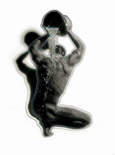
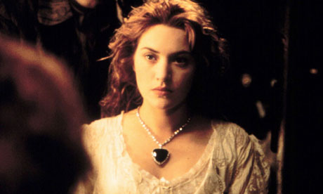
I have chosen the Waterman Brooch from the series, combining a postcard of a Bruce Weber image with the diamond ring of the commissioner. Bakker bought the image as a postcard from a secondhand store in New Orleans, then embellished it with white gold and diamonds that resemble water droplets flowing from the bucket down the model’s muscular back. The movement and elegance in the original image was heightened by the placement of the gemstones. Bakker eventually created two additional brooches using the same image; one is in the collection of the Stedelijk Museum ’s-Hertogenbosch, the other in a private collection.

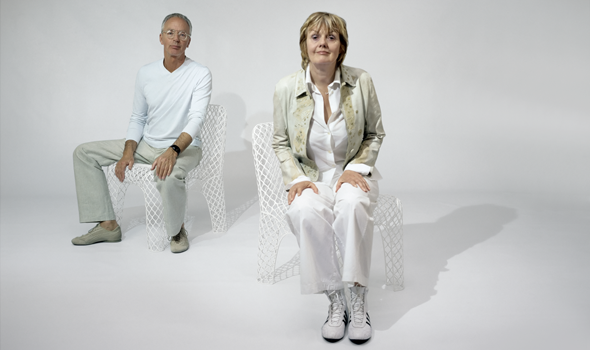
Gijs Bakker (1942) is a Dutch jewerly and industrial-designer, educated at the Gerrit Rietveld Academie and the Konstfack Skolan in Stockholm. Over the years, he has taught at various European art academies and worked on numerous commercial collaborations, creating everything from furniture through jewelry to public spaces. In 1985, Bakker began to use easily available and recognizable images of popular figures for his Sports figure series.

Passing by these items in the museum has made me doubtful about if it’s serious or some sort of joke ending up in the kitschy result. I’ve found this contradictional impression interesting enough to deal with it a bit further.

But what is jewellery’s role in our modern and future lives?

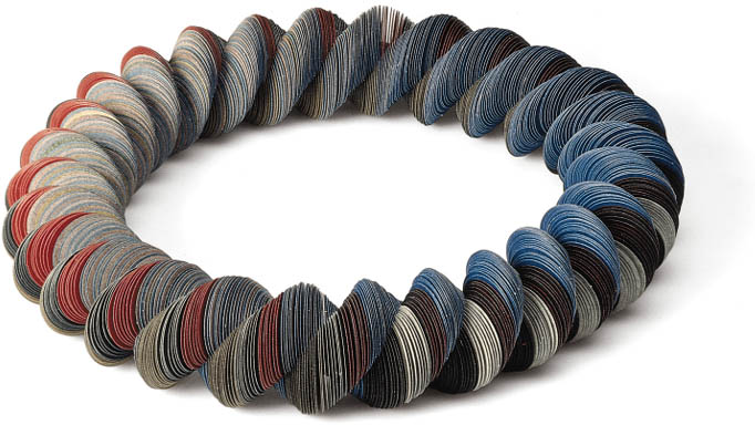
In the late 1960s, Gijs Bakker and Emmy Van Leersum, created a furor with their avant-garde jewelry and clothing that fused fashion, design, and art. They were the first to make minimal jewelry out of unorthodox materials, such as aluminum and plexiglas. The pair set of a real revolution in jewelry design. Bakker and Van Leersum’s breakthrough came in 1967 when they presented their vision of a total concept of fashion and jewelry with a spectacular show at the Stedelijk Museum Amsterdam. It was a provocation after which jewelery totally changed,especially on the subject of the concept of beauty and functionality.


MS04foto_matthijs schrofer_lowres


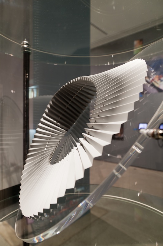
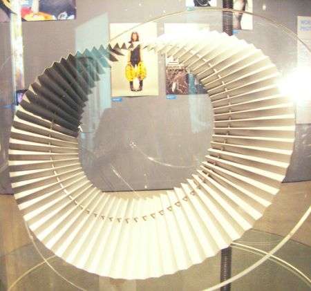
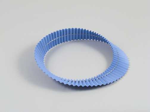
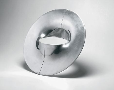
The most famous item of jewelry featured in the show is undoubtedly Bakker’s Stovepipe Necklace (with matching bracelet), now an icon of Dutch design. Bakker was the first designer to create a piece of jewelry of such audacity and on such a scale. It was a provocation.


The-Gijs-and-Emmy-Spectacle-exhibition-at-the-Stedelijk-Museum_dezeen_3


3.1999-K80249(A-C)A


https://vimeo.com/89612291

Afterwards his role in dutch jewelry design became really important in Holland, it changed the view on jewelry.


In 1993 he founded Droog Design, a Dutch collective of designers, products and information, together with design critic and historian Renny Ramakers. Together with Ramakers, Bakker was the selector and art director of all products within Droog. Droog works with independent designers to design and realize products, projects, exhibitions and events. During the Milan Furniture Fair in 1993, the duo presented a selection of sober designs made of industrial materials and found objects. The presentation was titled ‘Droog Design’, because of the simplicity and dry humor of the objects. The Droog collection is curated by Renny Ramakers and consists of around 200 products by more than a hundred designers. New designs are often developed and presented in relation with exhibitions “Saved by Droog” is an element of Droog design that buys up stock and transforms it into something completely new with a distinct voice and purpose. It’s more than sustainable design; it’s a “reflection of the designer’s creativity.

image.php

droog design [x]

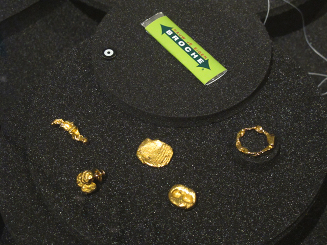
In current design projects Bakker investigates the relation between craft and design. Since 2009, he is exploring this theme in his role as creative director for HAN Gallery, formerly known as Yii in Taiwan.His new series ‘Go for Gold’ emphasizes the importance of gold in the competitive world of sports, business and politics. By laser-welding gold on titanium or by laser-cutting gold under titanium, the brooches literally go for gold.


 „I am watching football in the same way as I am watching ballet”


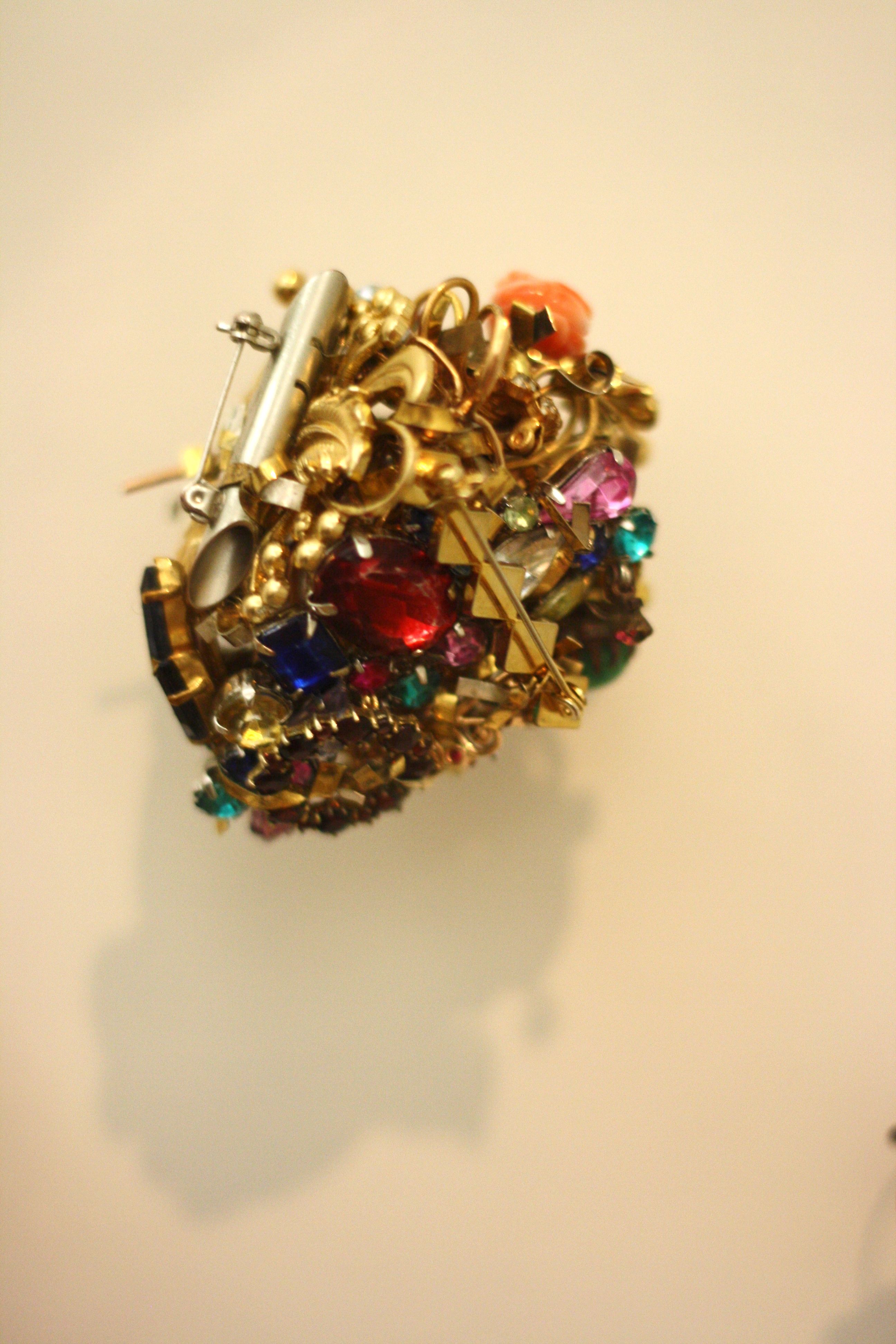
The Sport figures series used copies of images from various newspapers of athletes in track along with contrasting, valuable materials like gold for example – to emphasize and highlight a particular moment. The practice of this clash of substances ends up in a playful tension that comes from having precious gems combined with an everyday object, bringing focus (or questioning) the borderline between „cheap” and „expensive” materials.

Does the use of valuable material makes something a jewelry (as the commissioner ask for it) or does it become a design piece driven by the vision of the maker himself?

Since he was fluently shifting through content, character, and medium it makes it hard to categorize the Sports figure series. Visual references from sports, automotive, and history are imbued with a trademark postmodern stance: sarcastic, ironic, and unsubtly nonconforming.

All of the works demonstrate his unconventional relationship with his discipline, as Bakker once admitted, „I dislike jewelry. I dislike the behavior of jewelry buying ladies. I dislike ladies jewelry. jewelry shops depress me. if jewelry is only decorative, I lose interest. I like jewelry because it is absolutely superfluous. I like jewelry because it is never a prior functional. I like jewelry because like clothes, it is closest to our body and says something about the wearer. a painting is hung on the wall and can be ignored. a piece of jewelry is worn and creates an impression.”


timthumb.php


For the first look the Waterman seemed for me like objects what you find in shops selling useless stuff for tourist, ranging the weirdest combinations of taste and culture.  Yet Bakker’s main approach was driven by the concept over the final product. So instead of the craftmanship’s usual categories, he tried to focus on the driving thought behind the piece, which in this case was the clash of materials, a surprising marriage between the every dayness of the paper cut picture and the stones. For me, this piece is still about the beauty itself (like all jewellery), just inviting a rather unusual form of it, at least within this field. But picking athletes somehow still tells about the beauty, so this piece becomes a celebration of the natural born beauty, combined and emphasized by the diamonds, which becomes a secondary tool for this purpose rather then the main „attraction” or message of the work. Like if it would pass it’s shine to the photo itself.

Yet I think that next to all the importance of conceptual approach, the visual and applied design principle shouldn’t be left behind too much, especially in an originally and historically applied discipline like jewellery. I feel that it’s just not the right tool or way to mediate such a message. Let’s be honest, a jewel is made for wearing, but who would walk around in a piece like Waterman?


HEAD JEWELRY


Monday, December 1, 2014

Vaclav Cigler is a czech artist mostly known for his pioneering work in glass. Since the 1950s, Cigler has focused on glass sculpture and is still today considered as one of the preeminent artists working in glass. My interest in his work though did not develop from one of his glass sculptures but from an image of a mannequin head wearing a mysterious head jewelry exhibited in Stedelijk Museum.

Head Jewelry by Václav Cigler[x]

The jewelry consists of two galvanised brass circles put together, one that is fitting the circumference of the head and one attached to the other and placed in front of the face. The placing of the circle in front of the face affects the vision of the person wearing the jewelry. It becomes a frame through which the person watch the surroundings and in that way it changes and disturbs the perception. Furthermore the circled brass acts like mirrors: when angled, it gives the wearer a view of the room or of the people around which allows the possibility of intimate eye contact or covert observation. Imagining a lot of people walking around with this jewelry in the context of today it easily could be considered as some sort of electronic device attached to the head with a chip improving human possibilities. Or it could be a future, simplified version of virtual reality glasses having an invisible screen circled around the head. Especially the aspect of the mirror in the circle makes it relatable to virtual reality where the people around and the room then adapts into the screen of the virtual reality so it becomes this interaction between physical- and virtual reality.

When looking through some of Cigler’s work in glass it becomes clear that he is very interested in the human perception. That is also one of the reasons for his consistent interest in the work with glass because it is possible to create a new and different vision in that medium.

“…Glass is the most imaginative material that man has ever created. The presence of glass in a human space conditions not only the space itself but also an as the user. Glass is for me a pretext for expressing a different spatial and emotional perception of the world. A perception made unique by the optical means offered by this material, as well as by the new possibilities for using it in space… in glass, there’s the authenticity of the material, the discovery that it has uncommon optical and material properties, such as malleability. Glass by itself is a sufficient source of inspiration.”

Vane 2008 by Václav Cigler [x]

The sculpture “Vane” made in 2009 is an optical glass with an aperture in the center that gives an undistorted view of the landscape. A new visual perspective is given and what is seen is a collage space of reality.

In 1960 the phrase “Cyborg” was coined in a story called “Cyborgs and Space” and was used to describe a human being augmented with technological attachments which I find very interesting to put in relation with Cigler’s Head Jewelry. Manfred Clynes, being the inventor of the word cyborg, considered it as more human which is a contradiction to how it is generally perceived as something inhuman. But there is something interesting towards understanding or maybe even accepting a direct interaction between organisms and technology in order to enlarge the human experience.

You can question the definition of a cyborg and maybe this is also what Clynes is already pointing out; are all humans cyborgs? We do include both organic and inorganic subsystems. Inorganic systems being for instance prosthetic limbs or vaccinations that program the immune system in our bodies. At least it could be argued that we are living a cyborgian existence. A cyborg society has developed where the connection between organic and machine systems is extremely complex and inescapable.

A more direct example of a cyborg, or maybe as direct as most people would understand the definition of a cyborg, is Neil Harbisson. He is even considered to be the world’s first cyborg with an antenna attached to the back of his skull dangling over his forehead very similar to the shape of the head jewelry. Harbisson sees in grayscale but the antenna allows him to hear the color spectrum, even the colors that are beyond the range of human sight.

Neil_Harbisson_cyborgist

Neil Harbinsson[x]

He considers his decision of becoming a cyborg as an artistic statement: “I’m treating my own body and brain as a sculpture”. He is working with human perception using his own body as medium whereas Cigler uses glass to create different perceptions. Moreover, Cigler viewed jewelry as landscape for the human body as a means of connecting the body with its environment. Harbisson is literary connected with his surroundings by having the antenna which he considers just as much a part of him as any other organ or body part. Aesthetically the two objects, Head Jewelry and Eyeborg (what Harbisson calls his antenna), look very alike with their minimalistic characteristic but also their function has a lot in common if not considering the advanced technological aspect of the Eyeborg. What is interesting is how much an object can become a part of a human being and if it is really possible to not consider it as an object but as an organ. This also leads back to an acceptance of this cyborgian society that is already a reality. If a person got used to wearing the head-jewelry and seeing the surroundings through it, that is, having extra angles and the capability of observing secretly would this jewelry then also be thought of as a body part?

Stedelijk Design Show 2015 /Relevant Highlights


Monday, December 1, 2014


16 Rietveld Basic Year students visited the Amsterdam Stedelijk Museum to examine the items in the permanent survey of the design collection.

Does the Stedelijk exhibit all these design items simply because they are in their depot.

Do the collection criteria still have any significance today.

Do these design items have any relevance for us, our life or work,now? Is it possible to make a clear statement about that.

If you click on the image a caption will appear –just as a in a real museum– presenting information and a personal reflection on why that item is considered relevant. You can review the whole exhibition in pop-up mode.


click on images to visit the exhibit

Gijs_Bakker_Waterman_2_Cropped

modelWieke_stool_SM

PatrickJouinWelcome-To-The-StoreBeowatch_SM2

tafel-stoelunfolded

DSC_0321 Schuitema_300

superstudio_gherpe_flippedVaclavCigler_headband

cow-chair_flipped Paulina_glass


Are you the clothes you wear?


Wednesday, November 26, 2014

Every morning when I dress for school, I’m in doubt. I put something on and it’s again the same. I have a couple of outfits I wear a lot and that make me feel safe. Though, everytime I doubt whether it’s good enough. I’m in a school that calls itself an art school and it doesn’t feel like I’m a typical person that belongs in an art school, even though I don’t know if that kind of a person exists. Because of that I feel like I have to proof myself, as if I have to pretend that I’m someone else, wearing clothes that suit art school, but that suit don’t me. I feel too normal, too average, too ‘different’. Too boring. Even when the clothes I wear I really like and I feel comfortable in.

The strange thing is: there isn’t something like a dresscode for an art academy. Everyone wears what they like or what makes them feel good. So no one cares what you’re wearing. Although it feels like everyone has their own unique style, different from everyone, and maybe that could be the dresscode. Being as unique as possible. And if you see it like this, maybe I do fit in.

For me this proves that your identity is for a big part in the hands of the clothes you wear, prejudices exist and people pretend that they know who you are. You can deny that it is like this, and I’m sure that came across your mind, but I think everyone realizes that this is true. Even when you don’t really care about fashion or clothing, it says something about who you are, about your identity. It expresses your culture or subculture. The group you belong to. Fashion is the easiest way to express, to make a statement. And we do, all of us.


captura-de-tela-2012-10-22-c3a0s-09-02-0106-beyondthebody-publication

Beyond the Body, a perception of appearance and identity : video and publication 2012

Imme van der Haak is an artist who takes identity as an starting point. She says that fashion is, for her, the way to form your identity, to show yourself. But also and mostly to try and be someone else and experience how that is, to step in someones skin and mind. In that way you can undergo an metamorphosis and your clothes can function as an cocoon where in you can undergo that metamorphosis. Also without clothes there is an identity, in scars, hair, birthmarks and surgical adjustments. Our body is an product of nature and a product of science. There are tons of possibilities to give our body a certain form. In the end she says that even without clothes, fashion influences our body. This can come out in tattoos, piercings, the way we cut our hair, but also in the edit on photographs in fashion.


imme-van-der-haak

Configurations : Jewelry 2010

She makes works about changing the form of the body. This is shown the best in her work Elastic Mind, where she deforms her face and body with several tools, like elastics, balloons, tights, hairpins and treads. By this she does research to the form of the body, and tries to find new forms, that are not so normal but can be beautiful in a way. It was a research for a jewelry line she made, with really innovative and new jewelry. Also in her video work “Beyond the Body” shown in the exhibition The Future of Fashion is Now, a really beautiful and emotional video is shown, that makes us think about our own identity and how we express that. In the video two people are shown, covered by a transparent piece of fabric with the body of someone else printed on it, and by that they are given a second identity. The shape of the body changes because of the fabric and the picture, which is interesting and typical for Imme, like I said.

untitled-1_v7untitled-3_v2

Elastic Mind : publication 2010


Another artist that works with deformation of the body as a research for defining identity is Jeanne Dunning. She did kind of similar things, like putting balloons under clothing and creating extra bodyparts, which you can compare to Imme’s work in the video, because there you see two people at a time and by that sometimes there are more arms or legs. She creates surrealistic images as a result, not as a research like Imme does.

8fd0a8be

Jeanne Dunning : in bed 2004

I think it’s an interesting subject to think about how easily you can change the way you look and by that your identity. You will be the same person from the inside, but a lot changes by how other people see you or how your look makes you feel. It’s something we are busy with everyday.


1-2-3-:^)


Saturday, April 5, 2014

ppp1


Jumping around through these images in Designblog,

back to essay this title ‘1-2-3 Jewel’ caught my eyes.

An essay about jewelry? Cool, lets check out.

Not only its pretty graphic design and pinky pinky makes you happy, the content is really good.

For me hand made jewelry is unique, you can feel so much more than mass manufactured accessories.

And it’s always a great gift option for special occasions.

It’s so nice to read about the graduates, after spending so much time in Rietveld and staying in the Jewelry department.

What is their understandings or maybe personal relationships and reflection on jewelry.

To see how they find their own way through different approaches, experiments and observations,

finally to see where they are standing now.


ppp2


Are you an artist or a craftsman?

Are you making wearable jewelry or object for contemplation?

Does it matter? Does it not matter?

Sometimes I pass their department several times a day when I have to go to workshops,

then I start to guess how many people are working there on their table now:

Glue, hammer, burn, bang bang.

Pretty in color and form. Another jewelry is born.


ffff


The London Supplementary Design Show


Friday, November 1, 2013


< LONDON DESIGN >


< CAREFULLY SELECTED FOR YOU >


17 Rietveld Foundation Year students visited London in the first week of October 2013 where they composed their own London collection of design highlights.

Items were selected from the collections of many renown institutes like the British museum, Victoria & Albert, The Design museum, Off-site ICA or galleries (The White Chapel, Ravenrow etc…..). What is interesting for us? What do we like and why.

Previous to this trip we did visit the permanent design presentation in the Amsterdam Stedelijkmuseum. Compared to the items we selected and researched there [project: Design in the Stedelijk-3], this show presents a personal comparison between that and those of the London institutes.

If you click on them a caption will appear –just as a in a real museum– presenting information and a personal reflection on why that item was selected.
Researching contemporary design we present this “The London Supplementary Design Show” as a mirror of our own selection motives, an imaginary online exhibition space with items carefully selected for you.

click on images to visit the exhibit


Spira-Ribb Westwood_T-shirt

no_angle_no_poise_tiagodafonseca_2 ChloeMeineck_music-memory-box GatewayRouter_redu

8_snow_white_wrist_redubrave-new-world-lamp_1helmet_cropped

Samoerai-armor Sottsas_London_Item_LeftSottsas_London_Item_Right RavenRow_poster_tadanori-yokoo

MarjorieSchick material 3d printer

selected by Wiebe Bouwsema WillyBrown_redu TrojanColumn_VAA G_Force_Cyclonic_James_Dyson


A Completely New Shape


Thursday, September 26, 2013

Starting Point – Ted Noten “Chew your own Brooch”

Chew your own Brooch is a project by the Dutch designer Ted Noten, who is known for his jewellery and bag designs. It was started in the late 90‘s in the Boijmans van Beuningen Museum in Rotterdam, where visitors were asked to sculpt their own brooch with a piece of chewing gum which was afterwards cast in either gold or silver.

brooch

At first I could not see the connection between the golden shapes and the chewing gum above, still wrapped in its paper. The package was designed to resemble a regular chewing gum which seems to emphasise the close relationship between design and commerciality.

Having a concept for making own designs which is accessible to a wide range of people is a valuable thing. It enables somebody to adjust and shape a product instead of making use of a pre-designed model which may not be as suitable to an individual‘s needs but is more representing a general trend.

Even though mass-designs have their perks, people have always been striving for individuality – and they still struggle to find ways of expressing their ideas. Opportunities like Ted Noten‘s Chew your own Brooch are therefore a great enrichment to the world of design.

The beauty of this concept lies in the idea of creating completely new shapes by using everyday products. If the common purpose of an object is being put aside, new ways of applying its materiality and construction can be discovered.
To me looking at everyday objects without bias becomes more and more important since I realised that too many doors are being closed by focussing too much on what something already is instead of all the things it could be.

Taking this project as a starting point I want to investigate more on “new shapes”.


Experiment – Creating New Shapes

One way of creating a new shape is to exchange an objects material and see what it does to it‘s shape.


cup1 cup2 cup3 cup4

Ceramic to Chewinggum (aprox. 60 pieces) 

In this case what hapens is, that the reproduction does not want to stay in the original shape. The softness of the chewinggum allows the cup to collaps as time passes which leads to a unfunctional, and yet new shape.


elastic

Elastic to Polyurethanium

Something very different happens if you replace a strechy material with a solid one: the reproduction breaks into sections, creating different pieces with individual shapes. It almost seems as if by changing the material, the object has been dissected and therefore can be looked at from new angles.


plastic

Plastic to Polyurethanium

The original shape is almost not visible in the reproduction which, with its massive and clumpy look, is quite the opposite of transparency and lightness.


Another way of making new shapes it to detach the process of creation from personal intentions or standardized movements that were learned before and to use the element of chance.

This has been done by many artists and also musicians (John Cage, “Number 14” and “Indeterminacy)

Simple elements could be the use of dice or outer influences like nature or spontaneous reactions of people.


What does a new Shape bring?

Art World

There are several examples from the Art World where the replacement of an object‘s material leads to a dysfunctional reproduction. In the case of Claes Oldenburg‘s Soft Toilet creating an „anti-sculpture“ or an „anti-object“ was the aim, functionality did not play a role. Also Ted Noten changed an everyday object like a bag into something which cannot be used in the classical sense but is being used as a transmitter of a message or opinion.


Nature

Shapes constantly change in nature, everything is shifting, adapting, evolving, it is all about survival and therefore must be functional.

In colder regions of the world, animals have a different surface-to-volume ratio than animals living in a warm climate, meaning that the size of their extremities and the compactness of their body depends on external influences. Compared to a regular Fox, a Fennec has extremely big ears which enlarge his body surface in order to lose more heat. Even though both animals derive from the same family, the shapes of their bodies changed due to different needs.


New Shapes as Solutions

In the end, whether it is making a statement, forwarding a message or personal view, adapting to new circumstances or improving a present situation, it is always about a problem that requires a solution which can be found in a different shape through evolution, reflection or experimenting.


Brooch : Absence, Function & Contemporary Jewellery Practice


Thursday, August 29, 2013


he-jing-brooch-2013-7


My graduation work called ‘Brooch’ stems from my study in structure of brooches and daily objects. I am interested in the relationship of forms and functions in mass productions; how the form appeared because of function but not only aesthetic. I was wondering how they work and how people use or misuse them. During the research I questioned what jewelry can be and its characters, and compared jewelry with other ready-mades [x].
My practice has combined these daily objects with jewelry, focussing on the tensions between “sense and nonsense, “usefulness and uselessness”. I was observing every details of the objects, and in the mean time, I was observing my reactions to them. I saw my works as results but not answers of this process, which included remaking, testing, running, repeating and failing.
I take jewelry as a way of asking questions instead of giving answers, I hope people wear my works and question them, maybe even misuse them, or be questioned by others.


brooch8
Brooch by Jing He /photography DAN/NAD


My practice on jewelry is focused on the relationship of the human body and daily objects. I questioned what jewelry can be and its characters, observing and experiencing the function of objects, and comparing them with jewelry. The central interests in this are tensions between ‘sense and nonsense’, ‘usefulness and uselessness’. What I did was to focus first on the structure of mass produced products; how the form appeared because of the function and not he aesthetic. Then I explored how jewelry, as part of people’s daily life, resides at the edge of usefulness and uselessness/function and aesthetic, analyzing the special character and dilemma of jewelry makers. Finally I related my findings to the practice of the contemporary jewelry field.


post_card_2clean


In Chapter 1, I mainly referred to the philosophy of Laozi and Martin Heidegger: the absence and function of objects, the different structures and usages between jewelry with other practical objects.
From Heidegger’s essay ‘The Thing'[x], I found the handle of his example of the jug interesting. In my opinion, the character of the jug’s handle has similarities with jewelry. In addition, I described and questioned my own jewelry practice, and how I discovered “absence”.
In Chapter 2, I studied similarities and differences of the jug handle and jewelry. In the contemporary jewelry field, I provided examples, referred to Jacques Derrida’s idea of supplement, and questioning the meaning of jewelry.
Jewelry is not only about the creation process but also the viewing experience, thus in Chapter 3, I compared paintings from ancient China and Italy, and discovered a new way of viewing image and jewelry. I proposed the idea that jewelry is seen out of the corner of once’s eyes.
In the end, I refocused on the absence of objects, and added how people misuses daily objects, and a few pieces of art. I believe that jewelry making can originate in the idea of combining different absence parts from objects.

text by Jing He [graduate student department of Jewelery] he-jing.com


Pdf-icon Download my thesis: ”Absence, Function and Contemporary Jewellery Practice“
 

An infinite loop


Sunday, March 10, 2013

 halssieraad, Paul Derrez. 1982

Jewellery is mainly recognised by its symbolic and stereotypical image. This category is limited by the size, flexibility and wearability to mass market towards wider audiences. For long time jewelleries were symbolizing affluence, importance and preciousness, in the value carried by this word. Then the decade of the sixties, seventies set a new stage, without limits for jewellery design. The category of “art jewellery” appeared and new directions were taken. The traditional structure is then broken done, permitting freedom regarding the form, material, technique and production. Still the relation between the body and jewellery is getting the most out of boundaries. In this context I want to present Paul Derrez’s creation, halssieraad.

The piece is created in 1982, as part of collection of necklaces with pleated material, there are versions in different colors, red, grey, white, blue, black, so there were more, but grey was ‘one of the best’ as mentioned by the author. He made in total around ten, in different colors, maybe three grey, as the one exhibited at the Steddelijk museum.

When I interviewed Derrez, about the creation of halssieraad, he said that this work was

the end results of a period I was involved with pleating material. First I made a silver pleat from which I made earrings, brochures, smaller items, but by using that pleated, thin, plastic sheet, which is cheaper and easier to get, I could have bigger objects.”   

The weight was also important so the necklace is the product of experimenting with these materials and producing the so called Mobiusm necklaces. The Mobius shape represents a never ending plane . Over time, it became the accepted symbol for infinity. 

Paul Derrez’s interest in design is mainly connected to jewellery, not only in his work but also in his collection and research. He is a productive author and the founder of the gallery Ra opened in 1976 which for him is his main priority. In 2005, he wrote one of the essay in “new direction in jewellery”

Derrez prefers to work with pure and robust forms which are likely to give monumental effect even if his work is relatively small. He sees his pieces as a wearable sculpture and give an important place to the relation between object and body and also to the relation with the space.

It’s via research and mostly experimentation that he is developing his work and it’s a reaction toward a wide range of conclusions and results. It permits for him to look for new meaning, language form and new aesthetic. This symbolic importance appears a lot with his work “pills”, 1986, associated to drug abuse. . In the collections shown in Ra there is this passion for transient material. In his work as well the material experimentation show how it emphasis ideas. It has a Mobius space when you have a strip and you glue it and then you turn it together then it becomes a continuing line and this is halsieraad. Also in fact the plastic strip and also has a twist which is the Mobius principle, because it is also a necklace, it makes it even more infinite. I needed the pleating to make it work. There is a stainless steel wire in it, to fix it; the wire is just a circle.

In the other hand, even if his jewellery tends to stand as a sculpture by itself, he is defining and limiting a jewellery only if «it can be worn by a human being and is a thing » but « this aspect of ‘wearing’ can either be done easily or with difficulty ».

Then I asked about the relationship between the body and the object?

Due to the size, ‘it is almost more of a collar than a necklace’. The historical example is seen in old Dutch paintings of collars (those are made of textile) they are the same large size, making the person who wears them feel important. This is a similar piece, as described by its maker halssieraad ‘is quite theatrical, it is as if for a theatrical performance.’ In the 70’s it was all about size and material experimenting, when it came to jewelry, but also how it relates to the body. 

From my point of view, standing first as a sculpture and then as a necklace, I used two opposite ways to analyze halssieraad. This contrast made it interesting to understand the piece itself but also how Paul Derrez is approaching his work.

The first visual sensation I got from the work had both an architectural and sculptural impact. Therefore, it was the main reason for my selection of halssieraad. I have not perceived it only as a designed or useful object.

This work of Derrez gave me a sense of a complete control and true understanding of form and material. The shape is minimalist, recurrent and with the use of uniform plastic the collar appears as a light structure. When gathering my own perception of the work and forced by my understanding of an infinite loop and continuous movement in the object, the necklace gave me a meditative and hypnotic feeling.

The sensation and impression that the collar triggered in me is most often created by work that is impressive in size. I could feel the monumental effect that Derrez seeks to activate with a smaller size restricted by the jewellery.

The relation between halssieraad to the body and then to the space is also an important part of my interest in the object.


Thinking about it as a necklace to be worn is not appealing for me. The way it has to be positioned on the body by surrounding not only the neck but also the top part of the body and the contact of the material to the skin seem to me disturbing, irritating and disruptive. The piece gave me also a feeling similar to a fence which is creating a distance between the body and external interaction or even the space, yet after the interview I managed to support my views of the object’s use to create a sense of superiority and importance.


 Via Paul Derrez’s writing about Niel Linssen, I discovered her work. What I really found interesting is how I could connect my feeling from the necklace to the way that Derrez is speaking about her work. I associate the two artists because there is also with Linssen this experimentation for material, form and structure. And like Paul Derrez said: there is in her work this “determines form and direction” that I felt with Halssieraad.

Therefore I asked if there is any relationship between your work and Neil Linssen?

I have a different veto. I am a gallery owner and maker and by promoting, writing about and sponsoring, so I represent her artwork here, but there is no connection. She has a continuing line of research on a material and technique. While I work in themes, in groups of work and then I move on to something else, so I do not have this lifelong study of material, and her work is not connected to mine.’

chewing gum became a jewellery


Saturday, November 24, 2012

I went to the design highlght exhibition of the Stedelijk Museum, there was a lot of design. For example, chairs, textiles, jewellery, lamps, graphics, books etc. Suddenly one small piece of jewellery made me stare for a while. It was Ted Noten’s work which was “Chew your own brooch” 1998. For me his work was visually intriguing compared to the others. Particularly as I’m interested myself in making different things. For instance, clothes that I don’t usually wear. I even collect recycled things in order to rework them. So it reminds me of my interests and that is the reason I’ve chosen his work.

Ted Noten is one of the most influential Dutch jewellery designers working in the Netherlands today [x]. He is known his solid acrylic handbags and a little mouse necklace and brooch which I’ve seen it. When I saw this brooch (chew your own brooch) I thought that it just represented a chewing gum. Unexpectedly, after I research his work, it wasn’t that what I expected. According to him “ I got fascinated by the stains on the streets made by chewing gum that has been spat out. People either look for holes in the pavement to get rid off their gum, or they approach a building and spit it out on the steps before entering. These are places where the density of stains clearly thickens. It made me consider the relevance of such observations to my work as a jewellery maker”.


I was quite impressed and shocked, how he was inspired by stains on the streets made by chewing gum and I simply thought that ideas are always close to your environment as he observed by street. Basically, the process is that he provided you with a piece [X] of gum and then you start out with a thin strip of chewing gum; you chew it into a ball and then the process of shaping and re-shaping starts until it ends.

X] would be delivered to you by post. It’s fantastic to see how the designs become a brooch and each has its own personality of the chewer. This project connects the designer’s role and the role given to the audience.

What is the chewing gum? Basically, Chewing gum is a type of gum made of chicle, a natural latex product, or synthetic rubber known as polyisobutylene. Most chewing gums are considered polymers and they have different types of tasty but after a certain time the tasty always disappears and than you rid off it from your mouth. In my perspective, the chewing gum reminds me of the disposable society and relationship situations. For example, when we need it we spend time with it and after when it no longer necessary we unsparingly abandon it. I was curious Ted Noten thinks the same way with those chewing gums. I read an article about him, which described Ted Noten’s design act as a critique on contemporary life and on the history of jewellery, as well as on the wider context of product design. An interesting part of his work is to challenge convention.

When I looked up other work which he is known for, acrylic cast featuring a little mouse, it reminds me of one of English conceptual artists Damien Hirst. He became famous with a series of artworks in which he presents dead animals. Actually I’ve seen his work in Tate modern in London.

He displayed “The Physical Impossibility of Death in the Mind of Someone Living,” a 14-foot-long glass tank with a shark preserved in formaldehyde. Also he made “spin paintings” created on a spinning circular surface, which are randomly colored circles created by his assistants. It was a slightly different approach compare to Ted Noten. Hirst’s work investigates and challenges our contemporary belief systems. Even if they differ in  approach I found that Damien Hirst and Ted Noten are interacting with the audiences and both their work has a strong symbolic statement in it.

A bunch.


Monday, November 19, 2012

For this research I have chosen a brooch made by Manfred Nisslmüller [x] which is currently being shown in the design exhibition at the Stedelijk Museum, and is a part of their own collection.

Here you can see it on the Stedelijk webside.

Manfred Nisslmüller studied goldsmithing but his work is maybe better suited under the category of visual art than design. Jewelry is still the main focus of his work but now he looks at it from a different view. He investigates and raises questions about the media but wearability is not one of his main considerations. For example, in this work below he uses graphite to make a brooch, ring and a bracelet. But since it is made out of this unusual material the items are way too heavy to be worn.

Let’s turn back to the brooch. What I see at first is not only a brooch like the title suggests, but a bunch of brooches. It is like looking into my own jewelry box at home, all in a mess. A fusion too complicated to untangle before going out so instead of wearing it I let it lie there for ages just to tangle up even more.
But I like the idea of wearing all of your brooches at once. Why only chose one? It seems only to occur to me to wear one piece at a time or at least only a few but never the whole pile. Am I just bragging if I wear my whole collection at once? Is it the same to actually wear the collection tidily placed side by side like an award winning officer or wear it randomly twisted together like trash in the wind. How does the value of a piece of jewelry change by it’s contact with other pieces?

I really like this question of value. This brooch is a mixture of various brooches, cheap junk you could find in a 1 euro shop along with precious metals with natural stones. Somehow, when they get mixed up in a pile like that the value becomes unimportant and not visible. I like the idea of these jewelry becoming equal and becoming one. Their value is equally divided. But does this brooch have less value than one of the fancier brooches incorporated in it, if worn on its own? Is less more or is more less?

Perhaps, in the end the effect is exactly the same.
Jewelry is something made to decorate, to adorn. That is a fact closely examined by Nisslmuller in his work. He investigates the role of jewelry and the word jewelry on it’s own. He has been dancing on the line between jewelry design and visual arts throughout his whole career, constantly becoming more conceptual as he continues to question the media of jewelry making and wearability becomes less and less important.
To him the looks of jewelry, their beauty or ugliness, doesn’t matter that much. The purpose is always the same and it is always accomplished. To him a piece of jewelry can be an object, a situation or a feeling but they all obey the same basic rules – they all adorn.

In 1984 he presented these two suggestions for pieces of jewelry that I really like:

A) Spray both ears with fluorescent lacquer and whistle a melody in intervals.

B) One hears the word “BROOCH” repeated softly from a cassette recorder worn concealed on the body.

As you can see from these two examples his definition of jewelry is very broad. I think he really brings us back to the core of this ancient tradition and keeps on investigating it and questioning it into the infinite.

Manfred Nisslmuller was born in the year 1940 in Wien where he still lives and works. He published a book about his ideas about jewelry called “Uber (und) Schmuck” In which I got my main information about his works and thoughts. This book along with a couple of other books and newspaper articles on Manfred and his work can be found at the Stedelijk Museum library.

Here you can see their website [Stedelijk Museum Amsterdam].

Ted Noten’s jewelry piece “A split before imploding”


Sunday, November 18, 2012

Ted Noten (born in 1956) is a Dutch jewellery designer and conceptual artist. His is known for his work of making acrylic handbags containing various symbolic items like stuffed mouse, guns, and fishes.

I choose Ted Noten design, “A split before imploding ” which is one of 6 “jewelry bags” together called “limited edition” from 2007, from. “A split before imploding” is a 30-kilo trolley bag made out of solid acrylic and carries only one item, a trapped perfume bottle (named Flower bomb) made by two fashion designers Viktor and Rolf.

Ted Noten wants to deconstruct our preconceptions of jewelry and wanted to show how jewelry also can be implemented, without connecting it physical to the body. Ted Noten tells us that the trolley bag is a statement of “status and showing off” ….“The Fashion and jewelry worlds are absurd this bag’s 30 kilos -it would be ridiculous to carry”. The artist Marjan Boot also comments that the piece has a commentary toward predominant rise of wealth and the fear of robbery an it being in a trolley bag, tells something about the increased safety in airports and the fear for terror.

I find Ted Noten’s “A split before imploding” interesting because of the visual design itself and the concept of the perfume bottle. This aesthetic of sealed beauty locked-in forever by impervious walls, tells a story about an idea of perfect beauty never to be introduced to the spotted and imperfect world.

Limited edition

The trolley bag is accompany by 5 others jewelry bag in the series Limited edition. They all bear the same “inaccessible” construction of an item being behind a thick layer of acrylic. (a gun, fish etc.)

In Ted Noten’s work you often find some form of rebelliousness when it comes to him and his costumes. I find in his work “Pig bracelet” he made a golden bracelet with a small pig figure wearing a necklace. Giving the nature of this, being jewelry and highly expensive. one must assume that his costumers must have a reasonably good income. Having this in mind and seeing a pig wearing a necklace could indicate an ironic commentary toward his buyers as “rich greedy old woman” who are looking for beauty in all the wrong places.

I would refer this statement also with the trolley. People buying a 30-kilo jewelry trolley with no practical means, could tell a story about the absurdity Ted Noten is trying to reveal.

It seems that Ted Noten is often trying to bring forward the ugliness of mankind and then beautifully wrapping it in cellophane. You can see it in several of his works,  like “Be nice to her, buy her a ring” a project in which clients to the red light district could buy a ring for 2.50 to give to a prostitutes and then hopefully a more respectable relationship between client and prostitute could be established.
This is also seen in “limited edition” where one of the jewelry bags is a real gun inserted in acrylic and the cast like a schoolbag.
This lethal gun represents the dark side of mankind’s destructive behavior and selfish power. But when covered in clear acrylic it distances itself from the lethal projection and becomes a symbol of raw power.

His solid acrylic bag resembles a work I did a couple of years ago. I made out of 500 kg ballistic gel, 2 square boxes containing a flower and a number of bullets shoot in from the side.

In my ballistic gel art piece. I’m trying to show the true competition that takes place during human conception. This is the competition for life. More the over 100.000 sperm fight for their ability to live on, but only one is allowed in, to fertilizer the egg.

The gel is a tissue that to some extends resembles the soft environment that this conception is surrender of, but the gel creates an unbreakable and time free zone where nothing is allowed in.

Also in Ted Noten’s work where this perfume bottles is captured in time and out of reach for anybody outside the hard visible box. I see him as an artist trying to tell a story of his surroundings either if it’s a mouse with a pearl necklace (Turbo princess 1995) or a giant bottle of perfume locked in acrylic. There is always of story about how we human most live with ugliness and beauty side by side.

Golden Encounter


Monday, October 22, 2012

[publication of graduation essay by Richard Elenbaas 2012

Richard Elenbaas is interested in how value is created. He adds ideas to objects to create something valuable, but what is value these days in a time where most of the values are virtual? In the field of jewellery the theme of value is always present. A lot of times jewellery is valuable or bears a valuable meaning.

His work is based on topics that trouble all of us: newspapers filled with articles about the “crisis” and the degrading of the “euro”. As a jewellery maker he takes these themes to create work about “value”. The aim is to create connective possibilities to this theme and make suggestions.

Interested in symbols of value like gold and money, it seems this is all that matters today. So he try to triggers people with the seduction of interaction; to make them become part of the work and create value and social relations.
 
  Download thesis: Jewellery is a State of Encounter

[images of Richard Elenbaas's graduation show


“1-2-3 Jewel”


Monday, March 5, 2012

As part of the final exams and graduation show 2011, the Jewelry department of the Gerrit Rietveld Academie “Het Sieraad” published a wonderful triptych.
A successful effort to put the work of the 8 graduating students in broader perspective.

This triptych consists out of 3 layers in which the students present
1] their visual inspiration material, 2] parts of their theses in relation to the works, 3] the works itself.

The whole publication is beautifully designed by Anna Hennerdal a graduation student of Graphic Design herself. She managed in a very effective way to visualize these layers and their interrelationships. Most intriguing in this publication is the transformation of all the material through the miraculous technique of cyclo-style printing causing an unique visual interpretation.


“1-2-3 Jewel”
a feel of the field / research & inspiration / final pieces

page 2 - 3 : chapter 1 / a feel of the field / index - Boris de Beijer

page 8 - 9 : chapter 2 / research & inspiration / Benedikt Fischer - Catherine Doyle

page 12 - 13 : chapter 3 / final pieces / Nhat-Vu Dang - Marina Elenskaya

The 40 page publiation “1-2-3 Jewel” of which 200 copies were printed can be bought for € 25 at the Jewelry department or can be downloaded as pdf below.

  download thesis: 1-2-3 Jewel” [english language]


SM Research@TS2


Thursday, May 19, 2011

Berlage’s secret

For the people that have a big interest in hanging clocks the reading about the Berlage clock could have been exiting, for all the other people it was three times nothing. People that are against the cut downs in art should turn their head and look the other way, because if you find out that someone that studies on a clock for a year and finally comes with nothing is probably not worth any grants.

It is wonderful that a museum gives a look inside their research department. The presentations on the Amsterdam School and the Gijs Bakker dress were interesting to listen to and even though both of the researches weren’t finished on the moment of presentation, both of the researchers could justify very well what they did. The presentation on the Berlage clock was about a failure, about a broken clock with no information to be found, about a lot of compromises with an not original and not working clock as the result. As a researcher there is a chance that you’re not much of a speaker but if you can’t prepare a presentation after a year maybe you should make the decision and keep it with only the presentation of the work itself.

[by Taro Lennaerts]

Influence of the collar!

The radical design duo Gijs Bakker and Emmy van Leersum, famous for there futuristic creations, had there most sensational show in 1967 at the stedelijkmuseum. Not much remained of there fitting mini dresses with large metal collars, only one set of collar and dress survived and is now in the Stedelijk Museum collection.

At the time Gijs and Emmy’s works were not always appreciated and even considered instruments of torture by critics. Now 40 years later this new mentality in jewellery design founded by Emmy and Gijs is part of dutch design history and till today of great influence in designers works all over.[x]

rubber and metal collar by Katja Hannula and Giulia Shah, February 2011

[by Giulia Shah]

bijoux et le minimalisme

Emmy van Leersum's and Gijs Bakker's designs can be summarized as futuristic (similar > Pierre Cardin, Andre Courrèges) and conceptually groundbreaking (the ''unisex clothing'' > similar > Jean Paul Gaultier, Claude Cahun.)
The comparance of Courrèges's and Cardin's ''Space Age'' collection (towards Bakker and van Leersum) is intriguing and i was fascinated by the experimental jewelry (extreme sizes, unwearable, minimalistic and the Avant Gardistic approach.)

conceptually it's very interesting for me [according to the idea > jewelry without it's historical ballast and just a pure essence] and the awareness of exhibiting their works in a stable conceptual way, the free spirit thinking and the idea that aesthetics are not ''the main essence'' but that a concept is nr. 1 comforted me and made me feel challenged in several ways.

Equal [according >conceptual influence]:

Jean Paul Gaultier has a very similar way of thinking [reappyling gender codes, equality between female and male etc] and the idea of creating a unisex-line is fascinating. The idea's [according to groups, minority's, majority's etc] do remind me of Deleuze and Guattari. There is a equality [according to my aesthetical approach] according to Stanley Kubrick's 2001: A Space Odyssey [Djinn Chair by Olivier Morgue], Wiliiam Klein's ''The Model Couple'' and the ballets of Hans van Manen.

All by all; this similar approach has nothing to do with ''being similar or comparable'', it just has to do with the moment and the things that seemed equal [could be through a feeling, a aesthetical view point, etc.]

[by Petros Orfanos]

Share Our Stories

”After three hours of listening to lectures about design and designobjects everybody was a bit bored. This was not because of the content, but about the way it was presented and the retorical skills of the speakers. But see it from a other point of view than only the level of entertainment. What is the importance of art/design research and making it available to the general public? In my opinion it’s a opportunity, that it is made accessible, for everyone that is interested or wants to participate in preserving/documenting history. Cause this is what we saw. Not a great story, but people asking for help to make a great story. If you think about this, there is still a lot we need to find out to complete it. After a certain amount of time information gets lost and also the possibilities of creating a clear picture about history. Today some of the stories might be boring or uninteresting. It even can stay that way, but when times goes by it can become relevant and important. It is not up to us to make that judgement, but for later generations still to come. For now we need to search, share and organize information. So everybody has the same opportunity, like us, to access our history in the best way possible.”

[by Herman Paskamp]

obsurbed by research

Quite interesting to see these curators completely absorbed by researching one subject. Information was given about the 1960’s fashion of Emmy van Leersum and Gijs Bakker, the Amsterdamse School and then there was some dribble about the restoration of an old clock. In the following text I will focus on the first of these subjects.

It was compelling to learn from Marjan Boot that styles of dressing that are now totally accepted (a woman wearing pants) or trite (a jumpsuit) were completely groundbreaking back when van Leersum and Bakker gave their (apparently legendary) fashion show. Little proof that the show ever even happened remains today, so the curator explained her challenge was to represent the fashion show’s relevance and atmosphere in an exhibition with what little information and material was left of it.

My problem with this is, it’s not really possible to translate the excitement of then into a gallery now. If you exhibit remains of a fashion show in a museum, you will always be hindered by the limited possibilities. No matter how much information and material you collect, it will still come down to some text on the wall, dressed up mannequins behind glass and maybe (how exciting!) some moving pictures and sound on a screen. I’m not saying it shouldn’t be done, just that it will surely be disappointing experience to anyone expecting something as edgy and provocative as the original fashion show.

It will probably be a nice sunday afternoon for anyone who was young and hip and probably wealthy (and probably still is, rich bastards) and really with it and happening when it was still 1967. They will be reminded of the olden days and for them, but only for them, it will come alive again. Then they will go home again and read some Gerard Reve while smoking a pipe and listening to Vivaldi or whatever, after which they will go to bed and probably die in their sleep. God why don’t all these old people and curators just die already.

Unfortunately the tape Ms. Boot located with the music of the show was not yet in her possession so we did not get to listen to the pounding beats of early electronic music, which frankly excites me more than fashion.

[by Senne Hartland]

Liza on ‘over de jurk van Gijs Bakker’

It was in 1967 that a sensational show took place in the Stedelijk Museum. In this show futuristic creations of Gijs Bakker and Emmy van Leersum were presented, among music from Karlheinz Stockhausen. Only one dress remained, still I do think they have quite a elaborated idea about what the show must have been like. Marjan Boot, the conservator leading the research, put forward that she wanted to know (even) more about the show in order to find a way to present it in this time. I don’t actually know if she’ll ever know enough to get the right ‘feeling‘ back. I know this sounds vague, but since we’re not living in the sixties there’s no way we can present the work in the same way, or in another way but grasping the same ‘spirit’, as back then. Some things are just great because they happen at a certain place in a certain time, and we can’t bring them back. It’s a bit like childhood memories; we want to re-encounter them, but we will never succeed. Maybe this quality of time in relation to ‘memories’ is what make the ‘memory’ even more valuable.
So my advice is don’t try to hard to make people re-experience a faded memory. (I don’t want to say that you shouldn’t present it, but do it in a simple way, just pictures and the dress, and don’t be disappointed to hear that people didn’t ‘feel it’ )

[by Liza Prins]

Eatable fashion and so on..


Wednesday, March 2, 2011

BLESS DESIGN was founded in 1997 by Ines Kaag in Berlin, and Desiree Heiss in Paris.

In ’99 and ’04 they received the ANDAM fashion award.

They’re philosophy is creative freedom, they are busy with totally innovative fashion accessories through design to art.

The Bless creative expression takes the form through numbered editions, with a permanent research of timelessness. They’re way is to create without definite perimeter.

The two designers escape from any calibrated definition of fashion, “BLESS does not promote any style – BLESS fits every style!” they kept tight they’re initial concept and idea which was to combine creations between fashion, design, art and architecture.

The objects created by Bless result from the fascination of Desiree Heiss and Ines Kaag for recycling, the diversion of the uses and the traditional techniques.

They’re accessories turn what was supposed to be regular and unquestionable into surprising.

Like, for example the shoe-socks, that is a socks boot like, with a sole under, or from the collaboration with Le Pliage®, the bag that can be folded inside it’s own circular leather handles and can be worn as a bracelet.

(more…)

Black and White for today


Monday, October 18, 2010

We could imagine that an artist who decides to make a book to present his works, will make the choice to present it in the most realist way. The works have to be shown as clear as possible, with all the details and from the best angle in a way that the public can figure the work out as better as possible. (more…)


Log in
subscribe