Skip to Content Skip to Search Go to Top Navigation Go to Side Menu


"interieur design" Category


Stedelijk Design Show 2012 /Future Highlights


Tuesday, November 27, 2012

17 Rietveld's Foundation Year students visited the "Stedelijk Collection Higlights /Design" in the newly opened Stedelijk Museum. Marveling at some masterpieces of Interbellum design or surprised –a little further– by the Scandinavian design some of us know so well from our grandparents homes, we arrived at the last part of this "Depot Salon" wondering what a 2012 selection of Design could be.
Researching contemporary design we composed the "2012 Supplementary" which we present in this post. From the exhibit "Stedelijk Collection Higlights /Design" we all selected a personal best and made it the focus of the researches published as part of the project "Design-in-the-Stedelijk"


A vieuw on modern design


Sunday, November 18, 2012

Marcel Wanders and his airborne snotty vase

Scanned from the microscopic specks blown out when humans sneeze, hugely enlarged, and then produced using SLS rapid prototyping technology (dimensions 15x15x15 cm).
This is the description of the airborne snotty vase designed by Marcel Wanders. When I was looking around in the design exhibition of Stedelijk Museum Amsterdam I felt directly connected to its color, shape texture and the energy of the piece. How is that? What attracts me so much with the piece?
I started a research on Marcel Wanders to understand more about his perspective on design and his extraordinary new vision on what the function is of design. Especially his vision is what interests me so much. As a student he was already discussing the ”function” and set-up of design. His view on design is ”a designer should not apply to one’s costumer”. According to Marcel Wanders it is the other way around. He works towards his designs and says it is up to the designers to carry out their vision to this world.
Other students and teachers at that time found his statement/vision not in any way realistic. Still Marcel Wanders was pursuing his dream which made him a autonomous thinker within designs.

”Products can change function, the core is design”

This work (snotty vase) has a autonomous design. The function is not what made the piece, its the concept. The airborne snotty vase is a perfect example of his vision on designs. He shows that he can design according to his vision instead of a method. This points out that Marcel Wanders is able to execute his dreamy perspective on art and design.

For me this piece could also be used differently then only a vase. It could be worn as a piece of jewelery, a pen holder, it could even be a model for a bigger sculpture work. The endless possibility’s of the piece leave a gesture for the observer as well. When I saw the piece at Stedelijk Museum Amsterdam I didn’t think it was a vase. For me it was a free form giving me the possibility to analyze what his vision is about and to give it multiple functions.
Because of this free interpretation the piece shows it could be a solution to have a broader perspective on design and art. It gives new information about the mind of the designer and the need of people to see more then only a constructed piece.
For me this is an important statement. By this way of working and thinking, one creates more interest, personality, and life in art and design.

Observing Marcel Wanders work I can see the need to create one’s own vision, and working with new techniques and materials. This is also what I try to do in my work. When I was learning the craftsmanship of jewelery I applied this new material experiments as well. Working with 3D printed elements and polyurethane to create a new movement within the traditional jewelery scene. Exclusive and provocative designs made my work change the perspective on traditional jewelery. By doing this I have shown my need for change, and my interest in the future.

Another important thing shown in the present time is that we have the ability to design on an another level. Intuition and concept capturs a bigger role in the design process. Craftsmanship occupies another purpose in the piece. Still craftsmanship is important to indicate the value you give to the piece and to reach a certain personality. The possibility to design on another level is what we could use to give more meaning to the piece and to make designs more collaborative with the future perspective of the world.

Marcel Wanders shows in his work this future perspective and combine’s it with craftsmanship. He understands that perfection is not most important anymore. Maybe it is even a small mistake which makes a work personal.

Designs can be made perfectly, everything will be calculated and mistakes are seen before the making has begun this is because of our modern industrial and digital world. It is time to look for other values then perfection. Values you find in a layer which weren’t touched before Marcel Wanders gave his input in design. And this might be a layer we can expand more to keep moving forward and to take more out of modern life with its endless possibility’s.

A Printed Book History 13 : massive and monumental


Wednesday, May 30, 2012

‘Also sprach Zarathustra’

The book I chose to write about is F. Nietzsche [x] ‘Also sprach Zarathustra’ designed of Belgian Flemish painter and architect Henry van de Velde in 1908. The design of this book immediately captured my attention, but when I saw the title I was involved even more because I also have an e-book version of ‘Also sprach Zarathustra’ so it was very intriguing to see this book in real.

In this page layout we see a symmetrical duplicate composition which makes the whole design stronger and more impressive. The deep reddish – purple and gold colours palette gives it a very dramatic effect. The form of the image is massive and monumental and also flat but still decorative. The content of the illustration is quite abstract. H. van de Velde used organic motives which are creating a very dynamic atmosphere even if the framework has a very strict geometrical form though these two different patterns come together very well. Van de Velde leaves some ‘calm’ place for the text. The font of the title is solid and works with framework. The balance Henry van de Velde creates in his design is sophisticated. In conclusion it creates the feeling that there is just a thin line between simplicity and complexity.

This image I chose to support this text is a cover which I designed myself for the book ‘Grimm’s Tales’ a year ago. It is influenced by 19- 20th century typography. Between both images you can see some similar characteristics which are typical for that period.

post by Egle Petraskaite


Colouring Interiors


Thursday, November 24, 2011


There is no spectacular reason why I chose this Wendingen magazine. I haven’t had the luck to know anyone who owns such furniture or designed their home according to the Amsterdam School. But maybe because I know so little about the Amsterdam School and the Stijl I became curious in it’s influence on present design, art and architecture. Additionally, how do we people living in the 21st century look at the ideologies of the artists like Piet Kramer, Gerrit Rietveld and W. M. Dudok? Also, what do we think of the photographs of interiors that were designed by these designers?


The first thing I thought of when I saw the photographs is that I wouldn’t want my house to consist of only primary colors with the black, white and gray colour combination. I generally find their houses too impersonal and geometrical because of the lack of spontaneity and absurdity.
The Schröder-Rietveld House, however, I find exceedingly playful because of the ability to turn an open space into separate private rooms. Also, the practicality of the house is simple, sincere and has its particular charm.

The main reason why I liked this ‘Wendingen’ magazine was because of the numerous black/white photographs. My focus also drew to the captions underneath the photographs as they tried to describe the colors of the furniture, which you could not see or even guess.

For some years ago I liked to find old , black & white pictures of random rooms. I would use colored pencils to color these, for example, living rooms or dining rooms in. I would attempt to make the color combinations expressive, intense and sometimes clashing so they become livelier.

I like to work with themes such as nostalgia: focus on the beauty as on the absurdity of it. The furniture in the ‘Wendingen’ issue have a touch of nostalgia now, which I do not believe that someone like Rietveld or Kramer would have wanted their designs to turn into. This is simply bound to happen, so the interesting part to it now is what to do with these photos in the Wendingen issue?

There were several photographs of Piet Kramer‘s work in the issue, which I genuinely like, and who is now one of the known key figures of the Amsterdam School. I did a bit of investigation on him to see what else he has made, how his style developed and who he worked with etc. This I considered to share on the blog but I did not desire to simply focus on him but specifically on the work shown in the issue. I wanted to rediscover the style of the Amsterdam School and turn these practical and geometrical methods into something bourgeois and decorative and work against their ideology, without offending them.


(more…)

DeBazel


Thursday, May 19, 2011

On Chaos, Fine Matter & The Immaterial.

From a Theosophical point of view, the whole body of the Stadsarchief Amsterdam represents the three basic evolutional stages; chaos, fine matter and the immaterial. The dark, syenite foundation of the building signifies the lowest level of cosmic evolution from which all forms emerge. From the solid base rises the concrete skeleton hidden by the façade of interlaced yellow bricks and purple granite. To the Theosophist yellow is equal to gold and represents the sun and male cosmic power, the purple symbolizes the moon and female cosmic power. In this sense the façade realizes one of the most important principles in H.P. Blavatsky’s (founder of Theosophy and the Theosophical Society) work The Secret Doctrine; the cosmic creation rising out of the chaos. This is called the fine matter or Svabhavat. Finally the massive glass roof that rest on top of the building, letting the light reach all the way down to the central court embodies the spirit or the immaterial. The immaterial is the highest level of cosmic evolution and brings everything to life through astral light (imagine all the employees working on the ground floor of the building still being able to get a glimpse of sunlight). This brick spekkoek is not just a fireproof vault; it is the manifestation of cosmic evolution.

[by Olga Nordwall]

Light in ‘De Bazel’

Bazel’s unique architectural form was greatly influenced by the American architect Frank Lloyd Wright as it conveys a feeling of harmony and balance, with hidden religious influences in its simple organic form de Basel achieved to combine modern architectural ideas with ancient archetypes.
The glass ceiling of the building creates a sense of transparency as it leaves space for an everlasting game between light and darkness to be played within its chambers. In de Bazel sky is the lightest element of the building nearly unreachable source of luminosity then you have the last floors escalating like Japanese rice fields, 3 floors down , allowing thin air occupy most of the space in between. As you go down its round stairs the light becomes dimmer due to the stained glass that covers the windows, leading to the basement of the building where light slightly becomes less and less as you go further down, until the only source of light is artificial, asphyxiatin (being smothered) between the close walls of the basement, the spaces become smaller and the air thicker.
From the outside de Bazel seems like a close fortress contrasting with the true inner nature of the building, containing hidden beauties and mysterious qualities, stands and talks for itself as the great architectural piece that it is.

[by .............]

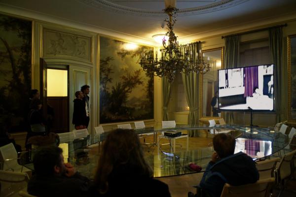
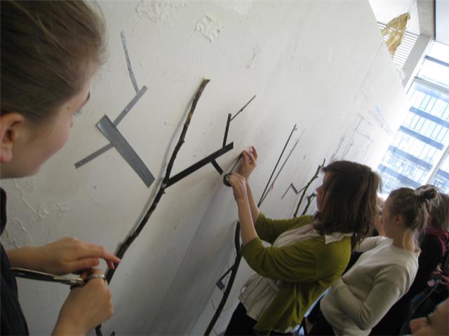
Checkout that amazing table.

I wanted to write you something about the amazing table in the Italian room/italiaanse zaal in de Bazel but I could not find any information about it from the internet and I missed the name of the designer, help me out please!
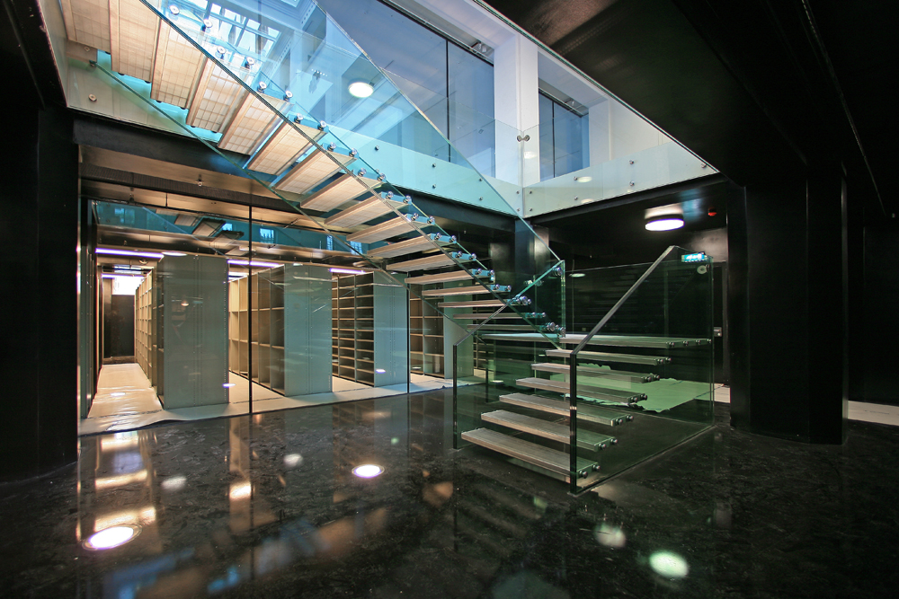
I think the contrast of something so modern with the rest of the room (18th century style Italian landscape murals) is a very cool effect. Since the weird Italian room quite stands out from the whole building and it’s style, placing such a minimal design table there was a brilliant move who ever then did it in the later years. I also had to think about a connection to the glass stairs (by Claus & Kaan) down to the archive that the guide was so enthusiastic about.

[by Katja Hannula]

Amsterdam City archives

Amsterdam City Archives was first built to be used as a bank, and it was not until 2007 that the purpose of the building changed to host the city’s archives.
The building was designed in 1919 by de Bazel and was finished at 1926, three years after de Bazel’s sudden death.
Its unique architectural form was greatly influenced by the American architect Frank Lloyd Wright as it conveys a feeling of harmony and balance, with hidden religious influences in its simple organic form de Basel achieved to combine modern architectural ideas with ancient archetypes.
The glass ceiling of the building creates a sense of transparency as it leaves space for an everlasting game between light and darkness to be played within its chambers, the glass ceiling also supports the contrast between the inside-outside impression since when you look at the building from the outside it gives the feeling of claustrophobic space but in contrary to its illusive form when you enter the space a feel like you re in the middle of an open space.
The building was officially declared as a national monument in 1991 for its distinctive formal values by the Dutch government.

[by Clair Bamplekou]

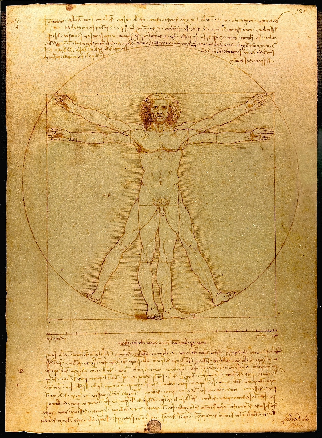
Balanced architecture

Amsterdam Archive building. A creation of Dutch architect Karel de Bazel in which each and every measurement and size are dedicated to the proportions of the human body. However the architectural tradition which seems quite unique for that period, takes its roots back in the ancient times…

The philosophical approach, formulated in 5th century BC by the Greek philosopher Pytagoras, stating that “Man is the measure of all things”, was further developed by the Roman architect and theorist Vitruvius, who created a famous code of human proportions, describing how a well-built man fits with extended arms and legs into the most perfect geometrical figures (circle and square), which was supposed to be the basis of temples and churches of those times to be able to give a person a feeling of balanced architecture.

This principle greatly inspired Leonardo da Vinci, who in the 15th century made a famous drawing of a vitruvian man as an attempt to relate human body to nature and architecture, as well as trying to define the ideal Renaissance church.

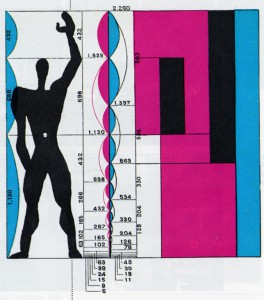
At the beginning of the 20th century, continuing the research of da Vinci, Le Corbusier created his modular, an anthropometric scale of proportions, based on the height of man with his arm raised as an attempt to discover mathematical proportions in the human body and then to use that knowledge to improve both the appearance and function of architecture.

In his own way, based on theosophical approach, de Bazel also set out in search of universal harmony and balance for his work on the Archive building. In the lay-out of the building he used a raster of rectangular’s of 3,2×3,6 meters, in other words 8/9×9/9, which reflect the proportions of the human body with and without head. A result of it – a building, which feels comfortable, inviting and truly made for a human-being!

[by Anastasia Starostenko]

personal architecture

What is fancy about building De Bazel designed by Karel De Bazel is the whole ideology he put into forms, patterns, outlays and finally the facade of the whole construction. He believed in harmony and balance in life so its projects, expressed his personal feelings and confessions. Noticeable is how every detail has been refined and his travels to Indonesia rebounded imprint on the inside of this building here. I liked the idea concerning the architecture as a bridge between cultures, beliefs. Coming into the building, despite not knowing the architect's plan was to feel the atmosphere of stability and peace. It seems to me that you have to have an amazing sense of form to achieve this effect. It is almost like being a good psychologist. Because of the openness of architect’s mind the building he constructed could be very easily called a place of a surprise and admiration but also curiosity. Indeed, when you keep moving between the rooms, halls, you almost get an impression that you are in a museum. The idea to place the archive there is the more accurate and suits his concept better than it did for the bank that was originally there, I guess.

[by Agnieszka Zimolag]

Bazel Civilization

The Bazel is not only a building, but also furniture! I had been visiting the Bazel before, but this time the guide was putting a particular accent for the furniture “designed by De Bazel”. Not only tables and chairs, but also coffee cups, inkwells, the colors of the walls. Everything inside the building was made on purpose to fit in the building and consequently I imagine the people looking like the building too! I personally find really contemporary the idea of making such big project and follow it from the beginning until every final detail (or almost, because Karel de Bazel was dead in 1923, just before finishing the project). A “total” architecture that keeps together the whole environment inside it. It makes me imagine at the creation of a new civilization where all the tools are thought in a way that consequences and growth are predictable. It sounds science fiction, but it’s what happen when design is perfectly designed. In the Bazel furniture, colors and objects have differences depending on the level of importance of the person they were  made for. Most of the differences are details that say “we are almost the same, but my chair has a more comfortable seat” or “my table is bigger”. That’s why the hierarchic system of the bank, De Bazel designe, required respect and strict definition of roles. This is not difficult to understand for that time (early ’20s), but weird to realize in the proud voice of the giude talking about “the desk set for the president manager, a bit more black of the others desk sets, designed BY DE BAZEL”.

[by Sara Cattin]

De Bazel

Vijzelstraat number 32. the front of this huge building is covered completley with construction frames. Workers are shouting.

Karel de bazel is responsible for this.

Enter the 1920s. Look at this beautful wooden floor! Elegant white. Sunflooded. A sealing out of glass.

„karel did this all by himself!“ i love our guide, she fits the building.

Shocking from the outside and so sensible from the inside, like everything in this cityarchive; the cellar, massiv tresor doors.

Esotherik painted sealing.

„ de bazel designd everything in here, thats a gesamtkunstwerk!“ „ de bazel designd everything in here, thats a gesamtkunstwerk!“ i love our guide.

But she loves karel.

Black marmor. Dark green walls. Thats the chef etage. Now a days you can get married here.

This going back way back into time. 1920s and stylishe lightswitches. De bazel is a craftsman he knows his bussines. This is love for the detail.

He died before the building was finished. True romance. he would be proud.

I am.

[by Martin Kaehler]

Front Design – New flesh for Scandinavian design


Friday, January 21, 2011

If we talk nowadays about Scandinavian design we mostly talk about Ikea. Simple, strong and just to serve its purpose. But there is and should be more to it. There is a younger generation of Designers who are coming to seize the throne and take Scandinavian design into the next jump of design.

Front Design

(more…)

As the cube became a Box


Sunday, November 21, 2010

Park at Wibautstraat, near Amstel station together with Rietveld architecture, become a starting point for the creation model of new building.

map and inspiration

The Rietveld Schröder House in Utrecht was built in 1924 by Dutch architect Gerrit Rietveld for Mrs. Truus Schröder-Schräder and her three children. Inside there is no static accumulation of rooms, but a dynamic, changeable open zone.

The functionality and rationality of the Rietveld-Schröder house inspired me to create something useful. When I started to think about it and tried to get more information about Rietveld architecture I found a table which gave me the idea to create a box for homeless and students.

Box & environment

Park at Wibautstraat is a perfect place for “Boxes for the homeless and students”. Trees in the park hide “shelter” under their crowns, but the bright colors of boxes make their way through the green “ceiling”. Boxes can be placed anywhere in the park, because they are mobile and each box is attached to a bench. Main functions of the benches are the storage place of cardboard. Yellow bench – for the new cardboard (which serves as a mattress inside the box). Black bench – for used cardboard (which can be used to fuel the fire in fireplace). I chose cardboard because every day in Amsterdam a huge amount of cardboard is released, so that it can be delivered to the place from the special services or concerned public.

(more…)

Growing chairs


Saturday, May 29, 2010

Growing your own design-chair, made out of living trees, grass or crystals – sounds interesting?

Nowadays, more and more designers are working with nature, instead of against it. They’re combining unpredictable, living objects with well-thought design and come up with new ways to make creative and durable furniture.

In a workshop, given by graphic designer Ayumi Higuchi, students had to create trees out of black tape. Every student received one role of tape and together they had to make a tree on the wall. It was interesting to see how this worked out – you’re able to control your own decisions, how and where to place the tape on the wall, but you can never completely control what the others will do with their roll.

This concept – not being able to direct the final outcome of a project- is closely related to the trend of ‘growing designs’. One could speak of an ‘eco-trend’, a form of slow design in the furniture-industry. In recent years, more and more designers experiment with the combination of nature, and the natural forms it grows in, together with practical and smart designs. We can see this most clearly in the design of chairs. Chairs that mingle the, in a way, unpredictable side of nature with the well-thought side of modern furniture design.

Just like with the trees made of tape, designers are using elements in their work that they can never fully control – and they do this on purpose, because it makes the outcome more interesting. One can only predict the way the final work will look like. And, commercially speaking, it’s a smart way of working. In the IKEA-era, a time in which identical chairs can be bought for just a few euro’s,  buyers are now looking for more unique, durable designs – they don’t want to see how the chair they just bought is also to be found in the living room of their neighboor.

Below, you’ll find some interesting projects that illustrate this new design-trend. All working very differently, they still show simular starting points.

First, there’s the work of Christopher Cattle that really shows the concept of taking the time to make an object, being very aware of the process of designing and being able to constantly make small changes in this process, to try to change the outcome. In this case it’s the use of growing trees, to make a small stool. The making of one can take about 5-7 years and you can make it bigger, stronger and higher by working together with the growing process of the tree itself. As you see on the image, the stool is made from three sycamore saplings that are ‘trained’ and grafted together around a plywood jig to form the tripod base of the chair. In an interview, Cattle points out:

Growing furniture […] can be used to demonstrate that it is possible to create genuinely useful things without adding to the pollution that industry inevitably seems to produce. Trees are self-generating […] It’s free and it’s non-polluting. Training and grafting trees as they grow are established traditional crafts, and wood is durable but it’s also biodegradable, so it doesn’t have to end up in a hole in the ground. I call this Grownup furniture as it’s the result of mature thinking.

Another project in which a designer is working with nature, is the ‘Venus Chair’ by Tokujin Yoshioka‘s. This chair might not be that comfortable, it is a nice concept in which design and nature can get along. The object is made from growing natural crystals.
The Venus Chair is grown in a tank, the production process is half controlled by Yoshioka and half left up to nature, therefore giving space for interesting developments in the work. Yoshioka says: “I […] feel that incorporating the principles and movements of nature into ideas will become something important in future design.
This is a prototype of his crystal-chair.

A work that is ready to use, is the design developed by Michel Bussien. It’s called the ‘Growing Chair’. It’s potted and on rollers, but you can of course remove the box and put it in your garden. A nice see-through chair, a very good example of letting nature, literally, fill up the design. To use the complexity and beauty of natural forms and include this in new designs – to almost ‘reconstruct’ nature, without having to bend and force the natural shapes in a dramatic way.

Also great for your back garden is ‘The Grass Armchair’, by Purves & Purves. Again, working with a frame, this chair is ‘leading’ the grass. It will almost dissapear in the landscape, being completely covered up with the surroundings, you’ll have to be careful while mowing.
The chair is made of biodegradable cardboard which you fill with gravel and soil, seed with grass.

Finally, this last example is made by the Dutch ‘Droog Design’. It’s the so-called‘Tree-trunk bench’ by Jurgen Bey. In his design ‘A fallen tree can serve as a seat. The addition of bronze classical chair backs makes it a proper piece of furniture, a crossing between nature and culture.
The designer makes clear, very firmly, that ‘it is ridiculous to transport trees when they are locally available.’
It is because of this statement that only the chair backs are for sale, thereby forcing the buyers to really find a tree, that’s already there, to use. Thereby making the buyer very active in the process of the design. Although this tree is not growing anymore, it’s still a nice way of using natural shapes and transforming it into a design.

All these projects show how you can make unique design in a new, eco-friendly way. A ‘movement’ that will probably set the trend for future designs and will constantly inspire designers to work in a creative way with what’s already there.

SI Module or total table design


Tuesday, March 23, 2010

SI Module is the portable platform for Applied Arts and Autonomous Design, initiated by Sandberg Institute Applied Arts department.
On a special table a system of modules will be build. The sizes of these modules are variable, depending on the size of works exhibited.
SI Module, was part of Object Rotterdam

three more links inspired by the design fair: Object Rotterdam
1•Odd Designs on Film, 2•Richard Hutten "playing with tradition", 3•Total Table design
The Object Rotterdam excursion was part of the Basic Year "form-lab" workshop

Come and read!


Monday, March 15, 2010

The aim of the project was to be capable of using the shape and quality of one object for developing another, completely different object. I decided to use my favorite chair as starting point for the assignment. While working I realized that I couldn’t solely rely on the factuality of forms. Rather I had to work on a more intuitional level; I had to interpret and translate shapes and texture into certain qualities.  I ended up making a bookshelf out of a chair.

Some general remarks on the chair:

  • 50ties
  • The chair can be divided into two parts, namely the seating and the legs. The parts differ in style and function, yet they seem to contrast each other in style -hard and soft, different movements-.
  • The chair is top heavy.

Qualities of the seating:

  • The round shape of the seating gives a sense of intimacy and protection.
  • The round shape has an inward movement that is inviting and suggests openness. It makes you want to sit down and crawl up into it.

Qualities of the legs:

  • Straight, elegant legs.
  • The legs have a vertical movement. The legs are scuffed all around and they seem to narrow down towards the end which also gives them a slight horizontal movement.
  • Breaks with the softness and inviting feeling of the seating.

Left: photo of the chair and the seating. Right: different sketches bookshelf

Left: photo of the chair and seating.
Right: different sketches of the bookshelf.

Idea behind the bookshelf:

  • The round shape and inward movement of the bookshelf corresponds with the seating of the chair.
  • The shape of the bookshelf gives a sense of intimacy and protection, which is also similar to a book cover.

The idea behind the books:

  • The books are placed with their covers towards the bookshelf, which gives one a peak into the books by just looking at them. The placement of the books is a literal expression of openness.
  • The pages of the books are meant to contrast the round shape of the bookshelf, similar to the way the legs and the seating of the chair relate to each other.

As can be seen in the sketches above I experimented with the general form and feeling of the object by placing the books in different ways into the bookshelf. Ultimately I had to conclude that the last sketch (the books placed in a crown shape) is corresponding best to the heavy, warm feeling of the chair. Furthermore the crown shape of the books helps to enhance the qualities and the shape of the bookshelf as they are reversed in form.

Several sights of the bookshelf -the actual result.

The ‘Wiener Werkstätte’ and the concept ‘Gesamtkunstwerk’


Wednesday, October 14, 2009

At the beginning of the 20th century Josef Hoffmann, Kolo Moser and the industrialist Fritz Werndorfer founded the ‘Wiener Werkstätte’. In order to protect traditional handicraft from mass-production they designed exclusive handmade everyday objects and gave them the aura of art. At the same time they tried to find an alternative to old representative art forms favored by the rulers of Austria which shaped the picture of Vienna at this time. When they started to design architecture which they filled with their handmade furniture and their handmade objects their work became a concept that led to an idea of a different society based on pure aesthetics: they tried to create a ‘Gesamtkunstwerk’.

Under which circumstances could such a concept develop? The design of the ‘Wiener Werkstätte’ is still very modern and popular while the concept of the ‘Gesamtkunstwerk’ is not relevant anymore. But why? Do we need a similar utopia today? If one wants to get an idea ‘why’ one has to take a closer look at the development of the concept ‘Gesamtkunstwerk’ in relation to its historic background.

Wiener_Werkstätte

LACE


Wednesday, October 14, 2009

Lace, does it need a presentation?
The history or origin… it is antique but not really clear where it came from, used in many culture, with conotation, with meaning, with symbolism.
The different types… Needle Lace, Cutwork, Bobbin Lace, Tape Lace, Knotted Lace, Crocheted Lace or Machine Lace.
The intention… manually made visual decoration.
Many things can be said about it’s past but is it really that important?

Let’s focus on the influence of lace in our future.

Lace, as every one knows it, is used for clothing and accessories, in folklore or modern fashion design but that is not the only place where the lace is used. In present time its presents can be found in art, architecture or even in contemporary design.

The “Lace Fence”, developed by the Dutch design house Demakersvan, is one of the works that was influenced by classic lace. This fusion between the industrial metal fence and lace embroidery modifies and cultivates a different look to our environment. What it achieves is, hostility versus kindness, industrial versus craft.

“Less or More” One Design Week Sofia


Sunday, May 31, 2009

Sofia Design Week was held in Sofia Bulgaria from June 5th-12th 2009.

Dima Stefanova, designer of the website of Gerrit Rietveld Academie and Sandberg/Design Institute and Henk Groenendijk, moderator of Designblog form together Icecreamdesign. As advisers they are involved from the beginning in this fist ever Bulgarian Design Week. As speakers and organizers of the “Bird’s Eye View” workshop they participate in the program.
“One Magazine” interviewed them for their latest issue

Next Identity Forum took place during a 7 day long event with lectures, workshops, exhibitions and presentations that gathers representatives of the worlds design avant-garde in product, communication, graphic and interactive design.
In search of its next identity, Sofia welcomed 17 of the most indicative in their field. Putting Sofia on the global design map for the first time.  Ji Lee, Niessen en de Vries ( the succesful traveling instalation TM-City was on display again), Peik Suyling YD+I, Frank Tjepkema “Tjep”, Marti Guixe, Erik Kessels from KesselsKramer, Lust en Ruedi Bauer were attending among many others.

Communicatie


Wednesday, April 1, 2009

Mijn zoektocht mislukte De link tussen beide teksten, die eerst niet helemaal duidelijk was, heb ik wel gevonden. Omdat we in een tekst elkaar altijd iets duidelijk proberen te maken was mijn laatste boek het meest heldere boek dat ik in de kast zag staan. Het boek bevat allemaal verschillen ’dingen’, dat is  bovendien ook de titel van het boek: Dingen. In dit boek zie je bijvoorbeeld een ontwerp van een beker. Eronder staat in zes verschillende talen de betekenis van de afbeelding plus de manier waarop je het woord uitspreekt. Toen ik dit boek ontdekte, kreeg de zoektocht naar mijn televisie opeens heel ander perspectief. Ook andere mensen zijn geobsedeerd door objecten, door beeld. Dus dat andere perspectief is de fascinatie voor vele mogelijkheden van communicatie.

cat.no. 772.9-cat-50

keyword: beeld

Elastic minds


Monday, March 30, 2009


The choice of projects, which are presented in this book is very various and reaches almost any kind of design. Many international designers are introduced with their latest works.
A lot of the projects are highly conceptual and touch the blurry spaces in between design and art.
I found the title “design and the elastic mind” very appealing in opposite to the cover, which is rather scary.
Therefore I posted a picture of Elio Caccavale’s project “Utility Pets”.
He is concerning himself with the various effects, that inter-species organ transplantation might have in our lives in the not-so-distant future.
The tools he invented, presented on the picture, are supposed to generate an intense contact/relationship in between the donor (in this case the pig) and the receiver.
From the upper left to the lower right:

– Smoke Eater- Toy Comunicator- Memento Service- Comforting Device

cat.no. 772.9-ant-

keyword: overview

More is more is more


Thursday, March 26, 2009

My search for another fragile subject led me to the book “The Crystal Palace Exhibition, illustrated catalogue”. Again I choose by title. Crystal Palace, what a beautiful combination of something stable and something fragile almost a contradiction. The combination crystal palace is somehow a little impossible as if it would only exist in fairytales.

The book is an old paperback, it used to be brown but on the back it’s been bleached by time and sunlight and has turned into a fifties purple. The pages are yellowed and the book is full of beautiful etchings of art nouveau design, furniture, elegantly ornamented pistols, silverware, and luxurious flower-print fabrics.

Last week I wrote about the book Fragiles, a book about contemporary ceramics and I can see a lot of connections between the two books. The art nouveau designs, just like the contemporary works, has a kind of playfulness in it, the flower ornaments seems almost alive as they intertwine around the legs of the tables and when you look closer at the ornaments soon you will find creatures and fairy tale animals hiding in the patterns. Another thing that I connect to some of the contemporary ceramic is the “more is more motto”. Some of the furniture in the art nouveau book is crammed with decorations, ornaments, cherubs and flowers, just like some of the objects in Fragiles are over the top kitschy. But there is something quite beautiful about this unwillingness to stop when it is enough.

cat. no. 772.1 cat 2

keyword: fragile

Fascinatie


Thursday, March 26, 2009


Hij staat er niet bij, wel zijn er heel veel boeken over Japans Design. Ik keek in alle boeken. In alle verschillende boeken stonden goeie overzichten van wat er allemaal uit Japan komt. Het begon meestal bij traditionele Japanse kunst wat langzaam overloopt in design. Het is een overgang van mensen die eerst voor zichzelf iets maakte wat later veranderd in mensen die allemaal onder één naam product maken. In het boek Japans Design zie je deze overgang heel goed weergegeven. Het is super om te zien hoe veel er wel niet in Japan wordt geproduceerd. Japan is zover weg en we hebben hier zoveel uit dat land en dat is wat mij fascineert.

cat.no. 772.5-spa-1

keyword: beeld


Log in
subscribe