Skip to Content Skip to Search Go to Top Navigation Go to Side Menu


"exhibitions" Category


unique versus serial


Wednesday, February 4, 2009

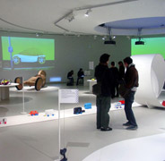
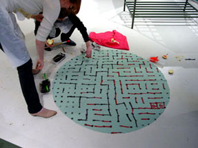
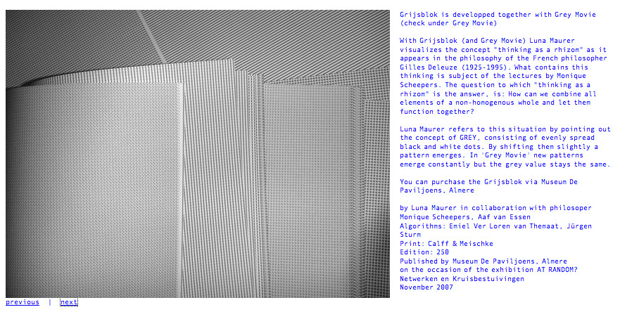
Starting of a new academical year of design theory and research with an investigation theme like Unique versus Serial could not have been better. Chosing from a wide variety of design objects exhibited in “Limited/Unlimited, 100 years of Dutch design presented us with the unique opportunity to get an inside in the position of the designer during the last 100 years in the Netherlands. A characteristic of Dutch design is the coexistence of these unique objects alongside serial production, concept alongside industrial reproduction. “Goed in vorm“, 100 years of design in the Netherlands: by Mienke Simon Thomas (curator of decorative art and design at the Boymans Van Beuningen Rotterdam) was acquired by the library and provide us with a lot of interesting background insight.
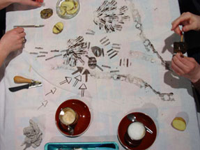
The question was simple. Choose an object and find out what the position of the designer was in relation to our theme Unique versus Serial .

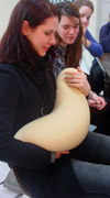
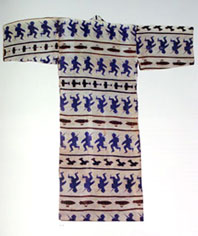
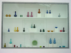
research: Samuel Schellink /vaas: Jan van der Vaart /research: Corné Gabriels

All those choices resulted in a colourful collection of investigations into the object’s background and the motives of their creators. Available in downloadedable pdf the students present: “Martin Visser, designer or collector“, “Starting with Anton Kurver’s Mailbox“, “Bruno Ninhaber, Stay Limited To Be Unlimited“, “Wim Gilles Dru Kettle“, “Wim Crouwel The Objective Functionalist“, “Adolf Le Comte, A Unique Mocca Set“, “Corné Gabriels, Not Your Average Fashion“, “Marcel Wanders, Knotted Design“, “Jacob Jongert, An Artistic Individualist“, “Limited-Unlimited, The Haque Plateel/Rozenburg“, “Jurgen Bey, A Narritive Structure“, “Jan van der Vaart, A Vase Is For Flowers“.

At the same time VIVID design galery presented a show of “Art Design“. A new phenomena that underlined the intriguing autonomous position of Dutch designers and design, making an on the spot discussion posible about art and design, commercial versus cultural or concept and functionalism. linked article Herald Tribune: Whatever ‘design-art’ is, it’s thriving ©2008

Objectiefied Bits


Friday, January 30, 2009

Maybe you find it puzzling that this posting about Helvetica and Wim Crouwel starts with an image of Paul Elliman’s “Bits” Alphabet.

Extremes can sometimes meet when you least expect it, and this fascinates me. It became apparent again during the investigation by the FoundationYear C group, into Gary Hustwitt’s Movie “Helvetica” and our consequently visit to the Wim Crouwel exhibit last month at the “van Abbemuseum”.

left: Bits by Paul Elliman, right: Objectified by Build (click images for blog info)

“Bits” was developed by Paul Elliman in the mid 90ties and published in the 15th (Cities) issue of Fuse’s conceptual Font Box. quote: “Language moves between us and the world on patterns of repetition and variation, and a mimetic example of this might be something like an alphabet”
Later, in 2004, it was included in the Cooper-Hewitt Design Triennial N.Y. which made “concept type” part of the established design world.

Gary Hustwitt’s new documentary “Objectified” takes design, and as a matter of fact “Bits” too, one step further by making it popular in the same way as he did with “Helvetica”.

Modernist thinking, or even constructivist-, lays at the base of the “Helvetica” concept and the work of Wim Crouwel, as this first movie on typography has him stated. As a true Dutch graphic design icon Wim Crouwel illustrated this through work, presented at the library exhibition of the van Abbemuseum, celebrating his 70th birthday. A small but beautiful display of catalogues and posters made for both this and the Stedelijk Museum in Amsterdam.


pages by Crouwel versus pages by Jan van Toorn from publication “Het Debat”

Extremes met in person when Crouwel and Jan van Toorn celebrated their life long controversy with a recurrence of their famous 1970 debate. Functionalism versus engagement. Jan van Toorn succeeded Crouwel as a designer at this museum under the directorate of Jean Leering to manifest in an inspiring cooperation what that leads to in terms of exhibition concepts and graphic design (“Museum in Motion” at the library). Jean Leering also closely work together with Jan Slothouber (read part 1 of C group’s research) at the TU-Delft where the published several internal essay’s on the philosophical and social consequences of design.


80/20/100 © Nijhof&Lee booksellers – Laurenz Brunner, final exam poster

More research was conducted to explore related content or work approach of other designers like, Laurenz Brunner’s “Akkurat”, his successful contemporary remake of Helvetica, Experimental Jetset convicted users of Helvetica, the cooperation “8020100” between Vivid Gallery in Rotterdam and Nijhof&Lee Bookstore in Amsterdam. Context was created by turning the focus on Adriaan Frutiger, designer of Helvetica’s conscientious alternative “Univers”. To further explore the relation to language and image we further focused our investigating efforts on the visual legacy of Charles & Ray Eames, the “El Hema” exhibition/store and Massin‘s timeless publication “Letter and Image“.

With the inclusion of Belgian artist Guy Rombouts the full circle of our focus on type design was completed. The investigation into his visual language concept “AZart” will be presented soon in a separated part 3 C_group posting. This was part II of the C_group research
All researches linked in this posting can be downloaded in A4 format and are also available as hard copy research prints at the ResearchFolders available at the academy library

The cube as a representation of a democratic art form


Wednesday, January 7, 2009

With a speech by Simon den Hartog, former director of The Gerrit Rietveld Academie, a small retrospect exhibit on the work of Jan Slothouber was openened at the “van Abbemuseum” in Eindhoven NL. An intimate group of affectionado’s and family bridged the gap of almost 50 years, when Jan Slothouber together with Willem Graatsma started his fascinating journey into the world of the cube. The Centre of Cubic Constructions represented a highlight in this extraordinary focussed research, culminating in the 1970 representation at the Venice Biennale.
Seemlessly scanning the architectoral space occupied by art and design, the exhibit –designed by Erik Slothouber and curated by Diana Franssen– clearly presented an extraordinary focussed spectrum of work

Some weeks later we revisitted this exhibit with a student research team of the FoundationYears C group. Exploring the cubic constructions we found direct relations between the work of Slothouber and the minimal art of Sol LeWitt. The choice for a simple universal and modular form makes it posible to built a grammar for an entire body of work in which all the steps in the process can become interesting in their own right. “in which even the concept can become as interesting as the final product” (Sol Lewitt, cat Sonsbeek 71).

The specific context of typedesign addressed in our workshop presented striking relation between their works and those of more contemporary designers like Radim Pesko and the Swiss designers Dimitri Bruni & Manuel Krebs of Norm

More research was conducted to explore related content or workapproach of other designers like, Bram de Does, Karl Nawrot, Na Kim (website) and Ji Lee.
This was part I of the C_group research.

All researches linked in this posting can be downloaded in A4 format and are also available as hard copy research prints at the ResearchFolders available at the academy library

Did you see ExperimentaDesign 2008


Monday, November 24, 2008

ExperimentaDesign posters by KesselsKramer

Did you see the ExperimentaDesign posters by KesselsKramer ! How long did it take you to find out what was going on? It was only after missing all the opening events, at which a score of great designers and artists like (Cyril Duval, Anthony Dunne, Ron Arad, Ian Anderson, Graffiti Research Lab, Mark Jenkins, Rem Koolhaas, Álvaro Siza Vieira) did their presentations, that we realized that something special was going on.
ExperimentaDesign Amsterdam 2008 opened its “Lounging Space” and Droog Event 2 “Urban Play” curated by Scott Burnham, behind the empty SMCS building, in these lost spaces “under the bridge”. “Come To My Place”, “Sunday Adventure Club” and parallel events like “Red Light Design” were all part of it.
At a cold and rainy Saturday afternoon, 6 weeks later, a small group of intimi braved the bad weather and enjoyed some inspiring presentations of an other select group of invited participants among whom, Kamiel Klaasse (NL Architects), Scott Burnham (curator Urban Play), Renny Ramakers (Droog Design) and Ji Lee (New York graphic designer).

It is all over by now. But do not worry Rietveld’s A group Foundation students did go out there to capture most of the events for you.

Straten op dozen


Sunday, November 23, 2008

“Beeldtaal, een design of logo probeert je altijd wat te vertellen” – Jeroen Bruijn, Designer van Design bureau Thonik
——————————

————————–
Jeroen Bruijn heeft het logo en de tentoonstelling voor het droog event 2 URBAN PLAY  ontworpen. Het logo verwijst naar straten en zebrapaden wat wel duidelijk is. Het verwijst naar straten omdat de tentoonstelling ging over straat interventie, kunst in steden op straat.
Het leuke van de logo is dat het vrij kenmerkend is voor de stijl van Thonik en voornamelijk Jeroen de Bruijn. Een stijl die gemakkelijk te herkennen is (er word veel met strepen gewerkt, herhaling en zware letters) en uitnodigt om ernaar te blijven kijken. *


De tentoonstelling is opgebouwd uit dozen met het logo erop in het midden van de zaal, met het idee van een stad. Tussen die dozen waren kleine tv’s geplaatst met daarop video’s van de artiest en een poster met informatie ernaast. De bedoeling was dat je ging zoeken naar de kunst in “de stad”. De keuze voor kartonnen dozen heeft hij gemaakt met het idee dat karton net als de kunst op vaak makkelijk beïnvloedbaar is door zijn omstandigheden. (Jeroen Bruijn zei zelf dat hij naderhand gemerkt heeft dat de tentoonstelling een vochtige ruimte is en dat dit ook effect had op het karton.)

Ik vond de tentoonstelling er leuk uitzien en opgezet, alleen voor mij was de bedoeling niet helemaal duidelijk. Ik vond het best verwarrend om daar tussen die dozen te staan en ik kwam pas later in het gesprek erachter dat het een stad moest zijn. Ik vind het niet erg dat ik er geen stad in kon vinden, maar wat me wel wat dwars zat is dat ik me nogal verloren voelde tussen die dozen en naar mijn opzicht het geheel chaotisch overkwam.
Maar het kan ook zijn dat hij het juist zó bedoeld had, en dat het gevoel van verlorenheid en juist de chaos die daarbij aansluit overeenkomt met de siuatie waarin je de kunst op straat normaal  aan zou treffen.

posting by Annelot Meines

Benno Premsela says: Show Yourself!


Tuesday, April 8, 2008

When you drive through the Vijzelstraat, you might have glanced in amazement at the huge block-size buiding that you pass between Keizers- and Herengracht. This building is called “De Bazel” named after the architekt K.P.C. de Bazel. It was built between 1919 and 1926 and served as headquarters of the Dutch Trading Company. Since a year it houses the new City Archive (Gemeente Archief). If you go inside you can walk through this amazing building and enjoy the detailed interior design and visit exhibits organized in the huge bank vault in the basement. more …. (posting 299)

Benno Premsela [poster by Anton Beeke

as a hommage to Premsela in the year of his death]

At this moment –until April 26th– The Gemeente Archive presents an exhibit on one of the prominent dutch designers of the 2nd half of the 20th century. Benno Premsela [1920-1997]. He was active in interiour-, and exhibition design as well as the design of shopwindows (Bijenkorf) and several interiour products. He also designed stages for the Dutch Ballet. As designer, advisor and organiser he manifrested himself in the foreground aswell as the background of the design community. Premsela was not someone to hide his private- from his professional life, which was most prominent in his manifest role in the homo emancipation movement.

The Premsela Institute is –in good dutch tradition– named after him. This institute promotes design national as wel as international. Platform 21 is is closely connected to this Institute

B group /encounters with the autonomy of design


Monday, March 24, 2008

When two exhibitions present a clear insight in the autonomy of modern designing, DesignResearch has to examen what it is all about and who is involved.
This occasion was presented by the “Joyride Expo” organized by Platform 21 and “At Random: Networks and Crossovers” curated by the Paviljoens Almere.

frank tjepkemaX-XL chair at Joyride
(l>r: at studio Tjep > cuddling the XXL-chair > visiting JoyRide Expo)

The participation of the Dutch product- and interactive design avant garde presented an unique opportunity to experience the freedom in which design concepts can be developped. This became clear at the opening event of the Joyride Expo, when designers transformed remote control toycars into their ultimate joyride dream

skycatcher at random reader
(l>r: Skycatcher by Maurer & Puckey > Expo & Reader designed by Lust)

When visiting Almere (only a 20 minute train-ride), Luna Maurer presented insights into the philosophy behind here work “Graybloc“. One of her other works “Floor design” –an ongoing and ongrowing work in progress– covers the floors with mappings of the organisations consultative structure, as such visualizing the Paviljoen’s network. We could be present to witness her weekly upgrade.
Studio >Tjep< was visited in a later stage as part of a students investigations. We enjoyed an informal presentation of some projectbooks, focussing on his proposal for the restyling of the IKEA restaurant.

Soap Box ResearchBertjan Pot Research part1

Research material was edited down to A4 sized guided tours into selected subjects. All subjects presented in this list are also available as hard copy research prints at the ResearchFolders at the Rietveld library.

Related to Joyride the investigation focussed on the following subjects and people: Bertjan Pot (furniture design), Strange Attractors (interactive design), Marijn van der Poll (product design), Moniek van Heist (fashion design), Dinie Besems, Pieke Bergmans (product design), Frank Tjepkema /Tjep (interior/product design) the general subjects of >Concept Cars<, >Soapbox Racing<, “Craddle to Craddle” McDounough/Braungart (industrial design) the Nature Design exhibit in Zürich and its publication by Lars Müller, Droog Design, Bruce Mau’s “massive change” (communication design) and as added subjects Sophie Krier (Design Lab) and the artist Panamarenko.

related to the ongoing At Random: Networks and Crossovers exhibit, the investigation focussed on: Jeanne van Heeswijk (artist), Lust (graphic design), Nathalie Bruys (geluidskunstenaar), Luna Maurer (interaction design), the At Random reader by Lust design, and the related subjects SKOR and OPEN magazine #13

Dexter Sinister at Whitney Biennale


Tuesday, March 18, 2008

Dexter Sinister Emblem
Dexter Sinister (Stuart Bailey, David Reinfurt and Sarah Crowner) call their project a “Just-In-Time Workshop & Occasional Bookstore”1. Their workshop deals with the classical production scheme of publications and the different roles of designer, publisher, producer, editor, curator and distributer. The twice a year published culture (“art-design-music-language-literature-architecture”3) magazine Dot Dot Dot is an example for the redefinition of traditional ideas of publishing.

They also take part at this year Whitney Biennial in New York.
“Dexter Sinister’s proposal for the Whitney takes the form of an extended poem titled True Mirror, a composite of excerpts from writings and artworks derived from a variety of artists and authors. Loosely based on ideas of reflecting and shadowing, the manifestations of this abstract proposal remain necessarily open until the Biennial begins. Dexter Sinister will occupy a former colonel’s dressing room at New York’s uptown Armory, from which they will explore various channels of distribution alongside the rest of the show. These activities are prefaced by a typically oblique double motto: “Quality is merely the distribution aspect of Quantity” (or vice versa).”2

A reasonable but rather long interview about things can be found at www.bombsite.com.

More information about the project, contributers and their releases can be found at Dexter Sinisters True Mirror website or Whitney Biennial
posting prepared by jan (group f)

Cooking and Constructing


Wednesday, March 12, 2008

Last Sunday afternoon E-Group went back to the basics in the “Cooking and Constructing” exhibiting-event organised by Platform 21. Together with students from the Textile department and Heleen Klopper we tried to use vegetables as a source for printing and making.

patato printingpatato print games

This event took place after an introducing visit and small lecture on “text and textile” by Erik Wong and a visit and guided tour into the wonderfull World of Vlisco (Garenteed Dutch Wax) printed designs (dessins) exhibited in the Volkenkundig Museum in Leiden.
Textile can be used as a medium for direct communication as these examples clearly show.

E for Ethical-EnvironmentalVlisco printWW2 Japanese Kimono
(Katharine Hamnett T-shirt, Vlisco print, WW2 japanese kimono)

Design Trip to Insel Hombroich


Sunday, December 2, 2007

0708_Hombroich4

Thomas Ruff at Haus Esters Haus lange

The Design Trip to Germany took us to Insel Hombroich in Neuss Germany. On the way we stopped at the Museums Haus Esters and Haus Lange, Mies van der Rohe’s first building experiments (1929) with -non supportive- brick housing. The buildings were clearly designed to look from inside out as we experienced while exploring the art and photography filled interiors. Especially the bathroom on the second floor gave us a sweet glimps in the past.

0708_haus_esters"Rietveld at Insel Hombroich"
"Venician Glass: crafts at insel Hombroich""Haus Esters Haus Lange Mies van der Rohe"

Top left > 1 Haus Esters • 2 Rietveld at Insel Hombroich • 3 Mies van de Rohe, Haus Esters Haus Lange • 4 Venician glass craft >< art in insel Hombroich

During a beautifull autumn day, we entered the magical Erwin Heerich‘s Pavilions followed by red and yellow leaves . Nowhere can daylight be experienced like this, looking at the art and craft as it realy is and was meant to be. The unique melting of architecture, art and craft can be enjoyed only at a few other places like..

Calder, Yves Klein, Buddha, China or Schwitters and Bart vd Leck, the sheer power of it made us enjoy this humbling moment.

Le Corbusier & Other Stories


Thursday, November 1, 2007

On September 1, before the program of the Foundation year even started, G-group visited the exhibition “Le Corbusier Art and Architecture” on it’s last

exhibition day. le_corbusier_tent

Corbusier_Istanbul_1911

right > Corbusier in Istambul 1911

0708g-corbusier-istanbul

It was the beginning of a journey with Corbusier which showed us that art, design and nature are permanently interconnected. The Lecture on Le Corbusier’s sources of inspiration and his journey to the balkan and Istanbul (by Carla Boomkens) prepared us for the yearly FoundationYear’s International trip to the “Bienalle of Istanbul”.
We found out that the richness of Corbusier’s oeuvre, connected us to many classic and contemporary subjects from Primitivism and the “Foundations of Modern Art” to the “Nature Design “in Zürich fall 2007


Log in
subscribe