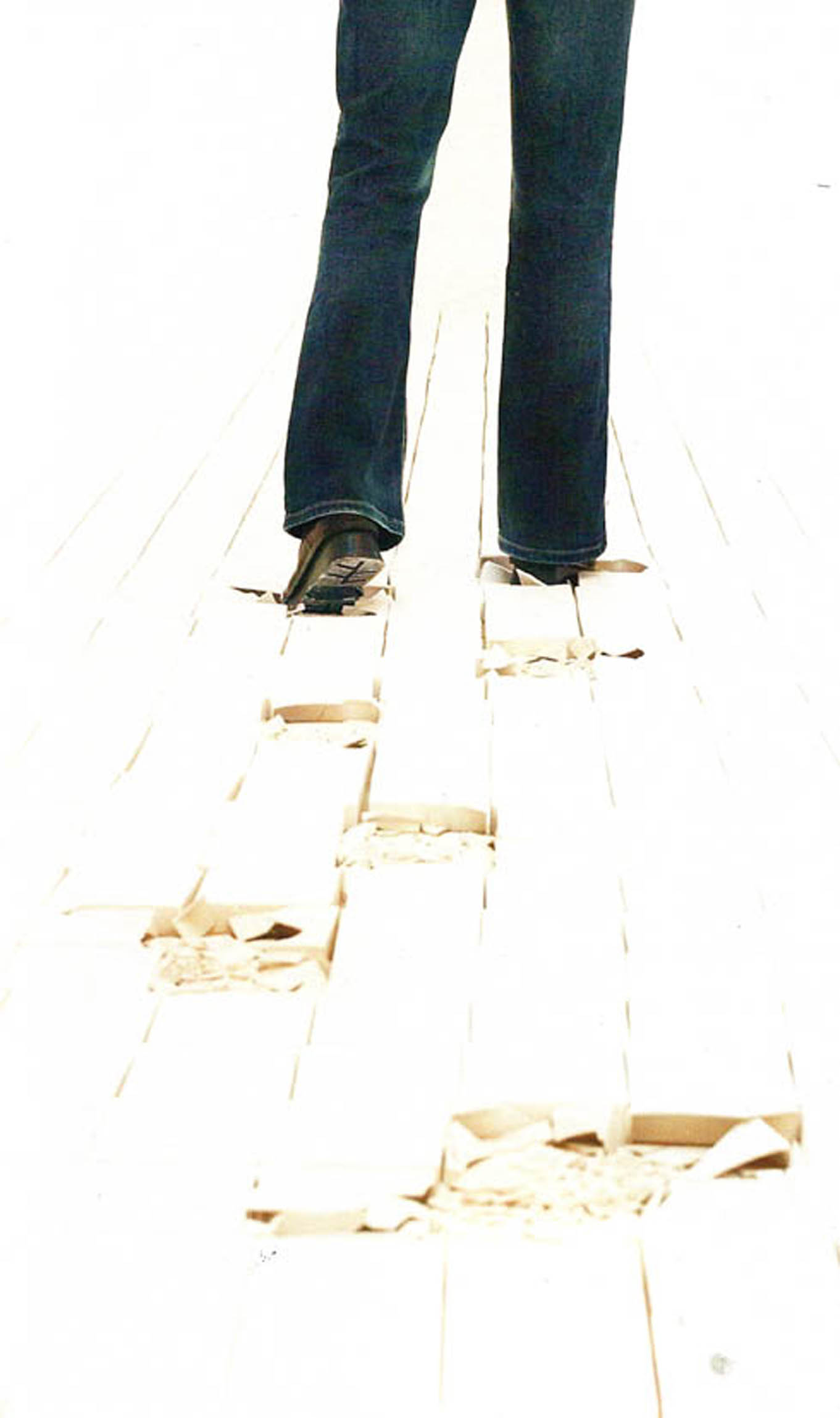
we are humans…
humans who are creating…
creation is an human action…
humans who are destructing…
destruction is an human action…
creation and destruction
thats human, thats us…
-twom- I
keyword: playground
we are humans…
humans who are creating…
creation is an human action…
humans who are destructing…
destruction is an human action…
creation and destruction
thats human, thats us…
-twom- I
keyword: playground
“Vorm van sculptuur” is on mine opinion a sculpture about sculptress like Marenne Welten, Anne Auloos, Inge van ‘t Klooster, Mia Trompenaars , Melanie de Vroom and Marenne Welten.
It’s a collection of small books form each artist.
Based on what i am seeing from the inside and outside of these small books,
i would say that they are showing fragments, details, sketches of the works.
The most interesting picture of the work of Anne Ausloos is for me one of her paper works from 2009. The reason why this photograph is so interesting to me, is because it brings questions and the form is funny.
what does the object represent? is it solid, is it edible, is it a sandwich?
if i talk about Inge van t’ Klooster i am talking about the most not attractive works of the whole group. i am basing this sentence on my taste and not on the quality of the work. the reason why i don’t find it attractive is because the massiveness and the darkness of the work. The Virtual work that she made with Martin Riebeek called “Between you&me” is interesting to me because it’s an outside platform for digital art. I think that this is a funny way to involve people in art. You could say that it’s performence art.
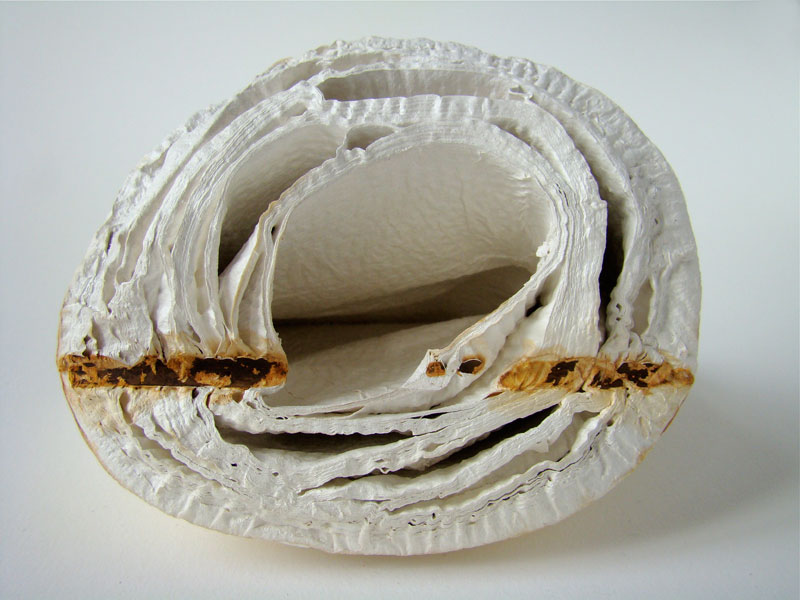
Anne Ausloos, 2009
Inge van t’ Klooster and Martin Riebeek
cat nr:726.8
keyword: best
 I went to “Swing Lantern”
When I went first time with my friend, there was nobody. We began to play Swing Lantern (that handles were high for me, but I managed). We had finished it, we were seeing it. Then, two persons came to Swing Lantern, they began to play it. I took a photograph. One of them spoke to us “If you want, I take a photograph for you playing Swing Lantern”. We were taken photograph. There was wide place, it was easy for us to find it. It was high, and colorful.
When I went there second time, a family played it. They had three little children, they changed to play for one child. In ordinary designers week (it was held in Tokyo every year), we couldn’t play with product. It was problem. But in this project, we can play, and we can make a memory with the products. It is a good experience and important thing.
I thought about “swing” and “lantern”. It reminded me of Japanese hu-rin. It is a bell which make sounds when the wind blows. Japanese hu-rin made of glass. We use it outside during summer. It was very small, the size is about 7cm. When we listen to the hu-rin’s sound, we feel cool and happy. During summer night, I open the window, while I listen to the hu-rin’s sound, I use to read books. “Swing Lantern” make us experience and remember. I’d like to make things like swing lantern. I’d like to make people have memory through my art project.
Similar project (Lantern), Japanese Windbells (Hu-rin)
posting by Juri Suzuki
After many month we finally present the research results into 25 selected books from the “Collections Groenendijk”. During a one-hour event every student was presented with the opportunity to start-up a research into the manifest art or design concepts presented in these unique book designs. Designers Julia Born and Will Holder were presented through an interview-DVD made by the graduate program of the “Werkplaats Typografie Arnhem” for the Chaumont festival workshop 2005. Others projects, by Richard Niessen or Andy Warhol, were presented at an visit to the Stedelijk CS, where their books were displayed in context. Coralie Vogelaar (a Sandberg Master) came to visit us in person to give insight in her work and ideas and lecture on the concept behind her latest publication “Masters of Rietveld: design in the 21st Century” published recently by the Sandberg Insitute /Design [above: Niessen TM-City / Warhol Index-Book
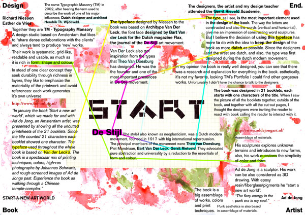
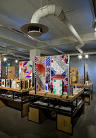
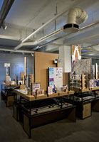
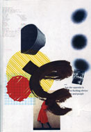
Caetano de Carvalho on “A New Art World” by Richard Niessen + Ad de Jong
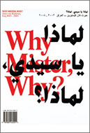
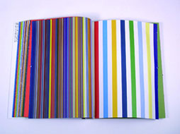
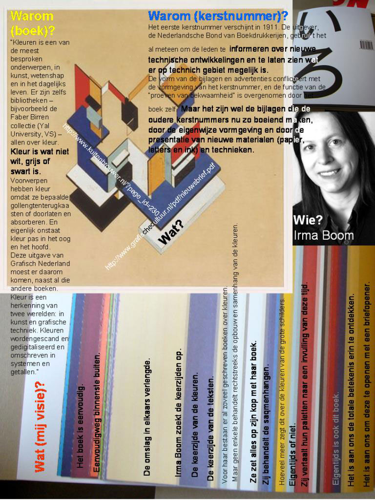
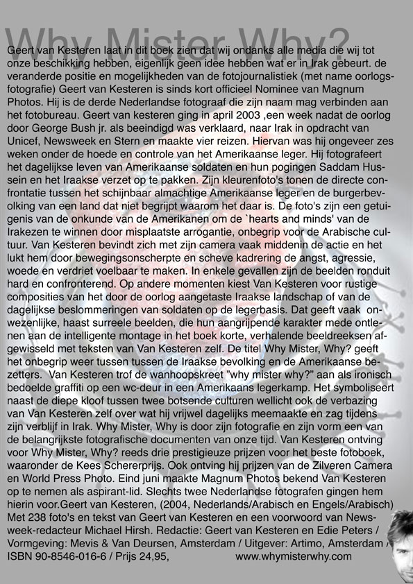
Research material was edited down to A4 sized guided tours into these subjects. All subjects presented in this list are also available as hard copy prints at the Research Folders at the library. The investigation focussed on the following book titles: Ed van der Elsken’s “Love Story in St Germain“, Irma Boom’s Grafisch Nederland 2005 on Color, “Start A New Art World”(published above), the acclaimed cooperation between photographer Geert van Kesteren and designer Linda van Deursen “Why Mister Why“, “Hhalo” by Julia Born and Rebecca Stephany’s “Archiving Today”project. Last 3 ladies all teaching at graphic design department.
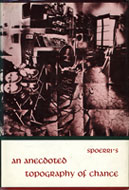
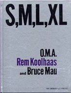
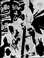
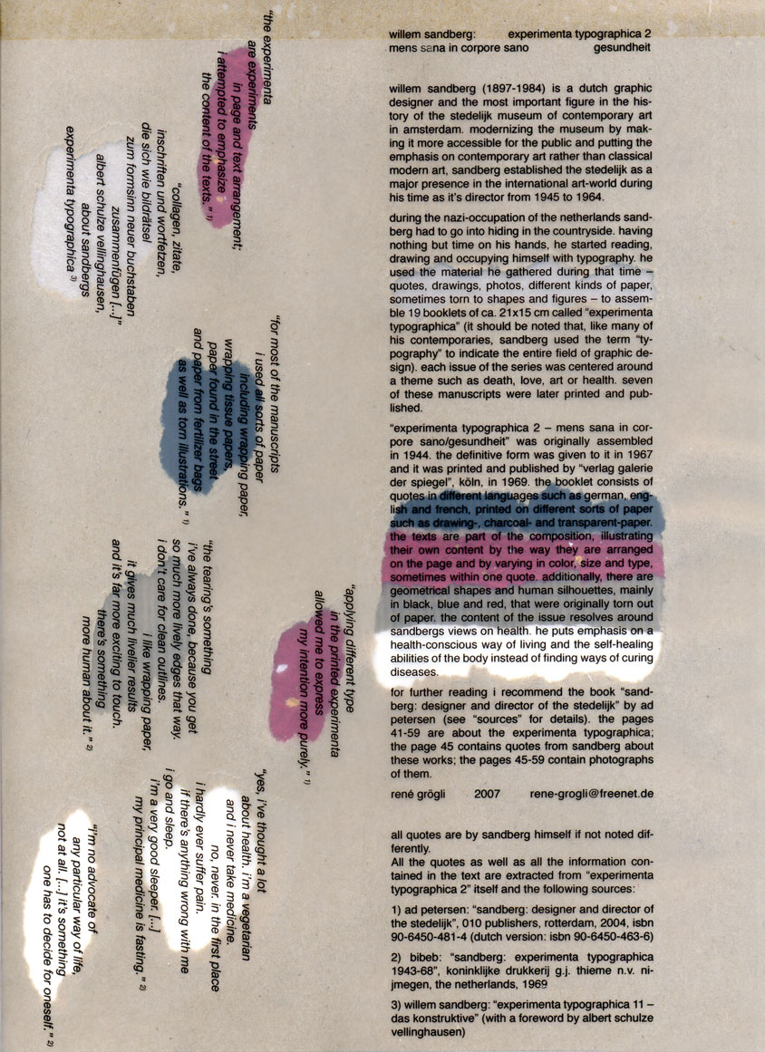
Daniel Spoerrie “An Anecdoted Topography of Chance“(extra info), Dieter Roth’s “Dieter Roth Band 10“, “S M L XL“by Koolhaas, Sandbergs “Experimenta Typographica“: Mens Sana in Corpore Sano and “Counterprint” by Karel Martens. “The Thing” by Norm designstudio, Andy Warhols classic 1967 “Index-Book”, Will Holder’s “Catalogue“: starring Gijs Muller, Edward Ruscha’s “Colored Peolple”, Richard Niessen’s piece de résistance TM-City.
Sandberg Institute Master: Coralie Vogelaar with “The Photoshop” and “De Hedendaagse Ontwerper”, Gerald van der Kaap’s original ” HoverHover” and the monumental cooperation between Jonathan Barnbrook and Damien Hirst “I want to spend the rest of my life everywhere, with everyone, one to one, always, forever, now”.
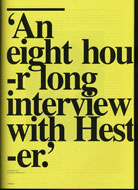
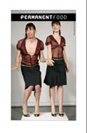
Finaly some highly conceptual magazine concepts like, the 1980’s I-D magazine 2, Jop van Bennekom with Re-magazine: ‘Hester‘, Permanent Food or Stuart Bailey’s “Dot Dot Dot” magazine.
