Skip to Content Skip to Search Go to Top Navigation Go to Side Menu


"Colour-Systems" Category


WHATISAWHILE’S COLOR SYSTEM


Monday, April 2, 2018

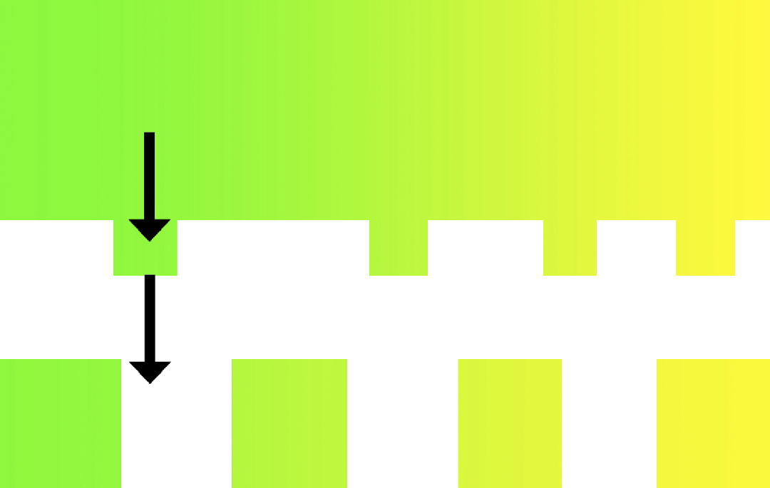
Aim: I need to combine two words which I found very different from one another: ‘system’ firstly appears to be very restricted while possibilities seem to be unlimited with ‘color’.


FIRST CONCEPT: Connect the situation in which you currently find yourself to music thanks to colors.

Process: You’re heartbroken and alone in the shower.
Find the key words: heartbroken, alone, shower.
Each key word is associated to one color: heartbroken = purple, alone = blue, shower = grey.
In the system, clic on the key words’ fitting colors « purple, blue, grey», it will send you a playlist matching your current needs.

Questions: How to realize the system? Do I use the computer or do I make it by hands? If computer, which site or application should I use? Need to select key words: how many, which ones and why? Do I use common key words or specific ones?

Issues: Want to use computer (better quality of colors, easier to extend the visibility and good way to classify data), I could find a specific application or website. I’ve been told by a classmate, who has studied computer science, that applications she knows are not for amateurs like me but professionals.

Conclusion: Because of a lack of knowledge and no skills in code I can’t bring this first concept to a successful end. I’m better to modify my system so I could create a new realizable one.
I still want to use the computer as my main tool.
However, I want to make this project more personal and subjective, meaning that I want the color system to depend on me. I will set my own rules.

Transition
I’ve asked to a friend of mine, a singer, if he was associating people with music, he answered he wasn’t and return me the question. Then I realize: I’m not associating music to people but colors. Indeed, when I paint someone the association of colors I choose come from what this latter inspires me, what he radiates out.
What if I would connect colors to something else than people? About me? (reminder: want to make this project more personal and subjective). I could write about my personal life? What occurred to me during the day? And connect this specific moment with a color?
From this developed the idea of my second concept: associate situations to colors.


SECOND CONCEPT: Connect a situation in which you have found yourself to colors.

Process: I’m going out of the cinema, touched by the movie I’m lost in my mind. Which color do I see at this current moment?
1) Visualize the color you’re seeing at the current moment
2) Find the color on internet
3) Save it on your phone
4) Give the color a name
5) Write a short sentence describing the situation linked to the color
6) Write the date and city

Questions: Want to use the computer but no code, what should I do? Where should I publish this system? Find a reachable application? Which application would fit the best?
 

 Answers: Instagram

+ Concept: share simultaneously what you’ve done with your followers.
+ Design: matching the concept (edit an image, description bellow, location, share…).
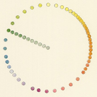
+ 1 Square 1 color: focus on the main theme ‘color’, interesting visual aspect (variety of colors).
+ # ‘hashtag’: to be seen and share data.
+ Follow or be followed by similar accounts


Ideas to complete:
1) Account’s name: ‘What i saw while’ = @whatisawhile
It refers to which color I’ve seen while a daily situation occured to me.
2) Profile picture: The color I identify myself with.
3) Short sentence to describe the account’s theme: ‘I associate everyday situations in which I find myself to colors’.

4) Description bellow image: for each image the description will start the same ‘What i saw while’ to give the account a rhythm and an identity and for the viewers to remember the account’s name.
Always the same plan for each publication: 1 color as an image – 1 title as color’s name – 1 sentence to contextualize – 1 date – 1 town – few hashtags.


FINAL PROJECT


WANT TO SEE MORE OF WHATISAWHILE‘S COLOR SYSTEM?

GO follow @whatisawhile on Instagram to discover other stories hiding behind the colors!! 🙂

Responsive Color System


Sunday, April 1, 2018

After researching information about different color systems, I realized that all the systems try to approach questions of color always in relation to something. Color in terms how we describe it in language, color as light, color as pigment, color as sound. As for the color in relation to human body there is a Chakras system. But it is all fixed, and doesn’t explain movements of the body. I see human body as a constantly changing system, it is changes every second, and I wanted to develop during this project I wanted to create color system which describes movements of the human body into the color, in the real time. I wanted it to be really interactive and visual.

illustration1_950                   illustration3_950

So I split whole process into two steps. First step was to find a sensor which will “read” movements of the body. There were several ideas possible, but after some try outs with heart rate monitors, ultrasonic motion sensors, I ended up using HC-SR501 Passive Infrared Motion Sensor (PIR) sensor. The module features adjustable sensitivity that allows for a motion detection range from 3 meters to 7 meters.  The device will detect motion inside a 110 degree cone with a range of 3 to 7 meters. I was using raspberry pi computer to program reactions of the sensor.

Second step was to find the way to represent the data from the motion sensor. I wanted to work with light. There were some ideas to use projectors. But in the end I was using Philips Hue lamps because they have open API and it is easy to program them.

There were some challenges with Philips hue lamps. They do not work by independently. If you want to communicate with lamps there is a physical device which called a bridge. . The Philips Hue bridge is the heart of the system. When you are programming, your are not communicating with lamps directly, you send commands to the bridge, and the bridge sends messages to lamps so they know, which hue and saturation apply to the lamp. Problem is that this bridge should be connected to wifi network. In school wifi network is secured, so you can not that easily add new device to it. This lamps are meant for use at home, and not really designed for the usage in the public locations.  So basically the solution to this problem was to create my own network. Raspberry pi computer became dhcp server and was assigning IP address to the bridge. It is very important to know IP adress, because than you know where to send your commands in program. So the whole system do not depend on the network connection and know can work on any location.

About the transformation of the movement to color. I built the whole system and tried it on the spot in the school. Originally it was working from the simple lamp. I installed the lamp in school and was observing people behavior how they react on the lamp. First setup was like this whenever someone pass by or approach the lamp it will switch on and start changing colors. This was clear, I noticed that once people realize how it works, they lose their interest in it. Like puzzle is solved. And usually it take 30 seconds for them to realize and they move forward. And also there were not so many people who will notice it in the first place. So I added blinking to get an attention of the passing by people. And once they approach lamp it will start changing colors, but with 5 seconds delay. After this changes there were more people discovering the work. And they spend way more time with it. Puzzled, and trying understand what action trigger lamp.

Next step was to put everything together in one container. So the whole system can work as portable device and can be shown in different locations.

As for the next steps I think it would be interesting to add more sensors. After some tests in library, I realized that people want to touch the object. It would be nice to add one more reaction to touch. And make more tests in different spots: Library, cafe, train station.


The birth of the Intrinsic Colour System


Friday, March 30, 2018

When thinking about colour  I immediately become somewhat insecure. For me colour has a strange randomness to it and therefore every choice I make based on or about colour becomes almost arbitrary. There is also this common colour psychology theory people start quoting when talking about colour. Maybe it is because they are just as uncertain about the subject as I am. Or maybe it is because they do know what they are doing when using colour.

In order to keep evading the subject of colour during this project I had to figure out how I used colour in previous works. It turns out that most of the things I made aren’t colored. Of course they have a colour, but that is because the material of which the object is made has this colour as a natural property. If a thing I make is made from wood it will have a wood colour. If it is made from metal it has a metal colour. Not choosing a colour doesn’t mean you have to pick white, but it means to not cover the intrinsic colour.

Now with this new revelation about my colour use I had to think of a way how to put this in a system. A couple of weeks before this project I did some research about the DIN colour system. Which was an interesting experience. There was nothing to be found about it on the web or in libraries. This meant that I had to define what the system was about by combining multiple contradicting sources. Although that feels like you are just making up something it gave me some understanding of the general structure of colour systems. Most modern colour systems combine 3 parameters: hue, saturation and brightness.

glass  plastic  wood

brick  clay  marble

concrete  metal

The First step in translating these intrinsic colours to a system was to just combine the two ideas I discovered. I tried to find three parameters, not necessarily hue, saturation and brightness, in the materials I would qualify as materials I would use. The list got longer than I anticipated. And I started to notice something else; these aren’t materials I would use, these are building materials. The focus of my materials shifted from sculptural perspective to a architectural perspective. Not held back by this discovery I tried to put the materials in a circle as if they were colour hues. This led to a couple of interesting connections and contradictions.

IMG_9518

Now that the hue parameter was replaced by material I still had to come up with a replacement for saturation and brightness. This is where things started to go wrong. It didn’t take long before one of the biggest philosophical themes entered this soon-to-be colour system: time. I came up with the idea that the use of material changed over time and that the amount of a material that was used could make great graphs. Now brightness became time and saturation became the amount of the material that was used.

IMG_9520

Because this may sound a bit abstract I will try to explain it with an example. Glass was used in small quantities during the middle ages. With several improvements in the production process and by improvements in building construction larger pieces of glass were used in buildings from the end of the middle ages. An even better production process because of the industrial revolution combined with the modernist ideas of the first half of the 20th century lead to a enormous increase in glass use. Our obsession with high buildings, great views and daylight lead to the highest amount of glass used in architecture since ever.

IMG_9521

I made timelines like this one for all the materials in my material circle. Now I could make the step from theory to a specimen. It seemed logical to make the graphs of amount of material over time out of the material they are about. I figured out a way to do that but I still needed something for these physical graphs to be presented on. Within half an hour I went from a graph to a maquette with 12 buildings in the middle of Paris.

IMG_9522kopie

As I said when I had to come up with 2 other parameters, it already went wrong after the first step. The parameters where to abstract, farfetched and maybe with this last step to applied. I got stuck in an object that was just there as an object instead of what a colour system should be: a tool.

So now what? As with colour in general I decided not to use it. I did nothing with the project for a couple of weeks. But one day before the deadline of the project I had to come up with something. It was clear that the project was way to much thought and far to little hands on with the subject. I had to get out. Check out how these materials are used in the city and try to find transitions in material. So I took my camera out on this lazy Sunday, jumped on my bike and went on a slow journey into Amsterdam.

I just took photo’s of every building that used a material because of it’s qualities. This resulted in about 300 photo’s of bricks, metal sheets and glass. The selection could begin. By deciding whether or not I picture was more than just a registration I could narrow it down to about 60. Which I then sorted based on material and colour. Just like I did when making the material circle in the first step weeks ago. In the end I had about 35 images which made a colour circle that could start anywhere in the series.

Schermafbeelding 2018-03-30 om 16.37.57

It could be because of the medium or traditional ways to show colour systems, but it seemed logical to make a book of these photos. I tried to make spreads in which it would be sometimes difficult to see where one image starts and the other ends. To create this illusion of a gradient, but also to make them more abstract. They are not about the building that is depicted, but about the material of its facade.

An intrinsic colour being covered by another while both are being slowly smuggled away.

An intrinsic colour being covered by another while both are being slowly smuggled away.


I printed the spreads on separate sheets which then were connected like a leporello. Just because I didn’t know any better I connected them with a nice wide piece of double-sided tape. This made the leporello almost a structure, something that could stand on its own instead of having a cover. When installing it in a circle it didn’t work for me, it wasn’t as self supportive as it was in a book form. So I decided to add a cover that was attached to the last page and would wrap around the first page. This would complete the circle, it could still be viewed as a structure and it would still feel as a book. The material circle is printed on the back and is incomplete, for new materials to be added. I think this fits in the idea of it being a tool instead of just an object.

If there is one thing I learned from this project it would be that it is important to materialize the process. This project, for a major part about thinking, turned at the end into one about doing. Though this thinking was needed for the doing in the end I would like to experiment with reversing this process. Do first and analyze afterwards.


IMG_9525


IMG_9523         IMG_9530


IMG_9524


IMG_9529


IMG_9526


IMG_9527


IMG_9528


DIN colour system


Friday, March 30, 2018

din logo

DIN is the German Institute for standardization (Deutsche Institut für Normung). It is the official ISO (International Standardization Organization) member for Germany. So far they made about 30.000 Din Standards, many of which are now used as international standards. They for example made the DIN standard for photographic film,  the A-size for paper and the purple and green mouse and keyboard connectors.

The DIN is often mistaken for the Deutsche Industrie Norm, which is a name for standards another organization published in the early 20th century. Despite that they aren’t called that way anymore they do serve their main purpose in the (German) industry. So is the DIN colour system.

It took the institute about 10 years to come up with this system. Starting in the 40’s they had their initial results published in 1953. But because it is standard that is still used by the industry it has been regularly updated.

When the researchers started they had as an objective to create a colour system in which to make all the variables in steps that are equidistant. Hue, Brightness and saturation all work in different ways, especially when it comes to how the colours are experienced. In order to define these steps and relations they did visual experiments in which subjects had to pick from a range of 120 colours the ones that they thought were equidistant. They boiled the results of this experiments down to 24 colour hue’s.

schema

By adding Brightness  (Darkness) and Saturation a system started to form. Each of the 3 parameters got there own letter. T for hue, S for saturation and D for darkness. By combining these letters you would get a TSD code. Of course the system is not about the parameters, but about in which steps these parameters are divided.

T values are between 0 and 24 and can be interpolated. So you could pick a hue that is not in their carefully selected group of 24 colours. This would not undermine their system as these colours would still be on a equidistant scale of hue.

S values are always between 0 and 6 in which 0 is grey and 6 is maximum saturation.

D values are set between 0 and 10 in which 0 is absolute white an 10 is absolute black.

geelNow for example if this yellow would be described in a TSD code one would get a 2 as a T value, 5 as S value and 2 as D value. To correctly write down this code a colon should be placed between the numbers. In this case it would be 2:5:2.

I think the most interesting part of this system is that it tried to make all steps within the system equal. Even though this resulted in a system in which all colours are mathematically unequal.

Check out the following links for more in-depth explanation of the DIN Colour System.http://www.farbe.com or http://www.vcsconsulting.co.uk

Ignaz Schiffermüller’s Color System


Thursday, March 29, 2018

Ignaz Schiffermüller (1727-1806) was an Austrian naturalist mainly interested in insects, specially butterflies. He was a teacher at the Theresianum College in Vienna. Schiffermüller is also recognized for his work in optics and colour theory. He developed scientifically based colour nomenclature to describe the countless tones of nature.

ignazschmetterlink

In 1772 his work “Versuch eines Farbensystems” was published . It contained an attractive full-page engraving with a colour circle, inspired by the optical theory of French Jesuit Louis Bertrand Castel(1688–1757) and hand-tinted with twelve colours continuously shading into one another. He developed it based on natural samples of colour and colour charts where he compared the tones. The circumference of Schiffermüller’s circle is filled with twelve colours to which he has given some very fanciful names: blue, sea-green, green, olive-green, yellow, orange-yellow, fire-red, red, crimson, violet-red, violet-blue and fire-blue. The three primary colours of blue, yellow and red are not placed at equal distances from each other; between them come three kinds of green, two kinds of orange and four variations of violet (excluding the secondary colour violet). Schiffermüller selects a total of 12 colours like Father Castel who linked his system to music — more specifically, the twelve semi-tones of the musical scale.


book2_corr

Ignaz Schiffermuller’s system served to illustrate Newton’s discovery that the pure colours could be arranged in a circle. He was one of the first to arrange the complementary colours opposite one another: blue opposite orange; yellow opposite violet; red opposite sea green. Schiffermüller also placed a sun (only suggested here) inside his colour circle in order to emphasize that all colours are produced by nature.

Circle Drawing with the Sun

What all three scholars had in common aside from naturalistic origins of their studies is how tones of colours and shading is crucial for development of each colour. The gradual change in colour’s intensity is visually representing the natural unstability of colours and how we perceive them. Because of that we can consider Schriffermuller’s work as a contemporary study of colour.

Coloroid


Saturday, March 24, 2018

The color system ‘Coloroid’ was originated in Hungary, developed between 1962 and 1980 by the Professor Antal Nemcsics. The objective of this arrangement was to provide technical and artistic help to architects involved in colored environmental design. There was no contemporary color system that fulfilled the requirements stipulated for color planning.
In August 2000, the Coloroid system has been registered as Hungarian Standard, and used as the main colour system.

The system is operated with the three parameters of color-hue, saturation and brightness.
Basically, the value ‘T’ stands for saturation, or purity of the color, the cylinder is created around a 48-part color circle ‘A’ or wavelength, and the ‘V’ is the luminosity, the higher it gets, the luminosity is higher, and vice versa.

02col 03col

The form that it creates is a modified cylinder based on ‘psychosomatic scales’.

01col

The guiding principle behind the system is to show the aesthetic distance between colors as being uniform, due to the fact that the 48 different colors are being located at approximately identical number of harmony intervals to each other. Within this, as the smaller perceptual volume defined by the limit of colors, it is possible to reproduce with physical media (material, pigment colors).

3-Figure6-1

The interesting part of this system for me is the idea of harmony, and how it can be defined or create with a simple linear or geometrical combination of colors.

HERMANN EBBINGHAUS’ COLOUR SYSTEM


Friday, March 23, 2018


Hermann Ebbinghaus (1850-1909) was a German psychologist who pioneered the experimental psychology of memory. He is mostly known for his discovery of the forgetting curve (describes how the ability of the brain to retain information decreases in time), the learning curve (graphical representation of the rate at which you make progress learning new information) and the spacing effect (phenomenon whereby information is learned and retained more easily and effectively when its studying is spread out over time).


However, Hermann Ebbinghaus has also been known thanks to its colour system. Indeed, the concept of the double pyramid gained in popularity thanks to the latter.


In 1902, he proposed a new version of Hofler’s double pyramid. Ebbinghaus constructed a colour system rest on this system of double pyramid but made few modifications: he put rounded corners and an inclined central plane.


He rounds off the corners of the solid as he considered the transition between colours as fluid and not sharply defined. The Hering-type fundamental opponent colours are located at the six corners (black, green, red, blue, yellow, white).
The resulting chromatic body, from the four primary colours, links Leonardo da Vinci’s idea that colours vary in brightness and can thus be differentiated. The idea was to separate and so distinguish those four colours due to the variation of brightness.
The base-square of the double solid is tilted in such a way that the best yellow hues, which are relatively bright, are nearer to white, and the best blue tones, which are relatively dark, are nearer to black. His system does not predict the mixtures of colours and the complementary pairs are not arranged opposite one another.


In 1893, Ebbinghaus published a «Theory of Colour Vision» in the Zeitschrift für Psychology (Journal of Psychology), in which he mentioned that humans perceive colours through higher mental processes. As a psychologist, he knew about the perception of the four elementary colour (yellow, red, green, blue) and thanks to physiologists knew there were only three photo-sensitive substances in the eye’s retina (rods, cones, photosensitive retinal ganglion cells) thanks to which the phenomenon of coloured vision and its anomalies could be explained.


In addition, Ebbinghaus has discovered that two white hues produced by spinning either red and green or blue and yellow, appeared to be the same at certain levels of brightness, but appeared different when the illumination was reduced or the speed was reduced.

iscc-nbs-system


Sunday, March 18, 2018


iscc


The ISCC-NBS system of color designation is a system of naming colors based
on a set of 13 basic color terms, it was first established in the 1930’s by a joint
effort of the Inter Society Color Council and the National Bureau of Standards.

Screen Shot 2018-05-23 at 19.19.22

The ISCC-NBS system believed colors should have names. The objective of the system is to assign precise names to the individual blocks of color of the A.H. Munsell color system, using ordinary words. And the systems goal is to designate colors in the Unites States Pharmacopoeia, the National Formulary and in general literature. And the system should be acceptable and usable by science, art and industry, and should be understood, at least in a general way by the whole public.


The backbone of the ISCC–NBS system is a set of 13 basic color categories,
made up of 10 hue names and three neutral categories: pink(Pk), red(R), orange(O),
brown(Br), yellow(Y), olive(OI), yellow green(YG), green(G), blue(B), purple(P), white(Wh),
gray(Gy) and black(Bk).

Munsell_1929_color_solid_cylindrical_coordinates


Then there are 16 intermediate categories, such as: reddish orange (rO) so an adjective and the hue name.
other example: purplish blue (pB).

These categories can be further subdivided into 267 named categories by combining a hue name with modifiers. Like the subdivision for Purple, you have all these works for how the color feels/looks, like: “blackish” (bk.), “dark-ish gray” (d.-ish Gy). So they really wanted to find a way to objectively measure a color. And I feel that this way is pretty objective for a color naming system. I find that this system is fast and easily communicated through the system they made using the brackets.

Moses Harris’s Natural System of Colours Wherein is displayed the regular and beautiful Order and Arrangement, Arising from the Three Primitives, Red, Blue, and Yellow, The manner in which each Colour is formed, and its Composition, The Dependence they have on each other, and by their Harmonious Connections Are produced the Teints, or Colours, of every Object in the Creation, And those Teints, tho’ so numerous as 660, are all comprised in Thirty Three Terms


Friday, March 16, 2018

Moses Harris, who lived from 15 April 1730 until 1788 in England, was a fanatic entomologist (this is someone who studies insects). As the first photograph had yet to be taken, it was common to use engravings to use as imagery to support your research. Moses did not outsource the making of these engravings, he made them himself. As the difference between two insect species is sometimes very subtle, the colours of Moses’s engravings needed to be very precise in order to be able to determine a species correctly. Thus grew his interest in colour.
 
Moses Harris engraving
 
In Moses’s quest to record insects as best as he could, he needed a new colour system that could help him when he was making the engravings of the insects. He decided to create his own colour system by using a  source that he as an entomologist was very familiar with, nature. He claims that blue, red and yellow are the prime colours, because those are the colours to be found back the most in non-domesticated flowers, thus nature must like them the most. He called them the prismatic colours, because those are the colours that are reflected by the prism. Which is quite remarkable, as his whole research is about colour in pigment and not in light like in the prism. The colours green, orange and purple he calls the compound colours, as they are made up from the prismatic colours. As Moses thinks that nature divides the prismatic colours and the compound colours, he decided to also separate them into two different colour wheels that together make his colour system. It is said that Moses is the inventor of the colour wheel.
He finished his colour system somewhere between 1769 and 1776 with a lot of enthusiasm. A bit too much enthusiasm maybe, as he named his colour system:
“Moses Harris’s Natural System of Colours Wherein is displayed the regular and beautiful Order and Arrangement, Arising from the Three Primitives, Red, Blue, and Yellow, The manner in which each Colour is formed, and its Composition, The Dependence they have on each other, and by their Harmonious Connections Are produced the Teints, or Colours, of every Object in the Creation, And those Teints, tho’ so numerous as 660, are all comprised in Thirty Three Terms”

Now this was a bit too long to go on the book cover of his publication about his newly realized colour system thus they shortened it to: “Moses Harris’s Natural System of Colours

If you’re interested to read more about Moses Harris’s Natural System of Colours, you can read more about it here on another designblogpost. 

moses-harris-prismatic-rca-mr_340 [x] Moses Harris's compound colour wheel

William Benson Cuboid Colour System


Thursday, March 15, 2018

The English architect William Benson developed a color system for practical application in the decorative arts. He kept well informed on the scientific findings in the color field. With experience in pigment mixture as well as his own experiments with a prism and mixtures, Benson fully understood the difference between light and colorant mixture.
In 1868, Benson published ‘Principles of the Science of Colour’, which describes a cubic color system. Based on this system, he derived rules of color harmony for color-design use. Later editions appeared in 1872, 1876, and 1886. Benson attempted to cover the totality of color sensation in appropriate geometric model named the Natural System of Cours. Benson’s system is a conceptually additive one. He considered spectral colours to best approximate pure color sensations:

In their binary mixtures, the primary colours red, green and blue form the secondaries, taken to complement the primaries, as determined with the help of edge spectra.The cube stands on its black corner, and three edges extend outwards to the basic colours of red, green and blue.
William B2

From the top, the edges lead to a yellow, a “sea-green” and a pink corner. Benson’s cube contains 13 main axes which he divides into three groups:

‘Primary axes’, connecting the central points of opposing side, meaning that the primary colours changes involving  3 axes.

‘Secondary axes’, connecting the middle points of opposing edges, meaning that two primary colours will change involving 6 axes.

‘Tertiary axes’, joining opposing corners meaning that all the three primary colours will change involving 4 axes.

Benson gave exact colour names to all the many points;

He named all the colours on his cube,mostly in name pairs to accurately describe the intermediacy of the colours, and where they would lay spatially. His model might be one of the first three dimensional color model.
William B

genuine product of light and shadow


Wednesday, March 7, 2018

18

Athanasius Kircher,was a German Jesuit scholar and polymath. As he had outstanding talents and  wide range of interests in mathematics, geology, medicine, etc.  he has been often compared to fellow scholar Roger Boscovich and to Leonardo da Vinci. Kircher also was a follower of the theory called ON COLOURS which argues that all colors (yellow, red, and blue) are derived from mixtures of black and white.


12


As we can see in this diagram, all the color points of the system can  be reached from white and black, and this shows his fundamental view on colors as genuine product of light and shadow. In his system, all combinations of colors are produced with three colors between white and black and all the possible mixtures are shown on half-circles.
132
For example, in the case of green, which is a mixture of yellow and blue, it is located at the overlap of yellow and blue and takes a special position as it is in the center with red below. It remained influential until Isaac Newtons’s experiments with light refraction came out. In fact, the prism, and its effect on light, was something already known to Kircher, but he made an incorrect ordering of colors from bright to black. Newton was the one who defined the right order of the rainbow colors.

14


Still his system has significance for the color theories for these reasons.


It is a linear diagram with red, yellow and blue as the basic colors

It is  a theory behind De Coloribus (all colors are derived from mixtures of black and white)

It also provides a firm idea of mixed colors, characterized by semi-circular bows


Robert Ridgway’s Colour Standards and Colour Nomenclature


Sunday, March 4, 2018

good one

Robert Ridgway (Illinois, 1850-1926) was an ornithologist who, next to hundreds of publications on bird species, wrote two books on color-classification. In the first book, A Nomenclature of Colors for Naturalists (1886), was relatively simple, but already gave 186 colors their own names, which was different to how colors were described at that time; usually they were named and described subjectively.

Looking for a way to create a more advanced and expanded work, Ridgway published his second book in 1912: Color Standards and Color Nomenclature (link to the book itself), with 1,115 new names for colors. This way it was a lot easier to communicate about specific colors between taxonomists in all kinds of scientific fields. Ridgway’s system is still used a lot in taxonomy to this day.

01ridldpd_8627102_000_00000003Ridgway240x330

The figure above shows how Ridgway visualized his coloursystem. One could imagine a two-dimensional, straight line, which has a lightness-gradient, going from white to black. This line doesn’t contain any colour, but as soon as it’s imagined as a three-dimensional shape, the line is surrounded by all 1,115 colours. The colours Ridgway specified were split up in thirty-six individuals, called the “pure colours”. The different teints in between the white, black, and “pure colour”, were all presented and named on the fifty-three hand-painted colourplates (as shown below). Though most of them were very well preserved, thanks to special care being taken to make them durable, some did slightly change hue. Sadly, an exact description on the procedure of how the colours were mixed is missing in the book, making the colours that changed, lost.

1912-plate31912-plate2-175x3001912-plate1-176x300

Maxwells Colour System


Saturday, March 3, 2018

The scientist James Clerck Maxwell discovered the additive colour system and showed the first colour photography. He lived in the 19th Century, influenced by the Works of Isaac Newton and Thomas Young. He has impact on our knowledge of the Saturn Rings, Electromagnetic waves and the RGB colours.

colour-mix-tool Maxwell Photography

Maxwell at Trinity College, Cambridge. He is holding one of his colour wheels.


In his student years at the Cambridge he was fascinated by the questions:

What are colours? Why do we perceive colour? And why are we so coloured?

At that time he read the studies of Thomas Young. Young thought that painters have a much better understanding of colours then scientist had at that time. They used the primary colours to get the full colour spectrum of a painting. He found that there’s a significance of these three primary colours and that biology has a role to play. He assumed there are three receptors for each of the primary colours in the human brain. By mixing these we receive our full colour view.

Maxwell read about this theory and wanted to prove it by mathematics. He developed a tool to trick the human brain. By spinning the right amounts of red, green and blue on a wheel, it seems like the colours are melting together to white. With this experiment he could prove that what we perceive as white is actually a mix of colours. And that there’s a difference of mixing colours in light and colours in pigments.

Colour Pyramid

From this he developed a Red, Green and Blue colour pyramid. On each corner there is the absolute of one of the primary colours. Towards the middle you get different hues of the colour and the center is white. The Pyramid is built on a x/y Axe. Mapping out a point on the pyramid gives a value of each of the primary colours.

To display his finds, he was invited to give a lecture on colour vision. What he did was to screen the same photograph with a red then green and blue light on top of each other. Where the colours intersect, there is white.

Maxwell Colour Experiment

At this time there was only black and white photography. With this experiment he made the world’s first colour photography. The additive colour system can be understood as the foundation of RGB colours and is used in the screens of most electronic devices today.
 

Isaac Newtons Colour Wheel


Friday, March 2, 2018

Back in time when Newton was around (1642-1726 ), people thought that color was a mixture of light and darkness, and that prisms colored light. Isaac Newton didn’t believe that so he decided to test it out for himself and around 1665 he passed white light through a prism. Here he identified seven colours: red, orange, yellow, green, blue, indigo, and violet. These colours he referred to the colours of the rainbow and that they were analogous to the notes of the musical scale.

1

In Newton’s color wheel, in which the colors are arranged clockwise in the order they appear in the rainbow, each “spoke” of the wheel is assigned a letter. These letters correspond to the notes of the musical scale.


What he did was that he projected white light through a prism onto a wall and had a friend mark the boundaries between the colours, which he then named. In his diagrams, which show how colours respond to notes, Newton introduced two new colours, orange and indigo. These to colours would correspond to half the steps in the octatonic scale.

3

In physics terminology, an octave is the frequency range from x to 2x, and that premise holds true for musical octaves. If light behaved like music, then photon frequencies of the spectrum would also range from x to 2x, and their wavelengths, inversely proportional to their frequencies, would too. Instead, the wavelengths of visible light range from 400 to 700 nanometers, which, if translated to sound waves, would be approximately equivalent to a major sixth.
Therefore Isaac Newtons colour theory was actually incorrect as the frequency range in an octave is different than photon frequencies of light spectrum. Although his theory falls apart his experiments with prisms showed us that white light is a mix of different coloured lights.

If all this sounds very confusing then don’t be alarmed. I recommend watching this video about the octatonic scale which Newton related his colour theory to. It creates a picture of the different layers of tones that Newton was trying to relate to the prism reflection with white light.

CIE-1931-System


Thursday, March 1, 2018

CIE-1931-System is a color matching system. CIE stands for Commission internationale de l’éclairage, which is an international authority for setting standards related to light and color. In this system the goal is not to describe how colors appear to humans but to categorize and measure colors and create a numerically order. Which then also provides a framework for precisely reproducing the measured color in printing or digitally. It’s a mathematical categorization of colors and it’s based on matching combinations of light to colors that appear to most people in this way.

unnamed

Light is transformed in wavelength and humans can perceive these waves in between 380nm and 750nm. Wavelengths are absorbed and reflected by objects. Inside the human eye we have our own system of perceiving this colors by conephotoreceptors. We have 3 of them and they’re sensitive to different but overlapping wavelengths of light. L is most sensitive to long wavelengths and therefor red, M to middle-long wavelengths and therefor green and S to short wavelengths and therefor blue.

unnamed

The cone’s of the eye are stimulated by complex spectral distributions of absorbing or reflecting light and then reduces it to numerical values which represents how much the three cones are stimulated. Important to know is that different spectral distributions can stimulate the cones in exactly the same way. This means we don’t need the original light source to reproduce a certain color but we can create a spectral distribution of light that stimulates the cone in the same way in order to reproduce this exact color if we find the right match. And it’s not only about creating a certain color, but it also deals with showing how to reproduce the difference in brightness of the color. And the CIE-1931-system gives us the information we need to find these matches.

unnamed

The system has 3 functions called the RGB color matching functions. These are three fixed primary colors and the color matching functions are there to show you the amount of each primary output you need to create a desired color when they’re all mixed.


Hering’s 4-colour wheel


Wednesday, February 28, 2018

I am going to explain to you Ewald Hering’s very exciting colour wheel chart containing of not 3 (RGB) but 4 primary colours (RGBY).

Hering was a German physiologist who specialised in colour perception. So basically how our eyes and brains work in relation to colour which we can call “the physiology of visual perception”
A problem that came up was the colour yellow; Helmholtz, another physicist who came op with the RGB model (the Young-Helmholtz theory) had stated that yellow came from a mixture of red and green (so there being 3 primary colours).

1
For hering this was not in line with the human experience because the sensation of yellow is very important and is not seen as a mixture of something else.

Instead of seeing complementary colours, like in the 3 primary colour wheel (RGB), Hering talked about opposing colours. Being; blue versus yellow, red versus green and black versus white.

7

So next to black and white there would be 4 colours which can occur without the “help” of another colour.
Every perception (what we see) is a mixture of the six basic sensations (so these four colours plus black and white) opposing each other and thus interacting.

Hering called these colours the “psychological primaries”.

Hering states that in the human eye thus brain there are three processes happening at the same time in order to see colour; the red-green, yellow-blue and black and white sensation. Later on I will explain why Hering also calls these sensations the “opposing pairs”.

(In his system, red green yellow and blue can be seen as primary colours. Anyone who is seeing orange can imagine it to be a mix of red en yellow. But no one looks at red, yellow or blue and sees it as a mixture of other colours.)

Hering wasn’t the first to talk about 4 primary colours. Before him so did Leonardo da Vinci. Only the arranging of the colours in a circular model was something Hering did. So the wheel is his invention with which he proved to have a real point.

The outer ring of the wheel shows how every primary colour has a warm and a cool side.
So warm red is red with a lot of yellow while cool red is more bluish
Warm yellow goes towards red and cool yellow towards green. Etc.

Each primary colour pair in the wheel has the same warm and cool side.
For example: Green and red have yellow for warm and blue for cold which makes them pairing as well as opposing.

Although having the same hot and cold sensations, the opposing colours in the weel cannot be part of each other.
– yellow can be kind of green or red but never blue
– green can be kind of blue or yellow but never red.

Complementary colours complete each other (like in the RGB wheel) but Hering’s opposing colours do the exact opposite.

A lot of us have learned in high school that there are three primary colours; red yellow and blue. The thing is actually that this 3 primary colour wheel is how to mix colours by knowing what colours complement each other and what colours generally look good together.
If we are talking about how we actually see colours, there are 4 primary colours!
So this is the big difference between the two wheels; the three colour wheel is about aesthetics while the 4 colour wheel (Hering’s) is about the psychological relationship we have towards colour.

5

You have to look at the 4 colour wheel like meters in your head. When the meter goes one way, there is more red, if it goes the other way you get green. If the meter stays in the middle you get zero so no colour (or actually a kind of greyish or brownish), same with yellow and blue.
Then at the same time you have a meter that, for example, goes from a reddish yellow to a greenish yellow and that goes from a yellowish green to a blueish green
And then there is also a meter that adds more or less black or white, also changing the colour.

R – 0 – G , so there is no greenish red
B – 0 – Y , so there is no yellowish blue

There is a greenish blue or a reddish blue (purple)
There is also a greenish yellow or a reddish yellow (orange)

Hering’s colour wheel is used a lot because it shows how the eye naturally perceives colour. So it’s less a bout just mixing paint or seeing how colors can be made in different media in what case you would need only three colours (RGB).

Instead, the wheel is better at showing what happens in the upper, brain level, and describing humans colour sensations.

CMYk printing advices:


Tuesday, February 27, 2018

CMYk is color system used for printing. To print an mage, first you have to separate it into four colors: Cyan, Magenta, Yellow and Black.
Each of this colors consists from halftone dots, when dots of different colors overlap each other you can get all colors of rainbow. By using halftones of each colour, we are able to mix various percentages of all four process colours to print a huge spectrum of colours. If you take a magnifying glass to the full colour image, you will see that it is comprised of dots of various process colour. There is a measure of density of this color dots, it is called DPI, in particular the number of individual dots that can be placed in a line within the span of 1 inch (2.54 cm). If you are printing photo, dpi should be around 300. But if you are printing big board or posters, something that people will observe from the distance dpi can be less than that.


Screen Shot 2018-02-04 at 11.02.20 PM


In theory, the mixing of C, M and Y should give a black color, but in practice gives a dirty brown. Therefore, the fourth paint is often added black. If we add one or more of the other CMY colours to Black in 4 colour process printing, we get a darker, truer Black than just using Black ink alone. It is called Rich Black. In theory, you can get the richest Black by using 100% of all four inks but in practice, you are limited by how much ink you can lay down on the paper (how wet the paper can get) and the technology used in the printing process. A typical Rich Black mixture would be 50% Cyan, 40% Magenta, 40% Yellow and 100% Black. This produces a darker Black that is neutral in colour. Some other combinations of process colours can produce other looks like “Cool Black” or “Warm Black”. Rich Black should never be used for small type, especially fonts with fine serifs.


Log in
subscribe