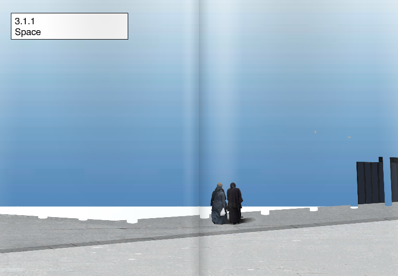
i was interested in the term “meta-modernism” that i had been reading about, so when we got this assignment i decided that i wanted to focus on that topic.
i found an artist named Jonas Staal that works in a meta-modernistic way.
before my meeting with Jonas i made some research about his work, and when we met we went straight into discussing his works.
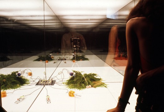
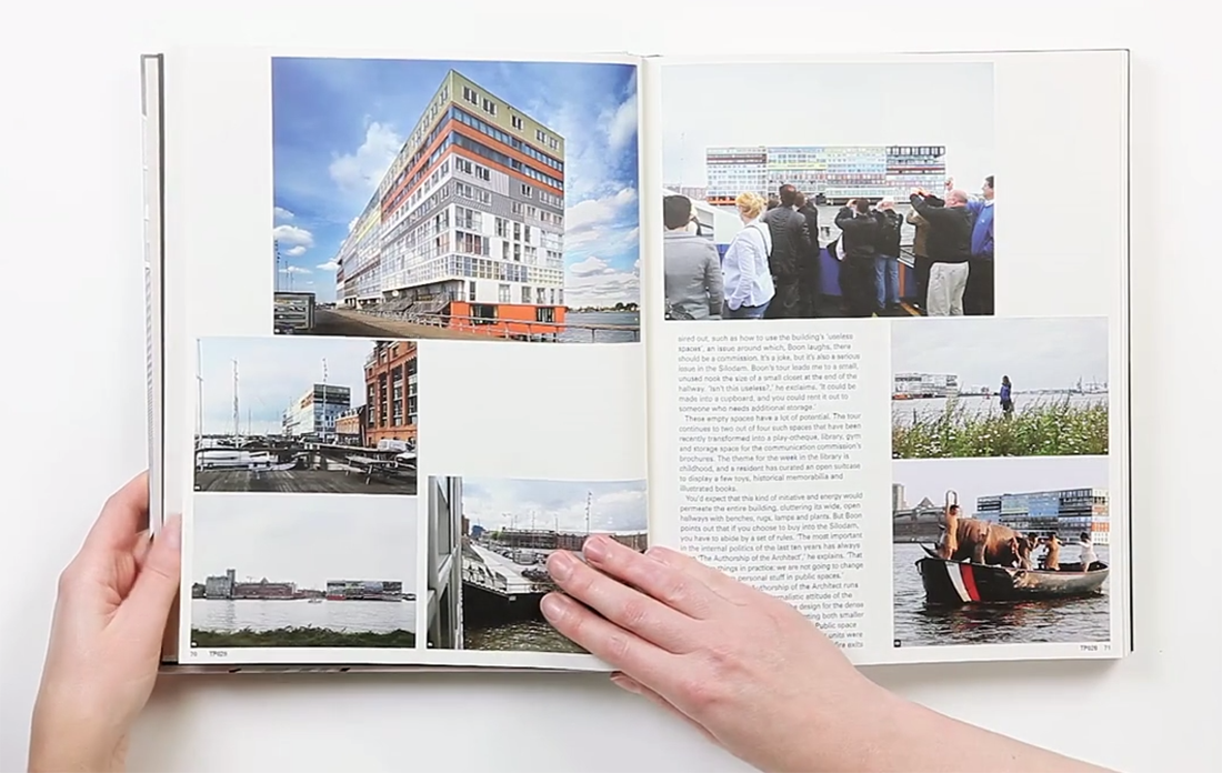
he had one work about a new prison model, a thesis by the leader of the Freedom Party MP, Fleur Agema.
(book is called Art, Property of Politics III: Closed Architecture if you want to read more. you can download the publication with this : link)
this publication became a starting point for me, as i was inspired to change/improve/alternative solution of an existing structure.
i decided that i wanted to “minimize” the gap between the suburbs and the city center, a topic that have been very discussed in Swedish media lately.
to enter this topic, I felt that starting with something I already know would be a good starting point. to this took me back to Sweden, mainly in Gothenburg.
i tried to find out what have been done/tried to be done, to “solve” it.
there were a lot of different approaches.
i am going to mention some of them briefly:
– back in 1985ties if you were a Swedish citizen and moved to the suburbs, you got 15% of your rent.
– some apartment buildings had rules, that X apartment is only for Swedish citizens, in apartment Y you can only live if you are a non-Swedish citizen, and in apartment Z you can only live if you are over 50.
– a large number of high schools have been built outside the city center, to send people outside of the center.
– building large shopping-malls with a number of exclusive stores that can not be found anywhere else in Gothenburg.
– building villa-neighborhoods and schools for kids age 6-12.
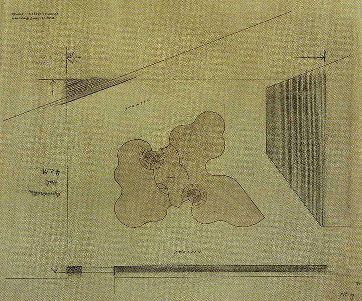
with this knowledge in my mind, I started sketching up a city plan, as you can see below.
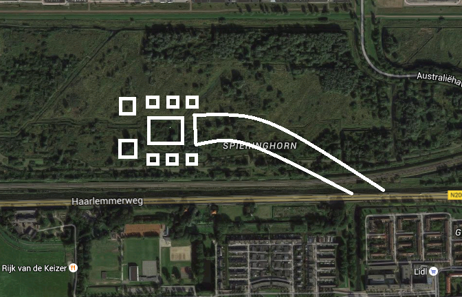
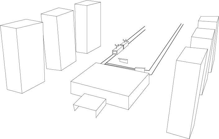
my idea behind this plan is based on what have been tried before. but how come those plans did not work?
why do I go out of the city center?
with these questions in my mind, i decided to make a construction plan where student housing/cheap housing, is built around a galleria with some exclusive stores.
when i leave the center it is because i am going to visit someone or if i need to go to a specific place to buy something.
the area i decided was a place where it was possible to make fast collective traffic and effective bike lanes into the center and out to the neighborhood.
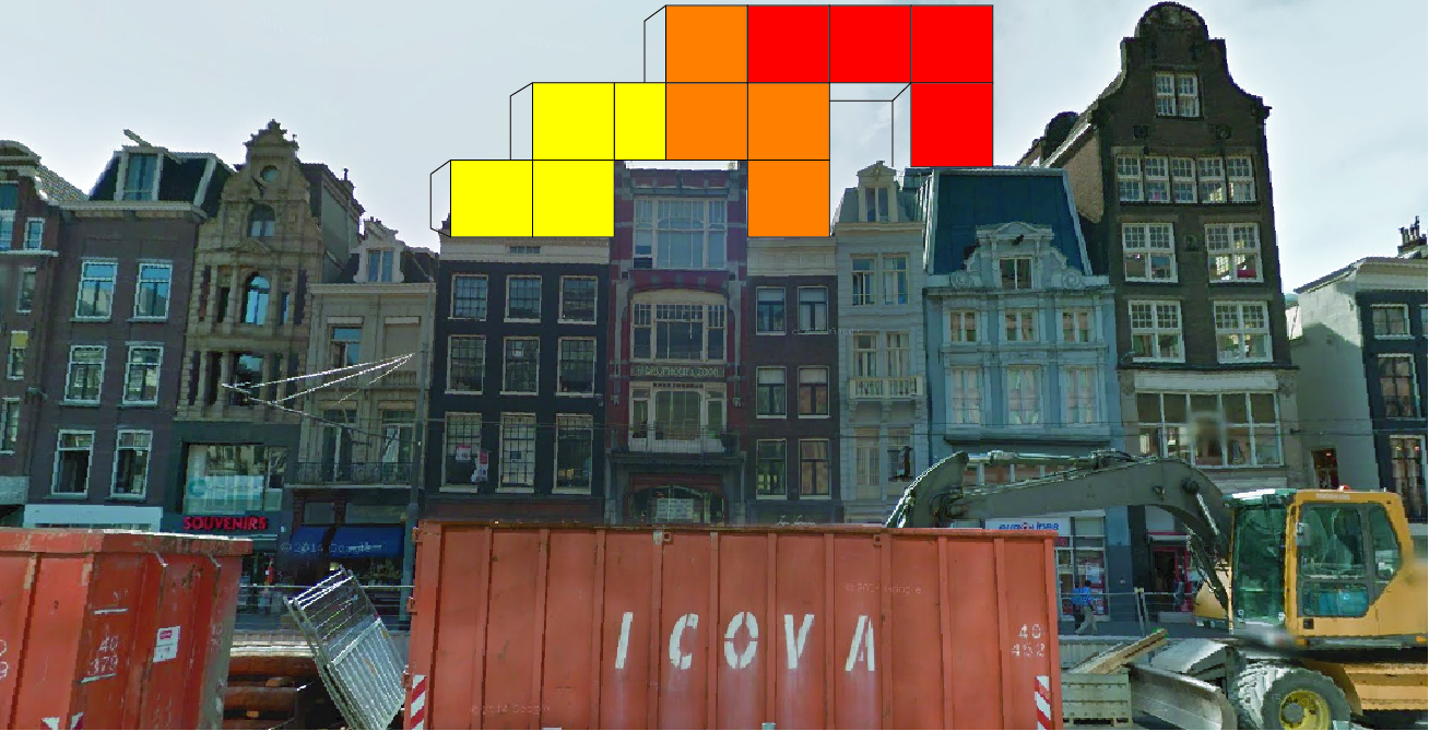
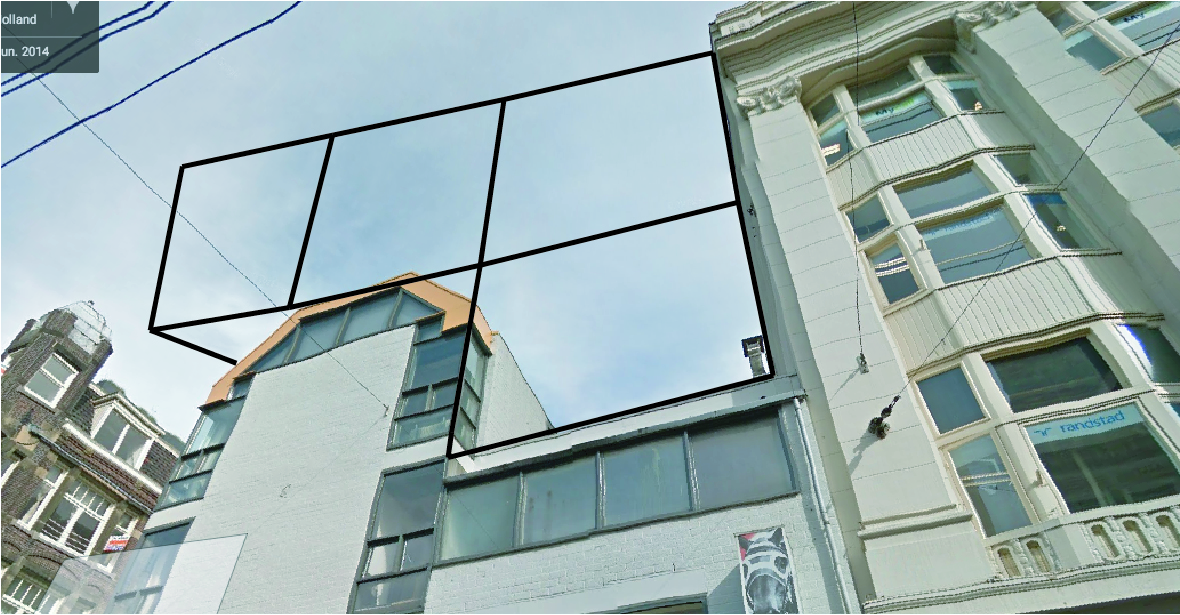
instead of creating a new area, how can i expand the already existing center?
here are some try-outs where i try to add to already existing buildings:
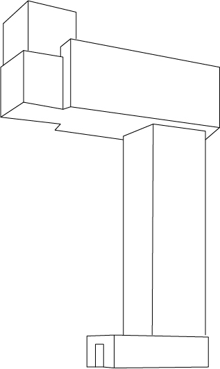
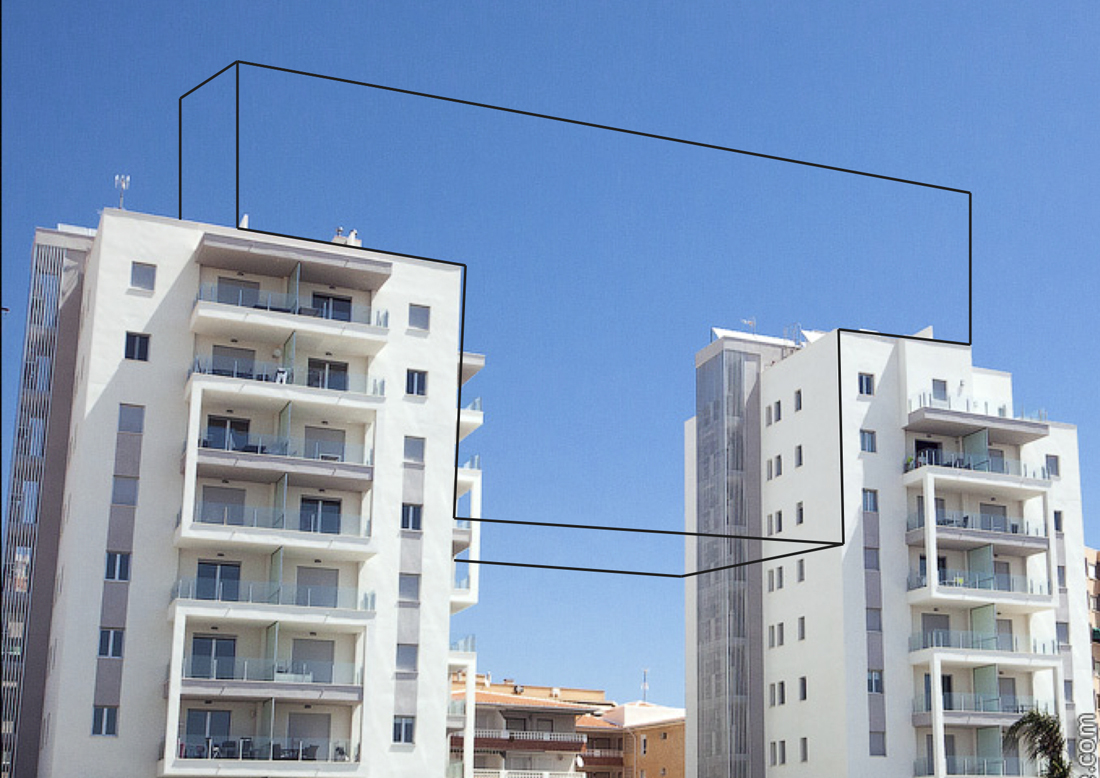
with the try outs above, i tried to use the space that would not take up space on the ground but still expand the construction of the building.
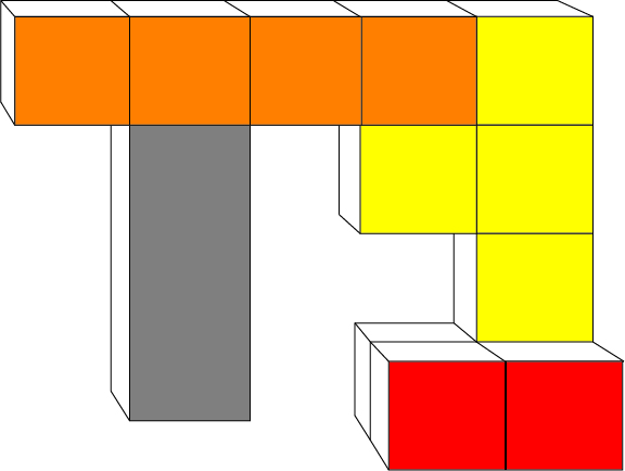
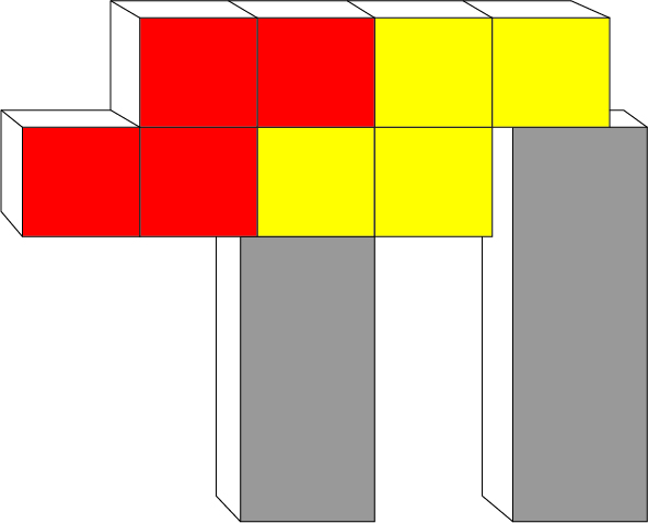
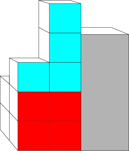
in the last picture, i was trying to work with two buildings and a piece to connect them, that made made me think of Tetris, and my work took another direction.
into something you can always keep adding as long as you have the right pieces.
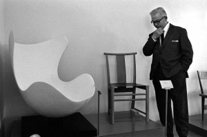
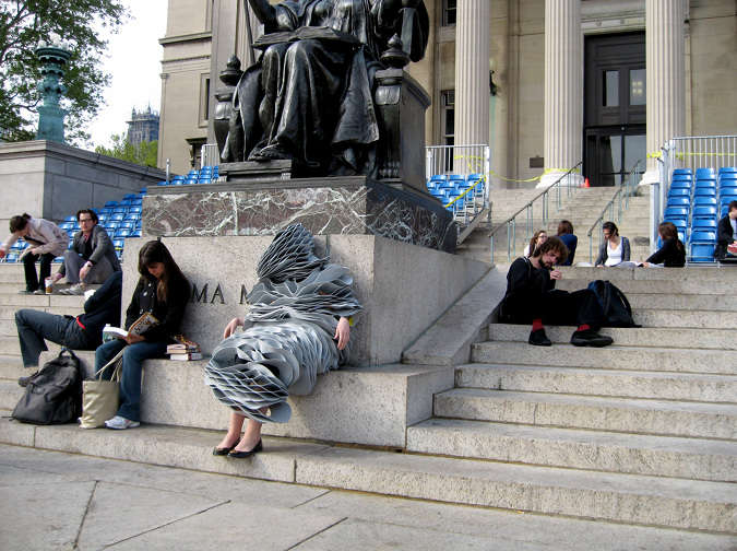
It’s always hard describing a well known person, a song, movie image, object, etc. In my case it’s a chair. Not only any chair, but Arne Jacobsen’s famous, or should I say infamous Egg chair. So, to get the formalities over with, I will start with some less elaborate reading about Jacobsen’s history.
Arne Jacobsen (1902-1971), was a Danish architect and designer. Jacobsen graduated from the Danish Royal Academy of Architecture in 1927, where he later became professor in 1956. After graduating, Jacobsen quickly became a worldly name. He is internationally best known for his iconic chair design; Seven, the Ant, the Swan, and the Egg.
Jacobsen is one of the few who have enrolled in both design and architectural history. His breakthrough as an architect came in 1929, with the winning proposal for a competition, House of the Future. The proposal, which was realized temporarily in connection with a large housing exhibition represented the then 27- year-old Arne Jacobsen along with fellow student Flemming Lassen. As an architect, Arne Jacobsen was truly an interpreter of functionalism, with its rigid geometric lines, and white surfaces. Even though the rigidness and sharp lines remain in Jacobsen’s architecture, he breaks with it in his furniture design, especially with the Egg and the Swan. It is this integration of architecture and design, also known as Gesamtkunstwerk (total work of art, ideal work of art, universal artwork etc) that reveals Jacobsen’s best abilities.[x]
10 Crosby Fall 12 By Derek LamSo what is it about that Egg, why has it won so many people over, what is so alluring, so irresistible that people are even willing to spend thousands of euros, or in other cases willing to buy fakes, just for the sake of owning a Jacobsen? Is there at all any difference between a fake and a real chair, does it even matter, and is it perhaps not about authenticity, but instead about the design, the look?
When someone says that the dog looks like its owner, is it because the owner chooses a dog that mirrors some of the owner’s properties. Here I guess we can transfer the example on our personal choices of design, because we often choose designed products from our own personality. Thus the objects we buy, become a kind of extension or doubling of ourselves. Often it happens unconsciously, but we can also choose to “brand” ourselves, that is, create a specific idea about ourselves to others, by choosing a particular clothing style, listen to a certain type of music and buy products that support the impression we want to give of ourselves.
If you invest in expensive design, and designer ”stuff”, it’s obvious you want to portray yourself in a certain way. But what about originality ? If someone chooses to invest in an original Egg chair, and bought it in good conscience, but it turns out it’s a fake, without the buyer knowing it. Would the value still remain the same because the conviction of belief still is intact ? Here I would argue that it is.
I recently read an article in the danish news paper Politiken, about a man, Henrik Buus Nielsen, who purchased two copy’s of Arne Jacobsen’s the Swan chair through the English dealer Voga.com.
” I could well buy the classics in the ‘real’ issues, but ‘why pay 30,000 Kr, when you can make do with 7,000‘, he asks. And since the money still does not go to the designer, but the producers, he can not see a problem in buying replica furniture.
I think Henrik Buus Nielsen makes a good point in the sense that the money doesn’t go to the designer, but to the producers. In this way he argues that the ”original” Egg or Swan chairs being produced today, in a way also are ”fake”!? So perhaps originality doesn’t play as big a role any more, and if so what is it about?
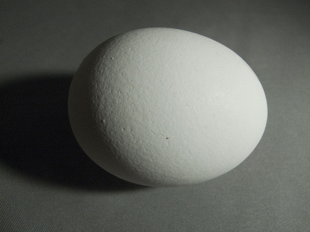
My first encounter with the Egg chair, was on an eighth grade school visit to the famous Royal SAS hotel [x] in Copenhagen. I remember starring at the chair, and feeling quite apprehensive about sitting in it, it was almost to ”valuable” in a way. It reminding me of the first time a saw a baby chicken hatch. The Idea of protection, and openness at the same time, was quite intriguing. The Egg is crafted as one piece, and in doing so, it gives the impressions of shelter, it kind of holds you, almost like a hug.The form of the chair is recognizable, you have seen it before. But there is something about the shape, the eye never becomes sated by, and you constantly see new lines and new forms. I Recently went to visit the SAS hotel again [x], and it’s quite remarkable that the Egg chairs in the lobby feel ever as contemporary as they did 10 years ago. Personally one could argue that the modernist building style and architecture, hugely inspired by the functionalists, in some cases doesn’t always work in the interior design, but in this case it really does. The round curves of the chairs, oppose the straight and linear constraints of the building, which together dance quite elegantly. While I was in the lobby I began to think about Henrik Buus Nielsen, and his fake chairs, and what if these chairs in the lobby indeed also were fakes. Firstly I don’t think anyone would noticed, or ever question their authenticity, after all they are in an original Arne Jacobsen building inside and out. And honestly I don’t think it would bother me that much if they were. In this case the design overshadows the fake, or real of it all. Stores have copied quality design for ages, but I think it’s first during the last couple of years, that it has become more accepted to own or buy fake designer goods. The tendency is all but increasing. People want good design, but for a cheaper price, and like Henrik Buus Nielsen said: ‘why pay 30,000 Kr, when you can make do with 7,000.’ Originality can always be discussed to a certain extent, and probably a question that is going to be asked more and more frequently, but good design can never be discarded. For me that is the main essence with the Egg, having a design that no matter how many years go by, and how many replicas there are produced, still prevails. And that is what Arne Jacobsen’s Egg represents. It embodies all aspects and criteria of good design, a universal design, and like the hatching of an egg, Arne Jacobsen’s chair will remain, it really is perfectly laid.
I am sitting behind a table, in my parents house, on a familiar, comfortable chair. I am used to this seat and it has been around for as long as I can remember. My grandmother got a set of four teak wooden chairs with a matching table as a wedding gift in the late fifties. I have seen them in two different states throughout my life. My mother was given the set when she was about twenty years old. Feeling that the natural teak wood colour was outdated and ugly she decided to paint the chairs red. The table was not present until recently.
About a year ago my mom started to regret her decision to paint the chairs, and had them brought back to their original state. After my parents moved to a new house the chairs and table were placed in their newly furnished home, where they stand in full glory. Ever since then I keep admiring them more
two generations sitting at the dinner table
The Danish designer/architect Arne Jacobsen (1902-1971) introduced the munkegaard chair – also known as the mosquito – in 1955, in the Munkegaard school located in Gentofte, north of Copenhagen. The school is considered one of his most important architectural works, within which he designed everything from the light fixtures to the sinks [x]. The chair that belonged to it became an absolute classic. Because of the setting that the chairs were made for, the design is highly functional. They are very easy to stack, which is perfect in places where you have to deal with limited space. They are extremely durable and comfortable at the same time. The part on which your back rests follows the natural shape of your spine. The seat of the chair is made out of pressure moulded sliced veneer. The bases are made of chrome steel tubes. The thin wood is strong but flexible. If you lean backwards, the wood moves slightly with you. The chairs are more than just convenient though. The elegant objects have an inviting look. They are unique in their simplicity with an understated aesthetic quality, which makes them so brilliant. They will complement any decor or surrounding, and bring an edge to any interior. Having only been produced from 1955 until the late sixties (and for a short amount of time in the nineties), they are now back in production again. When you pay attention they appear everywhere. When I was on a holiday in Denmark, I noticed that the chair was used in many different places, from office spaces, to cafeterias, and from the fancy to the less fancy places. Everyone seems to appreciate them. See here a website made especially for the chair.


Munkegaard School The Mosquito Chair, Teakwood
Jacobsen plays an enormous part in the image we have of danish design, and maybe even design in general. Traces of his work are found worldwide, even now still, thirty years after his death. Jacobsen was a man of extraordinary vision, strong ideals and in his time was considered true avant-garde. He is not considered intellectual or analytical in a traditional sense. Jacobsen was a producer; even when he was not working he worked nonetheless. Relaxation for him meant a shift in the creative realm. His output therefore was enormous. As a designer he strongly believed in the ‘form follows function’ motto. Jacobsen was inspired by the works of Le Corbusier, Mies van der Rohe, and Walter Gropius, which is explicitly visible in his own early works. He was also inspired by the furniture of Ray and Charles Eames who worked a lot with bent plywood. Even though Jacobsen is most famous as a designer he never called himself as such, and it is said he had a strong dislike towards the word. A lot of his designs were created in the context of the architectural buildings that they would be placed in.
I see Jacobsen as a visionary, as he played a huge part in designing the environment we live our daily lives in. From architectural masterpieces to simple things we use everyday, Jacobsen surrounds us. He makes things exactly the way I like them. His designs are the perfect formula of functionality, durability, and aesthetics. They are modern simplicity: all that it needs to be and nothing more. His mosquito chair will remain a timeless object that people will appreciate for ever. As for the chairs in my parents house, they are probably not originals, since the design is one of the most copied in the world. Nonetheless I am happy that I have grown up acquainted with such a beautiful piece of design.
A model is initially an object whose purpose is either to represent the real world or to be translated into the real world, in short the model can be a copy of reality or reality a copy of the model. The main difference is in terms of scale. Usually the model is a miniature of reality. But what more can it be? When we look at a toy car and a car, what do we see? Is the toy car just a replica of the car in a tiny scale? It is hard to analyze such a thing but I think that there is a huge difference triggered by (but not exclusively) the change of scale. When the toy car is made, it has no longer the same purpose as the car does. A child playing with it might as well imagine it just as real as the car and drive it around with his fingers, or see it in a whole new world, making it fly away, fist-fight and dance Rock n’ Roll. The new scale for things sometimes creates a new meaning for them above representation, a new reality even if they are seemingly the same object in different sizes.
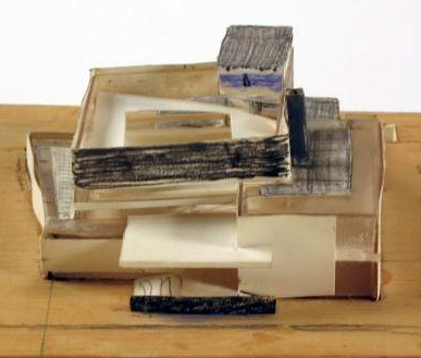
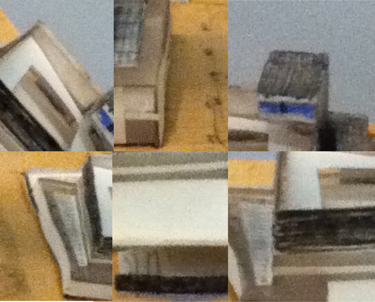
sketch model of van Gogh Museum, Amsterdam by Gerrit Rietveld [object: SM]
In 1963-1964, the furniture designer and architect Gerrit Rietveld (1888-1964) designs the Amsterdam Van Gogh Museum. In 1964 the architect dies before the project is finished. The building is completed by his partners J. Van Dillen and J. Van Tricht, and the construction was concluded in 1973. The model exposed in the design collection of the Stedelijk was produced by Gerrit Rietveld in those first two years. It is a sketchy model made of wood, paper, cardboard and glass. The final building is close but does not respect this concept, with a unified color of brick and very little white (from front).
I present this piece for multiple reasons. First, because in my personal taste, I prefer this version from the finished one. Rich in contrast between black and white rectangles overlapping each other, the building has the balanced complexity of the Rietveld style although the shapes which compose it stay simple and limited (only colors: white, black and blue) which gives sobriety to the building. When we look at the final museum’s front view, the unity in brick color makes the building lose its striking composition at first sight, for the overlapping rectangles melt into each other. The second reason why I chose this model is because of the way it was made, without any connection to the building itself. I see in between the other models of the museum [x], well built, detailed and clean; something of a stain. On a dirty piece of wood on which we can see quick pencil sketches for the display, an irregular, clumsy, and worn little building is erected. The colors are simply indicated by a rapid and un-precise use of color pencils ( blue and black). The materials used are cheap, and if we try we might not even find one horizontal or vertical line. And yet it is beautiful, marrying complexity and simplicity in form and color, with a rich diversity of cheap materials. Its cheapness gives it a poetic and rough authentic aspect, we see that it was handmade.

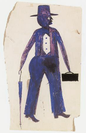
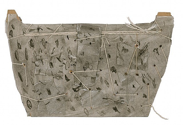
This may remind us of James Castle’s sown cardboard sculptures, which are made of scrap which gives them strength, or Bill Traylor’s choice (and no choice) of using cheap surfaces like cardboard for his paintings.
The model is in addition to this, very close to the final version. That sketchy but precise model shows the talent of Gerrit Rietveld as an architect, like the lines of a great draftsman. Its clumsiness along with the use of paper, lightly put together and slight curved, gives a feeling of fragility and tenderness which contrasts with the strongly built shapes of Rietveld’s buildings or the roughness of the materials.
I love this model because –to me– it is not a model anymore but a sculpture that contrasts with what we usually see, giving a new idea of his work and of what a model can be, even though it was not intended to become a piece of art. A model can be seen in ways that exceed its limits as a technical object.
A perfect embodiment of this idea is seen in the Tim Burton film Beetlejuice. The movie takes place in a small town and specifically in a house on top of a hill overlooking the town. In the opening scene (link here and here for the end with spider) a fake areal shot of the town is taken on a model of the town one of the main characters has built. We are tricked into believing that we are flying over a forest to finally overlook the whole town, then fly over and across it all the way to the house on top of the hill. Although it is possible to see that the scene is really shot on a model, the illusion is strong, and we are astonished to see a real spider (this time) which seems to be the size of a hippo, climb over the roof and be picked up by a real (gigantic) hand. What this illusion does is it gives life to the model, it gives it a new reality, and this is proved later on in the movie when we discover that the model has an “inhabitant”. When the protagonists are changed to the scale of the model, (in this scene) they come to its graveyard to dig up the main antagonist, Beetlejuice. In this case, the change of scale from real world to model is more than representation, the real world and the model are entangled, mingled into each other, whilst the two are different, the real world and the new world of the model. The model can open a whole new world for our imagination to create, a transcendental realm full of fire, wonder, and dragons.
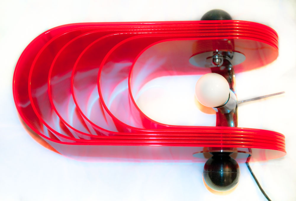
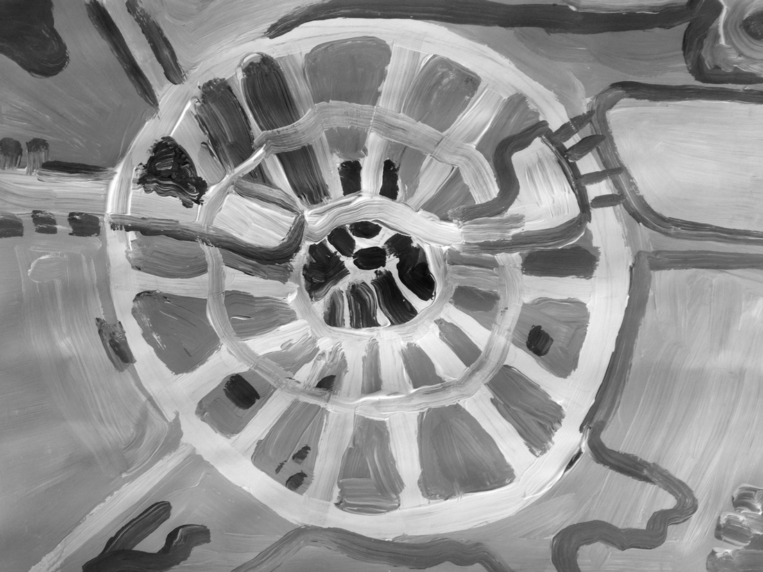
Gherpe – a lamp designed by Superstudio
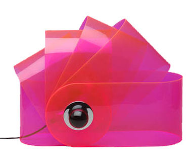
(via:http://www.nova68.com/gherpelamp.html)
I think the Gherpe lamp is a relevant design because of several reasons. First of all, the lamp itself is made of materials that are still considered modern, even though it was designed more then forty years ago. That alone already shows how we still hang on to, or maybe are condemned to these materials nowadays. Next to that is the design, which references to the mathematics that appear in Nautilus shells. Then again the way this shape is interpreted is more like a cartoon of it, leaving the classical Nautilus image behind. This way of designing, letting interests and research – the designer was into marine biology – influence the work is something I think many designers work like, or would like to work like. Last reason why I think this is a relevant piece is because I think the whole of Superstudio, their designs and mainly their architecture is, because of their new views and extensive researches, relevant. They were part of a critical wave, commenting on Florence and it’s ancient heritage, on the years of full trust in technology and on architects before them. They wanted designers to be responsible for their creations when they design to make a better world. Their criticality on how design and architecture influences the life of other people and self-reflectiveness is what made them different from many before them. This idealism in theories, but with playfulness towards the designing process itself is to my opinion something important to keep relevant in art and design.
(via:http://photografieundmehr.com/pics/2012-11/gherpe_01.jpg)
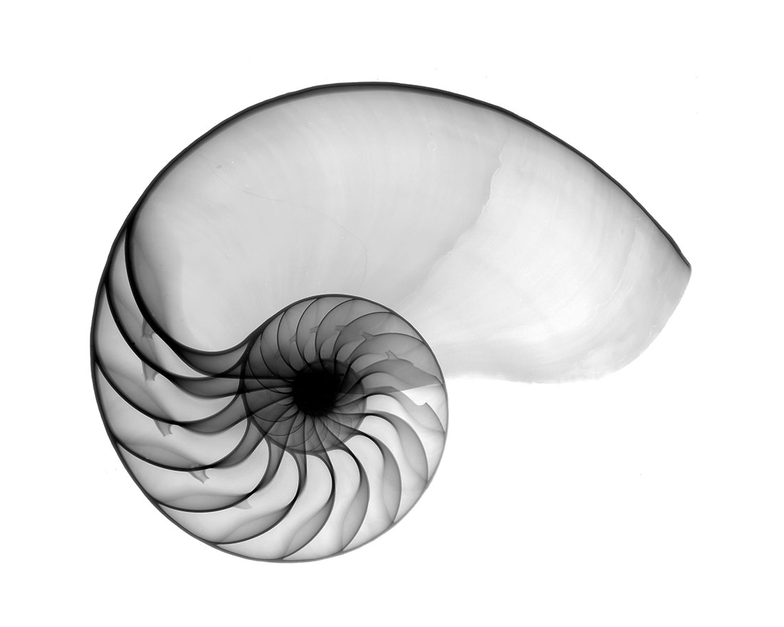
Nautilus shell
(via: http://www.hungrywalrus.com/wp-content/uploads/2011/08/Nautilus-POS.jpg)
To test it’s relevance I’ m trying to get to know what Gherpe is, what it is not and what it could be, what it means to Superstudio and what it means to me.
At a time where popular culture is stealing all the science and logic that Modernism employed to make this world better, with youngsters starting to call themselves Mod.’s, Pop Art commenting on this Modernist reality and society by reproducing imagery from that popular culture, Gherpe is born. It’s designed by Cristiano Toraldo di Francia, and adopted by Superstudio, the Italian architecture group where Toraldo is the most important member of, together with Adolfo Natalini, who is a Pop Art painter when they found the group in 1966.
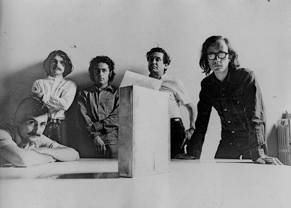
Alessandro Magris, Cristiano Toraldo di Francia, Piero Frassinelli, Roberto Magris, Adolfo Natalini
(via:http://www.domusweb.it/content/dam/domusweb/en/from-the-archive/2012/02/11/superstudio-projects-and-thoughts/big_374062_2176_giulia_superstudio3.jpg)
Where Modernism, in its affirmation of the human power to improve their environment the aid of practical experimentation and science, goes for logic, Gherpe pretty much mocks Modernism, by taking it’s science and it’s new materials to make something that is not in any way useful other than it’s aesthetical purpose. Gherpe is not practical, and it’s not helpful. But Gherpe’s cartoon like ambiguity looks fun, you want to have it, it looks smart even though it isn’t, and that’s exactly in line with popular culture of that day. Gherpes connection with nature is meaningless, but very important for it’s attractiveness. You could say it’s a beauty trick. The interest of Superstudio in nature combined with construction is to be traced back to one of their guides in the Academy of Architecture in Florence, which most members of Superstudio were attending. His name was Leonardo Savioli. As Adolfo Natalini says about Savioli: “Even when the drawings looked like traces of insects or explosions, galaxies, spiderwebs or wounds, they were always able to resemble parts of constructions or something constructable”.
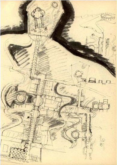
Plate XVIII, a drawing by Savioli
(via:www.etsavega.net/dibex/Savioli_citta-e.htm)
The fact that Gherpe’s reference to nature doesn’t have any symbolism or engagement in it, already shows what things it really has to do with, things like freedom. Gherpe is free from the morals that come with modernism: Superstudio didn’t think architecture could change the world for the better. Gherpe is the joyous realization that the burden of creating something that will add to create paradise on earth is not possible.
Gherpe was in the Superarchitettura show. This was a show combining two groups. The Superstudio and Archizoom, both from Florence and mainly from the same architecture school. The show took place right after a flood had swallowed a chunk of Florence’s renaissance beauty, at a time where others mourned renaissance architectures birthplace the Superstudio show was a psychedelic experience work that purposely lacked engagement and put consumerism on a pedestal. Their ideal: morals were irrelevant to architecture, and so you should not aim to change the world with it either. So there is a different approach: “Superarchittettura accepts the logic of production and consumption, it utilizes it in an attempt at demystification” and “Superarchitecture is the architecture of superproduction, of superconsumption, of superinduction of superconsumption, of the supermarket, of the superman, of the super gasoline”.

Toraldo and Gherpe, and Passiflora
(via:http://www.centrostudipoltronova.it/wp/wp-content/uploads/2014/07/gherpe-archivio2.jpg)
Seeing Gherpe from the eye of the Superarchitecture that it is, means not that Gherpe was meant for a world better than ours, but for the world as it was in 1967, where consumption and production were exploding. You could say, Gherpe is super itself. A lamp fitting for all these phenomena that felt relevant for the younger generation at this time. Instead of denying these phenomena, or wanting to change them, Superstudio designed something that fit in. It might even accelerate superconsumption, be meant for that purpose. In this perspective Gherpe is in a way a neo-futuristic piece, a monument for the speed and mass of its time. You could also see Gherpe as an, perhaps slightly melancholic, attempt at creating something, something touchable and real out of all the superlatives that together form the ungraspable frightening dystopia that was (and is) everyday life. And maybe that this is the reason we enjoy it, because Gherpe is then our comfort, a sign that from superproduction and superconsumption something appreciable can materialize.
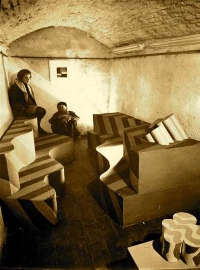
Image of Superarchittettura show
(via:http://www.stylepark.com/en/news/a-landscape-of-mountains-and-valleys-the-design-parade-03-in-hyeres/283330)
Gherpe shows Superstudio’s double nature: it’s serious, socially critical but can also be ironic. When Superstudio presents an utopian, or dystopian design we can never accept it at face value. When they design a utopia, they explore every possibility into the extreme, and so exploration of the architecture itself is it’s aim. Instead of presenting the possible solutions it tells the stories of the decisions of mankind, the ones it made and might make. A very serious and melancholic subject, reflecting their serious opinions (Adolfo Natalini: “the race of consumerism is definitely wrong”) but enabling playful and smart experimentations.
As Gherpe is an early Superstudio piece, Gherpe is also an early exploration which, as we can see in the Stedelijk, ended in a lamp. As Superstudio kept exploring their ideas became more and more critical of architecture and design, which made their projects end up way less often in actual designs and realizable architecture. Instead they expressed their ideas in movies, models and collages.
According to Superstudio architecture was corrupted to such an extent that even the avant-garde architect was guilty of suppressing human development, since he made use of existing conventions in architecture. An interesting idea, which suggests human development can come from no other place than out of the blue. Where one can ask the question what human development actually is, but let’s get back to Superstudio. They saw reason as the only quality that’s uncorrupted by these conventions. This makes it’s easy to see why they step farther away from architecture and design, as they are easily seen as complete and valid evidence of manifestos or ideas, rather than generally questioning and alienating. That doesn’t mean Superstudio didn’t make anything at all anymore, as you might expect.
Instead they found ways to visualize what architecture could be, without designing from conventions. Something that wasn’t really architecture. For the exhibition “ Italy: The New Domestic Landscape” in the MOMA Superstudio made an 8 x 8 black square on the floor, and made it repeat itself in an endless grid by placing mirrors at the walls. They put a box with wires on each corner, making the plugs recur regularly in this “landscape” [x]. It wasn’t the first time they worked with this black grid [x], but it was the first time architecture and design was so completely dismissed that it was actually left out at all. Even though this seems like the ultimate conclusion, there’s more to the ever expanding black grid. In the Continuous Monument, a glass grid-like structure that spans all over the world, visualized in absurd collages [x] where it embraces Manhattan or faces the Taj Mahal, the irony, social critic and dystopia remains: a homogenous unrealizable blank space, but also a space where we can project our own ideas on of what it really is. Our ideas, full of conventions and corruption.
Grid in the Moma: View of Supersurface: An Alternate Model of Life on Earth, by Superstudio, in Italy: The New Domestic Landscape, MoMA, 1972. Photo: Copyright Cristiano Toraldo di Francia.
As you understand now, Gherpe too is a piece of corruption. A mash up of conventions and brainwashing, which will, as you look at it, only corrupt and brainwash you more. Which is very true in the sense that, the more you know, the more you are stuck in the things that already are. Whether that really suppresses the development of humanity is questionable. I personally am less negative about the influences of the past and the conventions we get taught. But the fact that Superstudio deals so productively with their frustrations over a system is something everyone, defenitely every art student, can be inspired by.
Over thinking and commenting on how design works is something I find fundamentally important, as I think this self reflection is what can bring us to new insights. Insights that can be reflected on again later, a continuous process I’d say would be human development rather than corruption. But, if you are reading this, and you do happen to find yourself having been corrupted by looking at Gherpe and reading about it, then at least we can be sure about it’s relevance for the (design) world today.
The Continuous Monument, one of the many collages.
(via: http://www.spaceinvading.com/bookmarklet/Images/2701091233096716superstudio_monument_1_kl.jpg)
16 Rietveld Basic Year students visited the Amsterdam Stedelijk Museum to examine the items in the permanent survey of the design collection.
Does the Stedelijk exhibit all these design items simply because they are in their depot.
Do the collection criteria still have any significance today.
Do these design items have any relevance for us, our life or work,now? Is it possible to make a clear statement about that.
If you click on the image a caption will appear –just as a in a real museum– presenting information and a personal reflection on why that item is considered relevant. You can review the whole exhibition in pop-up mode.
click on images to visit the exhibit


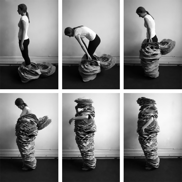
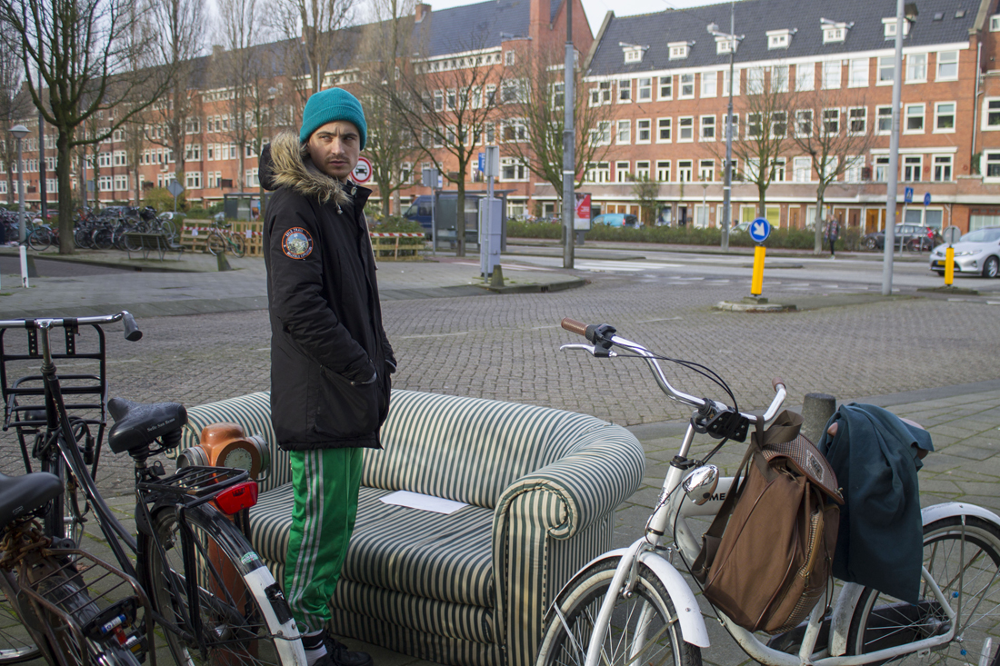
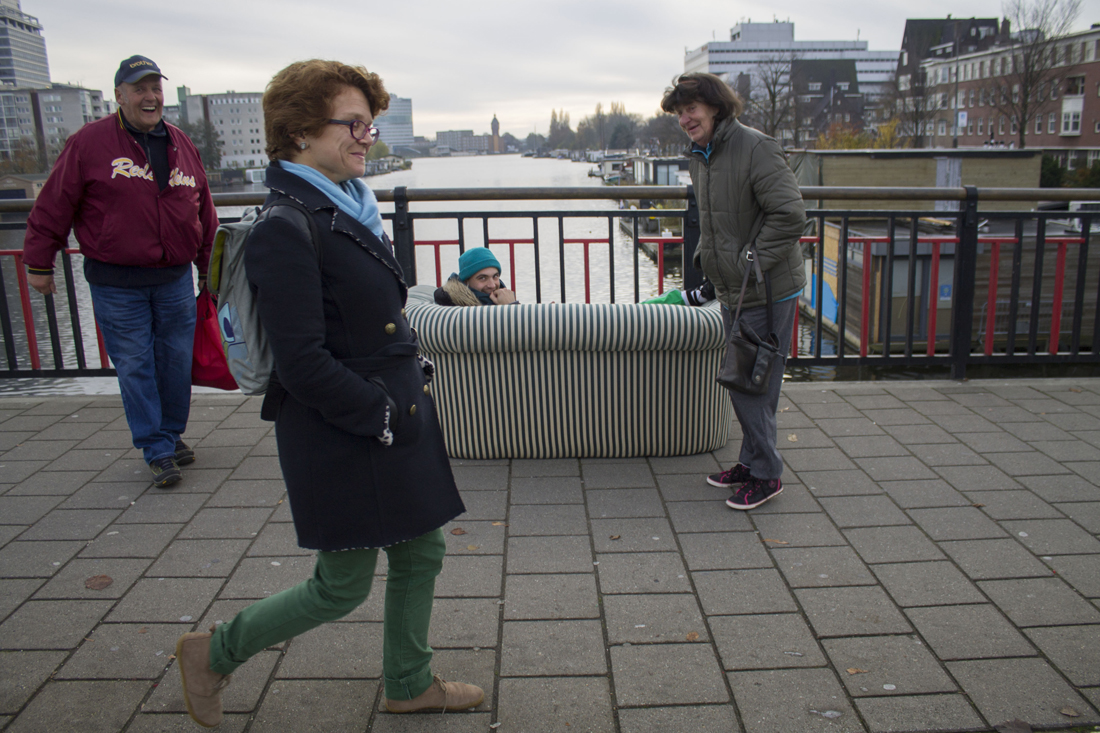
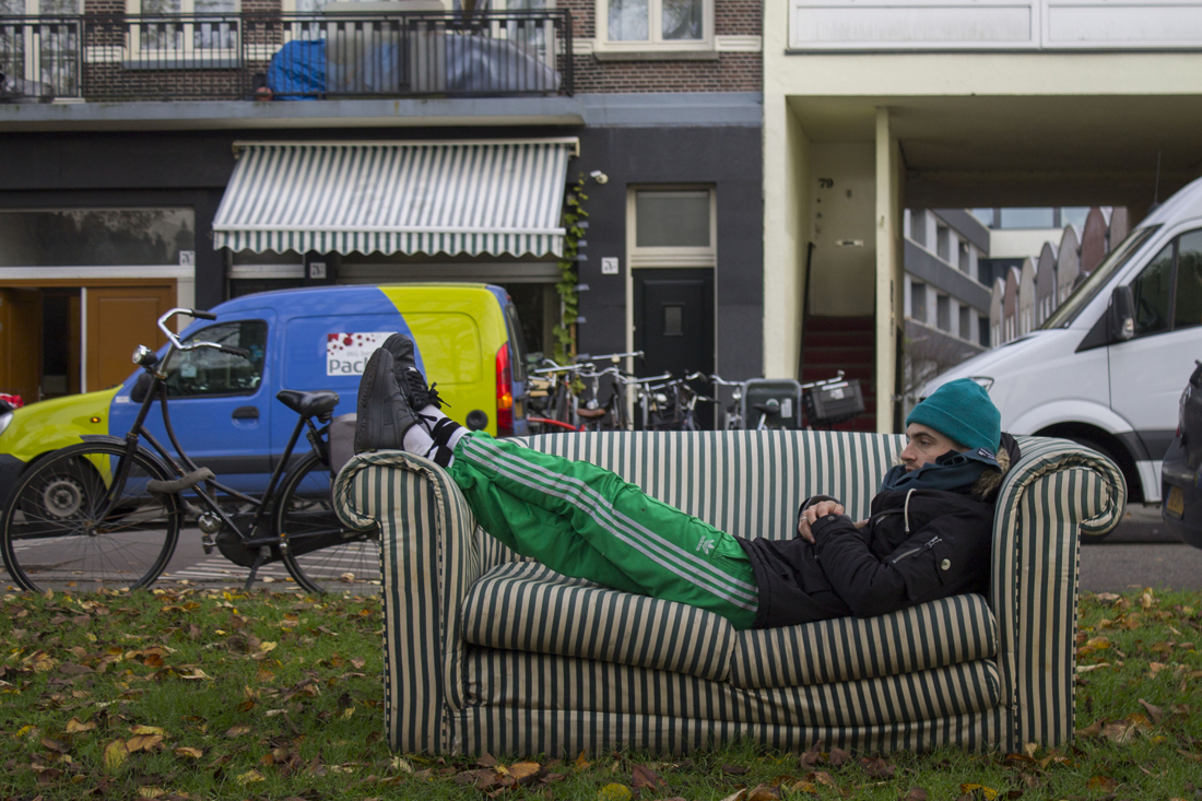
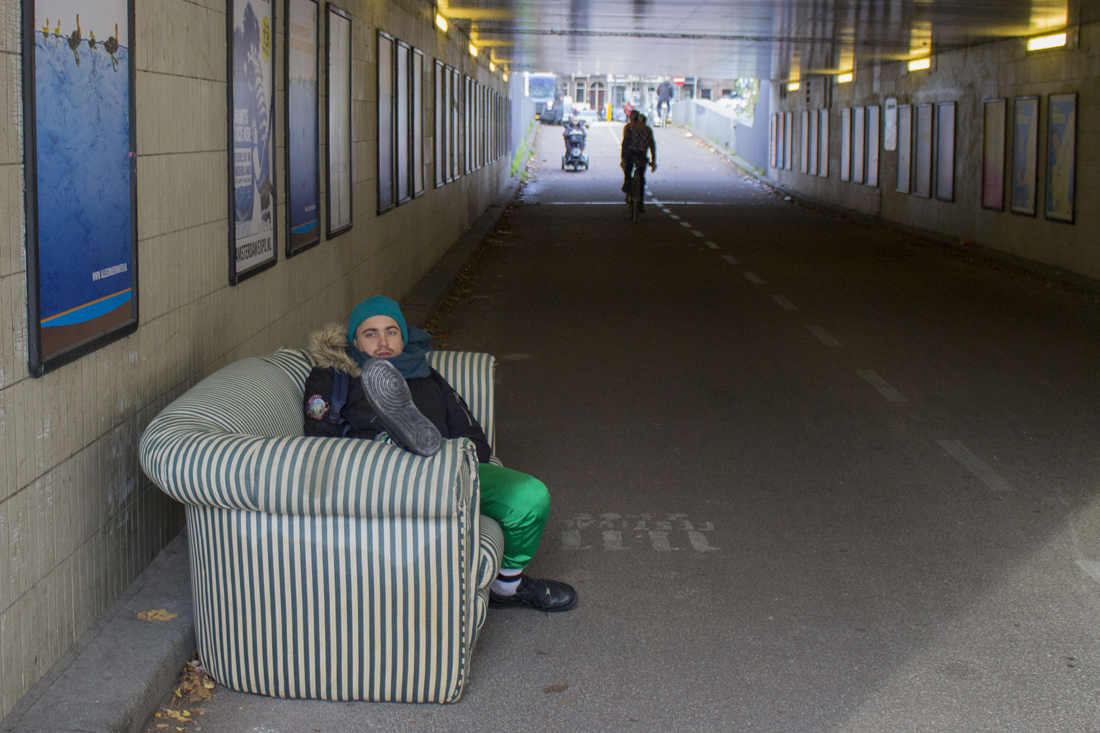
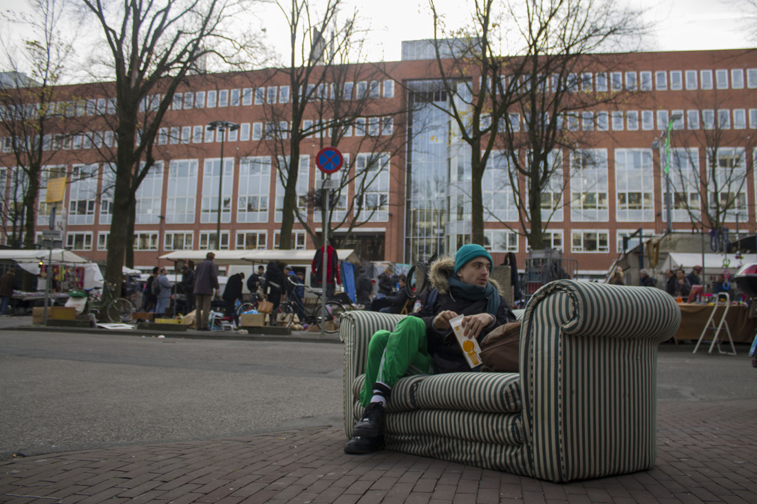
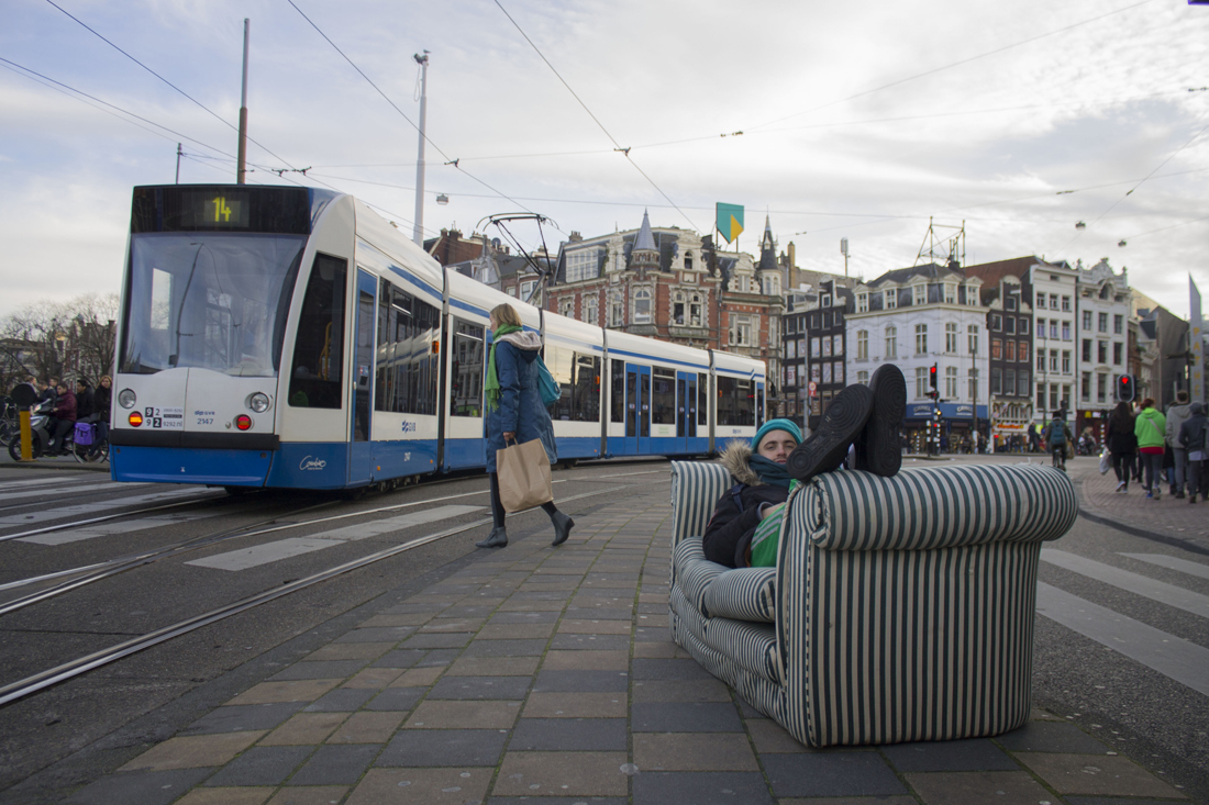
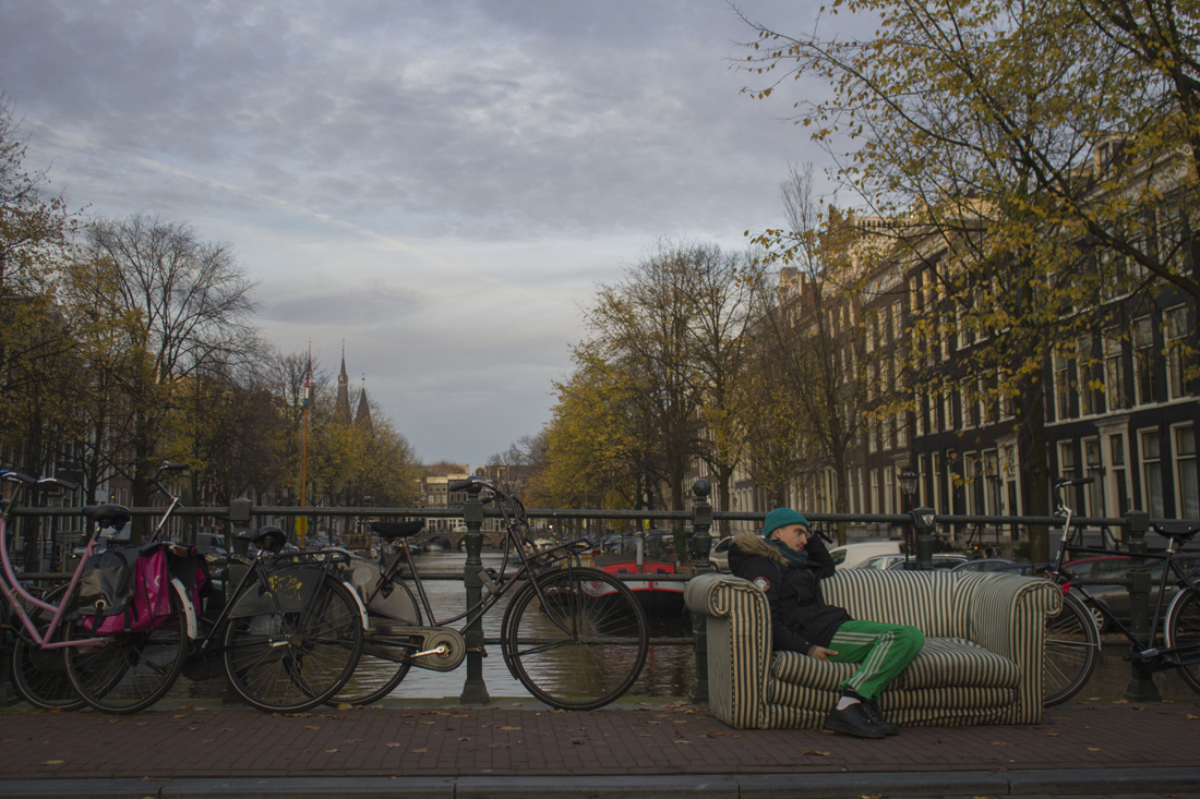
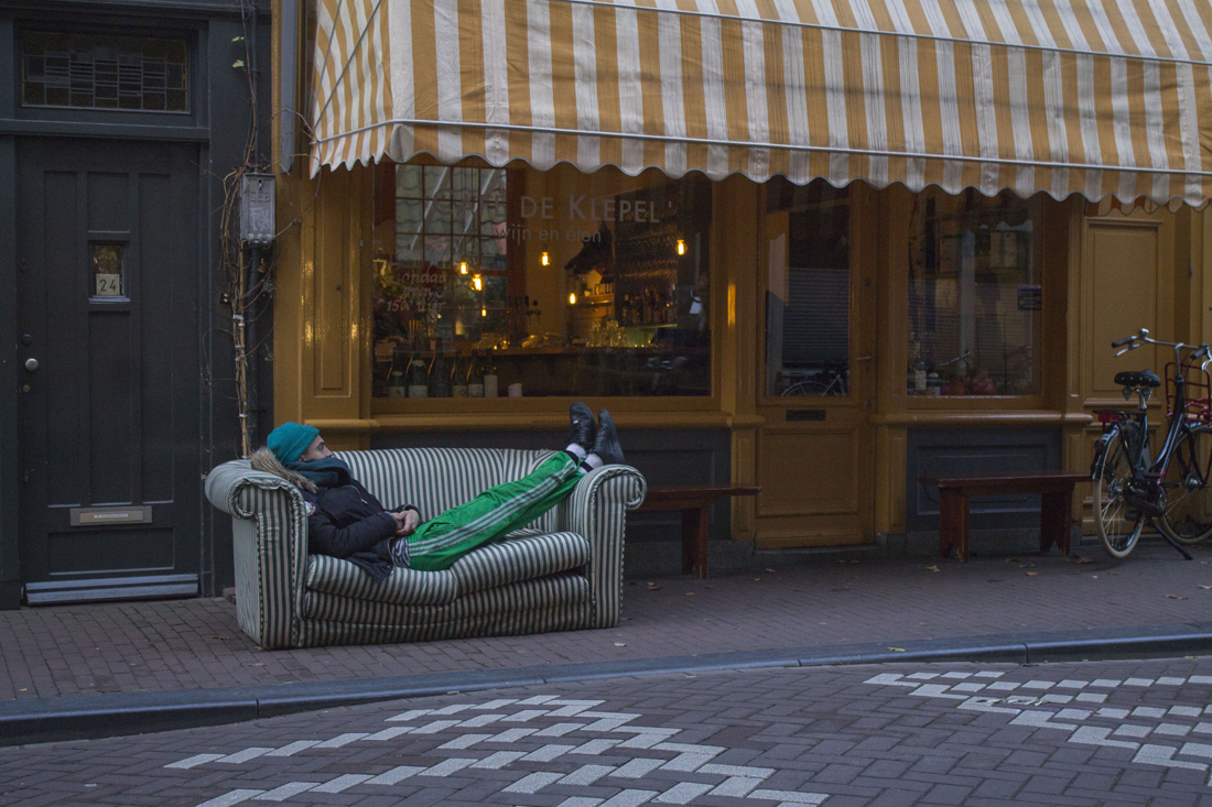
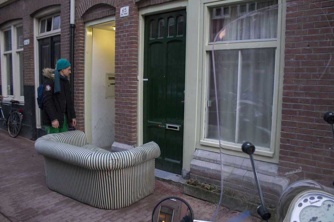
What happens if you could take a nap when and wherever you want? Forrest Jessee designed the sleep suit(1), that makes it possible to sleep in your own cocoon, at work, school or at the streets. I wanted to challenge the idea of Jessee. So I went to the streets to experience it, not with clothing… but with a simple sofa.
The sleep suit of Jessee immediately got my attention when I visited the exhibition “The future of fashion is now”. The shape in combination with the material its made of, creates an architectural form. It looks as a personal space, because of the thickness of the primary material, EVA foam, which is also used for padding and shock absorption in sports equipment. Usual fashion, in my opinion, is meant as a kind of jewelry for the body. Fashion, in common, plays with the form of the body, and is meant to be decoration. In this design the form of the body is almost not visual anymore. It adds something to the body, where it almost becomes a second body part. That in combination, with the daily environment, creates very interesting images (2,3).
 (2)
(2)
 (3)
(3)
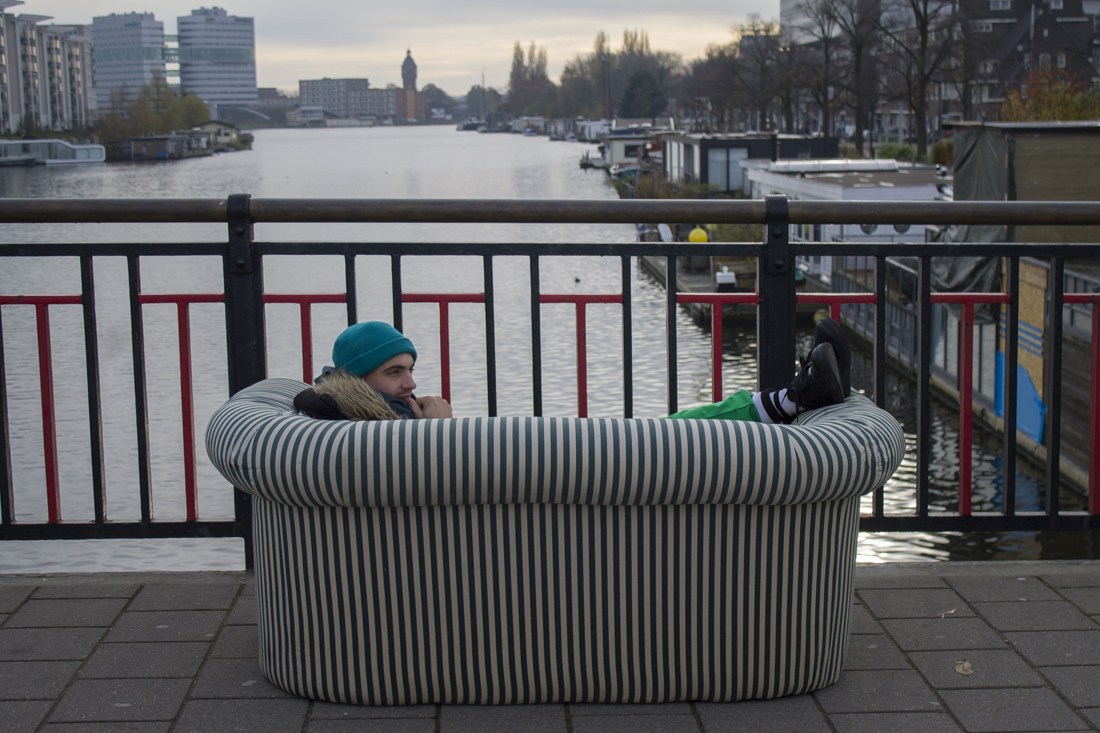
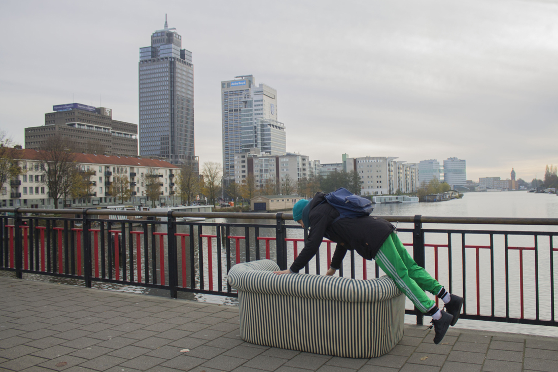
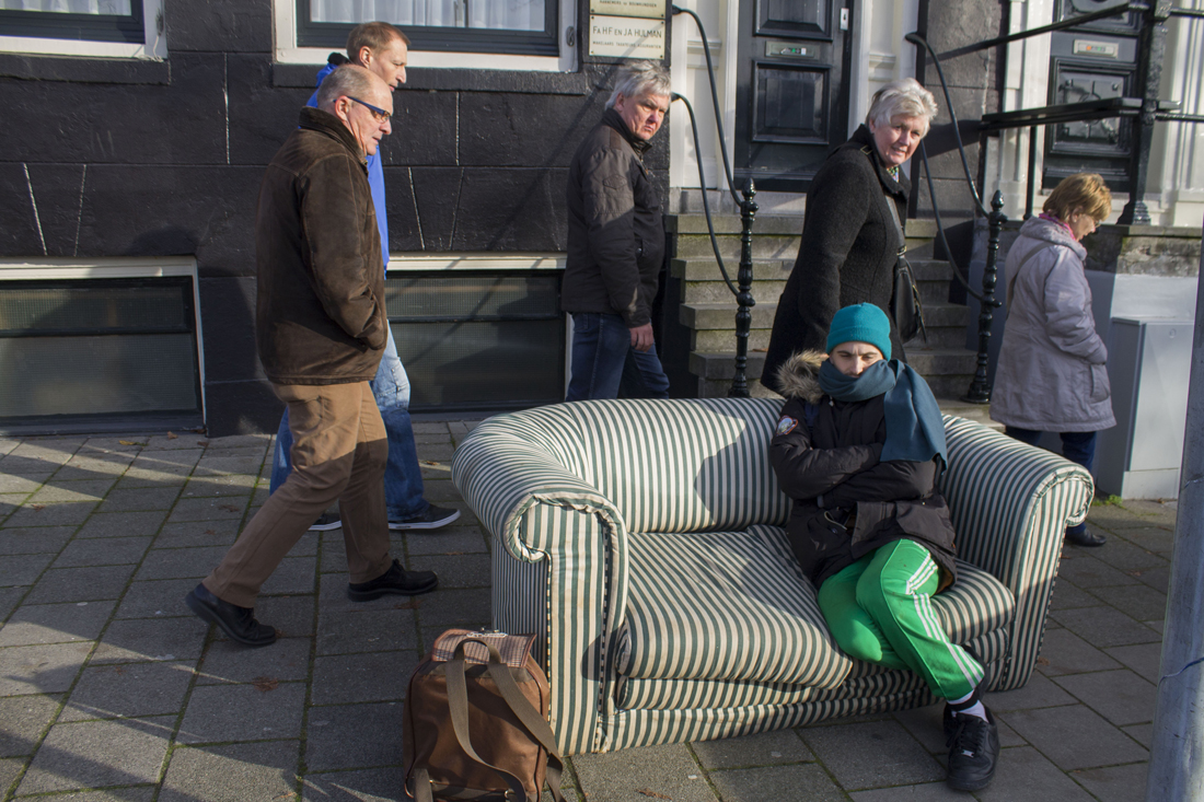
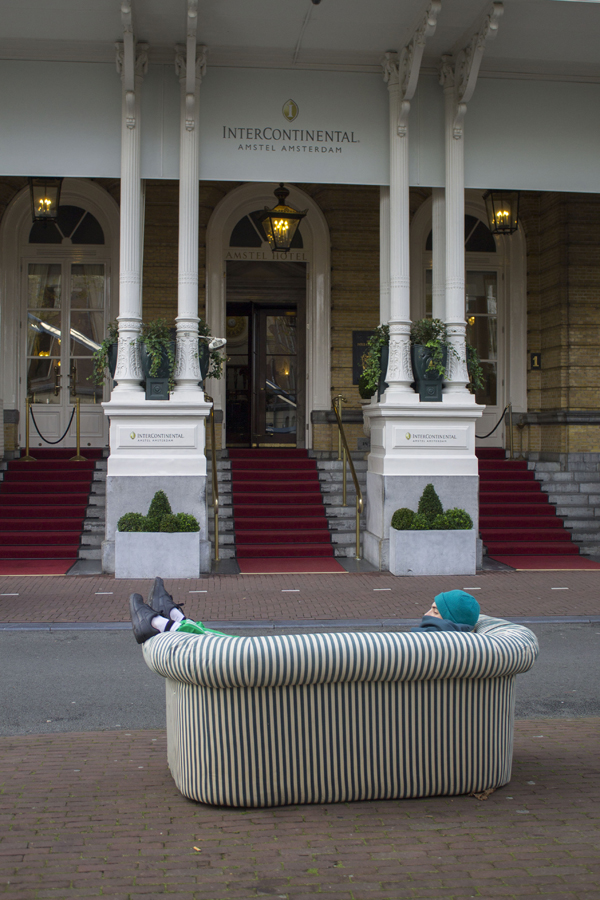
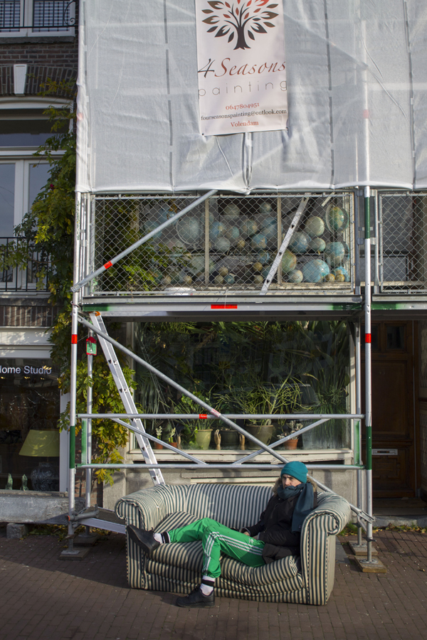
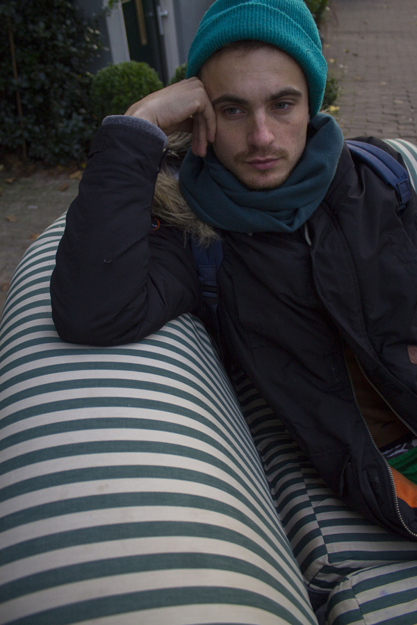
The part where this piece is playing with his environment is the part that I wanted to experience by myself. I just moved to my new home in the centre of Amsterdam, as I found my new sofa in the streets of Amsterdam South. So I walked 5,2 km to my home with it. I had to take a lot of breaks, and interesting things happened that for me related to the ‘Sleep Suite’ of Jessee.
What I wanted to experience, is the interaction with me laying/relaxing/sitting/jumping at my sofa and the busy city life. A lot things happened on my way so…
I want you to share my ‘Sofa Journey’.
 (4)
(4)
 (5)
(5)
 (6)
(6)
 (7)
(7)
 (8)
(8)
 (9)
(9)
 (10)
(10)
 (11)
(11)
 (12)
(12)
 (13)
(13)
 (14)
(14)
 (15)
(15)
 (16)
(16)
 (17)
(17)
 (18)
(18)
 (19)
(19)
 (20)
(20)
 (21)
(21)
 (22)
(22)
 (23)
(23)
 (24)
(24)
 (25)
(25)
 (26)
(26)
 (27)
(27)
 (28)
(28)
After 4,5 hours
 (29)
(29)
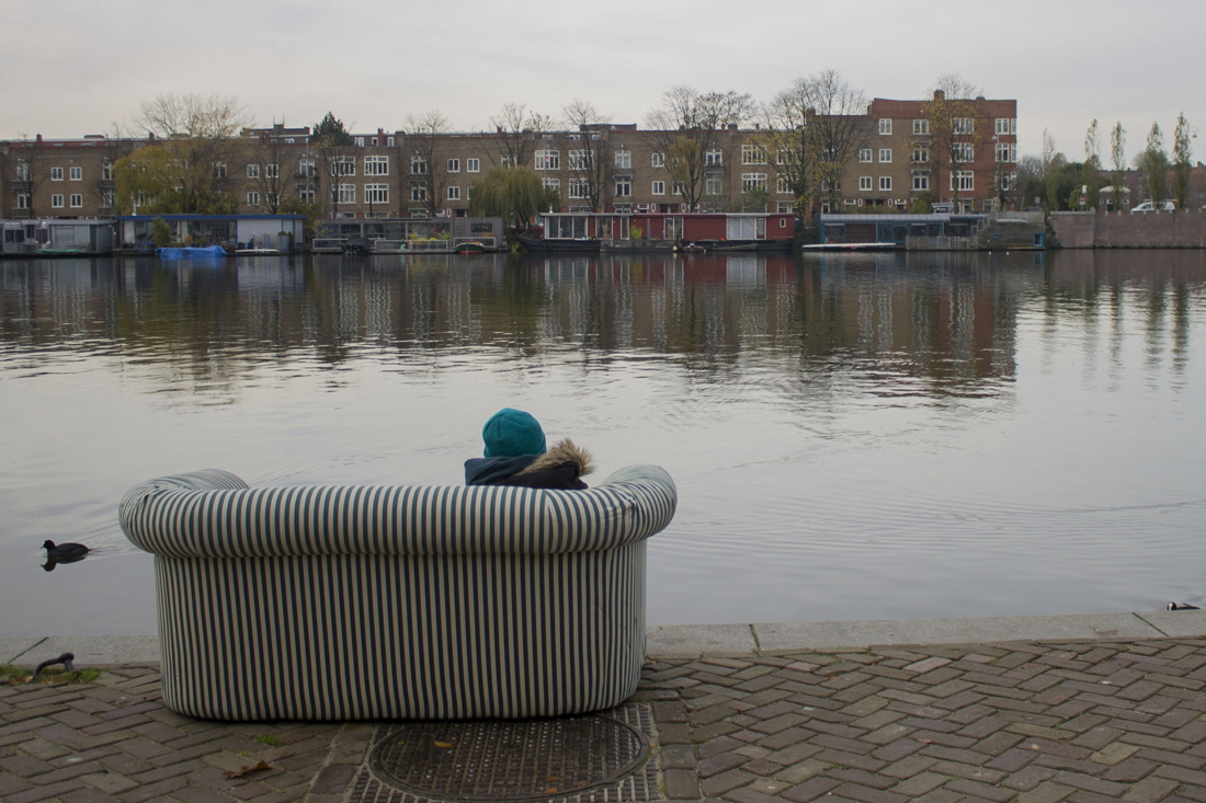
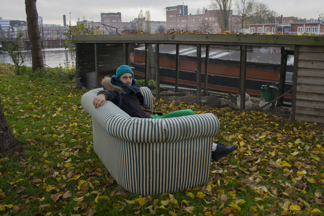
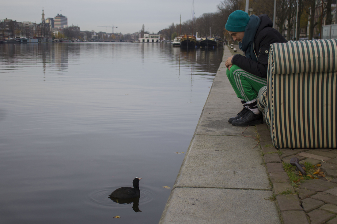
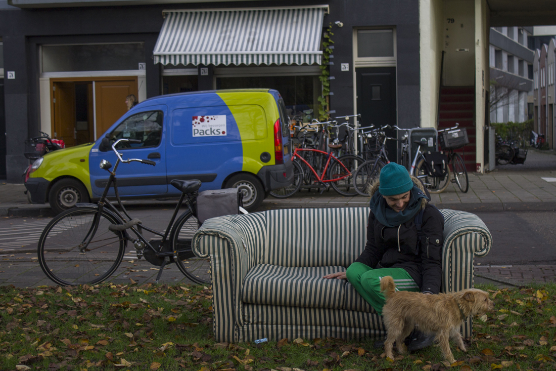
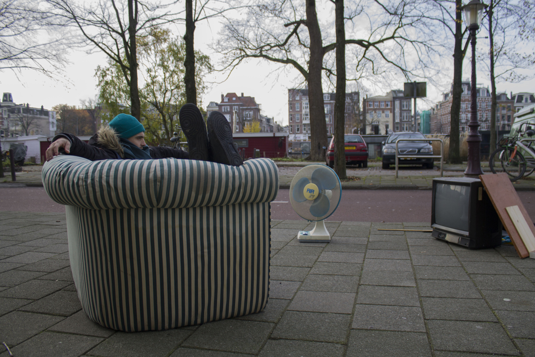
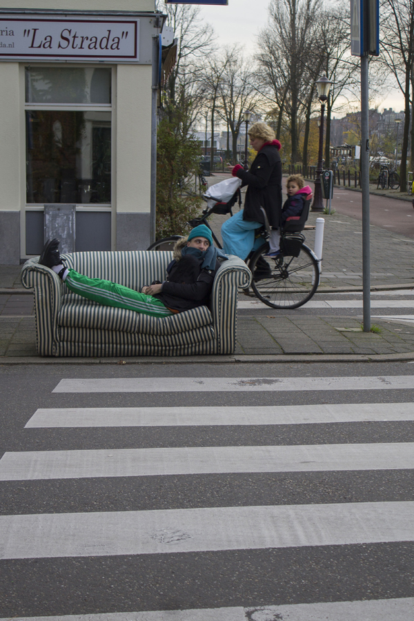
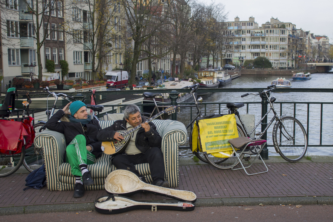
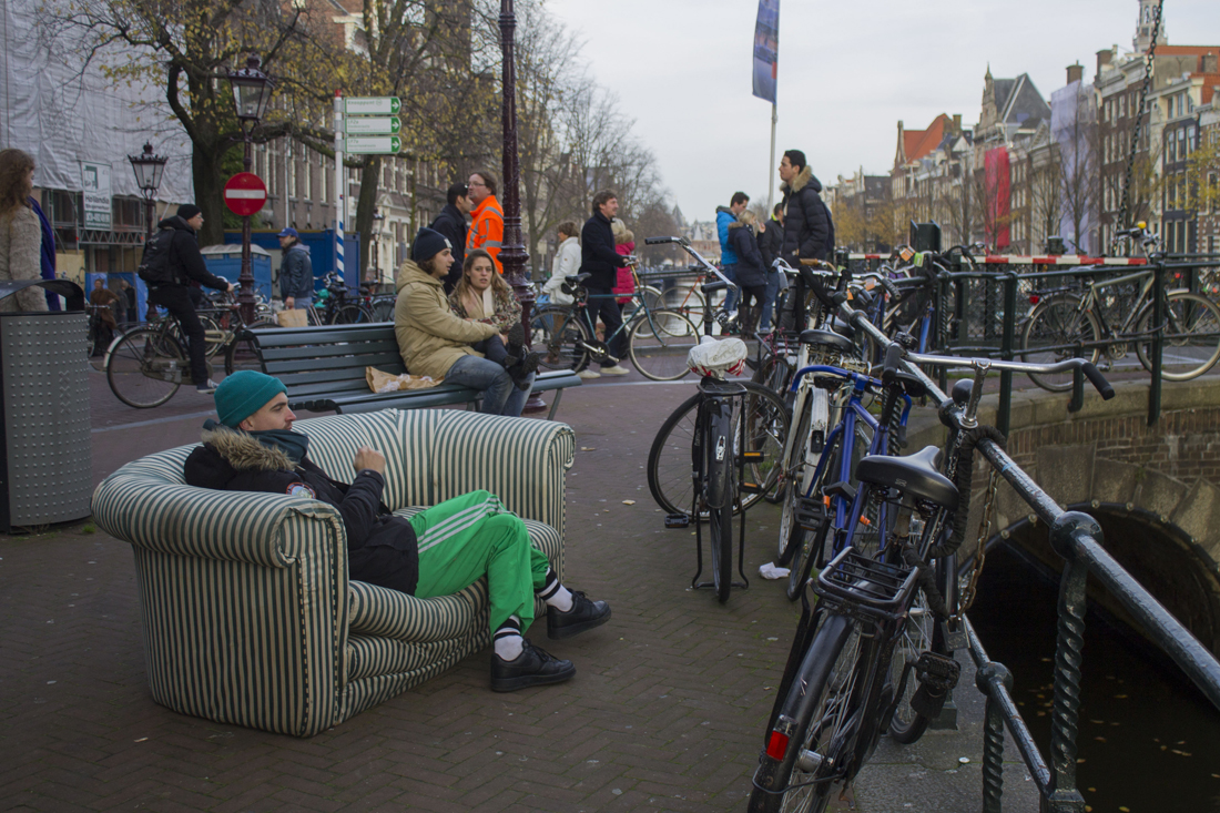
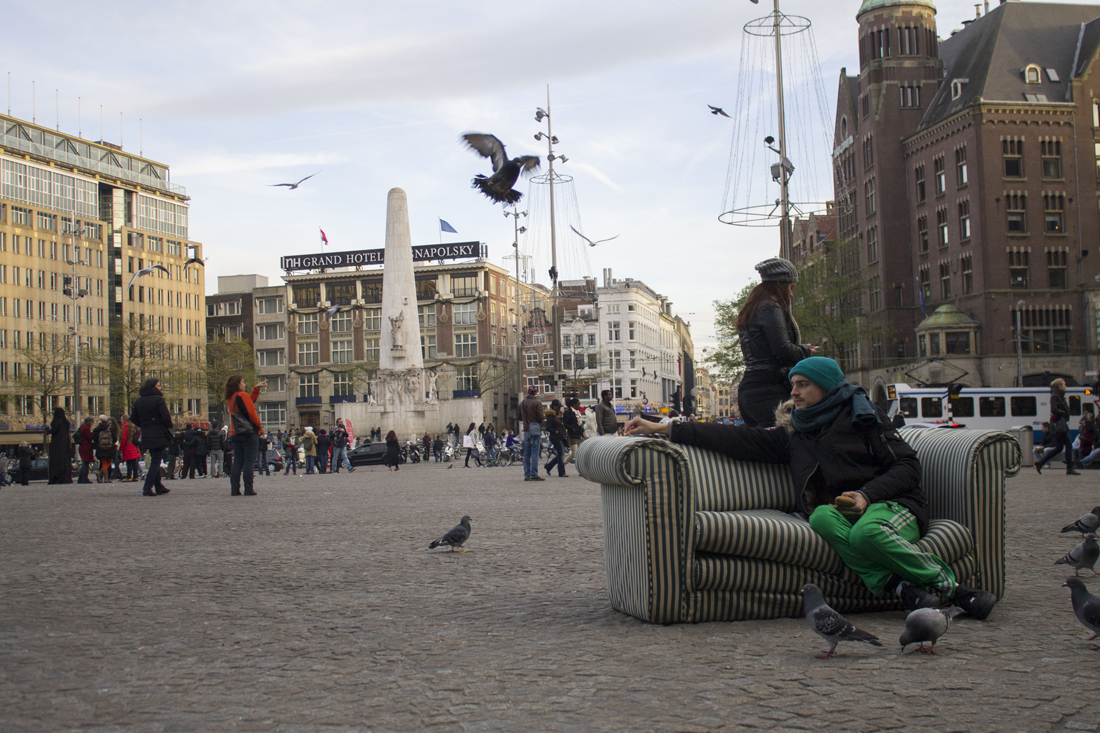
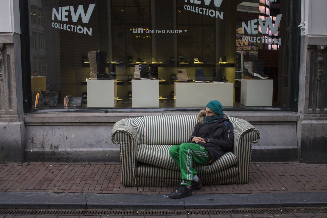
The experiences I’ve had this journey, I would never had without the sofa. The sofa became a medium to communicate with buildings, animals, trams and people. In the pictures I tried to play with the environment. For example, I saw a lot of buildings which had the same stripes above their windows as the stripes from the couch. I could involve in that way the couch with his surrounding(11,12). Also the stripes of the zebra path were interesting to combine with the sofa(14). The garbage that I found at the streets I also used to create a fake ‘living room atmosphere’, with the television, couch and ventilator(13).
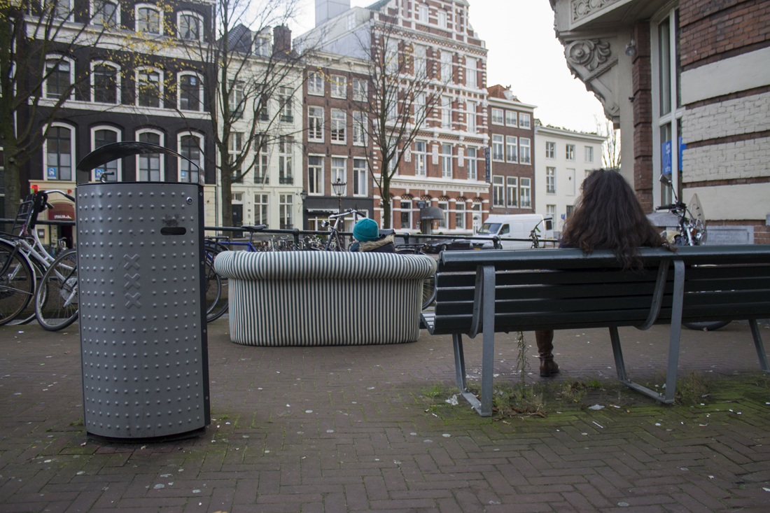
Also the opposite situations were very interesting. Where the sofa was not palpitating the surrounding. A good example of it, is the picture where people looking strange at me sitting at my couch.(16) In the rest of the pictures there is also a lot of ‘miscommunication’ between me, relaxing at my sofa and the busy background. I enjoyed the journey a lot with me and my sofa, which is now settled in my appartement. It will always remember me of this day.
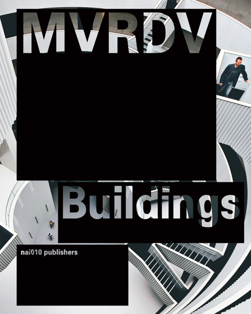
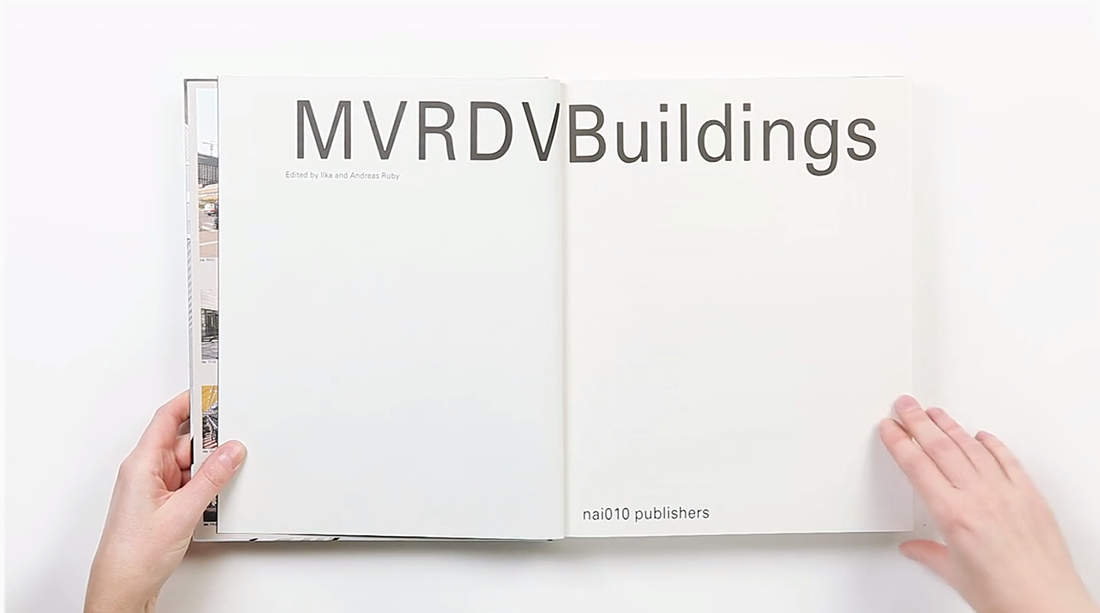
The reason why I chose this specific book was its colour and image placed next and on top of each other. It has caught my eye and wanted me to read and analyze its content. Page after page I began to realize there was a type of system that the designer, Joost Grootens carried out.
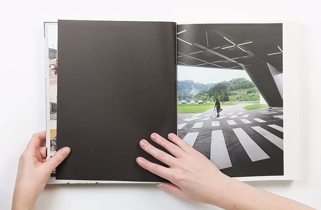
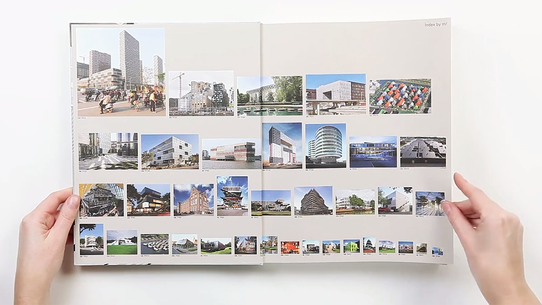
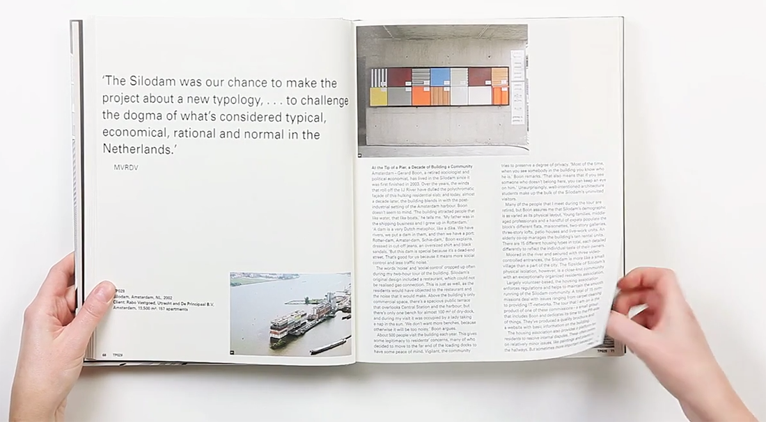
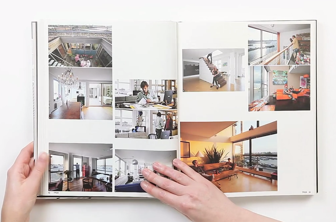
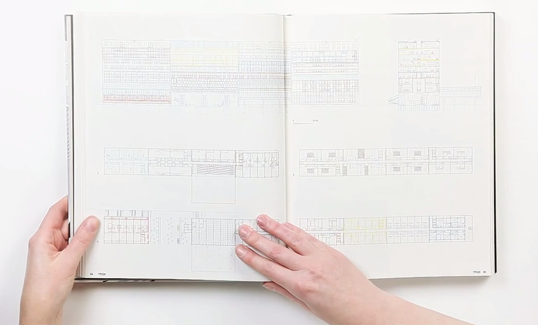
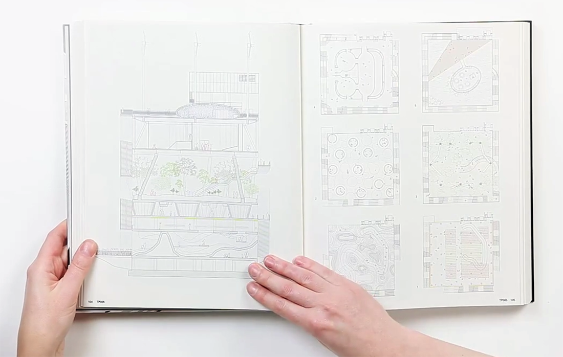
MVRDV Buildings, published by 010 Publishers, is a complete overview of MVRDV’s architectural practice over a total of 20 years. To me, this has been a positive discovery while analyzing the book. It was a very good surprise. I am very much interested in architecture. The way I have understood it was that the designer has deliberately chosen and created a way of method to display and present this portfolio of this architect firm. My impression was that this “method” is a way of telling a nice story or even a nice joke. A way to share important information with people. (click on the title page image and browse the 11 consecutive images)

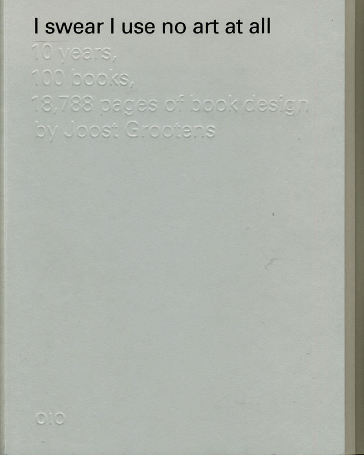
Another consequence was that I got to explore Joost Grootens own book. The book called I swear I use no art all, has been written by the designer and summarizes 100 books, 18788 pages of his book designs throughout 10 years in that field. The interesting part is to see how, the originally architectural-designer became a graphic information-designer. The book describes his relation to publishers, supporters, authors, collaborators, printers, workplaces and studios. A very personal way to present the changes and development that his own working field. It has made me realize how nice it is to make a summary of your own development. Even though I can not yet make a summary and create a descriptive portfolio of the last 10 years of my work-field I have already imagined creating the mapping of my family or origin.
(click on the cover and browse the 2 consecutive images)
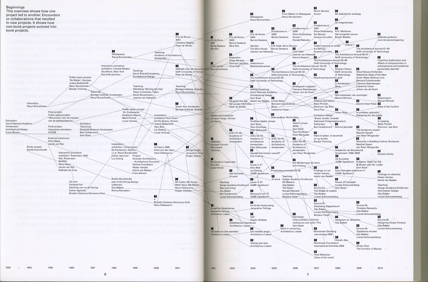
A part which describes the beginning in a overview, showing how one project led to another by encounters or collaborations and led into a new project, caught my interest. The designer has focused on presenting how non-book projects evolved into book projects. This made me think about my own encounters I had in my life that has influenced some decisions made later. Furthermore, allowed me to think in a non project based way. It also made me think of the origin and allow me to imagine the beginning.
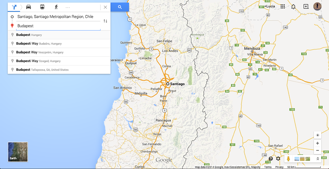
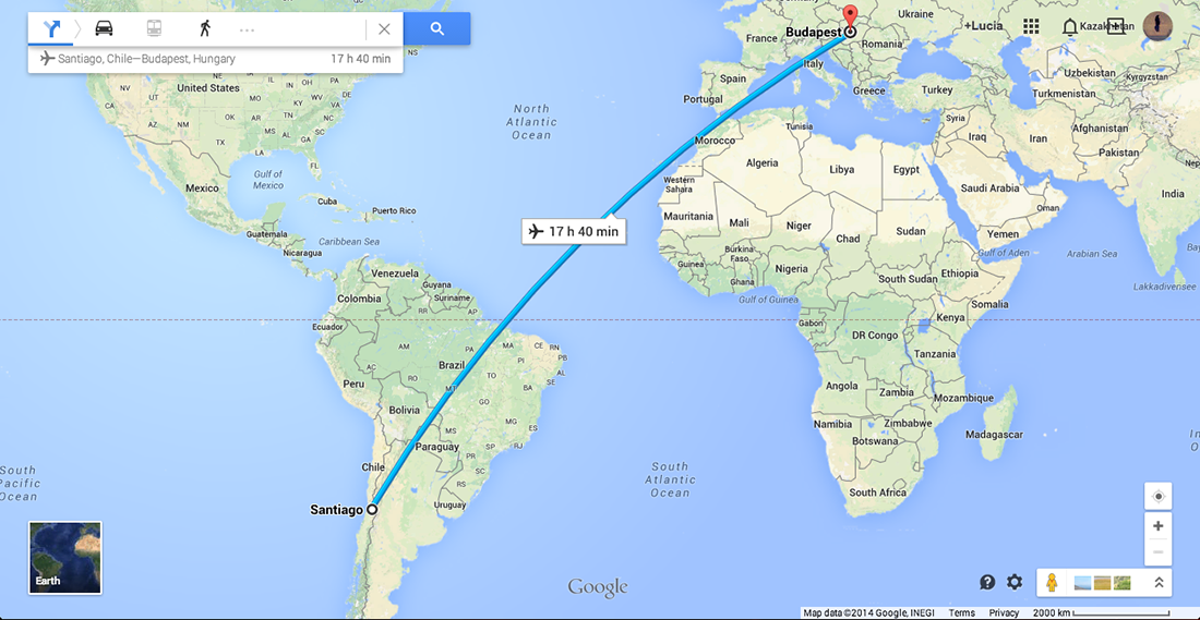
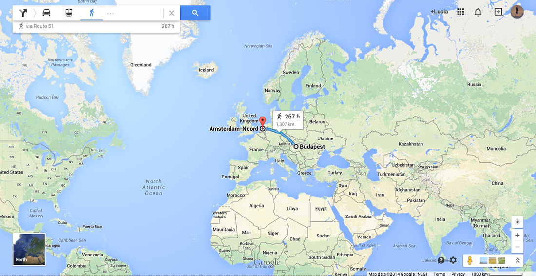
As a personal mapping I was first interested in looking online for my origin in order to see routes and possibilities to reach Santiago, the origin of my father, and Budapest, the origin of my mother. I have also looked for the distance between Amsterdam and Budapest. Nowadays, it is very easy to travel between my hometown and Amsterdam which is the city I have chosen and encountered on my own. I had first visited and met this country at the age of 16 and already new that one day it would be my home. Due to the fact that I can not connect to my origin nor to my parents because of their divorce I currently have to focus on the present and the decisions I have to make every day. Choosing to study but first of all choosing to apply to the Gerrit Rietveld Academie has happened by chance. Through the Academy I have also encountered the Design Academy in Eindhoven. These two Academies are important in this case because interestingly Joost Grootens who graduated from the Gerrit Rietveld Academie is now a teacher in the Design Academy.
At this point I have immediately remembered my past with both academy’s. At one point in the last two years I have met students in Eindhoven who have shared a lot about their work process and further information of their studies. This also made me consider to apply to that school. Although I have never succeeded to enter the Design Academy I have, as a result, got to know the Rietveld more.
Once again, choosing >MVRDV Buildings< still proves how interested I am in design, how fascinated I am about architecture.
I knew I had a good feeling about the book’s black cover.
(click on the map and browse the 2 consecutive images)
To conclude; black to me is a colour. It is a comfort zone and also a strong feeling I have towards it. Black to me is the house I wanted to have and the friends I wanted to play with as a child. Black is also the material I preferably wear during my daily life and it is the ink I like to draw with. Black will never leave me and will always be part of my decisions in the future.
Talks about Money: Rietveld library catalog no : 716.9 rub 1
This is a search that started as a response to the 'Orthogonal Allegory Thesis' I found at the the essays page of Designblog. It shows the dynamic of my browsing, dealing with the facts I bumped into, as well as the associative impulses that coincides with it. I tried to translate my sketched browse history into a text version, to make it more readable ! If you click it, an interactive pdf. version will create that experience for you.
![]()
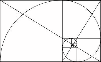
If I tell you architecture, you’ll tell me SQUARE
If I tell you nature, you’ll tell me ROUND
We obviously link architecture to geometry, structure, squares, etc… and nature to organic features and therefore curves and irregularity.
Therefore what is interesting is the notion of curve in architecture.
We started seing curving architectures at the same time as the introduction of movement in art (cubism, kinetic art, futurism, chrono-photography, mobiles, etc….)
Beyond the fact that it’s aesthetically seducing, and beyond the fact that it is bringing movement, curves are attracting more attention from your brain.
Psychologist Oshin Vartanian made researches on what was going on in people’s brains as they viewed two rooms — one with rounded features, the other more rectangular. First of all, the ones that were confronted to the curvy one were more likely to define it as “beautiful”. They also displayed more activity in a part of the brain called the anterior cingulate cortex that, among other functions, is linked to the brain’s ability to regulate and process emotions.
Curved buildings can point to nature, whereas angular buildings contrast with it. Straight lines and angular shapes are disconnecting a building from nature, and humans natural state. It is reducing everything into a harsh and boxy aspect, which we naturally don’t identify in so much.
I observe (on a very personal level) that in the end my attraction goes to buildings balancing the angle and the curve. The final reconciliation between “organic” and “organized”. People like Frank Gehry, Herzog et de Meuron, Oscar Niemeyer, Zaha Hadid, Rudi Ricciotti and many others are/have been working on it and succeeded quite well so far, to bring new rules and esthetics to modern architecture, inspired from the so called international style and reconciled with more organic references, as well with new materials that are more environmental friendly.
I am starting for this occasion a tumblr “Curves” where I will be developing this idea through posts and references, grasping a lot of elements orbiting around this, and that is starting from this thesis that I invite you to read on Orthogonal Allegory in Architecture by Anton Stuckhardt [graduation essay [x].

I found the blog post “Chaos and Order” when I was looking at different tags on the design blog. I thought the tag and title “Chaos and order” seemed interesting and I started to read the blog-post.
The text is based on the Dutch architect and graphic designer Hendrik Wijdeveld’s exhibition ” To plan the impossible” [x].
Henk Wiljdeveld had a romantic viewpoint with a focus on nature and the universe in his utopian architecture. His project “Chaos and order” [x] was a proposal for an alternative expansion of Amsterdam. He wanted to protect Amsterdam from chaos from Randstad. In his plan Amsterdam as a perfect star shaped city with green surroundings from the city centre to the edge. He was searching for an universal model of urbanisation.
The blog-post “Chaos and order” starts with:
“Chaos and order in its most extreme form can be used as a formula for practically everything. From the beginning of time to the death of universe.”
” Chaos and Order” also refers to the Saussurean constructionist’s who believe that you cannot understand a word until you are aware of its opposite. To understand order you need a understanding of chaos. Saussure is the father of modern structural linguistics and he means that meaning is constructed by the use of the language. It is not fixed. Saussure divides the sign in the categories, the signifier and the signified. The signifier is the actual word or sign while the Signified is our idea of the concept.
A lot of focus in the blog-post is on the Universe and life/death in relation to order and chaos. To grasp this huge questions is not simple and I tried to relate the idea of chaos and order on myself.
If you see “order and chaos” from a personal perspective chaos and order are essential elements of daily life. It is impossible to have order everywhere. Chaos is somehow always present. It is as if you are just able to focus on order for some elements of your life at the same time. When you focus on one part and create an order other parts will be in a state of chaos. A very literal example is an article I read about that it exists two types of people the type who is spending a lot of time on cleaning and therefore can find everything fast and the type that is living in chaos but does spend a lot of time looking for things. Both types are spending the same amount of time but some are creating order and others do search in chaos.
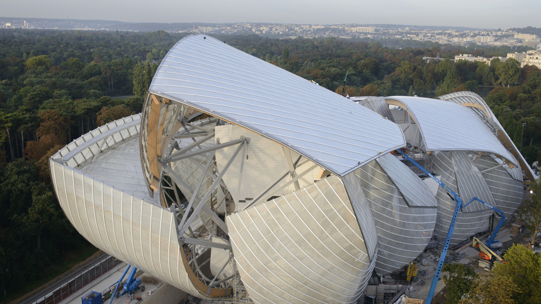
The impact of Ludwig Mies van der Rohe on modern architecture is of similar magnitude as that of Le Corbusier and Frank Lloyd Wright. With his timeless, rational architecture and eternal quest for the essence of architecture his influence can still be felt today. The career of Mies van der Rohe falls into two parts; until 1938 he played a major role in the German architectural world and after 1938 he influenced a totally different world on the other side of the ocean, in the United States.
In the 30’s of the last century the architects of the bauhaus were very aware of their dangerous position in Nazi Germany. In 1938, Mies van der Rohe emigrated to the United States where he was appointed director of the Illinois Institute of Technology (IIT). The work of the architect changed, but related topics returned regularly. He studied in the United States how he could coordinate the technical and constructive capabilities of the U.S. construction industry architecture.
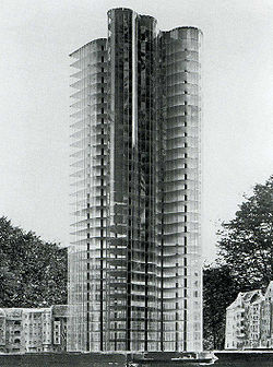
From the Wendingen issues I chose the Glass skyscraper desiged by Mies van der Rohe, Due to the nazi rule it was never actually build. Van der Rohe stated about the building “the exceptional form of the plant stems from the structure of the site and the result is due to the properties of transparent and reflective glass facade, which the architect admitted openly: “Tests on a model of glass showed me the way and soon I realized that by using the crystal is not achieving an effect of light or shadow, but rather to achieve a great game of reflections of light. ”
I do think that is one of the reasons why these buildings are seen so frequent until this very day. The scale model shows how far ahead of his time Van der Rohe was.
Wendingen 5-3 1923 Rijksacademie Amsterdam
Hermann Finsterlin was active in the German expressionist architecture movement in the early 20th century. World War I combined with the political turbulence and social stirring that followed the German Revolution resulted in the utopian and socialist attitude of the expressionist. There was an underlying effort to achieve the NEW. The style was characterized by: expression of inner experience instead of realism, distortion of shape for an emotional effect, and the study of psychological effects of form and space. The research of dreams and the unconscious influenced Finsterlin [x]. Nature was also a source of inspiration. Finsterlin studied the naturalist, Ernst Haeckel [x].
Because economic conditions limited the number of built commissions it resulted in many expressionist works remaining as projects on paper. Finsterlin never built a permanent structure which entitles him a visionary architect. However I believe this is not a consequence of the financial climate but because he was a radical expressionist and produced studies of the most unrealizable buildings. Finsterlin was an idealist, he allowed insight to a fantasy world which was impossible to visit. That the presentation of his concept was more important than the actual finished product is an aspect which I like and can relate to. The artist Sol Le Witt said that ”…the idea or concept is the most important aspect of the work. When an artist uses a conceptual form of art, it means that all of the planning and decisions are made beforehand and the execution is a perfunctory affair…” I believe these words and that they can be applied to Finsterlins work, as conceptual art questions the nature of art, Finsterlins architectural work questions the nature of architecture.
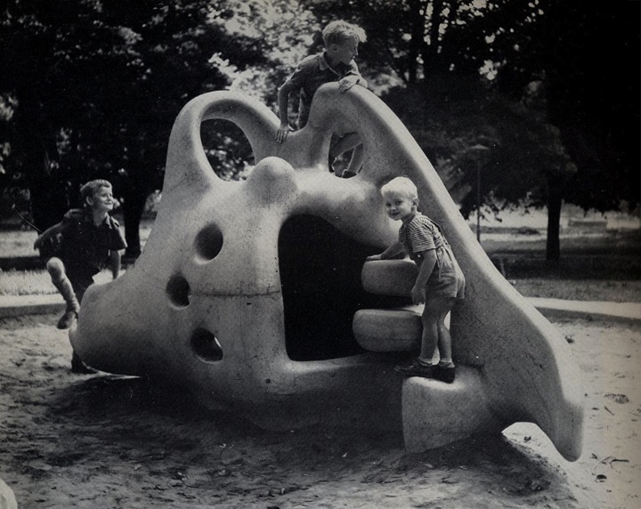
I find Finsterlins work to be pleasing because I draw parallels to the Danish architect and sculptor Egon Möller Nielsen’s playsculpture Tufsen from 1949. As a child I would endlessly play on the abstract and surrealistic sculpture. It was my favorite thing to do in Lund’s city park. The possibility of not simply admiring the sculpture but also physically experiencing it was fantastic. Though Finsterlins work remains on paper his work is still regarded as architecture and not drawing or painting and that that is enough is good. But it is a paradox because I also have a desire for the work of Finsterlin to really exist.
Wendingen 6-3 1924 Rijksacademie Amsterdam
“the west discovered the quality of space in traditional Japanese architecture through a filter of western architectural values”
"Myths of Modernism: Japanese Architecture, Interior Design and the West c. 1920–1940" - McNeil, Peter (1992).
In 1925-26, seven issues were devoted to the up until then life work of Frank Lloyd Wright. The cover designed by him, used bold red and black graphics. This cover, one of several created by Wright, is one of the first European publications to promote and document the work of an American designer. It has special title: “The life-work of the American architect Frank Lloyd Wright,” colored cover by Frank Lloyd Wright.
This richly illustrated collection of Wright’s early architecture includes essays on his work by architects of the period and by Wright himself. Features more than 200 photographs, plans and drawings of his early residential and commercial designs.
Frank Lloyd Wright 1925 Wendingen Series – Can be found at the Rijksacedemie in Amsterdam. If you have enough time and love books and have a special interest in this series become a member for one year with a small fee, it’s worth it.
Through the many drawings and photographs in this series I could see so many types of architectural styles from Mayan to Indian temples and Japanese style. It is what attracted me to the picture you can see in this post. I could see many similarities in Japanese architectural elements that appear in the pictures and drawings repeatedly. I have a great interest in Japanese culture and architectural elements also play their role in that. The nice thing about these buildings is that they are build outside Japan in United States, and with materials used of course different and available in that time.
I chose the drawing of one house specially designed for the 21st governor of Wichita Kansas, Henry J. Allen. Who hired Wright to design his home in Wichita, Kansas. Allen’s home is the only residence designed by Wright in Kansas. Like many Japanese homes the garden has a special place and for the big part the home surrounds it.
I can see Wright was influenced by the functionality of this style which surely must have influenced his later modernity. He of course visited Japan and not only was he influenced but the reverse also occurred.
A DVD was made with this concept:
MAGNIFICENT OBSESSION: FRANK LLOYD WRIGHT’S BUILDINGS AND LEGACY IN JAPAN [link] an excerpt can be seen at YouTube [link]
Wendingen 7-5 1925 Rijksacademie Amsterdam
Each project that students initiate, makes them into temporary experts on given topics. Art & Design schools then become knowledge hubs where different expertise cross fertilize. By looking at what types of research students engage in, Designresearch and UnBornLab organized a 'workshop' to investigate design matters from a students' perspective.
Through a series of short video's students from both the Foundation Year and the DesignLab department share ideas, focusing on the temporary expertise gained as part of their projects, rather than the outcome. The workshop was articulated around one of their given assignments. Students were asked to develop a specific object or context to help focus or explain content.
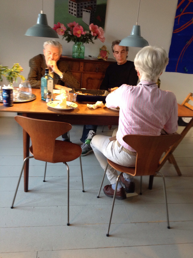
The format is clear: two persons, discussions, filmed from above.

the space is : two stools and a table.
* Foundation Year
Have you ever had different impressions than in the past or than other people in the same space? I can give two examples;
There is a place where I always pass by with my bike. Today, I decide to walk along that same space. I stroll in this space. I ramble through every corner and small alley. My feet lead me to the scenes which were always there but very new to me; an ivy-covered wall, small scribbles of children probably who lives in this neighborhoods, tiny bike tricycle lying on someone‘s front garden and windowsill-piece with nice touch. I enjoyed these scenes while walking through the same place where I pass by regularly. I always thought I knew this place very well, but today I was only started to become conscious of these new and everyday-life scenes.
My friend and I passed through the narrow alley and came to a small door. When we opened the door we were able to enter a space. It was deep and narrow. The width was not enough for us to stand side by side. The side walls are high and ceiling was open towards a nice blue sky. I could see a bird flying and hear the wind. Space was quite dark, but I felt very comfortable and fresh. But my friend had left the room already, later she explained why; she felt almost choking so left the space early.
This might be a daily experience which we encounter often, but if it occurs too often we might not put any extra attention to it. I had a curiosity for this event, and wondered why there are such differences according time and person. I am sure that many readers had the same experience like this and wondered about it.
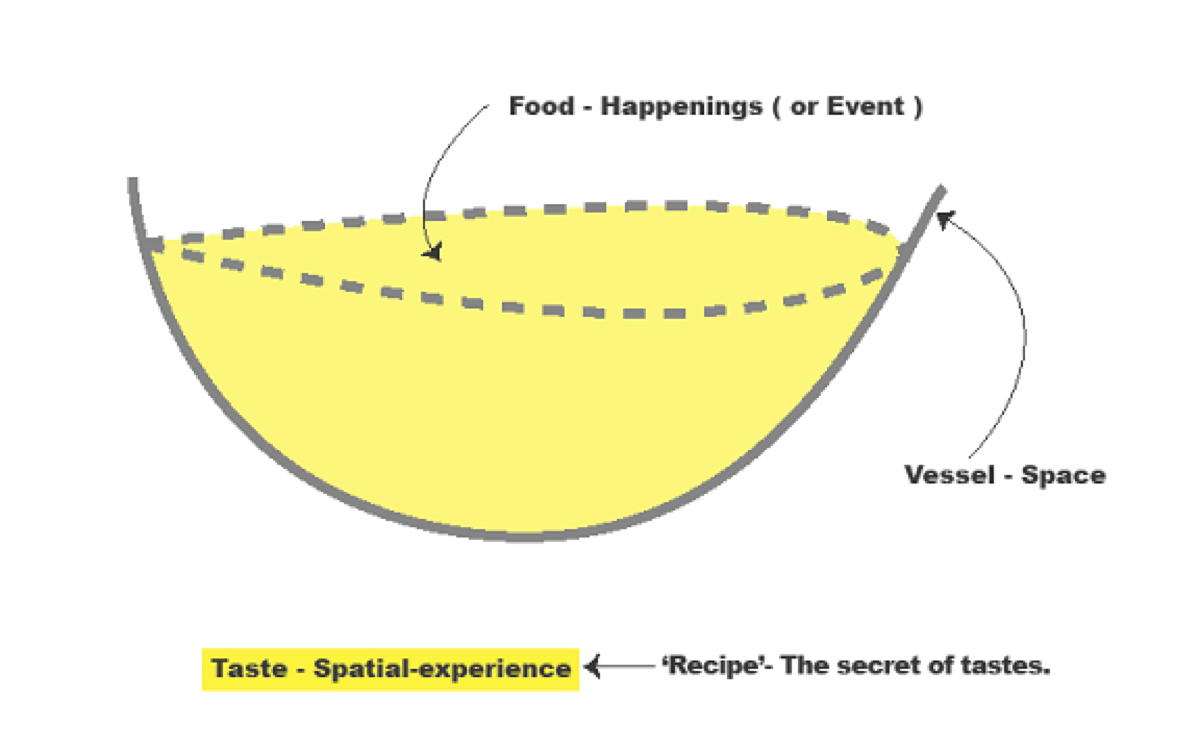
Metaphorically speaking, space is ‘vessel’ that contains food, and this food can be defined as ‘happenings (or events)’ in the space. This ‘vessel’ gains its meaning only when it is used and it meaning will be even enlightened if the ‘food’ is delicious. On the other hand, the shape of ‘vessel’ differs according to its containing food; bowl, plates or cups. Every food has is matching vessels, if it is not matched well; simply, the food loses its merits. And of course this same food in same vessel can be tasted differently to every people depending on their preference or their body conditions. This ‘taste’ can be also, metaphorically, defined as ‘spatial-experience’. I want to explore these factors that create different taste which can be said as ‘recipe’- The secret of tastes. And I presume this factors-recipe- is ‘Experience’.
I "Am" "Here" In This Space "With" You : read or download my thesis below
It appears you don’t have a PDF plugin for this browser.
No biggie… you can click here to
download the PDF file.
This essay initiated my graduation project “A Scenic Contemplation” presented at the grounds around the Rietveld academy as part of the 2013 graduation show.
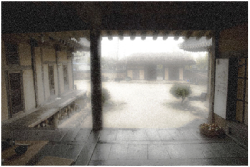
– A Korean Philosophy about window and surrounding says: “ Window is a frame that can hold scenery.”
This philosophy about the window is called “borrowed scenery”. The borrowed scenery method reflects the exterior landscape into the inner spaces, forming new scenery.
This method does not destroy environment. It just borrows the environment. If you follow this philosophy you can live with a breathing landscape painting. When you borrow a landscape via the window, the architecture can breathe thought the window. The borrowed senery method make your senses soft.
I was impressed with this philosophy, especially with the attitude and the way how they treat the environment. They did not use the environment only for their own sake, but they borrowed the scenery and lived along with it.
It is a humble way to live with the environment.
text by Hanna Lee [graduate student department of inter-Architecture 2013]
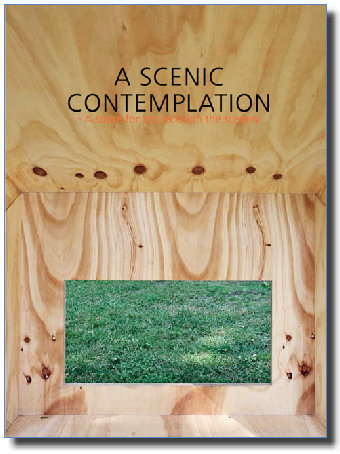
Download the publication ”A Scenic Contemplation“