Skip to Content Skip to Search Go to Top Navigation Go to Side Menu


"book design" Category


Catalogue–as–exhibition


Thursday, January 19, 2017

What do you see when you look at a book for the first time? Is it the title? Is the typeface on a cover? Is it color? Alternatively, material? Why do we still print books if we have the internet, computers, e-books, tablets, and phones, some of which have a screen of a pocketbook? Well, in fact, because we still need a physical medium. It is notably hard to predict the development of technology. Fifteen years ago we could get a DVD exhibition catalog or indeed a movie. It would be a modern and bright solution, maybe quite fashionable.

feeling the book 2

People who are questioning the need for printed books assume it is easier to read from digital sources. Furthermore, It is simpler to carry, and the digital book does not require physical place. Nonetheless, why do we need a material text? ‘The book, if properly designed can last more than five hundred years’ – says Irma Boom. However, digital data can probably remain longer. Though it is the feeling that makes the book unique. It is the design transformed into a three-dimensional object.

xerox book

book feeling

 Xerox Book (1) and Seth Siegelaub: Beyond Conceptual Art (2)

(more…)

FULL SPECTRUM BOOKSHELF


Tuesday, April 12, 2016


Some find comfort in mess and even manage to bring a certain order and coherence in it. As for me satisfaction comes in organization. By organization I imply functionality as well as visual clarity. When I found myself in front of a very extensive pile of book clarity was what I needed. My own bookshelf is sorted out by size, my clothes rack by color, stretching from black to blue through different shades of green, grey and pink. It brings order in the room. I know where things go and where exactly I can find them. I decided to experiment with my own bookshelf.


Self_organising_bookshelf


From grey to black. One entire shelf for the white ones. Brown, then yellow, red then come all the different colors from the visual spectrum. Although not all the book edges come with a singular color, the writing on it need to taken in account. The typography, its size and its color can completely change the order from one book to another. Organizing a library in such a way is a never-ending game. Taking one book out means it needs to go back in the exact same spot. At any moment the order can be ruined but finding the right former location is the same feeling as fitting the last piece of the puzzle in the whole picture.


A bookshelf organized by color is not only a piece of furniture filled with books, it becomes an architectural piece. The color coordination makes it a whole with a strong visual character. As the color together convened makes it look pleasing, it forms a new building, a construction in the space. Using books to build up the space is the main material of Fernanda Fragateiro. This Portuguese artist transforms books in “material prima”, which she uses to make her sculptures. What was supposed to be read before now is to be seen. By using books in her works Fernanda Fragateiro creates series of abstract sculptures in which the holder of the content turns into the actual content of the piece. However this content is closed and sealed and so forth silent. She picks the books for their visual property not for the content of it. Sometimes she even makes the books herself in order to get the right colors. This way the book is reduced to its only material quality and its symbolic value.


ff_notreadingrainbowcolors

Another example of someone sorting books by color is Willy Fleckhaus who designed the edition Suhrkamp from Suhrkamp Verlag. He created a very specific though simple visual identity consisting in the rainbow colors. He developed a highly ordered layout of evenly spaced rules with a single weight of Garamond for all the text but then gave each of the original 48 covers in the series a separate color, so that when lined up in order their spines formed a perfect graduated rainbow. The result was to make the series instantly collectable.

edition-suhrkamp-540x304


This visual identity is very specific to that edition and is still going on right now. In general a series represents a group of books which visually and thematically accompany one another and that are designated as series titles by the publisher. In a successful series the individual titles interact with one another, frequently presenting different perspectives on similar themes. By recreating a similar color ordered system as Willy Fleckhaus I was aiming towards a unity of the library. Books now relate to each other not through theme or author. They all have the same thing in common that makes them a whole rather than individuals. They stay distinctive in a sense because their content has nothing to do with the order they are placed in.


Some accidental situation can yet be fortuitous. Combinations happen while not expected. I find it most beautiful to randomly pick a book in a library. This organizing system creates the randomness for you and allows you to discover other books and not only the one you were expecting. A library needs to be able to surprise you and give you more than the Internet. Internet cannot give you random. You type in a request knowing already what you want. It then makes connections for you based on words, topics, or dates. That is also something I noticed while reorganizing my bookshelf; I have not be noticing a lot of books before because they were drowning in the whole mess. I put them together and discovered a bunch of them looking for their color. In the end I must have spent a few hours doing that getting caught by some unknown books on my way. I realized I have two volumes of New Perspectives in Drawing from PHAIDON editions: Vitamin D in english and Vitamine D2 in french. I opened both of them and definitely got new perspectives on drawing because doubled.


In this randomness I still find some order. Publishers working together with authors design, decide on how a cover should look like, what the colour should be according to its content. The example that comes almost immediately is the black cover and yellow typeface of most detective novels. Moreover how a book is physically designed, advertised, distributed, not only determines whether it is part of a series, but also who will purchase or read it.

Jazz


Thursday, December 10, 2015

Part 1

Library, spines facing you, from every direction. The opaqueness of all this knowledge is overwhelming to put it mildly – your head spins of confusion. The environment breathes an air of calmness, yet great anticipation, as if the myriads of hardbound works of literature and art are eagerly yearning to reveal their insides.

You stand still indecisively – you feel yourself on the narrow interface between on the one hand panic like running down the narrow corridor, to the door, halfway collapsing onto the floor and dying, and on the other hand siting down, indulging yourself in every publication that catches your eye, never leaving.

You regain your grip on reality. You see a bright yellow rectangle in front of you. You reach for it and you look at the front cover.

The cover of Henri Matisse's Jazz

You look at the cover for a solid minute. You like the bright yellow colour and the sturdiness of the cardboard. You look at the image on the cover. Primary colours have always fascinated you immensely. The blue night, the black figure, the yellow stars, and above all the tiny Red Dot as a heart. You are intrigued – you know of this man, Henri Matisse. In your head appear images of bright coloured faces and dancers, composed with mildly crude yet incredibly accurate brush strokes. You also like jazz, and wonder what this book could be about. Filled with curiosity you open it.

The inside of Henri Matisse's Jazz

That’s it. You’re taking this one.

What appears to be a great and interesting book, turns out to be – according to knowledge that you have newly obtained – merely a small, relatively unimpressive excerpt from the original Jazz. Published in German, this small yellow book is actually a book within a book. A book about a book. The middle set of pages are reduced size copies of all images of Jazz. A ten-page introduction preceeds it; succeeding are German translations and a timeline of Matisse’s life. The design of the yellow book is not very striking – minimalist but conservative, done by the publisher. Judging from the looks, the middle part – the excerpt from the original Jazz – is by far the most exciting.

The original is a thick pack of folded paper, twice as wide and twice as high as the yellow booklet you have found in the library. Twenty colour prints, of which fifteen that span two-page spreads are included in the unbound book, together with seventy pages of huge, handwritten cursive text in French.

Marveling at the bright and bursting colours you wonder – How? Why? What does it all mean? You want to find out everything about this book, so you start researching and reading, to learn more about how this artwork came to be. As you learn more and more you suddenly find yourself 74 years in the past, in the south of France.

Part 2

You are now Henri Matisse. It is the summer of 1941, and you are 72 years old. You are living in a suburb of Nice, and you own a nice house with a flowery garden, a big studio and a personal assistant. The gods of health have not been benevolent to you – you were diagnosed with abdominal cancer a few months back, and though doctors have removed the tumour, you suffered from serious complications. You have been on the brink of death for a while, and since then you’ve been only slowly improving. Standing is possible but laborious, so you prefer to lay down on your bed.

Matisse and Assistant

You have tried to pick up painting again, but it is tiring and difficult, and virtually impossible from a laying-down position. Thus, the ultra-creative human being you are, you have invented alternative methods of creating colourful expressions of expressionist effervescence: the cut-out method. Simple but very effective: cut-out pieces of paper, laid on top of each other to create compositions. You have used this technique before when making paintings, but only as an aid to perfect the lay-out, never as a means to an end. Your assistant dyes paper with pure, unmixed gouache and you use scissors to cut them into any shape you want. Easy and less labor-intensive than painting, you really like this method.

Matisse Cutting

You feel that scissors carry way more feeling for line than a pencil or brush ever will. You feel so much more improvisational and spontaneous, and your life after your near-death state feels like an artistic renaissance. You feel like cutting out people, and flowers and trees. Flowers are so amazing to make, since the natural world is not hindered by preconceptions of classical art. As you once famously said:

Nothing in the world is more difficult than painting a rose, since before he can do so, he has first to forget all the roses that were ever painted.

Full of inspiration, you start to create one, two, twenty collages. You write handwritten text, loosely accompanying the themes of the collages. The text is very big because you feel it is necessary in order to be in a decorative relationship with the colour prints. Your publisher likes the book and wants to print it: 100 copies without text and 250 ‘deluxe’ copies with text. The copies are printed by brushing paint over metal stencils made in the shape of the cut-outs. The paint is the exact same gouache used to dye the paper, so the copies are highly accurate in shape and colour.

Le Toboggan

Page from Jazz: Le Toboggan (The Sled)

The collages depict circus scenes, stories, myths, abstract shapes and personal experiences, in vivid colours and an uninhibited style. The cover displays one of your first collages, the clown, and the title of the book: Jazz. You chose this title because you like jazz, and you think there are parallels with the music on the basis of your unbounded, improvisational and innovative way of working. You consider the previous title, le cirque, not inclusive enough for all the themes the book discusses. In the front of the book you include a ‘table of contents’, an overview of all the collages, with individual titles.

Cover of Jazz

Front and back cover of Jazz

Table of contents of Jazz

Table of Contents of Jazz

The book is received as a wide success and it kick-starts a new stylistic era: the next 12 years, until your death, you will work on more cut-outs. You like the works you have made, though you doubt the artistic quality of the book – you think that the best way of presenting these collages is in their original form: loose pieces of paper, laying on a table in your studio, playful and vulnerable to any gust of wind.

Table The End

Rietveld library catalogue no : mat 17

Shapes, Space and Harmony


Monday, November 30, 2015

I tried to let my mind be open for new impressions during my selective process. My main goal was to find something that inspires me. Something that I can relate to but still find exciting in a new, different way. I also wanted to find a book with well thought out typography. So I can learn from it. Analyze it and break it down. Pick it apart like an engine.

At first, all the showcased works by students caught my attention and I started going though them. Although many of the works were inspiring—I felt like I had more to see before making a final choice. I started to drift towards industrial design. The aesthetics were nice, with a lot of grids and furniture covering the front pages. But the typography that I was looking for was missing. At last I found a book called “The Future Issue” next to the industrial design section. At first glance, the typography of the cover really struck me. It was well designed, set in black and white, in a balanced layout. I opened the book and saw that it was designed by Laurenz Brunner. He’s known to me from before and an interesting designer, the choice was easy.


Foto 2015-11-24 18 38 12_2

The Future Issue—Vol. III


FUNCTION AND FORM

In 2007 the first volume of “The Most Beautiful Swiss Books” was released. This catalog is the first part of the Back to the Future Trilogy. “The Future Issue” which I found, is the third volume. In order to learn about the design I decided to go back and start with taking a look at the first catalog to see how the design has developed. All three volumes are designed by Laurenz Brunner. A composition of several colorful images are covering the front page. The title “The Past Issue” is written across the center of the cover. The images are positioned in a way so their corners touch each other. Connecting them together, almost creating a spiral effect. I like the fact that it also creates a clear hierarchy among the images. The cover feels well balanced yet without losing tension. Some of the images are rotated. It helps breaking up the square layout and also makes it more difficult for the eye to see the pictures individually. Instead we focus on the whole picture and get the impression of a playful yet organized layout.


Foto 2015-11-24 18 59 00_1

The Past Issue—Vol. I


The second volume in the series, “The Present Issue”, has a similar cover. Yet again we see a composition consisting of colorful images. Although this time, the layout is much more organized. Every image contain the same size, and no one is rotated. They are positioned in a grid, spanning from every corner to the center, also connected by the corners. The titled is allowed much more focus—being set in a larger weight, in a bright red color. On the contrary, the title lose readability as the words are rotated. By comparing the two covers you easily spot the similarities and the differences. It is almost like they are reversed. On “The Past Issue” the images are allowed freedom and the typography is kept minimal. Creating a playful layout. While on “The Present Issue”, the images are static and the typography is allowed freedom. Filling the same function as the images on the previous cover.


Foto 2015-11-24 18 51 09_1

  The Present Issue–Vol. II


Lets jump forward in time and look at the cover of “The Future Issue” (Vol. III). The first you notice is that it does not look anything like the previous volumes. First of all the front page is completely covered in black. Second, there is no images. Only text. Despite this time, an illustration is also covering the page. The numbers in 2009 are spread out in a square with a loose spiral connecting them together. For me the cover feels much more mysterious and cryptic than the two previous ones. It’s atmosphere also works better with the title. The future is something that is unknown to us. Something that lies completely concealed in darkness. The spiral also emphasizes the mysterious vibe and makes me think of space. Which is also something that is very unexplored for us.


Foto 2015-11-24 18 38 12_3Foto 2015-11-24 18 38 40_2


VECTORS AND HARMONY

All three catalogues are set in Circular. Which is a geometric sanserif created by Laurenz Brunner himself. In 2004 he released his first typeface LL Akkurat which shortly became very popular. After it’s success he created Circular which is inspired by Paul Renner’s classical typeface Futura. Both typefaces has a purely geometric approach and a balance between functionality and idiosyncrasy. Circular also possess a recognizable character yet a universal appeal. The geometrical shapes became the representative elements of the Bauhaus design style and you can clearly see the influences in Circular and “The Most Beautiful Swiss books” series. The simple use of color also draws inspiration from the past, working only with red, green and blue. The layout and the typography of the series are simple. Designed in a minimalist way with high readability. Titles set in a clear hierarchy and text set in either two or four columns.


Screen Shot 2015-12-11 at 01.11.25Screen Shot 2015-12-11 at 01.10.27


The way Laurenz Brunner is working with the typography connects the individual catalogs in a clear energetic way. All based on the previous one but with another layer added to it. The design varies but always with the same principles in focus. Laurenz Brunner’s fine harmony between tradition and modernism creates a design that I find engaging and timeless, in a very intriguing way. Function always in mind but set in a contemporary way.

Below you can find some pictures showcasing the typography from all three issues.


Foto 2015-11-24 18 42 49_1


Foto 2015-11-24 18 51 51_1


Foto 2015-11-24 18 51 51_1Foto 2015-11-24 18 56 13_1

Rietveld library catalog no : 758.3 swi 2009

Element, Fifteen


Saturday, November 28, 2015

15-elements_cover2 15-elements_side 15-elements

front of box • side • 15 elements

When I first saw this book..
I thought that books always have similar size and shape before I see this book. For example, a book is made of one piece and has only one cover. When I saw this book at first, I do not know the series are a book that has one package. Also, I liked different colours in a black package and these books have diverse design and layouts. And I discovered that she used only small letters on the package and covers. I guessed small letters mean elements than capital letters. Moreover, when you open the book, you can see two pagination on the top and  under the page. I am not sure that I guessed a number on the top of a page is a pagination of one element(a book of series) and another under the page means a pagination of all elements(15 series). This is because second number start to 100 and finish to1500.  Actually, this book’s contents are very difficult and boring to reader since it deal with the history of architectural elements, the technical and social developments where they come from but this book design helps to vent. In addition, I could see really different layouts each book because these books have very diverse compositions to almost pages. So, it seems like I read a book but it is not a book.

elements-of-architecture

Venice Architecture Biennial

Design of this book..
Title of the book is ‘ elements’ designed by Irma Boom. This book is a series about architecture and the series is consisted of 15 books about 15 elements of architecture. It means this book is not one but it becomes the one as a black package. You can know what is the elements as seeing the 15 book’s titles. Also, you can find how did she show the ‘elements’ in design because it has 15 different titles, colours, books and contents. It is really interesting to me since she gave how to use the book’s title and concept as design. I realised that dividing a book is really effective for showing a small title. The book has 16 titles that is one big title and 15 small titles and you can see 15 elements before open the book ; floor, wall, ceiling,roof, door, window, facade, balcony, corridor, fireplace, toilet, stair, escalator, elevator, ramp. This book was made for the Venice Architecture Biennale by Rem Koolhaas.

Who is Irma Boom..
Irma boom is a Dutch graphic designer and she makes a book more special. This is her website. She has made over 300 books and her books are exhibited in New York City(MoMA). She is very famous designer internationally and she has lectured at Yale University in the USA. Also, she has been awarded a lot and worked as a critic. This is her website.

How does she make a book..
I was wondering when she make a book, how to approach, get a concept and develop. This means process of making a book. I was looking for some interviews(1, 2) for knowing her and her books. She said “Everything revolves around the development of a good idea; everything else – buying paper, production – are skills that one might or might not have, but the concept is what makes a project succeed or fail.” And she does not approach books like a product designer does. She said “I really approach books for what they are, as books, turning the pages. The object. Sometimes I see books, and I think it could have been a PDF. The regular book is not alive anymore. You can put it on a PDF on the internet, or on a Kindle or iPad, and it’s the same. But my books are something else. They have to be this three-dimensional object. Somebody once said that I’m building books. I really like that expression very much. ”

To sum up, I could realise that a book can evoke a lot of interests by design because I have saw books that made to similar size, techniques and feelings. I agree her opinion that her books are remained as three-dimensional objects because her books are truly special. For example, ‘Biography in Books’ is immensely small and thick. When you see the book in the internet or iPad, you can not feel this shape. Although this book is tiny, it gave very strong feeling to me when I saw. In addition, this is another example. Sheila Hicks: Weaving as Metaphor. This book on the work of textile designer Sheila Hicks. You can see different feelings when you touch the book even surface of the book. This means she just did not use the photos in the book and she made to feel real. So, she won the Gold Medal for the “Most Beautiful Book in the World” Prize given at the Leipzig Book Fair through this book. She does not apply the same style in everything when she makes a book. Moreover, searching about Irma Boom was really interesting since her books had very diverse design. I thought books will be able to disappear at one time except some specific books and be produced a small quantity. There were some intriguing points to me in her interview because Irma Boom and interviewers talked about digital books in her some interviews.

Sheila Hicks

Book number(Rietveld library) _ 710.4 bien 14 lll

Retracing, I swear I use no art at all


Friday, November 13, 2015

retracing

I enter the space and I know my mission.
I know that Today is my lucky day.
I’m heading up for something that interests and feels good to me, only one item is required.
It is an especially pleasing and reassuring occasion because I know what this place could do to me.
I love and hate this place.
As an example I know that I don’t know much, and this, adding a bit of curiosity, could keep me here for a couple of days.
Entering here I am well aware that words can trick, seduce, redeem or amaze people.
I remember that words are doors, that books are sleeping souls and that this open graveyard was once compared to a labyrinth, which indeed it is a sneaky way to describe a prison.
But today I’m blind from any content and this is my luck.
Thousands words laying down like disarmed soldiers, sleeping giants.
I’m blind and that’s the reason why I am wandering between bookshelves touching each spine, trying to use a different sense.

In this way I find the book, or the book shows itself to me.
Only by touching I read its title.
I open it  and I  feel the ink on its pages, the different kinds of paper used. It seems an attempt to remember something lost,it presents pictures in various format, it looks like dialogue between material. I still don’t know what this lost message is, after there is a text that I have not read yet. Anyway I am going to explore it now, trying to retrace it.

retracing.3retracing.2

Artist Rein Jelle Terpstra,
Book Retracing
Publisher Post Editions
Design, Studio Joost Grootens

17:45 12-11-2015

I am starting my research, I flipped twice every page of the book, still haven’t read the few written pages at the end. I am not doing so because I think it will probably be a sort of description of the work, and I would rather focus on the first part.
Like when facing a magician, you don’t want to know the trick from the beginning.
As well I want to keep being blind all those words cause this is why I choose this book, my research method.
Within its covering major capitals that protrudes through the grey linen cover, I can feel a dialogue, and I want to follow to it carefully.
It seems we are facing double track, series of thick deeply back matte pages are followed by glossy, light and shining ones, it is such for all the length of the book.
I figure out that the big thick black pages depict what it must have been a slideshow projection.
projection
In the dark of the room you can recognize the size of 35mm colour film slides projected on a wall, in the background emerge some objects like a desk and a chair. I have no clue what this slideshow is about, the diapositives depict snowy landscapes, flowers, tables.
The photos seems unrelated and the only thing I can feel is a taste as nostalgia and loneliness.
After few pages, this dark thick and deep side crash against a bright, clean and light one.
This new part is showing also some 35mm diapositives, but this time, thanks to the properties of the paper and the print, the images are clear and easy to watch. Still they are presented as part of a slideshow, and sometimes images are cut in half, leaving a white space before or after them.

Bright

For the whole length of the books these two part keep switching, dark and light pages alternate themselves, here you can see how.
If content of the pictures seems random I notice that the photos of one section reappear in the other, the slideshow must be about these 35 mm presented in the white side. My feelings are now confused. I feel like facing a reality (each photo) and being driven from a clear to a dark side of it continuously, as if we were inside a paradox,or like facing a duality a transition.
Like going form consciousness (white and clear pages) to oblivion (dark and blurry ones),from reality to memory.
All images show familiar, personal or peculiar places. I don’t know why the author made this double track, I don’t know why these and not other photos are in it and I don’t know why in this order. I need to know more, I wish I know more.

02:21 16-11-2015

I read the end of the book, everything sounds so funny to me now.
I discover why the book was and is so special to me, why I did chose it and indeed why I was so confused by the way is designed.
As described in the internet “Retracing’ is part of a wider investigation into perception, memory, photography, and the possibility of imagelessness. Rein Jelle Terpstra is working with people who are about to lose their eyesight. He has photographed images that are valuable to them on Kodachrome slides, with the promise to describe the prints after a few years very carefully in words, in an attempt to invoke the images in their heads through language. Earlier Terpstra made a slideshow installation with multiple projectors in which the light images of ‘Retracing’ slowly blend”.
The book that I chose blindly turned out being made for blind people, and it’s content try to describe how an image can disappear.
It simulate how our memories work but it is also an the attempt to save them. In fact Rein chose to make visible something impossible to visualize, to describe the process of disappearing while at the same time reverting it. She crystallize memories in order to give them back to their owner, to change the destiny of a memory while showing us how it can and does fade.
I said it sounded so funny to me because in a cynical way I think that my choice couldn’t be more natural.
Retracing came to me because of my research method, but the real magic lay in the fact that its design has been able to translate the content of the book into a material form. The design of the book, starting from its cover, where the letters of the title are almost invisible and only “vaguely looms out at a certain incidence of light”. The cover already speak about its content starting a tautological circle, the thickness and the quality of the paper, different for different papers and its printing methods.
Every element sustains the concept behind the books giving it a physicality.
Every detail is a confirmation  of the central statement and it strengthen its power.
I wish I know more about who designed the book, I know that his name is Joost Grootens, that he lives in Amsterdam and that following what internet says should look like this:

joost_grootens_portrait


01:32 18-11-2015
I still think how nice it is that a book can speak in so many ways.
For example  I have always appreciate old books, probably because you can feel that somebody (and not something) made it.
You can feel that the personal touch overcome its production, and I can wonder how much work and attention is behind every page.
In this way the page itself is becoming a medium behind the text or the information it is presenting. It feels that reading while touching such a book goes beyond its text.

22:24 19-11-2015
Today we had a meeting regarding our researches. I had more info regarding Grootens, for the entire meeting I had in my hands another book he designed, actually his own book, designed by himself for himself,
and it is GREAT.
I realize I should start a new post regarding this book but I will just say some words about “I SWEAR I USE NO ART AT ALL, 10 years, 100 books, 18788 pages of book design”, (in short ISIUNAAA).

ISIUNAAA_000_cover

First of all, it seems to me as the most rational and efficient work-related autobiography one can person can eventually make, for what I saw so far at least. In it are described all the works Joost made in the last 10 years, first presenting various charts regarding how his projects evolved, with whom, when and how.
As well he show a timeline about how each book or project was connected with others, describing why they were made or how they started, he present a map of the different studios where he worked, which and how many different kind of paper he used, all the kinds of binding methods, typeface, pictogram, pattern, grid and colour he chose for each book.
Here I decide to post some of these schemes and charters to make my amusement understandable.

no-art-at-all-crop-09 no-art-at-all-crop-07 no-art-at-all-crop-04 no-art-at-all-crop-10

The book is a masterpiece of order and functionality, but without losing an intriguing physical effect.
As for RETRACING the book can speak for itself about itself without the use of words, intact in the last part Joost present some samples of the 18788 pages he made, but with a trick. He reverse the order of each page so where it should be written “apple” you will read  “elppa”, this on order to make the reader look at the design without the possibility of reading its content.

00:35 23-11-2015
I found myself thinking a lot about ISIUNAAA,and I am amazed about the attention the author placed in his book, as for the control he has over it and the power of a systematical method. I think Grootens must love his work and in his book his passion manifests powerfully. RETRACING is a vivid example of it and ISIUNAAA is its symbol. It is like an old book, the attention in making it help to create a new channel of communication.

3:09 30-11-2015
It is more than a week that I am collecting memories about the book I saw only for one afternoon.
In the last week I went to the city looking for Grootens magical book, no one has it but I finally found it in Denmark.
It arrived yesterday and I can’t escape from it.
This is the end.
My research end with the beginning of a new one.
I had one more proof how much books are powerful, how much they can speak depending on how much attention they received while making them. I understand that an almost maniacal approach can be useful if it explores carefully the possibility to best way for express an idea and I intend to use this approach for my future researches.
It is important to remember that the focus and attention in the phisical presentation of a work is essential for increasing its power and strength. I am very glad all this happen, I am glad RETRACING pushed me to RETRACE, claiming awareness screaming beneath an almost invisible but powerful surface.

Rietveld library catalog no : ter 1


You’ve got a new message


Thursday, November 12, 2015

please 1 please 8

Please come to the show : the title is calling your attention.

HAVE A LOOK AT THE BOOK ( clic on : look inside )


«I’m inviting you to see my work.»


By that invitation, an artist is offering you a dialogue, a direct form of exchange. It’s becoming personnal, between the two of you. As if you were starting a conversation at this very moment and that will be continued at the exhibition.

Sending. Receiving. Answering ?

Artist. Postal service bridge. Audience.


A first visual step before you see the works, something to give you the curiosity to want to encounter it. By this piece of paper, an interaction is created. The showing process is a way of meeting and making a message resonating through people.

Please come to the show’; what a calling, yes of course I will. 

If the show is in that book, yes of course I will open it.


Because this is what it is all about in here : an archive of exhibition-related ephemera, which means ‘all the printed productions that go along with exhibiting’. All that pages are a tribute to the museum’s memory, an exploration of the ways of inviting people to experience art from the early 1960s to today. As an archaeologist, you dig into the stratified sampling of cultural communication.

Ephemera production relate to a specific time lapse : it gives a physical form to a moment. A moment that is coming or that is already passed. That direct way of seeing the setting and spirit of artist’s practices illustrate range diverse artistic activities. It makes a connection between the artworks and the viewing of it. As a window it enhances it, it disguises it or it gives a really good and simple viewing of it. It is at the same time an experience of the artworks just as much as the art piece in itself.


The information’s display builds a context, a fantasy of the event. The main goal is to attract people, to fan the flame of their curiosity.  We are talking about a place, a day ; the basic information that an invitation gives. Then the display of the words, the image, the size, the paper are adding a specific aspect to the message. Making it unique and appealing .

All this invitation production can be affiliate to the postal art way of thinking. What can you send by post? Basically everything if it is stamped enough and the receiver’s address is readable. The possibilities are rich and various. It is a way to make ideas travel and thoughts physical.  The communication is becoming visible, translated in an object. I’m nostalgic for that thing that we almost never experience : receive an invitation card by post or from someone . It looks much more personal than the new trend of mail-invitations or Facebook yes/like-it/no, I’m coming.  My letter box stays frighteningly empty with that surge of creativity.


invite


« The show looked back at the genre of the printed invitation in the midst of this technological watershed point – which has made it really hard to remember how people communicated in the not-so-distant past. 

During the last five years or so (or maybe it has been a decade?) it’s a regular occurrence to get notices from galleries or institutions announcing the end of their program of printing invitations. 

The example above comes from Brazil – a gallery named Galeria Fortes Vilaca. It has stayed on my desk for a couple of years as a particularly handsome example of the genre. In hindsight, I wish I did a better job at collecting more of these announcements.» 

David Senior MOMA bibliographer and editor of the book


If it’s important to collect and record this kind of production to keep trace of the artistic evolution, it has to become interactive. That is the goal of making a book : let the people use the archive in an active way.

In a formal way the book is an example of how to present an archive in such a way to put emphasis on their impacts, influences and the way they are interconnect.  The display is giving an other layer or makes easy the analysis of the collection process.


please 3  please 5please 2

As the book is a collection of communication medium it’s full of type, there is a lot to see and to read in the images but every thing is breathing on the white background. And there is no text to guide the images, which are free to express themselves. If you need to know more, all details are indexed at the end. No information overdose.

Every page is different; sometimes one image occupies a full page, then there are five images on the same. They are talking to each other, getting into some friction. The eye is jumping from one to another, navigating in the words flow.

Comparing, gathering, opposing.

please 6 please 7

You will come across some famous names of Arts History, making them close and alive. Connecting your art theory book knowledge with some other people real life memories.

In between some green interlude with food for the mind, text becomes more theoretical thoughts about the exhibition, focusing on particular examples and anecdotes about the theme. It enhances some specifics angles of the example and gives various tracks to look at it.

Looking, breathing, thinking.


Texte / image / image / image / image / image / image / image / image/ image / image / image / image / Texte / image / image / image / image / image / image / image / image/ image / image / image / image / / Texte / image / image / image / image / image / image / image / image/ image / image / image / image / Texte.


The graphic design of the book is looking for balance in the elements.
Make it simple, legible but not boring.


This book please to the show is part of Sara de Bondt and Anthony Hudek imprint Occasional Papers. A non profit publisher that is developing a collection of affordable publications focusing on various cultural research subject.

Make the reflexion accessible in the understanding and in the object.

In her works she talks of deconstruction, using and transforming the basics rules of graphic design. She is also talking about the uniqueness of a piece and the correlation between the context and the design.


A book about communicative printed objects are a poetic way of looking at history. It is an alternative way to think about what happens in arts. As someone who is working in the art field, ‘Please Come to the Show‘ is opening reflections on how you are sharing your works, the multiplicity of communication possibilities that are accompanying an exhibition .

Rietveld library catalog no : 700.4 sen1

Elvis lives forever


Thursday, November 12, 2015

part 1.1 bm

Very intuitively I picked up this book. The bright, contrasting colours were screaming for my attention. The colours reminded me of those beautiful 80’s ski jackets.


ski-jacket_3

nice

Next came the tactility. The moment you take it in your hands it feels like a good, quality book. The cover is a tough silkscreened fabric sheet which looks and feels substantial. The silkscreening is neat and professional. However when opening the book you see that the cover isn’t even attached to the rest of the book properly. It’s just folded around the pages. The book also slides around quite a lot within the cover, making it very susceptible for damage around the corners.

On further examination I found that the design of this book is actually full of contradictions. The paper on which text is printed is not the same as the paper on which the images are printed. Very high quality images are placed right next to very low quality images. There are two different fonts used. The text is printed in seven different colours. And Part I and Part II are in the same book, except you have to flip the book around if you want to read them both. All of these little disagreements within the design of this book are what made this publication so exciting for me.

François Girard-Meunier is the designer of the book; Graceland to Graceland. Graduated from the Rietveld Academie just last summer 2015, so he is a fairly new player in the Amsterdam design world. Nonetheless, his design for Mie Frederikke Fischer Christensen’s (a fellow graduate student) book “Graceland to Graceland” is more than noteworthy.

There’s just something childishly interesting about bright colors, which draws one’s eye to this book. The use of these bright and very contrasting colours reminded me of those amateur-built websites from around 2000. Which would tie in very well with the content of the book, elvis being quite a cult-figure with a fairly large amount of fans. The colours emit a certain immaturity, as if someone very unaware of conventional graphic design really wanted to make this book look as ‘beautiful’ as possible. And by doing so, that individual crammed in as much visual stimuli as possible. However, when reading the appendix (written by the designer himself) it became clear that all of these elements are actually a ‘leftover’ of the text editing proces.  “As multiple annotations came and disappeared within the editing proces, we [François Girard-Meunier and Mie Frederikke Fischer Christensen] somehow found [it] meaningful to keep a form that suggested this process.”


text         text         text


Moreover, not only the colours are striking about the text, the fact that François also used two different fonts to distinguish the interviewer from the interviewee is also very interesting. A certain distance is created between the two characters by letting the interviewer ‘speak’ in Arial and the interviewee in Times LT. When taking into account that the Arial typeface has mostly taken the position that the Times typeface had before, one could argue that this symbolizes the younger interviewer versus the older interviewees. In a sense that the interviewer is now more relevant than the Elvis fans. In this publication the focus lies more on  the reasons for these fans to be fans than on Elvis himself.

Furthermore, a plethora of images is showcased. Seemingly randomly stacked on top of each other and in different levels of quality. the pictures seem to be taken from all over the internet. Not only good resolution pictures are used but also quite bad quality stuff, watermarks included. The one thing they have in common though is their relation to, or, representation of; Elvis. This aesthetic is reminiscent of the ones found on fan-made websites, created to lift their idol to a higher level by posting as much images of him as possible. No matter the quality or the context, the only thing that matters is Elvis.
This is also what drew me to this book. These details supposedly try to reenact the feeling of a very DIY website. It takes a good eye to spot these kind of fan-made characteristics and even better eyes to imitate them. Then again, when reading, and hearing François talk about these things, these kind of decisions seem to have a more layered argumentation: “the massive amount of material that, even though not ‘clean’ are great forms of representation that show how diverse and polysemic a character such as Elvis Presley can become after being transformed into a mythology.” 
He turns the tables. Instead of all these image just being an illustration of the interviews, they are actually a representation of what the ‘myth’, Elvis, can mean.


plethora         plethora         plethora


The inside of the book also features two types of paper. One a bit more glossy that the other. The images being printed on the glossier one. This division also suggests a certain budget, as if there wasn’t enough money to make the entire book out of glossy paper. Which again, ties in with the aesthetics of these amateur fan-pages. When listening to François however, this was exactly the point. All individual materials used in order to make the book are of quite high quality, there is just a lack  of coherence (literally and by figure of speech) between the materials.

All of these clashes in the design and in my way of thinking about the book and the original intentions of the designer make me realize that this book is actually so much more than what I had anticipated it to be.


Rietveld library catalog no : graduation publication 2015


A Book where images are Still


Thursday, November 12, 2015


The Nature of Photographs_back The Nature of Photographs_cover
I choose this book because I like how the front cover looks. In the upper left corner, there are small letters saying ‘The Nature of Photographs’, but the main part is the picture: one of the pictures described in the book.

It shows a man’s hand, firmly holding one photo against the horizon. It’s a photo of a white ferry, slowly proceeding on black waves. The man’s sleeve is also white, and you can see rough wrinkles on it.

The sea is covered with wavelets, and light from them is diffused into the sky. The sky is of a lighter tone than the ocean itself, and there is a belt of white on top of everything …as if responding to the dark colors below. It creates a comfortable rhythm of black, gray and white.

One characteristic of this book is that the cover does not just place the picture of a hand among other elements composing it (to have a glimpse of what is inside the book, as most of pages are mainly occupied by photographs). Instead, the designer uses the photo as a base of his design: a black square of “PHAIDON” comes in lower- left corner, in response to the ferry-picture. Title, same as all of the text inside, is written in a ‘typewriter’ font. In this way the text becomes very subtle, like a transparent brook running through all the pages, sometimes long but sometimes as short as 3 lines.

Old Man with apples    Garbage


"Old man with apples", a small, anonymously taken picture is accompanied by a text concentrated in upper-left corner, while huge pictures with a lot of details often have very little text

All of this indicates that the designer tries to show the pictures in balanced way with the text.

1. Importance of font-design

The names of designers of the book are Henrik Kubel and Scott Williams. The two established a London-based design studio A2/SW/HK in the year 2000, two years after meeting each others as post-graduate students at the Royal College of Art, London. A2/SW/HK is now a member of ‘Alliance Graphique Internationale’, AGI, which consists of 440 influential graphic designers.
In 2010, they launched A2-Type, a new type foundry with a selection of 15 fonts specially created for print, screen and environment. It releases and distributes over a decade’s worth of specially crafted typefaces, ranging from serifs and sans serifs to handwritten types, angular types and ornaments.
The two designers have a rule to create a new typeface for each of their new works, whether it is a book-cover, a brand identity or a signage for an exhibition. For example, a thin font that reminds you of cutting-lines of stamps,  because its lines are hardly attached to each other, is called “Danmark”: it was used for a set of stamps designed by the duo.

postmarksDanmark


Another example is “Beckett”, which was made for series of books by Samuel Beckett, an Irish avant-garde novelist, poet, and theatre-director.

Beckett-ref-1   beckett-top_bold


2. How do they work?

A2/SW/HK have a conceptual approach. Their design ranges across various media including print, screen and interiors. (here, on their website, you can see a huge portfolio consisting of almost 50 works.)

From an interview with ‘Eye‘, an international magazine on graphic design, we can get an idea of their way of working on projects.

As eye magazine declares,  their attention for the materials, process and artifacts becomes clear as soon as you enter A2’s studio, located on the third floor of an old textile warehouse in Hoxton, London,. In case of stamp series for the first of James Bond books Casino Royale, it took the designers 2 months to research and retrieve every single edition that was published over last 50 years.

Casino royale


It is interesting to see how the style of illustration changes in accordance to the visual cultiure of the time.


3. Metro

The process of creating a font includes testing various typefaces and weights with one another, applying them across point sizes, and making sure it “looks right”, as Scott Williams mentioned in an interview with Aperture.

A project that shows up on top of their current website is “Moscow Sans” – a font designed exclusively for Moscow Department of Transport, DOT. The duo art-directed and designed the font in collaboration with Margaret Calvert, type and pictogram consultant, and Ilya Ruderman concerning design of Cyrillic script. The system of a custom typeface in 4 different weights, along with unique pictograms, is being applied to all the stations of Moscow Metro within this year. Compared to the gorgeous interiors of Moscow Metro, the signs look very bright and have a lot of difference in style from the station building. However, there is nothing wrong in the most important piece of information standing out from its context, and thinking of a rush in metro, I think A2 solved the complicated metro-system in a clear way. A straightforward, bold font, but at the same time round and warm, is easy to read; the station’s sign is written both in Russian and English, with one number and one color that has been assigned to all the 12 stations of Moscow Metro.


Moscow

Moscow is a capital city, and they say Moscow Metro is world’s 6th longest and the most crowded metro outside Asia. When there are more people and the lines are more complicated, it is essential to see what you really need in a short time: what station is it, which line. Therefore, I think design by Henrik & Scott is very user-friendly, displaying information in a plane, sensible way.


4. New Rail Alphabet

Another typeface which was designed by Henrik Kubel is New Rail Alphabet, which is a revision of the British Rail alphabet, used in UK’s National Health Hospitals, rail stations of Denmark and Britain, and BAA airports. Margaret Calvert, designer of the original alphabet, used to teach Hendrik in his younger days, and therefore, when adjusting it for digitalization, Kubel was able to link the font to handwriting of Margaret Calvert. Two points were altered in the original: one is its height, which used to be taller before, as slim tall fonts were considered to be fashionable when it became first in use in the 60s.

British Rail

5. A thought-through book

The more I read about the two designers, the more I understood that the large part of the body of their work is font-design. Sometimes they only have a name of a certain brand, so they find the best way to communicate with those letters that they have.

Returning to the book, (about which I haven’t talked so much .. its font is indeed designed also specially for this book, but as photographs are playing main role in it, text becomes more airy – different from letters in logos, that have a lot of visual layers.)

I think each photograph is shown, or “exhibited”, in a very thought-through way. Reading through it, I feel like it is a photographic gallery, where not only a picture itself, but the white space around it and size are taken into consideration. It is hard to find pages where pictures are placed in the same way.

Rietveld library catalog no : shor 2

Words used as objects


Wednesday, November 11, 2015

 
The front page of the book is plain white, with nothing but text – that’s not so special, you would think. But the designer of this book, Experimental Jetset, describes their methodology as ‘turning language into objects.’ And so it is possible that a plane white cover with nothing but the title and a few words could catch my eye.

DSC_0145_cover

Experimental Jetset is a small Amsterdam based design studio, founded by and still consisting of 3 designers: Marieke Stolk, Erwin Brinkers and Danny van den Dungen. They all studied at Rietveld academy and formed Experimental Jetset together in 1997, after their graduation.


DSC_0148_1 DSC_0146_2

Not only on the cover of “Wij Bouwen Nieuwe Zinnen” (building new sentences) are words turned into objects – through the whole book, this theme comes back. “Wij Bouwen Nieuwe Zinnen” is an art catalog, presenting an overview of the exhibitions, and their contributing artist, that took place in W139 gallery between 1999 and 2002. Every exhibition that is described (in words and in pictures) starts with a blank page, like the cover of the book, with in the same block wise shaped sentences describing which exhibition it was, when it took place and which artist contributed to the exhibition. The space that doesn’t have to be used for this information, is filled with word-objects saying constantly one thing: We Build New Sentences. In the pages that follow, pictures and texts are showed, a bit like you would expect it to be in a catalog, except the fact that the bottom of the pages is always reserved for the word-objects. Always you can find in the bottom of the page the name of the exhibition that is further described on the page, but the rest of the space in the bottom of every page contains more word-objects, which continue saying through the whole book: We Build New Sentences

DSC_0147

DSC_0149

At designboom.com Experimental Jetset gives a very clear explanation of how they work with words as if it were drawings or ‘objects’. ‘Originally, the word ‘graphic’ is derived from the proto-indo-european base-word ‘grebh’, which simply means ‘to carve’ or ‘to scratch’; but in greek times, the word ‘graphikos’ referred both to the act of drawing and writing. In a sense, we do believe that the current practice of graphic design still refers to this classic notion – the idea that writing is a form of drawing, and drawing is a form of writing.’

The way Experimental Jetset uses words in a certain shape and the repetition of this shape, I had never seen before. Because I am no designer, I am unable to see direct influences in the work of Experimental Jetset, but according to themselves they are influenced by all kinds of things, from punk to what they call ‘the late-modernist landscape’ in which they grew up. This is one of the reasons for their frequent use of the typeface Helvetica. ‘It’s only logical that this late-modernist dialect can be detected all throughout our work. we’re simply not the kind of people who feel it’s necessary to suppress one’s own dialect.’

‘We feel strongly connected to the Dutch graphic design tradition, much more than we feel connected to contemporary Dutch Design. Contemporary Dutch Design is often perceived as very ironic, and overly personal; something we have absolutely no affinity with. At the same time we do realise that our humourless and rather dogmatic way of designing is sometimes interpreted as ironic or even deadpan. We have learned to embrace this awkward friction.’

So though they invented a very original style, they did this in the ‘language’ they grew up with, and they often use nothing more than words and letters itself. I would call their work honest, and I think that is one of the things that I find so interesting and pleasant about their work.

Experimantal Jetset claims to have no affinity with ‘overly personal’ contemporary Dutch Design, but when I started my research on Experimental Jetset, it stroke me how many interesting comments the designers of Experimental Jetset make about themselves – in interviews, but also in the book the designers made about their own work: Statement and Counter-Statement. Notes on Experimental Jetset. These comments show a different image of the group: a very open group, eager to talk about how they work, how they come to certain designs, and even make personal notes on their own work. This is, according to themselves, to reflect on their work. In an interview they mention their way of using these texts: ‘Around 2005, we decided to make our first proper website, we thought it would be interesting to include texts like these. Mainly because we don’t necessarily see our website as a portfolio, attracting possible clients – we see it more as a diary, or a personal archive.’ So in this sense, and maybe that is different from the ‘contemporary Dutch Designers’ they are talking about, they are very open about their way of working and about their work-proces, rather than putting personal issues in the works.

The good thing about the many comments Experimental Jetset makes about their work and their way of working, is that it is easyer to put the work in a perspective. The fact that the designers point out their influences themselves, that they describe their own method, is a parallel to their work itselve – works that are always very open. The designers of Experimental jetset are not these artistic magicians who do magic tricks – they use means that are recognisable for everyone, they explain what they do and why they do it and this brings the honesty and clarity in the design and the concepts of the designers.


Rietveld library catalog no : 705.9

Ray


Wednesday, November 11, 2015

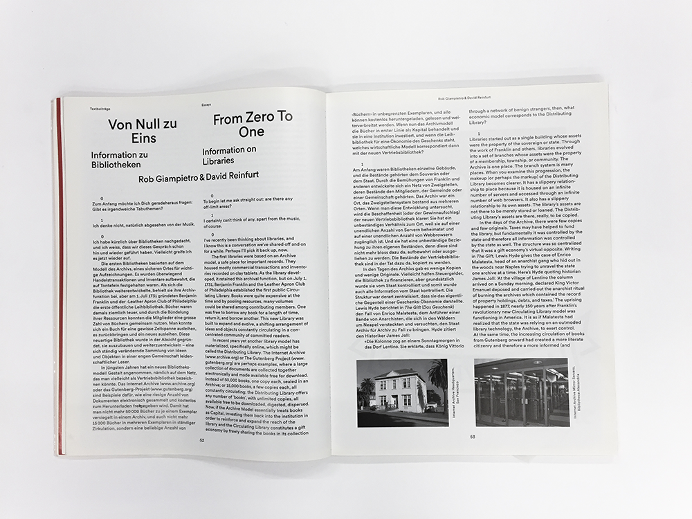
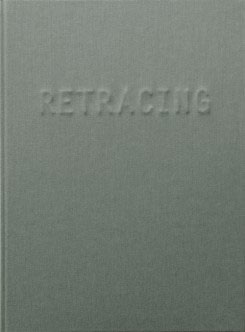
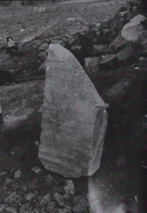
cover of Ray by Susanne Kriemann

What could ‘Ray’ be about I wonder? What kind of ray? Ray who? Stingrays? Electromagnetic radiation?
After holding this book for long enough to determine that it has nothing to do with any of these, the mystery of the content, for that moment, became irrelevant.
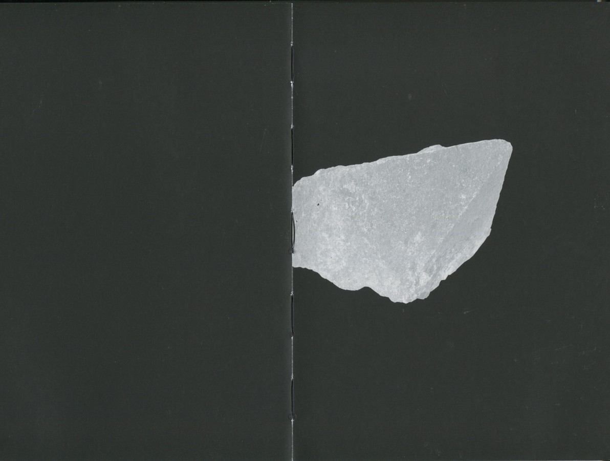
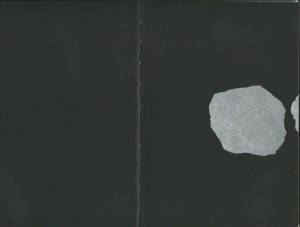
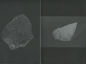
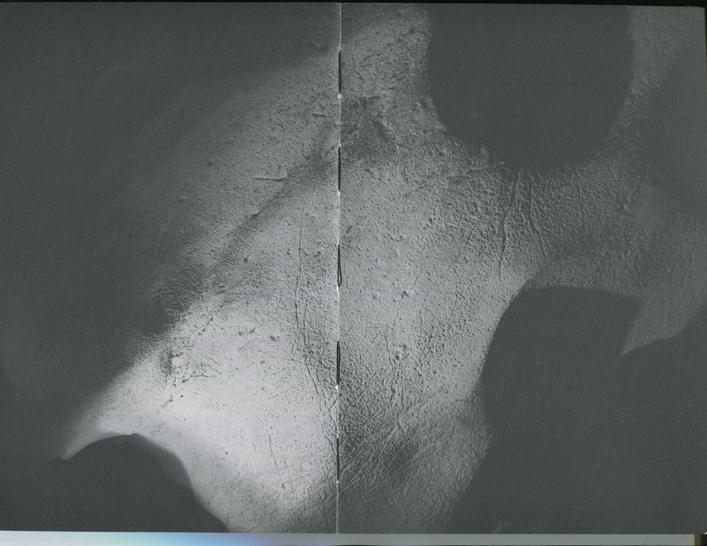
The matte, black and grey photograph of what seems to be a large rock amidst a rockier landscape provokes the question further, but this provocation is quickly smoothed out by the incredibly soft texture of the cover in which to run your hands across with pleasure.

Apologies Susanne Kriemann, for I am without doubt that this is an interesting book, but my other senses are currently occupied…

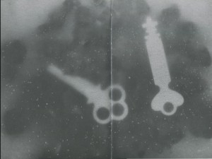
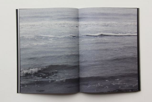
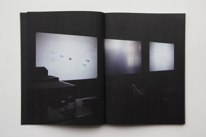
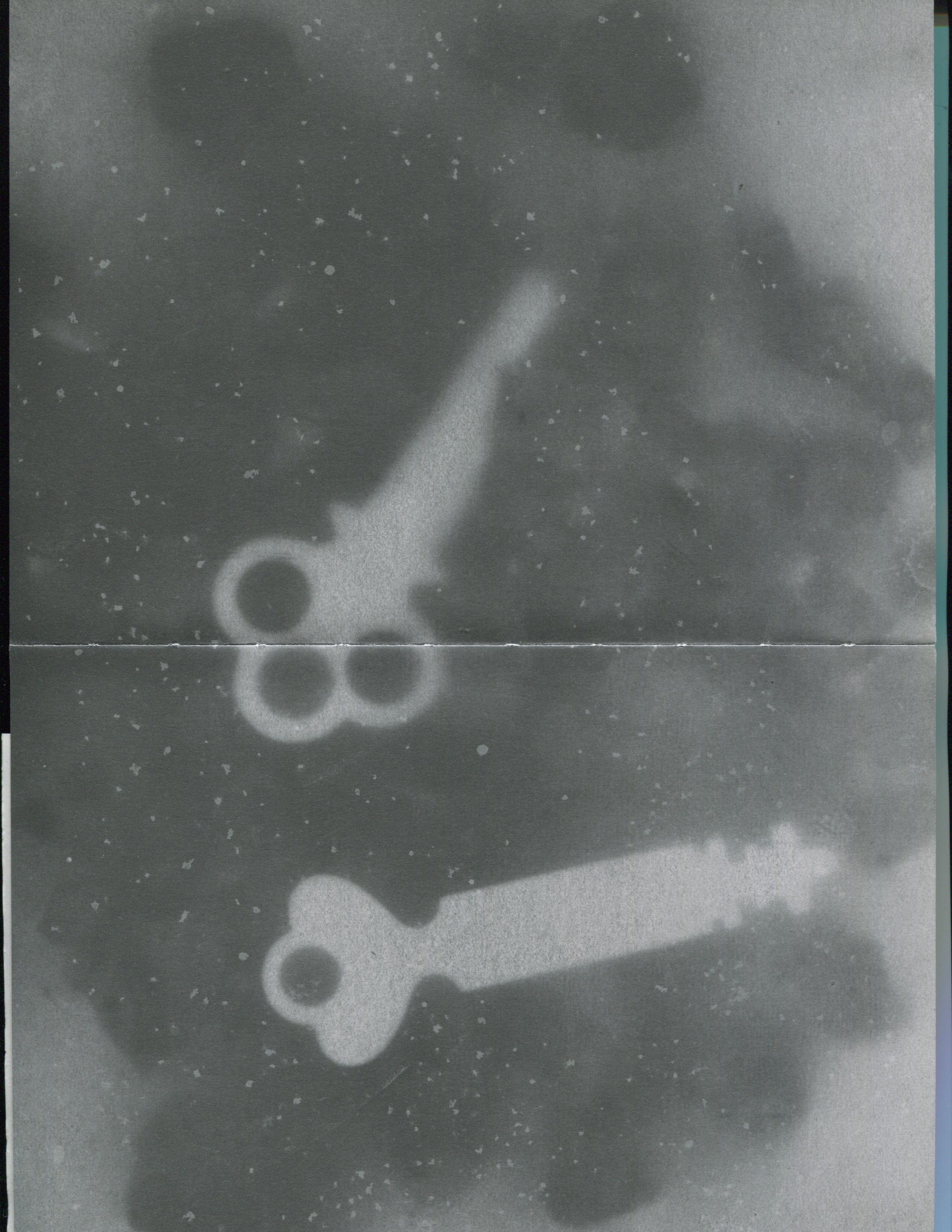
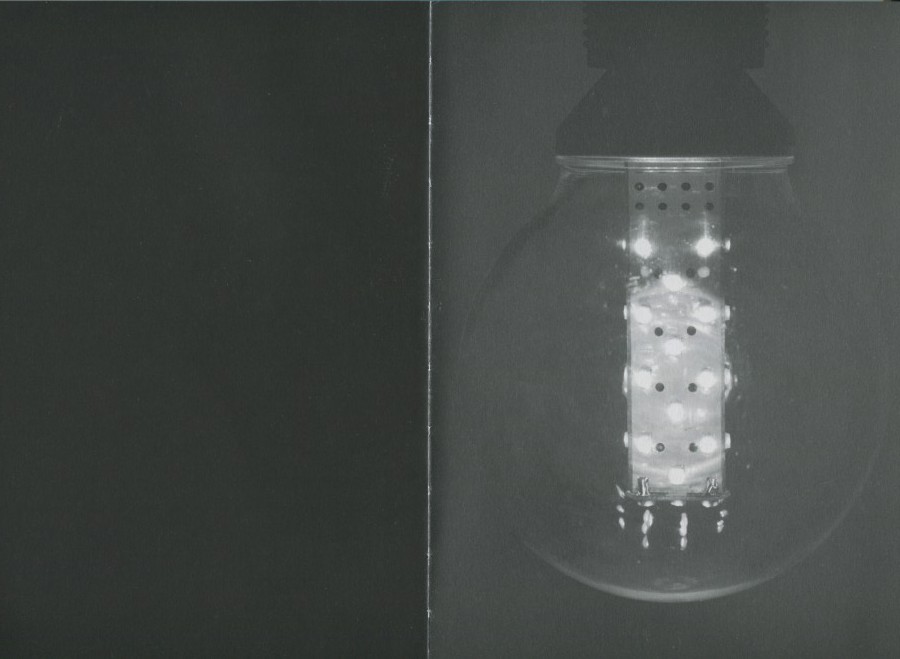
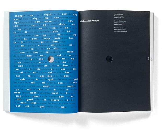
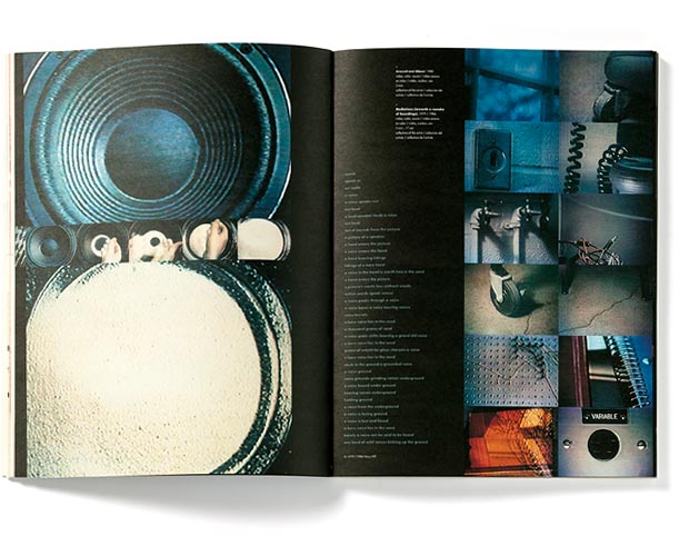
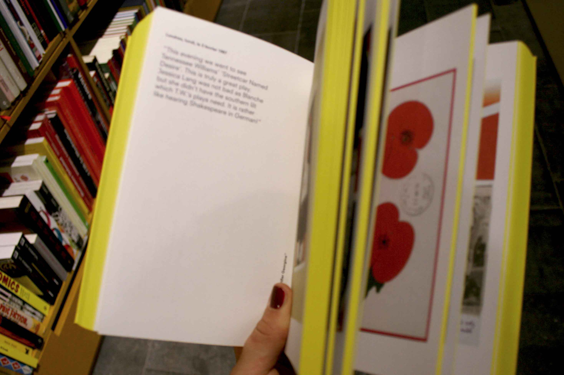
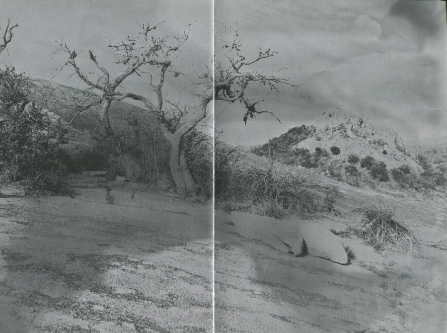
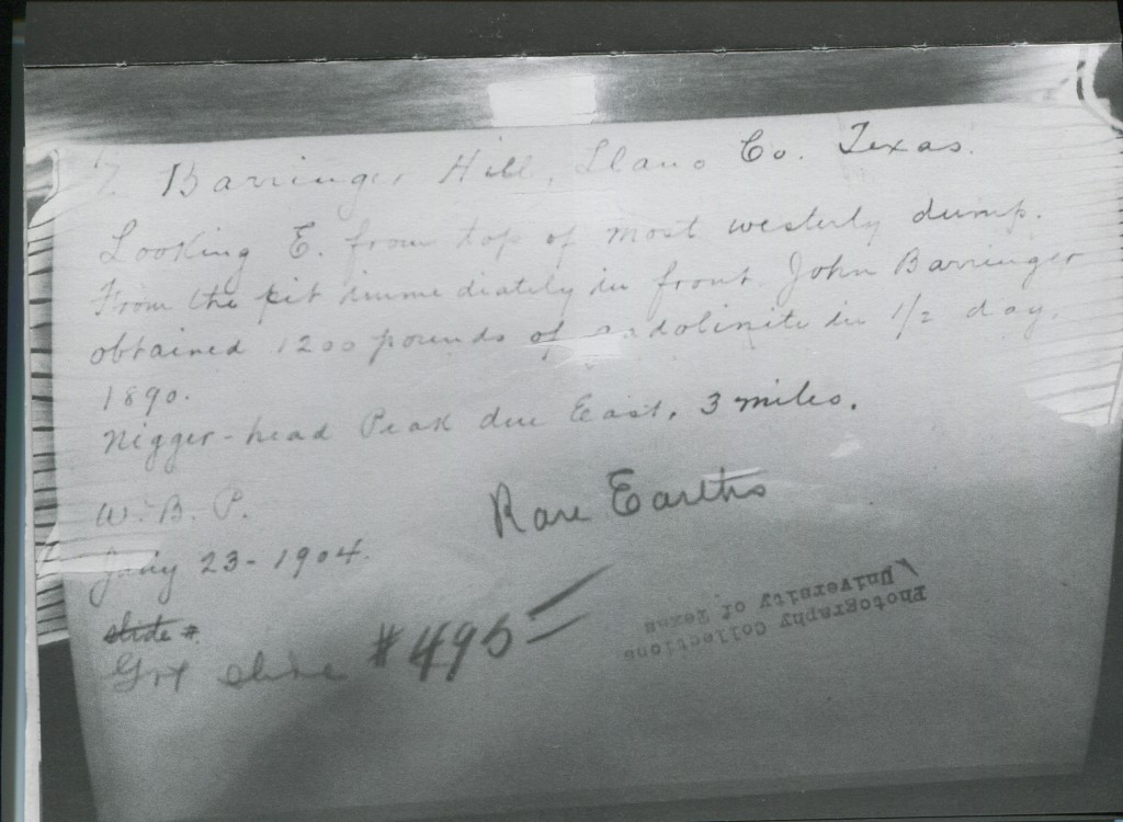
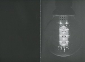
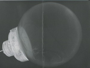
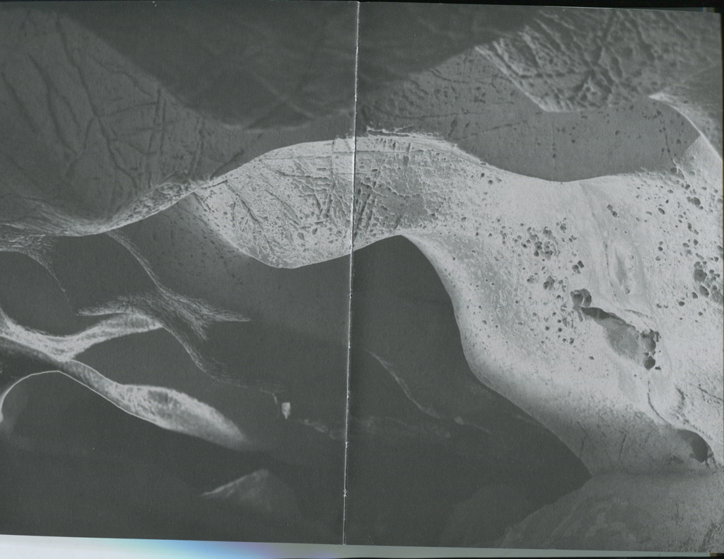
Opening the not-so-glossy, smooth publication that is creating such an aura of intrigue, is all the more satisfying. With black pages and a silver typeface to contrast, I am immediately drawn in by the first few images; a double page, inverted radiograph of two keys – unlocking this mystery at last perhaps – two saturated photographs of landscapes and hand written material.

page_trees

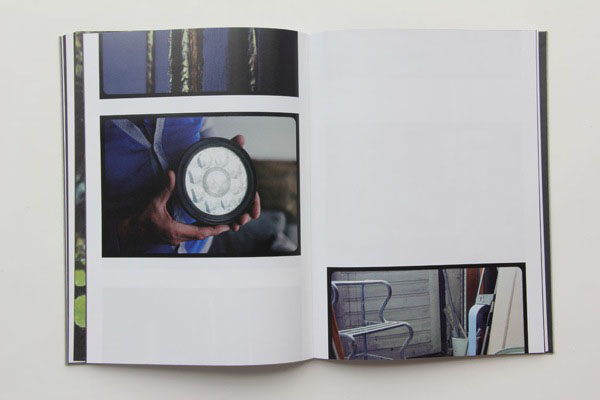
By cleverly playing around with the orientation and size of photographs; some with an opposing black page, others wedged between boundaries of silver, is just one of the ways in which Radim Pesko, designer, creates more invitation to go deeper into this book.

Scan-6-text

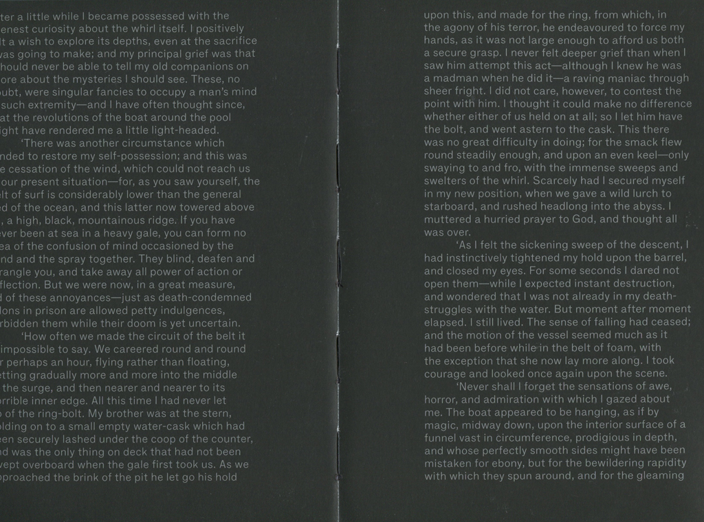
The simplicity in using a plain Typeface (F Grotesk Light) can be overlooked, with text positioned only on the far left and right of the page, giving the centerfold its black depth.

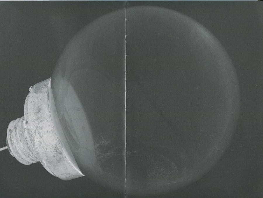
This dark and light theme gracefully continues throughout the book, with a few pages of text, followed by changing and developing perspectives of more atmospheric images.

This layout has been well thought out, even down to the threaded binding, this book has a particular attraction about it.

Finding an instant connection with a publication is a rare and enjoyable experience.

Sacrificing myself to the curiosity that had built up, just by holding the book and skimming through the pages a few times, I decided to delve into the contents.

Obscurely at first; broaching a subject that we are so familiar with, and such an integral part of every crevice of our lives,  yet we barely give it any thought. Written in such a way that doesn’t seem to want or need to give too much away, which matches the design impeccably.

When talking about light, to a photographer especially, the layers upon layers of this incredible source we take for granted becomes aparant, and goes deeper than expected.

Rooted in geology, rocks and the landscape; our connection and consciousness with the Earth, are essential in Kriemanns research. The birth of photography and introduction of electrical lighting, the minerals extracted, right down to the mine from whence it came; the corruption that followed blinded by human desire, to the growth into the world we live in now, with the glare of an LED screen ever present and almost impossible to escape.

A somewhat poetic approach, exemplifying more than just the artificial. As humans we are connected to the landscape and geology of the Earth, both physically and psychologically, as much as we continue on the unscrupulous path we tread.

An enticing read, with interesting extracts from contemporary writers and stories of the past, many angles are covered and stones unturned. This goes deeper than a photography publication, but more like an exploration into the process; the why, where and how we have reached the conditions we are in today…

This conceptualization must have also attracted Pesko to work on the design. For him, methods in working number 1: have an interest!

If you are not drawn in by the concept or idea, then you will not produce a successful outcome. With ‘Ray’, he brings forth an approachability to a book that I have not encountered before.

I could have returned ‘Ray’ to the library weeks ago, but I didn’t want to. It felt too nice and I had not finished reading it. But also the photographs, are wonderful, and mysteriously come together and take form as you read on. I want a copy of my own.

So how is he able to hit the mark? Well not only is a peak in Pesko’s interest essential, but also an element of humanitarianism; doing it for the people and the community.

After gaining plenty of knowledge studying at art academies in Prague and London, then completing a post-grad at ‘Werkplaats Typografie’ in Arnhem, he began designing for a magazine.  The history of all typeface-design, and the idea that you could make a part of that history, was an interesting thought for Pesko, and when design became more serious a deepening interest and work on commissions helped to form his own preferences and continue to develop his skills.

Successful working method number 2: be comfortable with your own limitations. That’s when it got more interesting, as his style became more refined and he was easily able to pull together key elements.

Formerly based in Amsterdam and once a teacher at the Rietveld Academie,  he now primarily works in London as an independent graphic designer. Whatever the project, I think Pesko has developed a good approach to his way of working.

Lesson 3: You begin with no material, until you start drawing, then allow your concept to grow. In each typeface created, he is also finding its own story, and history.

Playing with weights, styles, layers and colour, there are “endless combinations and infinitive variations”, which gives him a sense of freedom. A freedom that he also shares… At RP Digital Type Foundry established in 2009.

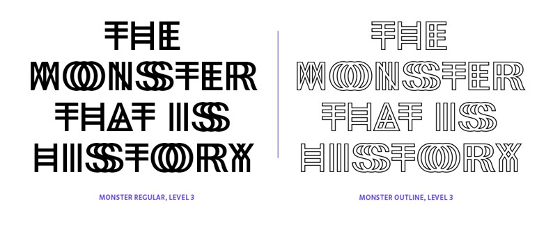
‘KILL YOUR TIMID NOTION”

is one of the many examples that have been used to preview his fonts. This information is automatically saved to his website. From Amsterdam Weather Forecast, BBC News and New York Times, to tv show The Wire and other websites and sources. Hundreds of these headlines are cataloged and published in the ever updating book ‘Specimen’, along with new and indicative fonts.

”DESIGN FICTION; GOLDEN ORB SPIDER FARM”

His distinctive family of fonts, whether in response to changing conditions in production or individually adjusted according to the space they occupy, are highly recognizable forms with the design remaining in the defined project.

Working method number 4: VISUAL is important.

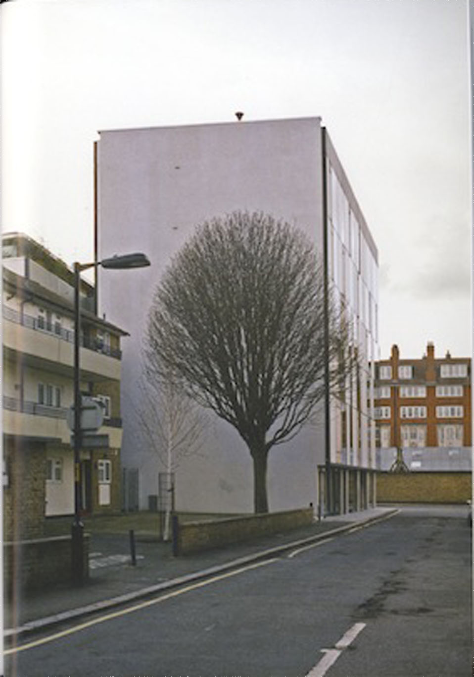
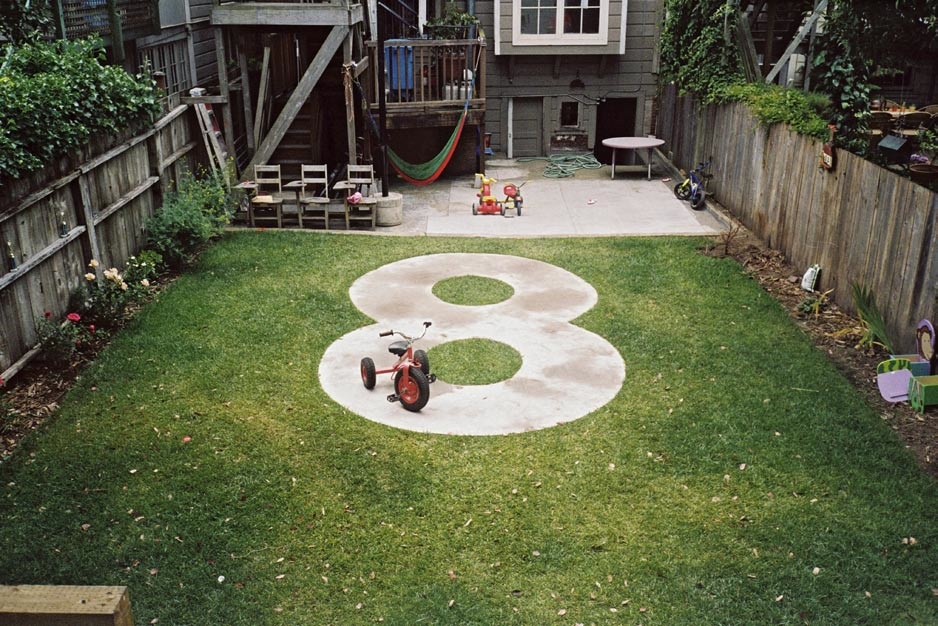
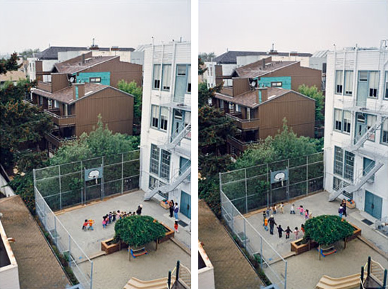
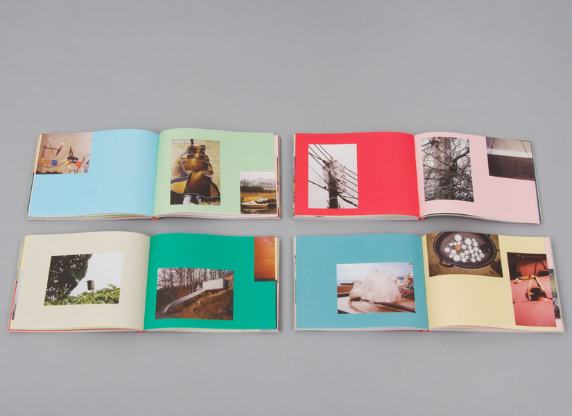
Emphasized in personal projects such as the book ‘Informal Meetings’. A collection of photographs made during his travels to different places.

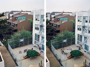
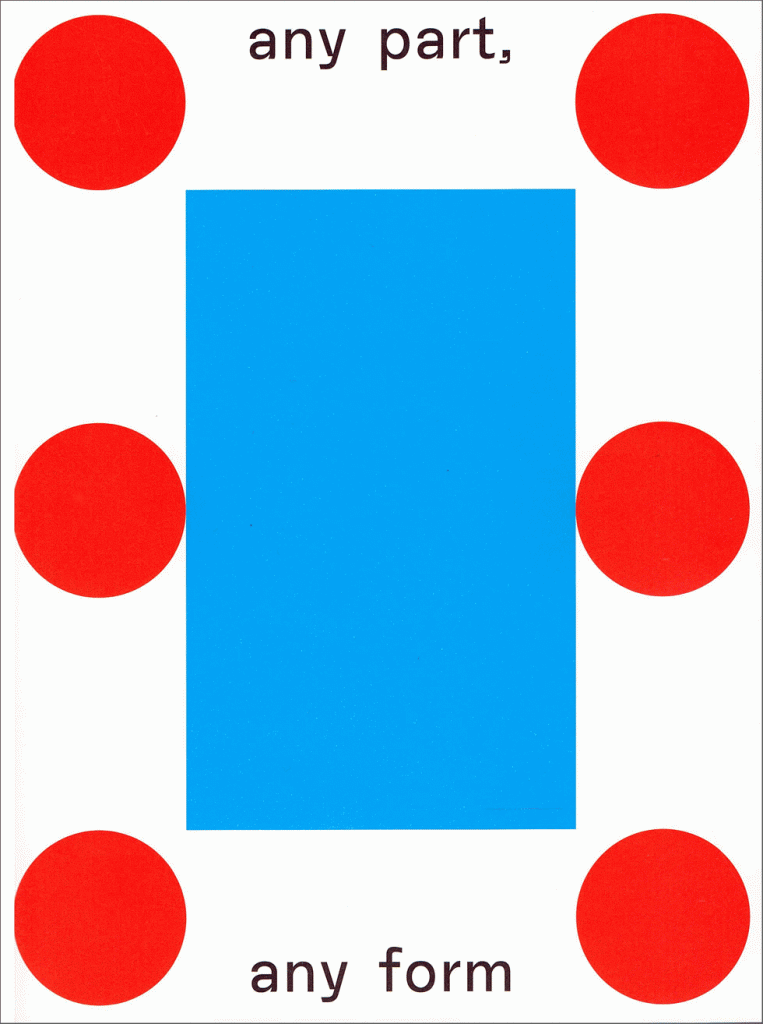
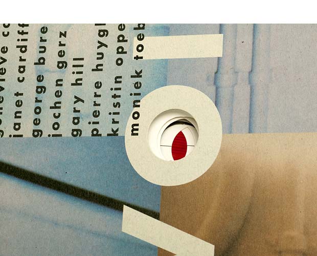
‘any part, any form’ is the follow up to this, and also the beginning and the end. No other text is included in this book. Discoveries of interesting encounters between space, architecture and water, each photograph seems to reference the other, forming a narrative and giving the images a natural flow, without the addition of text. A blue rectangle and textured red circles on the cover are all this book needs; relating to the title and content, everything makes so much sense, without giving it all away at first glance.


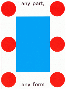
cover of 'Any Part, Any Form' by Radim Pesko [x]

 
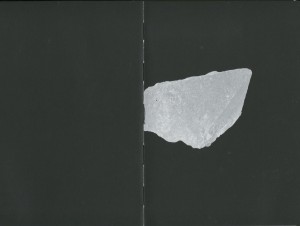
Similarly in the design for Ray; the links form themselves. Ah so that is a Quartz Crystal on front cover… nice.

Teaching number 5: Let me take you on a journey, let me be your guide on this path of realization that you have already begun, you just don’t know it yet.

Okay, entice me a little more why don’t you, that is fine with me.


Scan-12

Scan-11

Rietveld library catalog no : kri-1


pearl and sophia bible


Monday, October 5, 2015

This article aims to compare two bibles, Sophia bible from Holland and  The Mother of Pearl bible from Belgium, both found at the Design Derby Exhibition at the Boijmans van Beuningen museum in Rotterdam.

b8eef0808b9ba6c571c9db492c59d6f9-256x300

The ‘Sophia bible’ was made by Dutch publishers ‘Uitgeverij van Goor’, a family run business who specialized in Children’s literature.                                           It was made for Queen Sophia and the Dutch King Willem III in 1855.  It was called the Sophia bible, after King Willem’s wife Sophia of Württemberg. It was for public sale, but two very ornamental copies were reserved for the Royalty.

2d22868db9545eb3f67b7743278292b7

The bible is bound with calf’s skin and velvet,  decorated with wooden graphics and golden clasps. Sophia bible is illustrated, suggesting that it’s function was more ornamental than informative.

(Taking it’s style from Art Nouveau, )

The 19th century was a time of civil unrest in the Netherlands, as there was much conflict between the Protestant and Catholic churches. In 1853, King Willem gave permission for the Roman Catholic bishop hood to be restored. Although the Royalty remained favorable to the Protestant Church, this elaborately decorated bible could have been an attempt for the King to neutralize the differences between the two sides, as it’s ornamental design refers far more to Roman Catholicism, than to the more humble, Protestant style.

173d5793d5c188ad286e461e737ffc09

The Mother of Pearl bible, published by the Belgian publishers ‘Brepols‘ in 1882 is a small, silver bible made from Mother of Pearl, gold leaf and copper. It’s Art Deco Style owes to the geometrical triangles, it has a small clasp and is made to be kept close at hand. This may be because the popularity of Christianity was declining in the late 19th century, meaning people wanted to protect and prove their faith. A pocket sized bible would mean people could read from it on the streets, either preaching from it, or using it to prove a Christian identity. In 1882, Belgium was Roman Catholic, so the pearl bible was too. The Belgian publisher ‘Brepols’ was a family run business, who coincidentally also specialized in children’s literature.

The two bibles are vastly different, firstly and most notably, in size, sophia bible is very big compare to the pearl bible .They came from two different ideas of how to practice Christianity. The Sophia bible is purely ornamental, the desire to look inside is great, but the idea of using it as book for Christian practice seems less so. The Belgian Pearl bible is used for reading every day and following faith. It’s hard exterior prevents it from damage, so it is designed to be portable.

Secondly, the design styles. The Belgian bible follows Art Deco, somewhat unlike the rest of Belgian design in the 19th century. It’s symmetrical triangles, it’s ornamental pearl cover and the small copper clasp  make the bible elaborately shiny, but also visually very simple. The Dutch Sophia bible was made in the Style of Art Nouveau. It’s design follows Neo-Classicism and Baroque revival design which was popular in Holland in the 1800’s. It’s ornate wooden floral patterns, it’s huge golden clasp and it’s royal red binding make the bible decorative, fitting well with the rest of Dutch design from that period.

Lastly, there is a difference in the Status of the bibles. The Sophia bible was made for Royalty, already this calls for intricate and decorative design. Before the second half of the twentieth century, there seemed to be an unspoken rule that design for Royalty must be elaborate and ornate and just because of this, it creates a huge bias in the design of this bible. The pearl bible is vastly different as it was made for upper middle class Roman Catholics. It was designed far more simply, you would not recognize it as a bible unless you looked inside, whereas the Sophia bible gives it away with the ornate effigy of Christ on its cover.


In conclusion, these bibles are vastly different. Although both using expensive, decorative materials, one is over-designed looking at it from a 21st century eye, whereas the other is far more simplistic. The pearl bible’s Art Deco design is more modern than the Sophia bible, which screams Art Nouveau. They were used for different purposes, I imagine the pearl bible more actively so than the Sophia bible, owing to it’s sheer size and weight. The Sophia bible is probably more fragile than the pearl one, as it has many thin, decorative wooden features which may not survive a fall from table height. The bibles are 30 years apart which was enough time for design styles to change quickly, especially in the second half of the 19th century.

Written Colaboratively with Freja Björnberg

My associations with the Bird chair


Saturday, March 28, 2015


So many times I have seen chairs with an adjustable back; but I have never had any ideas where this design came from. To be honest, I was not so much interested in it, because I never liked it. However, when a previous tenant of my flat left a nice rush chair, which looks like a chair from the Van Gogh painting, I suddenly became more interested in it. I was wondering if I had this almost original Van Gogh chair, a chair of one of my favorite artists, or at least a copy of it.

a van gogh`s chair

Than I saw this rush chair at an chair exhibition and I was wondering again. I tried to get more information in the books and found out that this style was brought into fashion again by William Morris. I have never heard of his name before and became interested. I found amazing the way he looked at the world, how what he was making is directly connected to his perception of life.

Being under the strong influence of medievalism while studying Classics at Oxford University, William Morris became significant figure of revival of traditional British methods of production of the textile. He was also designing wallpaper, fabrics, the stained glass windows and so on. In 1861 William Morris and his friends from the the Pre-Raphalites have found  furnishings and decorative arts company Morris, Marshall, Faulkner & Co, which became later Morris & Co. Moreover, Morris was also known as a poet and novelist. In other words, he was a very versatile person and became a role model for me in some way.

Suddenly, reading some book about him, I found information that he was that person, who has created the first chair with an adjustable back, exactly such type of chairs which I did not like. I also found a picture of this chair ,which is called Bird, and was so amazed by it. How it is different from all the similar latest chairs I have seen!

a chair with an adjustable back william morris`s chair `bird` with an adjustable back

What I liked a lot is that feeling of coziness which this chair gives me. Of course it is very old fashioned and maybe too fancy and frilly, but to me it seems so comfortable and inviting. Usually, I prefer the use of minimalistic shapes and simple colours in art and design. But in case with this chair I feel like if I would have such chair somewhere in my old fashioned library, where I would have the same amount of books as Rijksmuseum does, for example, and where I could feel the specific smell of the books or somewhere on the attic, I would sit on it reading, thinking or just enjoying my sitting. It is making a special atmosphere for me because of the warm colors and a middle age pattern with a lot of small details. All its birds, fruit, flowers create a new world, when you look at it for a while. It reminds me myself at the age of 5-6, watching the illustrations by Russian artist Ivan Bilibin.

an illustration by Bilibin

They were also quite simple, but because of ornaments it was kind of imaginary traveling to the fantasy world for me. This chair gives me the feeling of infinite calmness. I think that only peaceful and calm person could create it.

While reading about William Morris, I realized that most of the times when I like some artist`s works a lot, I try not to read about this person and don’t see the pictures of his face, because sometimes his biography or facial expression ruins all my perception of his art and then I do not like it anymore. However, it did not happen in the case of Willam Morris and I still do not know why.

I found his art so organic and so suitable to his life, thoughts, home and even his face. I could not imagine another person doing such art. I also found him similar with one of my favorite Russian artist and writer of 19th century Konstantin Korovin, who was a good friend of Feodor Chaliapin.

a painting by Korovin

He is the second person of whom I was so happy to read, and who also, in my opinion, did not have any dissonance between his art and his point of view, which was quite similar to William Morris his ideas. Korovin liked the nature and he also was trying to make everything around him beautiful, thinking that natural beauty has a huge influence on people, their lives and behavior.

william morris konstantin-korovin

But continuing about Morris, I found his patterns for wall paper and  the book designs so elegant. Once he said: ‘I began printing books with the hope of producing some which would have a definite claim to beauty, while at the same time they should be easy to read and should not dazzle the eye……I found I had to consider chiefly the following things: the paper, the form of the type, the relative spacing of the letters, the words, and the lines; and lastly the position of the printed matter on the page‘.

a book design by William Morris

His book designs are so fairy and detailed, although not readable at all, at least to me. But it inspired me a lot and also reminded some of the old engravings depicting plants and animals. I felt like trying to do something similar, something really small and precise and I drew a silly painting depicting a beetle with a boy`s face. Of course it was not a serious work, but still after seeing William Morris`s works I had a lot of thoughts and ideas in my head, which I wanted to immediately realize.

a beetle with a boy`s face

I found out later (which was quite to be expected) that I am not the only person who was inspired by his book designs. So many people were trying to continue work in this style later. For example, such as the US artists Elbert Hubbard or W. A. Dwiggins, however some of them had not the best reputation. For instance, a daughter of William Morris called May believed that Hubbard was an obnoxious imitator of my dear father.

elbert hubbard`s book

It can be true, but I see Hubbard’s books more readable, although less decorative and precise. Anyway, I think it is not that bad, when one artist creates something inspiring for other artists, who start using or copying this style in their works. It just shows again the ingenuity of the inventor. Especially, talking about William Morris, who has definitely done a lot for arts and crafts in so many fields.

In this research it was very interesting for me not only to get to know more about some subject that was my starting point, but also to see how this subject brings you to something completely different. As I wrote, even if you have no desire of getting more information about something particular, this something can bring you to completely different field which can do affect you. It gives you this possibility to see the same not interesting from the beginning thing, but from the different angle, and then you are more into it.

I still do not know anything about the rush chair, but just because I started searching for information about it, it brought me to William Morris and now I know a lot about him and also about the adjustable chair, which did not had my interest before, but now.Now I know it’s story, I like it as a design product.

See through the whole


Wednesday, November 5, 2014

‘Voices’

Designed by former UNA-Designers (Hans Bockting + Mark Diaper)

As a start of my ‘guiding’ through my research I will write down a few sentences about the designers/design agency of the book. Just a few sentences because the designers doesn’t seem to have the need of sharing a lot of personal background information on the internet, I don’t feel the need of sharing their personal information as well.

Mark Diaper who was part of the UNA design agency at the time of creating the book, founded his own design agency “Eggers + Diaper” (1999, Berlin) together with Birgit Eggers.

The former UNA design agency existed from 1987 untill 2007, founded by Hans Bockting, Will de L’Ecluse and Henk Hoebé, who all went seperate ways by 2008.

quote; “Kenmerkend voor het werk van UNA is de grote aandacht voor het evenwicht tussen vorm en inhoud, oog voor het detail, respect voor traditie en een zekere vorm van speelsheid.(playfullness, !imporant! to translate!, as I found this interesting for my research, looking at the work of Hans Bockting) Eveneens tekenend voor het bureau is de lange relatie met zijn opdrachtgevers. Voor de stad Amsterdam is UNA een belangrijk bureau geweest omdat de meeste opdrachtgevers hier gesitueerd waren.”

“UNA-Designers” is now going on as “Bockting Ontwerpers” (from 2009) runed by Hans Bockting and his wife Sabine Bockting. Hans Bockting is also co-founder of “Traffic Design” and “Concepts”.


.

WDW_CT_vo98_02

The book I chose for this project is titled “Voices”. It is a book named after an exhibition that once took place, which had the same name as the title.

“Voices is an exhibition that brings together works by nine contemporary artists of different origins and generations, discovering the domain of the visual and the material of sound contributed by the human voice”

The choice I made for this book was quite selective. As I scanned through the given booklist, what caught my attention most were titles with the word ‘voice’ in it. Probably because of last years Studium Generale that took place with the subject of ‘voice’, but turns out a subject that I have an interest for. I noticed this strong attraction for this word and decided to find a book related to this subject. Immediately my eye fell on this book with on its front cover the word ‘voices’ with big letters centered between 4 images that are filling up/being part of the front cover. The backside is divided in 2 images. On the front cover there is a hole in the letter “O” of the word ‘voices’. You can not see through the hole because the following page is covering the hole with its white. But when you flip the second page you will see (through) the continuing hole till page 33.

WDW_CT_vo98_12

And there is more which caught my attention inside the design, the ‘dividing’. A thin black line through the center of the pages (horizontally/vertically) is attracting my eye. It’s seems like a strange element in the whole of the design. I want to know about this line. Why do I experience this line as unfitting, and why is it at some pages not reaching the opposite side it should do/ and does in other pages. 3 Languages who are divided by those attention-seekers of lines in many different ways, so many notations within the book, within the design, resulting to a bit of my frustration of not be able to ‘read’ this musical score.

WDW_CT_vo98_04WDW_CT_vo98_05
WDW_CT_vo98_07WDW_CT_vo98_11
WDW_CT_vo98_09WDW_CT_vo98_10
WDW_CT_vo98_03WDW_CT_vo98_06

While looking at other work of Hans Bockting, and getting introduced to a calendar from Hans Bockting (Traffic Design,1980), which I played with for a while, every month/page a different surprise in it’s full meaning, small attachments, opening/closing/lifting-up/changing material/sizes/colours, TACTILE SENSATION & FEEDING FOR THE EYE, again the sheet music work which I can hardly handle following from start until the end, but knowing it works perfectly as a whole. Let’s play it again.

After some plays I questioned myself why for godsake I am always attracted to such a full-filled mixture of information/ images/elements/things going on in, as now researched ,a book,design. Translated into my experience of observation “CHAOS”!

It is for my personal perspective exciting to see as much as possible, as many possible variations of information on a surface , in design, images etc. ! MASS !

I like to see mass and take time to discover every quality within that mass, but at the same time it is in general the case that I get stuck in the beginning of the discovery, losing track of what I am actually seeing while zooming in on a particular element/part, raising questions, no answers, no guide-through,raising frustration,loosing interest in zooming in on the following element, and taking it as a whole, but not really understanding.

Looking at my personal way of living, way of working, WORK, I consider myself as a possible face of the word ‘chaos’. I am attracted to chaos, but I would be happy if the chaos could be read in the way of the music sheets. In my personal way of working, I have taken steps back from mass into simple and clear, to understand the way of quality of less and the non-questionable/for itself-speaking element, in order to get to combining variables into a creation not-longer experienced as chaos as ‘?’,. My so called chaos who creates the heart/ the melody in the music sheets.

I decided to send a letter to Hans Bockting with the question, how Hans Bockting can permit himself the freedom to create such a playful diversity of work.

I did not get any response ……………………………………………………………………………………………………………………..

…………

…..

.

Then at one moment in thought, I looked up in my room, seeing my lamp.

IMG_0111

The circle. my escape out of the chaos.

IMG_0100IMG_0101
IMG_0102IMG_0103
IMG_0104IMG_0105

I had returned to the holes-element in my chosen book. My melody maker within my daily-life chaos. I saw dots in everything. The very clear round shaped element just made me understand.

WDW_CT_vo98_01

circles.

dots/points/holes.

the simplest element of visual design.

The defining characteristic of a dot is that it’s a point of focused attention. Dots settle themselves in space and provide a reference point relative to the other forms and space around it.

Dots are the focal points in our compositions. Dominance.

Dots create a relationship with the space around it. The two most important relationships formed are the proportion of the dot and the space around it and the position of the dot within that space.

As dots increase in size we start to see them as shapes, but they still retain their dot-like qualities and characteristics. A square placed in the white space of a page is still a dot. It still attracts visual attention to it, which again is the dot’s defining characteristic.

WDW_CT_vo98_17

Dots centrally placed within a composition create symmetry and are neutral and static, though they tend to dominate the space around them. Dots placed off center create asymmetry. They are dynamic and actively influence the space around them.

Serenity is my outcome of the research. I look through the holes of the book again, but now only focussing on what I see through the circle-out-cut on the following page. I will find the rhythm, I will find the voice.

Rietveld library catalog no : 708.5-cat-50


PROVO | Amsterdam’s Anarchist Revolt


Thursday, October 30, 2014

Provo | Amsterdam's Anarchist Revolt

designer: Josh MacPhee


The title of the book strongly indicates that it is of political context. Being myself concerned with politics, especially in a period of great upheaval (globalization/economical crisis) like the one we are in now, and coming from a country where politics itself plays a significant role in its history ever since the ancient times, this book instantly attracted my attention.

It is recognized that art is part of a practical activity that can change the world. In many cases it comes into existence in response to certain definite problems. Leon Trotsky has written that art can play a dual role within society: That of the mirror and that of the hammer. In other words, what he means by that, is that art has the ability of reflecting the movement of society while also forging consciousnesses inside it. Provo is representative of such case.

Provo is based on a political struggle in the mid 60’s, that focused on provoking violent responses from authorities using non-violent bait. It is an Amsterdam-based anarchist, political, social and art movement. Its interventions where staged into the symbolic and everyday spaces of Holland. What is interesting to look at, is that the activists involved with this movement, where really creating their own distinctive posters, graphics and other forms of art, such as political spectacles and street theater, illustrating their beliefs and intentions.

Walls and words, silk-screen posters and hand printed flyers where the revolutionary media passed out in public. The Provo radicals would carry out total black or even totally blank banners, purposely provoking the police in a ‘ludic’ attitude. They would relate themselves to Dada, constructivist movements, Bauhaus and other Russian ways.

wit

They took existing rules and decided to play within them, to see how far they could push the limits of those rules.
They were not allowed to use actual slogans, so they decided to use unwritten banners. They made use of the ambiguous nature of play: They were protesting, but at the same time not protesting. There were no forbidden slogans on their banners, but at the same time, the slogans were ever so present throughout their absence.


pro0102-provo-artists-book-god-nederland-oranje  Anarchy


http://www.experimentaljetset.nl/provo/

http://www.experimentaljetset.nl/archive/interview-graphic-no-24


It is a simple, black & white book. Its design is intentionally simple, in this way successfully highlighting the content of the book, erasing any type of decorative matter. Looking at it’s outline, it is clearly characterized within the Provo attitude. It is not modern or in any way trying to draw attention through some kind of unusual graphic design. The pages are matte and the text produced with a bold, black typeface. The only evident, decorative detail are some thick black lines and squares either on the sides and bottoms of each page or in the beginning of a new chapter. The ink on the paper seems quite thick, giving the impression that if you rub the pages in the book you are almost able to scent, as well as feel it.

Consequently, it successfully carries out a very strong depiction, that the book itself, could be an original Provo pamphlet or poster. The do-it-yourself feeling is well portrayed through its design. The cover of the book itself is also represented by a successfully eye-catching Provo poster, illustrating a pair of gigantic feet ready to be chopped off by a tiny white figure.


Photographic documentation from the book:

ANP01_13385083_X
AdamCanon_45


The designers background totally reflects upon the the books context and therefore explains his design. Josh MacPhee is a Brooklyn based artist, activist and archivist. He is also a print-maker and a self-taught historian of 21st century left politics. He established a distribution system called ‘Justseeds’, a decentralized, worker-owned cooperative of twenty-five other artists. Justseeds relates to social and environmental movements and issues in order to get more radical art projects out to the public. Their work illustrates an extraordinary aesthetic range of radical movements during the past 50 years and explores the rise of powerful countercultures that evolve beyond traditional politics, creating distinct forms of art, lifestyles and social organizations. MacPhee’s simple aim is to use art, such as visual and graphic work, to inject protest politics into public discourse.

Besides Justseeds, MacPhee also organizes  the ‘Celebrate Peoples History Poster Project’, an ongoing poster series in which  different artists create posters to document and remember moments in radical history. He himself, has a big collection on political posters. For instance, he collects Cuban political posters as, while according to him, they are some of the “most aesthetically diverse, experimental and impactful in the history of political posters.”

http://www.justseeds.org/subjects/anarchism/


We cannot delude ourselves. No art has ever only served itself. We ought to support and defend the art born within resistance, the art which fights and contributes to equality and fairness.


04pcnofence_400043Steps1_400

Josh MacPhee :
No Fence Uncut /offset printed postcard • Three Steps /3 color screenprint 

Rietveld library catalog no : 947.6 kem 1

She put a spell on me


Thursday, October 30, 2014


Boezem

The book was staring at me. With its big shiny, purple letters saying BOEZEM, the Dutch word for bosom, and its firm, solid appearance, almost like a brick. What could this book be about? Anyway, this title, the bookmaker must definitely have been aware of the confronting and maybe also provocative impact it has on its audience. Me, in this case. I found it daring. I found it also daring that there was no picture, no nothing on the cover, except for those letters. I felt like touching the book.

I lifted it from the shelves and it surprised me once again. Whereas I had considered the book as quite minimalistic and probably consisting of just the two colours black and purple, it actually had this very subtle grey pattern on the side, looking a bit like stars in the galaxy. When opening the book it had more surprises for me. So much information! Totally not the white, sterile pages that I had expected, with maybe equally sterile pictures and once in a while a minimalistic amount of text. There were drawings, there was text, dark green as well, and both black and white pictures and full-page colour prints…


Yellow-coverred-cover

OrangeDesign-coverNewspaper-cover

“I want to make books with a high amount of density and content.”

Says Irma Boom, the designer of BOEZEM. You can say that in that sense, this one is a very typical book of hers. Just during a first sec google-investigation, I found out that she is probably the most famous Dutch book designer of the moment and that she has made over 250 books. It made me wonder; if I had known this designer Irma Boom, would I have known that the design of BOEZEM was hers? In other words: if a person makes this many books, is his or her ‘handwriting’ visible in every single one of the books? Is it even inevitable? And maybe even more important: would a clearly visible signature of the designer rather thwart or support a proper presentation of what the book is about?


It made me wonder about what it specifically is in that makes people like her books so much. I knew that I had already experienced it in kind of an intuitive way, when getting drawn to her design for BOEZEM. And the way I responded to this book must be an experience a lot of people have when seeing one of her books. Otherwise, she would not have been praised so much as a book designer. But what are the more concrete causes for this?

In order to find out more, first I decided to get more informed about her books; about what kind of projects she has done and about the books` appearances. I started searching on the internet for interviews and articles and I also went to the bookshop Nijhof & Lee that has two bookshelves dedicated to Irma Boom`s designs. To get more of an overview, to hold the books, and experience them as the objects they are. Some of her projects that were the most striking to me, seemed to be also the most famous.

For example, there is the SHV Thinkbook (not in the book shop) which is a jubilee book for SHV, a family owned company with interests mainly in the energy-industry and it is a collaboration between Boom and the art historian Johan Pijnappel. It weighs a little less than 4 kilograms, has 2136 pages and is made up of poems, quotes, letters, advertising, interviews, reports, speeches, memos and photographs from the company`s archive. The book has no page numbers, because it is not meant to be read from beginning to end, but as a ‘voyage’; you have to discover things by coincidence. The touch of Irma Boom becomes maybe the most expressed in all the little details: the poem on the side, the text on the cover that only becomes visible after the book is being used, the fact that there are a lot of pictures in it of family members with their dogs…

Another example is N°5 Culture Chanel, a book printed with no ink, because all the text and all the images are embossed. Just like the perfume, you see it, but it`s not there. This book as well has some interesting detail. The book for instance has a height of 5 centimeters, referring to the name of the perfume, and it is fully white and goes in a black box, referring to the relation between Chanel and black and white.
Furthermore, there is Colour Based on Nature, which consists of colour diagrams that are derived from 80 natural locations designated as UNESCO World Heritage sites. The book pages have to be torn open in order to let more diagrams appear. Another notorious example is Sheila Hicks: Weaving as a metaphor. One of the many beautiful details are the rough edges that refer to Hick`s tapestry.
Just some examples, but they already show how varied the projects are that Boom has done. Every book is a totally different object, having an original style adapted to the subject and interesting new details, and with a totally different format.
 

“Perhaps every book I make is kind of a failure that I constantly  want to improve by the next book.”

Book-image_IrmaBoom

But still this does not necessarily exclude that there are some resemblances throughout Boom’s designs, because there definitely are. They differ from returning details – little obsessions maybe – to approach of book design, but one thing is clear: they are indispensable for a Boom-design.
What the books are known for in the first place, is their object-like quality; they are almost like pieces of architecture. This I experienced when seeing BOEZEM and having the association of a brick. Boom sees the book as a container of a lot of information, an ongoing thing, with a permanent quality (of spreading information), in contrast to the internet. And this of course should be manifested in and attained by the design of the book. This is also why the book’s edges are almost always incorporated into the overall design: to make it one whole. Besides, a lot of the books ask for interaction and this way a relation is stimulated between the viewer and the content.
Next to that, attention to detail is what is most essential for a Boom-book. Through those exceptional details, Boom is really able to make –mostly symbolic– links between design and content. Otherwise there is these recurrent little features Boom seems to be fan of, such as embossing, reversed chronological order, and every publishers` worst nightmare: the white cover.
But actually most of all, her books scream uncommonness, everything in it is opposite of what you would expect.
So, the designs certainly have things in common and are in that way sort of connected, very much also approach-wise. You can call this Irma Boom’s signature, but I think it would go too far to define her signature by an obviously present personal ‘imprint’.

But let’s get back to the other questions I raised in the beginning of the article. As a book designer, is it actually desirable to have your signature visible in your designs? And if not, is it even avoidable?
 

“Making a book you should do with your heart, intuitively”

If this is Boom’s belief, how can her own ideas and preferences of aesthetics not prevail? But still, by saying that she wants to make the book for someone and not just a book, you might actually conclude that Irma Boom tries to keep out anything that refers to herself, as a book designer and as a person, so the book can be fully centred around its subject. You could translate this statement of her as the aim for objectivity. But just have a quick look at her books, and you are assured that her books are far from objective. Her taste, her humour, and her willingness to experiment always become apparent.

And the fusion of Boom with a subject, it seems to work. The adding of a little subjectivity, so to speak, seems to lift the subject. It seems to give it a structure, a context, a voice maybe… This effect is also enhanced by the fact that she is often the editor of a book as well. Maybe this kind of ‘subjectivity’ that Boom incorporates in her designs is part of what makes her so successful. So, in case of Irma Boom, she is sort of depending on her signature and thus it is very desirable for her and her audience.

From a different viewpoint, if someone, a publisher, a company, or an artist asks her if she wants to make a book for them, wouldn’t they want, the ‘handwriting’ of Boom, to shine through in the design a little bit? She is so renowned that it is such an honour if she makes a book for you. Let it be visible, they would probably think. Besides, it obviously sells better when people know that she is the designer, or it could mean something very good for one`s career… look at Sheila Hicks. The many awards winning book that Boom made for her, instantly gave her a huge career boost. Of course, you can also question why customers buy one of Boom’s books in the first place. Is it because they are actually drawn to the book itself? Or is it because they are drawn to the fact that the famous Irma Boom has done the design? Looking at it in this way, does Boom’s signature perhaps stand in the way of properly presenting the subject? Anyway, fact is that the people she makes books for are almost always very content with the outcome. And who knows better if the subject is well presented, than the subject itself?

Simple as it is, that is what Boom does: she evokes excitement. At the time, her own wild ideas excited herself, and through realising them she shares with us that feeling. Going for the realization of these wild ideas, it also takes some courage, and I think this is also something a lot of people respond to. Boom is not afraid. She is not afraid to personally connect herself to the subject, she is not afraid to not know at forehand what the exact outcome will be, she is not afraid to take her time (it took her five years to finish the SHV book), and she is definitely not afraid to do the uncommon. But most of all, she is not afraid to disappoint her clients or to not do what they want. The risk-taking in combination with her ingenuity and eye for beauty are always the recipe for a special result. Most people love this specialness, but of course a risk-taker has a lot of enemies as well. In the beginning it took Boom probably a lot more courage to not listen to them than nowadays, since she is a very respected and many awards-winning book designer.

It all started with that very intuitive attraction to a book that turned out to be made by one of the world`s most famous book designers. Now it ends with me feeling like having at least partly unraveled the magic behind it. But even if I might have unravelled the magic a little bit, the spell that Irma Boom`s books put on me, is definitely not broken.

Rietveld library catalog no : 05547


Don’t judge a book by its cover


Wednesday, October 29, 2014

Esther de Vries is a graphic designer specialized in book design. Among many projects, she made two books on her father, the sculptor Auke de Vries. The two books, dealing with the same artist, are yet very different, the first one, Auke de Vries Photo Archives, being much more intimate than the second one, Auke de Vries: Sculptures, drawing and work in public space, which is more meant as an chronological overview on the evolution of the artistic career  of Auke de Vries. But what is surprising is that both books are very different from the first impression the reader can get just by watching the cover.


Indeed, at first sight and because of its very strong cover and size, the biggest book seems to be one of those very classical and sometimes deadly boring art books that present an exhaustive view of the work of an artist. But going into the design and the content of the volume you can experience it as an actual novel object. A lot of different materials are used in the book, making it exciting to go through, and a great importance is accorded to the process, thus gathering a collection of sketches, photographs and forms that helped or influenced the artist with his sculptures, and even pictures of the artist working in his studio. On all those pictures the text is set in an unquestionable playful way, sometimes even covering the images.


An other particularity that makes the book playful and thrilling is the use of very thin pages presenting a compilation of different forms, cut from a photograph of a work of the artist and magnified. Those pages refers to the collection of forms that the artist developed and used constantly in his work. Esther was keen to scatter that through the pages as, what she calls, an alphabet.


As for Photo Archives, the fabric and very simple cover makes it look at first glance as a secondary book, very small and discreet, soft, not meant to go through the years as the other one. But once more the design and content makes it very special, in a precious and sprightly way. While the other book is meant to present mainly the evolution of the artist’s works, this photography book shows through the collection of pictures the process that took place even before the artworks, as a wandering in the thoughts of the artist.


Here the relation to the reader is completely unusual, as there is no chronological order or reading direction. The reader, who is more a viewer since

there is no text, can open the book in the middle, at the end, or open the same page again and again, led to wander in the same way that the artist was wandering when he took those pictures.


archive_04


This is also a quite seducing book, designed between rule and coincidence with a set of colors and places for the pictures that are sometimes cut in two by the Japanese binding, leading the reader to focus on a particular shape that recalls Auke de Vries’ work. I noticed that the two books are very different from the first feeling you can get from them.


Yet, maybe Esther’s work, or at least these two books, deals a lot with feeling. That is to say the very strong feeling that the reader gets or is given in both cases of the close connection between the work of the artist and the design of the books. They pay homage to this work. It might has to do with the fact that both books where initiated by Esther herself, and not commisioned, hence the liberties in the design. This is also caused by the very long process that the designer went through while making those books, meticulously choosing each picture and composition, trying all the colors with each image again and again, changing direction until being fully satisfied, regardless of time.


All that makes both works very touching and the enthusiasm of the designer becomes very apparent, discovering a treasure made of all those pictures and willing to share it, making it as complete as possible to preserve the emotion aroused by the pictures themselves.

Rietveld library catalog no : Vrie 5 (

Rijksmuseum library catalog no : 832 E 13 (


Log in
subscribe