The most interesting thing about the book I chose in the library: For Every Dog A Different Master [x] was oversized texts which were intolerable for me. I was very confused how to perceive the texts on the book which did not seem like texts because of illegibility. At the beginning I thought it has something to do with different cultural background, which is that moderation from the balance between negative and positive space is highly valued in life generally in Asia. However, soon I had to admit that graphic design no longer can be classified its style by borders.
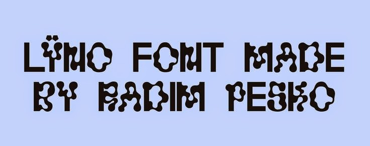
Since I have researched about Radim Peško [x] who is, editorial, typeface designer as well as photographer combined, I gazed that texts could become images and be totally looking different with the other not only by its size and composition, but also typeface itself. There was no much things to get from his other books which were about his photographs so I made a research about typefaces that he designed. Furthermore, I wanted to know what kind of impacts typeface can have because I used to marginalize it.
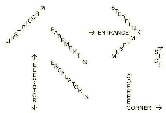
Stedelijk Museum is one of my favorite museums in Amsterdam since I came to the Netherlands. Stedelijk Museum exhibits modern and contemporary art and design to give visitors insight in their connection between art and life reflecting social issues. The Logo of Stedelijk Museum caught my eyes at first glance because of its confusing flow. The font of the logo: Union designed by Radim Peško is simple without ornament. The design of logo by Mevis & Van Deursen is controversial due to its readability. However, I think it is clear enough to represent the identity of Stedelijk Museum symbolically. The shape of the S represents the dignified history of the Stedelijk Museum and vibrant atmosphere.
Stedelijk Museum Logo
Signage proposal
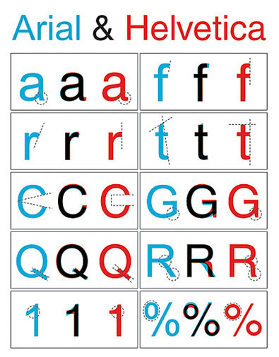
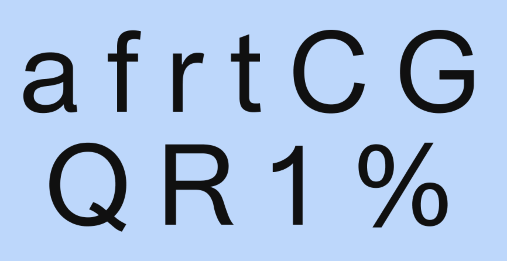
Usually logo reflects the value and direction that the brand pursues. Throughout research about many kind of logos, it was interesting to see how the image of the brand remains in memory by the logo. Also, I was intrigued to investigate conspicuous components in the logo design such as typeface. Union is a typeface which was designed by Radim Peško. Union was designed based on Helvetica and Arial.
Helvetica was designed in 1957 by Max Miedinger. Helvetica’s design is based on that of Akzidenz Grotesk (1896), and classified as a Grotesque or Transitional san serif face. Originally it was called Neue Haas Grotesque; in 1960 it was revised and renamed Helvetica (Latin for “Swiss”).
Arial was designed in 1982 by Robin Nicholas and Patricia Saunders for Monotype (not Microsoft), it’s classified as Neo Grotesque, was originally called Sonoran San Serif, and was designed for IBM’s bitmap font laser printers. It was first supplied with Windows 3.1 (1992) and was one of the core fonts in all subsequent versions of Windows until Vista, when to all intents and purposes, it was replaced with Calibri. [x]
In brief, these typefaces have something to do with their intended usage. Helvetica was designed for print, while Arial was designed for laser printers and then adapted for use on computers.
Normally Arial has been considered as an imitation of Helvetica although both have its own uniqueness by each delicate details that they have. Look at the below pictures. For instance, the terminals of the lowercase in Helvetica cut off straight while Arial’s is cut at an angle. Arial has blander appearance and Helvetica has an overall less rounded appearance and slightly higher waistline. Due to these trivial differences, Helvetica looks more elegant than Arial.
Radim Peško explained about this combination, “Union is intended for situations where Helvetica seems too sophisticated and Arial too vulgar, or vice versa.”. Eventually the new is evolved from the combination with the old. I think that the intention of Union implies the position of Stedelijk Museum.
Helvetica and Arial
Union
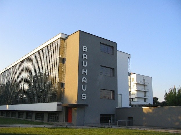
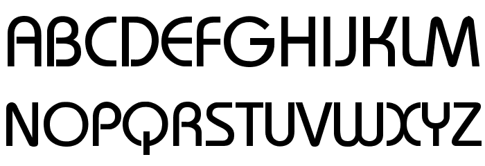
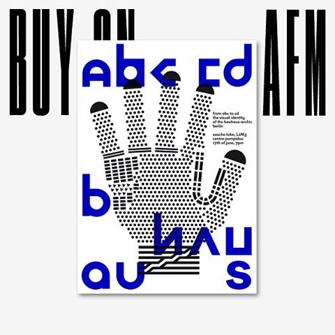
Frequently graphic designers design typeface only for museum itself. Another examples for instance are: the identity for The Chicago Museum of Modern art (commissioned by the same designer duo Mevis & van Deursen and designed by Karl Nawrot) or Bauhaus-Archive Museum. Design studio L2M3 looked to the typeface Bayer Universal reflecting the heritage of Bauhaus typographical design designed by Herbert Bayer. Universal encapsulates the Bauhaus’ stark aesthetic by basic principle of typographic communication of Bauhaus,
1. Typography is shaped by functional requirements.
2. The aim of typographic layout is communication (for which it is the graphic medium).
3. For typography to serve social end, its ingredients need internal organization (ordered content) as well as external organization (the typographic material properly related).
Bauhaus and Universal
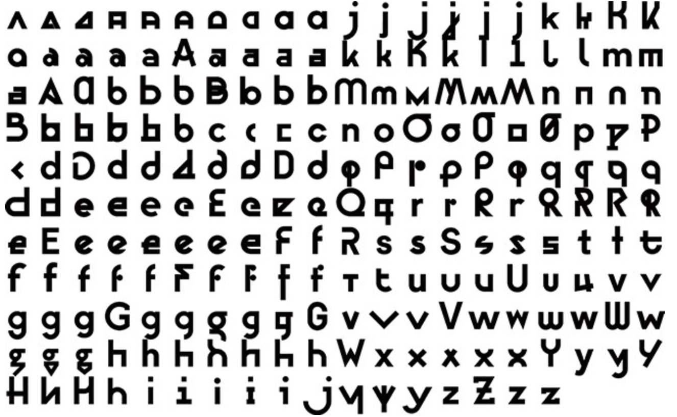
The interesting fact in design process of new identity of Bauhaus-Archive Museum: Bayer Next is that it retained originality but did not restrained its possibility. Sascha Lobe of design studio L2M3 [x] updated more than 555 glyphs and we see more than 10 different versions of each letters. The goal of Bayer Next [x], he says, was to create peculiarities within the typeface. This idea is contrasted with Bayer’s original ideal for simplifying typography down to a universal typeface as we see Bauhaus’ philosophy.
Bayer Next
Poster of Bauhaus-Archive Museum
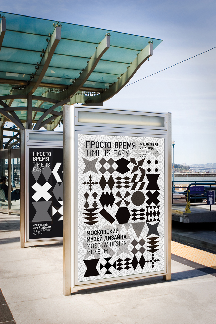
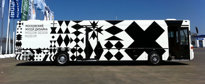
I had thought this expansion and flexibility of identity does not give exquisite image of the brand in memory of public. However, good identity does not mean tangibility as a one certain figure. These examples, see below another example of Moscow Design Museum, are ubiquitous. This museum is based on Moscow but it is mainly imagined as a nomadic, pop-up museum. And, their identity was designed by Amsterdam-based Lava design studio [x]. The identity of Moscow Design Museum does not even emphasize its name to identify them but numerous and changeable icons for logo, which was inspired by Russian glass patterns. Good identity is adoptable for various applications and formations in digital society. Eventually typeface is recognized as one of the strong image although sometime they are not readable.
Moscow Design Museum
Katerina Sedá : for every dog a different master = kazdej pes jiná ves.. /Rietveld library catalogue no : sed 1
Frankly, when I read through the book-list, I could not find a book which made me feel interested just by the title. So I decide to walk through the library and choose.
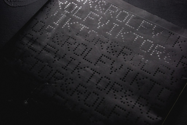
The reason why I chose this specific book was its black smooth color cover with the dots typo, braille lookalike. It has caught my eye and wanted me to see and analyze its content. Page after page I began to realize there was a type of system that the designers, Armand Mevis and Linda van Deursen carried out. A designer makes choices. When it comes to book design, he or she is likely to decide on redaction, typography, grid system, editing, binding, format, print technique, paper quality and so on. The sum of these choices create a unified expression that tells us something. It can be a parallel language to that of the content of the book and it can be more or less emphasized and thought-out. Some would say it could even be devious in its intentions.
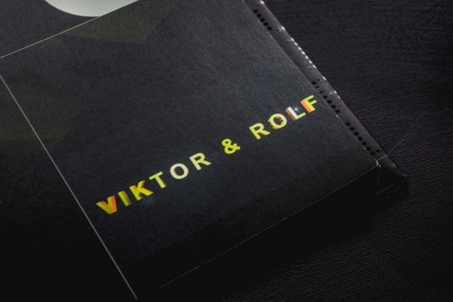
This is an exploration of a book of Viktor & Rolf, from a design perspective.
The cover consists of mat black thin board with the title in what looks like braille typography with dots which looks like sewing. The black cover folds in to almost full width of the very first and last page. I learn from the designer that this is a technical solution to add steadiness to the book.
It was published by Artimo in connection to Viktor and Rolf exhibition ANDAM. It is designed by the design office Mevis & Van Deursen. I interviewed Linda Van Deursen in connection to this essay to get further insights in the design choices and the conditions from which the book came to be.
There’s an intriguing black colour inside the book in every page. This feature clearly communicates that it is a book mainly concerned with visual language or images. It resembles a visual preface or introduction to the book. The book has it owns signature, which is a brilliant manifestation of overlapping functions of the grid lines in the publication, categorizing the content by dots. Most of the paper types only occur in one single signature, this gives us a clue about the parallel function of the book.
I learn from that the book is a sort of material archive or assortment of papers of a specific kind. A rule that she set up for the book was that only two sided paper (meaning the paper has a different appearance on each side) of the type used in posters and envelopes (because they can’t be see through) were to be used. Not only does this create an intriguing visual and physical experience but it serves as a kind of metronome or conductor where the different surfaces of the paper are altered rhythmically but not predictably (you learn the rhythm and then it alters). This feature creates a playful element to the structure of the book. In addition to this, all rules seem to be broken at least a couple of times in the book which is a testimony to the sure instinct and playfulness of the designer.
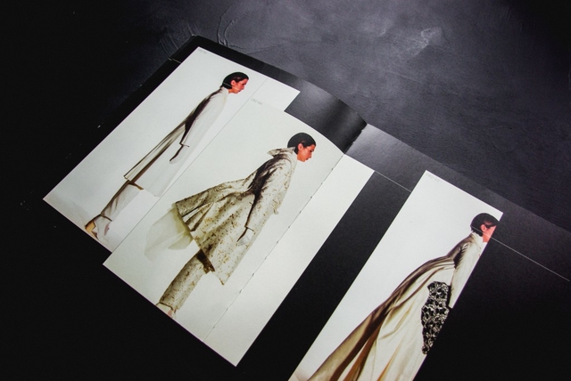
I find out in every other pages, codes and images. This book doesn’t contain much text, except the references in the end of the book. cause there’s no text I started to take another good look at the repeating dot lines, placement and spacing of the images, composition and sizes of the images. I found out that any other collection has it’s own lay-out.
Viktor & Rolf seal, designed by Mevis and van Deursen
For example the second collection in the book is mostly big pictures, mostly layered, the white dotted lines mostly separate the photo’s, but are black when most of the line is over another photo (with white collection photo’s). The fourth collection is only shown on all the right pages, left ones left black. The seventh has one big image per page, combined with a few miniatures. And so on. The repeating white lines always go together with the codes along side of them. There’s a code for every image on the page, therefore it’s always easy to look up what you’re looking at. It really feels like you have to follow this actual ‘timeline’ through the whole book. De pages with collection photos on them have a ‘C’-code, which stands for collection.
The rest of the images are pronounced with ‘NC’ which – duh – stands for ‘no collection’. These NC-works are basically all the other things they did, such as installations, perfumes and the photos they commercially used for promotion back in the days. All these NC pages have their own different lay-out too. When you go through the book at first, it may look really chaotic. If you slowly go through it from front to back, the way you are suppose to read it (timeline) it makes a lot more sense, because the changes in layout fit the changes in style and time of the collections.
One other publication Mevis & van Deursen designed for Viktor & Rolf is the No.E Magazine as catalogue of Premiere Décenne at the Museé de la Mode et du Textile in Paris 2003/04 [x]. A publication reproducing all fashion magazine pages on V&R published to that date.
Around that same time (2005) Mevis & van Deursen published their own studio publication “Recollected Work” [x].
Viktor & Rolf : 1993, 1994, 1995, 1996, 1997, 1998, 1999. /Rietveld library catalogue no : 907.8 vik 1
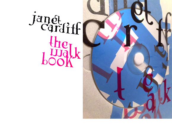
As soon as I opened Janet Cardiff’s The Walk Book in the Rietveld library, I knew I had found the book I was going to make my research on. There was not a single page that didn’t awake my curiosity on how the design had evolved.
The reason for this was the very dynamic and multidisciplinary design. Distinctive colors, shapes and placement of the content creates a chaotic and playful impression. Although you suspect the organized work behind it. Those responsible for this are the two designers, Thees Dohrn and Philipp von Rohden who shared the design agency Zitromat in Berlin. The later of which I had a chance to interview on a few points. I will share this with you as the text develops.
Let’s begin where the journey of the actual The Walk Book begins. It was initiated by a proposal from the art collector Francesca von Habsburg to the artist in the early 2000’s. The hopes of von Habsburg were to enlighten many others to “the magical world behind Janet Cardiff, her creative talent, and vivid imagination”. She also says “Hopefully, it will reveal how she works in a playful, yet extremely serious manner (…)”.
For those who aren’t yet acquainted with Cardiff, let me give you a short introduction.
As this book investigates, she has created several video and audio walks. These are extraordinary works that allows the participant to experience a dualistic moment through the act of walking and continuously listening to her narrative. The act of walking unfolds the space along with the process of narration which creates both a corporeal and a visceral form of knowledge, as two intertwined levels of consciousness.
In my interview with Philipp von Rohden he shares with me that from the start the plan was only to make something like a small catalogue on approximately 120 pages for one of the “walks”, but as the actual result now shows it turned into a 345 page book.
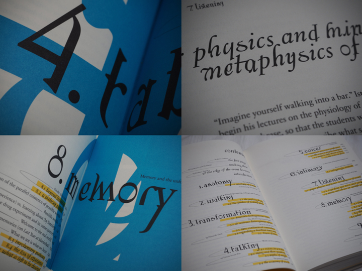
One of the additions to the production was the artist’s own suggestion to turn the book into a walk itself. This is the reason for the cd on the cover. This inventive design allows even the front of the book to be dynamic, as another aspect of this multi-layered book.
oooooooooooooooooooooooo
But it is not merely a cd that adds to the aesthetics of the book, the track-list introduces me, as the reader/walker to the book in a frisky way. It invites to a vivid insight into Cardiff’s work and welcomes you to approach the book in a non-linear fashion. The audio walk in itself makes the already expressive impression of the pages become even more alive. The book actually expands even outside the pages when brought along on a walk and your “real world” impressions become combined with the audio and the content of the book. Pictures appear almost animated and the content is even more appealing when you’re encouraged to dive into parts of the the material along with Cardiff herself. I start to detect the hidden codes for the different design layers. For example I notice differences in size and color of the text according to the different sounds or voices I hear.
Perhaps it has already started to make more sense now that I’ve shared a little more on the actual subject of the book, and how she expresses herself. Fact is, that when I ask what is the organizational guideline behind this very expressive design I’m told that they based their inspiration on Cardiff’s own working process.
She works by collecting fragments and combining them to art pieces. Sounds, pictures, words. And this notion of collecting fragments is what initiated the design. A clear example is the special typeface used on the cover and also on titles inside the book. These characters were set up especially for this book and were created by finding typography elements and then combining them. Collecting fragments.
oooooooooooooooooooooooo
Another design element inspired by the work process of the subject herself are the yellow highlighted words continuously occurring in the text, smaller sized sentences in between the lines in the middle of a text and the little arrows leading the reader away from the columns to imbibe some extra information that could be useful for understanding the text.
These features are not just there by chance, they are inspired by Cardiff’s own notes, which are actually embedded in the book as well in their full pride on pages 54-61 for example.
oooooooooooooooooooooooo
The result were these playful pages that by constant interruption prevent a traditional reading experience. Von Rohden comments on the way Cardiff highlights certain pieces of her notes, crosses out and adds words to the texts in between the lines, “is it just a comment? Is it important or not?” he asks rhetorically. This process is clearly applied to the design of the book and I think it’s fun to be invited to see the connection.
Further, I’m informed that they had 6 content layers when designing the book.
For example my suspicions when experiencing the walk are confirmed:
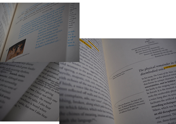
Cardiff’s voice is always blue,
and a little bit bigger
than the author Miriam Schaub’s texts that are black and seem regular sized in comparison. Another layer example are the pages in the back of the book that contains writings from exterior curators and are drained in a yellow color to divide them from the rest of the content.
Other genuine elements in this book that the artist herself is particularly happy about are the fold out pages to show the actual audio editing. Among other things, she also mentions the photos that are simply thrown into the book, detached so that you easily can hold them up in front of you when you experience the walk that’s included. I agree with her that these relatively rare book design elements definitely contribute to the exciting impression of this book.
The project went on for ca 2 years and the design process was short and difficult, described as a nightmare by von Rohden. But that doesn’t change the fact that he feels it was an honor to be a part of a project like this, and that it is rewarding to see that the book still seems to have some relevance after more than a decade.
I’m happy I got acquainted with this book, the artist and the design methods. Brought upon much inspiration for the future.
Thank you to Philipp von Rohden and Janet Cardiff for sharing your thoughts and knowledge about this book.
The Walk Book /Rietveld library catalogue no : card 1
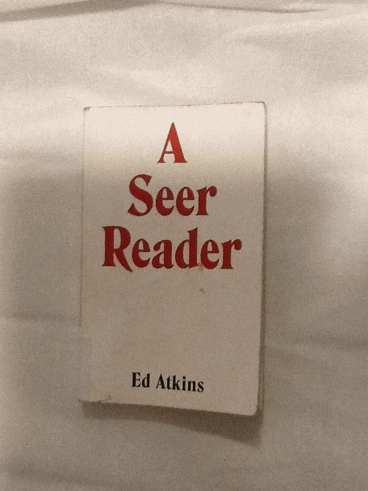
I was trying to find a book in the library with a design which excited me; something I’d like to write about. I chose to pick up A Seer Reader for the assertive, bold cover design it boasted. By using red, white and black, the colour contrast is stark, the combination connoting power. The font type replicates typical, 70’s typography, with its sweeping thickness and curvy motion; it asserts a confidence. A shallow indent delicately engraves ‘A Seer Reader’, indicating the importance of the books title, over the authors name. The ‘A’ starting the title, leads a triangular shape centering attention to the middle of the page. Every element to the cover designed by Zack Group, makes for an eye-catching, attention-grabbing book. The cover enticed me to open the book, and discover what inspired me to chose A Seer Reader for my investigation on design. Surprisingly my analysis wasn’t the result of my initial drawing to the cover, (and therefore comes without credit to the books designer,) but moreover to the author, Ed Atkins.
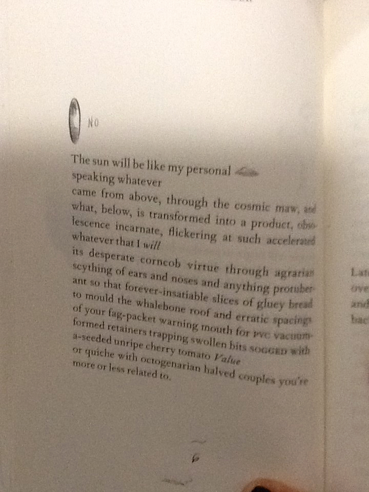
I discovered that every page of the A Seer Reader was adorned with dancing doodles; playful, printed, pen-style drawings dangle from the words, interrupt the verses and sulk in the far corners of the pages. There are tiny squiggles, illustrations, and symbols referencing or resembling punctuation. The doodles appeared to me, to specifically elude each poem with unique visual imagery. I decided I’d like to discover why they were designed in the way they are. I’ll investigate the context the book is published within, and therefore the content of A Seer Reader. Focusing on the style of the font used for the doodles, their arrangement on the page, and the choice of imagery, I’ll analyze specific examples from the book in attempt to explain why the doodles are designed in this way.
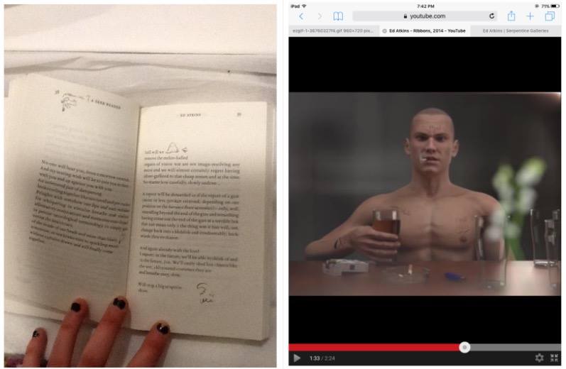
A Seer Reader was published for Ed Aitkin’s solo exhibition in Serpentine Gallery during 2014. Working predominantly with video and language, Ed Atkin’s visual art is inspired by the poetry he wrote for A Seer Reader. Ed atkin’s solo at Serpentine consisting of sound works, text instillation and images revolves around a multi-screen video instillation named Ribbons, where Atkins attempts to emphasise questions concerning the relationship between real life and virtual concepts, objects and environments. He explains that his videos are a ‘…kind of poetry of their own’.’ ‘…interested in previously literary-theoretical concerns about seeing and reading, interpretation of metaphor, figuration and literality.’ He uses CGI to literalise what was once only possible in metaphor.
In Ribbons he creates a surrogate character resembling his own physical appearance in a haunting online replication of a life. Atkins intends to ‘re embody’ himself as a possibility of what we may become in an paradoxical way of spreading a message that we need to focus on developing a more powerful mortal life. Through this high tech HD animation he ironically uses his medium to do exactly the opposite by creating a virtual world.
The character developed by Atkins is a young white male, wearing a bald
head and an action man body adorned with tattoos, he has a habit for drinking alcohol and smoking cigarettes. His appearance and his humanly habits reflect somebody stereotypically disapproved of, in today’s society. Atkin’s concern for the world we exist within, is evident in the design of the tattoos enscribed on the skin of his surrogate, Dave. Desperate phrases like ‘love please’ and ‘bankrupt’ are scrawled onto his skin to illustrate his story of conflict. They physically demonstrate the feelings Dave would have as a human, but as a virtual delegate, his being is absent from. On his skin; they’re positioned outside the human nervous system. I think this indicates a detachment from the animations human intimacy with himself.
After studying the videos Atkins produced for his solo exhibition, I noticed similarities in style between the doodles illustrating A Seer Reader, and the tattoo’s scrawled on Dave’s skin. It now became evident to me, that considering the importance of what the drawings suggest in his video work, the way they are designed in A Seer Reader will also have a special significance to the ideas Atkins questions in his work.
I’m curious as to why the doodles appear in the font style they do. They are printed on the paper in a scrawly handwriting in a biro or sometimes with a bold marker
The independent, physical and primally instinctive movement of writing with a pen in ones hand, is raw and natural to the intellectual human being society knows today. Atkin’s uses the soon disappearing practice of writing by hand, to convey the humanly emotions of himself, or anybody in our society today, onto the virtual future we face (the skin of Dave). Therefore the font design that distinguishes the poetry in A Seer Reader, from the handwriting doodles can be compared to the contrast between Daves cgi skin and his tattoos.
The poetry is written in a serif font type, commonly used in literature of today, its appropriate for clear messages to encourage the reader to focus on the content of text. It may be used to help develop the trust of the modern target audience, which is important if they are to value Atkins’ poems as high literature. By choosing a serif font which was developed digitally, Atkins paradoxically hints at what the digital world has already done to change the way our brains work, to raise questions regarding our future and technology. There is a confident, official level of professionalism created by digitally produced font, totally un-emotionless and un-personal for the reader of today. Its in these respects that the I relate the choice of serif font to Atkins virtual surrogate replica of a human. Both the poetry in sensible, digital serif font and the pinky rendered skin of the CGI Dave is tormented whilst illustrated by a real humans handwriting scribbles. The choice for handwriting therefore poses a conflict between some of the characteristic, fundamental elements of human development regarding language in the mortal world, (a practice at threat of,) the human’s of our virtual future; a product of our current society.
By using handwriting the design of the doodles appears uniquely personal; autobiographical. Atkins uses his own style of taking notes to project his personal concerns with society onto his surrogate; he plays with his ego, flipping himself into his virtual identity blanketed by his naked, surplus and mortal emotions Through his CGI in Ribbons. In A Seer Reader the intimacy created between the reader and Atkins, through his use of highly personal handwriting, implies the doodles are like entries to a diary, personal thoughts belonging to the artist. The doodles style in handwriting therefore allows us to understand Atkin’s truly distressed feelings towards our existence in the future he insights, in the mostly raw, open and honest way.
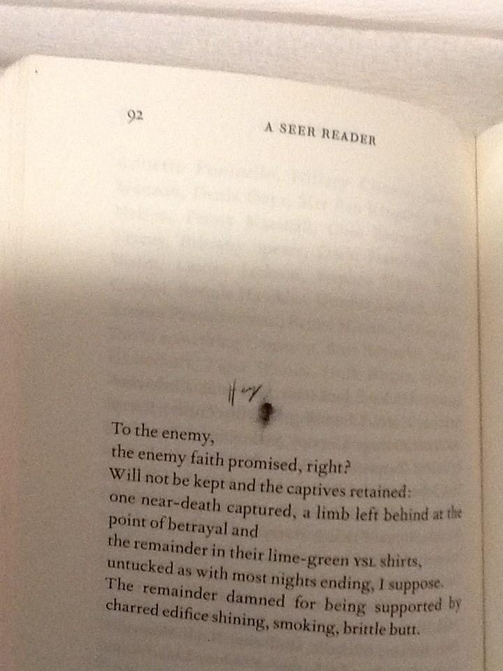
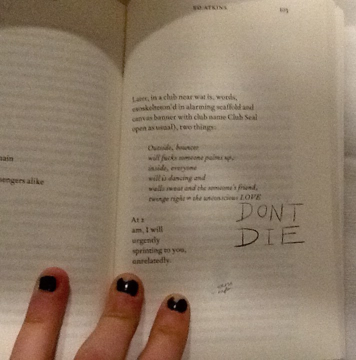
A consolidation thoughts form from Atkin’s head; the handwriting translates a universal language of emotion, in how each word is formed from the authors hand to the paper. The handwriting helps to illustrate Atkin’s feelings as he writes, and emotionally connects with each specific word. For example on page 92 of A Seer Reader, Atkins poem stabs at capitalism and using a current slang, (another characteristic typical to a human of our time,) he makes a metaphor for our choking industries; ‘butthole’.
He illustrates with a pencil sketch of a butthole, labelled with more slang; ‘hey’. He adopts a loose, scrawly joined up handwriting to do so. It feels fluid, creating a casual, relaxed visual effect which allows the readers feel comfortable to laugh, as he playfully mocks the sincerity behind his poetry. By contrast the choice in design regarding capital letters, a larger size font to the majority of the doodles and sharp points determining the end of letters, suggest aesthetics which relate to an irrational state of urgent, abrasive, human panic.
Page 103 in the handwriting ‘DONT DIE.’
Capital letters accentuate importance, taught in the grammar of the languages in our society, showing Atkin’s thoughts which should shout from the page. These features of the handwriting style show how Ed Atkin’s conveys different emotions through the doodles design, he plays with his readers to elude how he feels as the artist.
The design regarding the placement of the illustrations on each page and they’re relationship with the text arrangement is also of interest to me. The doodles are very specifically positioned, creating a new design and rendering a unique layout on each page. The notes are cheerful, their haphazardness and impermanence in position creates a youthful energy of its own. Many harass the text, dangling from the words, interrupting them like a vandalised high school text book decorated by an excited teenage rule-breaker. Upon flicking through the book I think Atkins creates a chaotic feel with the arrangement of the doodles. Maybe he does this in an attempt to question the power which our mortal life (represented by the emotive tattoos / doodles he writes by hand,) has, over the possibility of a virtual future (what his poetry represents). An issue presently discussed within his poetry, as well as what he represents with his surrogate Dave in Ribbons. Chaos raises concern to me, and suggests Atkins might be trying to raise awareness of his issues with the future and society today, through fear.
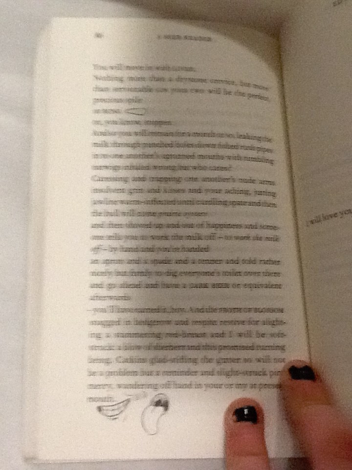
On some pages it appears the design regarding the placement of doodles serves purely for illustrational purposes. For example on page 86 a smiley mouth and a big floppy tongue curve and grin around the word ‘mouth.’
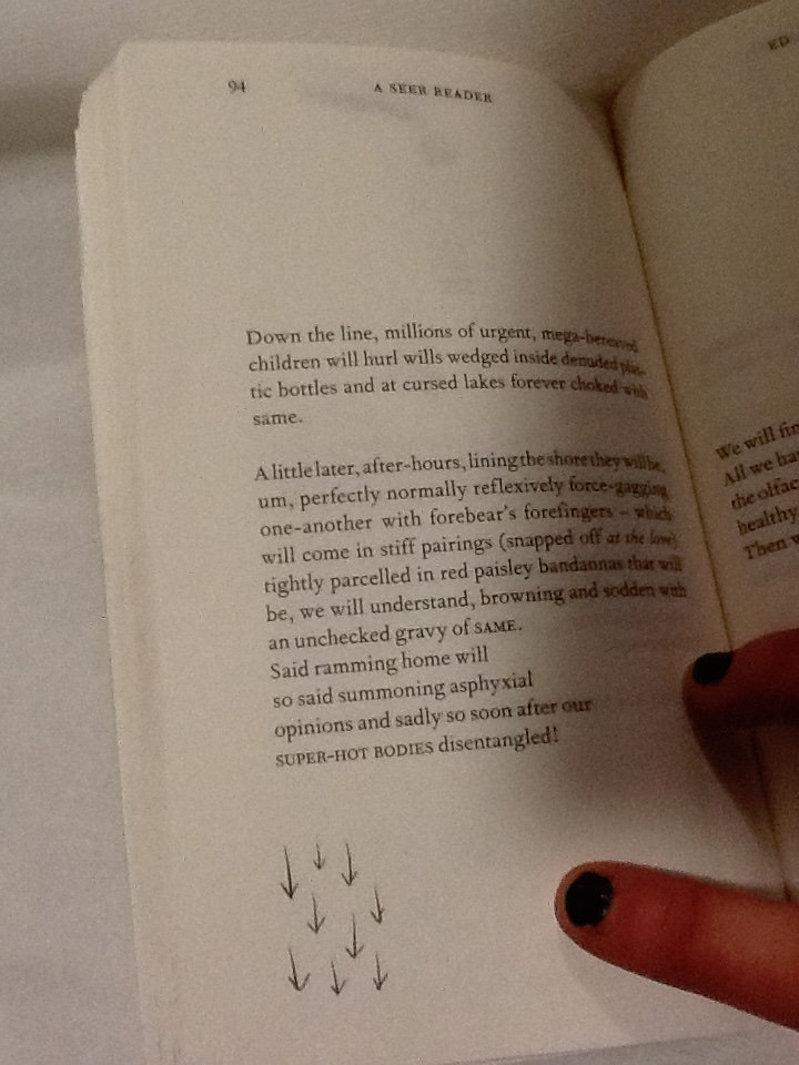
The positioning of the doodle presents a clear visual anecdote of the text, as its placed directly next to the words, the reader sees them together creating imagery. The poem on page 94 begins with ‘down the line.’ Directly beneath at the end of the poem and the lowest point on the page is an illustration of 9 arrows pointing downwards.
Again this provides a clear illustration of the text, but it also speaks of itself and the symbol is close to the bottom of the page, it feels they are going down as well as ‘being’ ‘down’.
I’m curious to understand if there is a relationship between the way the doodles are used for illustrational purposes which seem therefore to be in harmony with the poetry, and the concepts which lie behind Atkins exhibition at serpentine which A Seer Reader was published for. Despite the chaos of the doodles, and the lively energy they carry as they appear in different places for each poem, they do help the reader take their imagination further in their illustrative quality. If the handwriting doodles refer to issues regarding mortal life, and the poetry talks on the concern for the virtual future, then Atkins could be showing the bond between the illustrations of his thoughts, and his poetry. As one where he symbolizes how mortal life still has power to change the effect of the virtual world or what is to be of the future, as the illustrations aid the text.
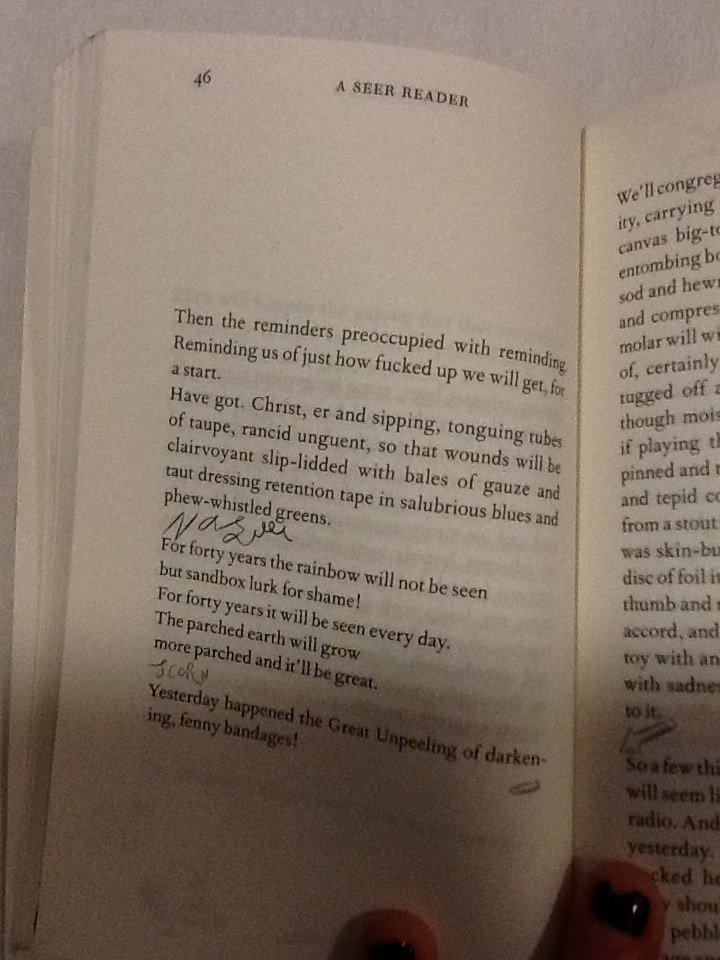
The discourse structure (involving the positioning of illustrations with relation to the poetry,) may be designed as it is in A Seer Reader to give stage directions to the reader. It creates a similar discourse structure within the poem to that of a script. On page 46 Atkins places the handwriting scribble ‘nausea,’ in a new verse, in line with the direction the poem would be read in.
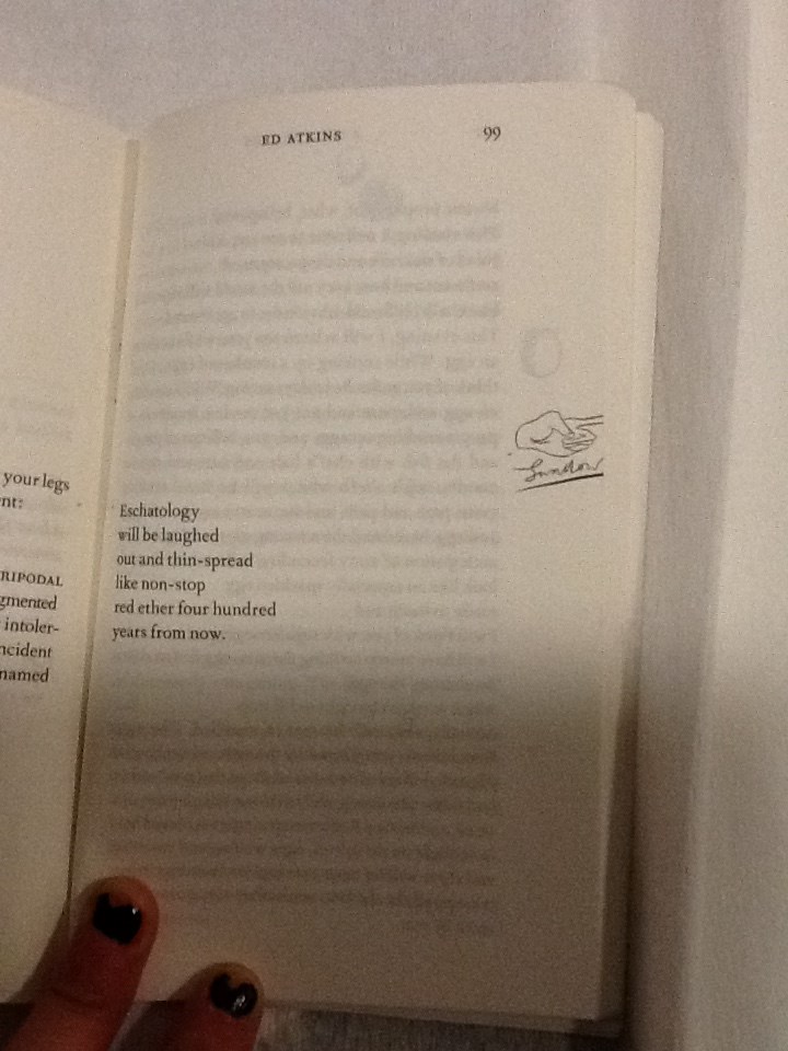
Atkins allows these direct assertions of feelings to stand as lines by theirselves. They appear significant and with a different font (in scrawny pen,) they contrast to the rest of the poem, they work as powerful instructions. With their own space they order the reader to feel something. They also give relief to the poetry; a breath between verses to give time for the reader to reflect, to feel, before continuing to read. When looking at page 99 a short, six line poem is centred to the left of the page, so the text lays closest the core of the book.
A poem which torments human’s obsession with eschatology, with disregard and humour. A slap-stick illustration of a hand, labelled ‘swallow,’ underneath, sits directly in line with the verses on the opposite side of the page. Aligned with the poem on a vertical axis, its clear the text and illustration are to be read one after the other; they have a connection, although they are separate because they imply a direction; a change of action. The illustration is cut right to the edge of the paper, giving the impression there is something to reveal on the next page. Its likely that after reading this grave poem, which makes dark humour about the possibilities of our future, the space allows the text and the reader to breathe. I think Atkins wants the reader to digest the words of this poem, look to the right and ‘move on,’ indicated by the encouraging instruction of a pointing finger to turn the page. In this case the positioning of the doodles may be used as a order to feel an emotion like a stage direction, or to initiate a direction.
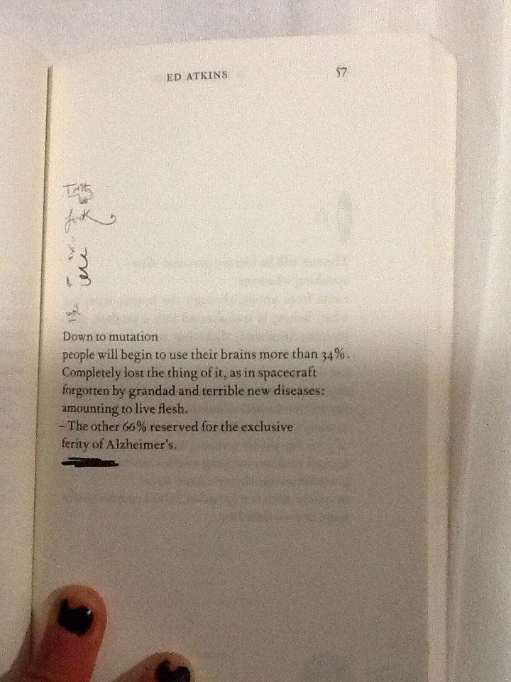
Some doodles intimately relate to words in the poems. On page 57 a bold marker is used to underline the final verse in the poem, this draws attention to it and marks the line with importance.
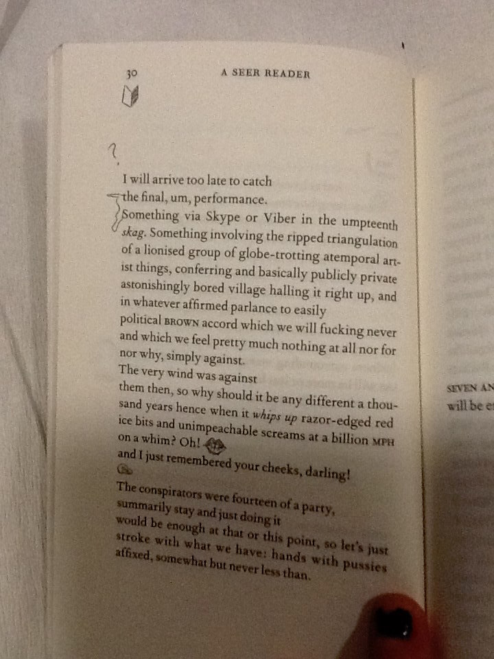
On page 30, the two opening words, which start verses following each other, are connected with a squiggle.
When joined they spell the phrase ‘the something.’ Making a new verse within the poem. This statement also exists on the page now without relation to its context in the poem without the joining squiggle. This draws emphasis to the phrase and creates layers within the poetry.
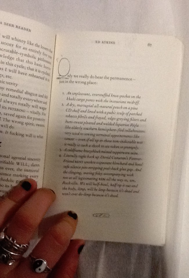
In some cases the positioning of the handwriting squiggles make them a part of the poem, although they contribute letters in a different style to the rest of the poetry in its serif font. On page 67 the poem begins using letters O the handwriting style, to begin the first words of following verses.
The size of the squiggly letter is obese to the rest of the text, it helps to compose a bold and grand opening word. This is a common design in a lot of literature, Atkins makes a reference to it in his own style in an impish attempt to add intellectual value to his poetry through his page design. The choice to have these in the doodle style instead of the serif font refers to the power the doodles have over the poetry on the page, as they refer to the dying practice of handwriting as a symbol signature of our mortal lives in society today.
I’d like to find out why Atkins chose to use this specific imagery, for his doodles. Many of the symbols he uses look similar to punctuation, commas, full stops, brackets. His choice to use marks in A Seer Reader and for the tattoos in his video, which are similar to punctuation, gives a further clue that not only the handwriting is being used as a symbol of our mortal life today. There are other reoccurring themes within his imagery, including hands, eyes, penis’ and delicately sketched vaginas. All parts of the human body. Atkins decision to design his illustrations using this imagery, again, references mortal
life and current society which he discusses along with his thoughts about the future in his poetry.
By investigating Ed Atkins process as an artist, focussing primarily on his exhibition at Serpentine Gallery 2014, and more specifically the video work Ribbons, I have come to various conclusions about why the doodles which intrigued me into investigating the design of A Seer Reader, are designed in the way they are. The handwriting style the doodles are written in, connotes natural human thought patterns, unstable emotions and ultimately the questions the author presents. Handwriting also serves as a symbol for language and writing in which could represent the typical medium used and developed throughout our human age. It therefore creates a tension with the computer generated font type used for the poetry, which might suggest the virtual future which Atkins discusses, as a running theme to his work. The doodles appear in totally different positions throughout the book, on each page. I therefore discovered various different reasons for the design of their arrangement. They can be placed intimately within contact of the poems, to draw attention to specific words or phrases, or to illustrate an idea directly which shows how human knowledge can still be useful for bettering the future, when considering the broader context of his practice. They can be placed in a location on the page which will give a direction to read in or indicate that one should stop reading to feel something. The placement of the doodles when they create letters which integrate directly with the poem, connate high literature as Atkins desires his writings to be read with sincerity as he discusses deep issues surrounding our society and regarding the future. Finally the chaotic feel created by the different placement of doodles on each page questions the urgency of the issues the handwriting stands for; the mortal world and its conflict with the virtual world of the future. To end my investigation I discovered that the imagery Atkins uses in the design of his doodles references English punctuation, and the human body. Again it links directly with his exhibition and his proposal of questions regarding our existence in the society we live in today, and its relation with the virtual future.