Although this is a completely black book, this book represents the best book designs of 1988.
The design of the books is simple but elegant. Just with the name of the author and the title of the book. Some designs make use of illustrations. There is not much use of different colors. Mostly, two
or three colors on one book. The designs of the books that are the most attractive to me are those with a simple choice of typeface , that represents just the basic information of the book.
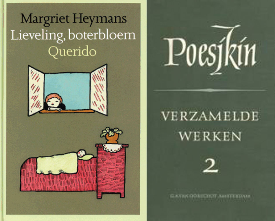
For me the most attractive design of he book is the one that uses very light colors’ for illustrations. Although I already said that the most attractive books, for me, are the ones that use, just words for the design, I found this design the most fascinating in the collection of 1988 because of the simplicity of the illustrations that make the book very stylish. It’s a children’s book of Margriet Heymans “leveling, boterbloek Querido”. The book that is less attractive to me is the book of Poesjkin “verzamelde werken 3”.The reason for that is because of the use of, on my opinion, hideous use of the teletype and large font for his name. The color of the book is dark green that is used a lot in the design of books from that period. Although I like the simplicity of the design of the books from that period, this specific green is not attractive to me at all.
cat. no. 758.3
keyword: best


