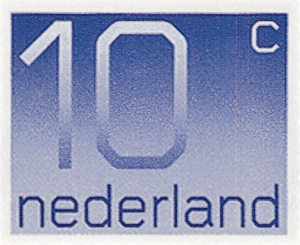
The stamps Wim Crouwel designed for the Dutch postal service PTT were used for 25 years. The first thing that came to my mind after hearing this was the amount of tongues that must have licked these stamps. 25 years is a long time. Millions of letters were decorated by this sophisticated square. Figuratively speaking, it was the key to another persons mailbox.
When we look at the stamps we see a clear design, a distinct communication speaks from it. Stripped of any adornment it is a severe design to me. Extremely functional. Exactly what Crouwel was aiming for. Everything that cited emotion was left out. Functionality above all. It seems very contradictory to me that a design so rational was used for such an emotional communication process. I find this contrast very interesting. On the one hand there is Crouwel, driven by a concise aesthetic, succeeding in his job. On the other hand there are the sober Dutch people, whose eyes have looked at these stamps more than a billion times, yet most of them have not seen the aesthetic essence of it.


