There is no spectacular reason why I chose this Wendingen magazine. I haven’t had the luck to know anyone who owns such furniture or designed their home according to the Amsterdam School. But maybe because I know so little about the Amsterdam School and the Stijl I became curious in it’s influence on present design, art and architecture. Additionally, how do we people living in the 21st century look at the ideologies of the artists like Piet Kramer, Gerrit Rietveld and W. M. Dudok? Also, what do we think of the photographs of interiors that were designed by these designers?
The first thing I thought of when I saw the photographs is that I wouldn’t want my house to consist of only primary colors with the black, white and gray colour combination. I generally find their houses too impersonal and geometrical because of the lack of spontaneity and absurdity.
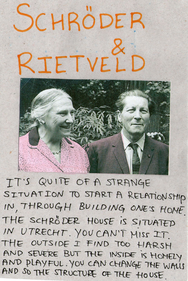
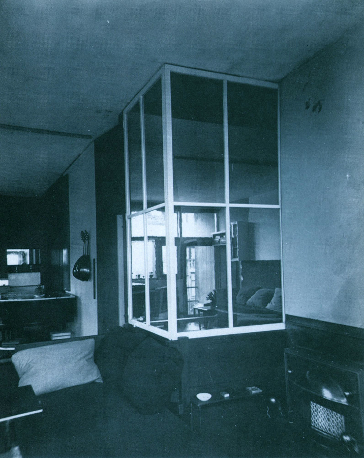
The Schröder-Rietveld House, however, I find exceedingly playful because of the ability to turn an open space into separate private rooms. Also, the practicality of the house is simple, sincere and has its particular charm.
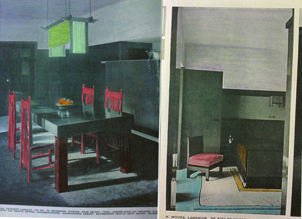
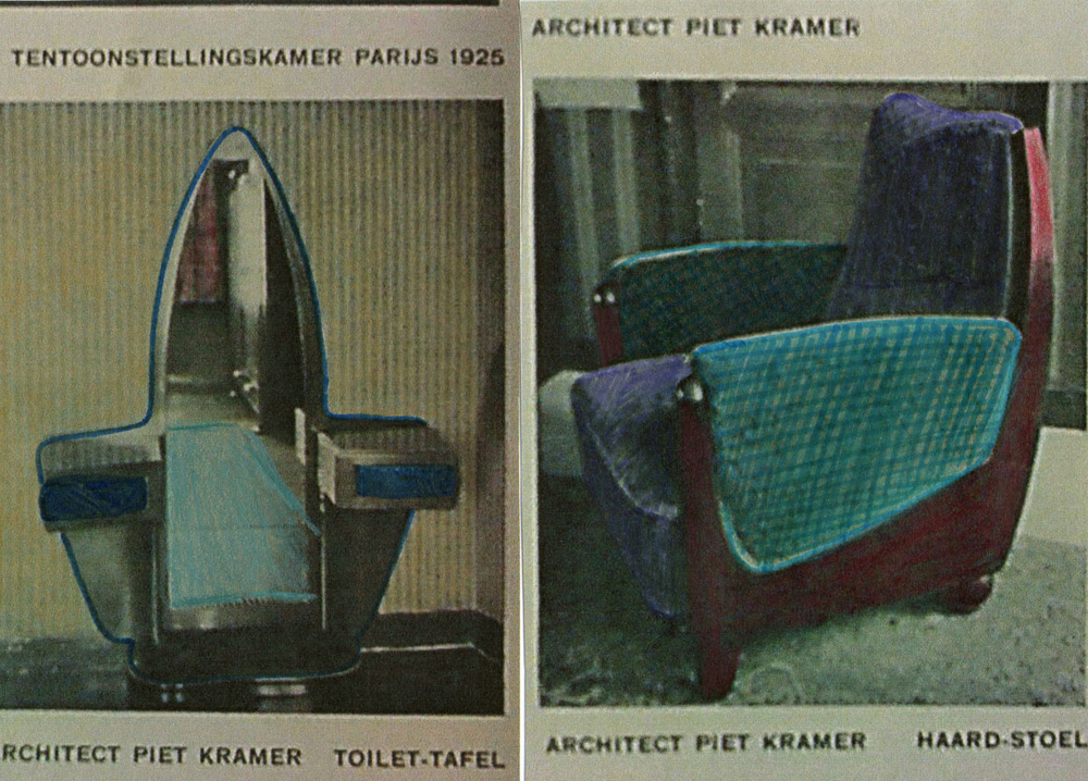
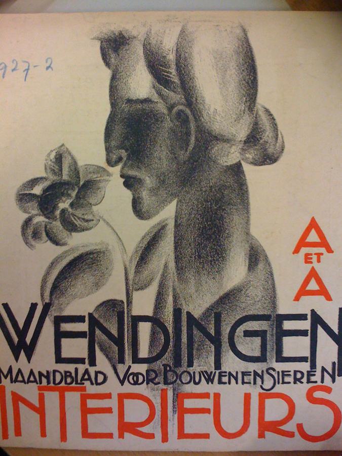
The main reason why I liked this ‘Wendingen’ magazine was because of the numerous black/white photographs. My focus also drew to the captions underneath the photographs 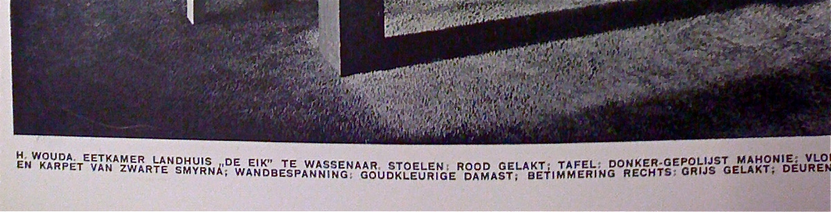 as they tried to describe the colors of the furniture, which you could not see or even guess.
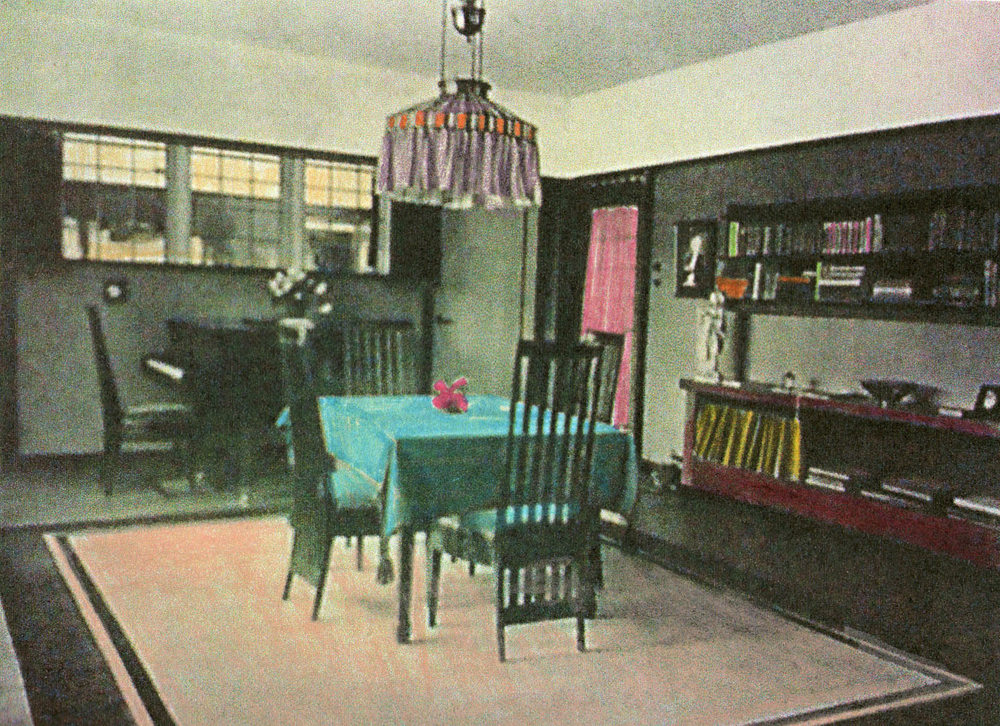
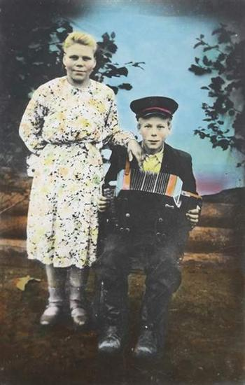
For some years ago I liked to find old , black & white pictures of random rooms. I would use colored pencils to color these, for example, living rooms or dining rooms in. I would attempt to make the color combinations expressive, intense and sometimes clashing so they become livelier.
I like to work with themes such as nostalgia: focus on the beauty as on the absurdity of it. The furniture in the ‘Wendingen’ issue have a touch of nostalgia now, which I do not believe that someone like Rietveld or Kramer would have wanted their designs to turn into. This is simply bound to happen, so the interesting part to it now is what to do with these photos in the Wendingen issue?
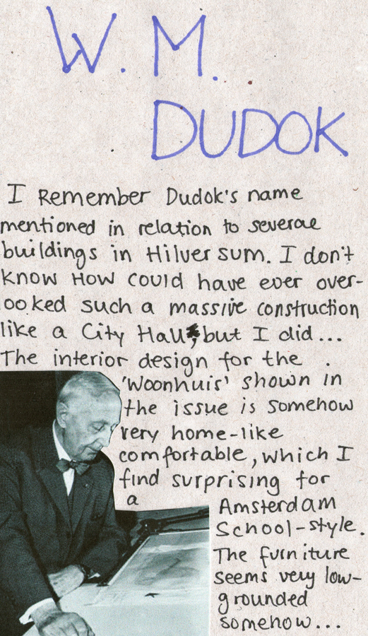
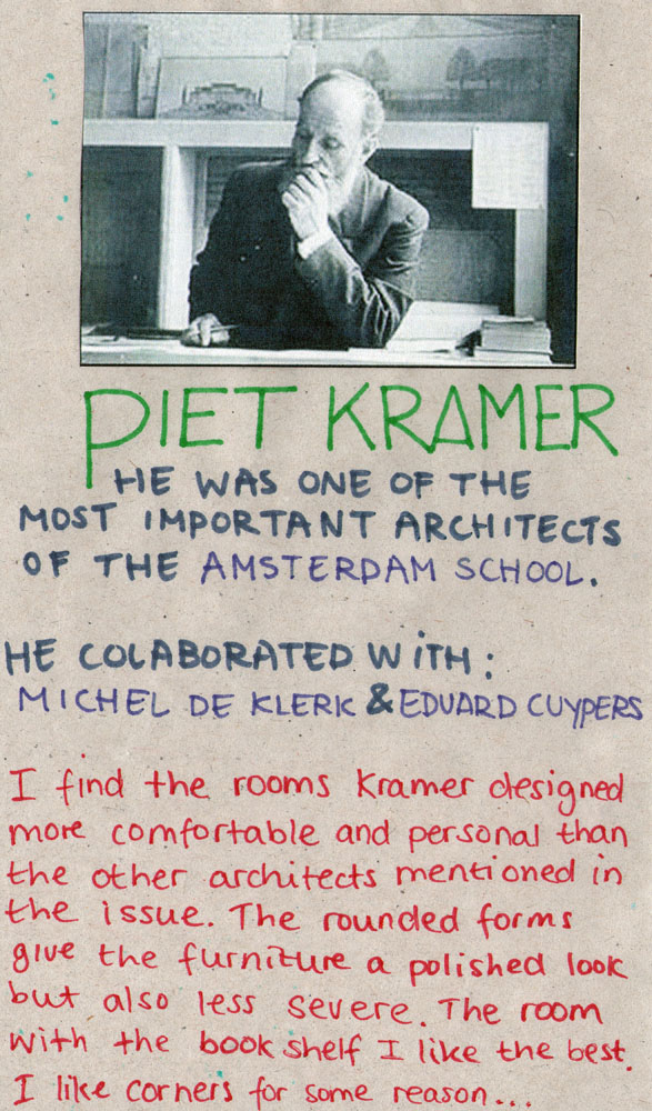
There were several photographs of Piet Kramer‘s work in the issue, which I genuinely like, and who is now one of the known key figures of the Amsterdam School. I did a bit of investigation on him to see what else he has made, how his style developed and who he worked with etc. This I considered to share on the blog but I did not desire to simply focus on him but specifically on the work shown in the issue. I wanted to rediscover the style of the Amsterdam School and turn these practical and geometrical methods into something bourgeois and decorative and work against their ideology, without offending them.
Boris Mikhailov
born August 25, 1938 in Kharkov, Ukraine
He is a fine art photographer who started photography mainly as a hobby until the KGB discovered nude pictures of his wife and he was set of work as an engineer. Mikhailov’s focusses mainly in his photography on Russian society during the USSR and the how it affected the people afterwards.
Some months ago I watched an interview with Mikhailov on Arte in which he showed some of his reversal films. He explained that in his earlier works from the 60s he was fascinated by the kitschy Soviet family photographs. He told that it was fashionable for the common folk to ‘brighten up’ some of their old black/white family portraits by having them coloured in. This I liked to do with some of the photographs in the ‘Wendingen’ to turn the rooms retro and cosy.
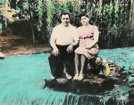
Soviet style photo-editing by Boris Mikhailov

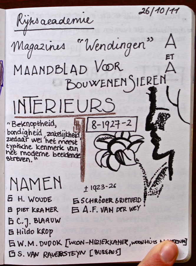
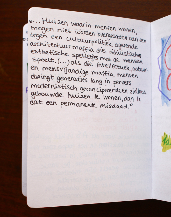
Wendingen Notes
‘Houses are built to live in, not to look at’
I took some notes on the Wendingen issue about interiors in my note book. As they were private notes it is mainly in dutch, sorry.

The Nostalgia of the Amsterdam School