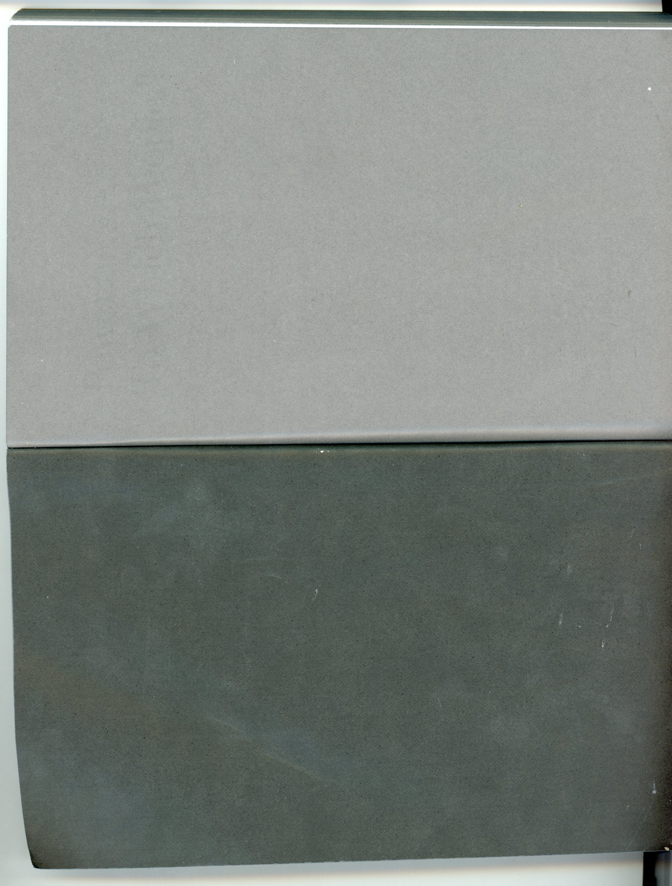
the edition Suhrkamp designed by Willy Fleckhaus, 1963
The book I want to write about was actually a series – the edition suhrkamp from Suhrkamp Verlag. Willy Fleckhaus designed it in 1963 and it remained unchanged till 2004. He managed to create a very basic visual identity which consists only of colour and typography.
The covers of the 48 books which are published every year are held each in a different colour of the visual spectrum. No pictures can be found on the covers – in fact it is reduced to the name of author, title and publisher put into a grid of lines in the width of the cover page and at the bottom of it. The books are affordable and therefore popular in literature class in school. For a lot of pupils in Germany a certain title is very strongly connected to a certain colour.


Edition Suhrkamp books were a forum and inspiration for leftist-intellectual discussion in Germany for years, which came apparent as well in reviews written by its protagonists for the edition’s 40 year anniversary. It has published texts from Adorno, Brecht and Barthes. As well as the texts, the daring design stays in the minimalist style of the avant-garde. I see it as a metaphor for the development of the 68-generation that the complete collection can be bought inclusively made-to-fit, white design book shelf for the avant-garde living room. Ideals and individuality are important, but it comes with a surprisingly open attitude towards consumerism and must-haves.
From this text it may seem a rather impersonal approach to my choice of a book from “Printed Matter“, but I am mostly fascinated by the role of edition Suhrkamp as a publisher in society and as one of the most important forums for intellectual discussion in German. Adding to that I like timeless design which became fact here and it is as an example next to for example Otl Aicher‘s pictograms [x] for the 1972 Olympic games. At the same time, because of my impression that all books in “Printed Matter“ stood in a modernist interest of solid, timeless, well-designed books and me being familiar to that 60s rainbow colour design with typo, I chose Willy Fleckhaus‘ series also with a bit of irony.
post by Nicola Arthen