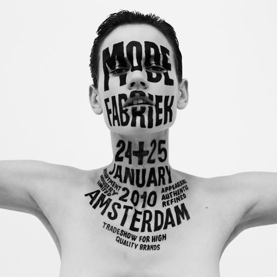
Letman. Behind this nickname hides a former student of the Rietveld Academy, Job Wouters. He represents well a very illustrative part of graphic design and type design. This young artist is currently becoming quite famous, with some impressive institutions as clients like Monoprix, Heineken, Tommy Hilfiger, the New York Times Magazine, Playboy, or more recently a collaboration with dutch artist Dries Van Noten for a fashion show. In addition he has just published a book in collaboration with Gijs Frieling, and received the Dutch Design Award for his series of posters called Undercover.
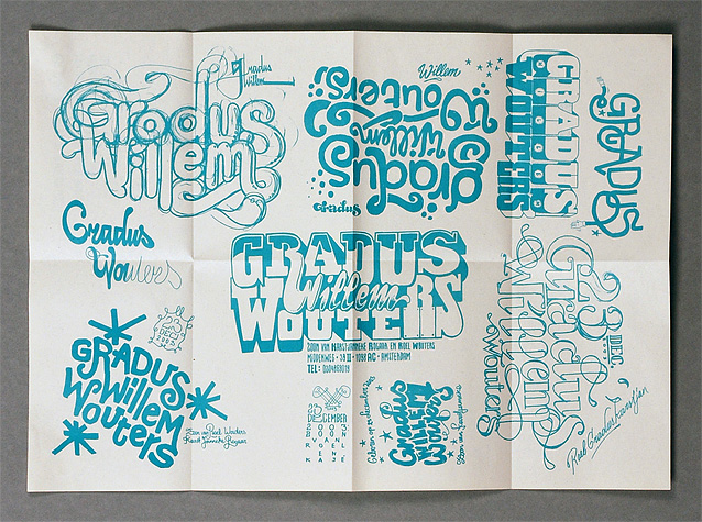
Wouters first started to practice his drawing passion with friends and his brother, sharing their discoveries together. He still often collaborates with his brother Roel, or his childhood friend Yvo Sprey. He was quite intrigued by graffiti, practicing a lot and was particularly interested in street art lettering. This was his first step into the world of typography. In an interview, he said: when I was a youngster I was especially interested in graffiti-writers, who could write their names flawlessly in different styles. The communicative potential of type style was already of great interest to him. It is ironic to start looking at different styles that could communicate your personality through graffiti and finally do the same for corporate firms or advertisements. Later Job entered the KABK school of the Hague in the typography department and then carried his studies further at the Rietveld Academy in Amsterdam, where he graduated in 2004. His great passion for graffiti and handwriting was already very present during his studies. His graduation work was for example made out of 500 posters displaying each name of his classmates, they were handwritten thanks to a huge panel of graffiti styles. Job is definitely interested in underground handmade style of graphic design always keeping aesthetic problems, finalization and communication effects in mind. It is impressive to see a designer like Job who found his way so early, and then sticking to this fundamental base, staying true and evolving all the way.
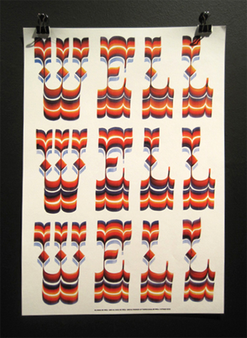
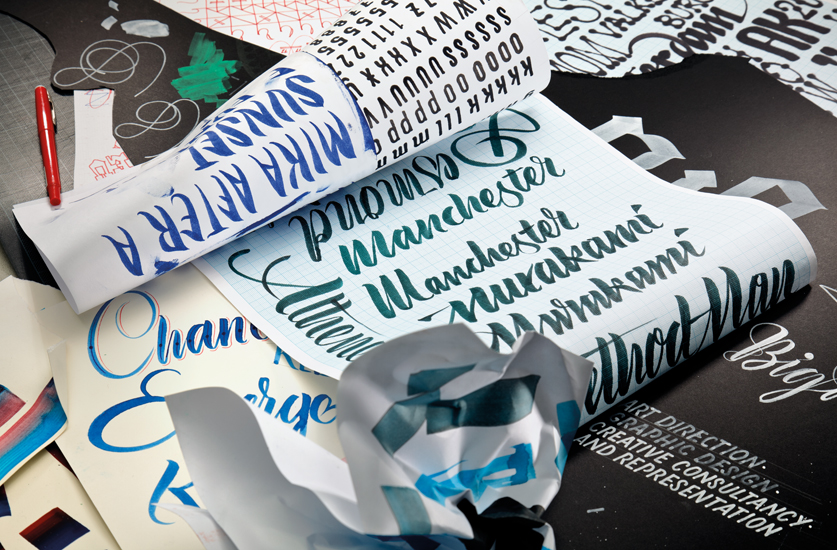
Job pushed further his exploration of the handwriting after finishing the Rietveld. His new influences are more based on classic calligraphy, and various lettering styles from the 60s pop culture advertisements, shop lettering, people’s handwriting, airbrushed circus vans, scribbles on toilets etc. He started to use more flat brush, calligraphy pencil, stronger colours, screen printing processes which influenced his typography a lot to become sharper and more breathy. His knowledge in calligraphy increases as he does not copy existing fonts anymore he has started to create his own techniques. For an outsider, it is very hard to define a calligraphy handwriting as particularly original or not. There is such a huge diversity of different calligraphy that it seems to be hard to revolutionize it. Wouters worked at Unit CMA in Amsterdam and shared a studio with his brother Roel Wouters (with whom he collaborates very often with). He currently lives and works as an independent artist in Amsterdam.
It is interesting to see in his sketchbooks how he explores both parts of handwriting referring to graffiti type and processes within the traditional world of typography and graphic design. His work becomes more defined as well and you become aware of how important the part of the analog work is for him. This is what defines a part of his actual success, his ability to open himself and push further his curiosity in different fields of typography further away from graffiti. Nevertheless he stays faithful to its origin without being trapped into this street art cliché everybody knows.
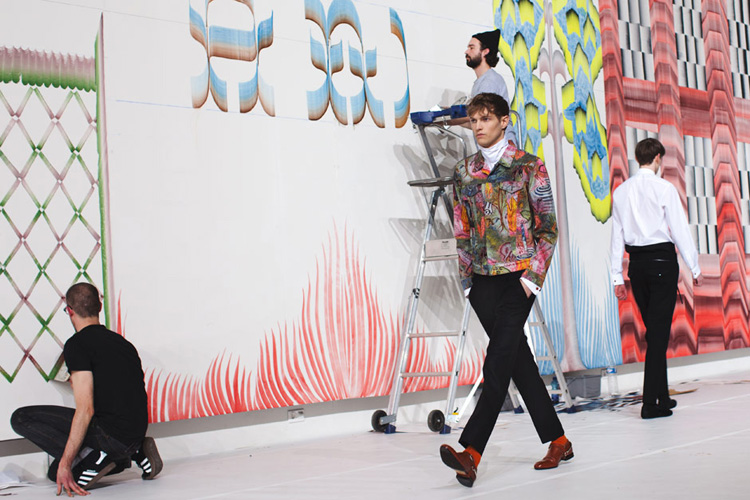
Nowadays, Job Wouters work is more and more visible for everyone. The clientele he has built is very diverse and count great commercial clients such as Heineken or Audi, cultural ones like the New York Times and renown fashion label Dries Van Noten. During their fashion show, he painted a huge fresco of coloured typography while the top models were parading. These are examples of Job Wouters’ trademark: Always marking his lively attitude by developing handmade typography or other interventions, finding a way to include it. Whatever the product always ready to dirt his hands for a better physical outcome. It is obvious how pleasurable it is for him to work analogous showing how play and amusement determines his approach only changing with his mood or age. His approach stays the same, from small scale work like doing a birthday card to large scale commissions as creating a series of advertisements for Monoprix in France. The modesty and power of communication is found in all of his works. He said in an interview: If I love a project it will show in the end result and if I don’t love it, that will show too. Ideally the viewer will receive the same amount and type of energy from the work as what I put into it while I was making it.
His approach of the canvas remember me of illustration, the way he arranges the space and structures it leads to a very independent and strong communicative result. In my point of view, he represents an explorer of the limits between illustration and graphic design, mixing both so well that it becomes hard to define. His curiosity leads him towards experimentation with creating drawing objects or performing an alphabet next to a child. His work is very contemporary, fitting perfectly in the present period of graphic design, in a kind of logical wake of artist such as Herb Lubalin, with his capacity to create huge logo-compositions through calligraphy lettering and Stefan Sagmeister, who enlarged the field of graphic design by including handwriting and DIY design in an independent and revolutionary style. I would define their working methods as taking one step back from todays use of technology. They grab something interesting in the past, re-use traditional methods and then take it one step further. This process is to me a good way to stabilize an overview on actual mainstream?.
Job Wouters is a tought letter designer, particularly in present time which contains too much handwritten- and homemade design. I made a research on what the most downloaded handwritten fonts from the internet were, and unfortunately many of them shows how poor the opinion is about the beauty of calligraphy, and how unsuccessful the communication of it is. “Comic Sans Ms” comes in number One followed by “Sketchy”, “Billiebared”, “Handvetica”, etc… I suppose that when looking at these free downloadable fonts there is an answer why all these big clients comes to Job – his work is made on mesure.
I recommend you to follow his work on his website. It’s interesting to see how passionate he is, how strong his influences are and how evolving he is in his style, how he suddenly develops a passion for a style and then pushes it to the maximum. His actual point of interest is in calligraphy with gouache, creating a gradient with a flat brush (see his last collaboration with Gijs Frieling named Vernacular Painting).
I will finish by stating that I think Job Wouters special talent is in the way he continuously stays young and active in his approach, showing a very modest and passionate person, who is always ready to take the brush and feel the letters through his finger, feeling the gesture of it, as graffiti painters would feel it. It is quite rare to find people with busy work and big responsibility still practising their art by hand. Maybe it is a way to stay anti-comformist and close to his roots?