I started looking for a book on my knees, because like in the supermarket the cheapest products are on the lowest shelf, I had this crazy idea that maybe the most interesting dusty books would be down there too. (of course this completely ignores the system of the library and is more an appropriate theory in a second hand store).
First I looked at the few books that were not standing but lying between two shelves. Nothing really interesting came up, and then I noticed a little book (the books I picked were always huge or very tiny). It turned out to be about typography and it’s called “Experimenta Typografica 11”,
it is written in different languages such as Spanish, German and French. It has different kinds of paper and also a few see-through pages. It is a shame I don’t speak Spanish, German or French but maybe this is protecting me from a huge disappointment.
I’m kind of falling in love with this little book as I’m writing about it. I might steel it.
Rietveld Academie Library No: -san- 3


November 10th, 2009 at 4:17 pm
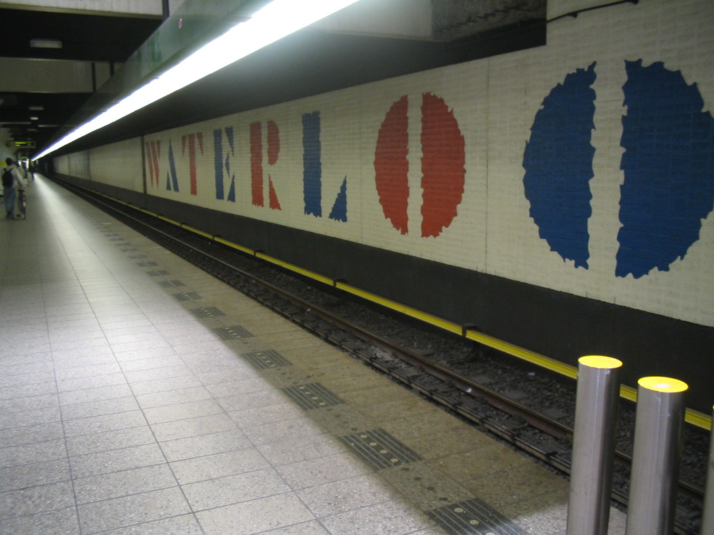
Funny that you place a picture of the waterlooplein metro station under your post about “Experimenta Typografica”. Because in my opinion this station, together with the station on the Wibaustraat, are a good example of very ugly typographic use.
November 10th, 2009 at 5:42 pm
wanna see it?
http://www.flickr.com/photos/uniteditions/sets/72157619776223003/
November 10th, 2009 at 6:34 pm
Thanks for choosing this book! I’m very glad that someone chose a book about typography. It’s such an interesting item and it’s a shame there are not more books written about this subject. I think your supermarket-search-theory is nice, I do this all the time (and not only at the supermarket) and it always works for me. On the lowest shelves are usually the most interesting things because other people are too lazy to look there. Well done!
November 10th, 2009 at 9:52 pm
Karoline Kvist, kaolaqs@hotmail.com
It is funny to think about how this book of yours really isn´t about language. And I don’t think it’s important in which language it´s written. It’s about how languages are written. So really you could read it, even if you do not understand the language. How many books does that apply for?
November 11th, 2009 at 1:59 pm
I don’t think this is very ugly typography, however I also don’t love it. But it is done by the maker of this book, Willem Sandberg. Therefore my choice is not “funny” I think.
November 11th, 2009 at 8:00 pm
You’re right, the choice is not ‘funny’. I thought that you choosed a random picture of typography. And the font is not the most ugly one I have ever seen. But the use in the station is a bit banal I think. It’s maybe the station itself with his specific light in combination with the color of the text that makes the type looks a kind of cheap.