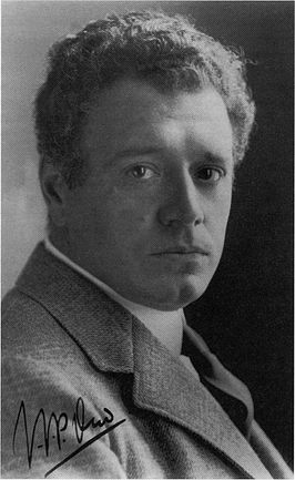
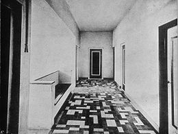
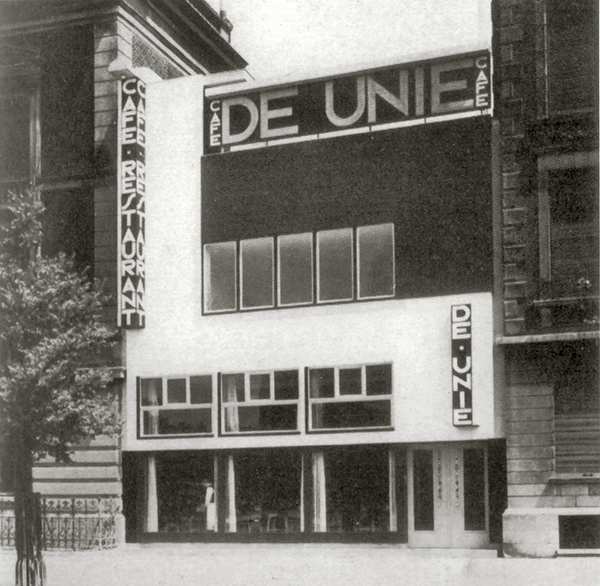
Jacobus Johannes Pieter Oud is a dutch de stijl architect. In his early career he was mainly inspired by Berlage. Buildings he designed were really geometric, he used long staright walls, rounded corners, horizontal and vertical lines. And these elements would cover an open space inside. He was interested in using unexpensive building materials and on the buildings he didnt want a trace of human hand. He was also interested in how the light comes in the building, how clean and fresh does the building look and feel. In his sketches you can see how he also sketches the entrance of the light into the space. Between 1918-1933 he was Municipal Housing Architect of Rotterdam. During these times the country was getting a lot of labor so he worked on mass housing for the coming workers. He didn’t want to use the traditional way of using bricks. Other two examples of his known works would be: Vakantiehuis De Vonk, it was made for working women so they could spend their weekends outdoors and be involved with the countryside. What makes this building special are the tiles on the main hall. They were painted by Theo van Doesburg to include painting in architecture and they thought this would make people interested in art when they were staying there. The other example would be Cafe de Unie. It was not really liked when it was built. Outside of the building looks like a Mondriaan painting. With the use of these primary colors and illuminated signs they wanted to attract attention. The building was destroyed during the 1940 bombardment and was reconstructed later.
What I want to investigate further is the situation in Vakantiehuis De Vonk. Can we really make people interested in something by just putting it “there”? Or did the answer to this question change in time? In one of Oud’s projects (Vakantiehuis De Vonk), they painted the floor tiles on different colors and it was designed by Theo van Doesburg. They wanted people who go into the building get into art by experiencing it. When I think about it, the purpose of commercials is the make the consumer interested in the product. Does this really work now in 2017 ? We have internet and social media. We are living in times that is extremely easy to reach people. So you would think that it would work amazingly because when you think about it a lot more people actually see the commercials now therefore the sales should go up right? Well, online commercials are everywhere but people are not seeing it. A personal example would be: when i am just scrolling through social media, I don’t stop scrolling until I see something that immediately grabs my attention. Let’s say an AD grabbed my attention, as soon as i realise that it is an AD I would just go back to my endless scrolling to the depths of the internet. More general example would be Adobe’s researches about ADBlocking. In the graphs they made as a result you can see that adblock users keep growing daily and in January 2015 monthly active users were 181 million. So in conclusion I would say in 2017 ads are definetely seen by a large group but it doesn’t interest people. The reason i am giving an example from online advertising is according to the research done by Nielsen(2013-2015) shows us that the most effective way of advertising is online. By these information I could say that these days placing something somewhere to make people interested in it doesn’t work really well.
So in the making of Vakantiehuis De Vonk, the artwork became a commercial and art became the product. But this is not the only way to use art. I think we can all agree on that in contemporary art doesn’t carry this purpose of making people interested in it but also we can’t deny that artists, sometimes in groups and sometimes indiviudually give art their own purpose. So I can say that art is subjective. Therefore, using art for a purpose would only work if the audience had the same ideas in art with the artist.