Sound file: ‘Front Cover’
[audio:https://designblog.rietveldacademie.nl/wp-content/uploads/2017/11/Front-Cover-Audio.mp3|titles=Front Cover Audio]
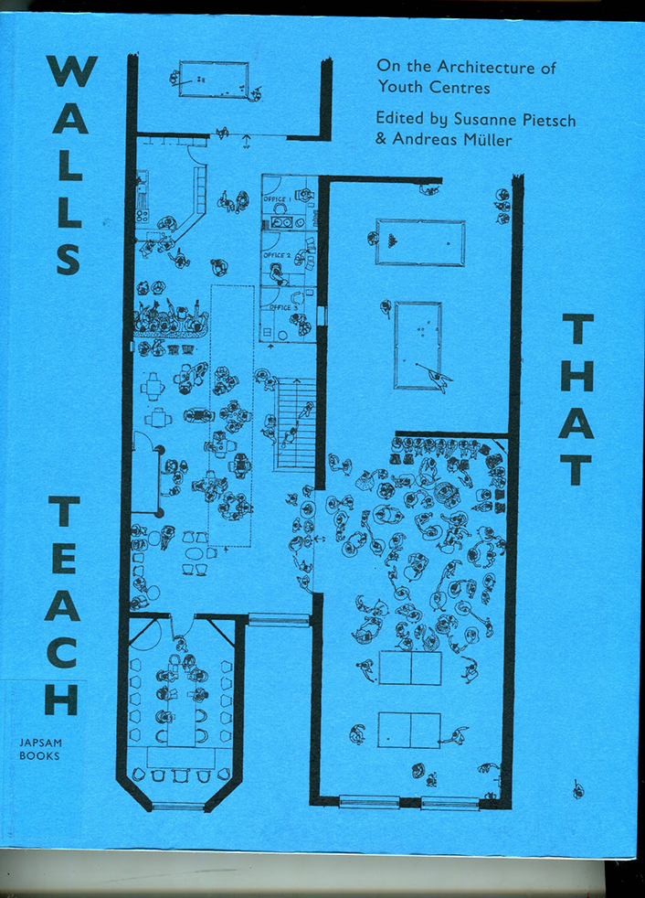
The blue colour of the spine was the first thing that attracted me to the book ‘Walls That Teach’. I reached up to grab the book and upon closer inspection I discovered a beautiful cover with an interesting layout of text and attractive illustrations. The layout of text on the back of the cover for example runs horizontally, forcing you to turn the book to the side to read the text – something that reoccurs occasionally within the book. Despite the title of the book and the topic – architecture of youth centres – being an unknown topic to me, the design of the cover intrigued me enough to give the book a chance and look within it.
I opened the book and ran my fingers through the pages to feel the paper. The book felt light and the paper felt thin. The colours of the paper were the next thing that I noticed – they vary between green, white, and black paper. The main texts appear on the green and black paper. The illustrations and images appear on the white paper. The white pages are laid out horizontally requiring the reader to turn the book to its side in order to look at it.
Sound file: ‘Chronological’
[audio:https://designblog.rietveldacademie.nl/wp-content/uploads/2017/11/Chronological-order-paper-choice-and-consequences.mp3|titles=Chronological]
The way the font (Gil Sans, Gill Sans Infant) is used and the strokes of the letters, the layout of the paragraphs, the letter spacing, word spacing and line spacing give a feeling of space on the pages without giving the impression that the page feels empty. The letters, words and lines are spaced quite far apart. The Paragraphs are centred on the middle of the pages, leaving a space of about an inch on either side. The strokes of the letters are also light (there are specks of white on the text that is black). All of these factors contribute to the appearance of the pages not looking cluttered.
Sound file: ‘Playful Typography’
[audio:https://designblog.rietveldacademie.nl/wp-content/uploads/2017/11/Playful-Typography.mp3|titles=Playful Typography]
The illustrations throughout the book are very imaginative. The first illustration is on the front cover. it is an architectural drawing of a youth centre with illustrations of people demonstrating how the space would be used – people are dancing in a disco, some people are playing table tennis, some people are sitting around and some people are working.
Sound file: ‘Illustrations’
[audio:https://designblog.rietveldacademie.nl/wp-content/uploads/2017/11/Illustrations.mp3|titles=Illustrations]
However, these illustrations change inside the book. The people depicted in the illustration on the front cover are no longer contained within the walls of the ‘youth centre’, but are left to roam freely over the pages. Sometimes at the bottom of the page you will find a couple walking hand in hand. On another page there are people playing table tennis. On another page beside a paragraph about the planning of a youth centre there are a group of people meeting around a table discussing something.
The contrast between these illustrations and the more practical architectural drawings within the book is really amusing. For someone like myself who doesn’t know much about the topic of architecture, small details such as the people wandering through the pages really capture my attention and encourage me to read. The different photographs of the youth centres under construction, how they were used and exterior shots of the buildings punctuated throughout the book also adds another dimension. The combination of how the text is put together, the illustrations, drawings and photographs really brings the book to life for me.
Sound file: ‘Images’
[audio:https://designblog.rietveldacademie.nl/wp-content/uploads/2017/11/Images.mp3|titles=Images]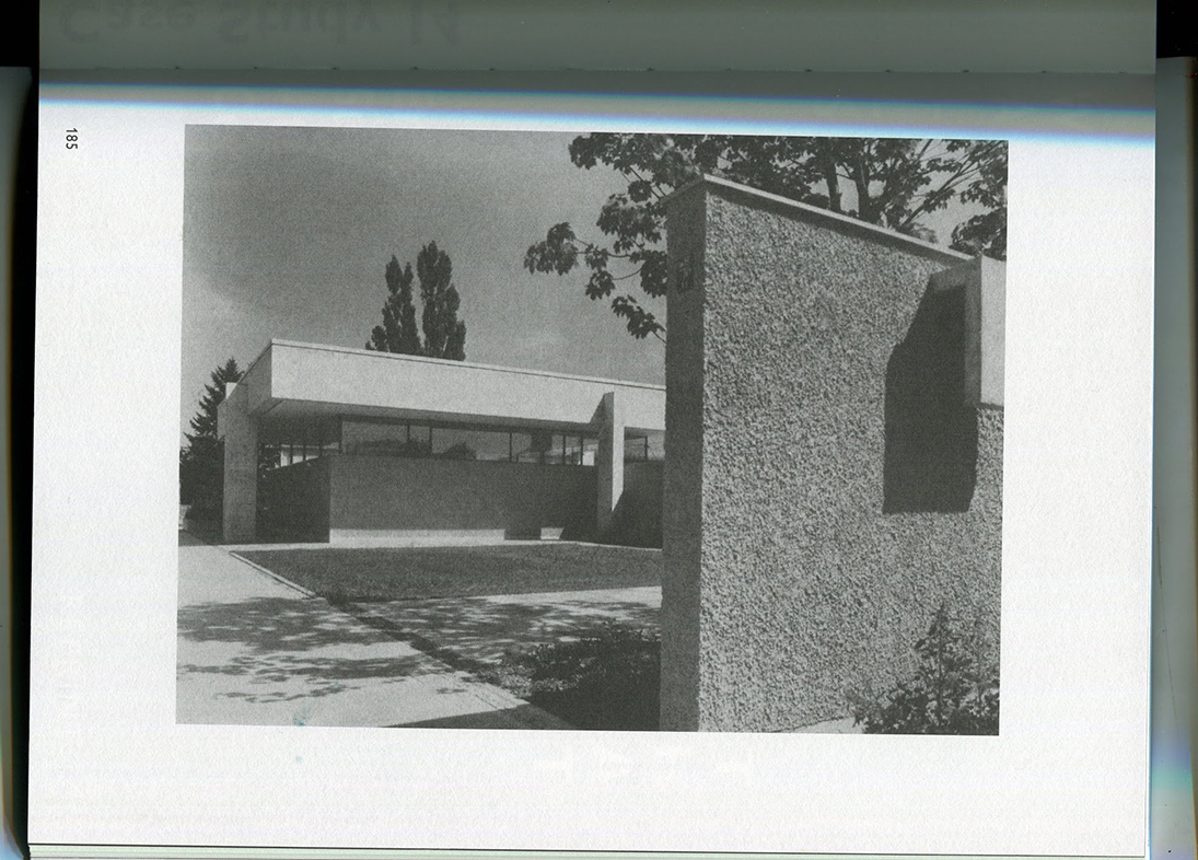

My first impression of the book was that it appeared to be playfully made. This struck me as being funny because the topic of the book is about youth centre architecture, but the topic of the book suggested that it could be heavy to read. Upon opening the book and reading it, I was pleasantly surprised to find that the playfulness of the cover continued throughout. All the different elements brought together really encouraged me to read. I think that the intention of the design element of the book is to inspire the audience to interact with the book and create discussion. All in all a very well designed book.
Walls that Teach, designer: David Bennewith & Sandra Kassenaar, Rietveld Library Cat. no: 718.5 pie 1.8 met 1