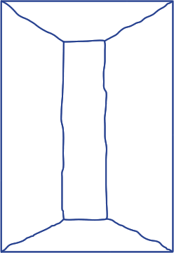
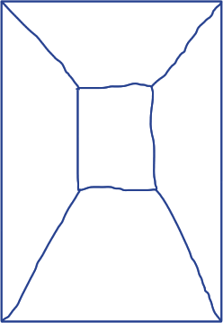
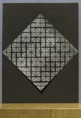
I had difficulties reading the title, which made me pick up the book in the first place. Different kinds of black letters which reminded me of the graphic bauhaus logo. Since I am a pretentious, yet troublesome, art kid I had listened to some bauhaus earlier that day, which might have affected my interest in trying to read the title. Though it was impossible to read the title without knowing what was actually written. Thankfully the title was also written with bold letters in the bottom of the left corner; “JURRIAAN SCHROFER (1926 – 90) Restless typographer”.
This intrigued me to know more about this Jurriaan Schrofer. Why would someone choose a typo for the cover of a book, which you cannot read in the first place and in what way is this man restless?
I tried to get some more information about this book by looking at the backside, where you usually see some information, or a short summary about the book. But it was just the same incomprehensive letters, but this time reversed. A cool way of dealing with the backspace of a book, respect! Not being able to fully understand what the book really was about intrigued me even more to choose it, I wanted to know what it was all about.
I liked the binding of the book, a japanese binding, which you very rarely see in a bookstore or library. The pages are put together with a special way of stitching, which I find very aesthetically pleasing to look at. It looks homemade yet professional at the same time. I want to learn how to bind books that way. The japanese binding of the binding also gives the impression of a exclusive and a bit luxurious, like “this is not an ordinary book you are holding in your hand”. And just like everyone else I want to feel special every now and then.
757.3 sch
