Skip to Content Skip to Search Go to Top Navigation Go to Side Menu


Can we control our Nature ?


Saturday, February 9, 2019

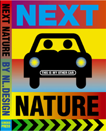
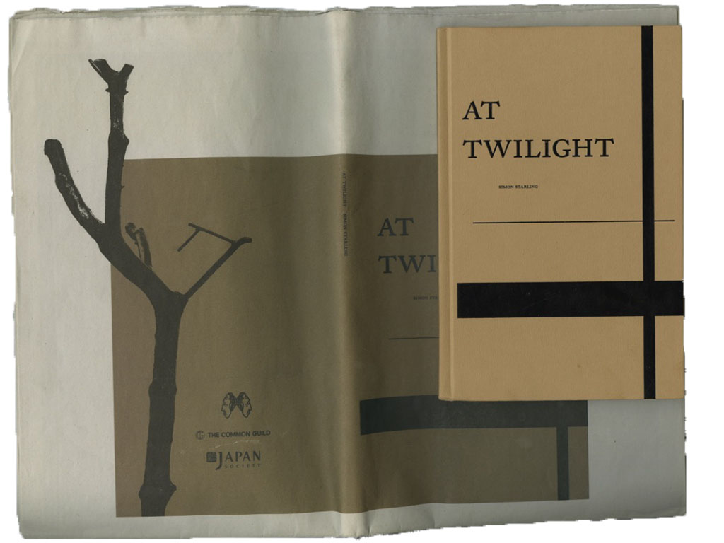
Front cover of the book Next nature

  Next Nature is a book designed by Mieke Gerritzen and edited by Koert van Mensvoort, Mieke and Michiel Schwarz. it was published in 2005. The design of this book is really interesting, not so much because of the paper chosen, the format of the pages or the functionality, but more because of the choices made on color, as well as the fonts and basically the whole visual identity, that is closely linked to the raised subject. The relation between text and image is really particular and intense with a lot of repetitions for example. This is not the only book by Mieke Gerritzen treated in this way. Her work as a designer and artist is a study of the image culture, in relation to technologies and all kinds of digital medias. She also designed other books such as mobile minded for example, “A booklet about the mobile world of quotes, essays, statistics and factoids, all reflecting the very young state of wireless thinking”, is said on the website, showing that there is still a relation to technologies.


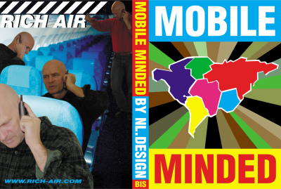
<code.Front/back cover of the book mobile minded

Her website transcribes this idea quite well with a lot of of images, fonts and projects coming to your eyes as you open the page. It even gets you lost a little bit.

Koert Van Mensvoort, artist, philosoph and scientist, and one of the editors of  Next Nature, made a few conferences to talk about what is next nature. At a certain point, he draws a graphic comparing the things that were born and that we control (genetically modified fruits for example), those who were born but that we don’t control (the sun), and then does the same with the things we created : a car is controlled by us but a computer virus not for example.
In the end, he proposes that we think of nature as a nature caused by us : next nature.


4

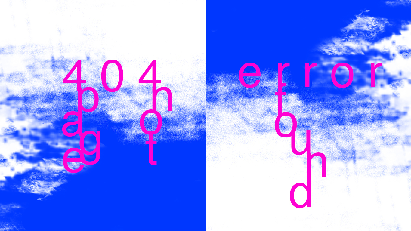
Image taken from the facebook/instagram page virtual experience : https://www.facebook.com/virtualexperiences.net/

The idea of next nature and the designs, visuals that join it, are present a lot on the internet. On many pages you find a lot of content with a crazy amount of information, different elements mixed together, images repeated or put there without any explanation.  This is something that you find in the book, on the first pages already. When you open the book, the first two pages are heavy repetitions of photographs of dogs and of a font « next nature ».  This kind of designs came, in a way, with the explosion of internet , and of a new digital era, following different artistic domains. For example, codeine/purple trippy visuals or videoclips mostly came with new rapers such as yung lean for example, with his music « ginseng Strip 2002 » . The video came out in 2013, but contains a lot of references to things that were popular in 2002. A lot of music artists consider this video clip as a revolution because of the raping style that is slower, along with the instrumental, but also the visuals for the video clip, and the outfit he’s wearing. For a lot of people, this is at the origin of a whole fashion/music trend that has been really popular the past years. In his videoclip « Hurt », you find a lot of visuals that are old computer/digital styled, often absurd and colorful, really similar to the book’s visuals.


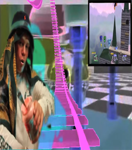
Screenshot from the video clip of Yung Lean - Hurt, on youtube.

The interesting thing is that this book next nature came out in 2005, but in 2005 only 9 % of the world population was using internet while now it’s 55.1 %, knowing that we are also more on earth. So, this kind of visuals were a lot less common in these days. The title next nature was actually more than accurate because it anticipated a lot of things.

As i said earlier, the content of the book is a lot about new technologies and medias, and so is  focused on modern society, in a way : « in this world it is perhaps fitting that we can now – thanks again to our technologies – also manipulate the images of nature ». Most of the images chosen in the book are symbols you find in big cities or famous logos remade with different colors, like the apple logo made as a pear for example. Even the use of pop culture images (Nike P.18 ; Coca cola P. 30) is recurrent.


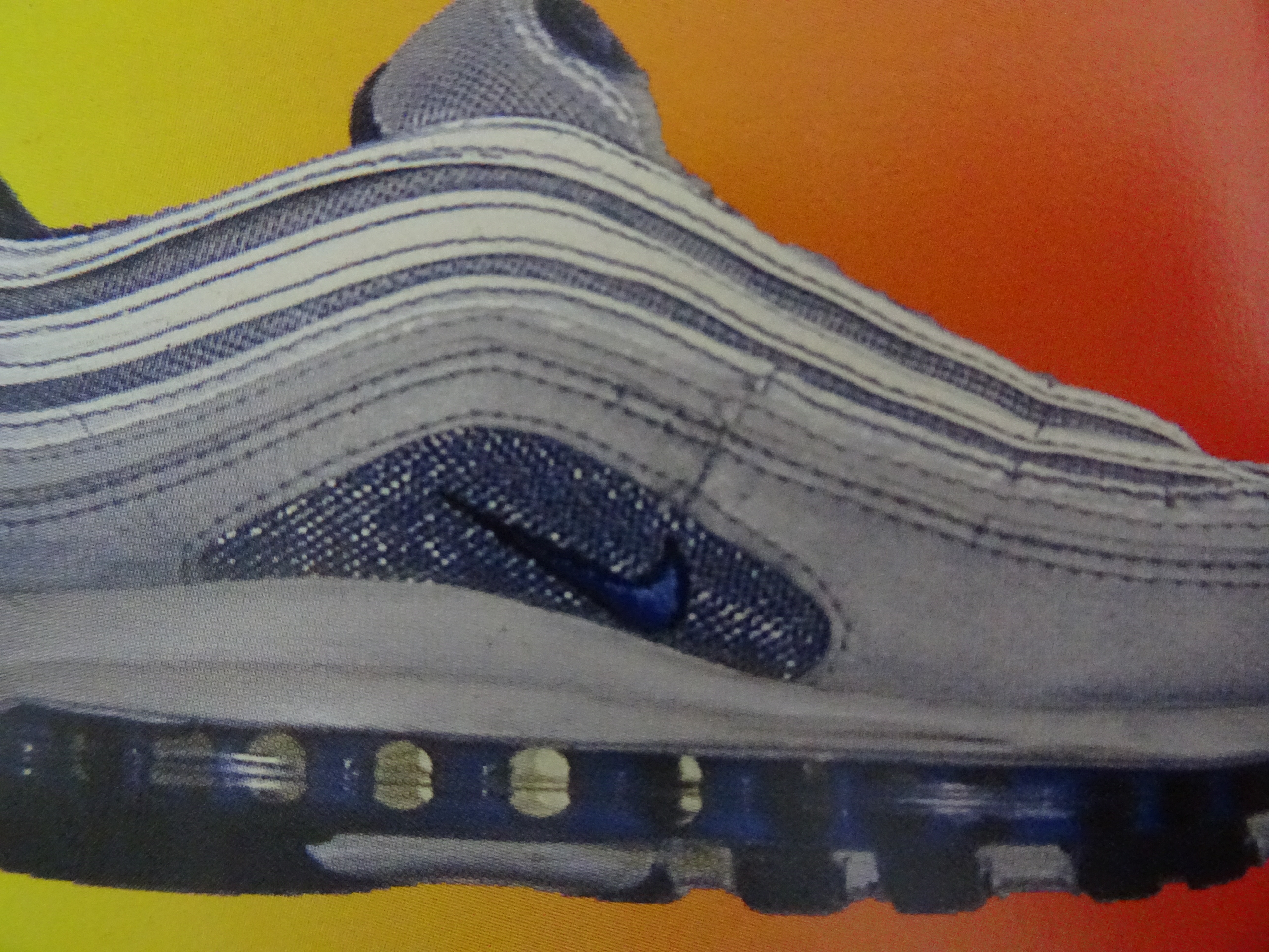
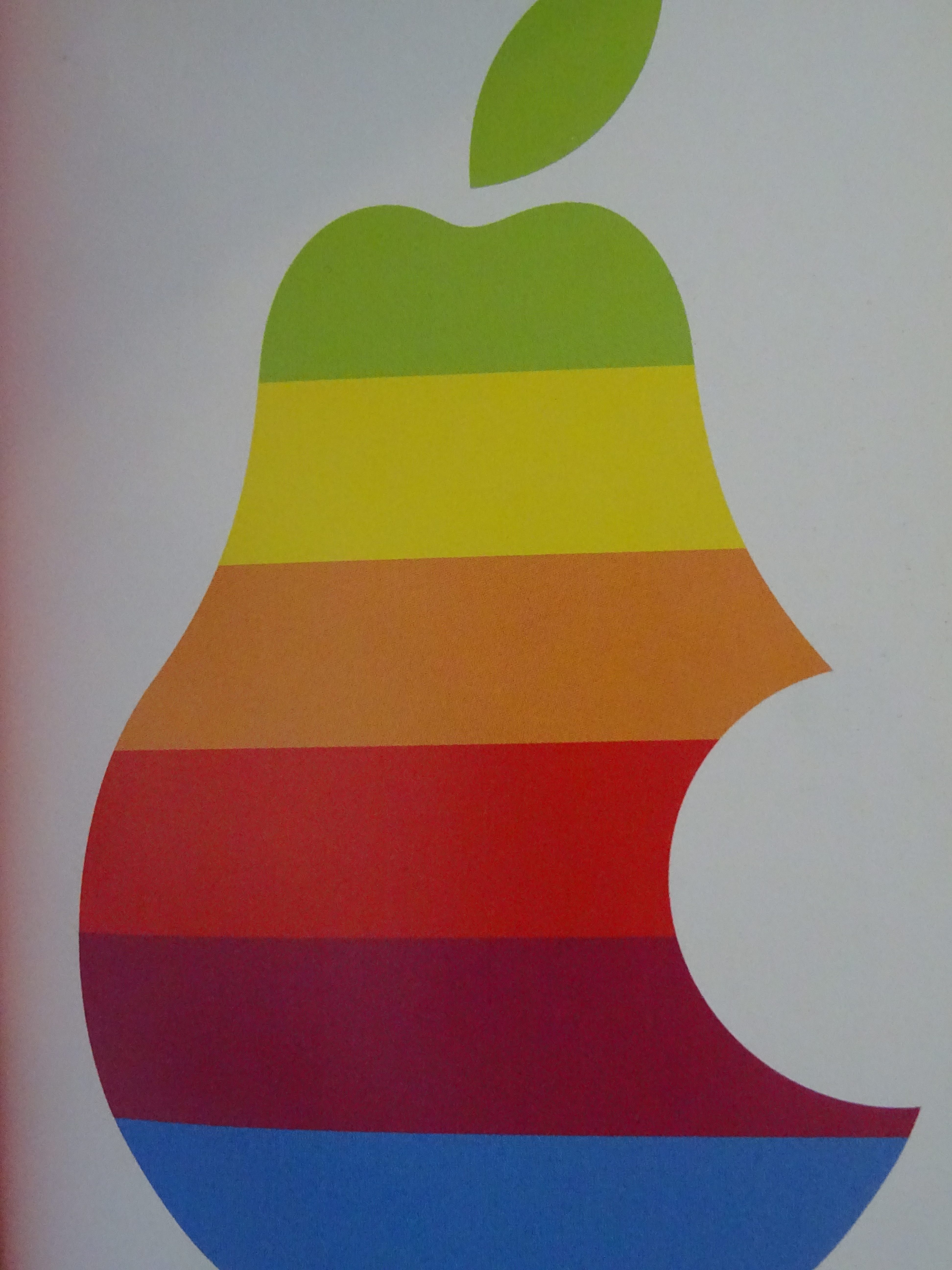
Images from the book Next Nature

You can see that one of the main topic of the book is the consumer society, something also present on internet with  “memes”, on social medias for example. It is humor, of course, but often about technologies, politics or the actuality, so it’s still an analysis of the modern society, even most of the time a criticism, in it’s own way. In the book, they’re almost using these modern society symbols as a lifestyle, a way to use social medias, to wear clothes, to talk, to write, to listen to music. This kind of designs take the side of accepting and amplifying the fact that we are over exposed to a big quantity of information nowadays. It’s like if they were ironically trying to like this society. For example, P.113, the supermarket is compared to a neighborhood, because it has everything : theater, a club… « The supermarket […] as lifestyle ». This crazy quantity of information is translated by the fact that each page is really different : some fonts or colors come back in the book sometimes but the display of the elements, or backgrounds, is always changing.


front and back cover from Everyone is a designer in the age of social media

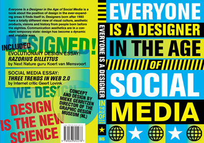
Mieke Gerritzen also published a book called : « everyone is a designer in the age of social media ». For me, this goes with the idea that us, the spectators, can now take a major role in the visual identity of objects, ideas and that by sharing it, liking it, we actively chose the way we treat the information we receive and have a role in what our designs look like. It also goes with the idea that nowadays, we, as humans, are designing our nature, the next nature.


https://miekegerritzen.com/books/

https://www.nextnature.net/2006/07/save-our-next-nature-buy-the-pocket/

https://miekegerritzen.com/vision/

https://miekegerritzen.com/exploding-the-world-of-graphic-design/

https://www.facebook.com/virtualexperiences.net/


Koert Mensvoort: Next Nature. design by Mieke Gerritzen, Rietveld library number: 754.2 nex 1

On a clear day you can see forever


Thursday, February 7, 2019

To be honest, nothing in particular made me take this specific book out of the shelf. Had it not been sticking out of the shelf already I probably wouldn’t have noticed it among all the others. It has a simple glue binding and is the size of about a standard sketch book, between an A4 and A5. The cover is a photo of a grey sky with an airplane, so the whole book is covered in a grey hue. But looking at it a bit closer, I started noticing the little details that made it a bit more interesting. The title on the cover of the book is actually not a standard font like I initially thought, but each letter is instead hand drawn from a squiggly line. A hand-made detail that’s not easy to catch on the first glance. The book is filled with diary-style texts, simple line drawings and black-and-white photos. The drawings are often of a little character, possibly a self-portrait, with funny captions. The drawings were the first things I found interesting, before I started looking at the layout and the design. The photos are most often centered on the page, but sometimes allowed to fill the entire space. They also often appear in pairs, or corresponding to a text or drawing on the opposite page. The layout was probably meant to work within each spread rather than just the page. There’s also a lot of white space still allowed on the pages. This allows the book to not feel cluttered and overwhelming. Although to be honest, nothing about this book gives an overwhelming feeling. The muted grey cover and the photos inside that are all black-and-white give the book a sober impression. One thing that sticks out is the choice of font. At first glance it looks to be a regular font made out of hand written letters. But looking closer at the different ‘e’s and ‘g’s and ‘f’s, I realized that the whole thing is probably hand written. It is however way too neat to be convincing as his actual hand-writing, but is something I found interesting enough to further research.
Looking into it more, I understood that the book is not hand-written but actually hand-traced over a printed copy of the text. If this is more or less time-consuming than just writing the entire book by hand is hard to say. But I do think it gives the book a softened appearance with it still being readable as the lines stay quite neat. Here’s an example of the traced text:

However I’m not sure if the (in my opinion) minor interesting effect it has on the appearance of the book is worth the time and labour needed to accomplish it. Since this is quite an odd choice of design and not something that I’ve come across before, I wanted to contact the designer. The designers of this book are the artist (Jan Rothuizen) and Armand Mevis. He is a renowned graphic designer part of  Mevis & van Deursen, a well-recognized graphic design-duo in the Netherlands (although they received a lot of criticism over their design of the new logo for the Stedelijk museum). I e-mailed Armand Mevis and asked about their decision to hand-trace all the text in the book. What I primarily wanted answered was “why?” but the reply i got only answered the question “how?”. Armand Mevis told me that Jan Rothuizen had initially planned to trace the entire book himself, but it turned out to be too much work, which is not very surprising. So instead, he invited some friends to help him. In the back of the book there’s a list crediting “the people who traced the text”. The list contains no less than 40 names, and the whole project apparently only took one full day.

I found out that there are a lot of interesting people that contributed to this book by tracing the text. From art conservationists to the previous head of the Design department at the Sandberg Instituut and of course several artist, designers and gallery directors. I also tried to hand-trace a printed text myself to see how long it would take for me. I didn’t get very far as my hand started cramping after about 25 minutes. In that time i managed to trace about 2/3 of an A4. Needless to say I was very disappointed with my performance, and it’s understandable that Rothuizen decided against tracing all of the text himself.

I’m usually one to appreciate any added “handcrafted” component, especially in printed material like books. But I am having a difficult time justifying the time/effort vs. the result in this particular case. Although I appreciate the bold choice to do this and I do think it looks nice, I am still asking myself “was it worth it?”. I could easily have gone with just a hand-written font, or any font for that matter.

Jan Rothuizen: On A Clear Day You Can See For Ever. design by Mevis & van Deursen, Rietveld library number: rothu 2

An Ocher Sheet


Thursday, February 7, 2019

« The library is unlimited and periodic. If there were an eternal traveler crossing it in any direction, the centuries would eventually teach him that the same volumes are always repeated in the same disorder». These thoughts from Borges’s Fictions often influence my mind when I’m searching for a book, where it seems that your choice will always be part of a gigantic spiderweb.

“>The title « A sheet of paper » and the name of the artist, Remy Zaugg, appear centered, in a Times New Roman font. The book, in a rectangular format (23×29.5), has a hard cover with a plain pale ocher background, accompanied by a gray square in the center that hosts the title. At first glance, A sheet of paper does not appear to sollicitate any attention, without breaking away from a very classic aesthetic regarding exhibitions books.

I thought I should reconsider my choice, even if it attracted me, for some other book, with a more modern, singular or attractive design. However, this book then seemed too willingly simple, hidden, to be just let on the side. 

By offering another look at it, I could then notice singular formal protocols that unravel, through visual variations and repetitions, the boundaries between the so-called informative and artistic content. In fact, A sheet of paper has been designed by the artist and his wife, and can be considered as another piece, or a prolongation of his works : on the second page, we can see written « This book as well as the reproduced paintings were produced in collaboration with Michèle Zaugg », exhibition photographs are made by Hans Biezen.

While opening the book, I could discover that the large ocher pale square from the cover multiplies itself in various ways : in the artworks presented, as in the architectural plans of the exhibition that are presented above the photographs, and many other forms.


In fact, Remy Zaugg’s artworks are large pale ocher canvases, and we see the m spread in different forms in the book. They appear sometimes photographed singularly : one big square taking a whole page, existing only in the space of the printed page with the white backgroung. Or, they also appear in an exhibition context (from Zaugg’s solo exhibition held at the Van Abbemuseum in Eindhoven, from August 31 to October 7, 1984.) Finally, they appear in their more abstract form with the different architectural plans that repeat as well the square structure. Thus, these artworks are existing in various forms on context (scans, photographs in exhibition, modeled), creating an effect of echoes, transmission, of this simple ocher square. You cannot discern a proper delimitation or annotation that intervene to say ‘this is the artwork’ and ‘this is the research’. The design seems to be confusing on purpose, to delete the boundaries of the classical artbook and offer something closer to experiment. Then, we can notice that the whole book is designed through an iterative process regarding this pale ocher square, that disseminate itself in every element presented.

The same visual phenomenon is present with the textual content : the text takes place under the same fonts in the artworks as in the information shown. Even if it’s still pretty classical (most of the text content is centered, justified, in a times font), the fact that it appears through different layers contributes to this repetitive visual process that ponctuates the whole book. The title « A sheet of paper » appear different times in the book, in different sizes and font.

These variations of patterns and games between the information and the artistic production creates confusion but then but at the same time they offer the possibility to approach as closely as possible Zaugg’s work. Indeed, all of his work is a reflexion on the absence, the disparition through the « banal » in art. The book A sheet of paper appeared to me entirely trivial at first sight, offering no necessarily different aspect. Yet, it is not the peculiarity of the elements presented that makes it a singular object, but the work accorded to visual rhythm, repetition, variation. It is the relationship between the elements that becomes interesting, where the repetition of extremely banal things suddenly creates a particular set. A contraction between the particular and the general. All of my research focuses on the possibilities and appearances of different forms of rhythm. The choice of this book makes me feel even more at the heart of this spider’s web, ponctuating and creating echoes between every choice.

Remy Zaugg: A Sheet Of Paper. design by the artist, Rietveld library number: zau 1

THE LOST CENT


Wednesday, February 6, 2019

I have the feeling that you had a big influence on the book, also in the design, how was your balance between you and Arthur Roeloffzen the graphic designer?

Years ago I saw an old American child book with a hole in it and I thought I really want to make a book with a hole in it as well. So it was already stuck in my head for a while, but the subject wasn’t clear yet. I knew that it had to be a thick book, so that the hole would be very deep in contrast to the child book. So I started to make a lot of drawings with the design of the hole in my head. The publisher introduced me to Arthur Roeloffzen, and we started to talk. There was also another book that I’m really fond of, it’s called Dreams from Jim Shaw it’s a very solid book and nice to hold, so I showed it to Arthur Roeloffzen and told him that this had to be the feeling of the book. Further the colours of the drawings were already kind of fixed, because I work most of the time in these colours. We had very interesting discussions about where the hole had to begin, that was something I didn’t really thought of before. So there was a lot already decided before Arthur Roeloffzen started designing. Even the one euro cent on the cover of the book was already thought of. The cent is there because the book is about the absence of it. Also, about the number 99, that you see a lot in the supermarket, where again the one euro cent is missing.

Can the hole be a metaphor for the absence of value?

The hole could be a metaphor for the absence of value, but there are many other metaphors in the book for it. The drawings are sometimes builded around the hole, but for me it was also very intriguing to ignore the hole totally. So that it’s sometimes just a hole in paper and not really an important thing.

       What made you choose to show the drawings next to each other and not like in the book on a pile? Isn’t then the hole losing his function in your opinion?

In the exhibition of The lost cent, we hung the drawings next to each other but decided to have a space between the drawings and the wall, so that the hole would be still visible and still had a spacious feeling. But the drawings are specifically made for to be in a book, not on the wall. For me it’s very important with art books that they can’t exist in another way than a book. The lost cent couldn’t be a website by example. It can only be an object that you can enter, this is the same for child books. Like in a pop-up book, you literally disappear in it. Art books can accomplish the same.

In the back of the book a dialogue takes place, it’s designed in a very specific way, is there a reason behind it?

Arthur Roeloffzen wanted to make a very solid looking page, made for a reader and not like a theater piece with a lot of white space in between. To make it compact and give it even more the feeling of a concrete thing. We also searched for a long time to find paper that would be as voluminous as possible, so that it would be heavier.

How started the collaboration with Onomatopee?

The publisher came with the suggestion to collaborate with Olav Velthuis, he wanted to add an extra context. Olav Velthuis knows a lot about value and art, as a professor at the Universitty of Amsterdam. Onomatopee likes to have a literary link in books that they publish. So the story of Baudelaire came in, because it’s also about a coin that also went in another direction than it normally would go.

Do you think that you gave the one euro cent a new value with The Lost cent?

A review of my book came on the financial page of the newspaper NRC, so I think that I gave a new value to the one euro cent. I think it’s an accomplishment to be picked up by the editorial staff of the NRC. It felt like a big compliment. It means that people outside of the art world picking it up and form an opinion about it. You always have a kind of ideal outcome in thought as an artist and it really adds something if other people can do something with it, that the audience is changing.

Serge Onnen: The Lost Cent. designed by Arthur Roeloffzen, Rietveld library number: onn 3

Who Is Rick Myers In A World Of Broken Music?


Tuesday, February 5, 2019


When I was in the library I noticed a pile of newly books stacked on a table. They looked completely fresh and untouched. I could look around the newly acquired books and quite quickly I came upon 2 books about music and art. 1: Records by artists & 2: Broken music. The first book on the left first pulled my attention cause I was interested in the topic. Which great artists also made music and how would it sound? But then i was drawn to the second cover by the misshapen LP and when I looked inside the second book I was immediately drawn in by the nice design. The design was quite straightforward in rows with alot of black and white but I liked that.

The cover of the book has no title on the cover which is something I still don’t really like. I don’t know if this is because I am used to books with the title on the front cover or that I just don’t like it and think that the book is laying with the wrong side on the table… Apart from the title, the cover has a nice image which is intriguing and brings questions. There is a little LP on the inside’s first pages which has some broken string music composed by Milan Knizak and played by the Arditti string quartet for the book (quite nice). The content of broken music has to do with music and artists. It’s a combination of records created by artists or covers designed by artists, books and publications containing music by artists and sound made by artists. In the design of the book the text is mostly normally arranged.

The way of using negative space and placing of larger objects is sometimes nicely done throughout the book.

This edition of Broken Music (2018) is a renewed edition of 1989. When I went through the book to find out what the designer Rick Myers changed I actually almost couldn’t find anything. On the second page the new edition 2018 said:

Sadly enough I couldn’t find out anything about Luzzi, who she was or how she was acquainted to anyone in the bookmaking process. This Luzzi was probably known to the designer Rick Myers but nothing can be sure and he also doesn’t respond to my emails.


When looking at the colour of the pictures there was a very small difference in the thickness and colour of the inside of the cover. The older edition had a sturdier cover and is 2 to 3 times thicker and had a yellow tint on the inside. The LP was missing but that was not because it wasn’t included in the original edition of 1989.

For the rest there was sometimes this slight difference in the colour of pictures inside.


The black white pictures were just a bit darker in the newer edition but the coloured pictures sometimes had a difference in colour which was quite noticeable.


When I digged in a bit deeper, I found out that he actually made a facsimile of the book ”Broken Music”. This completely explains why there almost are no differences to be found. He tried to make an exact copy of the older book. This was probably due to the great amount of request for the book still and it wasn’t being made anymore. He spent a pretty obscene number of hours on this project with absurd activities such as assessing the tonal values of Bernard Heidsieck’s trousers, checking the density of the shadow cast by Rose Sélavy’s hat or looking for clues in measurements concealed for 30 years prior, delving further into guillotine mis-cuts made in 1989 for the facsimile to sit quietly alongside the original.

So in this case Rick Myers role was to design this new book to be completely the same as the original. In the actual content and design of the layout he didn’t contribute anything (except for Luzzi maybe).

The designer Rick Myers is an designer as artist born in Manchester and working on text, video, installation, drawing and books and editions. He is the founder of Muta which is a publisher of artist books and poetry. Only when you go to their site it’s not that interesting. It seems that Muta is not really that active anymore. On their website you can see the work of 3 artists and that’s all. When you go to their Instagram you see their last post was in 2017.
Also, you can really see that the design of the website of Muta is corresponding to the design of Rick Myers own website. Very straight and everything in the middle but still it’s not really easy to navigate on his website.
In Amsterdam in the shop Boekie Woekie you can also find some books of him that he completely made himself. So apart from remaking the book broken music, he also makes alot of works himself and produces books with recollections of his own works.

One of his works ”Before and after Death” Has an interesting idea in which he collected light bulbs made before 1908 that were over 100 years old and thereby contained a vacuum of a century.


He then made a print of these light bulbs by stamping them and made it into a book as seen in the picture. I’m curious to see if the whole book only has 1 image because on his website you see 3 times the same print next to each other. Everything here is black and white, he does that a lot but not always.

Another work from Rick Myers is An Excavation / A Reading (Before the Statue of Endymion). He used a technique in which a text is first readable and slowly over time is not readable anymore while an audio fragment is playing and reciting the text. There is a short video fragment of the work on his website.  Check it out, it’s definitely worth it!

Ursula Block & Michael Glasmeer: Broken Music, artists' recordworks. designed by Rick Meyers, Rietveld library number: 708.4 rec 1

{any suggestions for a good title?}


Sunday, February 3, 2019

By reading an interview about Åbäke, a design collective of four, I found out that they decided to work together using one name, one emailadress, one bank account and one invoicing system. The group started in 2000 and at that time they always worked together on their projects. Nowadays they’re working more individually as “It seemed that only working within the four of us was leading to implosion”. I find this promise that they made very beautiful and intriguing, since I personally think it’s very unusual and brave to commit to each other like this. Because it’s so unusual, it also raised a lot of questions.
After reading this interview I wrote the following text about my thoughts around the decisions they made. I asked Åbäke to read it and to cross out certain statements that they don’t agree with and questions that would have a negative answer, those are marked red. Logically, the green stands for positive answers and agreement. I would advise you to read the interview before continuing reading.

The construct Åbäke made (sharing name, money) is really similar to the essence of marriage. People mostly marry out of love and therefore they feel the need to share (name and property) and promise each other (financial) support unconditionally. Even though the idea of marriage got romanticized, the foundation is really practical and pragmatical. But, the main goal of it is to become happy together forever. When it comes to work though, I’ve learnt that the main goal is to become successful. I wonder, did Åbäke become a group just because they liked to be together? Or to become successful? Most probably a combination.
If the reason would be success, would this need to be a group also state the presence of insecurities of one’s own abilities? If so, is that necessarily a bad thing? Or is forming a group actually proof of self-knowledge and honesty?

In this specific interview it’s really clear to me that being successful for Åbäke doesn’t necessarily means earning a lot of money, having a lot of free time next to work or becoming famous, it’s mostly being able to develop great work.
For myself and with me many others, I believe that I have the same goal, but I’ve learnt that the way to measure the “greatness” of a work is simply by the reward. In a way money or acknowledgement do translate back to me how much effort or work is worth. That’s also a reason why I find this promise so fascinating. Do you gain or lose acknowledgement when you share a name? Does it feels as nice to be acknowledged for a work someone else made under the same name as it does when you’ve made something on your own? Would it be more rewarding to receive money straight away to your bank account? So you can measure for each project separately what kind of work you delivered. Or does it work the other way around? That by getting the same amount paid every month, no performance seems worth less or more than the other.
Now that I write this I also realize a part in the interview about how interesting projects pay less than boring ones. Maybe that’s the reason to not even choose money as a way to measure achievements, since it’s apparently not that reliable.

But then there’s still the shared name. Although I think I’m understanding it more and more while writing this, I still don’t think I would be able to share my artist name with my boyfriend for example. Even though I would marry him if he’d ask, share everything together, both using the same name feels like I’m giving up a part of myself. I think it could have a lot to do with pride as well, and that’s mainly because of the creative part.
For example, if I would work as a waitress in a restaurant, I would also make a commitment to my boss, under specific terms and conditions. But, in this situation there’s a hierarchy; I’m working in the name of my boss, following his rules, not out of my own ideas. Everyone visiting the restaurant is also aware of that the way I work isn’t out of me as a person, but me fulfilling my boss’s expectations.

When working creatively though, the whole point is ideas being executed by this one exact person. The maker is crucial when it comes to creativity since that’s the person that creates the outcome. You could say that the work is carrying the makers identity. And aren’t we all proud of our identity? So what happens with your identity when you share it with multiple people? Does it gets lost? Or does it become even bigger/better? Is it even possible to identify an identity in a name at all? And if so, what happens then with this pride when you share a name? Is this identity actually as important as I just stated? Or is it just a way for artists to cover up their ego’s? Is it my ego that makes me hesitant to even thinking of sharing my name?
And when you’d look less into the emotional side of it, but more to the actual working process, does it releases work pressure to share a name? Or does the responsibility of others makes you work even harder?

I would also like to get back to this implosion they mentioned before in the interview. Something implodes when the pressure from outside is higher than the pressure inside.* Would the outside in this case then mean work related expectations from outside the group? Or, would both the outside and the inside represent the group itself? And again, what is the motive to stick together after a near-implosion, is it love, loyalty, or the pursuit of success?

In any case, I personally think it’s a very admirable way of being a collective. Also I’m happy that it invited me to rethink motives, certain constructs, and being an individual. It actually made me feel disconnected from myself and the reasons why I like to be busy with art. After I had a talk with Åbäke, a lot of questions still remained. What do I want? What do I need to get there? But, I also ended up with one really good advice. – Although it can be helpful to think about these things, it can also be helpful to let go of this assume that there has to be one higher goal. A better question to ask would be, why do I like what I’m doing now? In that way a person could spent hours on finding the right curve for the letter Å. The key isn’t necessarily to strive and long for “the great” but to find joy in small things and make them as great and important as you feel like.
“Success is mostly about being able to develop great work.”

*Åbäke did point out to me that after an implosion, an explosion occurs.


AT TWILIGHT // SIMON STARLING

When our teacher was explaining us in the Rietveld library to choose a book that the library obtained last year to eventually write about the design of it, I couldn’t really focus as there was this book sticking out on the shelf of which i thought i liked the texture. I went to have a look at it. As the teacher’s voice faded, the book cover became clearer. Turned out that it didn’t look like how i thought it did, but after going through the rest of the library, I still preferred this one. 

What made the book catch my eye was first of all that it was wrapped in plastic, as if it’s something really precious. And secondly it was a, I thought, white book that had brown bakery paper around it, as if it was handmade. This wasn’t the book though, and neither did it have brown bakery paper around it; I think it’s an extension of the actual book. The reason I do is because this “extension” has the form of a newspaper which makes it seem less important than the book that was also inside the plastic. Also in this newspaper there’s mostly big pictures shown, that probably aren’t the subject of the book but are there to support the context of the book.

The book itself has a very minimalist appearance, brown matte hardcover with black letters and three lines. But, when you open it, the first page is a very bright purple paper. After that, for the first half of the book it has brown paper and an often used font. Turns out it’s a play: probably the reason to choose an easy readable font and well structured text over the pages. The second half of the book has white pages and a more playful appearance. The font comes across less mature to me and also there’s a lot of pictures, even scanned in papers with written notes on it in this half of the book. I find it quite interesting how these simple choices changed the book into something special.

Simon Starling : at twilight, a play for two actors, three musicians, one dancer, eight masks (and a donkey costume). designer: Åbäke,  publisher: Dent-De-Leone, Rietveld Library Cat. no: star 2

my long lost error 404 (sad ballad)


Tuesday, December 18, 2018

Searching for broken links on the world wide web.
The question is how to do that, when a broken link is not usually something you look for, but something you find when you need it the least.

We were looking for the parts of the internet, old and forgotten, where no IT-guy would ever come back to clean up old links. We used random keywords as “blogger” and “star” or “dogs” searching for old blogs from the late 90’s not a lot later than the new millennium.
With this method we came across a lot of content long lost in the www. We collected screenshots from these sites that had dead links, also allowing them to once again have a new life in another part of the internet.
Also we saved the search history to show the paths we walked towards the broken links.
At last, from all this digging for dead links, a song came to life.
In the lyrics of the song (which are included in this blogpost) we reflect on the broken links, how we found them and most importantly the content we never got to see.

Soon the actual song will be released..
..so stay awake and keep an eye out for your soundcloud feed.

…………………….

Hello old blogs
We are revisiting you
We are looking for you (Where AARE you)
The search is hard and difficult
The Road is long and bumpy (Uuhuhuhuhuh)

To find one piece of gold in the Wild Wild web
(I’m an internet cowboy in the Wild Wild web)
(Searching for broken links)
(Lost in the cybernet)

My long lost error 404

You caught me by surprise
And then i wanted to click on this link
But i can’t
It’s a broken link

I’m an internet cowboy lost in the wild wild web…. ….

Oooh broken link you caught me by surprise
The connection is lost what should I do?
Everything is lost

Lara, I found you by typing “blogger” and “psychic” in google
I chose the golden years of 1997 and 1998 for the search resultsss

Lara
What are thinking about
What are you’re thoughts
Why are you so sad
I’m a cowboy looking for you, My long lost link

One small star, I rise up softly for a new hunt
The poem 224 you did not work
You were lost in the void In the title of one small star
“Pardon me deserts that I don’t rush to you spearing a spoon full of”

I found you by typing blogger and star
I wrote/keyword “blogger” and “hotline” found this weird blog
Another broken link
Another lost story
The men wearing suits and pink letters of a tele company

Who are you
Where are you from
Where are you now

I need you!!!!

Under a one small star the cowboy hunts for a broken link
The day is done and the world of the wild wild web is lost

a comfy break


Monday, December 17, 2018

In the studying of links a peculiar feeling comes to mind

links are not that old yet, the internet isn’t that old yet. These portals have only existed for short periods of time. Still portals decay. Rot, rotting. Try and make a difference, it won’t happen.

The internet is not our own but rather a new dimension. As Decartes pleaded that the mind and body are on different planes of existence, the internet exist on a third plane functioning on its own. Or perhaps, the internet exists in the mind plane
settled within our own consciousness

instead of being connected by the Amygdala, it connects through the eyes. Receptors receive, Sensor sense, the mind connects it all and files it away.

As humans we demand connection.

We see faces in images and foggy streets even if there is no person,
this nature prevents us from tolerating link decay

We click, we ask, we want.

In the moment we stumble across a broken link the mind gets stuck,
it wants to jump the portal but falls in a black hole.
Through the chasing of perfection and wholeness in daily life the brain cuts off when it cannot complete the link. The chain ends. This is an unsatisfactory experience.


To change the stigma of broken links and erase their oppression by capitalist society we will introduce a comfortable link,

 a nice place, a home, time to take a break…

A comfy break.

In search for Anton Shebetko…..


Thursday, December 13, 2018

A google search trying to find a guy from a different class, that I had never met before, whom I was suppose to work together with. It is hard to use the internet to figure out what people look like and who they are through multiple false links, that doesn’t concern the specific person. It might just be another person with the same name, or people who are linked online. Coming to a dead end online in the forum where you usually can find answers to everything.

Who is Anton Shebetko?

Room 404


Thursday, December 13, 2018

This post is about the about the genocide of Native Americans, because, according to the story, the post was placed on a Native American burial server; and there is imagery throughout the post associated with the American West. For instance, cans of Calumet Baking Powder are linked in this post. Because a calumet is a ceremonial pipe, and the cans featured the image of a Native American, one analyst believed that American imperialism was the subtext of this post.

Another theorist believed that the author had directed the footage disseminated by NASA to publicize the Apollo 11 moon landing. He believed that there are telltale signs of the use of linkrot in NASA’s footage and that the author of this post was contracted to produce hoaxed footage of a fake moon landing. He points to the knitted Apollo 11 sweater that’s in the link wears and claims that “404” refers to the mean distance of the Earth to the moon. He also refers to the fact that a image resembles the Apollo launching pad as evidence that the post is an elaborate apology of sorts for the author’s involvement. In particular, the analyst feels that the tirade of the author to this website about how they do not understand the importance of motivation and offering interesting assignments to students, portrays the author’s own sense of isolation from making this post.

One analyst connects the Designblog maze-connection graphic with the mythic story of the Minotaur, believing that a link in this post is actually about a minotaur. She bolsters her theory by pointing out that there is no graphic showing the website’s maze in the post and that an earlier author’s post was made for Minotaur Productions.


The authors do not attempt to promote any of the particular claims made by their interview subjects.

But honestly, who are you?


Tuesday, December 11, 2018

About linkrot


Tuesday, December 11, 2018

Hello, this http://www.bombsite.com/issues/0/articles/3117h https://www.dn.se/DNet/jsp/polopoly.jsp?a=762376 https://rietveldacademie.nl/designblog/wp-content/uploads/2008/03/texttextile_kimono.jpg http://z.about.com/d/inventors/1/0/h/B/corkscrew4.gif broken links. 

Link death, link breaking, reference http://www.nest-rotterdam.nl/17-1.html, links https://annevet.home.xs4all.nl/onderzoek/right_to_copy/part-1_2.html nowhere. 

These are https://www.youtube.com/v/i-HVW-0eoe0&color1=0xb1b1b1&color2=0xcfcfcf&hl=en&feature=player_embedded&fs=1%5C%22%20type=%5C%22application/x-shockwave-flash%5C%22%20allowfullscreen=%5C%22true%5C%22%20width=%5C%22425%5C%22%20height=%5C%22344%5C%22%3E%3C/embed%3E%3C/object%3E different names http://www.dantedifranco.com/DragKingFunRoyalBrands.htm definitions for when hyperlinks https://postuyhironnblqck.com individual websites are moved, taken down http://z.about.com/d/inventors/1/0/h/B/corkscrew4.gif reorganized, resulting http://static.hugi.is/misc/movies/1984macintro.mov making links permanently http://www.designws.com/vormgeverpagina/wimrietveld.htm temporarily unavailable.  

http://www.pliink.com/mt/marxy/archives/2006/09/on-The-new-japa.html process http://images.google.nl/imgres?imgurl=http://charliebakker.com/wp-content/uploads/2008/11/s7002318.jpg&imgrefurl=http://charliebakker.com/%3Fp%3D270&usg=__OX-IiT3S1ny-VojnR1BVZVj-xuQ=&h=567&w=756&sz=76&hl=nl&start=8&um=1&tbnid=5UnmYQK7eYd5FM:&tbnh=107&tbnw=142&prev=/images%3Fq%3Dcharlie%2Bbakker%26um%3D1%26hl%3Dnl%26client%3Dfirefox-a%26rls%3Dorg.mozilla:en-GB:oficial%26sa%3DN rot http://www.designws.com/vormgeverpagina/wimrietveld.htm nature occurs after https://annevet.home.xs4all.nl/onderzoek/right_to_copy/part-1_2.htm living organisms die. http://www.nest-Rotterdam.nl/17-1.html http://www.picasaweb.google.com/veriyanta/MyWeddingandHoneymoon#5072923308189265890 decomposition http://static.hugi.is/misc/movies/1984macintro.mov https://rietveldacademie.nl/designblog/?m=200806 https://annevet.home.xs4all.nl/onderzoek/right_to_copy/part-1_2.htm http://images.google.nl/imgres?imgurl=http://charliebakker.com/wp-content/uploads/2008/11/s7002318.jpg&imgrefurl=http://charliebakker.com/%3Fp%3D270&usg=__OX-IiT3S1ny-VojnR1BVZVj-xuQ=&h=567&w=756&sz=76&hl=nl&start=8&um=1&tbnid=5UnmYQK7eYd5FM:&tbnh=107&tbnw=142&prev=/images%3Fq%3Dcharlie%2Bbakker%26um%3D1%26hl%3Dnl%26client%3Dfirefox-a%26rls%3Dorg.mozilla:en-GB:official%26sa%3DN http://www.theyellowdog.net/iam_bkp/ nitrogen http://www.terhitolvanen.com/html/woodland12.html carbon cycle https://slowlab.net/index.html nature.

Links break https://rietveldacademie.nl/designblog/wp-content/uploads/2009/02/blogspot_forweb.jpg different reasons. Http://www.designws.com/vormgeverpagina/wimrietveld.htm some ways its inevitable https://rietveldacademie.nl/designblog/wp-content/uploads/2008/04/andreasa_strangeattractors.pdf natural, just like http://www.topstad.amsterdam.nl/nieuws/rietveld_trekt_in nature. Old things die http://www.picasaweb.google.com/veriyanta/MyWeddingandHoneymoon#5072923308189265890 http://http//www.arcspace.com/gehry_new/ things occur.


Is it possible to create an ideal ‘404 not found’ page?


Sunday, December 9, 2018

‘404 Error’ pages are basically pages that either doesn’t exist or they are broken. Sometimes being in control of thousands of pages on a site is troublesome and errors can be inevitable. However you can create an excellent 404 page that could in fact help your user.

Even though it can act as an advantage people still tend to avoid altering their 404 pages. But what could be useful to include in a 404 error page?

Tips:
  1. Have a search engine so that people can search what they are looking for
  2. Have a link to the main page so that people can redirect
  3. Create contact forms so that people can inform you about the broken link/fill in their inquiries

https://github.com/404


https://www.orangecoat.com/lost


4. It’s always disappointing when you reach an 404 Error page. Therefore it is a good idea to prevent further frustration.


https://studiofables.com/404?fbclid=IwAR213GVHwe_Z8uTB841NB0b1inAtyidMJ0FkA1bMmvDjBUNuejlz49nCUc0 


5. Or you can have a really playful design such as


http://www.romainbrasier.fr/404.html


6. You can also have a funny design.


https://www.newyorker.com/404page?fbclid=IwAR2TPHPft9kTmYHZ8iJYRXNsCPvkSXEMs7G1tOA_bBn8facq0bnUWb3dx2k 


In conclusion, 404 error pages can be useful for your users if you care about making it into a helpful page.


404 Error


Sunday, December 9, 2018

404 error page not found. A standard HTTP error message code, meaning that the website you were trying to reach could not be found on the server. Perhaps the website was removed or perhaps its URL was not changed accordingly. The error pages almost always have a similar design. Plain and boring. Nothing more interesting to look at than a blank page with disappointing content.

Let’s change that. Hereby we present five exciting design suggestions.

Video by Quirine Kennedy

Image by Lucía Vives

Image by Ravi Blits

Image by Leonie

Image by Amanda Bellman

Lady´s in a car?


Thursday, December 6, 2018

I don´t know why I pick the book in the first place. Sometimes I just take a book without reading the title or the writher. It was standing somewhere in the middle, normal thickness and normal height. Nothing special on the spine, it was just black.

But when I took this book I saw that it was a good choose. There were two lady´s on the cover. I´m actually not sure if it are lady´s or man who are dress like lady´s. The make-up is so heavy that its looks they are covering something up. So they caught my attention. And the longer I looked the more questions came in my head. They are sitting in a car and it looks like a car from someone else. The weather is shitty and their makeup is not so perfect anymore. I think they are in a different country. They are looking a bit lost. But they don’t care so much. The cover of the book is also not so pretty as it used to be. in the corner it’s a bit ripped. At first, I thought that it was the print on the cover itself. In the inside you can see that someone repaired it with adhesive tape. It fits perfectly by the style of the book. Today I don’t feel perfect either. I can imagine that I have the same impression of the `girls´. I had a massage from my friend Nina who is also having a winter depression. But it always starts before the winter even begins. The picture is not filling the whole page. The rest is just black. Only the two people have colour. Outside of the car it is grey except for some yellow. The yellow reminds me of a taxi. It gives the impression of a big crowded city.

*15086*

Iuvenis


Thursday, December 6, 2018

It drawn me to it. The cobalt blue colour emphasised the youthfulness of the imagery. The face was almost life sized, as if it wanted me to adore it and venerate the look in the eyes that told an enigmatic, coming to age story. A portrait of a working class, white, young man was gazing at me with his presumably blue eyes, covering almost the entire cover of the magazine. The image was beautifully screen printed with a raster. In a very strong looking font ‘’WERKER’’ was written above the flat cap of the lad. Immediately my mind started working – adolescent, masculine, boyish, Adonis. It was a very obvious attraction for me, as if the cover invited the spectator to get this aroused feeling of the sexualisation of a worker class lad.
As I’m browsing through the pages, the the layout comes across very nineties. It has a playful way of displaying titles, articles, text and images. But above all, it is a very smart moves that lies immediately the focus of the context of the magazine: young man. The structural slogans that are prominently coming back in the magazine, combined with the grainy images of young men and their body parts it gives the layout a feel of protest, anarchy but also youthfulness that keeps coming back as a theme. This combination is of the archiving layout and the strong images that are yet quite sexually intended are making everything stronger. It captures the underlying beauty of vital lads back in the day. It also reminds the spectator, by pulling the archiving trick, that now we can see them as more than just the middle class. It let my mind fantasize about these adolescent boys in a non embarrassing way. The mystery and subtle beauty, packed in something strong and masculine, let my eyes legitimize the scanning and the browsing at the photos. I wish I had a worker class boy by my side.


Indulgence at the beach


Thursday, December 6, 2018

Keeping my keywords in mind I drifted around during two afternoons, allowed myself to get a bit more ’lost’ in the library.

This book was squeezed in tight between other books on the shelf, but that only made it stand out more. I noticed its crooked pages seen from the top, making an interesting pattern.

I recognize the look of those pages. I feel like I know them well.
It is clear that this book at some point have been soaked completely wet in the top. And after the drying the pages now take on this beautiful soft curve, reminding me instantly of rivers. Somehow once material have been soaked it always leave a trace of water.

Clear nostalgia, I have tried it myself. Being caught in the rain with school books, drying them in frantic desperation on radiators and in front of the fireplace.
By instinct I smelled the book. Not took bad for being drenched! I only got a fragile musky scent from its pages.

I almost laughed out loud when I finally saw the books cover in all its glory: A tilted shoot; blue skies over a crystal blue ocean, a wave spilling over perfect white sand. In the sand a heart is drawn, and the flamboyant bold letters “LIQUID LOVE” is plastered in the middle.
Incredibly kitsch and yet irresistibly charming. –I both love and hate it.
I mean – who came up with that idea? For what reason? Amazing, I was stunned in full five minutes taking in the glory of the scenery.
It is clearly a book with personality.

Scenes like this are quite ionic. The island ‘paradise’. Blue skies, ocean, alone on a welcoming beach. The heart is really what makes this over the top – a sign of silly, clumsy first love. Desperate to prove itself and has to take form as initials carved into trees and hearts traces in the sand. And then you can watch as the ocean swallows it.

Then title in itself is quite spectacular “LIQUID LOVE”. The ultimate seduction, dripping from the title with desire. A love that is liquid, able to sneak in anywhere, binding, making you captured in its grasp.

By making this third choice I reveal my own fascinations. When choosing a books; wear, fragility and imperfections intrigues my curiosity and help me create a personality in which I can indulge.


This book can be found at: 305.9 bau 1.


Log in
subscribe