Sunday, October 28, 2012
My first contact with 4D typeface was in Casco at Utrecht. The 4D typeface was from Herman Damen and it intrigued me and left some questions behind. After i dived in the subject I found the typeface of Lo Siento. The beautiful designs are however not really used in the public space and not well known by the public’ because of that. Why? Are the 4D typeface not useful in public spaces or are they just not clear enough? In this research I will analyse which kind of way 4D typeface can be an extra supplement in public spaces.
Plan of the research
To find out why 4D typeface it not that much seen in the public spaces I will ask some different questions to help myself in this research.
-what kind of 4D typefaces are already present in public spaces?
-what do people think about 4D typeface? Is it well known?
Examples of 4D typeface in public spaces.
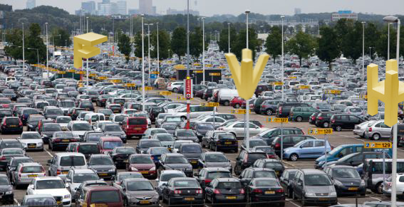
When we think about some known examples of typeface in public space we soon think about logo’s or indication of places (for example in public transport). It’s impossible to miss it on the highway: the Mc Donalds indication. Maybe that’s a part of the success of the logo next to the road; it is recognizable and readable from two directions. But is it also a 4D typeface? The definition of 4D typography: “4D Typography is the result of intersectioning, in an orthogonal way in space, two extrusions of the same character, which allows the spectator to read it from, minimum, two different positions in space.” (Lo Siento, 2012) that means that the Mc Donalds indication next to the road (what is readable from both sides) is a 4D typeface. But of course when the Mc Donalds logo is placed on a wall of a restaurant, this is not the case.
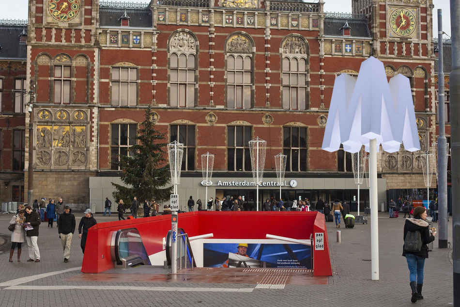
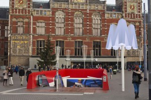
A second example of 4D typeface in public spaces is a place indication, for example a subway. In the Netherlands you see this a lot in the form of a cube with the letter ‘M’ printed on every side. The indication sign is readable from more perspectives (at least four). But… here starts the question: is it allowed to call this a 4D typeface when it is a cube with a printed letter on each side? When you ask me, it isn’t because the indication (the cube itself ) is not a character.


To define that 4D typeface will fit in public space, the opinion of the pubic on these places is important. To find out these opinions I went to Schiphol airport, the library in Middelburg and the railway station Rotterdam Central. Prominent is that a big part of the respondents (above 90%) never heard about 4D typeface. When I showed the 4D typeface of Lo Siento, there were not many people who recognized this way of typography. Of course they did when I showed them a picture of the indication of Mc Donalds. When I asked them about their opinion, a lot of people reacted really positive. Over all they thought that it is a really attractive supplement in public spaces. Eva: “For me it is really appealing. 4D typeface could give the usual (mostly boring) indications a new life.” Next to all these positive reactions there were also some negative points, mostly about the readability. Richard: “This way of designing is much better, nice! But I think it’s not always possible to use 4D typeface. The character ‘R’ is a difficult one, they should be careful with that.”
Ways to put 4D typeface in public spaces
In this research I couldn’t find many examples of 4D typeface, especially not in the public spaces. But the people I interviewed where really positive about it. I think (and the respondents also did) that 4D typeface could be a new supplement in the public spaces. I will give you some examples how we could do it. I hope that this way of typeface will pick up fast in the public spaces. For me this is a big discovery in the typeface.

Friday, October 19, 2012
 Marie De Bruyn makes monumental objects out of hand blown glass alongside video work and wooden constructions resulting in hybrid installations. Apart from the making process she is interested in integrating objects in a specific setting, creating atmospheres where the viewer can engage in a physical relation towards the objects and their surrounding space. Similar to Brancusi’s sculptural permutations – arranging and re-arranging the space in between his sculptures – the placing of an object is as important as the object itself.
Her work is about the relation  between the perception of inner and outer. ‘How do we deal with our (surrounding) space? How do we position ourselves towards ourselves, the people around us, and the objects taking place in a given situation?’ The theses then discusses the function of the surrounding in the work of Dan Graham and those of body and space in the work of Richard Serra

Download thesis : We sence volume before we can articulate it [in dutch]
[images of Marie de Bruyn's graduation show
Thursday, July 15, 2010

intuitive fear spaces
Architectorial anxiety.
Can I design a space that uses my experience of fear to design the perfect safe zone? How can I shape a space which gives one freedom and privacy but which is not enclosed?
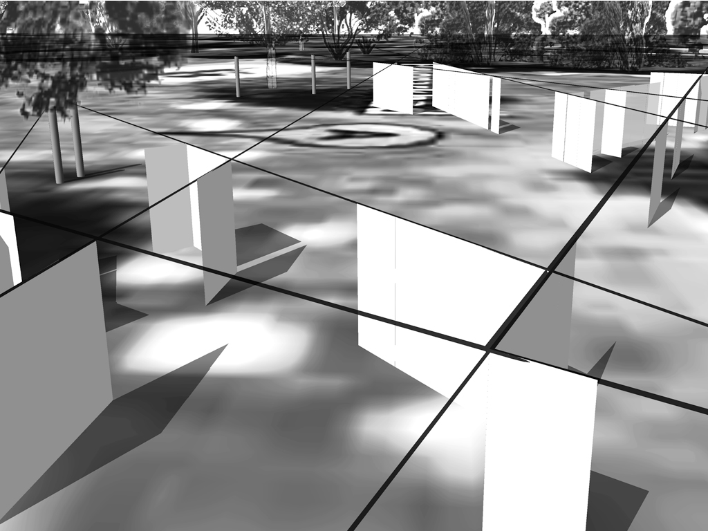
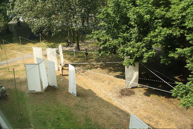
Shields and Shelter is a design for the grounds of the public bath – Flevoparkbad [link] – in Amsterdam. For the Rietveld graduation exhibition 2010, I realized a 1:1 detail of my design on the lawn behind the Rietveld Academy.
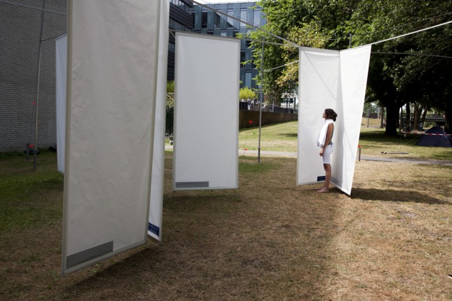
above : a 1:1 detail of my Flevoparkbad design on the lawn behind the Rietveld Academy.
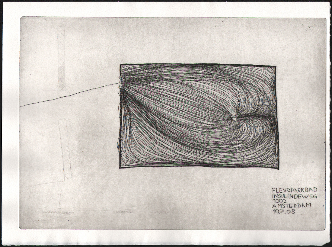
In Shields and Shelter I applied step by step the guidelines that I have developed to achieve safe and comfortable zones using my own fear experiences. These guidelines involve architectural concepts like shielding and view, shadow and light, flexibility versus rigidity. The perfect safe zone to me is a flexible space which gives one freedom and privacy but which is not enclosed. As basis for the design drawings I used an aerial photo from Google Earth of Flevoparkbad. From each towel, I constructed lines of sight from 120° angle views. Through shading these 120° triangles a map emerges with different degrees of surveillance. The darker the area, the more views. At the darkest areas the view must be blocked. Therefore I developed shields, which can be slided along rails that follow the lines of sight. This allows the bathers to adjust their exposure to others according to their own wishes.
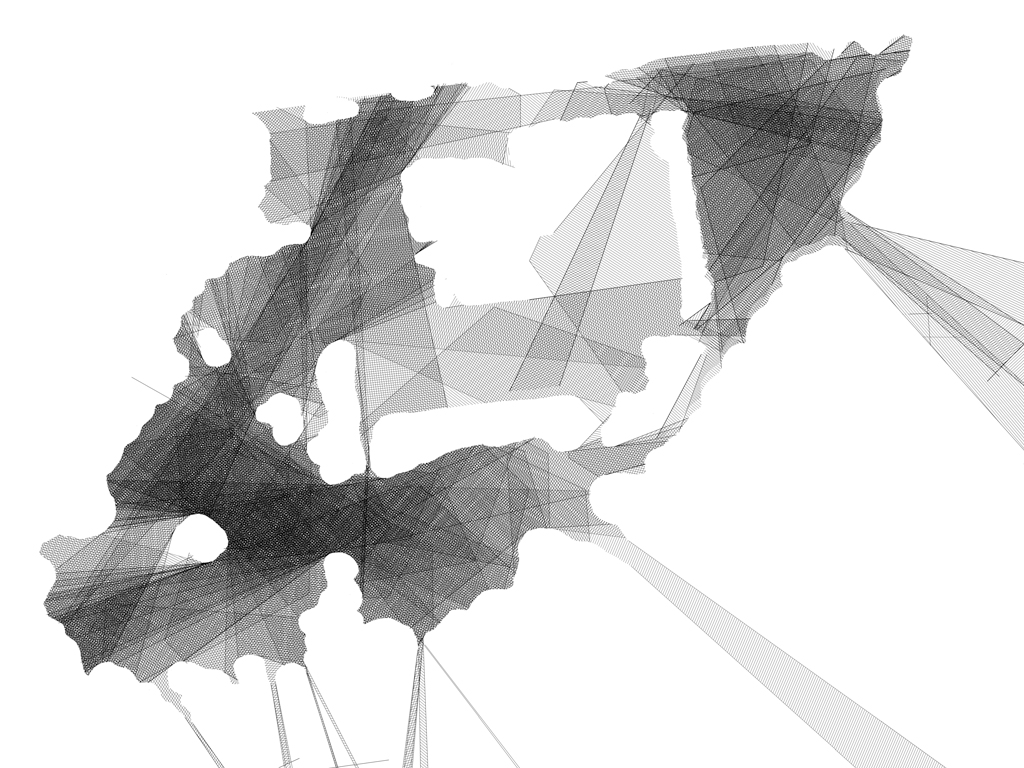
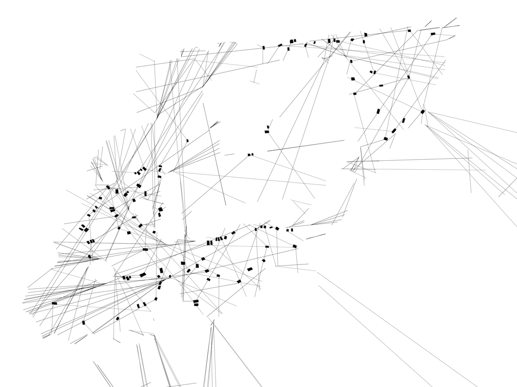
tracing the 'feel' zones and the emotion lines and reproducing them in a real situation.
From the jury rapport : Kristin Maurer’s installation outside is a whole new interpretation of space. Space can be created by shadows as well as materials. This is what struck our jury-members. Next to this the technical realization of the work is stunning and therefore our members of the jury wanted to celebrate this piece of work.
etchings at graduation show 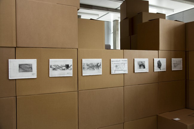
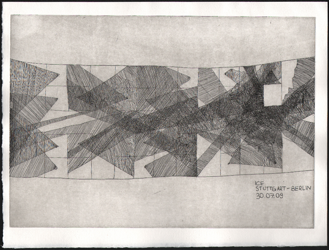
The etchings in the thesis, presented as part of the graduation show, are ground plans of remembered fear spaces. A scheme of lines of sight in train, Kristin Maurer, 2009 [etching]
Download thesis: Architectural anxiety. the perfect safe zone
Tuesday, November 17, 2009
A hole, a crack, a black space – consisting of nothing!
I came to the bookshelf to choose my book and what i found was a book on its own and a large space which seperated it from the main body of the other books. The absence of something was so present for me in its tension that it drew my attention to that spot right away. Like the suspense of quiet in between movements of musical symphony the quietness was pointing and preparing me for this one very special book.
Rietveld Library code: *7399*
Monday, November 16, 2009
At March 16th 1992, Cornelia, Jane, Greetje, en Weimpje Koelewijn Vermeer cleaned the pavilion of the Gerrit Rietveld Academie.

the soberness and functionality of Rietveld
the neatness and the costume of the women from Spakenburg
respect
space – light – color.
a women that cleans will not lose her morality.


Job Koelewijn, Winner of the Dr A.H. Heineken Prize for Art (2006) talks.
photo’s by Erik van de Boom, reprinted from Rietveld Publication no 76
By Henk Groenendijk
/ Categories: Folklore Project, performance, photography, product design Tags: clean, color, customs, Job Koelewijn, light, memory, respect, space, women
No Comments
Tuesday, September 8, 2009
 Welcome again to Designblog.
We hope you have enjoyed all our contributions and project of the last season published by the students, professors and guests of the Gerrit Rietveld Academie Foundation Year’s Design Program.
As an education project Designblog is constantly publishing new content and reinventing it’s format. Not satisfied with the option of being a publishing platform only, we do investigate all posibilities to become an engine aswell. We hope you enjoy the experiment.
Designblog is also a platform to show some of the dynamics going on in the Foundation Year’s Design Program and the many faces it can make….like:
.
DESIGN OF SPACES/architectonical design by Carla Boomkens
A project in which the making of spaces and their expressive means are investigated. Both real size- and scale models of spaces are ventured in this short-term research-laboratory on visual, functional and communicative qualities, according to a well specified theme.


Ranging from a tent-cabin to the built environment of a city, the very function of the constructed space offers the specific features to it, and thus the means for visual expression: defining the way a space can be specificly experienced. By analyzing the function unforeseen connections are to be revealed, which broaden the effective visual spelling and open doors to subtle and precise visual communication.


Examples of existing spaces and/or buildings will be extensively introduced and discussed as guidelines: the knowledge and understanding of the motives of their authors challenges to reflect on the motives of one’s own expression – it both intensifies and relativates. The visual research is valued as the most important contribution to the workshop, the results are considered as a consequence, not as a singular aim. About technique for building: through the making of the (scale)models the fundamental principles of construction will evidence themselves – and will be coached when the work calls for it.


text by Carla Boomkens /images & models by the students