Skip to Content Skip to Search Go to Top Navigation Go to Side Menu


"Subjective library 3" Project


A Book Makes History?


Thursday, April 11, 2013

When I search for a book in a library or in a book store the design as well as the title of the book has to be eye catching, recognizable for me and outstanding in its own appearance between hundreds or even thousands of books, especially if I’m not searching for something specific and have to walk through an overwhelming sea of letters and information’s.
Therefore the title, the subject or the design of the book doesn’t have to be beautiful or about something I’m interested in, it could be anything from an absurd, paradox, nonsense title/subject to an extremely kitschy, not aesthetically attracted cover design. The most important thing for me is to not only recognize it in ways of attraction rather as well in ways of questioning the whole appearance, the first impression of it.
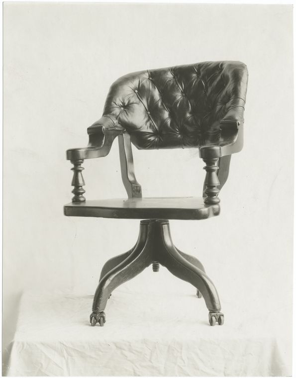
The first book that got my attention was the German book “Ein Stuhl macht Geschichte” from Werner Möller and Otkar Mácel, a book about different design chairs of an exhibition in the Bauhaus Dessau in 1992. It was not the subject which interested me; it was the title which first made me laugh. Normally I would connect the sentence “A chair makes history” not with a chair, something that makes history for me are people or certain happenings in the past history which are responsible for certain effects on our society or changing points in our systems of thinking or culture as well as political behaviors.  Of course I can see that the design of some of the chairs could have had a certain influence on a new way of living, a new lifestyle but I still see the title connected to a persona or a personification, a group of people or a movement which changed something more life essential than a chair (which mostly just changed something in the “history” for a smaller group of people). To be honest I think it was just absurd and funny for me to use such a personifying sentence for some object like a chair, which you basically use to relax your ass.
The Cover in that context to this thought was even more interesting, you can see on the front as well as on the back page black and white images of different Bauhaus chairs which have for me the appearance of old portraits of important figures of the human history, covered by a big black and white image of a Mies van der Rohe chair. For me that was definitely an interesting way of the personifications of chairs in context to the title as something historically important, almost holy, like the birth of Jesus Christ. I’m looking right now at the book and I’m still impressed by just the visual effect of it. I think it is the first time that I’m actually more interested in the cover as in the subject of the literature.

Rietveld Library cat.nr: 774.4-cat-20

Moral panic? No worries, there is a whole encyclopedia to help a filthy girl out!


Thursday, April 11, 2013

I had to swallow a bit of vomit in my mouth when I saw the cover with the title “Girl culture”. Raw quiche for breakfast was a good choice. And then the stupid pictures of: girls hogging a mirror to smack make-up in their faces. A little (girl)child in a fluffy room with bubbles and pink fluff and beauty queens.
How fucking stupid is that? Puke factor is high.
Girls do other shit than that, I thought. And then I felt a little bit better when I discovered a tiny picture of three girls in a locker room dressed in football gear.
Better, but not well enough. Because I flip the cover to get to the List of Entries. Scrolling down for my favorite two topics. As the girl I am surely they should be listed here, yes?
Baby phat
Backstreet Boys

Breast enhancement
Covering over
Dirty Dancing
Easy-Bake Oven
Fairy Tales
Fat Girl
Felicity
Filmmaking
Feminism? Nope.
And then I puke all over it. Damn it. All that raw quiche, took me a lot of time and love to make, wasted.

I scroll down.
Gilmore Girls
Hello Kitty
Innocence
JAP (Jewish American Princess)
Ken
Little women
Lopez, Jennifer
Madonna
Magazines
Moral panic
My little pony
Masturbation? Nada. “We rather put Moral panic in there”. Truly saddening. The way we’re obstructed, sub consciously, by images and mould by the power of words. Girl culture. With no equality nor sexuality. Ignorant and poor point of view.
Beware of shit like this coming your way. Because this was, as the title said, only VOLUME 2, there’s probably a VOLUME 1 out there too.

Rietveld Library cat.nr: 905.2

Amulet


Thursday, April 11, 2013

When I saw this book first time some one was checking it and considering to take it, which immediately attracted my attention. It happens to me some times. I asked that person If I could see it as well. When I opened first page I saw a fungus. It’s a glue got rotten. The book is broken, so you can see the glue between first page and the cover. The cover of the book looks quite boring and dirty. I made my mind. I fall in love with rotten glue. It is a palette from dark brown to yellow and beige with little crumbles and cracks. The same on the back side. I don’t know what happened there but I don’t see that often a pure life inside of books.

Pictures in the book are quite kitsch. Many of them I would say are very bad and cheesy. You are not really able to see a tittle of the book when you hold it first time. The tittle is Amulet. It is about jewelries. Jewelries are presented on the different parts of a human body inside  of geometric shapes. All the picture are taken on a way to make you think about vaginas and penises. The book has been taken from the library 7 times from 1993 to 2002. I guess it has not been opened that often. Probably it is a reason why the new life got born. It made me think about books in the third row on the top shelf at my parents house. Some of them will be never opened again. I am wondering what could happen there.

Rietveld Library cat.nr:777.6 cat 179


CHINESE BOOK


Thursday, April 11, 2013

The title got me immediately.
40 years of Chinese rock’n’roll is the title of the book. The typical stereotype of Asian people is that they are quiet, down to earth and hard workers.
What I experienced with Asian people is that they aren’t indeed that outgoing as for example people from the United States.
So I expected some Rock’n’Roll pictures that will change my thoughts about the stereotype of Asian people.
The print on the cover shows Chinese men sitting behind baskets with something I guess like potatoes.
Is there a price card in the basket?
Because there are a lot of cards coming out of the baskets.
But they are all red.
There is also a light yellow in the cover that reminds me of Tuscany.
I’m always searching for those pastel colors because it reminds me of the Mediterranean happiness.
The happiness of being always welcome to have dinner with the whole family. Also getting a lot of food because there is plenty enough. Eating good food instead of designed restaurant food with always a piece of parsley.
Being surrounded by a lot of people and sunlight that will lighten up your whole world.
The inside of the book shows a lot of different pictures.
Paintings made of the same fragments but showing 1 image.
Like a picture, all the pixels will become 1 image.
The structured chaos is something that surprises me in the book.
I know that you shouldn’t talk bullshit so this is everything I wanted to say about the book.
But I will give you a Chinese poem to read:

Thoughts afar in moonlight
by Zhang Jiu Ling

A bright moon rising over the sea,
Shores apart, watching the same
Is someone dear to me.
I loath this endless night;
And could not sleep but think of thee.
In this full moon light,
Who cares for candlelight?
Stepping out I don my gown,
And feel dew on the ground.
I wish to offer you moonlight in a handful,
But, to my real shame, ’tis impossible.
Retiring to my bed, it seems, I might find happier days in dreams

Rietveld Library cat.nr: 16845

Visual differences


Thursday, April 11, 2013


When we start talking about choosing a book on subjective grounds, we must first really understand what the term subjective actually means. So what exactly does it mean? Subjectivity is something existing in the mind. A subjective evaluation is different for every individual, everybody differs from each other, each of us have our very own personal taste and characteristics. Subjectivity places emphasis on one’s own moods, attitudes, opinions, perspectives, it relates to properties or specific conditions of the minds as distinguished from general or universal experience. One chooses an object mostly based on his or hers own subjective criteria. If you were to be presented with the opportunity of getting one free book out of a library without actually knowing the content inside the book, that would be the moment when you start choosing based on your own subjective criteria, you would start judging the book by the cover, its layout, the colors, letter type, fond, the texture and of course based on your own personal taste and what you find interesting or not, what grabs your attention or not. When I was placed in this situation I started looking at the bookshelves after which I realized that most of the books look basically the same from the sides. Most of them seemed boring and didn’t grab my attention, the few that I actually took out of the shelf were the once that stood out, the once that had a different aspect out of all the other, like uncommon letter types, or a visually nice combination of colors.

The book I ended up with is a book called Nest. and it’s about interior design. I choose this book because it is really different than the others.  When I saw it on the shelf I thought that the book was placed on its wrong side, when took it out I noticed that this book actually didn’t have a side cover. I immediately liked the book, the front and the back cover are the same, dark grey (which is one of my favorite colors) hard cardboard , with big white letters for the title and a small white square with a few words about the content of the book. The cover itself is quite simple and plain, I’m a person that likes simplicity so this grabbed my attention. What I liked most about the book and the reason why I chose this one over all the other once is that this book doesn’t have pages it is actually a long flyer folded zigzagged into a book. So I guess what made me choose the book is the design of the book self and its layout.

Rietveld Library cat.nr: 774.5

you remind me of gold


Thursday, April 11, 2013


Gold. I was thinking of all these gold bars, piled up in heaps somewhere.
 
It is a material like any other.


You can pile it up, stack it, cut it, bend it, shape it.
 
When I think of gold I see
 
minerals
 
stone collections
 
science
 
jewelry
 
the earth
 
and something romantic.
 
I see things that glitter in the dark, I see mysterious sparkling sources.
 
Like Anselm Kiefer’s gigantic paintings with small outstanding elements that speak to you.
 
Like the canopy of heaven and the sublime creatures drawn in patterns over a night sky with tiny flickering lights.
 
It is all very dramatic.


Like the phrase “You remind me of gold”. I would like to use that phrase of someone. I heard it in a poem somewhere and I like it. I would say that out loud and I would mean it.


“You remind me of gold, you remind me of gold, you remind me of gold”


It is sleezy and dramatic, it is far too romantic, but that’s how I want it to be.
And I guess it’s true that the people I felt love for would in a sense be golden.
After all, gold is just a material like any other and it’s all natural.


It is like this phrase “Eternally Yours”.
I don’t know if I believe in those kinds of words, but in a way I guess I do.
I think I am eternally yours to everyone I ever loved, in a way, and I will never leave them, nor will they leave me, regardless of physical distance or time. That’s how it is with love, I think.


I like small things. Things that don’t speak out too loud, that don’t shout or take place, but keep their integrity. These things intrigue me. They make me want to step up and look closer.
 
When I think about it I realize now that I have the same preferences for objects as for humans.


I also like black and white photographs, and the slightly worn-out look.
 
Like there is something forgotten in time, something that is slightly bashed and overlooked. It could be an old suitcase, a forgotten text, a worn-out shirt.
 
I have a lot of love for these kinds of objects.
Somehow when I look at them it is like they are all speaking to me at the same time,
saying something like
 
“Hey, look at me! I’m ragged but I’m alright”.

Rietveld Library cat.nr: 770.6-hin-1

What if the content DIDN’T matter


Thursday, April 11, 2013

Already as a young girl I had this specific love for libraries, though I’m scared they don’t love me back that much because I always seem to forget to get the books back on time… But anyway, being in a library felt like an adventurous gateway to all this different worlds and lives.

As a kid you make a decision on whether you like the cover or not, or on the amount of nice pictures in a book. When you grow older, the content starts to matter more and more, until it is the only thing that counts.

So last week I went to a library as if I was six years old again. Not thinking about a topic, just looking around and seeing which book catches my eye. And after some sniffing around, I found it: the book I didn’t know I wanted. On the uttermost left corner of a bottom shelf of the graphic design section, it was hiding. It had a small cover made out of a black fabric, like a luxurious pocket size notebook. But when I grabbed it, it didn’t seem to stop! Thinking it was a small notebook; it appeared twice as long as I thought it would be. Completely black, even the letters on the cover were black. It said: ‘Vladimir Navokov’. Given the fact that I found this booklet in the graphic design section, I would say, it is a rather odd place for a book of this old Russian writer.

The explanation would soon follow, because when I opened the book, it appeared to be filled with beautiful descriptions of fantasy’s Nabokov had when he thought of a specific letter. Each description came along with an illustration of the described letter. It seemed to be a new dimension of learning how to read.

This whole booklet breathes a sense of care and love for detail, a feature I can relay to a lot when I think of my own work. Even the smell is part of it. Exploring a publication on every detail you can find in the cover and layout, but without really knowing the content. And when I was studying this book, on the ground of the graphic design section of the library, I felt like I was six years old again.

Rietveld Library cat.nr: 757.3

The personal problem of contemporary architecture


Thursday, April 11, 2013

This building is one out of a million examples of problematic contemporary architecture. A grey building in a grey country, no exciting materials used, no decoration, not any different from the next building, no ambiance created, no emotion left behind, no warmth expressed, no nothing.

When I took a glance at the design books, my choice was clear rather soon; ‘Contemporary Architecture’. Admittedly, the contemporary architecture shown in in this particular book, which has an incredibly creative title for a book about contemporary architecture, is much better than the regular architecture you can see around you. Yet it will never change my opinion that Bauhaus has stopped any evolution in the artistic field of architecture.

How is it possible that in all fields of art, the artistic styles change so rapidly, while architecture looks almost the same for several decades?
You can’t compare films from the sixties with contemporary movies.
You can’t compare early photography with contemporary photography.
You can easily compare architecture of the 1920s with contemporary architecture.

Why oh why with our modern tools do we still worship the rules of Bauhaus?
Why do we fear decoration? Why do we need to make our homes so practical that we forget its real use: to feel home. Let’s face it; we are not living in a country where it’s a luxury to have a home at all, the use of homes in ‘our world’ is to feel at home. But no, we have to keep it gray, un personal, zero decoration.

Do I have such an untrained eye or do all products of architects look the same indeed?
Is it just what I see or are architects really so conservative? I’d just love to see architecture that acknowledges that a home is more than a frame. Let’s just make our homes our homes again, let’s stop those grey ‘machines for living’, those brick houses with their built-in BBQs, those average-man gardens with one tree surrounded by high anti-neighbour fences.

Ah well, I could probably have approached this subject in a more sensible way, with better arguments and all that, but hey, I am here to write a subjective article about the book that caught my eye – I can’t make it any more subjective than this.

It’s time for a revolution though. Dear architects, grow some balls and be creative, not practical.

Rietveld Library cat.nr: 13053

Hands up here comes the paperback traveller


Wednesday, April 10, 2013


There is at least fifty books on each shelves. Fifty title, and probably as much authors’ name. Maybe less actually if on have more than one book in this section. Go for a stroll among them is quiet random. Your eyes get caught and release instantly. The purpose is not to look for something. The quest without no goal has something relaxing. Maybe the atmosphere of the library is issue from that. A group of lonely loafer in between an ocean of lonely writers. If choosing imply the end of the journey, I might go on a bit longer.

Eyes flying over the cover. Plans among dead trees, I keep traveling. Suddenly I try a different contact, I touch. As the first encounter to this unknown world, my risk is huge. Infinity of lines, cliff to climb up and down. My first handlers is a soft old cover. The time is entering the journey now. Should I old to that?

I must take a precaution. Let’s stay simple and small. The comfort is not something to underestimate in trip. Over the practicality of the diary the relation toward the pocket map is always different.

Bending over, to put it back down. Rock and roll over the wooden shelves. Hold on sailor the storm shall end soon. A riff of page, this might be the end. It cant be that. Not now, the exploration started the dream catcher. The fingers are getting more grip as the training goes on. A ballerina step to the right, and the right hand got catch at the bottom left. Two flip, and a perfect landing on a monograph. But the local topics miss eccentricity. Layers of clouds over paper skin and the way thats getting more fogy. There not wet season forecast, but the time run on my watch. Straight turn to the left and larboard all sailor. Here it is, pocket size and soft paper. You must move rocks to find some precious grass. But the harvest isn’t always a success. But a web start to catch the essential. Title, destination, impossible choices. The hands go down the mine. No pity, scratch, move, rip it off to catch it. The lonely traveler is now isolated.

Unsatisfactory  feeling of beautiful emptiness. No more drift. Camping isn’t aloud on this land. The eyes get back on the track. Catch a pattern, them two. Hundreds of maps in my small hands. The plastic shield doesn’t matter anymore. The balance in the right arm sounds okay. The secret isn’t reveal and the quest over. There is always a next season to picking books. Run, run, booty in the hand and new journey to begin.

Rietveld Library cat.nr: 6247

Styles of Yesterday and Today


Wednesday, April 10, 2013

I always had an interest for braids and techniques of threading hair.
I grew up with a Jamaican and Haitian traditions, culture, and food.
The first time i can remember i got my hair braided was on the a beach in Aruba, I was eight years old. They had these braiding hair stands for tourist next to the hotels. And just for kicks, me and my aunt went to visit one to do my hair. It was a Jamaican lady called Paula, she insisted i get corn rolls and since then i was hooked. Every month i would ask one of my babysitters at home to braid my hair. I would always ask for a new style, something different then the month before.
You can imagine how much i got teased at my elementary school, i was the only Caucasian girl with these erratic hairstyles. But i never cared, i love it.
And thats why i choose this book not only for my childhood memories but for its appreciation of the world of hair design and styles. It is a technique that is not easily recognized in the world of design, but if you see clearly it is a design piece and sculpture on its own.
Not only does it take a great deal of time, it takes a skilled and patient hands to work with these complex styles and forms. In this book Sagay describes two different techniques, cornrowing and hair threading, with enough clarity and step by step photos that it is possible for a beginner to achieve one of the styles. There are also many outrageously time-consuming examples that would challenge the most proficient hair stylist to reach new heights of difficulty. Sheer, outrageous fantasy is the only way to describe some of the hair styles, but they are still fun to see.
She also gives a fair amount of historical background to show where and when the hairstyles originated. I was fascinated to discover that some of the hairdressing ingredients used in Africa were oil, charcoal and clay. The faces of the women and girls in the book are serene, joyful and proud. I wish that the book was updated to show current styles and that some of the photos were in color.

Rietveld Library cat.nr: 774.5

Design > Art / Design = Art ; tagging the Rietveld library


Wednesday, December 9, 2009

“subjective library” images and flickr tag-cloud

Read the reflections of students as A and C group journey into the Rietveld Library’s Design and Art section. A journey to investigate, making our fascinations, preconceptions and hidden desires manifest. How does a subjective book choice create a personal mirror and leave traces (tags), connecting Design to Art, exposing autonomy in both.

Read about the subjective, open and intiutive first book choices from the Design section of our library. Wonder about those tags connected to their accounts. Follow the continuing storiy after a second book is selected, based on those tags created. Witness the third posting in which those sets of tags lead us from Design to Art. A move that forces us to reflect upon the connection between them both.

Follow the continuing accounts of the three succeeding investigating postings by clicking on the yellow link. Experience the total list of tags created during this “Subjective Library” Project.

LIST OF TAGS:

3289 days, A4, cover, funky colors, television, unatractive, film photography : fauna, flora, interesting, lines, strange, fluffy, simple, horrible, brainwork, complicated, proud, “to know” : disorder, game, grid, systematization, “One Minute Sculpture” : library, swindler, breaking news, library loser, extraordinary, talented : space, absence-presence, framework, surrounding, returning : abnormal, rediscover, choice, plain, others : 1000, 754., direction, signs, city, direction, traffic, political, posters : blue Pinocchio, screaming, spine of book, blue, Pinocchio, blue fairy, eyecandy, contemporary, folk, mentality : not getting there, unknown, judging by covers, content, connection, strangers, subject : supermarket, theft, housewife, tiny, midlife crisis, multilingual : logic, question, reason, consciousness, interest, remarks, impossible, mathematical, perspective : attraction, strange, swissfolk, art, death, life, love, Maurizio Cattelan : cover, old book, unique, obsession, miniature : Anita, eyes, portrait, dominant, name, color, film : Wiener Werkstätte, characteristic, hand work, mass fabrication, original, process, realization, detail, photography, the nude : cheap fashion, funny, random, tattoo, tribe, weird, mysterious, tribe : attraction, new texture, action, quick, warning, a priori, new, amusement, choices, eye-catching, eyes, random : escape reality, library, overflow of impulses, fruitless reality, jostling time, absorbing force, déjà-vu : arrange, industrial, library, architecture, museum, self-made, Andreas Gursky, index : city, nomadic, reality, funky, colors, interiors : contrast, fat, texture, typography, culture, nudity : conceptional, distance, no image, steps, thinking space, braille : cat, compulsive, font, chaos, subjective, illustration, objective, random, Tadao Ando : airplane, airport, choice, structure, worldmap, 756, 80’s, human, machines, unique, flying : dot, jewelry, shapes & forms, yellow, children, fun, paint, playful, all colors, blue, green, theory : extraordinary, life, normal, objects, absurd : 80’s, desire, fashion, party, techno, desire, fabrics, orgasmatic : alchemy, identical, methaphysics, mysticism, mythology, Arabic, identical, inaccurate, ladies, naked, orient, sculptures, stereotypes : Canada, Indian symbols, kitsch, raven, Indian art, Mexico, Jeff Koons, porn : attraction, gold, meeting an old lover, recognition, cheap, irresistibility, not psychology, wrong, beauty, compare, contrast, couple, same, similarity, together, two books, ugliness : connection, embroidery, hundred years, death, funerals, general terms, invisible, object, spirit, visible : color, feeling, personal story, feminism, graphic : first sight, mystery, old-fashioned, bloody, mad, rituals, revelatory, Yin : oblivion, automatic lives, bottom shelve, eat, mantra, story-making, colorful, dogs, double-take, eat sleep, vases, vegetables : attracted, nothing, black, disturbing.

still curious read the books involved at the Gerrit Rietveld Library, (catalogue numbers are included).

Kandinsky’s Color Theory


Tuesday, December 8, 2009

Since I have chosen books in which the yellow color has been part of the content in different contexts, I took a book by Wassily Kandinsky for the last posting. The book describes a Color Theory according to Wassily Kandinsky, “Concerning the Spiritual in Art”. Here is his theory of the color yellow and the color that he thinks is the most opposite of yellow (blue).

Yellow means “warm,” “cheeky and exciting,” “disturbing for people,” “typical earthly color,” “compared with the mood of a person it could have the effect of representing madness in color […] an attack of rage, blind madness, maniacal rage.

Blue means “deep, inner, supernatural, peaceful “Sinking towards black, it has the overtone of a mourning that is not human.” “typical heavenly color”

Number: Kan 5

Still life


Tuesday, December 8, 2009

This time I looked for a book that would fit the previous two just as well as they fitted to each other. In connection to everyday life this book is about texture, colour and feeling of objects and scenes. It’s about the crackly sound of fabric, the smell of things, composition but also about life and death. It’s a book about modern still lives.

The under title is Objects of Desire; and now thinking about it, it is not a bad choice at all. It fits perfectly with the first book because they both represent the normal ordinary things. It suits the second one mainly because it’s as serious as the reality of daily life. It’s definitely a representation of the world in every aspect. Maybe the only tag word that is not so obvious is ‘absurd’, though it’s really there, just on a more underlying surface; subtler I guess.

Rietveld Library Code: 708.5-cat-43

From Patterns to Porn…


Tuesday, December 8, 2009

The step from traditional Mexican textile patterns to (soft) porn seems to be quite a big one. How would can you link these too subjects? They don’t seem to have too much in common. For at least as far as I know there’s no fetish movement that is sexually obsessed with traditional clothing that is hand made by Indian tribes of Middle America. But ey. You never know…

Anyhow: One posibble solution to this riddle goes by the name of Jeff Koons. If you try to find a book with the tagword “kitsch” you will find almost nothing – if it wasn’t for Jeff Koons. With his work I have the same ambiguous love-hate relationship that is characterizing my affiliation to Indian art as well. I described this in my first entry. So to close this blog I chose a book titled “The Jeff Koons Handbook”. Since everyone is familiar with Koon’s Balloon dogs I want to invite you to take a look at his photographic “art” – or rather: bad, bad kitsch…

– koon – 3

A Design Source Book…


Tuesday, December 8, 2009

The second book I chose is titled Mexican Patterns – A design source book. As the title suggest already this book is meant to inspire modern designers. Content wise the book is dealing with the very traditional and yet so vivid patterns of current Mexican textiles. Or in the words of the author Chloë Sayer: “Contemporary Mexican textile design derives its richness and variety from the fusion over centuries of decorative skills from both old and new worlds.”

This mix of traditional elements and modern influences makes the patterns so appealing and at the same time so open to the exploitation for kitschy designs. The patterns seem to be almost as vulnerable to this as the habits and customs of their creators are to the influences of the so-called modern world.

Again I have this strange mix of feelings: On the one hand there is the recognition of the craftsmanship and the tradition. On the other hand I can’t help getting the feeling that it’s all merely kitsch…

779.9 say 1

Now that I know why


Tuesday, December 8, 2009

The Second Design Book I choose to read and write about is one I picked out because of its beautiful side containing the text “eternally yours.” Also on the cover picture you see a couple kissing caught my eyes. When opening this book you see more photos of couples in love. Also this book is a sort of edited version because its full of marks made by former readers. This gives me the feeling that the book is very interesting, without even reading it. In my last posting I wrote about my questioning about the Why? Now I found out what the most important reason is to pick one book over the others. It’s not about the texts cause I can hardly find the effort to read it. It’s about my unconscious mind. For people who are interested in this book and not in my personal bullshit you can find this book about visions on product endurance in the library of the Gerrit Rietveld Academy under the number 770,6 hin 11

“The Nude…”


Tuesday, December 8, 2009

In the first books I choose, everything was planned. Every stroke and detail. Design is a view of something. From something which is mostly they same in somebody’s mind as in reality.

My other book is about photography, photography from naked people. It is called: “The Nude in Czech Photography”

I was inspired by tags from the second book, originally, realization and process. Human body, every body is original. Every body is unique, there is no body the same. The product in my other books are all things were you can make more of the same.

I have choose nudes photography because it is always about process and realization. If you ask a person to pose, you have to read their body language. You have to understand the light and try to photograph the energy from the person. A photo shoot is a ritual where your ideas become really with your improvisation.

Process from the photo is just as important as by design. In photography are photoshop and the dark-room two of the most important items. In the end I think that this book “The Nude” totally is related to my other books but also totally different.

(from the personal library)


Log in
subscribe