This article aims to compare two bibles, Sophia bible from Holland and The Mother of Pearl bible from Belgium, both found at the Design Derby Exhibition at the Boijmans van Beuningen museum in Rotterdam.
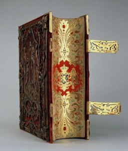
The ‘Sophia bible’ was made by Dutch publishers ‘Uitgeverij van Goor’, a family run business who specialized in Children’s literature. It was made for Queen Sophia and the Dutch King Willem III in 1855. It was called the Sophia bible, after King Willem’s wife Sophia of Württemberg. It was for public sale, but two very ornamental copies were reserved for the Royalty.
The bible is bound with calf’s skin and velvet, decorated with wooden graphics and golden clasps. Sophia bible is illustrated, suggesting that it’s function was more ornamental than informative.
(Taking it’s style from Art Nouveau, )
The 19th century was a time of civil unrest in the Netherlands, as there was much conflict between the Protestant and Catholic churches. In 1853, King Willem gave permission for the Roman Catholic bishop hood to be restored. Although the Royalty remained favorable to the Protestant Church, this elaborately decorated bible could have been an attempt for the King to neutralize the differences between the two sides, as it’s ornamental design refers far more to Roman Catholicism, than to the more humble, Protestant style.
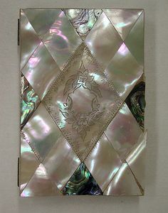
The Mother of Pearl bible, published by the Belgian publishers ‘Brepols‘ in 1882 is a small, silver bible made from Mother of Pearl, gold leaf and copper. It’s Art Deco Style owes to the geometrical triangles, it has a small clasp and is made to be kept close at hand. This may be because the popularity of Christianity was declining in the late 19th century, meaning people wanted to protect and prove their faith. A pocket sized bible would mean people could read from it on the streets, either preaching from it, or using it to prove a Christian identity. In 1882, Belgium was Roman Catholic, so the pearl bible was too. The Belgian publisher ‘Brepols’ was a family run business, who coincidentally also specialized in children’s literature.
The two bibles are vastly different, firstly and most notably, in size, sophia bible is very big compare to the pearl bible .They came from two different ideas of how to practice Christianity. The Sophia bible is purely ornamental, the desire to look inside is great, but the idea of using it as book for Christian practice seems less so. The Belgian Pearl bible is used for reading every day and following faith. It’s hard exterior prevents it from damage, so it is designed to be portable.
Secondly, the design styles. The Belgian bible follows Art Deco, somewhat unlike the rest of Belgian design in the 19th century. It’s symmetrical triangles, it’s ornamental pearl cover and the small copper clasp make the bible elaborately shiny, but also visually very simple. The Dutch Sophia bible was made in the Style of Art Nouveau. It’s design follows Neo-Classicism and Baroque revival design which was popular in Holland in the 1800’s. It’s ornate wooden floral patterns, it’s huge golden clasp and it’s royal red binding make the bible decorative, fitting well with the rest of Dutch design from that period.
Lastly, there is a difference in the Status of the bibles. The Sophia bible was made for Royalty, already this calls for intricate and decorative design. Before the second half of the twentieth century, there seemed to be an unspoken rule that design for Royalty must be elaborate and ornate and just because of this, it creates a huge bias in the design of this bible. The pearl bible is vastly different as it was made for upper middle class Roman Catholics. It was designed far more simply, you would not recognize it as a bible unless you looked inside, whereas the Sophia bible gives it away with the ornate effigy of Christ on its cover.
In conclusion, these bibles are vastly different. Although both using expensive, decorative materials, one is over-designed looking at it from a 21st century eye, whereas the other is far more simplistic. The pearl bible’s Art Deco design is more modern than the Sophia bible, which screams Art Nouveau. They were used for different purposes, I imagine the pearl bible more actively so than the Sophia bible, owing to it’s sheer size and weight. The Sophia bible is probably more fragile than the pearl one, as it has many thin, decorative wooden features which may not survive a fall from table height. The bibles are 30 years apart which was enough time for design styles to change quickly, especially in the second half of the 19th century.
Written Colaboratively with Freja Björnberg