First I would like to start with an introduction of the project. The typographic matchmaking in the city project, launched by the Khatt Foundation, focuses on typography’s use(d) in place-making within an urban context. It will investigate the way that typography can fuse with urban design to create public spaces with an unique sense of place. Places that attract people because they are pleasurable, involve social encounters and immersion in the sights, sounds and atmosphere of the space.
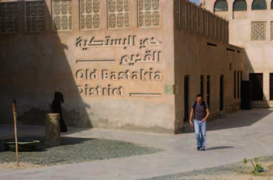
Trying to bring back the traditional use of typography in the city, five teams of fifteen Arab and fifteen Dutch designers collaborated on creating new bilingual typefaces formed for 3-dimensional/architectural applications. The end results of the projects are five new bilingual typefaces, inspired by both Latin and Arabic script traditions. These typefaces will be applied as poetic narratives in the form of participatory public art, into the public spaces of two cities: Dubai and Amsterdam.
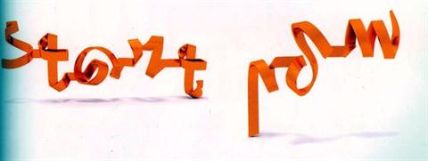
Each team took their inspiration for their typefaces from different sources. Their inspiration, process, brainstorming sessions, early sketches and prototypes are carefully documented [x]. It gives an insight into the thought behind typeface design. A big and complicated challenge in this project –of course– was to create the same visual language and aesthetically corresponding letters (type/font) for two scripts that are structurally very different. One of the five projects is the Kashida. In this project for example, they took inspiration for their typeface from broken pieces of tagliatelle. Kashida became a completely 3-D font, that is, in its result still noticeably coming from the tagliatelle. Here is a program to use Kahshida for your own personal text.
These typefaces are meant to stand out, in contrast to street signs for example, that affect us unconsciously. Eventually, the main goal is to have these typefaces to become part of public space and perhaps even to help create or improve public space.
So far about “matchmaking in the city”. What was more interesting for me, was the fact that for some people typography is a serious and genuine interest, even a passion. For me that is hard to understand. I think typography is something you either love or hate, or to be more subtle, like or don’t like. I can’t “kind of like” the subject, however I can try to get interested, but I will never fall in love with the amazing world of helvetica, verdana and Kashida.
Where did it come from? The urge to design something that has already been designed and been used in currentform for ages; our alphabet, simply how we now it, and once was decided how to write it.
Our alphabet, as we know it know developed from pictographs, that are dated before the 27th century BC, to hieroglyphs, known as the Egyptian writing, to the Phoenicians alphabet (1050 BC), which is first to be composed exclusively of letters and is the earliest alphabet that is directly related to our alphabet now. From this alphabet, the Greek alphabet derived, which in its turn evaluated to the alphabet we use nowadays.
So to make a distinction between the alphabet and typography: “An alphabet is a standard set of letters (basic written symbols or graphemes) which is used to write one or more languages based on the general principle that the letters represent phonemes (basic significant sounds) of the spoken language.” and “Typography is the art and technique of arranging type in order to make language visible”
There actually is a great distinction to make, and that is, that typography is something that is supposed to be designed, it is design. The alphabet is like the entity of typography.
Typography is about arrangement and appearance. This arrangement involves the combination of point size, line length, line spacing, defining the spaces between groups and pairs of letters.
Why do we feel so eager to arrange and to come back to my previous question; why do we want to design something that is, in itself already a design? What can there be designed out of something that already has specific rules to be followed, in order to be understood? Well, apparently, quite a lot. In fact typography is a way to say something in a text that is already saying something.
Typography gives a text a double meaning and can create awareness on itself. With a type font you can force someone to read, or experience a text in a specific way.
With this conclusion I would like to look back at the Typographic Matchmaking in the City project. A project based on trying to design an experience, rather than a type font. By reading a text in Kashida in the context of, for example, an urban environment, could give you, in a way, a certain experience of the space. A harmony or connection between languages and their role in society creates a consciousness of a multicultural space where everyone can feel welcome.
Because of doing this research I was forced to create an interest, not only for the subject I was given, but also for typography in general. I couldn’t have imagined how important a good designed type font can be and what it can evoke. How much time and energy it takes to design one and most important how it connects to way more than only just “saying something” with letters.
Still typography is something I was not made for, as well as typing with Kashida can only interest me for not more than the sentence: Hi, this is a type font.” surprisingly, over all, that was what I enjoyed the most.