Frankly, when I read through the list, I could not find a book which can makes me feel interested just by the title. So I decide to walk through the library and choose.
When I came across this book, as a Chinese person, the first thing I noticed is of course the Chinese title. It is with no doubt a misleading title, I would say, because it is not really about the development of rock and roll music in China during a 40 years period as stated in the title, but about Thomas Bayrle’s own art work and exhibitions and his own trips and experiences about China.

While I pick it up, the very conspicuous red and yellow cover jumped right into my eyes. It is a cartoon like cover, consist only black lines and dots with red tags and yellow people. The title of the book is placed in lower part of right half of the cover, also in red and yellow. After a second I realized this cover is a repetition of a curtain scene: as you can see, two people sitting in front of a pile of potatoes reading booklets while another man open his mouth, seems he was addressing some important issues regarding the potatoes. Which is some very typical political things during the period of Mao’s China.
This cover image is obviously not the original photo, but an art work from the artist, also one of the designers of the this book Thomas Bayrle.

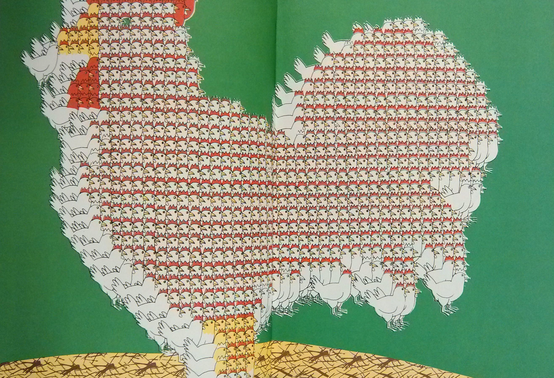
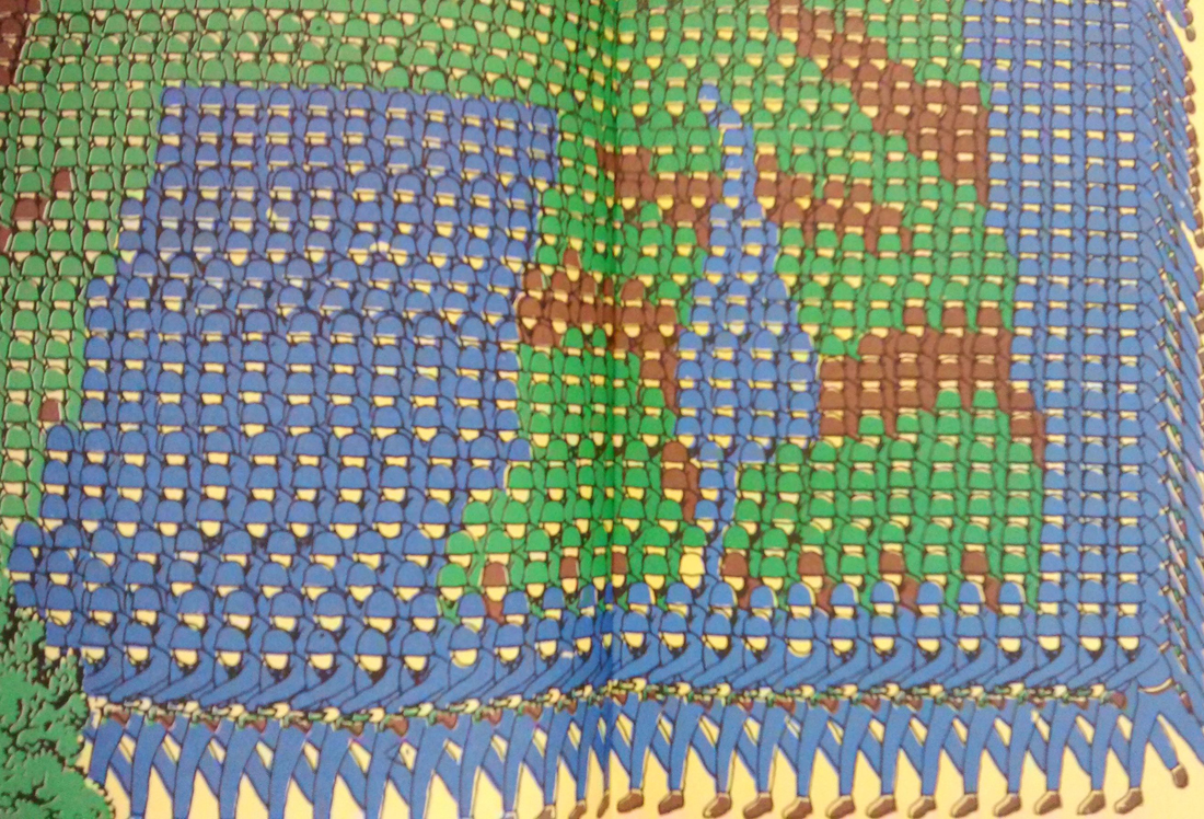
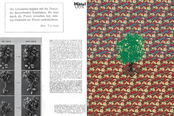
He has always been obsessed with Mao’s China. He remembers him as a young man saw photos of stadium-wide choreographed events there, where thousands of participants held up a sign on command, each sign a pixel in a giant picture. Of replicating that mass choreography in his early moving statues, including Western figures who shaved or ate ice cream collectively and mixing communist and capitalist elements in his work. He says: “irreconcilable ideological opposites thus become ever more similar and down through the years become blurred to the point of the global rock ’n’ roll today.” This volume takes viewers straight into Bayrle’s prescient globalism through bright graphic works featuring repeating soldiers, Maos, chairs and chickens.

The book use a rather soft cover binding, and it does not end just at the backside of the book, but wraps all sides of the book, extend from the back all the way back to the front, then lie beneath the front cover. And pages are printed at full bleed, without text, except for the interview section. I personally think this wrap over cover is a very smart choice. Because when you get your hands on a book for the first time, you will first see the spine of the book, then move to the front cover, then move on to the opposite side of the spine and try to open the book. You already find some clues on how to do that, sort of. But what this book does is trying to hide it, so when you open the book, you will be surprised by the fully printed colorful pages. At least for me it is. Although the cover is kind of the same as the content, I would not think of that, I would easily think the cover is just for drawing attention, which is one of the most significant functions of cover.
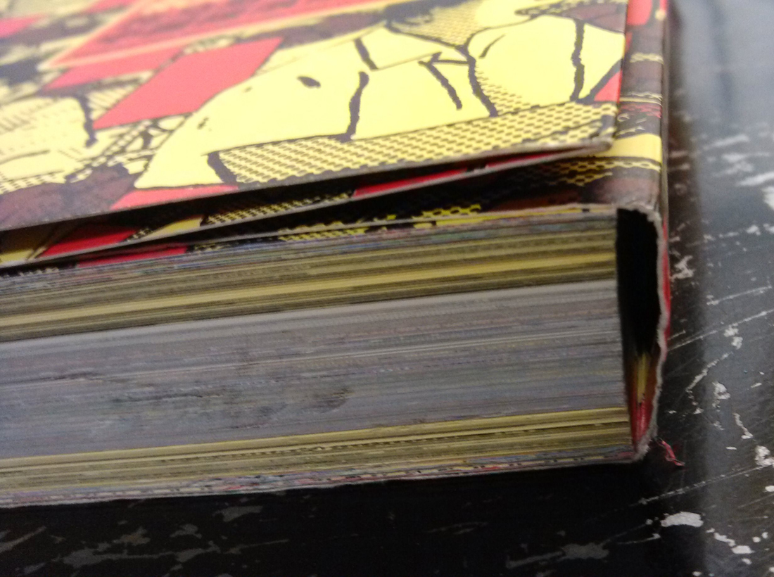
The papers are used differently between the fully printed graphic section and the interview section, which is black and white pictures and texts on yellow paper. This makes a very good distinguish from the graphic to the text.


It is quite a thick book, but there is only a tiny part with text and the rest are all images, and within this small part, there are three different languages used for the interview: German, English and Chinese. This raises the readability of the book, more people would be able to read it and willing to read it.
Rietveld library catalog no: bayr 1