Skip to Content Skip to Search Go to Top Navigation Go to Side Menu


Archive for October, 2015


Turbulant Times for Tubular Chairs


Monday, October 19, 2015

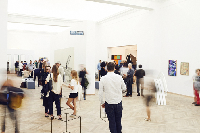
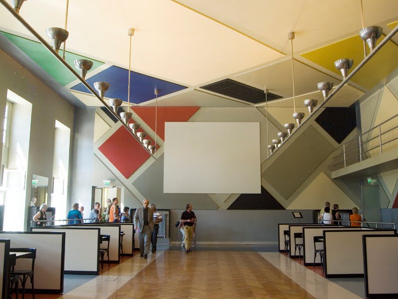
In the Boijmans Van Beuningen museum Design Derby exhibition there were two chairs that use a different main shape to catch your eyes and bring them to ‘ their side’ of the show. In both cases, the armrests follow this main shape; the rests of the Dutch chair are symmetrically shaped by an oval, while the rests of the Belgium chair are asymmetrical and sturdy angled.


Screen Shot 2015-11-23 at 20.28.27Screen Shot 2015-11-23 at 20.30.00

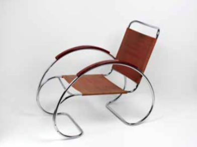
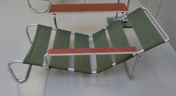
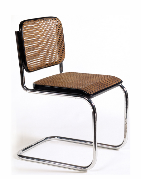
The Auping fauteuil, 1931 • The Chaise Lounge by Gaston Eysselinck, 1932


Despite this difference, the chairs are rather similar because of the chrome-coted construction parts, the use of wood in the armrests, the shared function, and the same exact period in witch these chairs were made (1930’s). Without any background information you could say that these chairs were made by the same enterprise or you can take it the other way around; these designs could have been competing with each other back in the day. This tension field spiked my interest to take a closer look in the history of both designs. Are they that different?

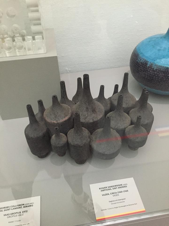
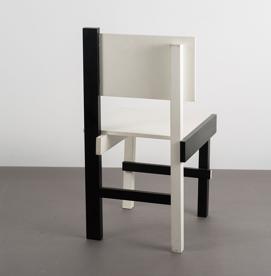
Examinating these chairs further I found that the same Dutch designer movements influenced the choices that were made in both of the designs. Designs meant for modern progressive consumers. These influences include Dudok [x], J.P.Oud [x], Gerrit Rietveld and De Stijl movement [x].

In the 1930’s Auping decided to broaden their horizon and manufacture a line of tubular living room furniture including the Auping fauteuil. At this time, this branch was not important. The designer of the fauteuil was not even linked to the chair itself. Later investigation concludes that the unknown interior designer Ben Reynsdorp is likely to be the designer of this magnificent chair. (jaarverslag 2014 Bojimans.nl [x])

At the same time, at the end of heroic period of the Avant Garde, the young architect Eysselink succeeded in assimilating these influences in a highly personal way. He went after Rietveld and designed his own home in Gent and manufactured fitting and unique furniture;

House_Eusselinck

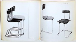
“In 1932 he designed all the furniture for this house. It is tubular steel furniture [x], of which the stacking chairs and the large recliner are the most interesting. He hoped to manufacture the furniture at a later date, with the name FRATSTA (Fabriek voor RATioneelse STAalmeubelen – Factory for Rational Steel Furniture), an enterprise which in fact proved unsuccessful. Eysselinck is the only architect in Belgium from the period between the wars to produce a ‘collection’ of tubular furniture.”

The latter brings me by another less fortunate similarity found; both chairs were part of lines that initially were not well received in the market and this brought production to an end in both cases. As said, the enterprise of Eysenck went bankrupt after only two years. His unique “machine à habiter” was not mentioned by the media. Auping on the other hand, focused on the improvement of their bedding and the continuing of their existing production lines in the crisis. They did not continue the production of tubular living room furniture as it was not as popular as their beds.

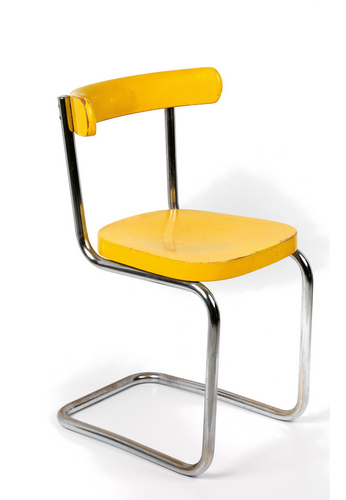
Nowadays Eysselink is seen as one of the great in Modernism. The Chaise Lounge [x] even got a re-edition in the 70’s; a modern and luxurious implementation.


474199.jpg;jsessionid=9E51294DBFF433EB0AE8992185C93492

The re-edition of the Chaise Lounge by Gaston Eysselinck, 1970's


The Auping chair ultimately got the attention and the designer the credit he deserves. Both chairs flourish at the Holland – Belgium Design Derby Exhibit and defend the honor of their ‘native countries’.

But ‘What differs the Chaise Lounge from the Auping fauteuil?’ you might ask. These chairs can not possibly be from the same designer for one major reason: The Auping fauteuil is not designed by Eysselinck’s ‘Form Follows Function’ regime. The armrests of Auping are used in a more decorative way than Eysselinck would have wanted. This makes that, although these chairs may look very similar, my gut feeling was right and they can be categorized in a whole different way.


Design Holland and Belgium


Wednesday, October 14, 2015

The composition of the ceramic vases Belgian artist Rogier Vandeweghe and vases Dutch artist Jan de Rooden.

subscription

Firstly, I’d love to explain why I’ve chosen ceramic vases for this essay. I imagine how the fingers are buried in soft brown slimy mass when I am thinking about creating a vase. I remember a few stories associated with clay from childhood. I grew up in a village. I loved poking around in the mud, but I had a special passion for the mud formed after rain on the roadway. Vehicles in the village – trucks, and the land under the wheels was pressed carefully because of heavy machine. As a soft mass, it was very pleasant to touch. Mud was becoming really strong as soon as it started to dry. I loved to do the round cakes of this manure. A day after i used to threw them on the floor and watch them breaking into pieces. This is the first thing I imagine when I’m thinking about ceramics. It seems to me very important to understand people, what events have affected them, how their personalities formed. An artwork produced by the artist containes all the information about his life, sensibility, condition. That’s why I’d love to highlight some events in the biography of Rogier Vanderwede and Jan de Rooden.

Born in 1923, he was the youngest son in the family. They moved a few years later to Beernem. From 17 to 23 years old, he studied at the Art Academy in Ghenthe. In the year of 1974 he was followed by a short internship at Joost Maréchal. In 1948 Rogier formed a business with his elder brother on the basis of fathers larger company. Their studio was named ‘Perignem (Latin for “through the fire”). In 1954 he married in the Church of St.Anne in Bruges on Maryanna Pyck (the collection vase that i chose called: Rogier Vandeweghe en Maryanna Pyck). Maryanna worked since 1952 as a ceramics painter at Perignem. As soon as regular production was established, Rogier decided to change direction towards a more modern product. The cautious, rather conservative attitude of Laurent and especially of Cecile Roets, which is in complete contrast with the radical and total renewal sought by Rogier, are the direct cause of the rupture between the two brothers in the summer of 1956. In 1957, Rogier Vandeweghe didn’t pay much attention to make his first ceramic production. In some cases, his wife Myranna Pyck painted the initials “RVDW”, eventually adding “Sint Andries”, with cold enamel after the firing. Soon however, Rogier adds this mark with glaze. In 1960, the workshop is named “AMPHORA».

Jan de Rooden Born in Nijmegen in 1931. When he was 5 years old his mother died. From 6 to 14 years old, he was admitted to Elementary School of the Heilig Landstichting. The landscape around us formed a beautiful country to grow up in. “In November 1944 I left home for the Passionist monastery in Mook September 1952 I became novice in the Passionist monastery in Pey, but after nine months I left the novitiate forever. Ultimately I could not reconcile myself with life in a monastery. I found that life too cut off, too safe and too well-provided for. ” As autodidact he started working in the studio of ceramist Lucie Q. Bakker in Amsterdam in 1956, and in 1958 started his own studio with Johnny Rolf with whom he later married.

Rogier was studying in artistic school and Jan at theological collage. But the story of the two artists is like when they meet their women and begin to follow their way.

I feel a similar sense when i am looking at the vase, I find something natural in that. Vases Jan de Rooden remind me about the forest, the surface of the vase is like a bark of a tree overgrown with moss and seabed, shells overgrown with silt. Vases Rogier Vandeweghe remind me of the mycelium, or forest spirits, or rocks. I like that he used black clay, I’ve got a association with caves and coal mining. From vases is completely different. Jan de Rooden used a simple sealed form. It gives a sense of confidence and stability, which in combination with glazing, creates the effect of natural stone. Rogier Vandeweghe several vases connects one composition and shape of these vases is like a bottle, but shorter, with a thin neck and a narrowing nizu.eta composition looks like a beehive. The Rogier Vandeweghe vase can be used rather only as an object, and the Jan vase may well accommodate some flowers.

In conclusion I would say that the facilities are beautiful.

Marshall Moderism


Wednesday, October 14, 2015

IMG_0377_2

The Design Derby exhibition at Boijmans Museum in Rotterdam compares what was happening in design in the Netherlands and Belgium from 1815 to present day. Pieces were picked as representative of the era of design in both countries, which allowed you to make comparisons of the objects for design and aesthetic value, but also by being displayed chronologically, you are able to see where on the timeline they place and thus allowed you to to understand the context in which they were designed and the preceding works/ inspiration. I picked two pieces from the 1950’s produced during the post war reconstruction period; a fascinating time for the reestablishment of design as a social, economical and cultural actuality.

I chose two pieces with very similar aesthetic qualities and obvious connections visually/materially, produced a year apart they are from exactly the same period so can be perceived from a single point in European history despite different national situations.
The first piece is a bookshelf designed by D.Dekker for Tomado – Dordrecht in 1958, The shelves are a genius design, with simple brackets on either side and tin trays which can be slotted in at any level, there’s a variety of combinations/arrangements of the unit so they adapt easily to any room.

Tomado Bookcase

The second is desk and chair by Jacques Seeuwes, designed for the architecture department of the University of Ghent in 1959. The only colour used is a bright blue Formica on the table, which compliments the soft dark tones of the oak seat and foot rest.  Its a vivid primary colour which is fitting with the modernity that was being practiced in the design at the time, when the chair is tucked under the table, there is brilliant flow of the basic forms, and the subtleties in angles of the chair suggest a certain spring to it by highlighting the ergonomics which contrast to the stubborn rigidity of the black tubular frame, they both exhibit a neo-plastic approach to design. This is collection of research i made in order to further understand the situation of each country after the war and how design fit into their society at the time. What were the inspirations/ defining influences in the Netherlands and Belgium which concluded in two very similar pieces of furniture.

Jacques Seeuwes Desk


De Stijl introduced an important merging of art an design by promoting an Utopian philosophical approach to aesthetics. The goal was to catch timeless beauty in spare precision, De Stijl movement was a reaction against the excessive decoration of the Art nouveau that preceded. It was an attempt at a universal language in design and aesthetic, that applied rules which erased all subjectivity to the artist because the individual was loosing its significance, ideals of the period shift from visually heavy to visually light and ‘de Stijl could be seen as social redemption.

During the post war reconstruction period, Tomado thrived because its products represented the incoming modern Dutch household; cheap, affordable, functional furniture. The core of Tomado string furniture was formed by pragmatism, before the war there was a demand of bits and bobs and comfort in clutter, but in the aftermath, there was a desire for a fresh functional way of living to maximize efficient recovery and thus wanted to be surrounded by practical and rational possessions. Tomado’s minimalist airy structures symbolized the modern age, and these bookshelves in particular were commonly present in households around the country, just like IKEA is nowadays.

tomado bij charlie ikea


The Dutch government returned to the Netherlands from its exile in London in 1945. The government, while in London, had created plans which would speed up the country’s challenging industrial and economic reconstruction, there was no conflict between industry and the arts, because the Netherlands has a trading history and sourced its cultural input from its colonies in Asia. This meant that recognizing the need for mass production to furnish homes wasn’t politically opposed and the dutch produced functional furniture for the masses with talented designers appointed to every sector, Marshall Aid investment into the Netherlands accelerated industrialization and by 1950, 38% of the population was working in manufacturing or some form of industry.

In Belgium, there is a rich history of the arts and crafts from their own country because they had no interest in their colonies in Africa. This meant that high level professional craftsmen worked hard to produce and design quality products, and then after the war they were fighting against the industrial takeover. However there were a lot of poor factory workers and thus mass production was a cheap necessity, people weren’t as encouraged by the government to pursue design careers whereas in the Netherlands every state company had a designer.

Marshall Aid played a large role in the modernization of Europe, with the investment to rebuild its financial economical and industrial systems, and along with the money came the intention to inject a new ‘spirit of productivity’.

e4436177fef81c8674471797ff6828ba f_10547351_1

In Belgium they funded the Belgium Office for Increasing Productivity (BDOP), which supported The Design Centre. Design in Belgium was struggling to find its place in society, The Design Centre aimed to broaden the understanding of design as a social, economical and cultural phenomenon, however, the BDOP demanded a definition of design which was appropriate to the contribution towards the economic efficiency, it was struggling to leave behind the origins of design promotion, dominated by national export interest and be recognized for its social and cultural value by the Belgian government, this was frustrating because of course they believed that design is the most visible and pervasive cultural manifestation of a country at any time.

Industrial design was redefined in Belgium  in the 1950’s, and planted foundations in 1954 under the reign of the first social-liberal government.
Industrial design is a creative activity whose aim is to determine the formal qualities of objects produced by industry. These formal qualities are not only the external features but are principally those structural and functional relationships which convert a system to a coherent unity both from the point of view of the producer and the user. Industrial design extends to embrace all the aspects of human environment which are conditioned by industrial production.

With this definition you can understand how the values of De Stijl integrated easily with this new wave of industrialization. Design was being viewed as a practical notion where productivity and efficiency is key, with such a mechanical demographic, it makes sense that the prevailing approach to design in Belgium was that of De Stijl – the international modern style, and easy to replicate in industry.

After WW2 De Stijl became known as the International Modern Style. However without Theo van Doesburg to lead the way and enforce the ideals and definitions of the movement, the strict pre-war rules were broken. The post-war reconstruction forcing society to depict a new way through complete disarray towards the future, efficiency was key and maintenance of artistic values weren’t withheld so preciously. Broader structural design properties of industrial materials could be worked with more easily in mass production too and the extreme ideals of De Stijl were not practical anymore.

To conclude, the unifying desperation of each country to rebuild after the upheaval of the war and the catastrophic state in which the Nazi’s left, meant the productivity objectives that accompanied the Marshall aid from U.S, persisted to define the countries’ reform and thus profitability and potency heavily determined design of the post war era.


BIG CHUNK, little purpose


Saturday, October 10, 2015

When I first heard about the task of choosing a pair of compared design objects in the Boymans van Beuningen exhibition “Design Derby” –where Dutch design is being compared to Belgium design– I thought it was going to be a long and painful process since I have never been interested in design. Especially not in furniture design which I know nothing about. It was a relief when I found out that the exhibition was well organized and the objects presented were described in an understandable manner. At first I had to take several strolls through the exhibition before I realized what my choice should be, and it was no other then the Grandfather clocks. Seeing them made the choice so easy that I even didn’t think about how hard it would be to compare them. That turned out to be difficult, since only later I realized I know nothing about the styles of design and even the point of owning one is completely unclear to me.

002_rb-image-1778000

So these are the clocks that I ended up choosing, The one on the left is Designed by a Belgium artists Georges Hobe and architect Antoine Pompe in 1902 while the other clock at the right is designed by a Dutch designer Christiaan Wegerif also in 1902. You can see that both of the clocks are made at the same time, yet they are completely different. The Dutch designed clock is much more masculine and solid, also it has more detail and decor in general. The Belgium clock meanwhile is famine and is more about the function, It hasn’t been overly decorated and is just as complicated as it needs to be in order to serve its function. To have a general idea of what similar types of clocks look like and how they are the same or different you can visit this link that sells german grandfather clocks or this that sells grandfather clocks in general and has some background info as well.

So after the exhibition I thought to my self what the reason was of making this, (now seemingly) foolish choice that seemed so easy and clear at the moment I made it. Suddenly it clicked to me; my grandmother, she used to have several Grandfather clocks, and only now I started understanding how sad it is that I never paid attention to them. I never had the chance of asking her why does still keep them. My grand mother was very old and as I noticed, the clocks just became closer to her with time, after she got moved to an old people home, she took only few belongings with her, few pictures, bottle of cognac and one of the grandfather clocks. I guess there it served as a reminder of past and the overall importance of time.

So due to the lack of information on the specific Grandfathers clock’s of my choice I decided to do a general research and the first thing that was unclear to me was the origin of the name “Grandfather clock” why not Grandmother clock or just Tall clock? Once again it all comes down to pop music, its named after a song “My Grandfather’s Clock” performed by an American songwriter named Henry Work [x], who wrote a song about a clock which stopped working the same minute of the day when the last surviving owner died and happened to be a grandfather, you might think that this is a made up myth but let me surprise you that the chances of this actually happening are pretty high since the less expensive clocks at that time needed to be wound every day or they just stopped working. The Grandfather clock is usually 1.8 – 2.4 meters tall and is a weight driven pendulum mechanism that is located in the tower or the waist of the body, this kind of clock was first developed in 1670 by an English clockwork William Clement.

Longcase_clock antique grandfather clock Friese staande klok

Until early 20th century these were the most accurate time keeping technologies so they were often kept by huge businesses and rich households. Now they only serve as decorative objects since it needs a lot more maintenance then a everyday wrist watch and most people now don’t have the TIME for that. Since I have a very limited interest and knowledge of history I decided to take a look at some modern day grandfather clocks, and I was rather sad to find out that with few exceptions they are not made by hand anymore and they have all become electronic. So I found very few companies that still make handcrafted clocks but only this Kauffman’s company offers to make a clock costum made just for you and how ever you want it so it has a much higher value and can relate to a specific family which in this case I think is very important. Though I must admit that the clocks made by hand then and now are not pleasing to my taste, and I find the modern ones more aesthetic and visually appealing for example this black and simple clock.

BLACK_CLOCK_1

At the same time by loosing the need of a huge item that serves only the purpose of showing time they now serve new purposes that previously just couldn’t fit in the same casing with a pendulum mechanism. They can have built in drawers or be used as book shelves a and probably many other new purposes could be thought of. Here you can see the same clock as previously but opened and instead of the pendulums you have a set of drawers, that could be used perhaps for your dirty underwear that you wish to hide from the public eye.

BLACK_CLOCK_OPEN

Another great function but a rather ugly outcome.

CLOCK_BOOK

I think the shape of clocks should not be forgotten, they just need to be redesigned to serve more purposes then showing time or they can just as well turn in to art pieces since they have such a strong image and meaning as a thing on it’s own, for example artist Maarten Baas has done few works that relate to grandfather clock directly or to time in genera. Most related to this subject would be his work “Real time” where instead of the usual clock face there is an LCD screen within the clock that shows a human inside the clock drawing the time on the clock face. Read about three contemporary artists that explore the general concept of time.

I personally don’t like clocks at all since they just keep reminding me of the amounts of time I have wasted on useless activities. So I would need a grandfather clock that goes backward and is constantly fooling me or doesn’t show time at all. Something like this…

CLOCK_FOR_ME


The 2 Visions


Tuesday, October 6, 2015

The Design Derby exhibition in Rotterdam is a friendly (or not) competition between Dutch and Belgian designs. It is presented as a playful and colorful route where, in chronological order, designed items are paired up for the viewer to compare the contrast between them. Some of them are not iconic (one of the works exhibited is even a student work from 2014) but I chose a rather famous pair (or pairs). I chose to write about the famous (or infamous) hoof-Tabi shoes by Belgian designer Martin Margiela and the Iron Lady shoes by Dutch designer and shoemaker Jan Jansen.

subscription

I have chosen these pairs of shoes because they stood out to me as interesting takes on what is beautiful, what to wear. They both have unusual and innovative designs with a strong vision. They have visual, emotional and conceptual impact, but they are also quite different.

Martin Margiela (born 1957 in Genk, Belgium) studied in the Royal Academy of Fine Arts in Antwerp and graduated in 1979. He is known for his avant-garde designs that break rules of aesthetics and are often with extreme proportions and deconstructed appearances. He has worked for luxury fashion houses such as Jean Paul Gaultier and Hermes before opening his own brand.

Margiela is continuing the work of Japanese avangardists such as Rei Kawakubo (Comme Des Garcons) which was started in 1980. This movement rebels against  the luxury fashion world with it’s unusual designs who challenge viewers to reconsider their ideas on clothing and beauty among others. Margiela often makes use of the post modern architectural concept of deconstruction. Deconstruction is characterized by fragmentation and distorted sharp shapes. It displays interest in manipulating the surface of the structure. Visually, these structures are characterized by unpredictability and a sense of “controlled chaos”.

subscription

He has maintained a low personal profile and was rarely photographed, staying behind the scenes of his fashion shows. Perhaps due to the hectic nature of the fashion industry, he has resigned in 2009.

His creation from 1989, the Tabi shoes, were inspired by the Japanese shoes of the same name that have a characteristic appearance similar to cattle feet. They are almost anti-aesthetic and opposite to traditional femininity. Although they are sometimes heeled, they can be quite repulsive at first glance. The first thought of visually pleasing high heels are not of ones that are completely closed off, with bulging seams and a shape similar to a camel’s hoof. The silhouette has become a classic for the Margiela brand and it has been reconstructed and revamped many times. The designs are often gritty and minimalistic, the most radical example is perhaps the version of the Tabis that is sold only as a sole and includes clear masking tape to connect it to the foot. The design is aligned with Margiela’s asexual and deconstructed esthetic.


Martin Magiela • Tabis Shoe

Jan Jansen is a Dutch shoe designer and maker, born 1941 in Nijmegen. He has been fascinated with shoe making from a young age, as his father was manager of the children’s shoe factory Nimco. He interned in a shoe factory in Brabant and took evening drawing lessons in the art academy of Eindhoven. Jansen studied shoe making further in Waalwijk and Rome. He has several shops in the Netherlands, including one on Rokin street in Amsterdam. His designs are extravagant and colorful, but maintain a certain classic appeal. Jansen says he’s not concerned with trends and market forces, and he mostly makes what he thinks himself beautiful.

subscription

Unlike Margiela’s Tabis, The Iron Lady shoes are extravagant. They are propelled by an exaggerated heel made of bent metal at the back and a pedestal-like piece of metal in front that seems to leave the wearer in mid-air. Two intertwined prominent straps connect it to the foot in a compelling illustrative way. The classic femme fatale red is on display, with a suggestive upside down heart shape in the front. Perhaps Jansen inspiration, his wife, and his love of timeless classic design which focuses on beauty contribute to his design aesthetic which is often colourful and full of lyrical and aesthetically pleasing organic shapes. They have an abundance of detail that keeps the viewer looking. While Margiela’s shoes and general design esthetic is a commentary on the high fashion luxury world that he perhaps reluctantly belongs to, Jansen’s design are not interested in trends. Not many people would wear them, but they are purely esthetic.

I don’t know what these two particular designers say about their respective nationalities, and do they fit the bill of Dutch and Belgian design. I’m not sure people’s esthetic and artistic integrity can be narrowed down in that way, especially in our time when each artist wishes to express him or herself and create something completely new. But it is definitely interesting to look at these two completely different takes on wearable art.

Designing A Country


Monday, October 5, 2015


Why is it interesting to examine the differences between Dutch and Belgian design? The exhibition that was supposed to make me understand what was interesting about comparing the two countries design-wise, made me even more confused. As I strolled down the beautifully curated paths of the Design Derby, I saw Dutch and Belgian design objects cleverly placed next to each other to make the viewer see the clear differences between these two very closely related countries. The problem was that every time I had concluded something drastic about one of the two being more art nouveau, constructivistic or a clear example of de Stijl movement than the other, I would see two new objects and be surprised that my conclusions were far fetched.

What I should have done instead of just casually taking a glimpse at the beautiful objects, was reading what was written on the walls next to them. This I found out by googling the relationship between Belgium and Holland, and figuring out that they have a closely related history, but developing different socio-economic statuses during the 20th century.

Hereby I found the answer to why this exhibition is interesting and relevant, not only to people familiar with the history of the two countries, but in general for people who want to understand how a design object can express a whole time period or the mindset of a country just in the way it’s shaped.

Here, for example, the two logo’s of respectively the Dutch railway system, and The Belgian Metro. Similar in their form, you think by first eye sight, but if you look closer you see significant differences.

NS-Logo_200logo-metro-brussels_200

Dutch >•< Belgium

The Dutch logo was made in the 1960's, a golden age for corporate design in Europe, with Holland and Switzerland as two of the main providers. This logo was made by the still existing Graphic Design company, Studio Dumbar, who created a whole Identity for the Dutch railways; way finding signs, tickets, the look of the outside of the trains etc. The logo is a symbol, no letters are needed, because this symbol is supposed to be strong enough to remind every Dutch person that 'here you can take the train', and maybe it even contains more than just that simple fact. The railway system of Holland is a public institution, it's a representative of the Dutch culture, signaling to both the people of the country itself and the outside. Maybe this is why the same company was chosen to design the identity of various other public institutions: to give the whole country a graphic identity. This shows a very visually conscious country, knowing the importance of a graphic identity.

Here an example from neighboring country, Germany  and Swiss, with  their big company's representing the country, the airline Lufthansa and Swiss-Rail. Other examples showing the strong, straight lined, European corporate design of the 1960's.

lufthansa-book-cover Swiss-Railways

Logo design by Otl Aicher 1963 and Joseph Müller-Brockmann 1982

The Belgian logo is a bit different in it's look. Less sharp, less serious with a lighter blue colour and a rounded and assymetrical shape. What is the most significant difference when you look up the history of this logo, is that it was made, not by a big company that knows about Graphic Design, but by a small and vagely well known Sculpturer, who never, before nor after, had anything to do with Graphic Design in a traditional sense.

Also interesting is, that if you google Brussels Metro Graphic Design, the images that turn up are far less clear than what turns up when you do the same to the Dutch Railways. This being said, it is also important to have in mind that the Belgian logo was designed in the 1980's, a slightly different style period in the history op graphic design. Less clear, more post modern, pointing in different directions. This shows in the logo being both sharp and soft, geometrical and asymmetrical, as if  it was shaped in the hands of a, yes, sculptor.
 
Skærmbillede 2015-10-05 kl. 23.06.18 Skærmbillede 2015-10-05 kl. 23.06.34

Google Search images for Dutch Railways and Brussels Metro


What is the difference between a waiter and a piano player?


Monday, October 5, 2015

The world opened a new window in 1844, when the public entered “French Industrial Exposition” in Paris. Quickly afterwards, various large public exhibitions were held in different parts of Europe. In 1851, the first-considered International Exposition was held in London called “Great Exhibition of the Works of Industry of All Nations”. A new platform was born, where art, science and technology from different countries were brought together.

In the process of the development of the platform, the pavilions became a tool to improve the image of each country from 1988. A study called “Expo 2000 Hanover in Numbers” by Tjaco Walvis showed that 73% of the countries at Expo 2000 were primarily interested in improving their national image. The world fairs had evolved into big vehicles for national branding.

 “In the desert of life the wise person travels by caravan, while the fool prefers to travel alone”, (African proverb)

As the importance of the pavilions’ look grew, the budget grew with it.

world's fair

At Expo 2000 Hanover, the average investment pr. pavilion was €12 million: A budget that made governments doubt their participation since the benefits were often assumed to outweigh the costs.

In a world today, where branding is a key asset: Is it possible for the artwork to stay as strong and sensuous to the audience? Does the creation of a salable layer (that has to be considered and assessed) leave the message behind? When a world fair tries to destroy the line between exhibition and exposition, is it possible to make both’ part equal?
Creating a community inside of the world fairs figurative walls is interesting. But at the same time, I’m constantly aware of the galleries’ need to sell. Does art lose its artistic value if it has to be salable? And does the price affect the experience of art?

CHART ART FAIR had its debut in Copenhagen 3 years ago. A Danish offer of how a world fair could look like. The CHART director Simon Friese wants to establish an international art platform for the Nordic region: “The ambition to do CHART in the first place was actually to make a platform that had the curatorial level to be able to attract an international audience coming here (…)”

CHART ART FAIR

But in the crowd, I feel like the gallery presentations convey get lost. The event has been located the same place all three years: Kunsthal Charlottenborg. In the 17th century surroundings, the location won’t disappoint you, but in the big spaces I feel an enormous distance between the art pieces and me as a viewer.
Before you are invited indoor, you can see advertising on display in different shops around town. Large video installations were put in shops as a warm-up before the fair this August. But every shop they have chosen had a specific status and price range. The locations were obviously chosen to attract an audience with a high income: because the buying of a ticket is only a small part of the money that’s exchanged inside the fair’s walls. If you’re interested in ownership, you can take the matter up with the gallery owner you can find next to every stand. Gallery owners you also can meet in the lounge section solely for specific members of the art world. (Some transported in limousines).
But why do I care? Do I want to play a role in the social club of the arts? Even though CHART is a new-born, the number of viewers has increased with 50% the past two year. Apparently, there are a lot of people, on national and international ground, who are interested in a Nordic art platform. Simon Friese and Denmark’s most famous gallery owners are those men who rule the roost, since they decide the selection of the approx. 28 galleries which are participating.

World’s Fairs are great scenarios to enlighten upcoming art and new ideas. The first telephone by Alexander Graham Bell was shown at Centennial Exposition in 1876. And the infrared touch panels were finally presented to the public at the 1982 World’s Fair in Knoxville, Tennessee, after 40 years of research. A lot of people, including myself, imagine the World’s Fairs to be like in the 1950’s, but the medium has changed.

Bell's  telephoneFirst touchpad 1982

In the old days, the rich would cross the sea to see the wonders firsthand, but the internet put an end to that. “I don’t know today how a World’s Fair can be viable, because everybody has a camera in their pocket,” says Louise Weinberg, World’s Fair Archive Manager at the Queens Museum. With everybody having art from each corner of the world in their pocket, you don’t need to go to foreign countries. With the internet, the outcome of World’s Fairs has been a massive slump.
Is CHART trying to transform art into a trade again? At Kunsthal Charlottenborg, the artwork or art “actions” seem like entertainment you can quickly pass without being further included. Is that the intention of the yearly event? And then I cannot not think about; are artists meant to serve the rich?

pearl and sophia bible


Monday, October 5, 2015

This article aims to compare two bibles, Sophia bible from Holland and  The Mother of Pearl bible from Belgium, both found at the Design Derby Exhibition at the Boijmans van Beuningen museum in Rotterdam.

b8eef0808b9ba6c571c9db492c59d6f9-256x300

The ‘Sophia bible’ was made by Dutch publishers ‘Uitgeverij van Goor’, a family run business who specialized in Children’s literature.                                           It was made for Queen Sophia and the Dutch King Willem III in 1855.  It was called the Sophia bible, after King Willem’s wife Sophia of Württemberg. It was for public sale, but two very ornamental copies were reserved for the Royalty.

2d22868db9545eb3f67b7743278292b7

The bible is bound with calf’s skin and velvet,  decorated with wooden graphics and golden clasps. Sophia bible is illustrated, suggesting that it’s function was more ornamental than informative.

(Taking it’s style from Art Nouveau, )

The 19th century was a time of civil unrest in the Netherlands, as there was much conflict between the Protestant and Catholic churches. In 1853, King Willem gave permission for the Roman Catholic bishop hood to be restored. Although the Royalty remained favorable to the Protestant Church, this elaborately decorated bible could have been an attempt for the King to neutralize the differences between the two sides, as it’s ornamental design refers far more to Roman Catholicism, than to the more humble, Protestant style.

173d5793d5c188ad286e461e737ffc09

The Mother of Pearl bible, published by the Belgian publishers ‘Brepols‘ in 1882 is a small, silver bible made from Mother of Pearl, gold leaf and copper. It’s Art Deco Style owes to the geometrical triangles, it has a small clasp and is made to be kept close at hand. This may be because the popularity of Christianity was declining in the late 19th century, meaning people wanted to protect and prove their faith. A pocket sized bible would mean people could read from it on the streets, either preaching from it, or using it to prove a Christian identity. In 1882, Belgium was Roman Catholic, so the pearl bible was too. The Belgian publisher ‘Brepols’ was a family run business, who coincidentally also specialized in children’s literature.

The two bibles are vastly different, firstly and most notably, in size, sophia bible is very big compare to the pearl bible .They came from two different ideas of how to practice Christianity. The Sophia bible is purely ornamental, the desire to look inside is great, but the idea of using it as book for Christian practice seems less so. The Belgian Pearl bible is used for reading every day and following faith. It’s hard exterior prevents it from damage, so it is designed to be portable.

Secondly, the design styles. The Belgian bible follows Art Deco, somewhat unlike the rest of Belgian design in the 19th century. It’s symmetrical triangles, it’s ornamental pearl cover and the small copper clasp  make the bible elaborately shiny, but also visually very simple. The Dutch Sophia bible was made in the Style of Art Nouveau. It’s design follows Neo-Classicism and Baroque revival design which was popular in Holland in the 1800’s. It’s ornate wooden floral patterns, it’s huge golden clasp and it’s royal red binding make the bible decorative, fitting well with the rest of Dutch design from that period.

Lastly, there is a difference in the Status of the bibles. The Sophia bible was made for Royalty, already this calls for intricate and decorative design. Before the second half of the twentieth century, there seemed to be an unspoken rule that design for Royalty must be elaborate and ornate and just because of this, it creates a huge bias in the design of this bible. The pearl bible is vastly different as it was made for upper middle class Roman Catholics. It was designed far more simply, you would not recognize it as a bible unless you looked inside, whereas the Sophia bible gives it away with the ornate effigy of Christ on its cover.


In conclusion, these bibles are vastly different. Although both using expensive, decorative materials, one is over-designed looking at it from a 21st century eye, whereas the other is far more simplistic. The pearl bible’s Art Deco design is more modern than the Sophia bible, which screams Art Nouveau. They were used for different purposes, I imagine the pearl bible more actively so than the Sophia bible, owing to it’s sheer size and weight. The Sophia bible is probably more fragile than the pearl one, as it has many thin, decorative wooden features which may not survive a fall from table height. The bibles are 30 years apart which was enough time for design styles to change quickly, especially in the second half of the 19th century.

Written Colaboratively with Freja Björnberg

PEOPLE NEXT DOOR


Monday, October 5, 2015

The design derby took place in the Boijmans museum. It is about the confrontation of Belgian and Dutch design objects from 1815 till today. The collection covered all kinds of design; from glass and ceramics, prints, furniture, fashion, even up to cars. The exhibition was ordered chronologically and all the items from each country were presented next to each other into two big lines.

Does this make sense and do you really find out more about Dutch and Belgian design by looking at it like that? This is an attempt to find out as much as possible through two chosen objects from the exhibition.


table carion OLYMPUS DIGITAL CAMERA

Francois Carion table [x] and lamp [x]

Firstly, a small round table by the Belgian designer François Carion. He built this table between 1925 and 1930, the materials he used for it are iron and pink glass. The wrought iron is one of the key symbols of his work and he used it for a lot of other designs as well.


ravesteyn chair ravesteyn

Ravensteyn chair presented at the "Exposition des Arts Décoratifs et Industriels Modernes in Paris 1925 [x]

The second is this chair by the dutch designer Sybold van Ravesteyn, who was born in 1889 in Rotterdam. Van Ravesteyn is a nationally famous architect who designed some quite important projects in Holland, for example the central station in Rotterdam [x] (shutdown in 2007) and also various residences and furniture [x]. The presented chair was designed in 1925. It is made out of wood and painted in geometrical shapes in black and white, designed specially for mister Rademacher-Schoers bedroom with the matching nightstand for his house in Utrecht.

To find out more about the artists it is important to understand the circumstances of life and therefore their inspirations.
First of all, after the first World War progressive designers took advantage of the knowledge of material and techniques they had gained during war. That’s why for example it was also a big topic to design the first cantilever chair out of tubular steel which was used by famous designers like Mart Stam, Marcel Breuer and Mies van der Rohe.

Moreover some big art movements were going on in this time; from 1890 until around 1910 Art Nouveau was a big influence mainly inspired by natural forms and shapes and therefore you can find many dynamic flowing lines and mainly asymmetrical shapes. Art Nouveau was seen as a harmonization between nature and design, and also a way of life. In the same time the Arts and Crafts movement was going on, which was an big influence from Great Britain; the movement was mainly about the combination of work and art. From France came the important Art Deco movement. Art Deco was defined by stylized and two dimensional representation of floral and organic designs. The industrial production and lack of shadows and natural elements was the new sign for modernity and the overtake of Art Nouveau. The absolute climax of Art Deco was the Exposition Internationales des Arts Décoratifs et industriels modernes 1925 in Paris, which defined the movements name.

Another movement was De Stijl in Holland. Famous contributors included painter Piet Mondriaan and of course architect Gerrit Rietveld. Their work is mainly known as plastic art which is a pure abstraction in form and colour. It is about the reduction to the essentials by only using primary colors (among black and white) and the limitation to use almost only vertical and horizontal directions. The most famous example is the Red and Blue Chair by Rietveld in 1917 which can be also seen as a three dimensional painting of Mondrian.This chair was also invented for mass production which expresses the mood of time in Holland at that moment.

Also because in most middle class houses in Holland and with the higher class in Belgium it became common to use a gas stoves instead of a big oven in the kitchen,  people didn’t gathered only in their kitchens anymore as nice and cozy place to stay but in their whole houses. There were other heated rooms, even central heating, as well and furniture became much more important in general.

I choose these two items mainly because of their difference, despite being designed and produced at almost the same time. This shows how many different influences the countries and artist themselves had during the time, which makes the derby more interesting, it is nice that you can find several elements of the ongoing movements in these two pieces.

arts and crafts   william morris niebelungenlied

Art Deco Jug • Charles Robert Ashbee (1904) [x

Art Deco Interior • William Morris Niebelungenlied (1860) [x]  

In Carions table for example I can find lots of flowing formed shapes and the motive of nature a characteristic of Art Nouveau and the Arts and Crafts movement which is coming mainly from Britain. I wanted to give another example for this movement because there are so many similarities to Carions work  in C.R. Ashbees work  (1863-1942) who was a British major designer for the arts and crafts movement. You can find simply the same elements and materials as Carion used in his works. In Interior Design wood was also a big thing  you can see that in the Red House from William Morris, who is actually seen as the founder of this movement and his friend Philip Wood. They designed this house in England together and until now it is a well known example for the Arts and Crafts movement.

18_designparade_jt130711   Bar Aubette

Art Nouveau Interior • Sybold van Ravesteyn room of Villa Noailles [x]

De Stijl Interieur • Theo van Doesburg Aubette (1928) [x]

Ravesteyn’s work which in this period consists of only geometrical shapes and very limited colours shows influences from the Dutch de Stijl movement, which is very much connected to Rietvelds work, who was also designing for private houses . But also artists such as Theo van Doesburg in whose Maison-Atelier de Theo van Doesburg de Meudon in Paris where he lived himself with his wife. It is quite obvious that both artists have similar inspirations and approaches in their work. In the picture you can see “Aubette” a collaboration between Hans Arp and van Doesburg for a cinema in Strasbourg which is very loyal to the de Stijl rules.

All in all from this exhibition as an example we can see the impact and influences countries get from other countries. As here seen in Holland which is more orientated on the East with Germany and the Bauhaus movement as there were also many refugees coming from there and they choose Holland as neutral country. In contrast to Belgium which was more focused on France and even Britain so therefore the south and west.

Moreover it is an interesting fact that people lived next to each other, but also very different, because there was a border between them. This has changed so much today where there is internet and it is so much easier to to cross borders to find inspiration online and not having to depend on the values and movements being part of the countries itself.

Mart Stam and Gaston Eysselinck ‘s chairs


Monday, October 5, 2015


chairs mart stamjpg

What first stroke me about those two chairs is how similar they look.

I thought they were made by the same designer. It’s funny because at first I was attracted by the colour of Mart Stam’s chair. Yellow is for me the colour, of happiness and brightness. I also thought that it was very modern and appealing in it’s shape and colour. I then saw that they were made in the 1930’s which surprised me because I believe they haven’t done anything so modern ever since.

Obviously throughout the last century we have discovered a lot of what arts have to offer and gone deeper and deeper in to the meaning of it. Just as Gaston Eysselinck’s did with his chair, pushing simplicity and minimalism to it’s most extreme point and aspect. I believe this is why Gaston’s chair is much more depressing sad even then the one of Mart Stam, because he has pushed the concept just a little bit too far.

eysselinck_10

The other aspect is that, they did it one year a part from each other but seemed to have had no kind of link what so ever, it means that in a way they had the same intention and were inspired more or less by the same idea. Both countries were at the verge of something new because of economical, social and political changes.

Gaston Esseyelinck Typist chair is way more simplistic and sad in a way, and maybe more to me I guess this is because of its wooden colour which brought me back to my teen years when I was send to an all girl catholic boarding school, where we had wooden bench as chair’s in our classes. Gaston Eysselinck’s rigid design reminds me of that a lot. They are not a very cheerful memory, so I might not be objective about it but as a involved spectator I can’t really be objective because of all these emotions that are brought in me be the design piece and this what it is meant to do. In that point of view Gaston Eysselinck’s chair worked on me by bringing back emotions even if they weren’t cheerful ones.

I believe the difference, is also the approach to the product of design it self. Mart Stam’s chair was meant to be sold for the mass so the idea of quantity enclosed in the design was appealing to that mass. Gaston Eysselinck, only

mart stam ellow chair

managed to make this one and didn’t manage to commercialize it. I believe he pushed his idea a little bit to far in the simplistic way, in wanting it to be to much avant-garde maybe to functional in the construction and lost himself in the process, or maybe just by being raised in Belgium in a Protestant society which obvious influenced him.

The exhibition itself didn’t interest me so much probably because it was so organized and most of the objects were not well presented in my point of view but when I saw those two chairs, even if Gaston’s one didn’t cut my breath, they were standing out in the crowd. Until a few days ago I could not say why but it’s because they aren’t just chair they are like architectures which makes sense as both designers were architects. The forms and shapes are very simplistic but very researched well thought.

Beautifully, according to me they are simply beautiful; “less is more” is a concept I completely agree with. And which applies here in its entire complexity, it is because those chairs are so simple, that they are so modern, triggering in me those emotions.

Mart Stam manage to create a chair that is still today a reference to any designer or architect that wants to create a chair.

He didn’t just create a chair. He developed an idea that brought out a lot of the new ideas at that time, but in 1930 proving that it could be simple and beautiful, was an achievement and innovative.

If you go to Ikea or any department store today you will find many chairs that will be in a way coping those chairs. This is why it is such an invention because we are still using it as a reference without even realizing it.

BEAUTY OF LACK IN A FORM


Monday, October 5, 2015

Museum Boijmans Van Beuningen in Rotterdam with it’s exhibition Design Derby, was a starting point in my research about design objects and empty space in their form. Exhibition in itself had a huge task to make, it was comparing two countries: Netherlands and Belgium in years 1815 – 2015 in their history of design, in their possible differences and similarities. You could easily dive in home furnishing, textiles, projects of interior decoration (even if it was on the pictures), posters (which by the way collected the whole dynamics of social and political situation at a time) and many more. Design Derby is one of those exhibitions or I would even say shows, during which you can spend hours on watching and contemplating, literally eating what you see.

As soon as I enter the museum I am vanishing for a few hours, as was the case exactly here. At first very carefully I studied the objects until, while passing from one half to the other half of the exhibition, I came across some chairs. Chairs from which I didn’t know yet who, when and why they were made. They were known to my eyes, popular through the times, translated into many other forms of furniture.

Like in a football match (as the situation compared in the interview with curator Mienke Simon Thomas http://arttube.nl/en/video/Boijmans/Design_Derby) Netherlands on the left with Mart Stam (Martinus Adrianus Stam) and his ‘cantilever tubular steel chair‘ (1927) and on the right side Belgian architect, furniture designer Gaston Eysselinck’s ‘office chair for typist‘ (1931).

 Mart Stam chair       Screen Shot 2015-10-04 at 22.24.24 copy

Both chairs are throwing in our eyes the amazing similarities. For Mart as well as for Gaston functionality was the most important thing. Form follows function and form is derived from function. For each destiny has to be a place. All this was dictated by the specificity of the times in which lived both creators. Shortly after World War I, damages especially in Belgium were enormous, economical situation was not the best for those who would like physically construct modern buildings. Despite the negative situation, technical progress is rising and with that faith in the future designers travel, meet, exchange ideas, communicate through new magazines (Werkbund G, ABC etc.). This gives freedom, freshness of development and creation, so needed after the hard, not so productive war times.

Mart’s chair, the icon of the modernist interior, looks in some way as a machine, it is smooth with its minimalist shape., with its slim figure and its perfectly bright, clean matching surfaces. In the same places will fit also good Gaston’s chair for typist, it will highlight even better its modest appearance.

My first meeting which described above chairs gave me a feeling of surprise, something attracted me in them, seduced but still not knowing what. It would be much easier to discover this riddle by sitting on them … but you know it was not possible to complete that at the museum. Then I got it! Such a simple answer. It was this empty space in the back part between the seat and a floor. This emptiness in the chair which gives you the possibility to hang in the air. These chairs were chairs for dreamers made by dreamers. Were explaining the spirit of the time in which its creators were living, their believe in future, freedom after the War, Utopian modernism.

With that feeling I went into the research. Internet did not give to me any juicy information and in the library I did not find any solutions in language that I’m able to operate. Resigned, I started to look through the pages of an other books in the field of design. In every few pages, in front of my eyes were appearing objects with desirable “chairish” looks. Let’s take into consideration for example Bridgestone Cycle (1985) designed by Giorgio Giugiaro.

Blouson Brigetstone

Of course, the whole project of the bike is deeply thought out so as to satisfy in the best way its function. Surprisingly it is a family bicycle, although it looks more sporty (maybe because of the whole shape). The specific form of the frame, its uninterrupted line and shape of a steering wheel, brings convenience while driving, pedaling becomes easier, plenty space for the knees, even if you want you can attach seating for a child. The design of steering, its suspension seduces the eye like in an example of a chair.

Funscate

I had very similar feeling with shown above, funscate (1985) design by Ravarini Castoldi. Although there is no significant steering suspension any way the designer uses it between the pipes for its function and captivating gentle curvature.

Coming back to the chairs with a special hanging feature, I would like to introduce you to few more dreamed examples. Heinz Rasch developed his own interpretation of Mart Stam’s ‘cantilever’ chair but more warm, soft shaped one (see below).

Heinz Rasch chair

An other designer, as well known as Mart Stam, Marcel Breuer (Hungarianborn modernist, architect and furniture designer) also developed and improved extensively described above chairs. Their constructions are more resilience, thereby, more comfort. Visual division between seat and the base disappears by using continuous supporting frame.


Marcel Breuer chair  Marcel Breuer chair

My beloved lack in a form is called ‘white space’ or negative space. Even if empty it says a lot. Having the same or an even more surprising message to tell than ‘filled space’. It is used not only in furniture design but also and maybe more in graphic design. Examples below:

trojkat  kulka

neg space

Some people have a huge fear of empty space, perceiving it as undeveloped. It looks for them like a mistake,. They are trying at all costs to fill it with whatever, ruining at the same time the appearance and first of all message. As for me, I am swimming in ‘amor vacui’, appreciating aesthetic minimalism, unfilled surfaces, limiting elements in art works or surrounding space.

Empty space in those objects bears its function which is always fulfilled. For me it is a negative space that it renames thanks to the positive role that satisfies, thanks to the transparency of form and seduction which is giving by interfering with the eye. Empty space described here can give us a feeling of comfort or discomfort, can attack us with its size or just only appearance, it may cheer us with clarity and translation. One is for sure, it will always say or do something to us not without reason.


Log in
subscribe