Skip to Content Skip to Search Go to Top Navigation Go to Side Menu


"intimate" Tag


A Bipolar Wardrobe


Monday, April 2, 2018

For many people colours have stark connotations related to their moods. Think of sayings like “feeling blue”, “being green with envy”, “seeing red” or think about mood-rings that supposedly change colour every time your mood changes. Undoubtedly moods and colours are intertwined in one way or another.

Thinking of mood swings related to colour makes me think of my mother, who has bipolar disorder. Bipolar disorder causes swings in mood, energy, and the ability to function throughout the day. It is known for alternating periods of depression and mania that can last from days to months. Thus she has experienced extreme mood swings. How does she relate her moods to colour? She personally doesn’t clearly remember what happened during her manic episodes, I however do and noticed how her mania and depression greatly influence her way of dressing. She has a wardrobe filled with exotic clothes in all colours of the rainbow and lot’s of different prints and styles. When being manic she dresses herself as an artwork before going outside, making heads turn wherever she goes. When being depressed she doesn’t really dresses herself, but instead stays in her grey pajamas’s at home all day. I think that a lot of people might experience that they wear more colourful clothes when feeling happy and wearing more neutral toned clothes when feeling sad.  I decided to create a colour system based on my mothers way of dressing, and not on people’s way of dressing in general or on people with bipolar disorder’s way of dressing. I thought it would be generalizing people’s experiences too much and I think that especially dealing with people who have a condition like bipolar disorder one must avoid that to avoid stigmatizing the disorder. Not every person with bipolar disorder has the same behaviour towards their wardrobe, or the same experiences in general.

After having decided to make a colour system based on my mother’s way of dressing, I read a lot of general information about bipolar disorder, which didn’t bring me any further in the development of my project. I could also hardly ask my mother any questions about it, as she doesn’t remember how she was when being manic. I later found an interesting article written by someone who also has been diagnosed with bipolar disorder, about what having this disorder means for their gender identity. The writer of the article identifies as a non-binary person, and thus I shall refer to them as “their” and “they”. They experience that when being manic they feel more feminine, and when being depressed they feel more masculine. This shows itself in many ways, one of them being the way they dress. When feeling manic, they will wear a dress, when feeling depressed, they will wear baggy clothes. This made me realize how my mother’s way of dressing doesn’t only change in colour when her mood does, but also in how traditionally feminine versus masculine her clothes would be. When being manic it wouldn’t be a bright yellow sweatpants she would put on, but a bright yellow dress. When being depressed she wouldn’t put on a grey miniskirt, but grey oversized sweatpants instead. This was something to keep in mind in the development of my colour system.

After researching I figured it was time to start working hands on. I collected all the traditionally feminine colourful clothes and the traditionally masculine baggy neutral toned clothes from my own wardrobe. I realized that I order my clothes by colour in my wardrobe, in some way I was thus already working on this project of making a colour system before it even started. With the clothes I tried making a small installation without damaging the clothes, this was very frustrating. Somehow nothing I tried seemed to work for me and I soon decided to quit trying. I felt like the best ways of displaying clothes without damaging them already existed and happens all the time and everywhere, which is putting them on mannequins, on hangers or folding them neatly. I didn’t feel like playing clothing store, so this was not the way to go. I took a step back from the whole process, let some time pass to then later come with new insights again. I concluded that the colour system I was trying to create already existed and just needed to be documented. I decided to make a video with my mother, of her wearing two bipolar outfits.

dav

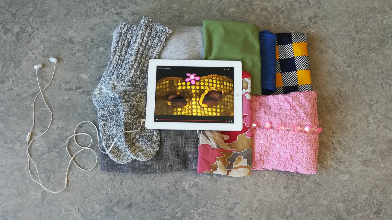
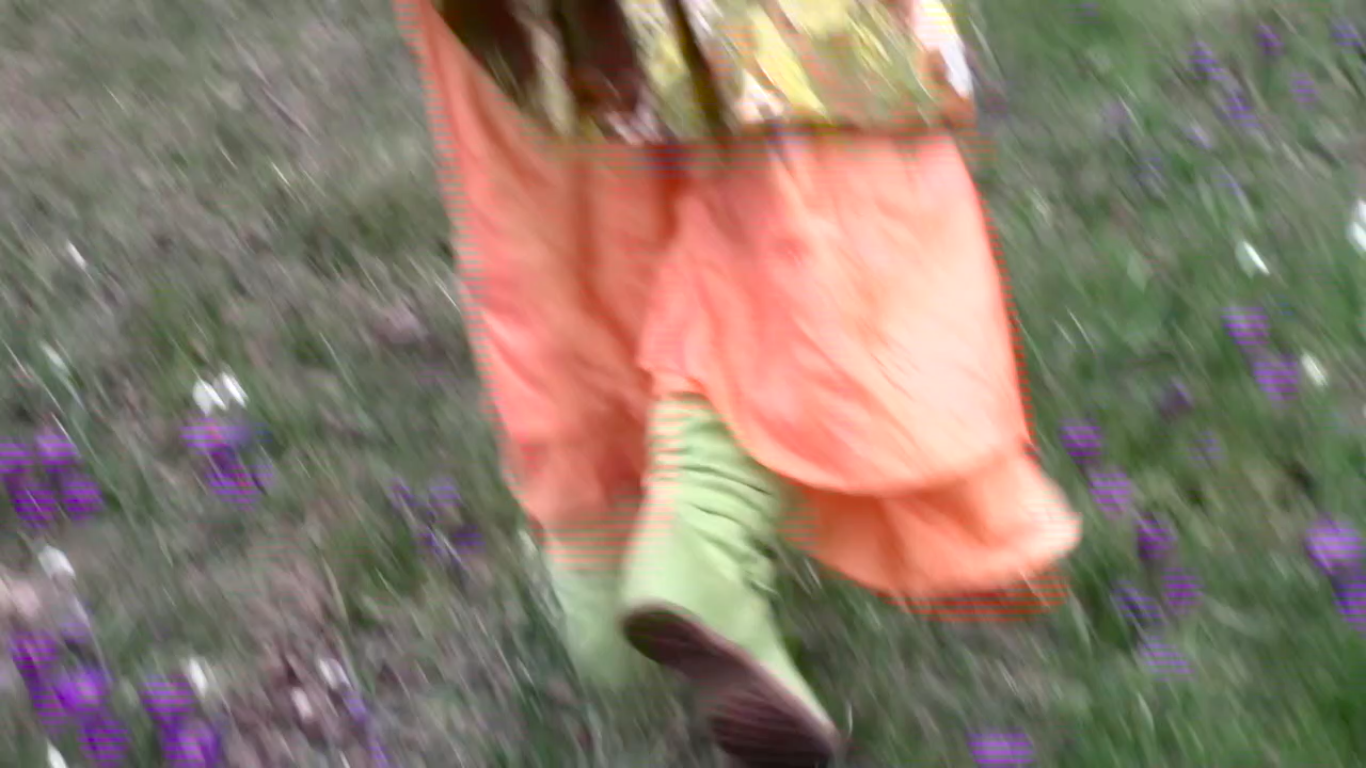
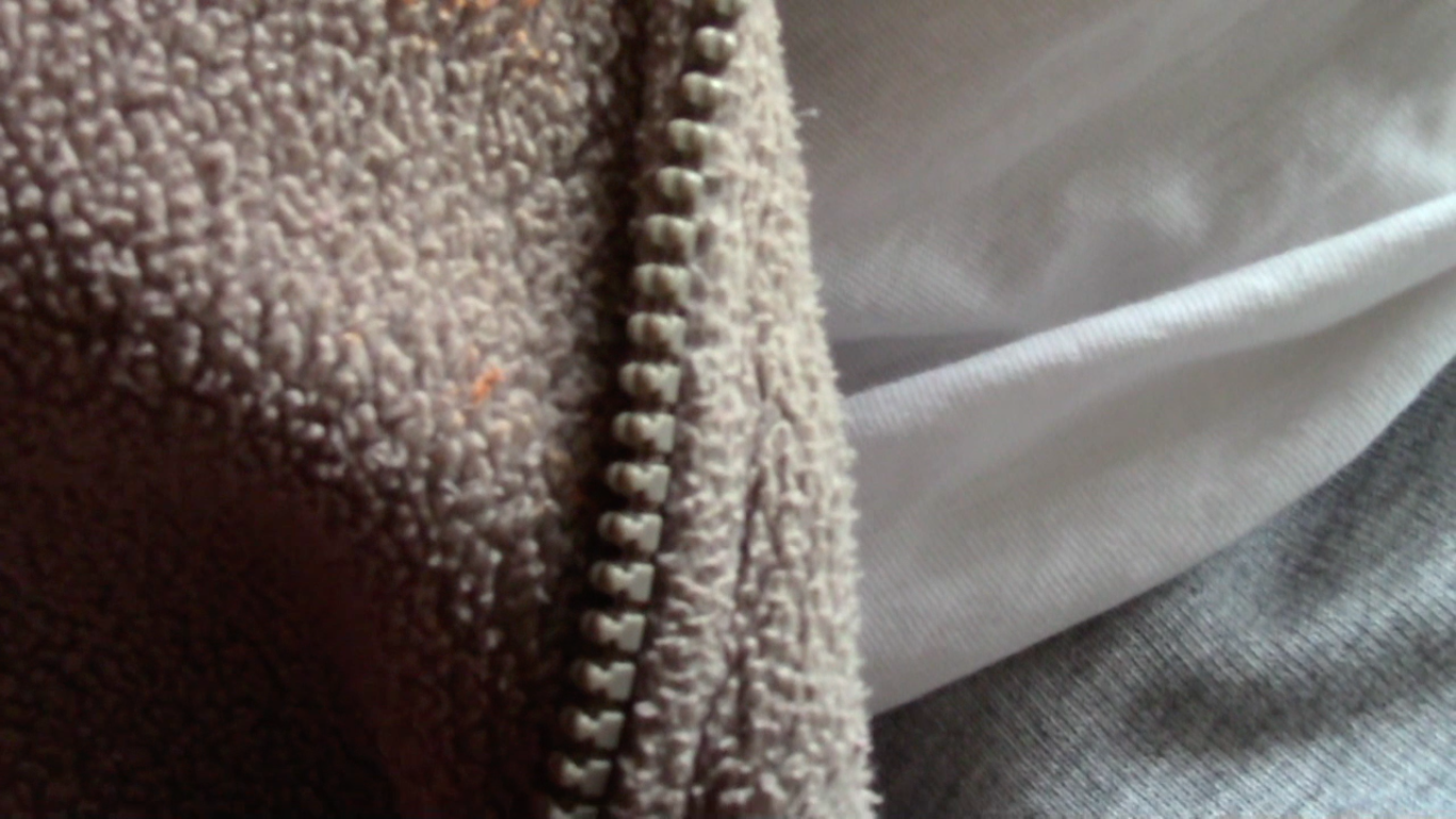
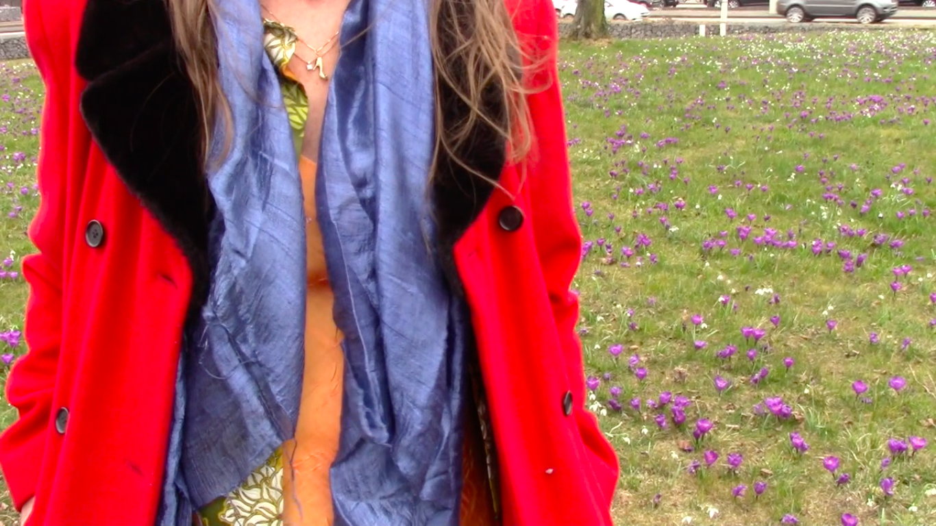
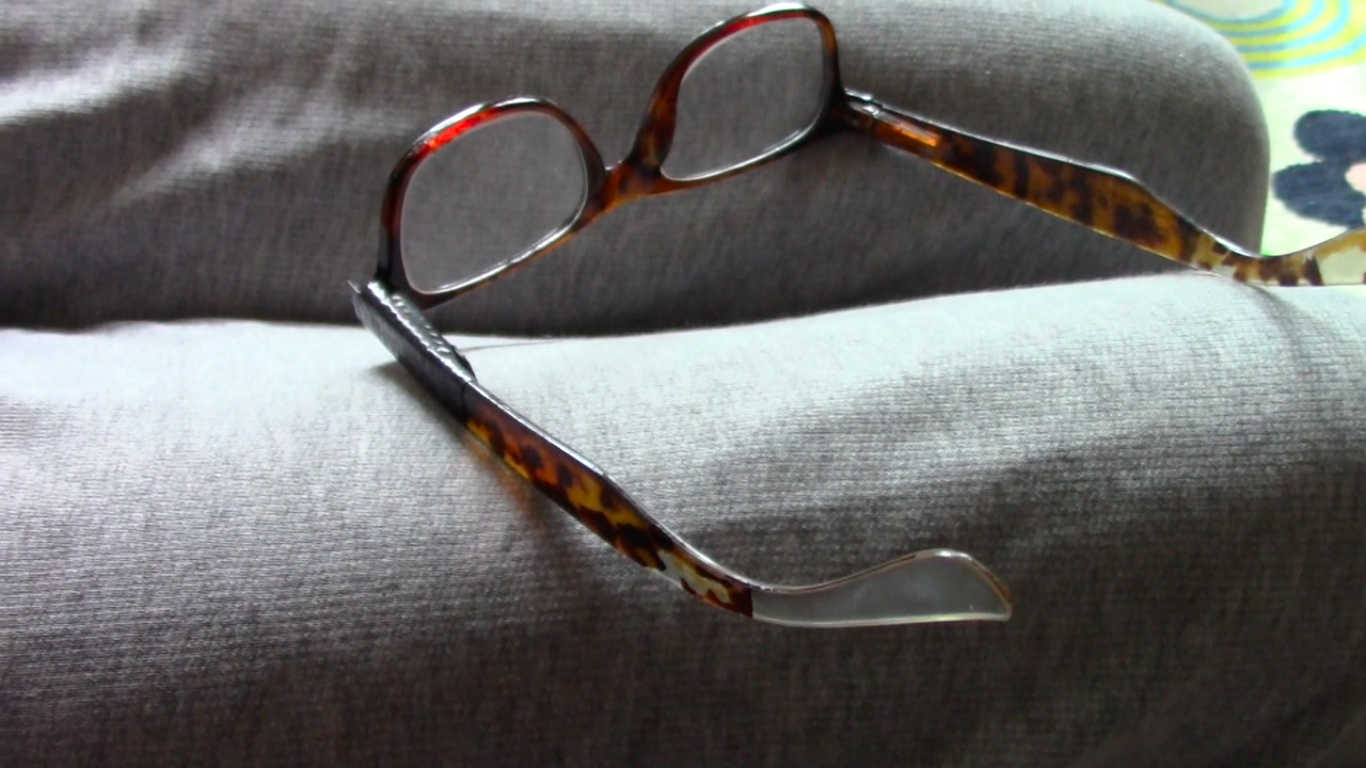
The filming went very smoothly, my mother and I enjoyed putting the outfits together and enjoyed spending time together, which to me makes the video feel genuine too. We tried to make the contrast between her two outfits/moods very clear, but still true to reality. This lead to us filming her depressed outfit inside on the couch, and her manic outfit outside in a field of flowers with more movement. I later also edited the video to be slowed down when her depressed outfit was shown, and sped up the video when her manic outfit was portrayed. When presenting the video, I went back to trying to make an installation using my own clothes but now including the video shown on a tablet. I felt like just showing the video on a big screen would not fit how personal and tangible someone’s clothes, and thus my colour system, are. To make it even more personal/intimate, the viewer of the work needs to wear headphones to hear the sound of the video.

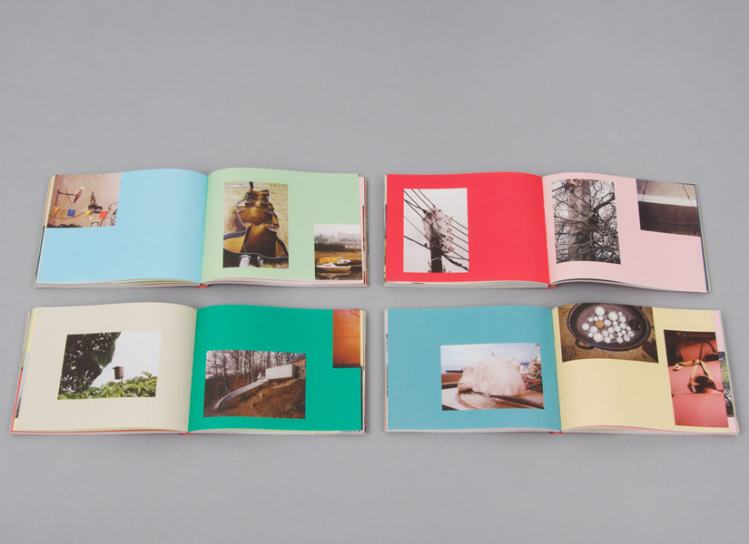
Here are some stills from the video:

Fast walking in a flowery field

Comfy outfit

Colourfull outfit in a field of flowers

Reading glasses with tape

Back to intimacy


Monday, February 19, 2018

When visiting a museum, it is often hard for me to decide what to find more intriguing: The exhibited artworks or the visitors walking carefully among them, observing them. Hardly ever do they physically touch, or if it happens, then in shyly hidden ways. Especially when it comes to everyday design objects, there seems to be a big gap in between the visitors and the exhibited pieces, which are locked away from their original function: to be touched and used. During my last visit at the Stedelijk Museum there was for instance a person standing for quite a long while infront of a vitrine where, in between other objects, Kaj Francks „Kilta Services“ was being exhibited.

Franck was one of the designers who developed the „Iittala philosophy“: creating design that is both beautiful and functional, and lasts a lifetime. „Does not ‘beautiful’ ultimately mean necessary, functional, justified, right?“ (Kaj Franck, 1978)

In the center: service „Kilta“, glazed ceramics, production in 1953 – 1975, designed by Kaj Franck

In the center: service „Kilta“, glazed ceramics, production in 1953 – 1975, designed by Kaj Franck

The person looked at the plates and cups inside, slightly leaning against the glass that was separating him from the objects. Why was he so attentively watching them? The longer I observed the visitor observing the tableware and the distant space between them, the more I started to think the glass vitrine away and imagined him having a real physical experience with one of the cups instead: the two being naturally rejoined, exchanging what is deep inside.

‘He holds the cup that is filled with tea, leads it towards his mouth and drinks from it. The content flows in one direction which is his interior. Luxoriously he sucks the liquid inside and the cup seems to be very willing to feed him.

“The cup is the drone of the ceramics world, perhaps the hardest working of vessels and the least appreciated. In the grandest of tea or coffee services, the cup is usually the most underdesigned object, playing the role of subservient pawn to the teapot’s queen.“ (Garth Clark, „The Book of Cups, Abbeville Publishing Group, New York, 1990, p. 17)

He drinks everything of it until it is empty. But it still contains the warmth of the hot drink, as he inserts his finger he can feel it. For a short moment they contain the same warmth, the cup and him: he contains the warm tea and the cup the rest of warmth of the tea.

„Close space! Close the kangaroo’s pouch! It’s warm in there.“ (Le Temps de la poésie, G.L.M. July 1948, p.32)

cup, Service "Kilta", designed by Kaj Franck

Service “Kilta”, designed by Kaj Franck

He shouts into the cup and holds it close to his ear: he hears a distant echo. The echo vibrates a few times and is gone. He holds it close to his breast and feels that it is vibrating synchronously to his heartbeat.

„When we evaluate everyday objects, we should place more emphasis than we usually do on ergonomic quality and tactile sensibility“ (Kaj Franck, 1978)

He fills it with tea, looks at it and it is roundly opened as if it was calling him. He lifts it towards his mouth and his lips connect to the cup. They softly touch and his tongue reaches the wet content. Then the kiss becomes wild.

„Many a slip twixt cup and lip“ (Garth Clark, „The Book of Cups“, Abbeville Publishing Group, New York, 1990)

service „Kilta“, designed by Kaj Franck

Service „Kilta“, designed by Kaj Franck

After finishing he cleans the cup. The cup is very deep, so it is hard for him to reach the ground. He cleans and dries it with care and attention, outside and inside. That makes the cup shine and renews its promissing interior.

„A house that shines from the care it receives appears to have been rebuilt from the inside.“ (Gaston Bachelard, „The Poetics of Space“, Beacon Press, Boston, 1994, p.68)

Afterward him and the cup are cold and empty. He looks around and decides to continue drinking from it: what comes out is sweet. He feels a strange feeling that is increasing and expanding inside of him. It tickles him in an unknown place and he bursts into tears.

„Moreover the cup does not have any immediate sense of drama (…). But that does not mean the drama is absent, rather that we need to examine the cup a little more closely and consciously to discover its sense of domestic theater“ (The Book of Cups, Abbeville Publishing Group, New York, 1990 p. 19)

     "Venus von Willendorf", 1963, by Otto Piene, oil and soot on canvas

“Venus von Willendorf”, 1963, by Otto Piene, oil and soot on canvas

His tears keep on falling inside the cup. It takes more or less three seconds for the first teardrop to reach the ground, the noise sounds far. When the cup is filled with tears he is still crying. He looks inside and sees his face inbetween reflections of light.

„My cup runneth over“ („The Bible“, Psalm 23:, Ezekiel 34:11-24; John 10:1-21)

Suddenly he grabs the cup and throws it against the wall…’

service „Kilta"

service „Kilta”

„A kind of cosmic anguish precedes the storm. Then the wind starts to howl at the top of its lungs. Soon the entire menagerie of the hurricane lifts its voice.“ (Gaston Bachelard, „The Poetics of Space“, Beacon Press, Boston, 1994, p. 44)

As I awake from my daydream, the visitor of the Stedelijk Museum is gone, leaving no trace of evidence for what in different circumstances might have happened between him and Kaj Francks „Kilta Services“.


Don’t judge a book by its cover


Wednesday, October 29, 2014

Esther de Vries is a graphic designer specialized in book design. Among many projects, she made two books on her father, the sculptor Auke de Vries. The two books, dealing with the same artist, are yet very different, the first one, Auke de Vries Photo Archives, being much more intimate than the second one, Auke de Vries: Sculptures, drawing and work in public space, which is more meant as an chronological overview on the evolution of the artistic career  of Auke de Vries. But what is surprising is that both books are very different from the first impression the reader can get just by watching the cover.


Indeed, at first sight and because of its very strong cover and size, the biggest book seems to be one of those very classical and sometimes deadly boring art books that present an exhaustive view of the work of an artist. But going into the design and the content of the volume you can experience it as an actual novel object. A lot of different materials are used in the book, making it exciting to go through, and a great importance is accorded to the process, thus gathering a collection of sketches, photographs and forms that helped or influenced the artist with his sculptures, and even pictures of the artist working in his studio. On all those pictures the text is set in an unquestionable playful way, sometimes even covering the images.


An other particularity that makes the book playful and thrilling is the use of very thin pages presenting a compilation of different forms, cut from a photograph of a work of the artist and magnified. Those pages refers to the collection of forms that the artist developed and used constantly in his work. Esther was keen to scatter that through the pages as, what she calls, an alphabet.


As for Photo Archives, the fabric and very simple cover makes it look at first glance as a secondary book, very small and discreet, soft, not meant to go through the years as the other one. But once more the design and content makes it very special, in a precious and sprightly way. While the other book is meant to present mainly the evolution of the artist’s works, this photography book shows through the collection of pictures the process that took place even before the artworks, as a wandering in the thoughts of the artist.


Here the relation to the reader is completely unusual, as there is no chronological order or reading direction. The reader, who is more a viewer since

there is no text, can open the book in the middle, at the end, or open the same page again and again, led to wander in the same way that the artist was wandering when he took those pictures.


archive_04


This is also a quite seducing book, designed between rule and coincidence with a set of colors and places for the pictures that are sometimes cut in two by the Japanese binding, leading the reader to focus on a particular shape that recalls Auke de Vries’ work. I noticed that the two books are very different from the first feeling you can get from them.


Yet, maybe Esther’s work, or at least these two books, deals a lot with feeling. That is to say the very strong feeling that the reader gets or is given in both cases of the close connection between the work of the artist and the design of the books. They pay homage to this work. It might has to do with the fact that both books where initiated by Esther herself, and not commisioned, hence the liberties in the design. This is also caused by the very long process that the designer went through while making those books, meticulously choosing each picture and composition, trying all the colors with each image again and again, changing direction until being fully satisfied, regardless of time.


All that makes both works very touching and the enthusiasm of the designer becomes very apparent, discovering a treasure made of all those pictures and willing to share it, making it as complete as possible to preserve the emotion aroused by the pictures themselves.

Rietveld library catalog no : Vrie 5 (

Rijksmuseum library catalog no : 832 E 13 (


Log in
subscribe