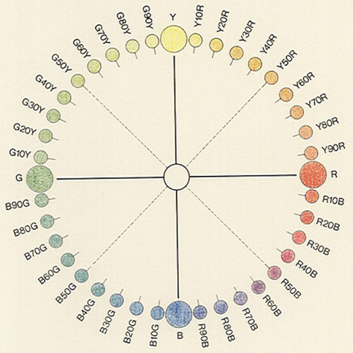
After studying and researching on William Benson cube colour system, based on a geometrical approach to the harmonious use of design colours, we had the announcement of creating our own colour system.
I looked to my predecessors and so, I decided to create a colour system based on a personal approach and a personal use. As a starting point I tried to figure out elements and interests of my life that could be and not be related to a colour system.
The thing that interested me the most between all the ideas I had sketched down was wind. I was really intrigued how to combine such a powerful element as wind to a colour system. The similarities between this two element is the representation of both of them.
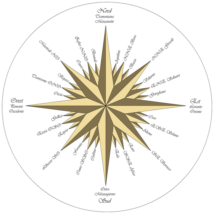
The diagram of the wind (Wind Rose) is used in order to know which directions the 8 major winds (and sometimes 8 half winds and 16 quarter winds) blew within the planet. In fact there’s no difference between cardinal directions and the winds which blew from the same points. Wind roses use 16 cardinal directions, such as north (N), NNE, NE, etc., although they may be subdivided into as many as 32 directions, so that creates a distinction between the degrees of each cardinal point ( North corresponds to 0°/360°, East to 90° exc.)
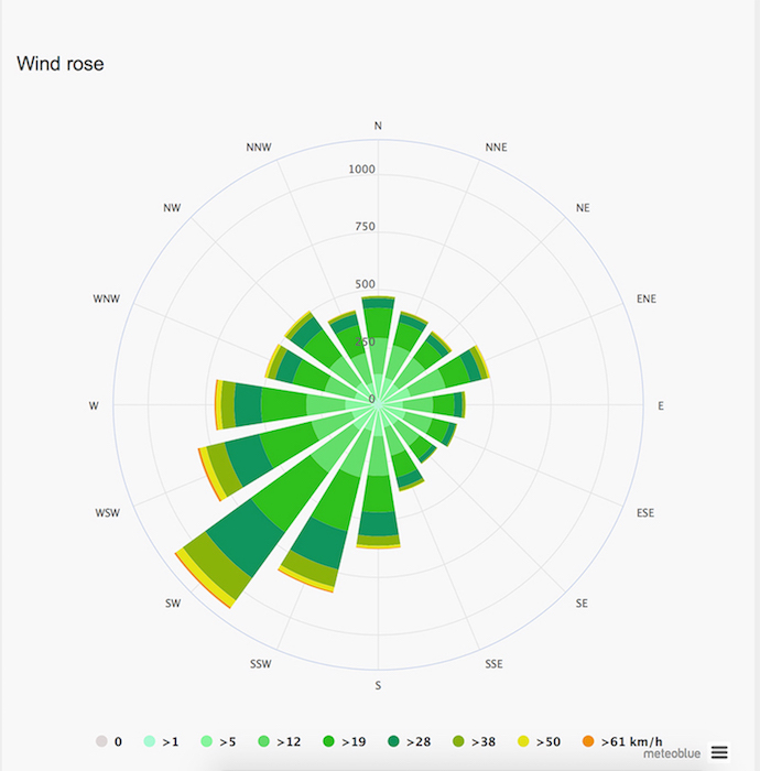
At the beginning I tried to give more of a strict or scientific approach to the work and to create something actually handy. In fact many airport, such as Amsterdam have records of how the wind had blew during the years. The diagram below demonstrate how the wind rose for Amsterdam shows how many hours per year the wind blows from the indicated direction. Example SW: Wind is blowing from South-West (SW) to North-East (NE).
My idea was to create a system based on how the wind blows in the city of Amsterdam, during a period of time, I wanted to actually use the records from the airport so to relate each cardinal point to a colour.
After reflecting on my idea for a while I realize that I was unsatisfied and things such as the difficulty of reaching the records and a big lack of interest and real personal approach on the theme were influencing my working process.
I started to reflect again on the idea that I have of wind and how I feel about it and after a while I found the perfect way to combine my interests to the work.
Wind is really almighty element that influence our existence, something that never stop blowing and will never stop. So I had to put this power in to my work and include it in to it.
I decided to work with coloured smoke emitter, and to bring my colour system where it belongs.
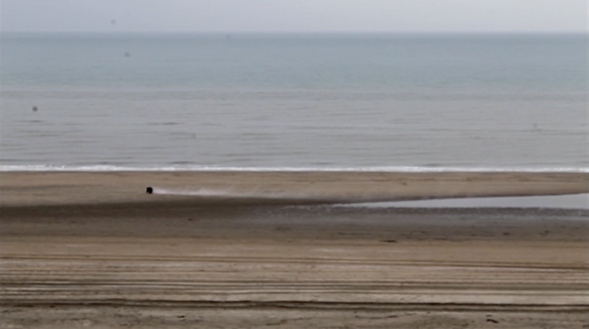
My initial idea started when I went to the beach and under the “eyes” of the camera I positioned 4 coloured smoke emitter on the sand. One for each cardinal point and then turned them on.
Since the regulation of the Netherlands doesn’t allowed smoke emitters with an high percentage of gunpowder, as expected due to the power of the wind, the emitters in my possession barely worked (result in the picture below).
The attempting of creating a land art piece, worked quite bad, consequently to solve the problem the solution was to work with the idea of the wind as an untouchable and floating element.
I decided then to create a performance in the spray-painting room of the main Rietveld Academie building, a really loud place caused by the ventilation of the room that reminds me a lot of the sound of the wind or how loud the wind can be.
click here for the performance.