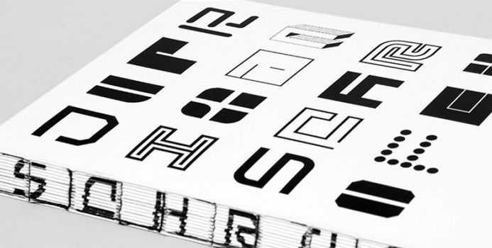
 Looking across the spines, looking for something that will excite my eyes and brain. looking for something I will like, that will make me feel something. So many titles of enticement. The search started with colour. What is the best scheme? The text doesn’t appeal but the colours do and vice versa. The high contrast of complementary colours creates a vibrant look especially when used at full saturation. The colour scheme must be managed well so it is not jarring. Many books later I start to think of harmonies, they usually match well and create serene and comfortable designs. Analogous colour schemes are often found in nature and are harmonious and pleasing to the eye. I have stumbled upon a trove of material. The search has been narrowed and now the idea of colour appeal does not suffice. The search then narrows to binding technique. The differences stand out. I try to purely focus on the physical aesthetics of the book. Focusing on what I like and what appeals to my eyes. As i blouse I seem to stumble upon more and more books which could be candidates. The diversity is wide and intimidating, many thousands of books stand in front of me, decisions need to be made. My choices have been narrowed down to mostly graphic design books. As I conduct the final steps of the test; browsing through the books. I judge purely on my own likes and dislikes. I am not satisfied with my final books so I go back to the search. Suddenly a book stands out to me, the binding is complex yet satisfyingly simple and minimalist. I pick up the book titled “restless typographer”. I sit down at the table and start to flick through the book and my mind is made up. This is the book I must choose. It spoke to me and I listened.