Skip to Content Skip to Search Go to Top Navigation Go to Side Menu


"shapes and forms" Tag


I’m new here


Friday, May 24, 2019

.

*****

I don’t really know the way, but I want to. I have this habit to wander off randomly when I’m unknown with a place. Just to see where I’ll end up if I let go of control. “Let fate decide” says the romantic in me.

After a while I see patterns and I believe that I know where I am. Finding attractive by-streets in every corner. But that’s an illusion. By the next turn this pattern is shattered by reality.

I don’t know where I’m going, but I know I don’t want to stay. Just keep going, till this frame turns into bedlam. Borders can’t contain me anymore. Looking back I can’t trace back my origins. I’m not lost. I’m new here.

I am chaos.

.

Type in Space


Tuesday, May 22, 2018

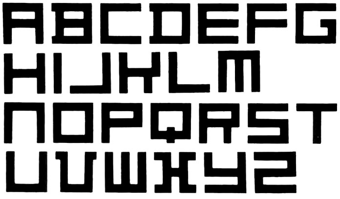
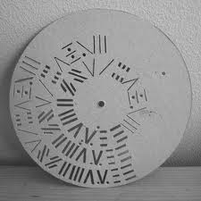
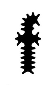
In 1995, the graphic designer Zuzana Licko created the typeface
Modula Ribbed, a variation from the original Modula font :

Zuzana Lincko - Modula Ribbed

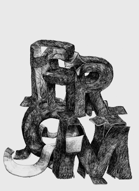
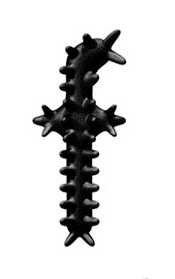
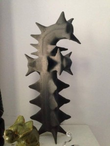
Then Guy Williams, made an 3D virtual interpretation of it with the program Alias, called Polymorphous : (see Dimensional Typography [x], J.Abbott Miller, 1996)

b

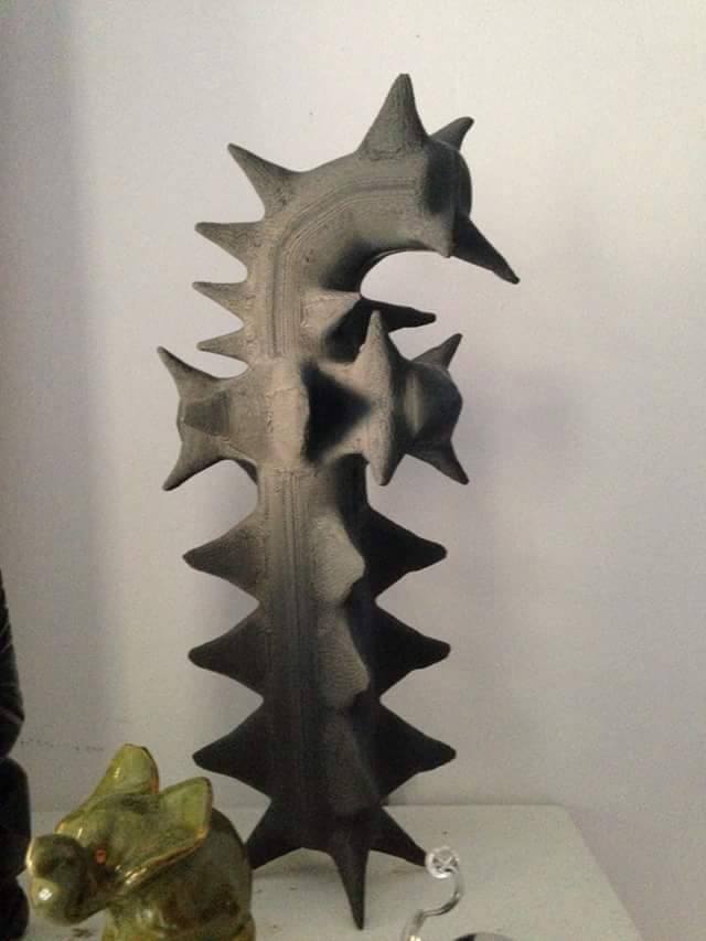
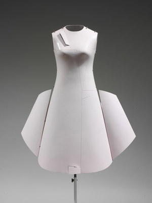
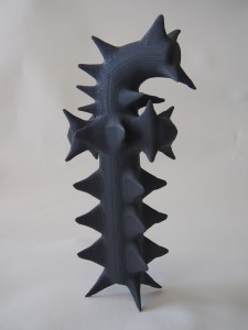
An former student of basic year, Suzanne Jensen, realized a 3D printed version of this letter as part of this research program back in 2016

42-225x3003-225x300

Modula


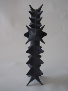
The original version of Zuzana Licko already shows an interest around a 3D perspective. Flat but already shaped; round, but with a sharp feeling. As if Licko already had in her mind the physical sensation of this letter in her hands. Considering this, we even could imagine this one as the shadow of Suzanne Jensen’s object, realized years after. Surprising how the shadow come first, before the object.

Simple, efficient, and very particular, Licko’s « f » gives a lot of inspiration for who’s interested in 3D environment.

Guy Williams obviously got inspired by those multiple peaks, and came naturally to this virtual 3D representation, which doesn’t surprise next to the original one.

S. Jensen challenged to finally give this « f » a physical form. The next step for her was to think about the materials and a  technical realization : how to choose a material which gives the physical feeling expected through the previous examples, and how to realize it with a practical and efficient technique. The 3D printer was obviously the most clever solution, to get quickly if we can say, a first physical result.

On the basis of those 2D to 3D experiments, and the desire to give a physical touch to a letter, comes naturally a curiosity for the other way around. Observing our daily environment, well known from us as a 3D space where everything get a shape, a form, a touch. The thing is to get into the same processes as Licko, Williams and Jensen did : looking at the qualities given by the dimension we work on, to see how they can relate to another dimension. The idea isn’t really to get a space visually flat, to then guess typography on it, but to perceive letters as 3D objects. Doing so gives almost infinite possibilities, typography appears everywhere, as long as we make a visual effort and look through different points of view around a portion of a space.
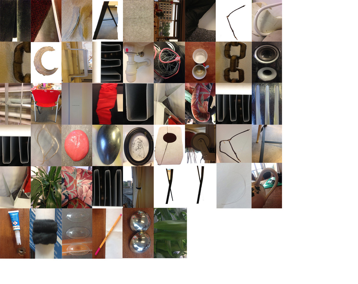
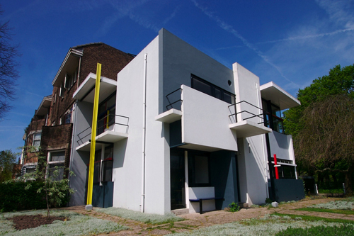
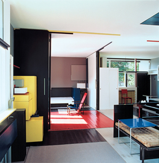
 

blog

In an apartment

p p2 p3 p4


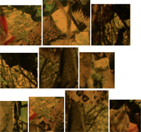
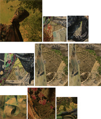
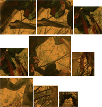
As well as in nature

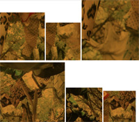
A skyline of colorful contrast talks in different shapes and by every millimeter i move my head a new letter appears by light incidence


A 2D surface already offers a lot of possibilities, considering that 3D got this 360° properties, we can imagine how far it can go. After looking around for  some time, the viewer get quite used, and letters pop up naturally to the eyes. They start to get bigger and bigger, as we don’t look only at human sized space and elements, notion of close and far disappear: buildings, trees, highways, clouds, …


blog fin

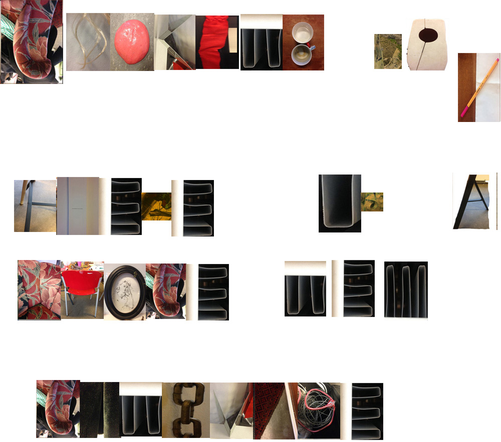
Looking up, there is a whole new language


So you like patterns?


Sunday, November 26, 2017

The book I choose to research is called ‘Biogea’ and was written by Michael Serres, and designed by Jason Wagner. Published in 2012 by Univocal Publishing, which Jason Wagner co-created with Drew Burk.
From the design of this book and from other books that Jason Wagner has designed I can see hints of his personality if not that then definitely his direction of interest. The way all the patterns are so precise and clean cut gives me the impression that he has a methodological nature and an obvious love of patterns both simple and complicated, while enjoying a subtle use of colour. As seen in another book designed by Jason Wagner ‘Variations on the Body’, which is also written by Michel Serres.

Variations -Cover

The fact that Jason Wagner is a part of the Univocal means that a critical look at the company can give an insight on the designer and ultimately the design itself.

Univocal Publishing was founded in 2011 as an independent publishing house specializing in small-scale editions and translations of texts spanning the areas of cultural theory, continental philosophy, aesthetics, anthropology and more. Univocal’s books including Biogea combine traditional printmaking techniques with the create evolutions of the digital age and feature letterpress covers designed by Jason Wagner, who demonstrates the technique in a video.

https://youtu.be/qwQSNhor1EQhttp://

Using techniques similar to this the publishing company oversaw the printing and binding of books from 2012 to May 2017, in which it ceased operations and merged with another company. This could seem to fall down to Jason Wagner who is stated to be moving on to pursue other projects.

But why did I choose this book? I decided on this book for a variety of reasons. I enjoyed its’ simple yet complex design containing a neat revolving spiral-like pattern which is placed in the middle of the book and looks pleasing to the eye. The pattern it self drew my gaze as I found it really intriguing as it resonated with my own interest in complex and unique patterns which I like to create.

The plain colours and easygoing layout of the book for me made it feel more approachable. The design it self didn’t take anything away from the content, for sometimes I feel that the cover of a book can sometimes give you false expectations of what it contains. Being misled into buying something based on its looks. This book however balances this nicely I think by not taking anything away from the content but instead relating and highlighting the themes within.

Biogea

The Typography is placed on top of the design and relates to and supports it nicely. Accentuating its colours and giving the book a clean and natural feel. The pattern initially drew my attention to the book, but as I took a closer look I found that the texture around the design on the cover felt good to the hand and gave it a thicker and more solid feel. This impacted on my decision as the pattern and texture subtly blend their delicate qualities together to create a book that i found aesthetically pleasing. While the design since imprinted on a thicker material felt noticeably different making it stand out from other designs and books.

The almost scientific complexity of the simple and delicate design also relates well to the content of the book for it’s a mixture of poetry and science. While also presenting a philosophy that merges the humanities with all creation. This has made Michel Serres “one of the most intriguing thinkers of his age”, and I believe is a reason why Univocal publishing has design and printed most of his books. Because of the authors philosophical and poetic inquiry sings praise of earth and life, and what Michel Serres names singularly as ‘Biogea’. The design relates well to the content as it mixes light fresh colours with an intricate pattern, which gives a natural clean aesthetic relating to some of the topics within the book. Some of the obvious examples being the use of blue in the typography which links with text within. “ Today we have other neighbours, constituents of the Biogea; the sea, my lover; our mother, the Earth, becomes our daughter; this beautiful breeze which inspires the spirit, a spiritual mistress; our light friends, the fresh and flowing waters.

Even though the design itself is quite precise it has a sense of movement to it and gives the book a poetic feel to it, this also relates to the content, as it’s a mixture of poetic statements revolving around natural themes. “In these times when species are disappearing, when catastrophic events such as earthquakes and tsunamis impale the earth” the author wonders if anyone “worries about the death pangs of the rivers”.

The author asks the same question of philosophy “as the humanities increasingly find themselves in need of defenders. Today, all living organisms discover themselves part of the Biogea”. Knowing the content of the book also ends up shaping my view on the design of the cover as the series of lines almost create a shield like swirl or sea creature, protected by the bold strong title Biogea.
 

Biogea, designer: Jason Wagner, Rietveld Library Cat. no: 157.3 ser 3

Building Blocks: De Stijl and Typeface design


Friday, October 20, 2017

video-1508250602   Spending an afternoon using an old letterpress I experienced what it would have been like to create printed text in the early 20th century until offset printing took over almost completely. This was a nice way to immerse myself into the subject of De Stijl and its relation to type design.

The Stijl movement which was founded in 1917 consisted of artists and architects who started building a new world, presumably as a result of the war that was just coming to an end. They literally started constructing their ideal world out of furniture, buildings and artwork. It seems to me that they tried to clear up the mess they saw around them by creating perfect straight lines and rigid blocks. Using primary colours, black and white, strict rules and useful functions they began portraying a ‘perfect’ world. In a way, they brought everything back to the basics while simultaneously making basic things more complex.
When researching De Stijl’s typeface design the first thing that comes to mind is the magazine published by Theo van Doesburg. The front cover, designed by Vilmos Huszar particularly caught my attention. Specifically the way the same exact rectangles create both the image and the type.
It seems to me like a practical method to create text, why not use the same structures used to create image, kill two birds with one stone kind of thing, and seeing as the spacers of the letterpress are perfect rectangles why not use those…? The Doesberg type shows this use of the letterpress spacers particularly well. One can see exactly where the spacers have been placed to create the alphabet.

alphabet-Theo-van-Doesburg-02
The same goes for Vilmos Huszar’s use of ‘building blocks’ to create both the text and image of the Stijl magazine cover. Or the logo he made for  ‘Miss Blanche Cigarettes’, again the same shapes are used to create the text and the image.

Huszar


This theme of using the same ‘building blocks’ to create image and text alike began to be a recurring subject in my research on de stijl’s type design. The line between image and text seems to blur and they both become the same thing, both showing information to the viewer.

Another fine example of this, is the 1941 publication of the fairy tale Het Vlas (The Flax) written by Hans Christian Andersen and illustrated by Bart Van Der Leck. The entire book is constructed out of straight lines, both the text and the images. One can see the strict guidelines that Van Der Leck stuck to precisely. This idea of having strict rules interests me, I find myself doing this at times with my own work, for example not letting the pen lift off the page. Although it makes sense to create these guidelines at times, I do get to a point where I’m thinking ‘I could create a more satisfying outcome if I didn’t have these self imposed rules’. Perhaps I am experiencing a similar thought to that of Van Der Leck when after disagreements with other members of the movement he decided to depart from De Stijl and create more abstract works with diagonal lines and other shapes and colours. Here is an early piece by Van Der Leck from his time with De Stijl and then one of his later works where you can see his departure from the strict guidelines.
 

Compositie 1917 no. 3 (Leaving the Factory), 1917 Abstract Composition, 1927
 
Abstract Composition, 1927 / Compositie no. 3 (Leaving the Factory), 1917


Going back to when he did use straight lines to illustrate the images and text for the fairytale, it seems as if this rigid rule was almost created as a challenge… To push further into the non obvious, the non default way of drawing things, the strictly abstract and to also challenge the viewer. In the literal sense as well: the text in this book is not necessarily easy to read.

Lets not forget who the audience of this book was supposed to be. If I imagine coming across this book as a child, lying among all the other softly illustrated fairy tales it would definitely stand out, I would have had to focus extra hard on each letter for it to make sense and watch as the lines constructing the letters merge into the ones creating the images. This principle, the way the image and the text is created in the same way, out of the same blocks is what stands out most about the typefaces designed by De Stijl. To take this one step further, it could be said that it is all the same, all the creation made by these artists is the same, for they use the same rules and guidelines.

The buildings, the furniture, the paintings, the typeface, all a creation from the same lines, forms, shapes and colours. This element is what I tried to explore in this little animation, the way the same ‘building blocks’ can create image and type. The seemingly rigid forms shift and transform around the page and merge into each other. Where is the line between image and text? I tried to play with this concept by letting the ‘building blocks’ move around the page and shift from image to text and then back again.

THE THRILL OF CONFUSION/ POINTY BEAUTY


Monday, September 30, 2013

One piece of the permanent exhibition at the Stedelijk that stimulated some form of internal reaction was ‘Cow Chair’ designed by Niels van Eijk in 1997 for his graduation project at the academy in Eindhoven.

At first glance it appears to be a thick legged kiddie chair with a cow hide pinned onto it, which is nice enough – I remember thinking how well it would go with my new old cowboy boots – however, much to my astonishment, as I drag my feet past the seat to check off the next object to admire that it was obstructing I sneak a peek into the chairs insides, where to my amazement was in fact no such chair supporting the skin! I began to pace from one side to the other, pushing my face as close as I could to the void within without drawing the attention of the eagerly hovering security, reassuring myself that it was truly self-supporting.

Curious, the way that it looks so flexibly drawn around a form, with bunched creases contrasting with the tautness in the extremities yet still feels that if you were to sit on the cloth would fall beneath you like a loose rag. When considering the properties of a hide I had no reason to consider that it was it’s own shape, rather than taking the form of a structure beneath it; after all, isn’t that what skin does? My perception of the design changed completely; a hollow, anorexic skin made rigid by the last moistness of life being drained from it, locked together by savage stitches pulling at the skin as both leathers shrink in opposition.


Rather morbid, really.

As oppose to being a complex object that requires calculated thought to attempt to understand, such as an optical illusion or some form of puzzle, this intense feeling of pure confusion is induced when a seemingly mundane, daily object or situation is not how you automatically assume it to be; so automatically  that you don’t even think about it, that’s what really puts you out of whack. This sensation is one that has fascinated me (or haunted, in some cases) since I can remember. One chair related experience almost brought me to tears, it was such bedlam. On a morning no different to any other I took my usual seat at my dining room table with my tea and toast, but as I slid my chair under the table the top of my thighs brushed against the underside of the wooden table; this never happens! I was simply overwhelmed, I just didn’t know why it had happened. I called to my mother to seek an answer, ‘oh, well it must be because one of the chairs is slightly lower than the others, they must have been switched’; what a cruel trick to play so early in the morning. It was such a minute change that upon reflection such a reaction could easily seem somewhat overdramatic, but in the heat of the moment it truly felt like the world was crumbling around me and the chair.

The experience with the cow chair was less of a painful confusion and more of an intriguing, encapsulating.. confusion.  An object to eradicate all other drifts of thought.  To be noticed above all other things, even if the intention of the design is to be discreet . To create an object capable of such engrossment is surely the target of all designs? I find it so refreshingly satisfying to experience such a concentrated distraction, allowing you to grant all focus to the subject at hand, being lost in thought for something that is really real. After all, how can you think in an unclouded manner when you’re constantly mentally multitasking?

Niels and Miriam, hangin’ out.

Mr. Van Eijk and Miriam van der Lubbe have been partners in design (and in [x] their personal lives) since they graduated from the Sandburg institute, leading them to found their design studio in 1998, which lead to their own label: Usuals. Whilst managing not to come close to making the same thing twice, these two capture Dutch design by collaborating humour with vast imagination and experimental works, ranging from spacial projects to product and furniture design; this creative combination attracted numerous museums and other collaborative design companies such as Droog, and many others.

‘Poodle Chair’ 2002, another example of humorous chairs by VEVDL.

The design was of pure inspirational birth. According to ‘Subjects’, one evening whilst Niels was admiring his shoes he was captured by the way the leather formed so beautifully around the point of the toe he thought ‘if this is possible, it must be possible to make a whole chair this way’. This notion developed my opinion on the design even more so; I like a good lump of leather around my feet and can absolutely empathize with the new found pointy beauty that the chair possesses. Why, I just want to wrap myself up in a crispy point of leather.

Although I am a great enthusiast in the field of pointy-leather-beauty, I can’t help but feel a mild disappointment towards the  lack of confusion in the way the design was conceived; it all seems a little too cosy. Alas, perhaps only few are subjected to the level of intense confusion that taunts me so heavily.

Herman Ebbinghaus, Deconstructing the Phenomenon


Thursday, November 29, 2012

Introduction

Herman Ebbinghaus (1850-1909) was a German psychologist, who pioneered the experimental study of memory, was the first one to talk about the learning cube and is known for his discovery of the forgetting curve and spacing effect. He has also discovered a color system, based on a double pyramid colored Red Blue Green and Red after Leonardo da Vinci’s idea. The idea was that due to the variation of brightness, those four colors can be separately distinguished. He strongly believed that being aware of the physiologists discovery,  in the eyes retina there are only three photo-sensitive substances who are responsible for the phenomenon of colored vision and its anomalies. He published in 1893 in the Journal of Psychology in Germany, a “Theory of Colour Vision” – in which he mentioned that humans perceive colors through higher mental processes. He had then discovered that if one of the combinations of pyramids, red and green or yellow and blue have a common base in a three dimensional space and that base spins (as seen in the image), two white hues are produced and the brightness is linked to the speed of the spin. It is a purely phenomenologically oriented portrayal of colors in which the complementary pair does not find a place opposite one another. The double-pyramid has then came to be a stronghold of phenomenology, an era in which colors were simple came to a close. After Ebbinghaus discoveries physics could never be certain again about the nature of light and it’s wave and particles properties that have also been discovered at the same time by Albert Einstein.    

The Machine

It really got me by surprise me that i couldn’t find any other source or any other image besides one website. All about this color system is theoretical, it hasn’t been applied into action. So i was curious to see this phenomenon happening. My first attempt was to create a physical machine with two rotated round edge squares, one would fit into the other and with the help of two air blowers, it would turn.The machine didn’t have much success as i realized immediately, it was an interesting shape but the squares didn’t turn fast enough therefore the phenomenon couldn’t appear. After creating the machine i wondered whether a digital form could be more efficient.

  (more…)


Wednesday, January 18, 2012

entering.
sucked in.
floating.
utterly detached.
vanishing edges.
out of focus.
trying to resume.
luminous.
reverberation.
collapsing borders.
surfaces.
totally surrounded.
circling around.
indifferent.
spinning.
round. round.
lined.
behind.
different shades of. red. yellow. purple. green. blue. pink. black. white. grey. brown. orange.
passing by.
driving.
forms. square. rectangle. stripes.

trying to summarize.
repack.
total loss of consciousness.
realization.
scattered.
vague.
blurry.
still floating.
losing direction.
packed.
rapped.
interest.
curiosity.
surprise.
amusement.
hope.
joy.
elation.
triumph.
attraction.
desire.
admiration.
panic.
aversion.
disgust.
revulsion.
fear.
anger.
rage.
cruelty.
hate.

greed.
jealousy.
sorrow.
grief.
remorse.
embarrassment.
shame.
guilt.

with hands forward walking. touching. scanning.
soft. squeeze. searching for edges.
lost. still floating.
vanishing.
deleting.

disappeared.


this post is part of he subjective library project "Unopened Book"
the book can be found at the Rietveld library : catalog no : -rothk-5

Rietveld knew his lines


Thursday, November 24, 2011

Two years ago I was building a model of a chair. After I have stared in 50 minutes of a detail of two black straight lines at the chairs back, my friend asked me: ”Julia what is it about your lines? There is only a difference of one centimeter?” I didn´t know what my problem was, but I knew this centimeter was a critical part if my chair would communicate or not. When I visited Rietveld Schröder house I got reminded of the situation with my friend. Every centimeter of the house was dynamic. The Schröder house with its characteristic bright colors and construction touched me. I could relate to myself in the aesthetic expression, but what do I have in common with the way Rietveld was working with the Schröder House?


Mrs. Schröder let Gerrit Rietveld design a house for her and her children. Rietveld and Schröder worked with the original idea together but Rietveld decided about the color and form. Mrs. Schröder wanted to have the interior with an open space that was customized for her everyday activity. Rietveld created a house that combined this everyday life with a playfulness. The house is made like a coordinate system of flat surfaces and straight lines. He used geometry och mathematics as a tool and trusted his feeling when he created the form. Gerrit Rietveld could feel if a form was working or not. He was only using geometry and mathematics as a tool. He was thinking in three-dimensional terms and sketched in 3D. His first model was made of solid wood which gives character to the building. The second model was made of cardboard, glass and matchsticks which is different from clay that usually is used as model material.


He worked asymmetrical when he composed volume of the different surfaces. One rule he used was that the lines should not be perpendicular or parallel with each other. This is associated with his feeling of three-dimensional forms. He could feel when the planes have the right position.


He worked playful with the surfaces. When he was working with overlapping he always let one line continue in front or behind the other one. I believe that if  a corner had been formed it had been a static expression. Some surfaces were slotted in the facade so it visually looks like they go into the wall. He built volume by letting the flat surfaces be slotted into each other. The Schröder House has multi intersections for the structure, but the main reason for that solution is aesthetic.
For Rietveld it was more important to create volume with space, then the material with which it is built. He said “The reality which architecture can create is space” (The work of G. Rietveld architect; Theodore M. Brown; A.W.Bruna & Zoon, 1958).


He was influenced by De Stijl’s paintings in the way he choose to paint details in bright red, blue and yellow. The facade was painted in white but with blocks of three different shades of grey to make the surfaces fold back into each other. He decide to have black lintels to make them reflect as little as possible and make them become one with the windows. From a light view the window’s reflect black and in that way he made a stronger connection with the interior and exterior space. The colors is important in my personal impression of the Schröder house. I like that he works with color at the same way as with a three-dimensional surface. He gave me the feeling that he was sculpturing more than painting when he arranged the color on the surfaces.


I got emotionally touched by the Rietveld Schröder House because Rietveld did not work with that house in a traditional way. He was feeling the forms. Just like me when I was working on my chair. I knew something was wrong. I am sure that Rietveld has been staring at a lot of angels and compared a 132 cm long beam with a 135 cm long one, when he was designing the Schröder house. Just like Rietveld I prefer to sketch three-dimensional and I´m thinking a lot about how different form relates to the space and to it self. I think Rietveld shows in the Schröder House that architecture can both work as an art aswell as a design object to which you can react and feel touched, but which is at the same time a functional home. That Rietveld used the elementary forms and had the ability to keep their independence in the new wholeness is what makes this house special to me.


Karl Nawrot, fascination for the In-Between


Monday, March 7, 2011

Typefaces always seem to be facing the wind, two feet on the sheet of paper, unmovable. Like a silent army, arranged according to there ranking, there are ready to take a new formation. This traditional and almost absolute arrangement tends to make us forget how those typefaces got there, what is there personal journey, what and even who shaped them like that.

Karl Nawrot seems to be privileging this particular journey i am talking about. So to say, his typefaces carriers are far from being all traced beforehand. Moreover, he seems to be having even more fun in creating devices and means to form those letters than in the final presentation.

By using tools he creates himself, he lets the door ajar to imagination, not exhibiting the letter as a final assertion but as a possibility. Stamps, enigmatic stencil disks, collages celebrate as much the process as the result.

Thereby the designer does not hesitate to present those tools, such as the stencils disks, also through a series of posters, respecting somehow the presentation of typefaces. By creating a parallel in the presentation, he builds up a clear bridge between the making and the result, putting them on the same level of importance.
Through this interstice he offers us, one can let his imagination grow about what could be the final arrangement.

But is it not the definition of children games ?Making use of the possibility of the material and playing around it more than gathering all the forces to the final result. Indeed he does not only create his own tool, he also documents the process by making use of stop-motion movies.
Once again the use of this device to present his work makes it really fun. The videos or clip-arts that can be found on his website, www.voidwreck.com , are, according to me, by no means instructions for the proper use of those tools but once again a celebration of its inner-possibilities.
Thereby, in a interview he gave to the blog Manystuff.com in January 2011, he gives his definition of what a good design is. He declares : ’’A good design gives you the feeling of a piece stuck between past & future.’’

Playfulness is definitely the word I would use to describe the work of Karl Nawrot. However focusing on this aspect would maybe undermine the importance of geometry in his creations. Indeed if there is space for game and ‘’abruptness’’ in the realization, there is a clear rigor in the fabrication of the tool. On the one hand the Stamps Box conceived in 2005 and 2006 has a clear connection to childhood but on the other hand the rubber stamps consist of drawn geometrical patterns of the same size. Even if Nawrot limits himself to four simple geometrical shapes (rectangle, line, triangle and circle), he succeeds in generating 150 different stamps : the result of an intense research in exhausting the possibilities and combinations of shapes.

Still Karl Nawrot is not only experiencing with typography, he is also an illustrator but those two interests tend to meet again through the approach he uses.

Indeed the letters he draws seem to peel themselves off, falling into pieces. But the movement could also be interpreted in a reverse manner : the letter getting slowly their final shape under our eyes. Once again Karl Nawrot creates the ambiguity, describing physically this in-between he invokes below, ‘’between past and future’’.

Background :

Karl Nawrot attended the graphic design school Emil Cohl in Lyon, France. He was accepted at the Werkplaats Typographie in 2006. He is now established as a graphic designer and typographer in Amsterdam where he lives.

what is happening


Wednesday, March 10, 2010

how can a line be straight from one angle, and curvy from another?

I turn the watch over and look and turn again.

what is happening?

it is all angles and shapes,

it’s all curves and lines,

its all male and female,

unexpected angles, unusual proportions.

I can keep discovering.

This watch is the property of science fiction classics and uniformed airline officers in the future we will all have microwaves and flying cars

and this desk

sculpture in space on figure in future


Sunday, January 24, 2010

In 1913 Victory over the sun was firstly performed in Moscow. From aesthetic perspective, it was Malevich who was responsible for the costumes and decor, we may recall upon this happening as the start of Suprematism.
In 1920, this time directed by Malevich, the opera was performed again. During this period El Lissitzky made his lithographic designs for the nine figures from the opera. Instead of costumes he designed electromechanical puppets. Puppets that would be controlled by one person. Lissitzky deliberately left this concept at the stage of the lithographies, as he had made his mind up that he wasn’t going to be the one realizing the project. “You can do this”, was his vision.

In terms of fashion, there are many ways to encounter these designs. I myself encountered three major elements that can be related with contemporary fashion: technology,expression and giving emphasis to -suprematist- shapes by utilizing them in a different context.
The use of electro mechanism could have easily inspired the work of Turkish designer Hussein Chalayan. This element comes strongly back in his 2007 spring/summer collection, used as a tool to transform. The remote control dress as an interesting outcome of the same mentality.

Dutch designer duo Viktor & Rolf greatly succeed in establishing moods and characteristics through their designs. Making these -invisible- elements visible and more importantly visual. A resemblance that goes up for every figure from the opera designs by Lissitzy.

British designer Gareth Pugh touches on these elements too, though in a more abstract way. Abstract in the sense that clothing no longer hold on to the outlines of the human body, but -form wise- is completely free to go into any directions. Great representatives of these elements are Japanese fashion designers -or rather fashion sculptors- Issey Miyake, Rei kawakubo and Yohji Yamamoto.

The Yellow Dot


Thursday, November 5, 2009

I choose a book on jewelry because jewelry often has some very nice organic shapes and colors that in a way makes them not much different from paintings. The reason I picked out this book about jewelry, instead of the others was because there is a yellow dot on the book which was the first thing that got my attention. The pictorial content of the book was more or less what I expected, when reading the title ‘Twentieth Century Jewelry’.

Rietveld Academie Library No:


Log in
subscribe