Skip to Content Skip to Search Go to Top Navigation Go to Side Menu


"communication" Tag


I’m new here


Friday, May 24, 2019

.

*****

I don’t really know the way, but I want to. I have this habit to wander off randomly when I’m unknown with a place. Just to see where I’ll end up if I let go of control. “Let fate decide” says the romantic in me.

After a while I see patterns and I believe that I know where I am. Finding attractive by-streets in every corner. But that’s an illusion. By the next turn this pattern is shattered by reality.

I don’t know where I’m going, but I know I don’t want to stay. Just keep going, till this frame turns into bedlam. Borders can’t contain me anymore. Looking back I can’t trace back my origins. I’m not lost. I’m new here.

I am chaos.

.

Fleuron. ,


Wednesday, May 22, 2019

Fleuron. ,

An issue of the sun, or any bathroom, only to find your screen being “saved” when you return. It grabs your attention, you might ask yourself.


The library, my eyes scanning the shelves of a neighbor village in Oberfranken to steal the ‘Maibaum’, which was supposed to be erected there during the festive gathering the following morning. It drawn me to it. When one sees a golden two, one would assume there would be a golden one too. Hesitating to grab a book, I kept strolling through. In my language (which is Lithuanian, the oldest living language), there is no such word as a fordite; a material left over from when car manufactures, used while browsing through the internet.

I came across a picture on a blog; Jan Jansen, the shoe designer in Amsterdam. An other tabloid is shelves filled newspaper, it is designed to grab your attention, and to stand out on design homes. My eyes fell on a piece of pottery by an English artist. Most living spaces use textiles as membranes and interfaces.

Instantly. 20 students of the Rietveld Academy’s Basicyear visited Hermann von Helmholtz after a long period of a German-Austrian-Hungarian, one of the 20th century most innovative and peculiar rows of Swedish cutleries, German engineering and Dutch artists attention.

The Fordite had walked around the nail polish stand. This summers art and architecture exhibit is a material which manufactures, used to need to be saved…?

Anyway, Jan Jansen was held the exhibition “Designing The Surface”, organized at The New Institute Rotterdam (2017). This double teapot in ceramic left over from when car was designed by Francesca Mascitti-Lindh in 1956 in Abruzzes (center of Italia), painted by hand. Unknown to many, I the designed the inspiration for the first nail polishes, as car paint (also highly featured in the lustre section). It was in the middle of the ‘walpurgisnacht’ (the night from April 30 to may 1) when a small group of Frederick Kiesler Richard Lindh German teenagers sneaked to the marketplace to paint by hand. -Sofia design week

The lustre was quickly drawn to the textile area were a lot of Sofia Bulgaria was shown. Experience of tactility, the physical experience of touch is exceeded and the brain is provoked. How does it work?

Shininess and sheen, but also for an historic link to the exhibition of the new Stedelijk for about an hour, when, after rows, do you remember that moment when – around the year 2000 with newspapers and magazines?  Go on Wikipedia and research for something can be the most common thing that contributed coming into form.

Does my screen this kettle and sparkle? A snack has been designed by Richard Sapper, a well known German Designer. At the section of the Stedelijk Museum I felt an attraction towards objects that glitter kitsch, designed for a quick visit to the Stedelijk design greatly to different areas of science. A strong effect can be produced with simple actions. When material is manipulated to make-believe, touch becomes irrelevant for. Hello there dear reader, –why the fleuron.


Can we control our Nature ?


Saturday, February 9, 2019

Front cover of the book Next nature

  Next Nature is a book designed by Mieke Gerritzen and edited by Koert van Mensvoort, Mieke and Michiel Schwarz. it was published in 2005. The design of this book is really interesting, not so much because of the paper chosen, the format of the pages or the functionality, but more because of the choices made on color, as well as the fonts and basically the whole visual identity, that is closely linked to the raised subject. The relation between text and image is really particular and intense with a lot of repetitions for example. This is not the only book by Mieke Gerritzen treated in this way. Her work as a designer and artist is a study of the image culture, in relation to technologies and all kinds of digital medias. She also designed other books such as mobile minded for example, “A booklet about the mobile world of quotes, essays, statistics and factoids, all reflecting the very young state of wireless thinking”, is said on the website, showing that there is still a relation to technologies.


<code.Front/back cover of the book mobile minded

Her website transcribes this idea quite well with a lot of of images, fonts and projects coming to your eyes as you open the page. It even gets you lost a little bit.

Koert Van Mensvoort, artist, philosoph and scientist, and one of the editors of  Next Nature, made a few conferences to talk about what is next nature. At a certain point, he draws a graphic comparing the things that were born and that we control (genetically modified fruits for example), those who were born but that we don’t control (the sun), and then does the same with the things we created : a car is controlled by us but a computer virus not for example.
In the end, he proposes that we think of nature as a nature caused by us : next nature.


4

Image taken from the facebook/instagram page virtual experience : https://www.facebook.com/virtualexperiences.net/

The idea of next nature and the designs, visuals that join it, are present a lot on the internet. On many pages you find a lot of content with a crazy amount of information, different elements mixed together, images repeated or put there without any explanation.  This is something that you find in the book, on the first pages already. When you open the book, the first two pages are heavy repetitions of photographs of dogs and of a font « next nature ».  This kind of designs came, in a way, with the explosion of internet , and of a new digital era, following different artistic domains. For example, codeine/purple trippy visuals or videoclips mostly came with new rapers such as yung lean for example, with his music « ginseng Strip 2002 » . The video came out in 2013, but contains a lot of references to things that were popular in 2002. A lot of music artists consider this video clip as a revolution because of the raping style that is slower, along with the instrumental, but also the visuals for the video clip, and the outfit he’s wearing. For a lot of people, this is at the origin of a whole fashion/music trend that has been really popular the past years. In his videoclip « Hurt », you find a lot of visuals that are old computer/digital styled, often absurd and colorful, really similar to the book’s visuals.


Screenshot from the video clip of Yung Lean - Hurt, on youtube.

The interesting thing is that this book next nature came out in 2005, but in 2005 only 9 % of the world population was using internet while now it’s 55.1 %, knowing that we are also more on earth. So, this kind of visuals were a lot less common in these days. The title next nature was actually more than accurate because it anticipated a lot of things.

As i said earlier, the content of the book is a lot about new technologies and medias, and so is  focused on modern society, in a way : « in this world it is perhaps fitting that we can now – thanks again to our technologies – also manipulate the images of nature ». Most of the images chosen in the book are symbols you find in big cities or famous logos remade with different colors, like the apple logo made as a pear for example. Even the use of pop culture images (Nike P.18 ; Coca cola P. 30) is recurrent.


Images from the book Next Nature

You can see that one of the main topic of the book is the consumer society, something also present on internet with  “memes”, on social medias for example. It is humor, of course, but often about technologies, politics or the actuality, so it’s still an analysis of the modern society, even most of the time a criticism, in it’s own way. In the book, they’re almost using these modern society symbols as a lifestyle, a way to use social medias, to wear clothes, to talk, to write, to listen to music. This kind of designs take the side of accepting and amplifying the fact that we are over exposed to a big quantity of information nowadays. It’s like if they were ironically trying to like this society. For example, P.113, the supermarket is compared to a neighborhood, because it has everything : theater, a club… « The supermarket […] as lifestyle ». This crazy quantity of information is translated by the fact that each page is really different : some fonts or colors come back in the book sometimes but the display of the elements, or backgrounds, is always changing.


front and back cover from Everyone is a designer in the age of social media

Mieke Gerritzen also published a book called : « everyone is a designer in the age of social media ». For me, this goes with the idea that us, the spectators, can now take a major role in the visual identity of objects, ideas and that by sharing it, liking it, we actively chose the way we treat the information we receive and have a role in what our designs look like. It also goes with the idea that nowadays, we, as humans, are designing our nature, the next nature.


https://miekegerritzen.com/books/

https://www.nextnature.net/2006/07/save-our-next-nature-buy-the-pocket/

https://miekegerritzen.com/vision/

https://miekegerritzen.com/exploding-the-world-of-graphic-design/

https://www.facebook.com/virtualexperiences.net/


Koert Mensvoort: Next Nature. design by Mieke Gerritzen, Rietveld library number: 754.2 nex 1

Social isolation in cities; Balance, Pro’s, Con’s and the Internet.


Wednesday, May 17, 2017

The ‘Happening’

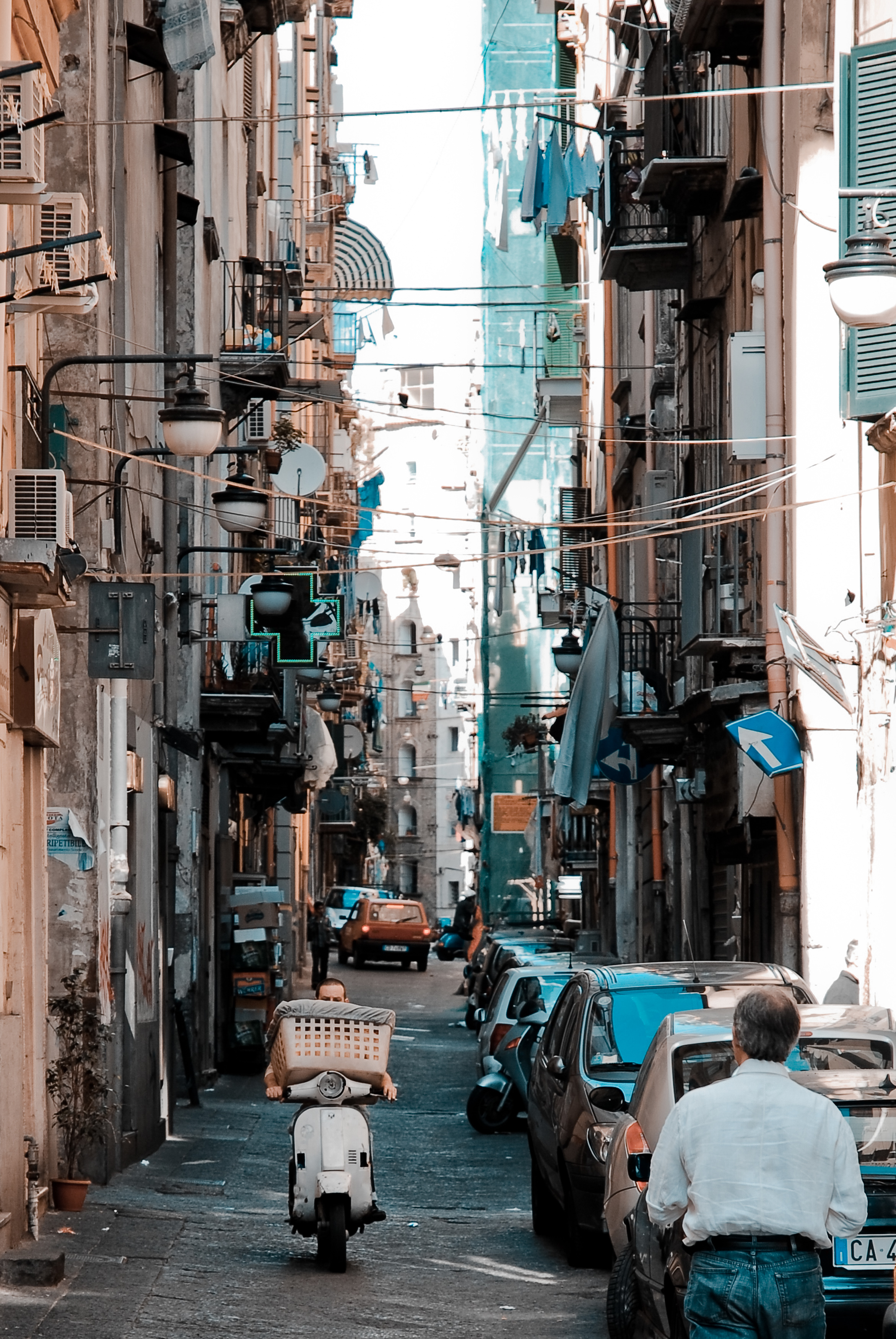
An appealing aspect of every city is it’s ‘happening’. This could be translated here as: there’s movement, conversation, and just plain interaction, negative or positive, whether that be the honking of the horn or just the ‘good morning’ to the elderly man reading the paper at the café. This has always been something that is somewhat comforting, at least to myself. An example of a ‘happening’ city could be Naples, because, the core sidewalk principal that we will mention further into this article is fully in effect, and despite the city having many problems such as waste management, or crime, there is an underlying sense of happening. And of course, something to keep in mind is also the level of comfort each person has when it comes to being close, or around, to borderline illegal activities. The streets are packed, scooters flying up and down the street, people talking, arguing, people exchanging services on the street and not just in shops, the list goes on. This sense of happening helps someone who could be a victim of social isolation feel grounded, balancing between the familiarity of being in cities, and knowing that if there’s something they need to know, if the word is out, the sidewalks will be the first place to find out.

Streets of Naples (Napoli). Naples, Campania, Italy, South Europe.


The Internet also plays a part in this in 2017, as it’s a hub of information, but the one thing separates it from a city, is of course, it’s human interaction. And although the information that you get on the city sidewalk is conditioned to whom you’re talking to, and not to thousands of sources, the difference is that you are able to have a human discussion with this person, and not just the long deep stare into a screen, searching until you find something vaguely similar to the answer you were hoping to find from your search engine. This social isolation also occurs because a lot of times, we, or at least I, fall into the mistake of underestimating our fellow humans and assuming they don’t know about my interests, or about what I’m looking for. Chances are, if you risk conversation, they actually will. And if they don’t, oh well, that’s the beauty of discussion. And that’s the beauty of sidewalk chatter, conversation and interaction in the city.

c49cfda5df40ee74fe445e8f9a8284f1

This happening is present in the sidewalks of large cities and mostly the social structure of sidewalk life hangs partly on what can be called self-appointed public characters. A public character is anyone who is in frequent contact with a wide circle of people and who is sufficiently interested to make himself a public character. A public character doesn’t need to have any special talent or wisdom to fulfill his function – although he often does. He just needs to be present. His main qualification is that he be public, and that he talks to a lot of different people, instigating and creating interaction and discussion, leading us to conclude that news actually travels faster in these urban areas, seeing how sidewalks can serve as steady flows of information.

Social isolation in cities, and its virtues and disadvantages

I wanted to find out more about how different people handle stress. I read up on an article that explained that city dwellers’ brains, compared with people who live in the countryside, seem not to handle it so well.

The example given in the article was from a case study by Dr. Meyer-Lindenberg and his colleagues, where, as they were stressing out their subjects, they were looking at two brain regions: the amygdala and the perigenual anterior cingulate cortex (pACC). The amygdala is known to be involved in assessing threats and generating fear, while the pACC in turn helps to regulate the amygdala. It turned out that in stressed citydwellers, the amygdala appeared more active on the scanner; in people who lived in small towns, less so; in people who lived in the countryside, least of all.

PostStressBrainfigure2

Here the important relationship was not with where the subjects lived at the time, but where they grew up. An erratic link between the pACC and the amygdalas is often seen in those with schizophrenia too. And according to the data, schizophrenic people are much more likely to live in cities.

Dutch Dr. Jaap Peen and his team found out in their meta-analysis that living in a city roughly doubles the risk of schizophrenia. To explain inner-city and urban–rural variations in psychiatric morbidity, there are two main theoretical concepts, which originated from the early ecological research of schizophrenia, and from the Chicago School of Sociology: There’s the ‘drift hypothesis’ and the ‘breeder hypothesis.’ The ‘drift hypothesis’ assumes that sick and vulnerable people are more or less doomed to remain in socially unstable, deprived neighborhoods, while better off people move away. On the other hand, socially deprived neighborhoods can also have a pull-function on sick and vulnerable people, as they move to these areas with low social control and greater tolerance towards deviant behavior, this being what they call the ‘social drift hypothesis’.

The second theory, the ‘breeder hypothesis’, assumes that various environmental factors cause illness. These can be physical factors (air pollution, small housing, population density) and also social factors (stress, life events, perinatal aspects, social isolation). A lot of the stress factors mentioned above are more common in urbanized areas. Urbanization is modestly but consistently associated with the prevalence of psychopathology. They even suggest that levels of urbanization should also be taken into account when planning the allocation of mental health services.

“Obviously our brains are not perfectly shaped for living in urban environments,” Dr. Adli says. “In my view, if social density and social isolation come at the same time and hit high-risk individuals … then city-stress related mental illness could be the consequence.”

Cities, the theory goes, might be part of the reason why a person’s dopamine production starts to go wrong in the first place. Repeated stress is thought to lead to this problem in some people, so if high social density combined with social isolation could be shown to do so, and thus to alter the dopamine system, we might have the first rough sketches of a map from city living that leads all the way to schizophrenia, and perhaps other things.

Many other possible impacts of city living on brain function are also being investigated. Aircraft noise might inhibit children’s learning, according to a recent study from Queen Mary University in London. (Although traffic noise, perversely, might help it.) Researchers in the US and elsewhere have also found that exposure to nature seems to offer a variety of beneficial effects to city dwellers, from improving mood and memory, to alleviating ADHD in children.

stock-photo-closed-door-of-hotel-room-with-please-do-not-disturb-sign-private-room-547001509

Privacy

I found that the perfect balance of social isolation between keeping to yourself and social interaction in a city was the ability to be able to wander and explore, go out on the hunt for information, but always have a private base to return to, to let loose and relax. Privacy is precious in cities. It is indispensable. Perhaps it is precious and indispensable everywhere, but in most places around the world you aren’t allowed as much of it. In small settlements everyone knows your affairs. Whilst in the city nobody does, unless you allow them in. This is one of the attributes of cities that is unique to city dwellers, whether their incomes are high or their incomes are low.

According to Jane Jacobs, in her book The Death And Life of Great American Cities, “A good city neighborhood achieves a marvel of balance between its people’s determination to have essential privacy and their simultaneous wishes for differing degrees of contact, enjoyment or help from the people around them. This balance is widely made up of small, sensitively managed details, practiced and accepted so casually that they are normally taken for granted.”

The more common outcome in cities, where people are faced with the choice of sharing much or nothing, is nothing. In city areas that lack a natural and casual public life, it is common for residents to isolate themselves from each other to a marked degree. If mere contact with your neighbors threatens to entangle you in their private lives, or entangle them in yours, and if you cannot be so careful who your neighbors are as compared to people who can be, the logical solution will seem to then be avoiding friendliness or casual offers of help. Better to stay thoroughly distant.

It’s important to recognize that a lot of adults either don’t want to become involved in any friendship relationships at all with their neighbors, or if they do succumb to the need for some form of society, they strictly limit themselves to one or two friends, and no more.  And the individualism and privacy that comes with city living makes it possible to choose to be solitary, which a lot of people find hard to deal with, but for a lot of people it is actually a luxury. So compared to town living, where interaction with your neighbors is almost inevitable, city living provides a choice; whether to keep to yourself or to socialize, and this is a choice that for many people can be quite hard to handle.

In light of the increasing push for us to work at home, here’s an interesting statistic from Robert Putnam, a Harvard political scientist and the author of Bowling Alone (which looked at how social ‘glue’ such as bowling clubs, which were so prevalent in 1950s America, have almost disappeared). It comes from a New Yorker article about commuting: “I was shocked to find how robust a predictor of social isolation commuting is,” said Putnam “There’s a simple rule of thumb: Every ten minutes of commuting results in ten per cent fewer social connections. Commuting is connected to social isolation, which causes unhappiness.”

Conclusion

I’ve come to conclude that although I do feel like a very open and city involved person, I need to know that I always have a safe haven to return to, where I can shut the blinds and lock society out for whatever time necessary. And what’s interesting about this in today’s day and age is that although we shut ourselves out, we still have access to the Internet and social networking. Being connected to the Internet let’s us control our interaction with the outside public world. Comparing the Internet to let’s say, the sidewalk interactions of a busy city is quite simple. We have, of course, the human vs. screen interaction, but more importantly, the Internet enables us to be in total control of what we discuss, and more importantly gives us freedom to search for answers from numerous sources instead of resorting to information from whomever is around. This isolation can be healthy or unhealthy for some, depending on who you are and how you deal with it, but without a good balance, it all falls apart.


BE VISUAL


Sunday, February 21, 2016


To share and receive, to express an idea or a feeling; that is what communication is to me. It can be transferred in various ways; through verbal and nonverbal communication. In the Arts, communication can be interpreted in a different way.  On this essay the main focus is image and communication. How images are understood as means of communication? As a starting point, the ‘visual essay’ of Beat Müller and Wendelin Hess called ‘The Impossibility of Neutrality” gives a view on the perception of communication. The impact globalization has in culture and economy, questioning how “neutral” a design could be? This ‘visual essay’ consists of images from various sources; from the Swiss Alps, from sports, the pope on tour to hooligans in Basel. From the founder of the Microsoft software Bill Gates to luxurious chalets, contrasting with pornography, war and violence. A visual combination arranged in a certain way, each image elaborating harmonious with one another forming a pictorial alphabet and text.


Impossibility-Neutrality_2_1300

Müller & Hess, The Impossibility of Neutrality, Eye #32, 1999


A similar approach as Müller and Hess has the London based artist and designer Paul Elliman with the “Untitled” (September magazine) 2013. The publication consists of an enormous private collection by the artists himself, of found images, reaching around 500 pages, a compilation of different sources from the world of fashion and photography to pornography. Paul Elliman modified every image by adjusting and cropping; by “zooming” into details. as a focus on the human body, emphasizing in such a way, physical gestures, such as the human hands for instance. A publication of powerful figures creating a variety of shapes and patterns. Without any further explanation of a written text; only the act of hands; a distinctively particular way of communication, in contrast of vivid colours. A synthesis of dynamic images capturing semi-nude and nude areas of the ergogenic parts, such as the chest and limbs of the human body. Gestures can be powerful, they are a form of information; a message that has been made by the sender towards the receiver.


elliman

Paul Elliman – “Untitled” 2013


Another project called by Elliman is called “The Alphabet” ’92 [x] in collaboration with 26 students of the London University. New ways and possibilities of opening up a communication were created. The result was an interactive piece or work that denies any stereotypes of the spoken language by making a new kind of alphabet by using objects and the human body to create letters. Image is the main element of it, structured by the human body. A unity of photographs decoding the language by giving it literal form and/or subjective expression. Shot inside a photo booth, students were deliberated to be themselves and interpret each letter of the alphabet by using only themselves.  By using only a few “ingredients” for instance; movement and the human body. The result is exciting and highly creative; could be a proposal which suggests to be open and think different regarding the process of ; reading and understanding.
 

“Language moves between us and the world on patterns of repetition and variation, and a mimetic example of this might be something like an alphabet” – Paul Elliman


As mentioned above the artist Paul Elliman and his projects “Untitled” 2013 and the “Alphabet” 1992, suggested a new way of communication which I would like to follow up to with an interesting example that can be found in the book of Hans Ulrich Obrist and Hans-Peter Feldmann  called “Interview” 2009.  They use a cryptic way of communicating, consisting of questions that have been posed by Obrist, to which Feldmann gives an image as the answer. A game between words and visual language, projecting social issues in combination with humor. The reader is allowed to make his own “translation” on every image as the possibilities of an answer are endless.


VT2A3857

Hans Ulrich Obrist and Hans-Peter Feldmann – “Interview” 2009


Moving on to one of the founders of the New Realism movement [x], Daniel Spoerri and his book “Coincidence as a Master” 2003. The Romanian-born, Swiss artist and writer have been collecting actual items such as; plates and cutlery for years. Creating himself the term “Tableau Piège” (snare-pictures) around 1960, which stands for; “objects, which are found in randomly orderly or disorderly situations, are mounted on whatever they are found on (table, box, drawer, etc.) in the exact constellation they are found in(…). By declaring the result to be a tableau, the horizontal becomes vertical”. What can be seen in this publication is a synthesis of found objects which each one has a story to tell. Taken from a “bird’s eye” point of view, of tables, frozen in time, captured in a certain moment. Remains of meals fixed on the table, an attempt of reviving a particular event. His own approach of expressing a story through fixed scenery of objects; a momentary need.


variant-spoerri

Daniel Spoerri  – “Coincidence as a Master” 2003


A similar approach as Daniel Spoerri has Uta Eisenreich as seen in her “A Not B” 2010 book designed by Julia Born. A mixture of colourful and playful photos, consisting still life images of objects like matches, balls, fruits and scissors. Rearranged in such an order which creates an optical illusion and language, where you might also come across with “spot-the-difference” mind game; experimenting between the thin line of common and uncommon sense. Eisenreich was inspired by scientific experiments, nursery rhyme poems and the “non-verbal IQ tests” for children,. The work contains of a variety of domestic objects directly connected with our everyday lifestyle. Questioning the possibility of placing in order items that has no function together although create a serene atmosphere. An exploration of structures between objects and space; “A Not B” takes us along into a playground of constructions of forms, the power of symbolism and youthful tendencies.


uta_346

Uta Eisenreich – “A Not B” 2010


Objects surrounds us, usually designed to fulfill every human need. Although, from another perspective objects can be used for another purpose. Through them we can create a whole new reality, new experiences which opens up possibilities. It is all about perception, how we see the world around us, how do you see it?  Eventually, everything is changing and new things are born. For instance, the collaboration between the “creative agency Forsman & Bodenfors, stylist Evelina Bratell and photographer Carl Kleiner” publishing the “Homemade is Best” 2010 cookbook for Ikea.  It consists of one hundred and forty pages of ingredients placed in such order of creating geometrical patterns.  A wide range of baking recipes motivating the reader to take action. Suggesting an alternative approach of reading a recipe; by looking the images of the ingredients, guides you to the recipe instead of reading a text of each step that has to be made. As a result focusing only on the ingredients that are needed. While you turn the page you can as well see the result of each recipe.


Language is not dependent on writing” – Ferdinand de Saussure


In conclusion as the examples of the artists mentioned above, communication can be understood without the use of words; the power of the image can be stronger. In depth, photographs can express an emotion and interact with its audience. Words can be unnecessary; the use of the body or an object can create another medium of communication.
 

“What can I say?”


Saturday, February 20, 2016

The world is pretty big, it’s cool we fit on it. Beat Muller and Wendelin Hess also noticed that the world indeed is pretty big. They were asked to do a visual essay for the Eye Magazine with their opinion about the neutrality of a country in a global world. They answered pretty clean cut clear with:

“Die Unmöglichkeit der Neutralität”


Muller-+-Hess_1500


They put together an image-based alphabet,    mixing Swiss mountains,    portraits of the pope, bloody guys, sports,     porn and by this stimulating the     uncontrollable    visual    stream of today.

                                                                                                            We are very visually orientated animals; from cave paintings to computers. We did not start communication with words. Homo sapiens first attempts at passing information took on the form of cave paintings. A small child first learns to draw before it is able to master more complex communication.   28.000 years after the first cave painting the alphabet emerged in Ancient Egypt. From then on communication in written word gradually took over. When you look at newspapers over 100 years old you see a large amount of text and an absence of pictures. Compared with newspapers from today they look like a dry toast morning read. In The Netherlands the best selling newspaper would be ‘De Telegraaf’. When you compare their percentage of image use with other papers they have the highest. It seems like visual language is gradually taking over written words, like we are going back in history.


Naamloos-22


The origin of text and the origin of visualizing seem to have the same goal: communication. Somewhere between the two lay contradictions and overlaps. We often need one of the two to translate the other of the two. For example on your computer; The computer used to be a very complex machine that could only be used by trained experts. Only when the Graphical User Interface (GUI) was introduced did computers become everyday appliances. This means that the computer actually is a big bang bomb of information, codes and things we don’t really understand. This GUI translates all this information into images, metaphorical images we recognize and know the means of. It is an international language, all over the world people from different cultures use the same icons, folder buttons and trashcans.

Naamloos-2Amsterdam_Lawrence_Weiner_Translation

We are constantly translating things we want to say into something other people can understand. When the Dutch artist, Bas Jan Ader made ‘too sad to tell you’ [x] he was too sad to tell you. He communicated visually rather than with words. When I feel too sad to tell you I send you a Crying Face Emoji. Like caveman, like baby, like Bas, we reach out for visual communication.

 Naamloos-3

                                                              Image and language need each other, sometimes. Sometimes they become each other: like slogans. Slogans balance on the edge of image and language. The words in a slogan are not working as a neutral informative tool. The words in a slogan become images loaded with suggestions. Reading becomes looking and looking becomes reading. We become image readers, because we understand images more rapidly.

An artist who works with the tension between words and images is Ed Ruscha, an American artist born in Omaha, Nebraska. His interest in words and typography are the main subject in his paintings, prints and photographs. The words, sentences and phrases in his work often radiate more than only a neutral meaning. When I look at the word “The” in the image below, it no longer looks like a word but becomes a picture, leaving its body, getting new meanings and becoming a word again.

12am215ed-ruscha-ooo

The combination of a (background) image and a ‘word’ provoke a lot of suggestions that ask for multiple interpretations. You could say that these text-images explore the possibilities and limitations of non-verbal communication. Ruscha is aware that letters, as well as words can speak. Different forms of lettering can change the meaning of a word. About his liquid letters he claims “I could make an “o” stupid or I could make it hopeless or anyway I want it to be and it would still be an “o”. He wrestles with the question “What can I say?” and “How can I say it?” Language is like a loaded gun, and we shoot, so what can i say?


The Indefinable Nature of Graphic Design


Wednesday, October 29, 2014

Book cover


In the following essay, an almost complete series of books will be discussed in comparison to each other, regarding the design, layout, and publishing choices that the respected artists/designers or publishers had to face. The books in question (both written and designed by) are: Talks About Money by John Barclay, I Heard They Ripped It Off by Robin Ekemark & Brita Lindvall, 37 Assignments by Indrek Sirkel, Can I Make Everybody Happy? by Dag Brandsæter & Noa Segal, and Our Daily Debates by Nina Støttrup Larsen.
The books in this series enquire into the different fields of graphic design, where the basic understanding of what graphic design actually is seems equivocal. They investigate this lack of definition in the different fields as a means to contribute to an otherwise arbitrary profession. The focus will be on Can I Make Everybody Happy?, which will be used as a base for comparison with the other books of the series.

All books share a similar front cover, namely a white background, with a black stripe of thick spray-paint horizontally across, that sometimes covers the title. If you place the whole series next to each other, you will see that the lines join up, and it looks like one fat line of spray-paint on a white, clean surface. The title is written in a specific font that is used throughout each book differently, including fonts such as Comic Sans for Talks About Money or Courier New for 37 Assignments also seen below. In I Heard They Ripped It Off, Robin Ekemark and Brita Lindvall created a new font for themselves in “an attempt to tell a story from the closest point of a source”.


talks-about-money-1


Can I Make Everybody Happy? designers Dag Brandsæter and Noa Segal had decided to compose the book of emails that had been sent back and forth between colleagues that mostly disagree on plans concerning the graphic design of specific, unknown projects. Ironically however, is that the blurb on the back describes how confrontations by e-mail are prone to make people aggressive and defensive, and that matters are best discussed face to face. This ironic addition to the production of the work coincides with the theme of the series, namely to investigate the miscommunication in the graphic design world.

In comparison to Can I Make Everybody Happy?, the layout in Talks about Money is a similar type of communication. Dialogue is displayed in speech-bubble format, discussing how much graphic designers can sell their work for. There are, like every other book in the series, chapters, which in this case are divided into a logical structure of explanation. Unlike Can I Make Everybody Happy?, the content is a constructive discussion, where graphic designers ask themselves how much they are worth, further accentuation the lack of definition within graphic design. Below is a picture to get an idea.

P1311_5220c3bf4f83a-580x387

In I Heard They Ripped It Off, the chapters are a lot less distinguishable. There are no chapters, as this is a retelling of a story about a specific project, the “Experimental Jetset”. There are divisions sometimes, to make the reader pause for effect, with a blank page. I heard They Ripped It Off seems like a personal encounter with the graphic design choices that have to take place during a project. The retelling of the story in the book feels more personal with this custom scribbled font. 37 Assignments focuses on the variety in 37/100 chosen graphic design assignments over the course of 2002 – 2007 at the Gerrit Rietveld Academy, to investigate potential patterns with the projects. To preserve the voice of the teachers, the texts are edited as little as possible: only specific dates are removed to make the assignments timeless and universal. All Assignments are presented anonymously, in an attempt to stress the entire approach of the department not simply the individual assignments. In a way, this book differs from all of the previously discussed, and dives into an almost scientific way of investigating graphic design.

Our Daily Debates is another new approach to investigating the indefinable nature of graphic design. The book is structured like a script, between Nina, Sirkel, and some other colleagues. They joined together to debate about graphic design, their future profession. In a way, this book is similar to I Hear They Ripped It Off, as the wall between reader and writer is once again broken down by the layout choices of the book.

IHEARDTHEYRIPPEDITOFF_853


IHEARDTHEYRIPPEDITOFF12_853-1

Subsequently, the series contains a variety of books that each contains their own specific design and content layout, sometimes seeming totally unrelated. However, the indefinable nature of graphic design is thoroughly reflected and investigated upon in these books, due to their contrast in content, difference in font choice, or disparity of the choices made to display the content. Therefore, the series works successfully together as a whole to provide a tangible examination of an indefinable, arbitrary, profession.


Can I make everybody happy?: Rietveld library catalog no : 750.1 bra1

I Heard They Ripped It Off: Rietveld library catalog no : 750.1 eke1

Our Daily Debates: Rietveld library catalog no : 750.1 stö 1

37 Assignments: Rietveld library catalog no : 750.1 sir 1

Talks about Money: Rietveld library catalog no : 750.1 bar 1

I >Am< >Here< In This Space >With< You


Monday, January 27, 2014

Have you ever had different impressions than in the past or than other people in the same space? I can give two examples;

image1_Hanna Lee

There is a place where I always pass by with my bike. Today, I decide to walk along that same space. I stroll in this space. I ramble through every corner and small alley. My feet lead me to the scenes which were always there but very new to me; an ivy-covered wall, small scribbles of children probably who lives in this neighborhoods, tiny bike tricycle lying on someone‘s front garden and windowsill-piece with nice touch. I enjoyed these scenes while walking through the same place where I pass by regularly. I always thought I knew this place very well, but today I was only started to become conscious of these new and everyday-life scenes.

My friend and I passed through the narrow alley and came to a small door. When we opened the door we were able to enter a space. It was deep and narrow. The width was not enough for us to stand side by side. The side walls are high and ceiling was open towards a nice blue sky. I could see a bird flying and hear the wind. Space was quite dark, but I felt very comfortable and fresh. But my friend had left the room already, later she explained why; she felt almost choking so left the space early.

This might be a daily experience which we encounter often, but if it occurs too often we might not put any extra attention to it. I had a curiosity for this event, and wondered why there are such differences according time and person. I am sure that many readers had the same experience like this and wondered about it.

image2_Hanna Lee

Metaphorically speaking, space is ‘vessel’ that contains food, and this food can be defined as ‘happenings (or events)’ in the space. This ‘vessel’ gains its meaning only when it is used and it meaning will be even enlightened if the ‘food’ is delicious. On the other hand, the shape of ‘vessel’ differs according to its containing food; bowl, plates or cups. Every food has is matching vessels, if it is not matched well; simply, the food loses its merits. And of course this same food in same vessel can be tasted differently to every people depending on their preference or their body conditions. This ‘taste’ can be also, metaphorically, defined as ‘spatial-experience’. I want to explore these factors that create different taste which can be said as ‘recipe’- The secret of tastes. And I presume this factors-recipe- is ‘Experience’.

I "Am" "Here" In This Space "With" You : read or download my thesis below


It appears you don’t have a PDF plugin for this browser.
No biggie… you can click here to
download the PDF file.

This essay initiated my graduation project “A Scenic Contemplation” presented at the grounds around the Rietveld academy as part of the 2013 graduation show.

650-_MG_0721_Hannalee_V

– A Korean Philosophy about window and surrounding says: “ Window is a frame that can hold scenery.
This philosophy about the window is called “borrowed scenery”. The borrowed scenery method reflects the exterior landscape into the inner spaces, forming new scenery.
This method does not destroy environment. It just borrows the environment. If you follow this philosophy you can live with a breathing landscape painting. When you borrow a landscape via the window, the architecture can breathe thought the window. The borrowed senery method make your senses soft.
I was impressed with this philosophy, especially with the attitude and the way how they treat the environment. They did not use the environment only for their own sake, but they borrowed the scenery and lived along with it.

It is a humble way to live with the environment.

text by Hanna Lee [graduate student department of inter-Architecture 2013]

Screen shot 2014-01-27 at 12.59.03 PM Download the publication ”A Scenic Contemplation“


The Blind make the Blind See


Monday, December 9, 2013

When I walked along the bookshelves, trying to find the most interesting book in the entire library (which is quite a task I have to say), the first thing I noticed that I was not able to read the title on the spine of one of the books I was passing. Usually I would just pass by the book, like people pass by signs written in a language they do not understand, besides, I am not interested in books which are not worth adding the title on the spine of the book. It is almost like the designer tries to tell you already that it is not worth it.

Though the title was on the spine of this book and it was in English.

The reason why I could not read the title of the book is because the title is written in braille. Not in the way of feel-able braille but in big and small dots. The dots are printed in silver on purple, reflecting the light in the room which makes it even harder to ‘read’ or recognize the text.

So I decided half consciously, half unconsciously to take the book from the bookshelf to take a closer look at the cover. I reached out to the book and grabbed it from the shelf. Because I am right-handed the first thing of the book I see, when I pull it from between the other books, is the backside. (Provided that it was not placed upside-down or backwards on the bookshelf, which was not the case here.)

Help me, I am blind - cover[3] Help me, I am blind - cover[2] Help me, I am blind - cover


I now realize that it is a pity books are to be read from left to right. Since then the front of the book is on the left side of the cover. Because of this and the fact that the majority of the people is right-handed, you will always see the back of the book first when you get it off a bookshelf. Most books are designed with the thought that you will see the front of the book first and the back last. If you experience the book the other way around, you get answers before you even have questions, causing you not to be interested in looking any further.

So I grabbed the book from the bookshelf with my right hand. Unintentionally already reading the back of the book, which contained both the title, the writer and photographer of the book. So when I turned the book in my hands to the front it already was not a question anymore what this previously so intriguing text in dots on the front of the book meant. Though what I immediately noticed when turning the book in my hands was the nice manageability of it. It has the size of a small purse, a slightly bit smaller than A5 paper format, which makes it very hand-able.

I personally always appreciate this very much in a book. I do not like to read books which are so big you can barely hold them or so small you can not even hold the pages without covering at least a quarter of the page with your thumbs. In my opinion reading a book should be a pleasant and comfortable activity, independent of  the content being pleasant or not. Unless, of course, it was the artists specific intention for the book to be not comfortable or pleasant in its physical appearance.

Help me, I am blind - side.jpg


Another thing I noticed, when turning the book in my hands, was that the cover was filled with one big picture spread over both the front, spine and back, keeping the three connected as one. The picture slightly being out of focus suggests the view of a sunset with an object reminding me of a curtain partly covering the view. Also this raises questions, it being partly unclear about what you are seeing. You can quite clearly recognize the sunset though the object in front is raising questions as ‘what is this object?’ and ‘where are you when this object is in your view?’ The last thing I noticed before actually opening the book was that the sides of the papers were black, matching the dark design of the cover well. The black edges keeps the book together, prevent the book from splitting up in paper en cover.


two-dates

When I opened the book on the first page, I was confronted with two numbers divided by a short horizontal line. When taking a closer look I found out that those two numbers stand for the passing time in the book. The texts in the book start on 12/05/2009 and ends on 08/06/2009 covering 27 days of  the southern hemispheres autumn and the northern hemispheres spring and summer. Every single day in that month is represented in the book. First by one or more pictures than by a text. These pictures (by Heidi Specker) from Australia are given another meaning through the texts (by Theo Deutinger) from Rotterdam.

The Book is build up in such a way that you are first confronted with one or more pictures, allowing you to find your own connection with and between those pictures. All these photos cover a spread, only allowing you to take in one photo at a time. While looking through these photos there is never one clear answer to the question what connects them. Is it a subject? An abstract keyword? Or just the day those pictures were taken?

Take A Quick Look Inside

The groups of pictures are followed by the texts, which always start with the date and the title on top of each other divided by a short horizontal line. All the texts start on the right page, leaving an empty white page on the left. This empty page is very pleasant when going through the book since it allows you a deep breath after those very informative photos. The content of the text seems to be based on the photos without any further knowledge gained from the photographer. They start right from what you see and develop into a more personal description from the writers perspective.

The book ends with the photo from the cover (which turns out to be an airplane window) and the text:

‘For a moment I totally forgot why I am on this Lufthansa flight heading to Frankfurt. Or isn’t it me who is flying? Suddenly I have the feeling that I have never been to Australia at all.’ – 090608, Evidence

In this way Christoph Keller both brings back and abandons the distance between Heidi Specker, the photographer, who was there to experience Australia through making photos and Theo Deutinger, the writer, who experienced Australia through the photos and his texts.
For more information on the designer Christopher Keller have a look at this: [link]

Rietveld library catalog no: spe 1

a visual study of the Young-Helmholtz color theory


Thursday, November 29, 2012

Hermann von Helmholtz was a German physician who contributed greatly to different areas of science. In 1851 he made a color system that looked like this:

This color system illustrates how color is perceived by the human eye. The system is based on a previous study made by Thomas Young in 1802, the color system has therefore been named the “Young-Helmholtz theory”. Young’s study states that there exist 3 different types of photoreceptor cells in the eyes’ retina, who are each sensitive to a certain range of light.

Helmholtz then went a step further by assigning different colors to the wave lengths that the photoreceptor cells were capable of detecting. Short wave length, Red. Middle wave length, Green. Long wave length, Violet. If a color between the primary wave lengths is seen, the different cells will react to create a mixture that will create this color. For example, if yellow is seen, both the photoreceptor cells receiving red and green will mix to create this signal. The diagram underneath illustrates this. (1 red, 2 green, 3 violet.)

Colored light is additive, which means the more color is mixed, the closer one will come to white. This is why white is centered in the Young-Helmholz color system. The lengths represent the amount of color eventually needed to get white.

All in all this color system concluded that us humans are trichromatics, which means that we have, as mentioned before, 3 different cells in our eyes that can catch different wave lengths of colored light. So if you are missing one type of these cells, you are colorblind. This information eventually led to developing a color blindness test that is still used today, called PIPIC.

Being new to painting, and especially mixing colors, I was amazed that the three cells in our eyes mix the color that you see for you (and much faster and more accurate than anyone would ever be able to do by hand!)

Hoping to maybe understand how my eyes got so good at mixing color, I wanted to visualize this unconscious mixing trick that they apparently do. I learned from my color system that the mix of colors, which happens in the eye, is a mix of three colors; red, green and violet.

The three colors are divided into wavelengths, this is how the three different cone cells absorb them. Red, short wavelength. Green, middle wave length. Violet, long wavelength.

When we look at different colored things, our cone cells do the mix and our brain sees the  color. cool.


I therefore thought that I might have to put one monochrome item into focus, too boil the mixing process down to the core. I first thought I might make the cones the color of what they saw, to show how they, when mixed, visualized this color. I tried this with a cucumber and the 3rd floor of the rietveld building.


But it was simply to easy and felt repetitive showing the same color twice. colors are also such an ambiguous and individual experience, so giving the mixed color away this clearly was no fun.

I wanted to show how the eye really works on this almost incomprehensible subconscious level. The cucumber could stay, but the cones needed color!


I decided to draw a chalk circle (vision is ephemeral), with the object in focus centered. From the center I drew three lines, one for each colored cone. The lines are the same length and represent the amount of that specific color needed in order to achieve the mixed color of the object in focus. The closer they are to the object centered, the more is needed.

So far so good, But a cucumber does not just lie on the floor, a balloon might, but it still seemed too random. A cucumber is found in the supermarket or in your fridge and the balloon, maybe at a kids party. But drawing chalk circles at albert heijn or amongst 30 six year old kids on a sugar high also seemed random.

Chalk is an outdoor thing and so is color, luckily. So I went out in my surroundings and documented, with photos, the different objects i saw. I eventually made a book with all my outdoor color observations.

Click here to view it!

It starts with a green dust bin and then travels around helmholtz color system going to a yellow car and so on, until we reach another dust din, but this time blue. The circle has been completed. At the very end of the booklet we see a white cup, white being a mix of all the colors deserved a special place, so there you go white.


I am very glad i finally got out of my apartment and ended up working outside, because colors outside, or in public, as communication, is a big part of my color system. The colorblindness test that the Young-Helmholtz theory helped develop, makes sure pilots aren’t color blind, so they know what the light signals on the airstrip are trying to say to them. likewise this also goes on in our everyday public; traffic signals, which bin to throw the right trash in and where the best offers are in dirk. which is why i choose orange to be my screen printed color, featured as a signal cone in the book, because it communicates so nicely. thank you orange.

i brought my book home with me for the holidays, my family liked it.

Signs and sounds – The way to communicate


Friday, October 26, 2012

If you talk about communication, you can not avoid Paul Elliman.

Paul Elliman is born in 1961 in the UK. He is a London based artist and designer, with works primarily focusing on communication and different ways of communication through language, sound and typefaces.

He is dealing with new looks and ways to use the written language. He has made a human alphabet, with people acting letters in a photo booth machine.


The original poster as Paul Elliman made it.

His work often involves collections of things. The largest project is his own font, “Found Font”, which is based on things from his everyday live. It is an ongoing project that already has been going for over 23 years.

(more…)

=)


Thursday, February 26, 2009

I prefer to walk. It keeps me calm. Every time I use my feet as transport I begin to notice unpredictable things in my surroundings. Simply by listening and watching more carefully everyday life becomes more valuable and interesting.

Restless behaviour. To wait for your turn, for someone or something takes a lot of our attention and patience. Slowness is often used as a negative characteristic. However, if you look at nature with all its complexity you understand what the process of time can bring.

Technology in daily life makes us more effective and increases quality time with family and friends. Consequently, tools for communication replace the physical bonding between people.

Telephone, Internet makes everything accessible 24 hours. Everything is in my reach with a couple of buttons. Furthermore, language has become simplified and straight forward, but more impersonal aswell. Our own expressions have been replaced with a combination of two symbols


Log in
subscribe