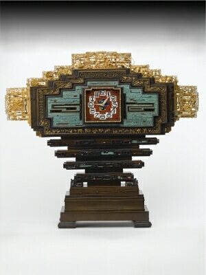
When I went to Stedelijk, I walked around design room and I was amazed from many interesting things I saw at one place and I had once again an opportunity to have a look at Gerrit Rietveld works, which I haven’t seen for a while. But by coming back to Jan Eisenloeffel’s Clock, I can honestly tell that after I left the museum, his artwork was still in my head.
The very first time I saw it, I thought “wow”, and than my friend asked me to come to see another thing, some posters, which I don’t even remember right now anymore. The funny thing is, that I think the clock chose me to make a research about it, because it was so extraordinary and unusual that I just could not get out of my head anymore.
It is very important to know some more information about the artist if you want to know more about his works, so here is some information.
John Wigboldus (Jan) Eisenloeffel was born in Amsterdam in 1876. He was dutch goldsmith, interior designer, jewelery designer, illustrator, silversmith, ceramicist, bookbinding designer, glazier and director of academy. He was educated at the State Normal School for Tick Education in Amsterdam and taught in Russia in 1898 working with enamel and niello. He got the highest award for his clocks with enamel decoration. Anyone who had known Jan Eisenloeffel at the beginning of his career could not have suspected that the same man would make this clock 25 years later. Eisenloeffel began as a reformer committed to ridding the decorative arts of excessive embellishment, pomposity, and the use of precious materials. In practice this meant that he designed simple, honestly constructed products for daily use, including tableware, vases, and lamps in silver and copper, produced in small editions.
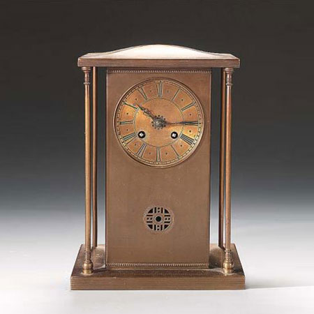
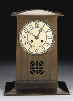
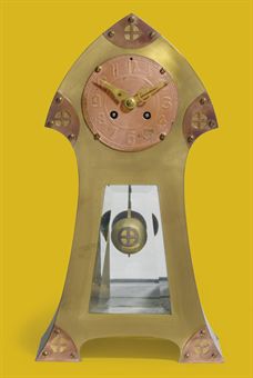
While I was collecting information about Jan Eisenloeffel and his artwork, I found a few of these early clocks designed by him. In my opinion in the beginning of his career he was designing more “clean”, and minimalistic things. Here are some pictures of the clocks he made around 1903-1905.
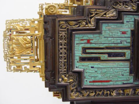
However, around 1908 Eisenloeffel became disenchanted with the possibilities of producing well-made, affordable items for a large public and turned almost exclusively to designing costly one-off pieces. This clock, made especially for the international exposition of modern industrial and decorative arts in Paris in 1925, is an example of this later approach. He wanted to demonstrate that craftsmanship was not a thing of the past. Whereas his tableware was conspicuous in its simplicity, this monumental clock is decorated with a complex scheme of symbols associated with time, such as the signs of the zodiac, and on either side and above the clock face the text is “Geniet den dag, left als de vogelen des hemels en als de lelien des velds”. Which means “Take therefore no thought for the morrow, live like the fowls of the air and as the lilies of the field” [Mathew 6 25-34]. The stepped construction reminds Aztec temples, and the multicolored enamel work was inspired by examples Eisenloeffel had seen in Tsarist Russia and also his inspiration came from Aztec architecture, Chinese motifs, and Celtic letters. Ironically, the dazzling decorative border of this demonstratively ornamented clock bears an engraved inscription derived from the New Testament.
I really found this clock interesting, because it is so detailed and kind of graphic style, that it is not enough to have a look for a second. I was watching this clock for a while and I realized that it asks for even more attention to see all small things and ornaments on it, so I came back even one more time just to get some more ideas and feel the stronger connection. After a while you can see there is some animals on the pattern – swan, dog, cow and a bird, as much as I could see. I am not sure if those things are connected with a clock or not, but I think the only thing which is the same for everyone, doesn’t matter you are human or animal, is time. So, perhaps Eisenloeffel wanted to express that thing, that time for everybody is the same.
Personally I prefer later Eisenloeffel’s style, because he is expressing himself or at least trying to experiment with different materials. He started to use enamel and he did it really succesfully.
Also, I realized that this clock reminds me of my grandmother’s old clock, which has almost the same form, just without ornaments. When I was spending summer in her place, every night, once in an hour I could hear the sound of the clock, for example, if it was midnight, I could hear 12 times of the clock churning, it was so annoying all the time. To get a better view how annoying that was I attached video where you can hear the clock striking eleven times.
But despite this bad experience, I like every single thing in this Eisenloeffel’s clock – color, form, pattern. It is different clock than we are normally used to see.
