Skip to Content Skip to Search Go to Top Navigation Go to Side Menu


"archive" Tag


way back to past


Friday, May 24, 2019

you can see the full video here

Living in the 21st-century ‘internet‘ has become a big part of life where it is inevitable. With the help of the internet, humans were able to achieve a lot of accomplishments. Looking at the experiences that I personally use the internet so-called ‘surfing’, I encounter with so many random information, and the randomness that leads to different randomness gives surprises and joy of knowing and not knowing at the same time. There are many choices that we can make and at the same time even with definite choices on the internet you never know what you bump into. Just like the times we spend on google or youtube. It goes similar to the design blog, there are archives of the basic year students and Rietveld academie with a lot of projects and archives from 2007.

In the blog itself, there are so many clicks or icons that lead you to so many different destinations. The changes in the cursor and the icon changes may distract you or guide you to almost infinite time and loop in the designblog itself. When everything is a possibility and knowing the fact of encountering different experiences and the randomness, having a perspective may give you slight changes in the times on the blog. Like the internet that we use and the deep web, they both exist but it’s just the way we approach the internet.


When spending time on clicking and facing different pages on the web, you will notice that the links provided on the blog may not always lead you to the web you imagine. Some may be missing the links and the websites may have changed over time and won’t lead to the exact place as the writer of the post.

First posts starting from 2007, I thought it would be interesting to see how the web would be like, and look at the posts from the exact time when the posts were published. Just like a ‘time-machine’ what was it like in the past? The web and the internet changes a lot and we only face the recent and modified versions, the majority of the websites are updated to the latest version. Thus, we only see the brand new versions and changes. However, with the help of the internet archive service website called ‘wayback machine‘ you can go back into the times where the posts were first published and can see how the blog was like back in the past. The experience of wayback machine web to the past and browsing through the blog gives you a totally different time. The websites leading out of the blog has a different design and directs you to the exact place the links were first made to. The service guides you to the past to see the old versions of the blog and fixes most of the missing links.

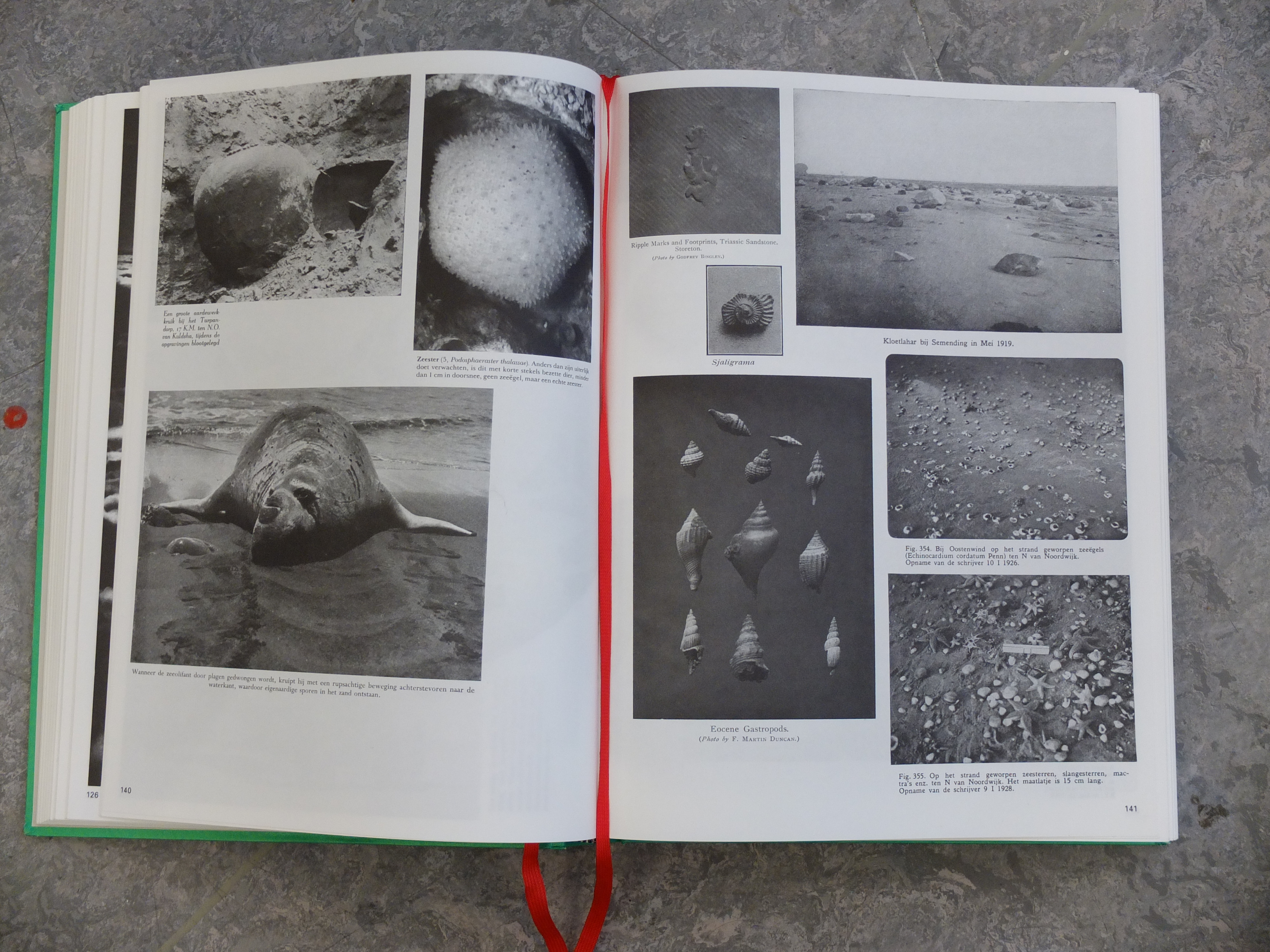
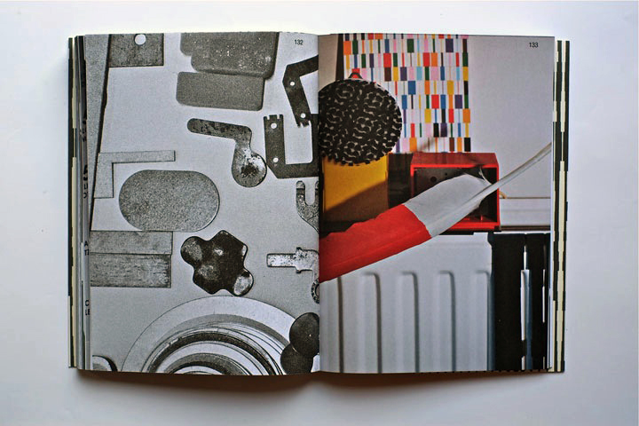
The experience with the wayback machine was like looking at books in the library. For example at a library when you choose a book and read, the design, context, and the information are the same as the date when it was first published. Thus, looking at a book can be seen as taking a time machine and experiencing the past. On the other hand, the Internet gives creators the ability to change and update information directly and instantly, and thus it’s hard for the users to notice or remember how the web was like in the past. The web pages are always changed and updated to something new. Since the design blog functions as an archive of the rietveld students like a library, the use of the wayback machine can make you feel the experiences you have at a library, by positioning yourself back to the time the post was published and see how what it was actually like.

Even with the same act of browsing the same website, a slight twist in looking from the past can give a whole new experience and the way of seeing things, like the game spot the differences.

Writing as a drawing


Thursday, November 29, 2018

Ideograms and how they can become drawings , loosing their first property of transmitting information , to turn into images we can just contemplate : this is what interested me the most  inside the first book I picked up and this is why I chose « The Art of writing » as as second step. This book gathers a large range of approaches towards writing from different countries and cultures. On every right side of the double pages inside the book, you can find images depicting those ideograms, all in black and white, with an old presentation : captions on the side, numbers & letters under the images :  this gives me the feeling to dive into fragments of a huge archive, travelling through excerpts just like in those history textbooks in high school. The ruined aspect of the book as well as the old list  with all the borrowing dates since 1971 emphasize even more this feeling you can have while entering in an space full of stories. I also appreciate the big « a » on the 4th cover : the « a » as the « starting point of the civilisation » with the creation of the western alphabet ; placed in the end, a kind of inversion is created that i also find interesting. While browsing through the pages, I could notice in the images how present were the ideograms inside architecture and space : on lightpanels of an Asian street, engraved on a south american’s stele or on a catholic church and many more. There is this need for humans to implant visible thoughts in their environments. This need, almost primal, is also what touched me because it carries at the same time a sincerity almost primal (see the page called « primitive signs ») and a desire to understand the world in a more objective way in order also to transmit this knowledge to others.

757.3 une 1

Reference work of the subconscious


Saturday, November 25, 2017

_MG_1108_1

Parallel Encyclopedia #2: welcome in Batia Suter’s head and my interpretation of what that might be. She searched, she found and she took, and now she is giving it back. The book turned into an object that spikes my curiosity, and not only because of her collection of curiosities.
The green cover spoke to me. I picked it up and it spoke even louder. I decided to dig further and at one point it made me want to dress in rubber boots, a jacket with too many pockets and a bucket hat and go off to explore the world. And bring a camera.

2014-01-03 12.11.22

After Parallel Encyclopedia – an almost black-and-white compilation of her personal archive of seemingly random pictures – Batia Suter made a second volume. An artist’s book poured into an encyclopedia-shaped cast. Where Parallel Encyclopedia number 1 contained strictly black and white imagery, number two also allows specks of colours to seep through the pages.

2014-01-03 12.09.10

One might wonder, in a book like this: what did the designer do? It’s Batia Suter’s collection, and her intuition that ordered the pictures. Where did the designer – Roger Willems – drop in? Where did the designer left his mark. Did he had a say and what did he say? Where and if to use colour in this otherwise black and white universe? To use Biotop paper in 90 grams, to give it all a functional feel? To add two red bookmark ribbons?

On might wonder – hidden inside this volume is a parallel world of a parallel world of a parallel world.
One might wander – an encyclopedia of no practical information but visual information, a dreamy answer to an 2000-year old tradition of encyclopedia-making. Another possible answer to this tradition is Wikipedia. Wikipedia suffocates most encyclopedia, but not this one, not Parallel Encyclopedia. This one tells us what Wikipedia can never tell and thank God doesn’t and probably doesn’t even want to. This one is a reference work of the subconscious. Batia Suter’s thematic categories are her own: giving us the suggestion of a story, or not at all – we all make up our stories anyway. She leads us into a great grey and black and white world, different worlds within different worlds, from curiosity to curiosity, from dreams to wonder. She let’s us jump from trees to mountains to griendhout to wolzakverwering and the wall of Hadrianus; Britannia. From fields to Kirchner to winter to bacteria and giving us a neat visual experience whilst doing it.

2014-01-03 12.13.24

Flip.

Page 105.

Workman sprays carbolic powder on a 35-yd long rubbish pile during strike of garbage collectors in London in September 1969. A picture of stacked boats, a woman shopping on the Amsterdam flowermarket. No clue how this works together, but somehow, it works.

Flip.

Page 177.

Verschillende dwarsdoorsnedes van kringsporig hout (es), verspreidporig hout (esdoorn), halfkringsporig hout (kers), mergstralen (eik), mergstralen (tulpenboom), and so on.

Flip.

Page 236.

The moon.

Page 237.

Several spherical objects, mirroring the moon.

Flip.

Page 440.

The entire page is filled with a picture of flowers that remind me of orchids, but apparently are called Odontonia.

Page 441.

The entire page is filled with a picture of geisha girls of the early 1900s. Their kimonos and the plants in the pictures depict flowers that mirror the Odontonia.

Flip.

Page 438.

Several pictures of butterflies, and hands being spread open, resembling butterfly wings.

It’s design is imbedded in it’s content, made to serve this visual feast. Made to serve the hidden narrative. Or the none-existent narrative. It’s not organised in a seemingly logical way, but for Batia Suter, it probably is. She is pretty convincing.

One might wonder – the strays and wanderers, all nicely wrapped in shiny green.

What’s the hand of the artist and what’s the hand of the designer?
They probably used both.
 

Parallel Encyclopedia 2, designer: Batia Suter / Roger Willems, Rietveld Library Cat.no: sute 5

Approaching the Archive


Sunday, December 11, 2016

‘Approaching the Archive’ begins from a coincidence that becomes an unexpected point of access to the archive and book collection of artist, writer, editor and graphic designer Will Holder, in the context of his exhibition ‘Sorry! NO we don’t do REQUESTS’ at Kunstverein in Amsterdam.

The essay deals with the successful as well as the unsuccessful attempts at trying to grasp a lot of material in a little space, and the systems that one makes up in order to organize and process content through. Moreover, it is an essay about books and the stories and associations they convey, as well as it is about the finding of an unexpected relationship between ‘typography’ and ‘topography’.

Will Holder click on the image to download the pdf

The studio of Karel Martens


Wednesday, January 8, 2014


I had my worries walking around the book shelves in the art book shop San Serriffe. I didn’t know anything about art books how to look at them and how to look at the design.
I skipped though some books but didn’t find them interesting. Then I saw a cover that caught my attention. I didn’t know the artist but I was enchanted by the simplicity of the graphic black-and-white book cover with Japanese text on the side and the title ‘Full color’. The size of the book felt a bit small in my hand, handy and easy to flick through the pages.
I turned the first page and discovered a colorful photo showing a bookshelf filled up with paper rolls and used fruit boxes properly containing more papers. The photo only shows a small part of the room but on the following pages the panorama of the room which turns out to be an art studio is shown. Page by page I was guided into the head of a graphic designer’s studio.


book coverbook-shelves2


It turned out to be the head of the Dutch graphic designer Karel Martens. He is specialized in typography, working with prints and books.

After his studies at the School of Art at Arnhem in 1961, he became a freelance graphic designer.

Since 1977 he has been teaching in graphic design at his old school in Arnhem and at the Jan van Eyck Academie in Maastricht. He is now working as a supervisor at the master-program Werkplaats Typografie [x] together with Armand Mevis. This program is based on practical assignments and self-initiated projects. It also works as a meeting place for graphic designers.


The book ‘Full color’ which is showing Martens’ studio was published on the occasion of the exhibition KM, Ginza graphic gallery in Tokyo in May 2013 [published by Roma Publications].

With the information about the artist and his work I started to look deeper into the book.

The photos by Johannes Schwartz are divided into 4 parts by the graphic designer Julie Peters together with Martens himself.


book2

The first part contains photos from the artists’ studio. They seem to form a long panorama, cut up and organized so you see some parts of a room at one photo and the second part of the room at the next photo. This way of organizing the photos gives you the impression of flashbacks and even more if you already know his work.

The next part is Martens’ archive, collected in boxes from the bookshelves. Here you look directly into the boxes which contain sketches, illustrations and prints of the artist. If you look at the prints you’ll find some of the shapes recognizable. When you flick through the book you get the impression of a system of colors and shapes which are being repeated. An example of that could be the small industrial metal pieces which shapes are to found on some of Marten’s prints. It seems like the editing of the book creates some sort of pattern – just like Marten’s prints.


book2


The third part is a close up of Martens kinetic work with clocks seeing from behind. A study about composition and color, by printing a dot pattern on two glass disks and attaching the disks to the second and minute hands of a clock. The chose of photographing the clocks from behind is again a way to show the process from his work.

The last pages in the book are writings by David Senior and Martens him self. The text is in English and Japanese describing the project around the book and the work of Martens.

One thing I was wondering about was why Martens choose to have a graphic designer on this book when he himself makes books. I asked Johannes Schwartz about that and he told me that the making of this book includes a close co-operation between all 3 artists. This book does not only work as a documentation of an artist. Not only the contents of the book tells about the artist and his work but also the editing is very important.

The result is this fascinating portrait which gives you a good insight knowledge of Martens’ visual language.
If you are curious for more please check one of his other books “Karel Martens: printed matter/drukwerk, 2nd Edition” which contains a big amount of exhibitions, art works and articles he have been taking part in. This book gives you a good insight into Martens’ environment and way of working too.

Rietveld library catalog no: marte 1

cover back

A hidden paper archive


Thursday, December 5, 2013

A designer makes choices. When it comes to book design, he or she is likely to decide on typography, grid system, editing, binding, format, print technique, paper quality and so on. The sum of these choices create a unified expression that tells us something. It can be a parallel language to that of the content of the book and it can be more or less emphasized and thought-out. Some would say it could even be devious in its intentions.

This is an exploration of the book “Klaas Kloosterboer: Shivering Emotions + Feverish Feelings” from a design perspective. It was published by Artimo in connection to Klaas Kloosterboers exhibition BALLAST at the Badischer Kunstverein. It is designed by the design office Mevis & Van Deursen.
I interviewed Linda Van Deursen in connection to this essay to get further insights in the design choices and the conditions from which the book came to be.

shivering_emotions_cover

The cover consists of neon orange cardboard (around 300 gsm) with the title in what looks like Klaas Kloosterboers handwriting in pencil. The orange cover folds in to almost full width of the very first and last page. I learn from the designer that this is a technical solution to add steadiness to the book. It’s a signature bound soft cover, consisting of a broad selection of heavy stock paper which can result in a weakening of the soft spine unless it is reinforced. I’m thinking it could invite the reader to use the orange cardboard gate folds as an alternative page in any of the books 100 spreads.

shivering_emotions_paper_archive

There’s an intriguing colour spectrum around the edge of the book. This feature clearly communicates that it is a book mainly concerned with visual language or images. It resembles a visual preface or introduction to the book. Each signature consists of 16 pages made from one sheet of paper. Most of the paper types only occur in one single signature, this gives us a clue about the parallel function of the book:

I learn from Linda van Deursen that the book is a sort of material archive or assortment of papers of a specific kind. A rule that she set up for the book was that only two sided paper (meaning the paper has a different appearance on each side) of the type used in posters and envelopes (because they can’t be see through) were to be used. Not only does this create an intriguing visual and physical experience but it serves as a kind of metronome or conductor where the different surfaces of the paper are altered rhythmically but not predictably (you learn the rhythm and then it alters).

shivering_emotions_paper

Rietveld library catalog no: kloo 1


shivering_emotions_sequence

This feature creates a playful element to the structure of the book. For example in the sections that consist of photos of Kloosterboers work, the reading sequence is ACBD where A and C are overviews of two different artworks and B and D zoom in on the same two images. But because of the rule of the two-sided paper rythm, this seemingly logic and rigid set up completely changes. In addition to this, all rules seem to be broken at least a couple of times in the book which is a testimony to the sure instinct and playfulness of the designer.

shivering_emotions_sequence2

The text is set in EF Maxima. This sans serif is used in two contrasting ways throughout the body of copy. The left hand pages are in English and set in larger size (approximately 12 pt) and narrower leading which results in a more contemporary expression. The tracking is on the plus side of the spectrum, perhaps around 10.

shivering_emotions_eng

The right hand side has the same tracking but is smaller in size (approximately 10 pt) and more importantly its leading is much bigger which leads to a surprisingly conservative appearance. This is a demonstration of how drastically you can change the meaning of a typeface with small means. It also solves the problem of fitting the German language in the same amount of space as the shorter English text.

shivering_emotions_ger

There’s a lot of trends in typography and it is hard to define what a typeface communicates without looking at its context and treatment. Also, the way a typeface is repeatedly used will change how we read it. This could mean that a typeface that was originally designed with utilitarian intentions can end up being perceived as elitist or exclusive. EF Maxima was originally developed by Typoart as a substitute for Helvetica. Typoart was a government owned, east german type foundry that was privatised in 1989 in connection to the unification of Germany. If we ignore the complex political situation in that area at that time, and just see Maxima as a typeface created with similar intention as Helvetica but without the same exposure, then I think we could dare call it a humble and uncommercial font. This could be illustrative of the intention behind this design. Because it is clear that Van Deursen is not concerned with selling commodities or increasing value to art galleries through slick design. All the design choices are closely connected to the subject that is the artist. I think this explains why the book still seems so relevant in its form.


Rietveld library catalog no: kloo 1

8.000 slides; Gray Magazine #5


Thursday, September 1, 2011

In 1977, the office of Charles and Ray Eames made a short film
depicting the relative scale of the Universe in factors of ten.
The film begins with an aerial image of a man lying on a blanket; the
view is that of 1m2, then slowly zooming out to a view of 10m2,
revealing a man and woman enjoying a picnic in the park. The zoom-out
continues at a rate of one power of ten every
10 seconds, ending with a field of view of 10m24, or the size of the
observable universe. The camera then zooms back in
at a rate of a power of ten every two seconds to the picnic, and then
slows back down to its original rate into the man’s hand,
to views of negative powers of ten—10m—1, and so forth—until the
camera comes to a proton in a carbon atom at 10m—16.

The analogy of cropping to and fro in the film suggests both an
interpretative view of an archive and an insight into provenance,
panning back to view it as continuously evolving means.

Slides function as a tool for teaching and this magazine presents
itself as a series of translated lectures by eight teachers from
various fields of study within the Gerrit Rietveld Academie. 8000 of
these slides were digitally scanned and structured as originally on
the shelves, then printed collated and dispersed to the teachers as
contact sheets.

On 8th April 2009, the new interpretations were presented and
recorded. After transcribing, the lectures have been edited into a
printed report of the day.

  download Gray Magazine # 5 [this is a 44 MB document] :
For more information on this and other lecture projects based on the same archive, read Gray Magazine #5. Get your own hard copy from the Library

.

Subjective Library on Flickr


Monday, November 16, 2009

“subjective library” on Flickr

click on the images above to find some of the tags as we translated them into images for you. If you want to check them all out go to …… Flikcr.com /subjective library /click people link

selection made by Matthias Kreutzer and Henk Groenendijk


Log in
subscribe