A
Object
- A material thing that can be seen and touched. (Oxford)
2. A thing external to the thinking mind or subject.(Oxford)
3. Something mental or physical toward which thought, feeling, or action is directed.(Merriam Webster)
Conversation
- Exchange of sentiments, observations, opinions, or ideas (Merriam Webster)
2. Talk between two or more people in which thoughts, feelings, and ideas are expressed, questions are asked and answered, or news and information is exchanged (Cambridge, Oxford)
Recognition
- Knowledge or feeling that someone or something present has been encountered before.(Merriam Webster)
Identification of someone or something or person from previous encounters or knowledge.(Oxford)
The fact of knowing someone or something because you have experienced it before.
2. Acknowledgement of the existence, validity, or legality of something. (Oxford)
Agreement that something is true or legal (Cambridge)
3. Appreciation or acclaim for an achievement, service, or ability. (Oxford)
Special notice or attention (Merriam Webster)
B
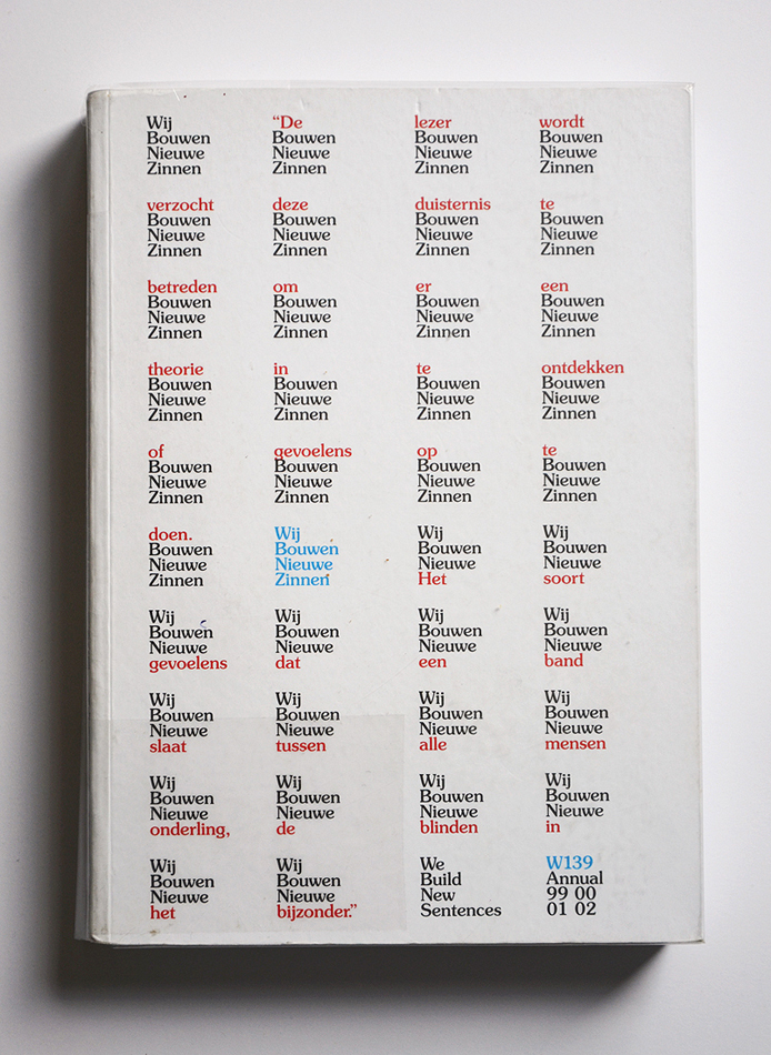
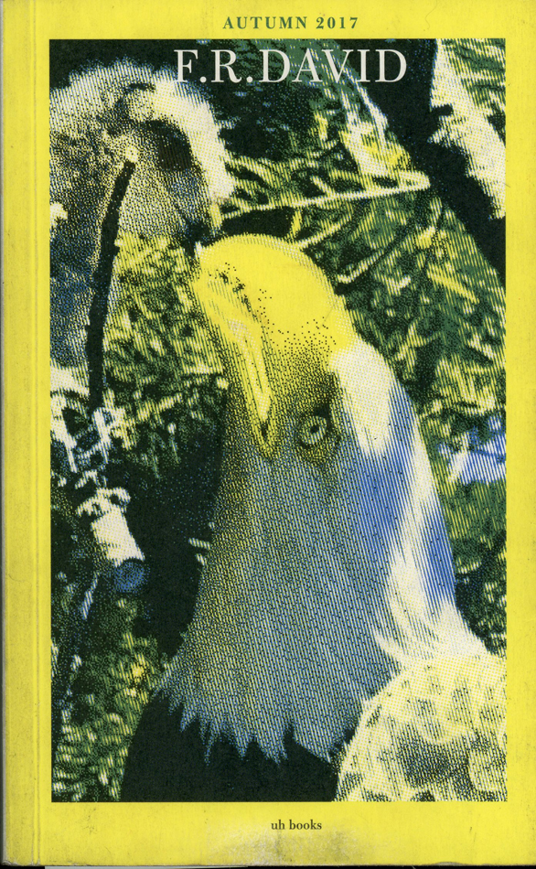
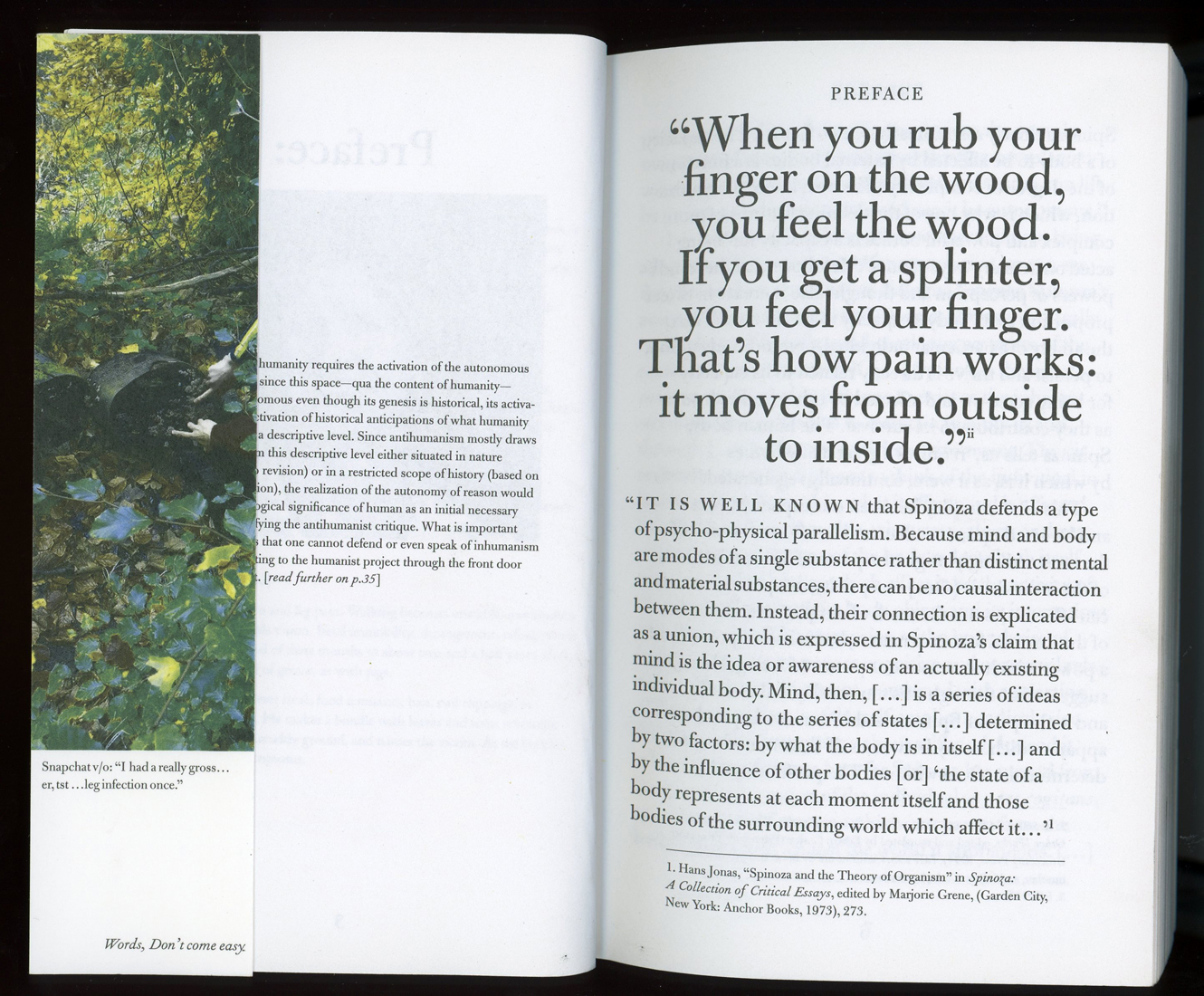
F.R DAVID is a biannual journal- founded, edited and typeset by Will Holder-concerned with ‘the organization of reading and writing in contemporary art practice’. It is chunky: a rectangular block. Like a brick. Or a novel: An object. This is what drew me initially to the Autumn 2017 edition- ‘Recognition’- and is illustrative of an important aspect of Will Holder’s work. His interest in the “thingness of words” is manifested physically, not only in the shape and feel of the journal (something which he plays with more explicitly in “Black my Story” an exhibition catalogue in novel disguise), but also in additional items that come with every edition- A book mark and a postcard- things that very much ask us to hold them in our hands. A specific rule defined at the founding of F.R DAVID stipulates that they are printed on the matte side of the card, the gloss side left blank (This is also true of the cover). Another, dictates that seemingly mysterious letters on the spine of each edition when placed together will eventually spell out F.R DAVID’s maxim ‘Words don’t come easy’. Of course, the 80s hit of French pop star, F.R. DAVID, whose name is appropriated hilariously as though it were the author’s on the cover of this intellectual, literary-art journal.)
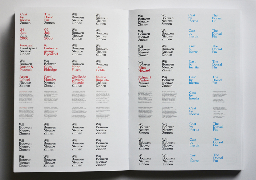
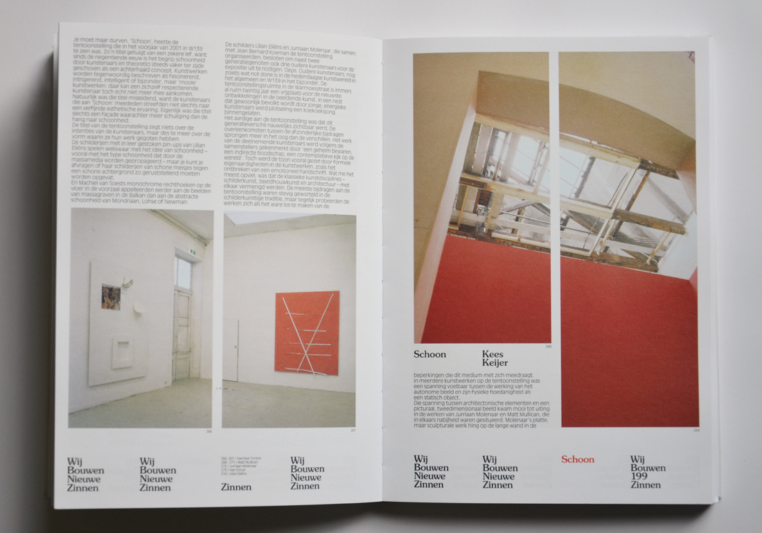
This kind of inversion of commercial publishing convention is present throughout ‘Recognition’ (and the rest of Holder’s work): images are placed oddly on the page, sometimes even overlapping with the text; the typeface shifts incongruously to ‘American Typewriter’ for one text only; images of text are used at points rather than the typed words; footnotes expand uncontrollably to fill entire pages. By subverting our expectations, Holder makes us extremely aware of the materiality of every aspect of the publication- both literal/physical and linguistic. The event of publishing too becomes an object: Holder organizes performances with readings in strange, poetical formats with quite trance-like elements. Constantly he is reacting against the increasingly conventional, stream-lined nature of the graphic-design industry, a world of “branding agencies and viral strategy analysts”
C
Will Holder told me about the role of page space and layout in his work in allowing room for multiple meanings:
“My work allows all present to have a voice, and often uses the page to score this polyphony and dissonance.”
In particular, he is concerned with the reader’s contribution to the meaning of a text; his work is conceived of as a collaborative exercise between author and audience and designer and printer and publisher and all who have played a role in producing it. The ongoing, dialogical qualities of book design become increasingly important with the modern explosion of information sharing. In an era very much preoccupied with notions like ‘fake news’ and ‘post-truth’ we need to find ways to re-legitimise published opinions.
“We could say that given today’s onslaught of information and multiple views, reading is an exercise in comparison, in order to distill one’s own position; and not regurgitate what others want you to”
F.R. DAVID being a journal, has to accommodate multiple voices more actively even than a publication with a single author. Each text is subject to the “inflection of [its] neighbours”. In catering to this and in embracing it, Holder intersperses separate texts in the ‘Recognition’ issue, using two different style sheets: While some typographical and formal limits are imposed for continuity, there is diversity within these limits, informed by the content. The original typesetting of articles has been maintained where Holder deems it relevant. And in all of these decisions he acknowledges the subjectivity of his own voice, pointing out “that relevance is dictated to me by my reading of the material”.
F.R. DAVID as well as many of Holder’s other publications uses primarily ‘The Doves type’, steeped, appropriately, in conversation and history and mystery: Its origins are in The Doves Press, founded in 1900 in London (since when it has been banished for almost a century to depths of the River Thames and then dramatically rediscovered). Its celebrated fount of metal type was designed with the intention of ensuring that it did not distract the reader from ideas within the text itself, ‘the thing intended to be conveyed’. The significance of this sentiment in relation to Will Holder’s intentions is apparent. So too is a playful irony: He is strongly conscious of the agendas of typefaces and the impossibility of one that obediently serves content, rebelling, in fact, in ‘the non-linguistic or extra-linguistic qualities of language’.


Mischievous subversion of a devise like this epitomizes Holder-style. He leaves questions- about the nature of the publication (a mysterious new magazine, ‘Staples’ with very minimal and odd content, for example, is entirely unexplained); the route we should take in reading it; and the boundaries between earnestness and farce, unanswered. We must surrender to the ambiguity of the work.
F.R.David, designed by Will Holder, Rietveld Academie library catalog no: magazine