Skip to Content Skip to Search Go to Top Navigation Go to Side Menu


Archive for December, 2014


HEAD JEWELRY


Monday, December 1, 2014

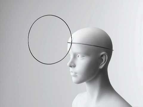
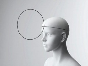
Vaclav Cigler is a czech artist mostly known for his pioneering work in glass. Since the 1950s, Cigler has focused on glass sculpture and is still today considered as one of the preeminent artists working in glass. My interest in his work though did not develop from one of his glass sculptures but from an image of a mannequin head wearing a mysterious head jewelry exhibited in Stedelijk Museum.

Head Jewelry by Václav Cigler[x]

The jewelry consists of two galvanised brass circles put together, one that is fitting the circumference of the head and one attached to the other and placed in front of the face. The placing of the circle in front of the face affects the vision of the person wearing the jewelry. It becomes a frame through which the person watch the surroundings and in that way it changes and disturbs the perception. Furthermore the circled brass acts like mirrors: when angled, it gives the wearer a view of the room or of the people around which allows the possibility of intimate eye contact or covert observation. Imagining a lot of people walking around with this jewelry in the context of today it easily could be considered as some sort of electronic device attached to the head with a chip improving human possibilities. Or it could be a future, simplified version of virtual reality glasses having an invisible screen circled around the head. Especially the aspect of the mirror in the circle makes it relatable to virtual reality where the people around and the room then adapts into the screen of the virtual reality so it becomes this interaction between physical- and virtual reality.

When looking through some of Cigler’s work in glass it becomes clear that he is very interested in the human perception. That is also one of the reasons for his consistent interest in the work with glass because it is possible to create a new and different vision in that medium.

“…Glass is the most imaginative material that man has ever created. The presence of glass in a human space conditions not only the space itself but also an as the user. Glass is for me a pretext for expressing a different spatial and emotional perception of the world. A perception made unique by the optical means offered by this material, as well as by the new possibilities for using it in space… in glass, there’s the authenticity of the material, the discovery that it has uncommon optical and material properties, such as malleability. Glass by itself is a sufficient source of inspiration.”
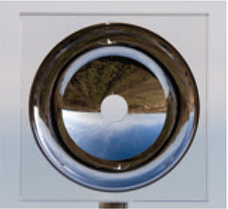
Vane 2008 by Václav Cigler [x]

The sculpture “Vane” made in 2009 is an optical glass with an aperture in the center that gives an undistorted view of the landscape. A new visual perspective is given and what is seen is a collage space of reality.

In 1960 the phrase “Cyborg” was coined in a story called “Cyborgs and Space” and was used to describe a human being augmented with technological attachments which I find very interesting to put in relation with Cigler’s Head Jewelry. Manfred Clynes, being the inventor of the word cyborg, considered it as more human which is a contradiction to how it is generally perceived as something inhuman. But there is something interesting towards understanding or maybe even accepting a direct interaction between organisms and technology in order to enlarge the human experience.

You can question the definition of a cyborg and maybe this is also what Clynes is already pointing out; are all humans cyborgs? We do include both organic and inorganic subsystems. Inorganic systems being for instance prosthetic limbs or vaccinations that program the immune system in our bodies. At least it could be argued that we are living a cyborgian existence. A cyborg society has developed where the connection between organic and machine systems is extremely complex and inescapable.

A more direct example of a cyborg, or maybe as direct as most people would understand the definition of a cyborg, is Neil Harbisson. He is even considered to be the world’s first cyborg with an antenna attached to the back of his skull dangling over his forehead very similar to the shape of the head jewelry. Harbisson sees in grayscale but the antenna allows him to hear the color spectrum, even the colors that are beyond the range of human sight.

Neil_Harbisson_cyborgist

Neil Harbinsson[x]

He considers his decision of becoming a cyborg as an artistic statement: “I’m treating my own body and brain as a sculpture”. He is working with human perception using his own body as medium whereas Cigler uses glass to create different perceptions. Moreover, Cigler viewed jewelry as landscape for the human body as a means of connecting the body with its environment. Harbisson is literary connected with his surroundings by having the antenna which he considers just as much a part of him as any other organ or body part. Aesthetically the two objects, Head Jewelry and Eyeborg (what Harbisson calls his antenna), look very alike with their minimalistic characteristic but also their function has a lot in common if not considering the advanced technological aspect of the Eyeborg. What is interesting is how much an object can become a part of a human being and if it is really possible to not consider it as an object but as an organ. This also leads back to an acceptance of this cyborgian society that is already a reality. If a person got used to wearing the head-jewelry and seeing the surroundings through it, that is, having extra angles and the capability of observing secretly would this jewelry then also be thought of as a body part?
To sit like a swan


Monday, December 1, 2014

unfolded

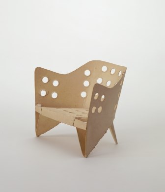
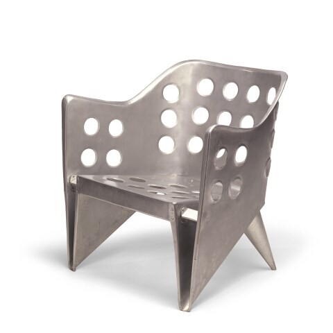
The object in this picture is a model of ‘aluminiumstoel’ by Gerrit Rietveld. It is simply a piece of paper cut in a way that when you fold it, it turns into a miniature model of the aluminum chair. The simplicity of this design is admirable, even though the final result in steel does not really give the same feeling of organic harmony. However, this model could not represent the creator’s idea better.


folded<a

Aluminium stoel model[x]

href=”https://designblog.rietveldacademie.nl/wp-content/uploads/2014/11/aluminum.jpeg”>aluminum

Aluminium stoel[x]


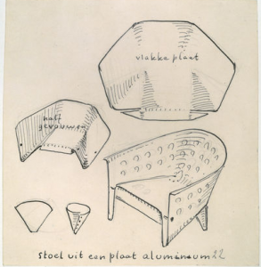
Rietveld made this chair in his attempt to create a furniture using one piece of material, or more specifically, one sheet of it. In this case, he used a sheet of metal for the chair we see in the picture and it is easy to understand how he handled the material to display the result in this, since we have at our disposal inside information of the designer’s process of thought, namely; this beautifully cut and pierced piece of paper. Rietveld also experimented with plywood to achieve an immediate connection of an idea with the act of making. When only one piece of material is needed to make an idea come to life, and when that material is so flexible that handling it seems as easy as drawing on a paper with a pen, then there’s a new type of harmony introduced to the design process; that of an immediate, fast action resulting in a beautiful and easy product.


Screen Shot 2015-04-17 at 12.58.59 PM

Sketch of Aluminiumstoel; notice how the designer uses method of folding as a starting point for his research[x]


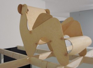
Rietveld and his contemporaries believed in a new world order, supported through their designs. In that world, one of the essential and necessary virtues would be the one of the minimum dwelling (das existenzminimum). For that to be achieved, all heavy labour would be replaced by machines, giving that way the man the freedom to use his leisure time in whatever way he thinks is best. In that world beauty and simplicity are the main gears of development. This is why in many Rietveld designs, in the model of the aluminiumstoel as well, we see a coexistance in harmony of these two and a lack of complexity which implies that the process of making of that object won’t result in valuing more than the object itself. For me, this is a reason why most of his chairs seem really uncomfortable; he wouldn’t want the owner of the chair to dwell in it for hours. There are examples of designs that embody perfectly Rietveld’s ideology, but were sadly never realised by him, like this chair of assembled plywood, designed in 1927.


plywood rietveld

Plywood prototype, 1958[x]


What I first thought when I saw the paper model – and what everyone probably thinks – is the old Japanese art of origami, the art of folding paper. The idea of folding a piece of paper in a certain way so that it creates a clear shape of something seemed really appealing when applied to interior design. More importantly, it seemed perfect for what Rietveld was aiming for; an oblect made of one sheet of material and whose existance would be a clear statement for an easy, free living of minimum dwelling.
Origami art has influenced many design-based branches, such as architecture, fashion and interior design. Its basic principles have even recently been proved to be beneficial for science when it comes to manufacturing. Assembled Additive Manufacturing is a new process of fabricating developed by researchers, which has origami principles as its base, as it treats 3D objects as multiple layers of 2D sheets.
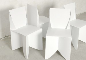
I was surprised, however, to see that most origami-influenced designs were really static and superficial; meaning that none of them took the idea one step further, none handled the art of origami as a general principle that could be the base of something bigger, or even as a statement. Designer Stefan Schöning came up with a design for a ‘folder chair’, where all that’s needed for its creation is a sheet of polypropelene.


folded chair

Origami folding chairs[x]

This example is really similar to what Rietveld was aspiring to do. Many similar designs have been realised, however it seems to me that they mainly aim at impressing the viewer, at making them admit that “that’s a witty design”, without committing a vision in it, nor giving the viewer and the world a tool for a better living, which will, in its turn, become a reason for contemplation.


WHAT HAPPENS WHEN TABLES BECOME CHAIRS


Monday, December 1, 2014

tafel-stoel


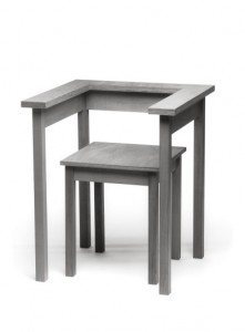
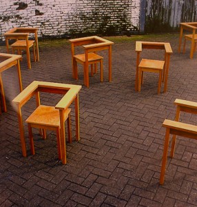
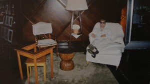
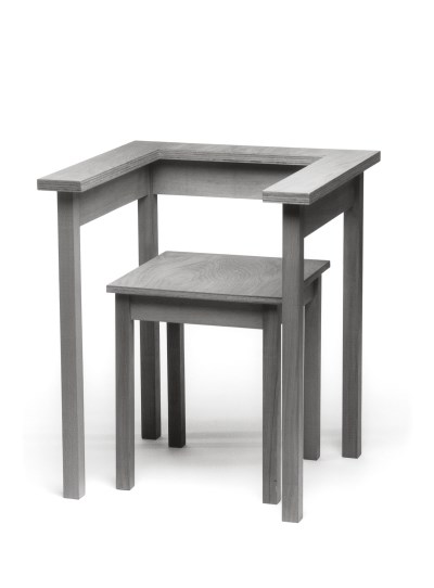
Wandering around in the Stedelijk museum my sight was caught by this ‘Tafel-stoel’ (table chair) by Richard Hutten (1990). It is part of the furniture collection. This collection will always have significance because furniture is part of the basics we use in life.
I was initially looking for an interesting chair, but this design didn’t look like a real chair. But then, what is a ‘real’ chair? To answer that question we’ll have to make up a definition of the chair in general. I would say that a chair is a design made for sitting with a backrest (otherwise it would be a stool). In this case there is a backrest present, but it doesn’t really function as such. I could imagine that leaning against it would make it fall. Therefore I would say that this chair is a case on the border of being a chair or a stool. Meanwhile it is also a table. Or actually it was. It looks like the former tabletop was cut out to become the sitting of the chair. Pondering about the traits of the chair I figured that this design item still has relevance for us in life and work nowadays. The question about the definition of the chair will always remain present and this chair is an example of it. Sometimes we can’t categorize items and that’s what makes these objects interesting to look at. They make us wonder and evaluate our attitudes towards the things we use in our daily life. And as Wittgenstein noted in his ‘Tractatus’ ; “we have to know about the connections between the objects we use to understand the world“.

They are always placed in a certain context. A table is not just a bare object, there are chairs around it, it is situated in a room, etc. With this philosophy in mind we might understand a little better why this chair is not easily understood. The connections are not clear.


The relevance of this chair will become more clear when we look at the reason why the Stedelijk came up with this collection to exhibit. The collection is considered on the basis of five themes, addressing aspects such as furniture in the collection which enjoys the status of international design icon and evolutions in particular kinds of furniture design (The furniture collection Stedelijk Museum Amsterdam – Dosi Delfini, L. A. [x]). The ‘Table Chair’ is an example of a conceptual design. Conceptual designs can’t be missed in an overview of furniture from (roughly) the last century, since that become a big focus in the world of art. Art can’t get more abstract than a white canvas. But ideas can go as far as you can imagine and beyond. And that’s where the conceptual art comes in. It’s about ideas, not about beauty and functionality alone. In Hutten’s work we can see the extreme clarity of form, which still leaves an unexpected amount of freedom in interpretation. “The austerity of his designs is the rare kind that makes you feel cheerful” (Richard Hutten – Ed van Hinte). As with the Table chair: it can be used in various ways, even in a way the designer could never have foreseen.


You could place the back- and armrest in another way then you would regularly expect. For example the other way around, so it becomes more like a table to lean on.


It is exactly what would give joy to Hutten and to me. I also like conceptual art a lot. But it can be a trap in which objects become too direct. Hutten knew about this pitfall and made sure that there was always enough space left for imagination in his designs. He said: ‘Traditionally design is about solving a problem. I don’t solve problems; I create possibilities’ (Richard Hutten: works in use – Brigitte Fitoussi). I share this opinion with him, because problem solving is one thing. Creating new things is something different. It is like grabbing something out of the air (which is quite hard). And it is like making a chair out of a table, which becomes a creature, challenging your common sense.


Form follows fact


Monday, December 1, 2014

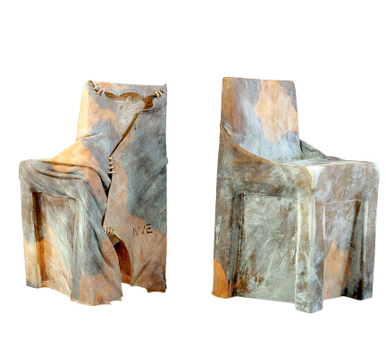
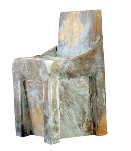
Cow chair was made in 1997 as a graduation project by the dutch designer Niels van Eijk. It is made from a single untreated cowhide which is stretched while soaking wet around a pre-consisting chair. It is left on the chair for a week until it has dried into a solid form. The idea was born when the designer looked down at his shoes and noticed how perfectly they were shaped around his feet. If this was possible, cowhide must have the quality to take on other forms, he thought, such as the shape of a chair. Van Eijk claims he is not a man of many words, he focuses on material and methods, which is clear in the case of the Cow chair. Despite that I think this chair is filled with relevant messages and comments on how we make and consume the objects surrounding us. It redefines the conventional use of familiar materials, It has strong relation to the discussion of using local recourses and it puts our attitude towards using animal products in context.

cow_chair_newmain

cow chair by Niels van Eijk 

The Cow chair does not try to conceal the single material used in its making. It almost looks like a newly skinned hide, having been laid on a chair at the tannery, waiting for further processing. Even the name of it has a very direct purpose, you are supposed to know that this chair was made of cowhide.
Normally, leather products have undergone such an intense working process that they do not remind us of they’re origin as much as the Cow chair does. As people of modern society, specially in the western world, have managed to distance ourselves from the source of the products we use that when we are exposed to the real thing a feeling of surprise or even repulsion arises. Sitting in a Chesterfield eating a fillet somehow feels more comfortable to most people than snacking on pigs ears and feeling the familiar texture of a cow behind your back.
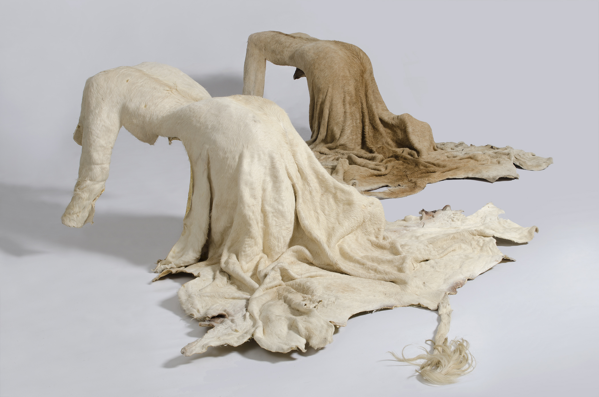
Since 1997 several designers have experimented with the use of untreated leather or familiar animal body parts and taken the familiarity of they’re origin even further than Van Eijk. The artist Nandipha Mntambo uses the same method of stretching leather to form hides around her body as sculpture material. By leaving the hides unshaven she achieves feminine, yet animal like objects. She wants to address the things we demand of the female body, and how we want to change it, shape it, shave it bare.

1-Mirror-image cut-final-websize1
mirror image by Nandipha Mntambo • precious skin by Viktoria Ledig

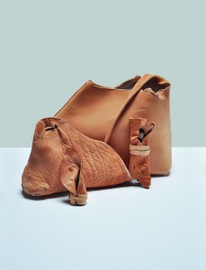
Viktoria Ledig, a Swedish designer, used the tail, head and ears among other parts of the cow that otherwise would have been thrown away to make a line of products called precious skin. She tanned the body parts with a method that kept all the characteristics of the skin, so the final products had obvious wrinkles and blemishes along with a pale yellowish colour not so different from a humans skin. When describing the reason behind the project she asserts the following:
Leather is dead animal skin. This is perhaps the raw reason behind the human fascination with it. It is beautiful, precious and grotesque at the same time. We sometimes forget that touching leather is to handle a former living being’s hide.

The project and other similar ones for example Rachel Freire´s nipple dresses have caused a strong negative reaction, a louder outrage than is heard every time a designer puts out a more conventional product made from animal products.
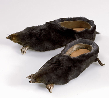
When Jan van Eijk later formed a studio with his wife and co-designer Van der Lubbe, they designed a product with a more deliberate intention of discussing use of animal products. They used mole rats that had been killed on golf courses in order to make the experience of golf playing more comfortable. The product was a pair of loafers made from the whole body of the rat, hair, tail, nose and feet still attached. I think this work is a great example of putting our claim on nature into context. Although the making of these loafers used material that otherwise would have gone to waste, wearing them is an uncanny reminder of the animals fate. In the same way removal of an unwelcome animal only for increasing human leisure seems unnecessary or even cruel but it can easily be hushed or forgotten.


mole-4

moleshoesloka

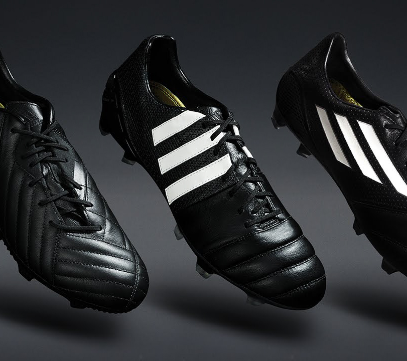
leather football shoes by Adias • mole shoes by Van Eijk and van der Lubbe

The method Van Eijk used to mould the leather is very inspiring. The finished object is not soft and smooth but hard solid enough to stand on its own as well as supporting  a human being. I think it invites us to discover endless ways of using hide to construct objects. It isn´t too different from the way many nations made their first books, or the way old drums and other instruments are constructed.

By stretching the hide with water there is no need to use toxic chemicals to preserve the material and prevent it from rotting. This is on the other hand unavoidable when tanning leather, even if it is done in the most eco-friendly way. So in fact using the hide as done with the Cow chair and the other things mentioned above makes far much more sense than using it to make soft articles such as shoes and clothing.


Screen Shot 2015-04-17 at 13.42.11

Screen Shot 2015-04-17 at 13.42.36

Making of prototype 1 by Garðar Eyjólfsson

Garðar Eyjólfsson uses a similar method of shaping leather while making lamps by pouring hot water over it. Instead of selling the lamp around the world he shares the way of shaping the lamp shade with a video. By using such a simple method and sharing it on the web he makes it possible for people everywhere to make use of it. He transports an idea, not a material, and therefor makes it possible to produce the lamp in different places with local materials. I see that same quality in the Cow chair as well.

In the times where our consumption of material is unsustainable and our sources do not renew themselves fast enough it becomes a part of the designers job to go out of his way to source new solutions. Contemporary experiments with bioplastics, biomimicry and new ways of recycling are a important part of this process. But I think it is equally important to reinvestigate our old materials, our old methods, just as Jan van Eijk did while designing the Cow chair. How can we use them or parts of them to create things in a better way than we are doing now?

cyber and (un)aware


Monday, December 1, 2014


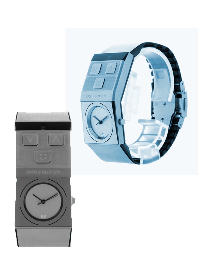
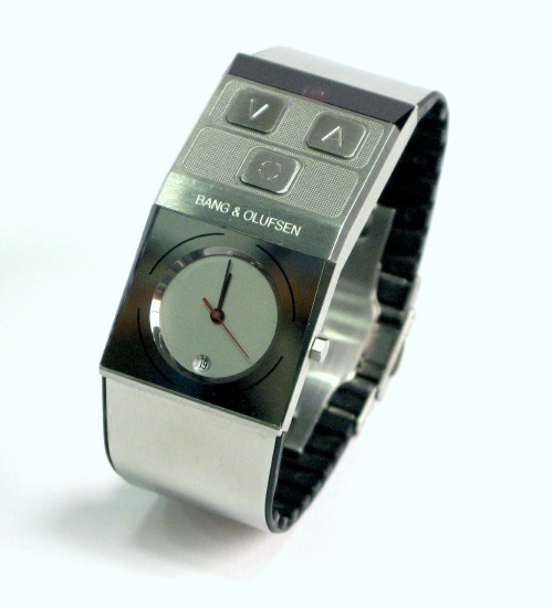
Jacob Jensen’s 1997 waterproof Beowatch (produced by bang & olufsen) was designed as a personal, unisex timepiece that makes telling time convenient and accessible. additionally, it also functioned as a remote control that controlled the volume of later bang & olufsen music centers. this design prompted me to question its present-day relevance in the design exhibition at the stedelijk museum, Amsterdam. over the last two decades the technology industry has undoubtedly grown and so has the way in which people engage with methods of measuring time. it is noticeable that less people wear wrist-watches everyday and the norm has adapted to using smartphones or other multifunctional devices to keep track of time.

this research will further discuss the design of the Beowatch in relation to the myriad of social questions it raises such as today’s security in wearable, intelligent technology and the aesthetics of unisex design.

b&o-image1

few wearable objects are designed to be unisex, particularly jewellery (if we classify a wristwatch as jewellery). i am drawn to the statement this wristwatch is indirectly raising about society’s perceived aesthetics of gender. the design is created as ‘neutral’, an object that is seen through its own entity- regardless of preconceived ideas of masculine and feminine beauty. throughout history, wearable objects or fashion, has had a very divisive characteristic – creating standards and room for assumptions. this design forgoes these notions and is created as its own autonomous form.

balancing aesthetic and (multi)functionality reiterates how the Beowatch was very modern for its time;.Jensen’s approach to design drew my attention as he states “…we expand our concept of…what a watch should look like. the sight of an object does not necessarily have to show its function…” (1994, Jacob Jensen design [paperback], Paul Schäfer). this relationship between functionality and aesthetic is a core issue that designers are faced with.

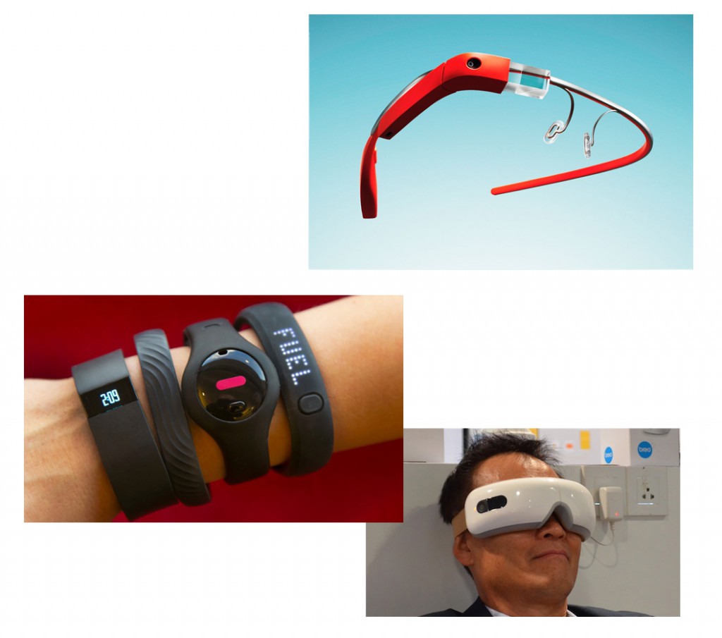
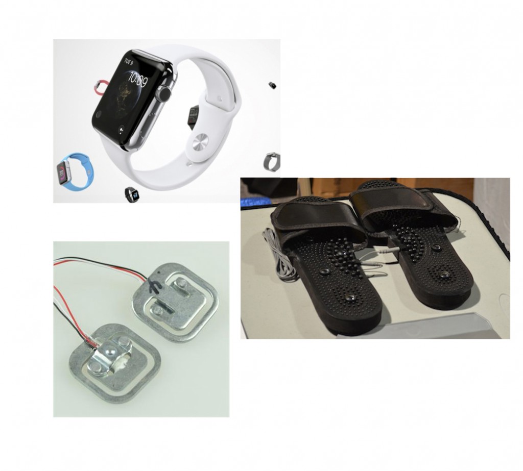
however, it is a challenge nowadays between technology and its external design. technology is becoming increasingly intelligent with wristbands/watches that gather data to measure heart rates, count steps, give directions, forecast weather, play music, interact with other devices, predict the position of the moon etc  and the visual appeal of wearing this technology. for example with the recent design release of Apple’s iwatch and Google’s glasses there is already considerable criticism on this ‘cyber-human’ image and artificial intelligence we are sometimes reluctantly and often unavoidably accepting.

b&o-image2

Jensen redesigned the concept of a remote control in the Beowatch by making it multifunctional (acting as a remote control and timepiece). similarly, designers today are changing conventional objects into ergonomic designs that fabricate, sync or react together with the human body. there is an evident focus from the technology industry to attach these gadgets and lumped plastic to people especially by getting them onto wrists. of course there are many benefits of having such tools; they are accessible, readily available and can make tasks faster. however, the fact that these devices become so quickly absorbed into the culture of everyday society is blurring the boundaries of our true basic needs.

they are also perhaps just purely adding insult to injury- for example do people need to know how little sleep they are getting? or if they have eaten too much on one day compared to the next? or if they have skipped a day of exercise? this data collection that these devices provide may give us information but it is still not enough, what is more important is the reasoning- why we slept/ate bad and missed exercise, for example. simply knowing these facts without reasoning is the added ‘insult’ to the injury/damage that has already been created. for instance if your watch tells you that you haven’t exercised enough, things that you probably know already, would you change your routine just because your watch is telling you? in most cases, not. there are versatile calculations everywhere, but the problem is what to do with this information and how to interpret it.
it is irrefutable that the pace of technological advancement is remarkable; but this also affords the risk that people will develop a better reading of their technology/ wristbands and lose their sensitivity and awareness in reading their own bodies.

b&o-image3

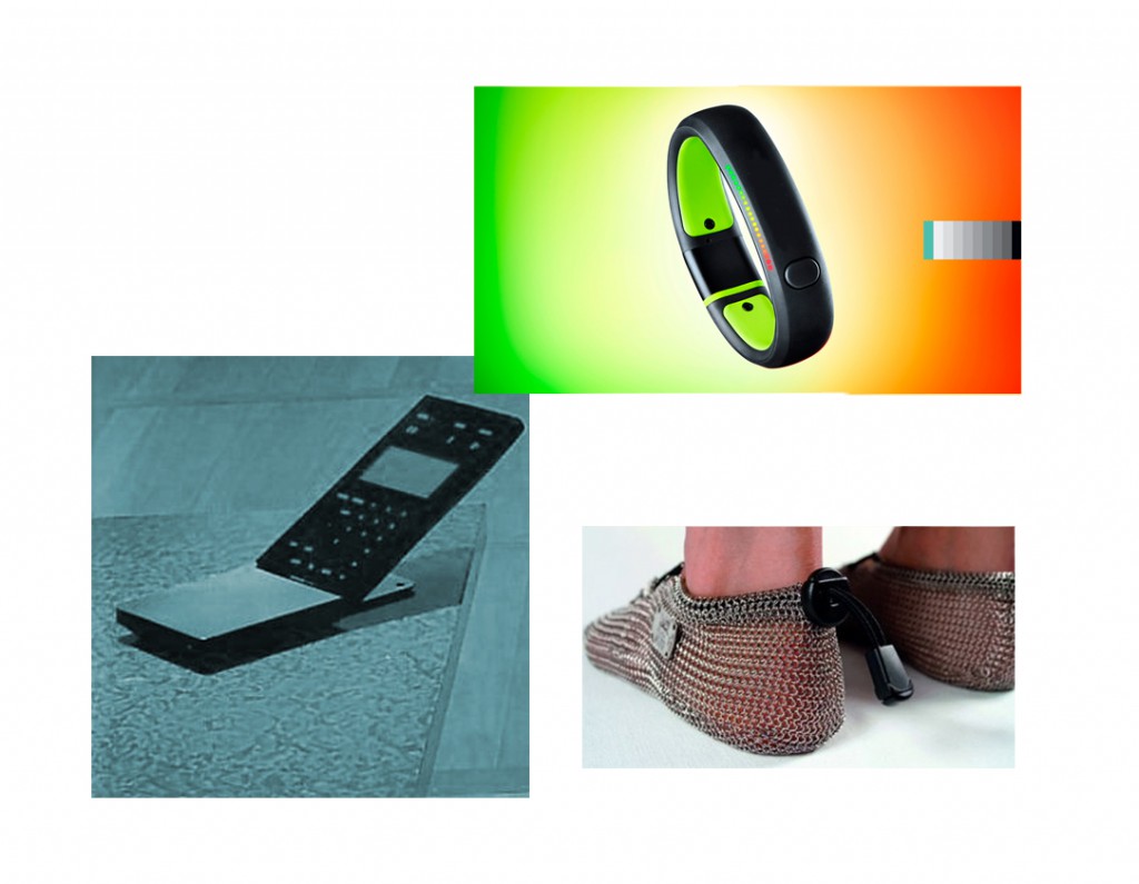
since the Beowatch, wrist technology has advanced further than the individual, as over the past decade debates have risen over personal security and privacy. it is unknown to the individual how much is known about them through their digital dossier. we are uncertain about where our information is stored or if it is being used for analysis; examples we have witnessed recently include the NSA files, cyber-hacks with phone applications and celebrities, Facebook scandals, Wiki-leaks and much more. these personal items have the potential act as a sensor or tracker, they constantly collect data which are ‘invisibly’ fed to different networks. though this subject may seem far fetched from the design of the Beowatch, the design is relevant as it marks part of the evolution of our technological reliance and dependence. it is uncertain where this line is between the personal object and a device that is actually just a form of data to a bigger establishment.

b&o-image4

the Beowatch nowadays represents a certain phase in design (1993-1996) as well as the literal time. it represents the start of multifunctional, human-fitted technology. though now the object is more about its face than its function, being presented in a showcase at the Stedelijk Museum, it is still highly relevant and raises many direct and indirect issues. As the son of Jacob Jensen said in an interview: “a product which survives the test of time, even when it has been out distanced by technology, contains a concise idea carried out at the right time, and with an aim of thorough reworking” (Timothy Jensen in Jacob Jensen design, 1994, Paul Schäfer). though technology has definitely distanced since 1997, the design of the Beowatch has survived by providing a mark for its time as well as offering insight into how we should speculate the future of cyber-human technology.


Stedelijk Design Show 2015 /Relevant Highlights


Monday, December 1, 2014


16 Rietveld Basic Year students visited the Amsterdam Stedelijk Museum to examine the items in the permanent survey of the design collection.

Does the Stedelijk exhibit all these design items simply because they are in their depot.

Do the collection criteria still have any significance today.

Do these design items have any relevance for us, our life or work,now? Is it possible to make a clear statement about that.

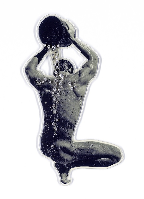
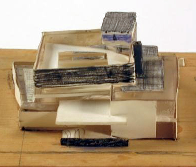
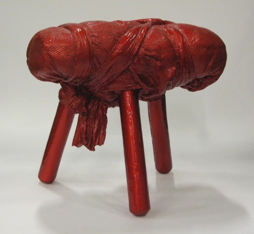
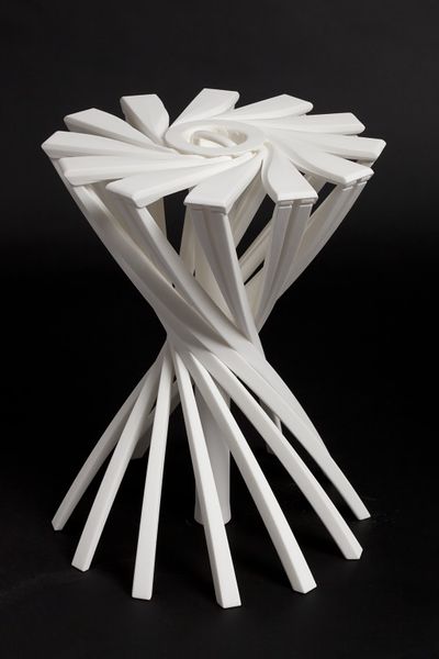
If you click on the image a caption will appear –just as a in a real museum– presenting information and a personal reflection on why that item is considered relevant. You can review the whole exhibition in pop-up mode.


click on images to visit the exhibit

Gijs_Bakker_Waterman_2_Cropped

modelWieke_stool_SM

PatrickJouinWelcome-To-The-StoreBeowatch_SM2

tafel-stoelunfolded

DSC_0321 Schuitema_300

superstudio_gherpe_flippedVaclavCigler_headband

cow-chair_flipped Paulina_glass


minding material


Monday, December 1, 2014

The exhibition The Future of Fashion Is Now [museum Boymans van Beuningen until January 2015] showed us an inspiring assortment of progressive designers with their newest techniques.

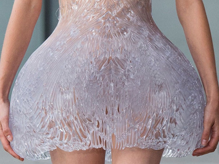
One of the many designers who participated in this exhibition was Iris van Herpen, who graduated at the Hogeschool voor de Kunsten Artez in Arnhem, the Netherlands. During her study she did an internship at Alexander McQueen in London and Claudy Jongstra in Amsterdam. Later, she began designing shoes for United Nude. An intriguing aspect is that she sees herself as a combination of a fashion designer and designer.
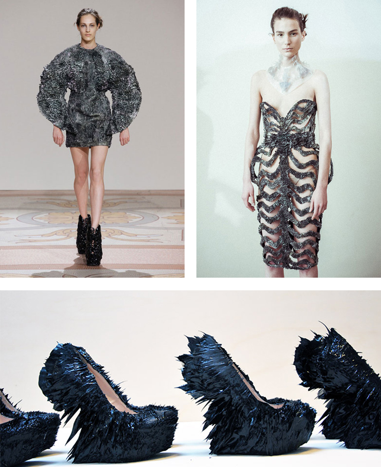
Iris van Herpen describes her own work as fashion where norms have no value and are being discarded. For her, fashion is a combination of craftsmanship and innovative techniques. It’s those techniques that really fascinate me in her work. Personally, I got really intrigued by the unique combination of materials and the technique with magnets she used to create the metal dress with, in collaboration with Jolan Van der Wiel.
On the other hand, the idea of using unusual materials such as wood and synthetics for 3D printing and laser cutting which eventually can be transformed into –wearable or non wearable– fashion, was a true eye opener for me.


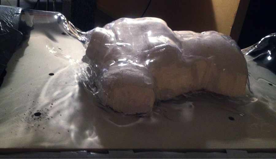
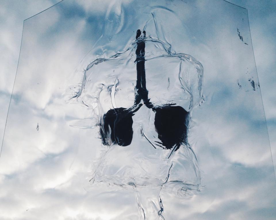
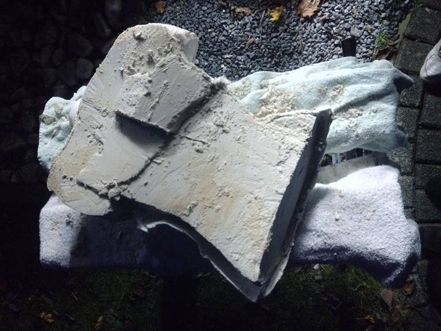
Inspired by this project, I have pictured my own body in a plastic vacuum. Since this wasn’t possible with the vacuum machine that is available in school because of its size, I did thorough research on the internet in order to be able to build my own vacuum machine with the help of my father. Firstly, I made a mold out of plaster so that I could ‘pull’ vacuum from a see-through body. The heat got spread by a heater. In this way, only a small surface could be heated and I had no control of how the pvc plate would react to this. The consequence was that the pvc was about to burst or left air bubbles behind.

vacuum_1_900 vacuum_2_900

10912953_10203785246617845_1268682439_n

In the beginning I was quite disappointed because it didn’t go the way I expected it to. On the other hand, these little imperfections in the body actually do give some added value to the work. Having control over  your material can be handy, but as soon as you lose this, interesting and unique things can happen. This reminded me of the magnets that have a will of their own in the project of Iris van Herpen en Jolan van der Wiel.


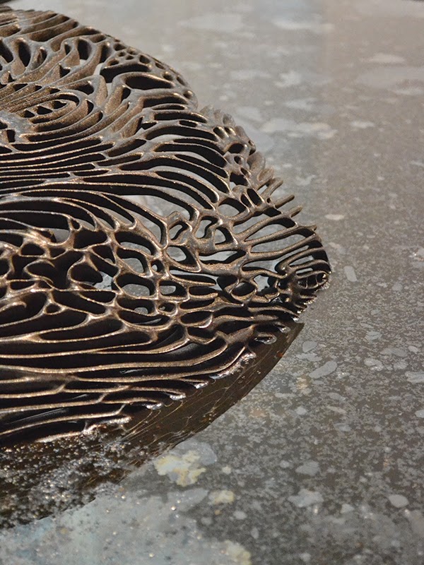
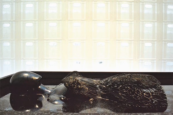
Her growing metal dress from immediately had an impact on me when I saw it from a small distance. The dress presented in the museum was one of her latest experiments. The 3D printed dress lay in a bath and grows with the help of fluoride liquid and magnets. To develop this dress she asked Jolan van der Wiel, a product designer, for help. Because of her urge to constantly apply new techniques, she frequently works together with other artists who specialize in the handling of these certain techniques. Jolan tries to forget the mundane things in his studio and to trust and make use of his imagination. Just like Iris van Herpen, he is fascinated by the working of different instruments that offer him a platform to his fantasy.

Iris van Herpen_ferroJurk Iris van herpen_FerroJurk 2

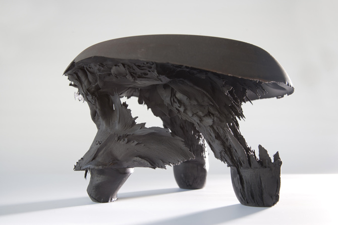
One of the instruments he uses are magnets. He creates a mixture of synthetic and metal that transforms by the help of magnets in order to create his own, unique chairs. The magnet grabbed Iris van Herpen’s attention, what resulted in a collaboration. Together, they developed a way to transform metal by using magnets so shoes and garments could be made from this. They used the same technique as Johan van der Wiel (graduated from Rietveld Academy’s

Designlab in 2011) did to design his chairs [x]. JvW_black-gravity-stool They made a basis mold, the form of the dress or shoe, and ornamented this with the synthetic magnet mixture. Subsequently, when the mold is solid, the magnets continue to do their job. They determine how the form eventually will look like. The attracted force designs the shape and after that the plastic hardens whereby the form stays permanent. In this way, thousands of divergent forms can originate and every product has a truly unique aspect.

magnetenjurk_950

They practiced this technique in real life situation in the Boijmans museum. Underneath the 3D printed dress, different magnets are hidden. Above the dress, the fluoride liquid drops down, falling on the dress. Through the magnets, the liquid sticks which makes the dress grow layer by layer. Therefore the name ‘growing dress’.

SONY DSC images-5

Furthermore, without the fluoride liquid, the dress is made out of synthetic that is 3D printed. This is a technique that we continually see coming back in her designs. A 3D printer is a device that creates arbitrary three-dimensional objects based on digital drawings. The material that is used builds up layer per layer, such as the Ferro fluid process. With this technique, Iris van Herpen is able to accomplish sculptures that are impossible to make by hand.


Next to the 3D printer she also makes use of a lasercut machine. This machine makes it possible to cut or engrave different patterns out of different materials. These patterns are being outlined on a computer program like Illustrator and Autocat. I recently used this technique as well. The only thing is that you need to have good knowledge of material. Is the material elastic, is it going to melt because of the heat?

iris-van-herpen-ice-dress-2

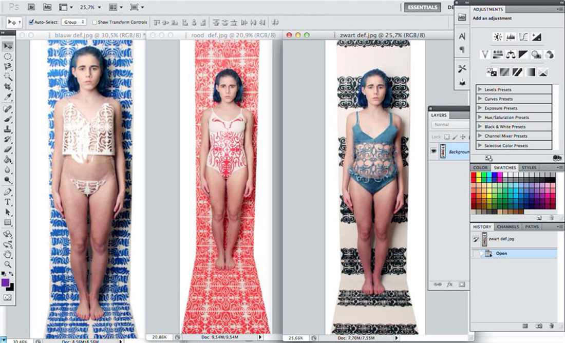
The laser cut literally cuts the pattern or the figures with a cropped laser. On the basis of the material you coordinate the data for the machine. How deep does the radius have to go? How fast? Is it supposed to go slower somewhere, for example in turns? I personally experienced this when doing material research for the making of my bodysuits. Some materials work a lot better than expected, others are being destroyed completely by the heat. Now I know that table foil is a perfect material to cut and ribbed cardboard is completely useless, while I expected the opposite.


bodysuits2_1100


Iris van Herpen and Rem D. Koolhaas, the face behind United Nude, both agree that the border between fashion and design is tremendously vague. Together, they try to make the impossible possible as not everything has to be easy. One of the first shoes they developed together is the ‘Iris van Herpen x United Nude 2.0’, a limited edition made out of patent leather. The big secret of the weirdly formed shoe is the balance between the heel that is curved to the front and the gravity. This shoe was a big challenge for the both of them, but also for the wearer. United Nude was founded with the idea of breaking the conventional rules of designing shoes. The rules don’t have to be broken, they just tried to simply ignore the rules. The higher the heel, the bigger the challenge.
Speaking of challenges, Iris doesn’t only pushes boundaries in the shoe world but also in the fashion world. Here, we also see that she applies techniques that are being used in the design world. She wants to experiment with material and shapes.
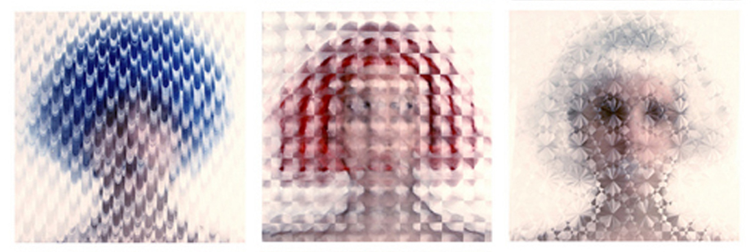
This is something I also try to do myself, processing unusual materials while keeping the pure visible. In photography, I try to apply as few Photoshop techniques as possible. In my opinion, Photoshop is only there to corrugate, like for example the contrast, a disrupting line or adapting a color. Thus, I made a triptych in which material is central. In front of the camera, someone held table foil, which actually did all the work for the photo. I could have Photoshopped a nice little effect, but for me it’s all about experimenting with different materials.

table-foil_1100

Iris van Herpen doesn’t like following the rules blindly and decently too, that’s why she doesn’t think wearability is important for fashion. Because of this reason, she is able to use materials like synthetic, metal and wood, that can be transformed and cut through the help of her favorite techniques, namely 3D printing and laser cutting.

/


Just like Iris, I like working with unusual materials, and that’s why her work has a definite impact on me. She inspired me to dare to use different materials and techniques and made me step out of my comfort zone. So the main difference between all the other shown designer pieces is that the Ferrofluiddress is not at all a static object but it is a growing piece of art. Iris isn’t only a traditional designer who only works in fashion, but an artist who converts her experimentation into wearable sculptures.


“I find beauty in the continual shaping of chaos, which clearly embodies the primordial power of nature’s performance”
–Iris van Herpen–


There is no future, we create the past.


Monday, December 1, 2014

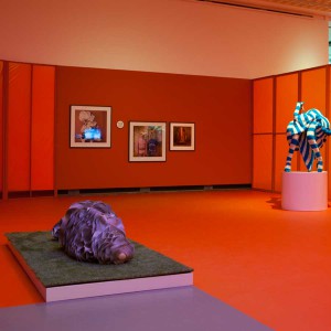
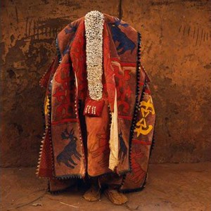
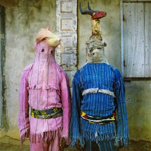
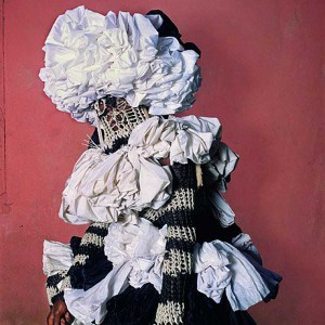
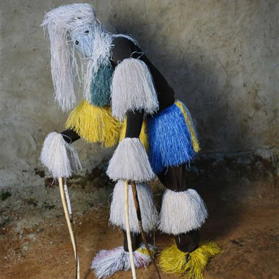
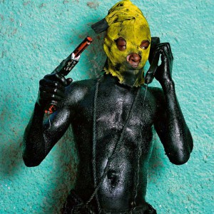
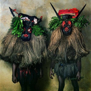
3 During the visit at the Boijmans Van Beuningen’s, between all the dresses who can melt and the one who construct themselves there where an UFO. Three little canvas on the wall of a red room , hidden by a giant costume referencing to the solar system. These three pictures were the work of Phyllis Galembo, the sample of an all life research about the ritual costumes and masks in Africa and the African Diaspora. This work was specially interesting not by the subject or the strong visual effect who drop out of these images but because it’s presented in the exhibition -The future of fashion is now- How can we related the future of fashion and a research about traditional costumes in Africa, who exist from centuries? We can relate this question with the work of Pablo Picasso who has been influenced with the first exhibition of african’s sculptures and masks in France and revolution the art history, but now is it still accurate? What is interesting about these traditional costumes is that they construct a bridge through the past and the future, pieces of art who travel between the ages, but the future of our own civilization is to look back in the past of other’s one or to build our own, now.

1 2

4

Phyllis Galembo is an American artist, fine art photographer. Her work is now related from more than twenty-five years at the African masquerade and ritual clothing. her first travel to africa was in Nigeria in 1985 since she travel through the west and central africa and regularly to Haiti. She document with simple and sober portraits these ritual clothing/art pieces without adding any meanings, keeping them in there own environment. This is a really important part of her work because these costumes are already meaningful in a lot of different themes (religious ceremonies, secret society, rituals, spiritual meanings…) An other big part of her work is to create a relation with the members of the different tribes and then be able to be in contact with these sacred objects. Here we find another interesting relation with the exhibition at the Boijmans Van Beuningen’s. The relation between the creation of a new area for the fashion designer’s and the work of Phyllis, who don’t create a new idea of fashion but put in the podium an ancestral art. The attention of the spectator is fixed on the clothing on the pictures relate to the meaning of the exhibition and not the pictures themselves who are the work of the artist. The projector should’t be pointed on the creator of these art pieces, or is it the collaboration with the photographer who make them important for this theme -The future of fashion is now-

7

These pictures were presented in the section “The (re)definition of the human figure”. It was the topic who interested me the most in the exhibition and also the one that disappointed me the most. The theme is so large and for me unxploited at all. Only the work of Pyuupiru (Tokio) “Mercurius” and the “Akata Masquerade” from the american photographer was relevant, even if my only wants was to see in real the costumes on the pictures.
The african traditional masquerade costumes are for me a door for a mystical world and also a question about the definition of the human being. These costumes are more than a redefinition of the human figure but a way to escape totally this human aspect, physically and spiritually. And maybe lead us to this question, why i was interested by this part of the exhibition, What is it to be human, Just a concept, are we just animals or is it something spiritual that we should be aware of, or search for?

6 5


Log in
subscribe