This post is dedicated to the design approach, names, some interesting facts of project “Body Type” by Anthon Beeke.
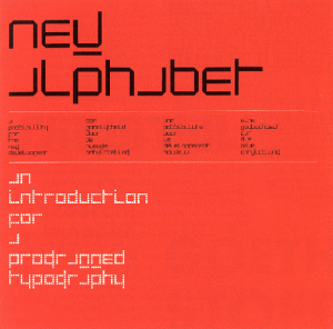
The book, which I want to consider was published in August 2011, but looking into it, it become clear that this box/book is the second time this project of this talented graphic designer is published. For me, it is important to say that these two publications are based on an idea of an alphabet made up of ‘Beautiful girls’ created originally in 1969. In past, this alphabet was based on naked female bodies, which posed (where constructed) like letters and punctuation marks. Beeke made this alphabet as ‘a tongue cheek’ response to Wim Crouwel’s famous New Alphabet published a year before in the same series “Kwadraat bladen/Quadrat Magazine”[x]
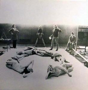
Project ‘Beautiful girls’ in process in a GYM of Gerrit Rietveld Academie
photographer: Ed van der Elsken
This alphabet as an experimentation was a sensation for late of 60’s, nobody has done something like that before.
Considering the second publication it is extremely essential that a lot of famous designers as Wim Crouwel, Rene Knip worked together and organised every aspect of the book.Well, I can say that this book is as a result of cooperation of several designers. That means that this project was mulled over from different points of view and all design decisions were discussed in a professional surrounding and this fact automatically increases its quality.
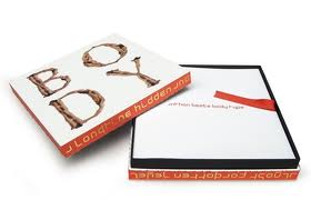
The ‘Body Type’ book was made as a box,which is a really attractive ,in my opinion, because of a size, image on a cover and, of course, colours. Despite on a fact, that book is based on a quite old idea, it looks contemporary and a cause of it is that Anthon Beeke decided to make it in colour. The whole publication saves a tendency of 3 main colours: red, white and black. Thats is why it looks bright, new and interesting. A content of the box consists of 3 parts. In the first part you can find an introduction ,which was written by Wim Crouwel ,who also was a designer of the main font for a book.Text is provided in Dutch and in English, and following a purpose to create a fast visual difference between these two languages and to make it easier to read,separating one from another , Dutch text is in black colour, English in red.
The second part of a book is a ‘body alphabet’ itself.In this part Beeke also decided to add something new (compering with a previous publication), there are letters from not only women, but and from black men, what shows an expression of time ,which we live now. The third part consists of printed letters , so you can tear out and string up to bring this alphabet to life in words and texts that means that now a benefit from a book is not only to read it and enjoy its design ,but and use it for whatever you like.
This video shortly shows how photos for letters were made.Enjoy!
https://www.youtube.com/watch?v=FoSNFuVM3Tw
Rietveld library catalog no: 757.3 bee 1 (N.U.)


