When first introduced the idea of creating a color system, a small panic appeared in me. After studying ‘theory of color’ in my previous studies, I was afraid that it would turn into a theoretical and precise boring system, where the colors are mixed based on a strict formula, very far away from my interests.
What is then what is so interesting about color for me? What will make me excited or what do I need to create a color system for?
After a long process of reflecting, I decide to take a step out and look at color differently and alienate it from any system that I have studied before.
Reflecting on my need, I’ve always looked at color in food, due to my intolerance to sugar, some food is forbidden, meaning, some colors are forbidden. For example, when my friends ask me, what vegetables can you eat? I say, only greens, so it’s easier for them to remember that tomatoes or paprika or others are not good for me.
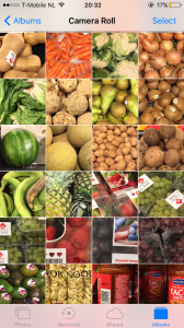
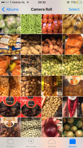
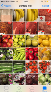
Thanks to this I started collecting images from the supermarkets, walking around and seeing the difference between what I can eat and what I can’t. All the bright colors from the fruits and some vegetables, were forbidden of course, and all the not so hysterical colors from the rice, beans, meat were fine.
Now the challenge was, what do I do with this pictures?
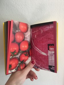
Something like a guide, a small booklet I could carry around, and I could give to my close friends, similar to a little Bible.
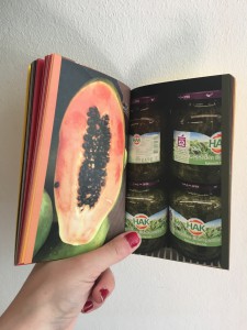
I always carry a small notebook that fits my pockets, so I decide to take that format and create a two sided booklet, where one side has all the food I can eat, and on the other side it has all the food I can’t.
I took the decision to add a small color mark on the side of each page with the exact color, creating a small gradient on the side of the booklet. On both sides, it starts with light colors, and goes to yellow, orange, red, green, brown and darker. The order of the gradient has been influenced by the harmony between colors in the Coloroid system I wrote previously about.
![]() yes
yes ![]() no
no
Because it’s a double sided publication, the gradient is on both sides, and always both pages contrast with each other, one being the yes and one the no.
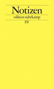 The book that inspired me is 9,5 x 15,cm, single pages and glued. The design of it is taken from the notebook ‘Notizen, edition suhrkamp’. (click on both images to access more information about the edition Suhrkamp)
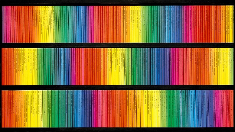
These are the rest of books that this publisher has created and this as well was a part of the inspiration for the harmony in the gradient.
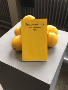
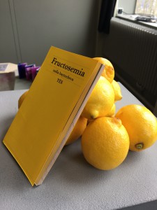
It has a yellow cover first, because of the inspiration I took the book from, and as well because of the color of the lemons, which is the only fruit that I can eat. In the presentation I decided to include some lemons that ill hold the book standing and as well camouflage it and integrate it in the space so it’s not flat.
I am very satisfied with the result as well as happy about how much I learnt about book binding, and the paper. For example, how important it is the direction of the fibers of the paper when you print so the corners of the paper don’t bend. Since it was a very precise color scheme, it had to have specific bleed marks and cut marks that I never used before.
