Skip to Content Skip to Search Go to Top Navigation Go to Side Menu


"functionality" Tag


Hella Jongerius and the in-between-state of Design.


Sunday, November 27, 2016

Within a era where design industry has been mostly focusing on how-to-reach at quickest the largest market possible by basically allowing marketing and communication departments to take the lead and most companies are sales-increasing-oriented, there’s a figure I’ve been admiring a lot for a certain capability to break this kind of mechanisms. Dutch designer Hella Jongerius has been an attentive observer of the industrial production process and its weaknesses and I could think of her as a designer capable to give the design industry a remarkable, somehow playful response.
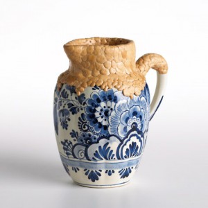
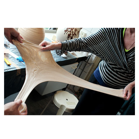
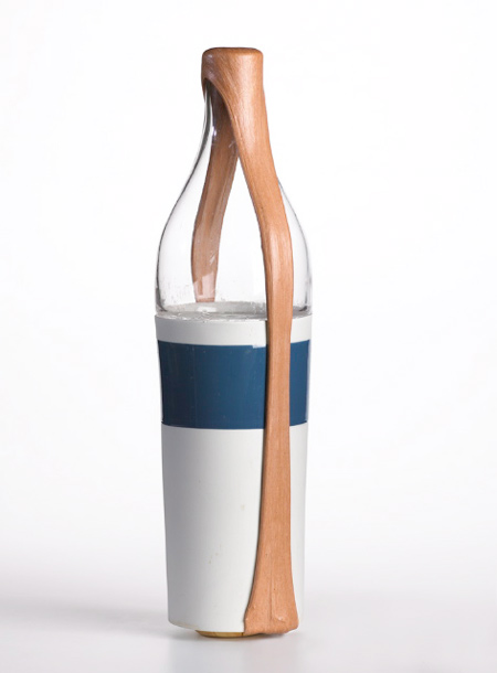
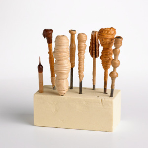
Chicle Project, material experiment for The Nature Conservancy, 2009


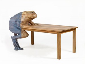
By having a broad look here and there to her work, I could figure out that the strength of her designs lies in their between-state for both caring about details and imperfections and still being able to fit into an industrial production rhythm. In her work I see some sort of generosity which looks up back to the past (not just to appropriate herself – as most designers nowadays would do – of principles such as authenticity and sustainability) by giving it a further value as a result of her never-ending research around life and ”afterlife” of objects. What strikes me about Jongerius’ design approach is that she pushes design to an almost imperceptible limit which oscillates towards an artistic process. Hers seems to me closer to an art-related way of processing research, brain storming, sketching ideas and projects themselves starting as sketches, always caring about some imperfection which can emerge through unexpectedly magic come outs. This is at least what it means dealing with handicrafts. Something that she has discovered already in the 90s when giving the design industry imperfection as an answer. Concerning to Jongerius, design should firstly be communicative. This is what design is about. Its function lies mainly in its communicative power which can be measured at different levels of meaning.  Even ugliness can be very a strong means of communication. Since handicrafts primarily deal with the impossibility to produce perfect finished products, she has considered it as her own vehicle to face the anonymous perfection that industry has been producing for more than a century. In most of her works, she is been playing with the imagination of the user, by creating fore ex. a ”frog table” which is basically a frog seating at the table itself and a question which comes along with that is: why do we need imagination for (a specific) utility? isn’t use already enough?


Frog Table [Natura Design Magistra] 2009

According to the Dutch designer, there is a persistent prejudice concerning the essential difference, drastic separation between designs that are made to be purely functional and expressive designs which are able to tell stories which go beyond themselves as objects.

Once again the function of design has assumed new meanings and contents. It cannot be formulated strictly depending on terms of use or comfort.
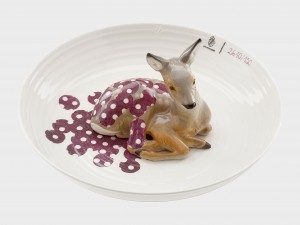
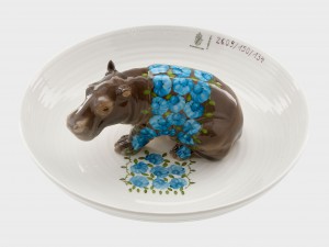
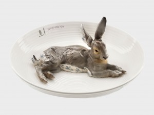
Sometimes the core signifier of design can actually be its paradoxical non-functionality > animal bowls < a project started in 2004 for which Jongerius is been selecting different pieces ouf of the Porcelain Manufacturer Collection of Nymphenburg – as a celebration of age-old crafts and treasures found within the Nymphenburg archive, in Germany.


Bowl with hare / Bowl with fawn / Bowl with hippopotamus

Some other aspects that I really appreciate about Hella Jongerius’ work are the experimentation with the more diverse materials and her deep passion for colours I feel somehow very close to.

In 2009 she’s been leading a project for The Nature Conservancy [x]. In this particular project Jongerius is been experimenting with the natural material of chicle, derived from the rain forests of Mexico. The project itself consisted of a group of internationally renowned designers who have been participating, initiated by the American Nature Conservancy, an organization which strives to protect sustainable materials for use in contemporary art, design and architecture. The results of the project were shown for the first time at the Cooper-Hewitt National Design Museum in New York.

Chicle project [x]


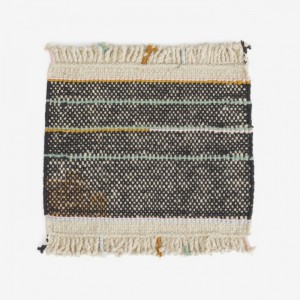
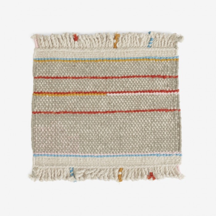
Argali Rugs, 2015

For this project Jongerius has created – within a palette of six colours typical of Nepalese yarns – Kilim rugs which have been hand woven from special Tibetan wool from Argali – a wild sheep breed that resides in the Himalayan mountains. The yarns themselves have been hand spun by local weavers, and their naturally faded colours and irregular character lend each rug a truly individual appeal. Each rug incorporates several design details, including a hand-embroidered area with silk yarn – a reference to an old tradition of repairing the rugs. The fringes are braided, a practice that also refers to an old custom in Nepal – this for its decorative appeal.


argalic0231©danskina

Argali for Danskina [x]


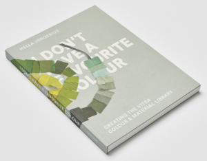
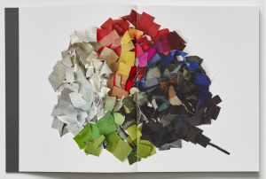
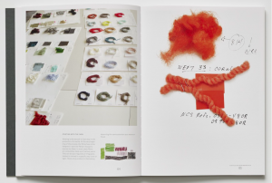
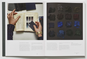
There are some many things which should be told about Hella Jongerius, that comes almost difficult to make a choice ouf of the huge amount of her research. Jongerius has been the Art Director for colours and materials at Vitra for many years, during which she has developed Vitra Colour & Material Library together with a quite recent book ‘I don’t have a favourite colour’ which basically refers to the establishment and +further development of an intelligent system of colours’, materials and textiles that make it easy to create inspiring environments in offices, homes and public spaces. It is definitely an interesting book since the Dutch designer has been illustrating her method of research and the application of its results to the Vitra product portfolio.


'I don't have a favourite colour' [x]


Jongerius way of dealing with the design experience is very fascinating for me since I’ve always felt quite far away from the design process, very related to super appealing – almost perfectly finished products.
Her installation/selection within the textile archive of KLM company for Dream Out Loud exhibition at the Stedelijk has been so inspiring for me. It confirmed me further my pre-existing love for textile matter. It immediately brought me to a sort of aesthetics that I personally feel pretty much related to. By reading part of her book Misfit and her .Manifesto. Beyond The New written together with Louise Schouwenberg so many exciting questions came up – concerning the contemporary era – where are we going to? design/art? this over exploited back to the roots feeling and the over flooded quantity of emerging designers. What can design add to the world of plenty? and What is functionality in the here and now?
 

ARE WE STILL FUTURISTS?


Friday, March 27, 2015


h2_1987.98.1a-d

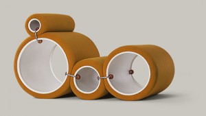
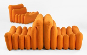
                                        Joe Colombo, Tube Chair, 1969-1970


This is my chair. The Tube chair designed by Joe Colombo in 1969-1970. First I will introduce the intentions of this designer as a representative architect of that period and shed some light on the ideals behind designs from this time. Colombo was mainly focused on the creation of living systems (Combi- Centre of 1963) that were made to become micro-living-worlds with dynamic, multifunctional living spaces. He was very interested in furniture systems (Additional Living System), as an example the Tube Chair that could be set up in several different ways depending on the users wish!


first impression

One of the things that caught my attention when looking at this chair is the shape. To me it is quite unusual and therefore appealing to think that a construction could be shaped by only using round cylinders. I also found quite interesting the fact that these shapes could be organized according to the position you want at the moment, which to me is fascinating. Also the color of this particular model is very present and strong, adding to the shiny material it is made from. All of these elements create a quiet eye-catching construction.

Intrigued, I decided to research more about the aesthetics of the sixties and early seventies and learn the meaning behind this particular aesthetic and philosophy behind this kind of design.


for whoever want to know Joe Colombo

shiny tubes

shiny

shiny shiny shiny shiny shiny shiny shiny shiny shiny shiny

perfect colliding cells of bodies, body parts inside parts of parts of bodies inside shiny parts of bodies, is this a body, is my body this, parts of colliding shiny cells colliding bodies?

or cold neglected manufactures of machines? Machinery taped forcefully by robotic aggression or casually naturally beloved shapes holding, sustaining, lovingly enclosing tender body parts?

this is my question when sitting in the tube-chair.

both.none.both and none at the same time

because time is the reaction after this action.

orange tube chair.

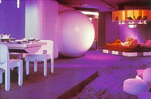
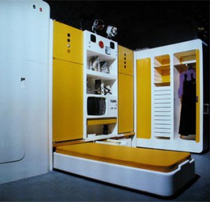
I saw lots of similarities between the interior design that is visible in furniture design, decoration and the architectural use of space used by  Joe Colombo during the late sixties/early seventies. here are some pictures to show some representative interiors designed by him in this period!


Manu 6

Manu 5

MANU 3


Joe Colombo, Visiona-Livingroom of the future, 1969, Total Furnishing Unit, 1972, Spring Lamp’s prototype, table lamp version, 1968,‘Plywood Chair’, 1963, Carrello Boby, 1970, Spiral chair, 1932, B-Line Colombo Modern Multi Chair, 1969


some history lessons:

The 70s represented a reaction against the sleek minimalism and simplicity of modernism and instead sought a  “playful embellishment and radical experimentation with form.” So this meant that functionality had a high importance yet still creating an exciting and almost utopian space. These spaces had unusual colors, shapes and functions as to move towards a successful future of living.Self-expression and individuality were defining for the time. Technology started gaining importance and spaces were used as organisms that were part of their surroundings.

The architecture of the time was also very innovative when it comes to light and space. In many ways, the 70s started the concept of “open plan living”. Many designers reacted to changes of how families were starting to be structured (women started working outside of the house thanks to  technological advances and overall economical growth f.e.) with double-height spaces, open planned living and grand entrances. Many homes had giant windows, spiral or “floating” staircases, interior and second-floor balconies. The kitchens were made to accommodate more cabinets and high spaces. Many kitchens had islands or breakfast spaces, bringing the family into a room that was once reserved only for women or staff. This was a symbol for the slight change in position women were starting to have during this period, that was to be seen in the way the living space was designed by the architects of the time.

During the seventies there was an enormous use of bright colors. Houses became very inviting and there was a lot of eclecticism when it came to the furniture designs and nearly every object had a bright color such as toilets, walls, furniture and decorations which came in several colors .

The 70s was a time of many advances in the design of chairs and office furniture. Designers began experimenting with ergonomic designs for the workplace and home offices. Many Italian Designers were at the forefront of radical and experimental furniture design, using high tech materials, tubular steel, bright colors, and polyurethane plastics.

1970s stuff

• Sleek plastics and high-tech materials
• Avocado green and gold
• Bold patterns and prints
• Stacked stone fireplace and stone walls
• Timbered ceiling beams
• Exposed brick walls
• Metal (chrome, polished steel)
• Geometric shapes and lines
• Thick and chunky masculine furniture
• Fiber optic lights
• Wood paneling
• Skylights
• Atriums
• Indoor gardens
• Fireplaces with elevated hearths
• Big windows and lots of glass
• Wall-to-wall carpeting
• Sunken living rooms
• Wicker furniture
• Shag rugs
• Earth tones
• Brightly colored furniture
• Orange

MANU2MANU


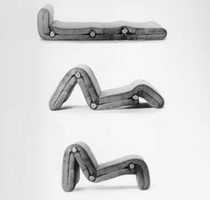
Joe Colombo, Additional System chair,

1967-1968, demonstration of positions


parallels to today:

IKEA

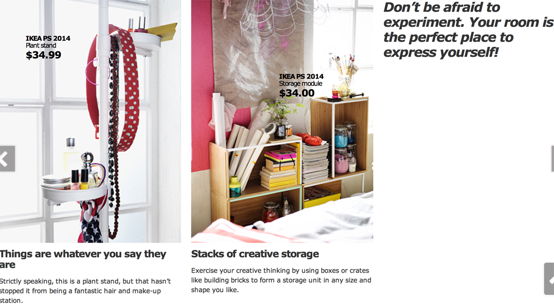
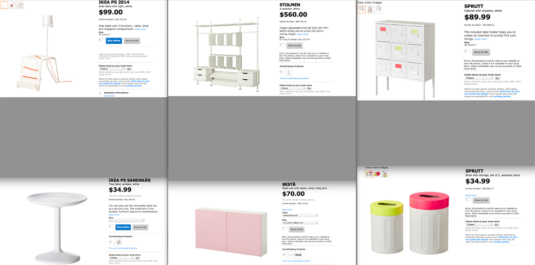
Reading about the sixties/seventies really got me thinking about how much of the ideals and aesthetics I recognize in our contemporary culture today. Some of the things such as experimentation with form, eclectic interiors, technological advances (that are employed within living spaces) and individualistic approach to the design and embellishment of a living space are elements I strongly recognize in our culture today. The first place that came to my mind was Ikea because of the presence it has amongst nearly all of us, as well as its attracting quality it has to people today. Here are some pictures that I thought were representative for the similarities!


Ikea_catalog1 copy
Ikea_catalog2 copy

ON FUNCTIONALITY


Tuesday, April 1, 2014


Esther Frank* and Kjersti Alm Eriksen and NicolasChuard and Salomé Roodenburg* on functionality


Each project that students initiate, makes them into temporary experts on given topics. Art & Design schools then become knowledge hubs where different expertise cross fertilize. By looking at what types of research students engage in, Designresearch and UnBornLab organized a 'workshop' to investigate design matters from a students' perspective.

Through a series of short video's students from both the Foundation Year and the DesignLab department share ideas, focusing on the temporary expertise gained as part of their projects, rather than the outcome. The workshop was articulated around one of their given assignments. Students were asked to develop a specific object or context to help focus or explain content.

The format is clear: two persons, discussions, filmed from above.
the space is : two stools and a table.

* Foundation Year


ON MAKING COFFEE


Tuesday, April 1, 2014


Martina Turini* and Matilda Beckman talking together on the subject of getting people talking


Each project that students initiate, makes them into temporary experts on given topics. Art & Design schools then become knowledge hubs where different expertise cross fertilize. By looking at what types of research students engage in, Designresearch and UnBornLab organized a 'workshop' to investigate design matters from a students' perspective.

Through a series of short video's students from both the Foundation Year and the DesignLab department share ideas, focusing on the temporary expertise gained as part of their projects, rather than the outcome. The workshop was articulated around one of their given assignments. Students were asked to develop a specific object or context to help focus or explain content.

The format is clear: two persons, discussions, filmed from above.
the space is : two stools and a table.

* Foundation Year


Log in
subscribe