Skip to Content Skip to Search Go to Top Navigation Go to Side Menu


"sensation" Tag


Food color perception


Monday, April 2, 2018

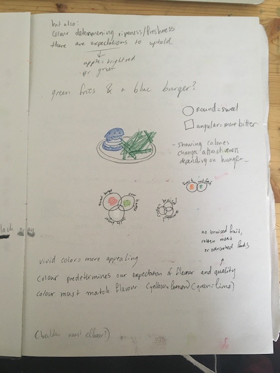
You know how, when you have a bag of sweets, the yellow one is going to taste sour like a lemon, the green one tart like a green apple and the red one will taste the sweetest, like a strawberry.

Have you ever had a blue sweet? They do exist but often don’t represent a certain familiar kind of food. The blue is “odd-tasting”, the blue one is often considered the least tasty of these four colors or at least the least familiar. This is because we are used to associating dark colors, like black and blue, with rotten foods.

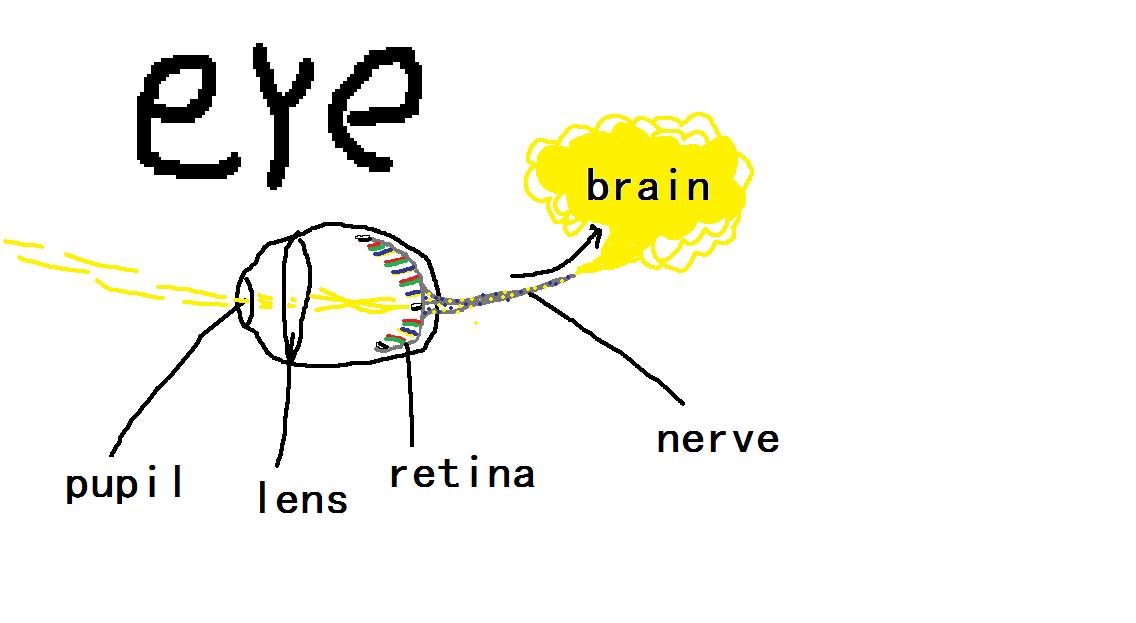
Different research over time has proven that color can affect the (sense of) taste of different kinds of food. Even if the food doesn’t actually taste sour but is yellow, our brain will respond to that colour and tell you that this food tastes sour.

“we taste with our eyes long before we taste with our mouths”. Here is a short video of an intelligent looking man telling you more about this phenomenon.

I know there are a lot of interesting turns on this “color” theme but this topic of color in connection to taste and/or the expectation of taste  is one I found particularly interesting because apparently we can change each others senses of what we see just by changing a colour which is pretty spectacular!

So; I did some research and wrote the basics of what I found down in my notebook.

Notebook1 Notebook2

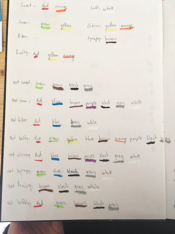
Certain colors stand for certain tastes as well as the perception of the freshness and/or ripeness of the foods we see. Our brain creates this link between color and taste and/or smell and also just the expectations of the taste of certain foods.

For example; we expect a red apple to taste more sweet in comparison to a green apple that would have a way more sour taste (which is ok because we know that red is sweet and green is sour).

I wanted to somehow capture this occurrence and I figured that the best way to let the colours speak would be on a photograph because this way the look of the food (where you say “this shape looks like a banana”, or “this shape looks like a lemon”) is the only thing determining your expectations of the food and not the smell, consistency etc which I felt would not make my point stronger.

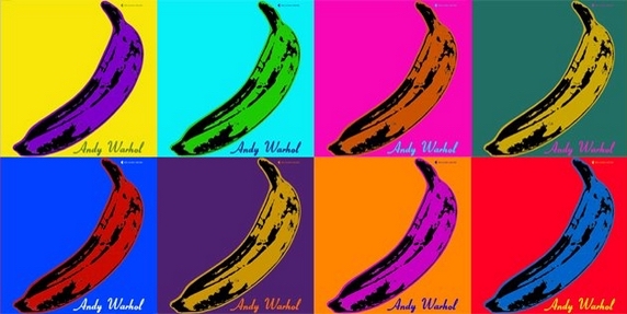
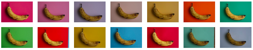
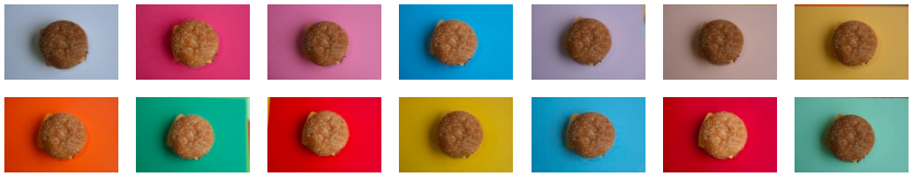
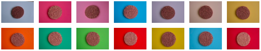
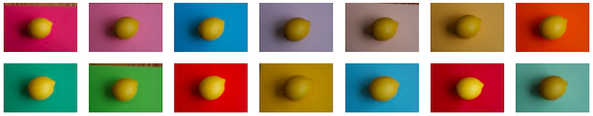
The next step was to take pictures of a banana, a cooked stake and a tomato, putting them on a differently-coloured background in each picture.


Bananas 1

Steak 1

Tomaat 1

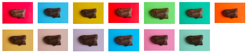
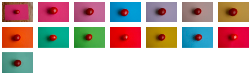
I didn’t feel this worked at all. Looking at these pictures, my perception of the food didn’t change. It looked flat and the only thing that came up with me was how much the bananas looked like an Andy Warhol print.

Andy bananas

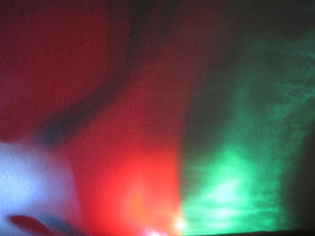
So then I read about this one study (click “download” in the link. p.22 of the downloaded file) that took place in the 1970’s where investigators had put participants in a room with a colored light and a plate containing cooked meat and fries. Because of the dimmed colored light the participant wouldn’t really be able to determine the color of the food.

Once they had half way finished the plate the light in the room would slowly go back to a normal color which revealed that the meat was blue and the fries were green. As a reaction to this, a lot of participants refused to finish the plate and/or immediately felt sick.

I think this was a strong investigation because it shows very clearly that the color of the food is very important to our brain. It has to work. Our banana simply has to be yellow and our apple red or green, otherwise your brain will definitely warn you not to eat it and it will look way less attractive to eat.

Notebook3

Some extra ideas that came up

So I figured this was what I did wrong with the banana.

This is where the idea of colouring the actual food lured me in. It made total sense that when it would work in this study, it might also work on my photograph.

This way the shape of the food would not cooperate with the color it had which might not work for our brains.

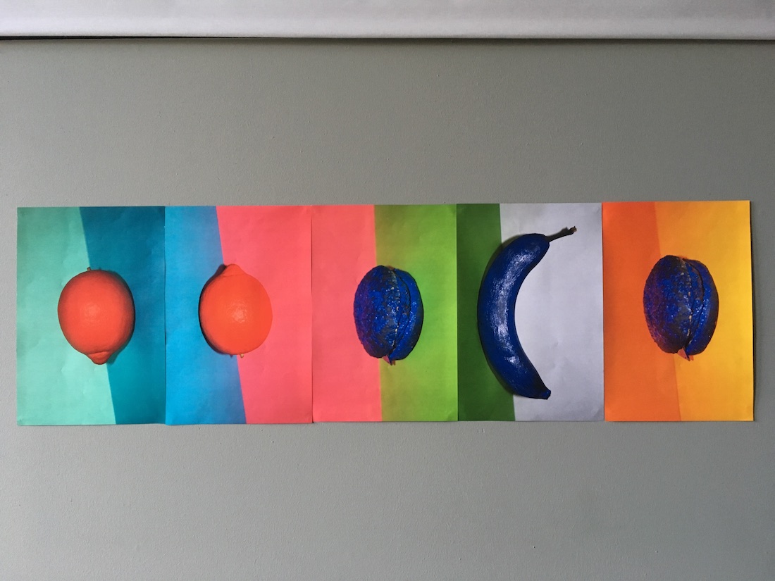
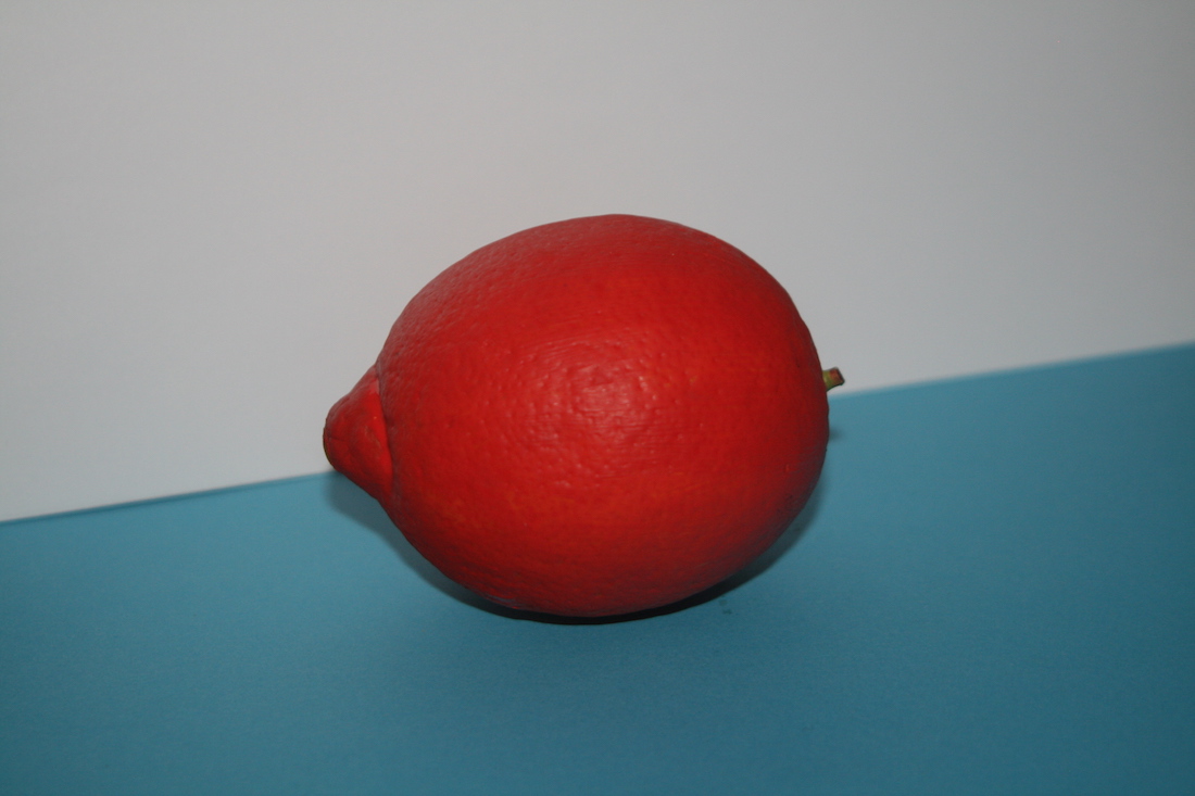
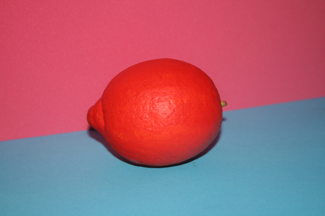
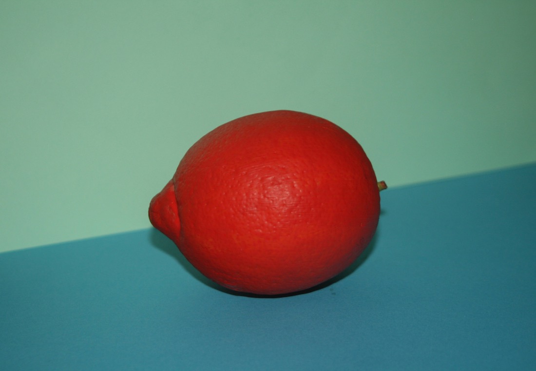
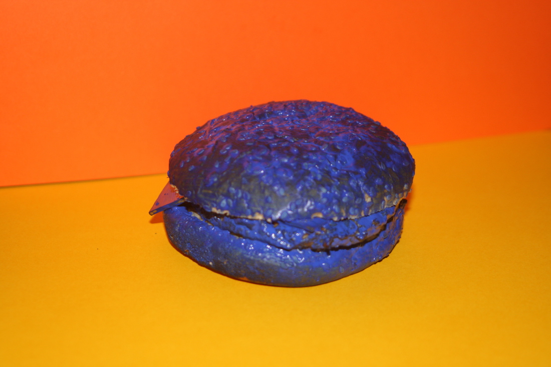
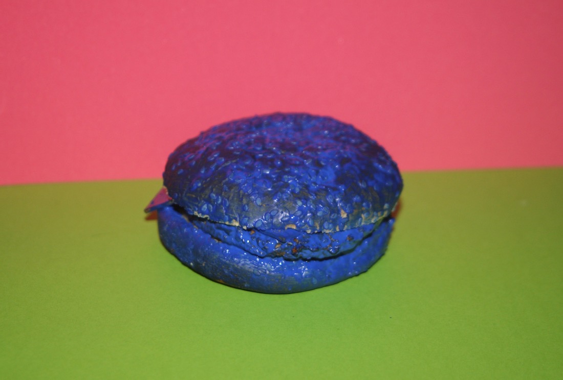
I chose new foods that have a clear taste in our head. So a lemon, a hamburger, a vegan burger and a banana.


Bananen 2 Burgers 1Vega 1 Citroen 1

And then I painted them which made me decide to let the vegan burger go because this was near to impossible to do and it didn’t have the look that I wanted it to have.


Geschilderd boven 1 Geschilderd boven 2

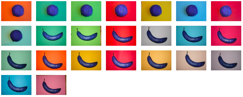
I took these photo’s from above (see above) and thought it was too clean which food isn’t. To me, making the pictures from above made the images look flat, less like real (eatable) foods but rather like something fake, non-existing.

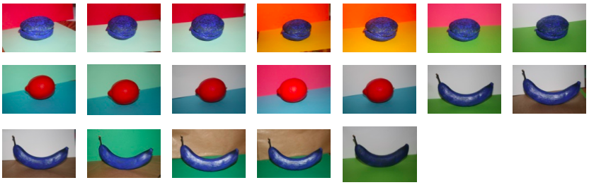
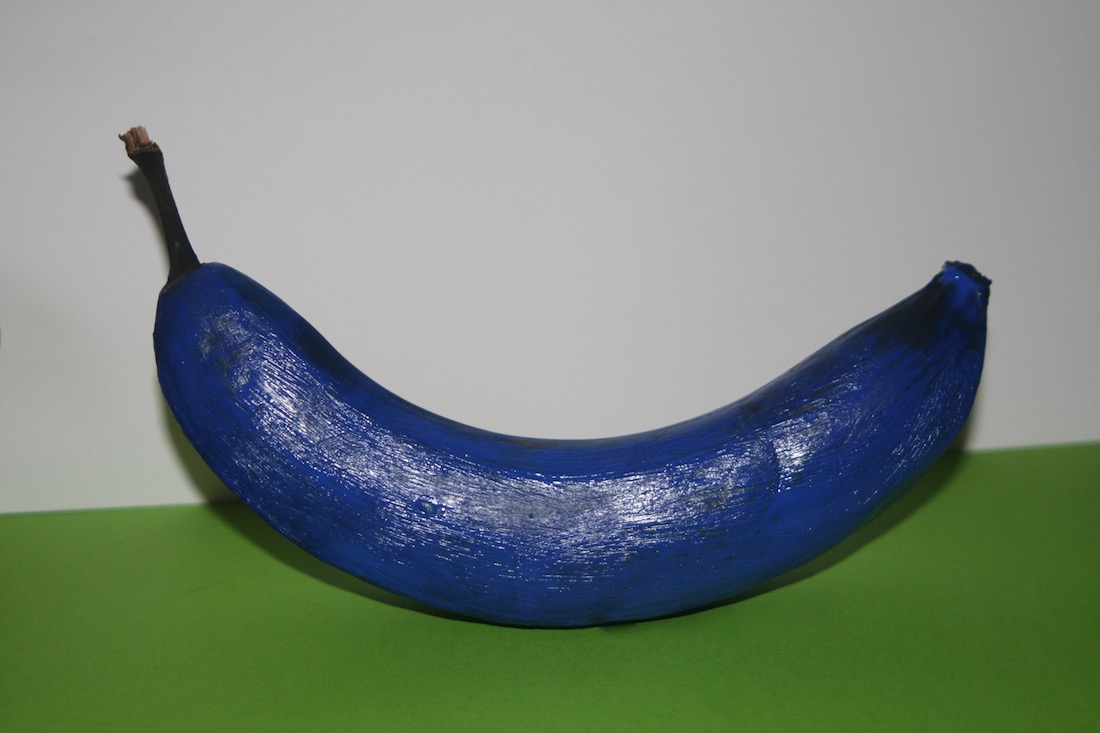
This is why I decided to take the next pictures from the side rather than the top, like the food would be laying in front of you when you look at the image. I used two different background colors for two reasons; To further convey a spacious effect (rather than flat) and to experiment further with the color perception at the same time. The latter conveyed by trying to make the changing perception with different colors more clear in one single image. You could put your hand on the top part of the image and the experience would be different than when you would cover the bottom part, just like it would be different looking at the image and the colors as one whole.

Geschilderd 3D

Then I would have to make a next, maybe final, step. What images/image should I use as my final work or should I just continue experimenting until the end result will automatically present itself to me?

Should it be a book? A print? A collage? Everything? A lot of times a photo (series) is displayed in a frame on a wall and maybe also sold in a booklet or on postcards on the side. Is that how it should be with this work? And if I would put work on the wall. Would that be one photo or a series of photos and how would that work since all the works have different colors with the possible result that the colors don’t go well together on the wall.

There are a lot of possibilities but for now I found one way to present the final work I was particularly happy with because of the overall composition of the images I was content with made above but also, to be honest, kind of based on intuition and the general feeling some of the pictures gave me.

I think that, in general, the pictures are very well able to work by themselves but I also think that the images have the ability to amplify/strengthen the general notion of this work, the changing perception of food depending on color.


So in this instance I chose, as perhaps a final work (for now), a collage of different images working by themselves, together.


Eind 1

Freaking contrast


Monday, February 3, 2014

Some time ago I heart about color theories. My focus was mostly on the color theory of Ewald Hering. He was a psychologist. As a psychologist, he was busy with the perception of color by people. He made a theory based on another theory. The theory of Helmholtz and Young. Young and Helmholtz said that there are three primary colors (red, green and blue) these are the basis for every color. But Ewald Hering made his own improved version of this theory of Young and Helmholtz.

               Ewald_Hering2   hering1

Ewalds color theory is about how color is perceived in the eye. The perception of color is (re)made in the brain. In the eye there is a layer which is sensitive for color, it is called the retina.

You have little cones in this layer of your eye. Every cone has its own function in relation to color. Each cone is sensitive to two colors. The cone has two colors that are opponents of each other. Red and green are together in a cone. As well as blue and yellow and as black and white. When a cone is being activated by for example red, green also reacts to that cone. In the cone there are nerves which pick up the signals of the colors and transport that to the brain.

eye


The introduction of the color yellow into the theory was very important. Hering said yellow was a primary color. We see yellow as a primary color in painting but in light it was new to use yellow as a primary color in color theory. Like in the theory of Helmholtz and Young, there yellow was said to be a mix of green en red.

The color is what makes Herings theory innovative for the time. He changed from three primary colors to four primary colors.

 Yellow

With his fourth primary color, the way the colors responded to each other had to be different. He made a theory for that which deals with opponent colors. Because the sensation of green and red together cannot be seen together in one color. (Reddish-green doesn’t exist). But his theory claims that they do have to interact with each other.

Get the Flash Player to see this content.

I thought it was fascinating that someone could create a theory by thinking in a logical way. Because Ewald could not proof that Helmholtz and Young were wrong with their theory. He based his whole theory on the fact that he experienced that people could not see yellow as a mix of green and red.

colors

What I then tried was combining red and green light through 3D glasses. I thought I saw yellow but when I looked again, I just saw black. That might also have been caused by the method of using filters. When you put a red filter and then nothing else red goes through, if you then put a green filter it will go black.

I find Herings way of making a color theory a beautiful way of finding new things.

Opposites attracts and influences


Sunday, March 31, 2013

Ettore Sottsass designed this lamp in 1981 for the Memphis Milano Collection and it got its name after the great Indian emperor Ashoka. Fascinated in ancient cultures, he travelled in 1961 to India, which profoundly affected him. However, there is nothing that precisely reminds me of Ashoka in the lamp, neither in colors, form nor material.

Portrait of the emperor Ashoka and an Ashoka temple in India.


With deeper investigation I found out that ashoka translates from Sanskrit into English as “without sorrow”. The emperor Ashoka was revered by many as a leader supporting big changes. After years of rationalism, Sottsass along with Memphis Group were rebels. The style they brought up was seen to be perfectly in tune with the early 80’s post-punk culture, without a doubt a distinction of the often-obscure theories of postmodernists. This brings me to the feeling of Sottsass as a punk, reining the future without sorrow for the past and incorporating art into design.

What further strikes me is the significant playfulness that follows his designs and thinking. A good description of his works is “a shotgun wedding between Bauhaus and Fisher Price”. It shares a common interest with toys such as testing out, trying, building as in children’s mind and color palette.


Fisher-Price advertising and Ettore Sottsass Flavia vases


Duplo lego and Ettore Sottsass Casablanca Sideboard


The name Ettore Sottsass was unknown to me, until some months ago. I was star-struck by his philosophy and work. Coming from Sweden where popular design often is characterized as being very minimal and serious, I was experiencing the complete opposite. It was playful, bold and colorful. He totally distracts me with his colors, what he calls “gas station colors”. Maybe my attention is drawn to the object thanks to the distinct primary color used; there is something pure and genuine about them. To Sottsass these colors are the ones he used as a kid, learning to draw. Freedom and rejection of prejudices is supposed to be a reason why he uses them. There is always an extra effort to be able to combine or even use color. What he expressed in 2007 becomes especially interesting since my wardrobe exclusively consists of black and different shades of gray:

“It’s a shame, but yes, color is still something unpopular. The predominant shades are white, black, beige … I think the reason is that it is just easier. If you go all dressed in black its very easy.”

Sottsass was, besides working solely colorful, well known investigating in combining different materials, from cheap materials such as laminate to richer ones – brass and marble. This creates a conflict for possible new life or at least raises questions about it.


Furthermore, from my point of view, it is important to notice that the lamp (plus almost all of his other works) seems to widen the users’ idea of function in every day life. Instead of taking the obvious and primary functionality of an object for granted, in this case, a source of light, Sottsass deliberately add another dimension into the object. By taking away the familiar he surprises and asks for participation and sensation. He gives the object an aura and hence creates a presence to which I am confronted to and that makes me feel alive. One noteworthy quote from Sottsass is when he explains his view on function:

“All the objects I have designed are ‘functional’. They can always be of use. What matters is that the one who uses them must be able to use them. (…) Everyone has different ‘function’ or necessities. (…) Maybe a young man wants to put his rolls in a container, whereas a young woman wants to put all her books there. I don’t know. There is no generic function. Function is life. I cannot foresee function. The furniture I have designed has always been functional. However, one needs to know what it is for.”

I would define my sentiment regarding Ettore Sottsass’s work as an ‘opposite attraction’. Opposite, because originally, my personality and work do not reflect at first sight his point of view. Attraction, because he has and will inspire me to break up predefined rules, experiment techniques and challenge mentalities in my personal work.


Log in
subscribe