Frankly, when I read through the book-list, I could not find a book which made me feel interested just by the title. So I decide to walk through the library and choose.
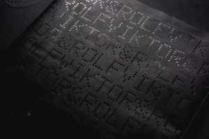
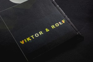
The reason why I chose this specific book was its black smooth color cover with the dots typo, braille lookalike. It has caught my eye and wanted me to see and analyze its content. Page after page I began to realize there was a type of system that the designers, Armand Mevis and Linda van Deursen carried out. A designer makes choices. When it comes to book design, he or she is likely to decide on redaction, typography, grid system, editing, binding, format, print technique, paper quality and so on. The sum of these choices create a unified expression that tells us something. It can be a parallel language to that of the content of the book and it can be more or less emphasized and thought-out. Some would say it could even be devious in its intentions.
This is an exploration of a book of Viktor & Rolf, from a design perspective.
The cover consists of mat black thin board with the title in what looks like braille typography with dots which looks like sewing. The black cover folds in to almost full width of the very first and last page. I learn from the designer that this is a technical solution to add steadiness to the book.
It was published by Artimo in connection to Viktor and Rolf exhibition ANDAM. It is designed by the design office Mevis & Van Deursen. I interviewed Linda Van Deursen in connection to this essay to get further insights in the design choices and the conditions from which the book came to be.
There’s an intriguing black colour inside the book in every page. This feature clearly communicates that it is a book mainly concerned with visual language or images. It resembles a visual preface or introduction to the book. The book has it owns signature, which is a brilliant manifestation of overlapping functions of the grid lines in the publication, categorizing the content by dots. Most of the paper types only occur in one single signature, this gives us a clue about the parallel function of the book.
I learn from that the book is a sort of material archive or assortment of papers of a specific kind. A rule that she set up for the book was that only two sided paper (meaning the paper has a different appearance on each side) of the type used in posters and envelopes (because they can’t be see through) were to be used. Not only does this create an intriguing visual and physical experience but it serves as a kind of metronome or conductor where the different surfaces of the paper are altered rhythmically but not predictably (you learn the rhythm and then it alters). This feature creates a playful element to the structure of the book. In addition to this, all rules seem to be broken at least a couple of times in the book which is a testimony to the sure instinct and playfulness of the designer.
I find out in every other pages, codes and images. This book doesn’t contain much text, except the references in the end of the book. cause there’s no text I started to take another good look at the repeating dot lines, placement and spacing of the images, composition and sizes of the images. I found out that any other collection has it’s own lay-out.
Viktor & Rolf seal, designed by Mevis and van Deursen
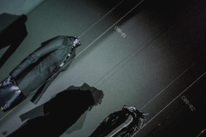
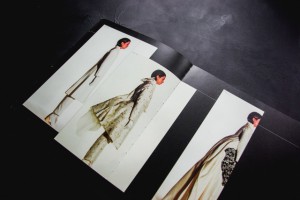
For example the second collection in the book is mostly big pictures, mostly layered, the white dotted lines mostly separate the photo’s, but are black when most of the line is over another photo (with white collection photo’s). The fourth collection is only shown on all the right pages, left ones left black. The seventh has one big image per page, combined with a few miniatures. And so on. The repeating white lines always go together with the codes along side of them. There’s a code for every image on the page, therefore it’s always easy to look up what you’re looking at. It really feels like you have to follow this actual ‘timeline’ through the whole book. De pages with collection photos on them have a ‘C’-code, which stands for collection.
The rest of the images are pronounced with ‘NC’ which – duh – stands for ‘no collection’. These NC-works are basically all the other things they did, such as installations, perfumes and the photos they commercially used for promotion back in the days. All these NC pages have their own different lay-out too. When you go through the book at first, it may look really chaotic. If you slowly go through it from front to back, the way you are suppose to read it (timeline) it makes a lot more sense, because the changes in layout fit the changes in style and time of the collections.
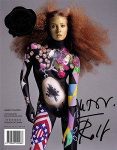
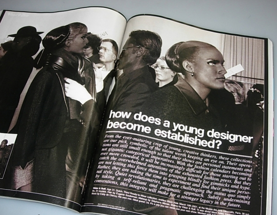
One other publication Mevis & van Deursen designed for Viktor & Rolf is the No.E Magazine as catalogue of Premiere Décenne at the Museé de la Mode et du Textile in Paris 2003/04 [x]. A publication reproducing all fashion magazine pages on V&R published to that date.
Around that same time (2005) Mevis & van Deursen published their own studio publication “Recollected Work” [x].
Viktor & Rolf : 1993, 1994, 1995, 1996, 1997, 1998, 1999. /Rietveld library catalogue no : 907.8 vik 1
