The DIN color-system.
I started learning about the DIN system and i will try to explain you about it.
When i went looking for this system on google, i didn’t find much. I had some struggles dealing with the explanations, and ofcourse they also had interesting words in it which i didn’t knew the exact meaning of.
I am going to explain to you the DIN color-system in my own words, and hopefully you will get it and than maybe you can explain it to me again.
D deutsche I institut N für normung
The colour-system started development in 1941 on the initiative of the Deutschen Normenausschusses in Germany.
They recognised the need for a more practical color-system than the Ostwald system. The Ostwald system was used since the First World War.
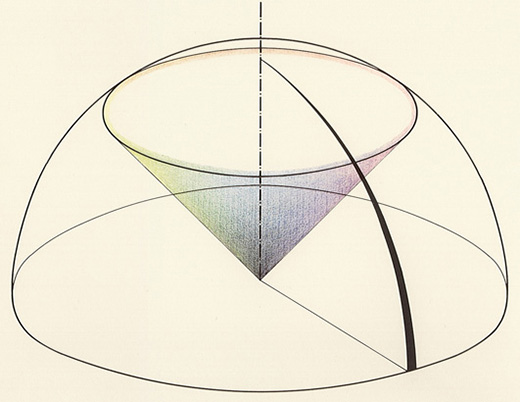
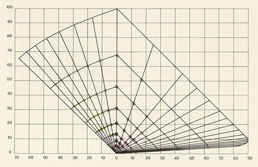
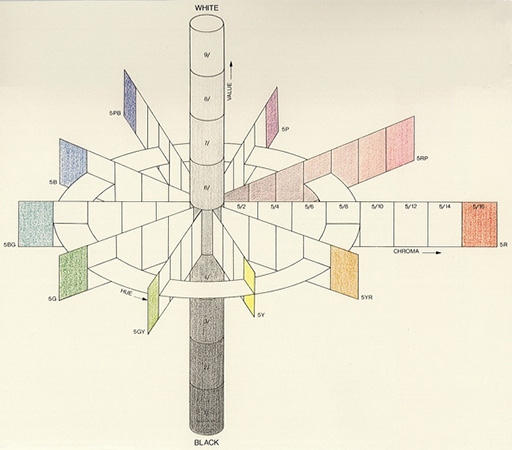
By psychological experiments, they created an order in addition to a circle of 24 color-hues and a saturation scale, introduced a darkness scale as a special parameter for establishing the relative brightness of non-self-illuminating colors. (copied text)
They attempt to show equal distances in defined color series, the idea was to create a color-system operating with the explicit variables of colour-hue [x], saturation [x] and brightness. And than in the most perfect way.
The main aim is a technical application in close connection with colorimetry. (copied text)
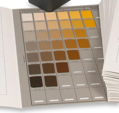
I put in some images in the text as you see, those are the technical images of the DIN color system. The explanations of these where nowhere to find, but when you take a look at the other color systems here on the blog, you can have an idea of how it works. Because in a way they all want to show their perfect way of showing colors.
In the end i get what the institute wanted to create, but then if i take a look at the technical part of the system my attentions fades away. And there was not enough information (for me) to find the completely explanations.
As you can read in the text, you can see that the colour-hue [x], saturation [x] and brightness are important in the whole story of the DIN system. In my case I heard and I see these 3 words a lot. Especially while using Photoshop. But what do I exactly do, while using these adjustments?
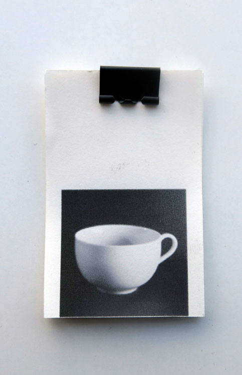
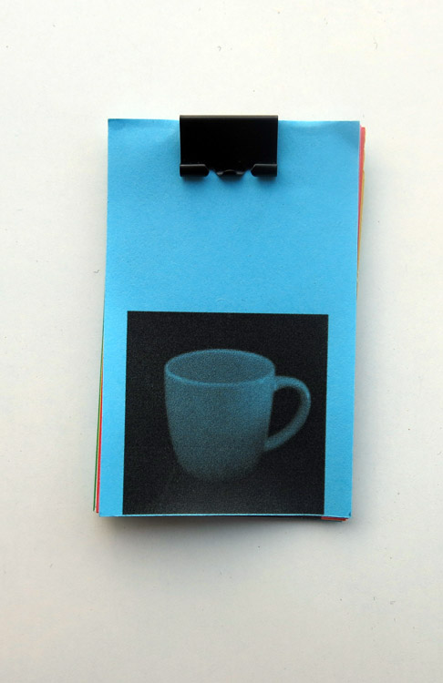
In the process of learning about a color system for me it’s important that it’s fun, because learning for me is not the most fun and easiest to do. So I started thinking of a nice way to learn about hue, saturation and brightness. First I came up with making pictures of it. But how? I don’t even now exactly the difference between the 3, and how to show it in pictures?
I took my laptop and started playing with the 3 things in Photoshop. I made pictures of white objects on a black background.
HUE
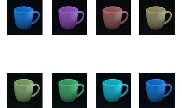
SATURATION
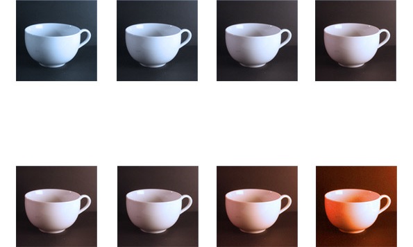
BRIGHTNESS
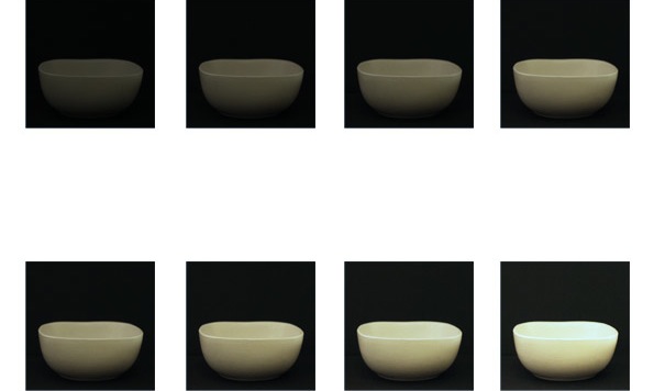
After I made these adjustments on the picture I thought of a way to present it. Immediately I thought of a flip-book. And this is what I did.

Well now I know the basic importance of the DIN system, and I think also a lot of other color systems haha.
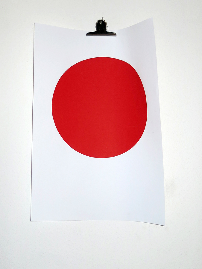
If I had to show the system in one colour? …The most purest and perfect RED.