Skip to Content Skip to Search Go to Top Navigation Go to Side Menu


"modernism" Tag


Becoming an Utopian Dream


Wednesday, February 21, 2018


stoel 1

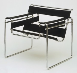
 Picture 1: The Wassily Chair (Model B3)


Marcel Breuer

Wassily Chair (Model B3)

1927 – 1928


Medium:

Chrome-plated tubular steel and canvas

Dimensions

28 1/4 x 30 3/4 x 28″ (71.8 x 78.1 x 71.1 cm)


I still remember when I was a child the furniture of my uncle was always in the way. I couldn’t play with my toys because of the strange shimmering steel frame that was blocking my way. As I grew bigger and bigger I found out that the frame was part of a chair, but not a very comfortable one. I climbed the chair, but my legs got stuck between the spaces of the frame. The only thing that went on in my mind was, why the hell would you buy a chair that’s not comfortable at all? Later I found out that the annoying thing that was blocking my playground was a part of the chair that I now recognize as the “Wassily Chair” made by Marcel Breuer in 1927. A chair that symbolizes modernist design.
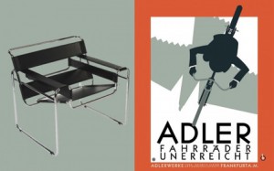
stoel 2

Picture 2: Reclameposter from the bicycle brand Adler, the brand from the bicycle on which the chair is inspired. 

 
The story goes that Breuer often rode a red bicycle and that this inspired him and led him make the most important innovation in furniture design: the use of tubular steel (Picture 3). Strong and lightweight. Perfect for mass-production. A model that is based on the traditional overstuffed club chair: but all that remains is mere the outline. In this way, an elegant composition of gleaming steel arises. The seat, back and arms seem to float in the air. An interesting tension between heavy and light is created.

stoel 3

Picture 3: The “exposed” chair

By scrolling over the internet, I found a picture that really catches my eye. On this picture (Picture 3), an “exposed” version of the chair is showed. The photo makes me curious, I want to see and touch the steel and throw it and feel how heavy it is. See what happens if you turn the frame around, would it still be a chair? It looks a little bit ridiculous. In my head, it looks like a tool for a playground, or a tool to work-out with, no wonder that I got stuck. But at the same time, it looks fragile and light, and the shiny steel creates an effect of a mirror, it reflects the surroundings. All of this creates the feeling as if the completely chair doesn’t exist. The feeling that I had as a child, by almost disappearing in the chair pops up in my head. The feeling of exposure, getting stuck between a frame that is almost invisible, in other words a human trap.

Breuer himself spoke of the chair as “My most extreme work… the least artistic, the most logical, the least ‘cosy’ and the most mechanical.” And he was probably right.
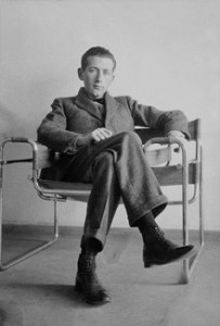
stoel 4

Picture 4: Marcel Breuer on his Wassily Chair

The chair is part of the style of Bauhaus. Which is part of the Modernism movement. Modernism is a term widely used, but rarely defined. We live in an era that still identifies itself in terms of Modernism. The buildings we inhabit, the chairs we sit on, the graphic design that surrounds us have mostly been created by the aesthetics and the ideology of Modernist design. The term refers to something that is characteristically modern, of its time. “The New”, “forward-looking”. In the designing world, it can be defined as: “Modernism is not a style, but loose collections of ideas.” It covered a range of styles, spread along different countries. But all those sites have in common that they were espousal for the new and mostly rejected history and tradition. An utopian desire to create a better world, to reinvent the world from scratch. Belief in the power and potential of the machine and industrial technology. Where there is a rejection of decoration and ornament. And a belief in the unity of all the arts. Most of the principles were frequently combined with social and political beliefs, which held that design and art could and should transform the society (Wilk, 2006), and by this raise the standards of living for all people [x].
It’s a global architecture and design movement emerged in the 1920 as a response to accelerated industrialization and social changes. By using new materials and advanced technology. It emphasized function, simplicity, rationality and created new forms of expression with a new aesthetic. Building and design can be recognized by use of clear lines, geometric shaped, cubic forms, windows, flat roofs and functional flexible spaces (Poursani, 2018).

The Bauhaus movement, started as a design school in 1919 by Walter Cropius, Mies and Marcel Breuer, Wassily Kandinsky and Paul Klee. They combined technology, crafts with industrial production to revitalize design for everyday life (Poursani, 2018). They thought that ‘new machine age’ demanded a new way of living and a new architecture with new materials as reinforced concrete, steel, and glass (Poursani, 2018). Their design principles, such as simplicity, rationality, functionality and universality, would change the world (Poursani, 2018). Their mission was to create a functional design with the principles of fine arts. Faith in new technology convenience and the promise of a better life. New materials brought new possibilities, break with the conventional forms, and use traditional and modern materials that show the possibilities of the modern industry. Functionalism is priority. Production for everybody a fact.
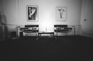
stoel 5

Picture 5: The Wassily chair in its “natural” habitat 

When I was able to climb the chair, I got stuck between the frame made out of steel. The space between the black leather and the frame was something where I got lost into, and my body didn’t know how to findrest in this chair.  The leather seat turned into a slide, and the chair became for me more an attraction then an object with the function of sitting. A labyrinth of body, steel and leather, or maybe a hybrid creature seen from far away. Where the object and the human became one, or where they are maybe to different.

Seeing this chair in the Stedelijk, brings questions to the mind. For example, by placing the chair in the museum, its uniqueness is accentuated. But do cheap reproductions destroy this feeling of uniqueness again? Does the space where the chair is placed have influence on how we look at it? The function of the chair is faded, by placing it really high and not as how it should be (picture 6).
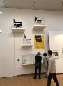
stoel 6

Picture 6: The floating chair

Could you speak of design for “everybody”, when the price of a “real” Wassily chair is “almost” unaffordable. Does the contrast between functionality and comfort, make the chair a utopian idea?
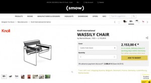
stoel 7

Picture 7: The Rising Star (prize wise)

By designing an object, such as a chair, the tension between the user and the object is important. There seems to be a confusion between things that are designed and who is going to use it. There is a risk that design can be over-determined and this creates not enough space for the user to act and improvise on the object. Knowledge about people, capabilities and needs and desires is required. It seems that there is a misunderstanding in the way that the intention seems to design the user experience, but this doesn’t make the user the subject of design. By the design of the Bauhaus form became subordinate to the function. Design became not only a matter of forming objects, but increasingly a matter of how ways of use and even ways of living can be designed and in this way, it turned into designing with a social agenda. This clearly state an ambition of social transformation. But by now we know that while the social aspects of the modernist project may have been ambitious, they did not necessarily succeed. Misfits between the intended and actual use, and the user’s understanding is something that exist, but this doesn’t need to mean that they are not necessary to have. Misfits can bring new knowledge on what can be improved. Also by designing you’re in a sort of way predicting how the object will be “used”. But this doesn’t mean that it will work out in this way. Communication between the user and the designed object is based on understanding and interpretation, misunderstanding can also be seen as a point of this. It’s in important to understand that people are active parts of the system and not only a “user” because they are turned into an object. By designing it’s not possible to making people fit into systems, societies and strategies. People are fluent and flexible, such as their taste, needs and desires.And besides that, people are moving creatures, changeable, and different. Creating something that fits all of them is a beautiful utopian idea (Redstrom, 2005).

Back to the chair again, a couple years ago I found out that the chair from my uncle had disappeared from the room. The space of where the chair ones was located is filled with some new interior stuff. Something soft, more colourful and bigger. When I asked my uncle where the chair went he said that he had put it with the trash (picture 8). Not even tried to sell it, because according to him nobody would have been interested. Maybe this was something that should have happened. How my connection with the chair started as an annoying object turned into a fascination for the weird structure. But how the chair in the house of my uncle turned from something functional to something that was not interesting anymore.

stoel 10stoel 11

Picture 8: Life of the Wassily chair


Modernist had a Utopian desire to create a better world. This they frequently combined with left-leaning political and social beliefs that design and art had the power to transform society (Lodder, 2006). The word utopia is taken from the Greek and literally means both nowhere and a good place. An impractical scheme for social improvement, an imaginary and indefinitely remote place, an ideal place or state. Something that is described as perfect, but from what you know is not possible, it’s more like a beautiful dream (Collins, s.d). Nowhere and a good place is an interesting point, because in my eyes there are contradictions from each other. A good place can exist, but maybe it’s then subjective. For example, the house of my parents is a good place to me. But nowhere only seems to exist in words. It means to no place, the state of nonexistence. So actually, it’s not there, but a good place can be, can exist. The chair makes clear that the faith in new technology is a usable for creating new objects, and in this way the step to a better life is maybe made. But the chair makes also clear that the “right” object doesn’t exist. By making the chair, an idea, an ideal, a dream, (a good place), is created as an existing object. But because the chair doesn’t completely function as a chair for all the people, because of taste, price, function and discomfort, and new materials and development of technology. It makes clear that the perfect “chair” doesn’t exist (It’s nowhere). Time is a huge disturb transmitter. Technology and innovations are changeable. Besides that, humans and their needs and desires are not predictable, stable and universal, and this makes it impossible to create an object that suits all and is timeless. The chair is the symbol of modern design. Progress is the realization of Utopias, and by creating this chair at that time a little step towards a utopian dream was made. And a progress starts with a strong idea, that then is made in practice. So maybe the outwork and how it is used doesn’t need to be perfect, and we only need a Utopian dream to move forward in making new things.

It’s interesting to see how a chair can be placed in a museum, but at the same time can be sold on Marktplaats just for 100 euros (Picture 8). How easy it is to own an “extraordinary” piece. But also, how fast you don’t want to have it anymore. When I walked in the Stedelijk, the only thing that I thought was, why are those chairs so high, I want to sit in it and try them out. Untill I saw the Wassily chair, because it gave me so much memories of my childhood. Ofcourse the chair made me more curious to try out than any other, but at the same time the “special spot” in the Stedelijk is the “special spot” that the chair deserves. The untouching, unreaching of the chair, by placing it this high, reminds me of the fact that as a child I couldn’t climb the weird steel thing. And this “unreachable” value of the object as a child I now have when I walk into the museum and this is for me a beautiful annoying feeling.

A dream that started as a functional designed chair for everyone, made of new materials. Unity of all the arts, and principles combines with social and political beliefs and raise the standard of living for all people. A step to a utopian dream. Realized and made, fitted for a living room, but where slowly the function and the appreciation faded. Just as the visions that inspired the creative figures were dreams based on the technological potential and the social experiences of that time. Maybe the chair cannot be seen as a symbol of modern design, but as a symbol of the progress to realization of Utopian dreams.


References:

Collins Dictionary [Online] / aut. Collins // Definition of Utopia . – 17 02 2018. – https://www.collinsdictionary.com/dictionary/english/utopia.

Modernism in Architecture: Definiton and History [Online] / aut. Poursani Ela. – 10 02 2018. – 2018. – https://study.com/academy/lesson/modernism-in-architecture-definition-history.html.

Searching for Utopia [Sectie van boek] / aut. Lodder Christina // Modernism: designing for a new world / boekaut. Wilk Christopher. – Londen : V&A publications , 2006.

Towards user design? On the shift from object to user as the subject of design [Tijdschrift] / aut. Redstrom Johan. – Sweden : Elsevier, 2005.

What was Modernism? [Sectie van boek] / aut. Wilk Christopher // Modernism: Designing for a better world / boekaut. Wilk Christopher. – Londen : V&A publications , 2006.


Adolf Loos vs Hansje van Halem and the importance of ornament in the contemporary world


Thursday, October 19, 2017

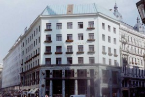
Adolf Loos was an Austrian and Czech architect and an influential European theorist of modern architecture. One of his famous buildings, Looshaus, is now one of the most representative architectures of the modernist movement, although at the time it was established it had received great opposition and contempt.


The industrial revolution, the sudden accumulated wealth, and the people who longed for the appearance of the nobleman came to the city to compete with the idea that they should be more splendid than anyone else and it is natural that such people despised Looshaus. Anyhow, Loos was established with his opinion, he believed that the ornaments were not beauty, but more as a self-display and that if an artist made commodities for aesthetic purpose, it would not reflect the way people live and would not have the necessary function. The ornaments were a crime for Adolf Loos, a waste of the craftsman’s time, they were made for the main purpose of aesthetic pursuit and must be eliminated from architecture and design. He said that if an artist produces household items for aesthetic purpose, it does not reflect the way people live and it is a crime to make the worker spend so much time on such a useless thing. Therefore, he can not be called extreme functionalist, rather, his ideals were to produce household goods and to build buildings by reflecting the people’s real life at the time. Alfred Loos want to send his message to people who are captivated only by their splendid ornament and life and who are trying to forget their past without being true.


59291451bfcde2e8a4f4df61c4343021-loosbuilding-535x408


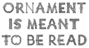
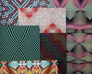
Hansje van Halem is an Amsterdam based graphic designer, she is mainly interested in typography, book design and other printing techniques but she also experiments with computer processed graphic patterns and drawings. Her work is centred on “exquisite” typography, it is a fusion of ornamental patterns and letters which become more then letter-forms, they are ornaments wth a specific function, they are meant to be read.


Ornamentismeanttoberead


There are 100 years between the idea that Adolf Loos had about the use of ornament and the way Hansje van Halem is using it today, and it is very interesting to see how, although their point of view regarding it is so distant from each other, there’s still a big connection between two, both indeed are giving great importance to the “function” of their work, Loos eliminates the ornament because there is no function in it and van Halem on the other hand gives a function to it though the use of typography.


23602106_333892837084262_1573328493_n


But how are the contemporary artists and architects actually reacting to the Adolf Loos’s ideas nowadays ? There are different manifestations of the ornament’s resistance in the contemporary architecture, The London-based FAT (Fashion Architecture Taste) for instance consider ornaments as an important and indispensable part of architecture, Charles Holland, partner of the FAT says in an article from the Financial Times: “The Loos argument is very interesting. As I understand it, he was saying that ornamentation was a waste of labour, effort and craft. With contemporary techniques and manufacturing it is possible to achieve a lot of complexity and intricacy with very little effort, so there’s a weird reversal of his argument. We regard ornament less as a guilty pleasure and more as a communicative tool. There is traditionally a kind of puritanism in the UK, a rather macho approach in which engineering and high-tech appliqué is OK. It can all be justified in practical terms but I think we can look more critically now at a modernism in which the motifs of industry were applied to architecture to make it look modern, which in itself is a kind of ornamentation.”

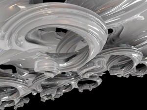
The current computer technologies are also playing a big role in the contemporary w  orld, this modelling and manufacturing technologies has allowed the mass production of the most complex forms and ideas. Evan Douglis is using this technologies to create new strange, forms which recall baroque and rococo decoration in their own new digital world, he also says: “The technology and the software at our disposal now gives us enormous control over form, equations can become a material presence. We’re interested in that intricacy between pragmatism and retinal exuberance – it’s something that bridges the disciplines, from architecture to furniture, interiors and product.”


23602226_333892887084257_1985383228_n


This new digital tools are helping designers and artist in their work as never before in our history and are also an easy way to experiment with forms, letters and of course ornaments, it makes the whole procedure more interesting and exiting, this is how Loos’s position, after a century, is slightly starting to become invalid, and the ornament on the other hand is on it’s way to decriminalisation.

a cooperative research by Yuriy Krupey & Eun Seo Lee

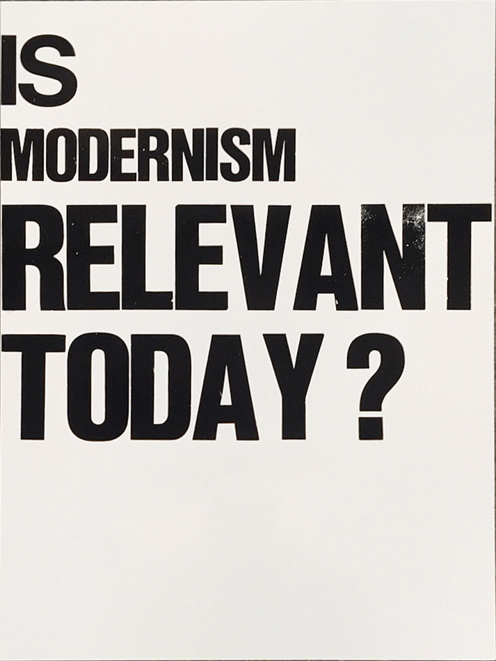
Is modernism still relevant today?


Thursday, October 19, 2017

poster-modernism

In the late 19th century, artists and craft-people in Europe already had a will of rupture with all the previous, too classics works. They saw in industrial revolution means of creating more accessible and more efficient productions.
This craving for newness emerged in Europe as new currents, such as Arts and Crafts, and later on, Art Nouveau, Jugendstil, Neue Kunst. 
On the same time, artists experimented new ways of expressing emotions and feelings. Abstraction developed in art slowly in western Europe, inspired by the recent opening of Japan to the world, but also by all the feedback from the arts and traditions of French, dutch, German and  English colonies.

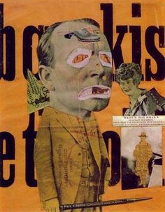
Fauvists tried collages and works with simple shapes and colors, but still in a slightly figurative way. Also, we can see in Dada and Cubism a new approach in composition,  use of shapes and colors, and, in the case of Dada, photomontage.


dada collage


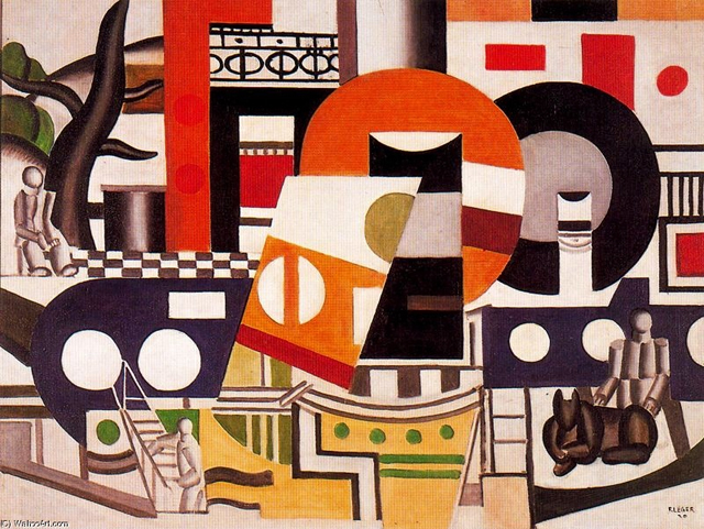
We can notice in Fernand Leger’s work some approaches of the principle of modernist graphic design. Illustrations, at the edge of abstraction, and a game with the letters, where it becomes an entire part of the composition, using stencil characters and foundry typefaces. The imprint  of the man’s work is now less visible, as the use of the machine and standardization of shapes and characters are now a solid part of the artistic production.


fernand leger


At this point graphic design, and, of course, being a graphic designer isn’t a status in itself. It consists of experiments by artists in western Europe, and artists alongside with architects and designers in the central and eastern part of the continent.

The early 20ties century in Europe has been the theater of a lot of revolutions and wars. Seeking refuge and peace, or simply trying spread new theories, architects and artists moved around in Europe. Starting from the 1918’s, The Netherlands, Germany and Switzerland become places where the intellectual Avant-Garde starts to develop, not in private, but as groups.

This results in the creation of collectives of artists, architects and designers, all teaching, and rethinking the place of design, art and architecture in this modern, industrialized society. They fully embrace that industrialization and the new means of production brought by it to create new, peculiar designs. Modernism is born.

We can isolate several groups working on the raise of modernism alongside Europe, inspired by new theories on fine arts (constructivism, Suprematism) from Russia and Italian futurism. Almost each central European country had its own movement: De Stijl for the Netherlands, the Deutscher Werkbund and later on the Bauhaus school in Germany, the Wiener Werkstatte for Austria, and Der Schweizer Werkbund for Switzerland.

They all had the same goal of one philosophy, that binds architecture, art, product design, and later, graphic design. To sum it up, we can quote Henry Van de Velde’s lecture to the Swiss Werkbund in 1947 :
“That chain, which has extended across the centuries, which in the end shows just one family, one single family of pure form and pure decoration, a unique style: one that is rationally conceived, consisting of pure forms determined by their function”.


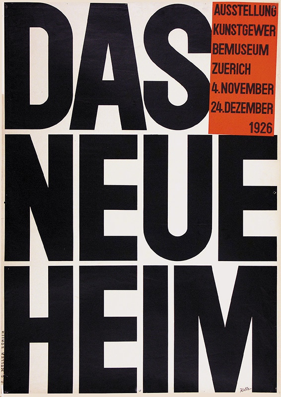
das neue heim


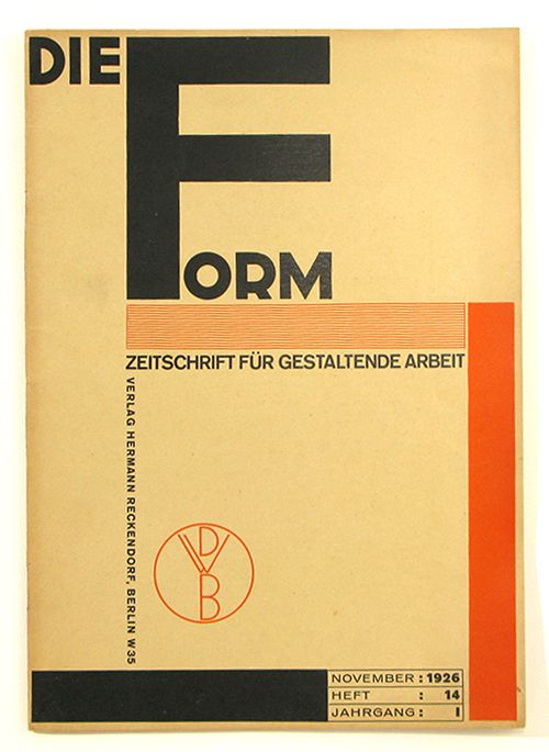
Of course, these groups had to communicate, on exhibitions, but also monthly, to keep the Europe informed of their progress. They started using magazines and posters to spread their words. This is how graphic design entered and embraced modernism. Of course, it was a new mean of expression, and architects of the modernism, to remain within the modernist unity, applied modernist architecture principles to it. These magazines (De Stijl, Die Form, Das Werk, Bauhaus), even if their main subject was not graphic design, expressed the group’s beliefs on type and composition through their formal construction.


Die Form cover


Out went symmetry, ornament and drawn illustration; in came white space, plain letter forms  and photographs. 
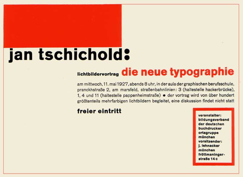
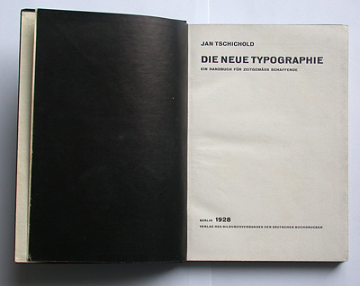
But even after all those works, Europe had to wait until 1928 for someone to actually theorize graphic design, with Jan Tschihold’s “Die neue Typografie”. This book is the starting point of the idea of graphic design to be a separate kind of design, with its own principles. And as you can guess by its title, it explains the rules and ways of using the self-proclaimed new typography : lineal characters, absence of symmetry, purpose of the white space, hierarchy of the information.


Die Neue Typografie


With all those interventions, modernist graphic design became what we know today: sober, using photographs, collage, geometrical shapes and a small range of colours to illustrate, with simple, lineal fonts for the text.

But as the fascism rises in the 30’s in Europe, many intellectuals had to flee from Nazi Germany, and went to Switzerland, to other neutral countries, or to the USA.

Overall, to understand modernist graphic design and its aesthetic, we need to understand that it was created in a mean of efficiency, by people who were not graphic designers, and who experimented for a long time before finding something that would suit their beliefs. It is born out of architectural principles, and as a part of the modernist’s formal aesthetics. And it was so radical, and such a brutal change, that all along the 20th century and still today, we can feel its influence. Just look at you computer. The font you’re reading right now is probably Helvetica.

Thus, we may ask ourselves « is it still relevant to use modernist principles in graphic design ». That is, in our opinion, a legitimate question. It is true that, in a contemporary creative process, using 1930’s ideas might be perceived as some kind of stagnation, our even a regression in the thinking of graphic design. That is not our opinion. But as some ideas, or principles; for instance the universal grid, are killing the thinking and creative process in the long term, it is important to go further than that, and keep investigating what those developments of ideas has permitted us, and what is the next step, in this constant research of efficiency, and simplicity.

.poster neue

a cooperative research by Souheila Chalabi and Antoine Dauvergne

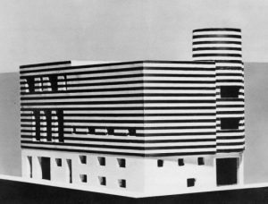
Niban-Kan building, Tokyo


Thursday, May 18, 2017

Walking around Shinjunku, Tokyo’s district, one may have noticed the unusual buildings standing out on its east side.
The Ichiban-Kan (“building number one”) and the Niban-Kan (“building number two”) were designed by the architect Minory Takeyama in 1966. They were commissioned by a Korean Toyota salesman, asking him to design both buildings at the same time, and finally completed in 1969. Respectively, one was home of 49 tiny bars distributed through its eight floors, and the other hosted bars, clubs and sauna.
Slides from the 1970s, reproducing the two buildings. Domus Archive


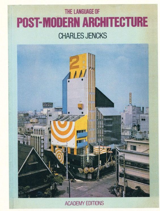
In 1977, the cover of Charles Jenks’ The Language of Post-Modern Architecture features an enigmatic Japanese building. It raises the Niban-kan as an icon of Supergraphics, along with its adjacent brother building the Ichiban-kan.
Niban-Kan’s colored surface has been painted over by now, blending now with Tokyo building’s flat designs.
But what made this building so special, beside its colorful surface ?

ea51f7eab203dca46b02e89a28e9f475

In the 60’s, East-Shinjuku was the land of protest and porn, where one could meet the radical, intellectual, and other underground Japanese subcultures. This area’s hyper activity led to an important street competition, where signs and speakers had to be bigger and louder.
Minory Takeyama was challenged to implant a new architecture in the given context. It had to stand out of this saturation of lights and neons, while blending in with the energy of the district.

big_373446_6621_5street2

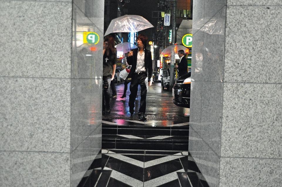
Entrance of the Ichiban-kan building


Japanese architecture is typically vertical, where each floor has a common area with entrances to shops and bars. As architecture was being more and more influenced by western design in term of multi-storey models, Takeyama exploited the local past of architecture and brought the verticality back to the front, creating a vertical street through the facade. The late-Modern “High Architecture” aim to reveal the movement directly from the outside, such as what’s going on, and how to get there.
The front shows the circulation, to arouse curiosity. This is completed by signs that bring an informative layer to the surface. At night, neons reflect on the glazed area, which emphasize the gap between the surface and the platform, and reveal part of the building’s activity.

big_373255_2410_5coppia

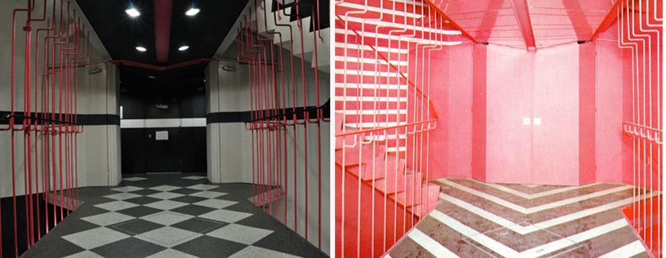
Left: a view of the Niban-kan interior today. Right: The same space with the original flooring, as seen in a 1970s Japanese publication, Domus Archive


The Niban-kan and the Ichiban-kan are representative of Tokyo’s relation between private and public space. You can go from the street to the seventh floor without encountering a door. By directly opening to the street, those buildings breaks the boundary and transmit a feeling of public space from the street.

big_373446_9514_4street

Entrance of the Ichiban-kan building, with a direct access to the outside


In the exhibition “Designing the surface”, The Niban-Kan was presented as an item from the, ‘agency’ category, through Charles Jenck’s 1977 bookcover.
Agency is an action or intervention producing a particular effect. Minory Takeyama’s colorful and ambitious buildings were possible to realize at that time, far from the actual strict rules of urban planning. This freedom made it possible to bring local tradition in the actual architecture and –promoted by Charles Jenk– become a figure of Post-Modernist Architecture.

Screen Shot 2017-05-18 at 02.43.21

Screen Shot 2017-05-18 at 02.41.21

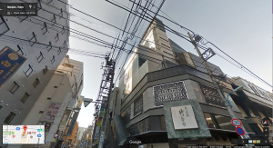
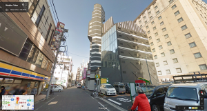
Ichiban-kan and Niban-kan seen from Google street view 2016

Architecture became almost a banal experience, we are surrounded by buildings that we don’t question much, because the more we see them, we forget them. We take design for granted. But sometimes one stands out and makes you travel.
It’s fascinating how design, by small changes of the interface, can revolutionize the way we experience our environment.


Charles A.Jencks, The language of Post-Modernist Architecture 1977-1987, London. New Institute. exh.cat.no.61-agency

Turbulant Times for Tubular Chairs


Monday, October 19, 2015

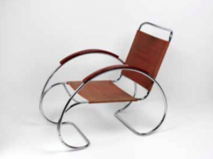
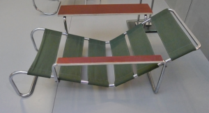
In the Boijmans Van Beuningen museum Design Derby exhibition there were two chairs that use a different main shape to catch your eyes and bring them to ‘ their side’ of the show. In both cases, the armrests follow this main shape; the rests of the Dutch chair are symmetrically shaped by an oval, while the rests of the Belgium chair are asymmetrical and sturdy angled.


Screen Shot 2015-11-23 at 20.28.27Screen Shot 2015-11-23 at 20.30.00

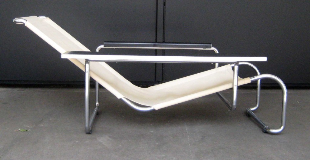
The Auping fauteuil, 1931 • The Chaise Lounge by Gaston Eysselinck, 1932


Despite this difference, the chairs are rather similar because of the chrome-coted construction parts, the use of wood in the armrests, the shared function, and the same exact period in witch these chairs were made (1930’s). Without any background information you could say that these chairs were made by the same enterprise or you can take it the other way around; these designs could have been competing with each other back in the day. This tension field spiked my interest to take a closer look in the history of both designs. Are they that different?

Examinating these chairs further I found that the same Dutch designer movements influenced the choices that were made in both of the designs. Designs meant for modern progressive consumers. These influences include Dudok [x], J.P.Oud [x], Gerrit Rietveld and De Stijl movement [x].

In the 1930’s Auping decided to broaden their horizon and manufacture a line of tubular living room furniture including the Auping fauteuil. At this time, this branch was not important. The designer of the fauteuil was not even linked to the chair itself. Later investigation concludes that the unknown interior designer Ben Reynsdorp is likely to be the designer of this magnificent chair. (jaarverslag 2014 Bojimans.nl [x])

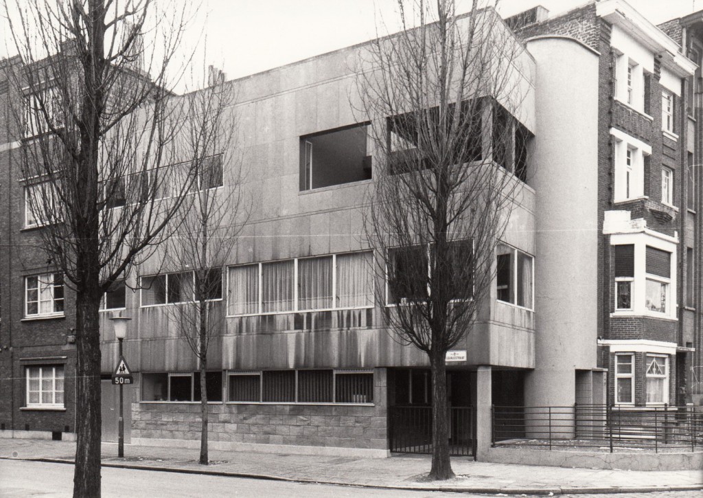
At the same time, at the end of heroic period of the Avant Garde, the young architect Eysselink succeeded in assimilating these influences in a highly personal way. He went after Rietveld and designed his own home in Gent and manufactured fitting and unique furniture;

House_Eusselinck

“In 1932 he designed all the furniture for this house. It is tubular steel furniture [x], of which the stacking chairs and the large recliner are the most interesting. He hoped to manufacture the furniture at a later date, with the name FRATSTA (Fabriek voor RATioneelse STAalmeubelen – Factory for Rational Steel Furniture), an enterprise which in fact proved unsuccessful. Eysselinck is the only architect in Belgium from the period between the wars to produce a ‘collection’ of tubular furniture.”

The latter brings me by another less fortunate similarity found; both chairs were part of lines that initially were not well received in the market and this brought production to an end in both cases. As said, the enterprise of Eysenck went bankrupt after only two years. His unique “machine à habiter” was not mentioned by the media. Auping on the other hand, focused on the improvement of their bedding and the continuing of their existing production lines in the crisis. They did not continue the production of tubular living room furniture as it was not as popular as their beds.

Nowadays Eysselink is seen as one of the great in Modernism. The Chaise Lounge [x] even got a re-edition in the 70’s; a modern and luxurious implementation.


474199.jpg;jsessionid=9E51294DBFF433EB0AE8992185C93492

The re-edition of the Chaise Lounge by Gaston Eysselinck, 1970's


The Auping chair ultimately got the attention and the designer the credit he deserves. Both chairs flourish at the Holland – Belgium Design Derby Exhibit and defend the honor of their ‘native countries’.

But ‘What differs the Chaise Lounge from the Auping fauteuil?’ you might ask. These chairs can not possibly be from the same designer for one major reason: The Auping fauteuil is not designed by Eysselinck’s ‘Form Follows Function’ regime. The armrests of Auping are used in a more decorative way than Eysselinck would have wanted. This makes that, although these chairs may look very similar, my gut feeling was right and they can be categorized in a whole different way.


Marshall Moderism


Wednesday, October 14, 2015

IMG_0377_2

The Design Derby exhibition at Boijmans Museum in Rotterdam compares what was happening in design in the Netherlands and Belgium from 1815 to present day. Pieces were picked as representative of the era of design in both countries, which allowed you to make comparisons of the objects for design and aesthetic value, but also by being displayed chronologically, you are able to see where on the timeline they place and thus allowed you to to understand the context in which they were designed and the preceding works/ inspiration. I picked two pieces from the 1950’s produced during the post war reconstruction period; a fascinating time for the reestablishment of design as a social, economical and cultural actuality.

I chose two pieces with very similar aesthetic qualities and obvious connections visually/materially, produced a year apart they are from exactly the same period so can be perceived from a single point in European history despite different national situations.
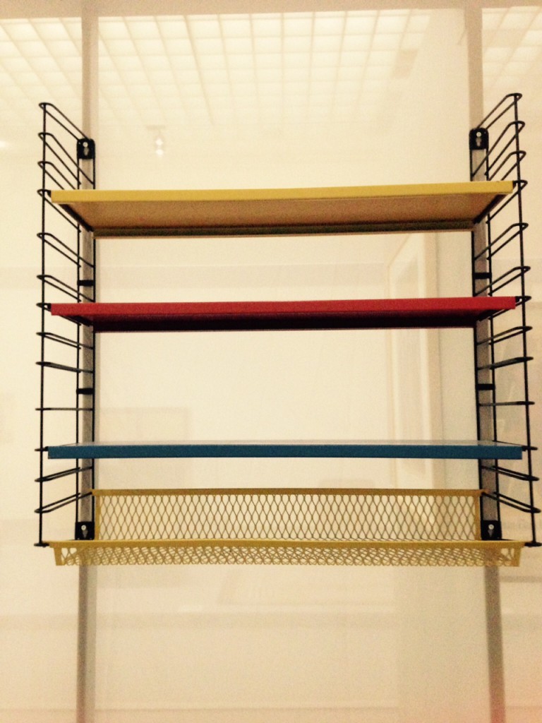
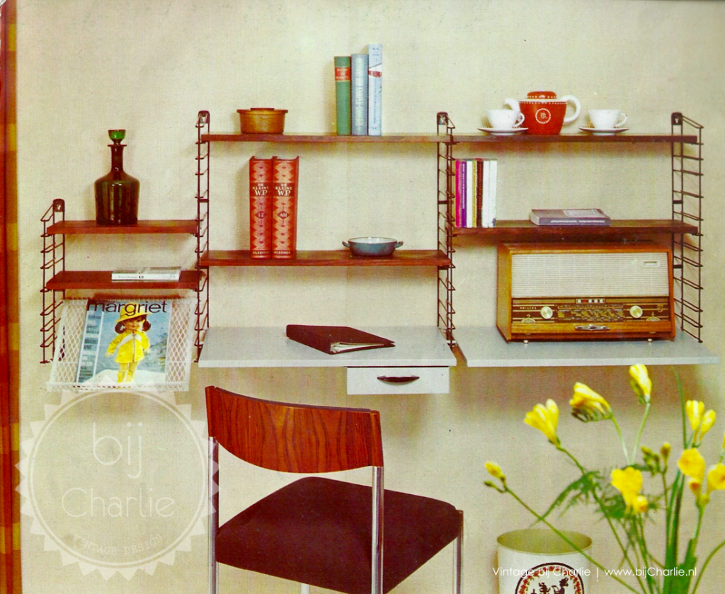
The first piece is a bookshelf designed by D.Dekker for Tomado – Dordrecht in 1958, The shelves are a genius design, with simple brackets on either side and tin trays which can be slotted in at any level, there’s a variety of combinations/arrangements of the unit so they adapt easily to any room.

Tomado Bookcase

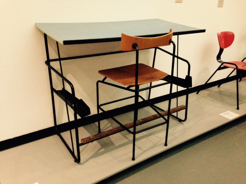
The second is desk and chair by Jacques Seeuwes, designed for the architecture department of the University of Ghent in 1959. The only colour used is a bright blue Formica on the table, which compliments the soft dark tones of the oak seat and foot rest.  Its a vivid primary colour which is fitting with the modernity that was being practiced in the design at the time, when the chair is tucked under the table, there is brilliant flow of the basic forms, and the subtleties in angles of the chair suggest a certain spring to it by highlighting the ergonomics which contrast to the stubborn rigidity of the black tubular frame, they both exhibit a neo-plastic approach to design. This is collection of research i made in order to further understand the situation of each country after the war and how design fit into their society at the time. What were the inspirations/ defining influences in the Netherlands and Belgium which concluded in two very similar pieces of furniture.

Jacques Seeuwes Desk


De Stijl introduced an important merging of art an design by promoting an Utopian philosophical approach to aesthetics. The goal was to catch timeless beauty in spare precision, De Stijl movement was a reaction against the excessive decoration of the Art nouveau that preceded. It was an attempt at a universal language in design and aesthetic, that applied rules which erased all subjectivity to the artist because the individual was loosing its significance, ideals of the period shift from visually heavy to visually light and ‘de Stijl could be seen as social redemption.

During the post war reconstruction period, Tomado thrived because its products represented the incoming modern Dutch household; cheap, affordable, functional furniture. The core of Tomado string furniture was formed by pragmatism, before the war there was a demand of bits and bobs and comfort in clutter, but in the aftermath, there was a desire for a fresh functional way of living to maximize efficient recovery and thus wanted to be surrounded by practical and rational possessions. Tomado’s minimalist airy structures symbolized the modern age, and these bookshelves in particular were commonly present in households around the country, just like IKEA is nowadays.

tomado bij charlie ikea


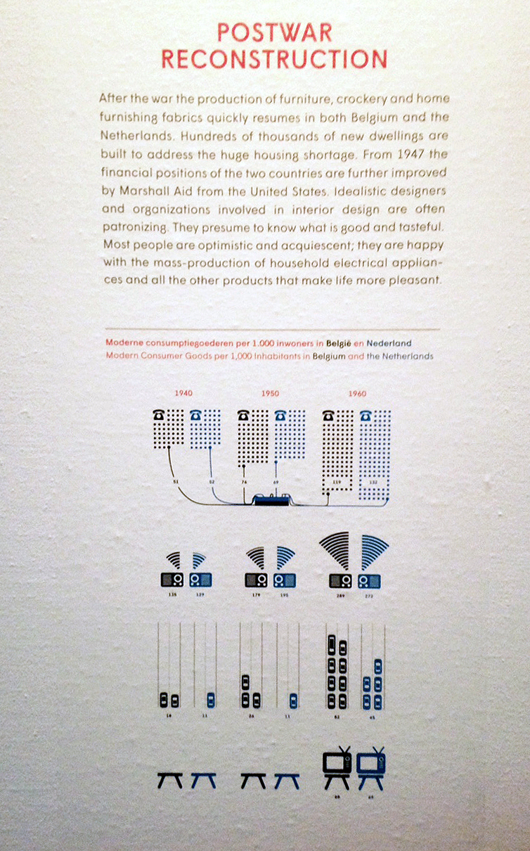
The Dutch government returned to the Netherlands from its exile in London in 1945. The government, while in London, had created plans which would speed up the country’s challenging industrial and economic reconstruction, there was no conflict between industry and the arts, because the Netherlands has a trading history and sourced its cultural input from its colonies in Asia. This meant that recognizing the need for mass production to furnish homes wasn’t politically opposed and the dutch produced functional furniture for the masses with talented designers appointed to every sector, Marshall Aid investment into the Netherlands accelerated industrialization and by 1950, 38% of the population was working in manufacturing or some form of industry.

In Belgium, there is a rich history of the arts and crafts from their own country because they had no interest in their colonies in Africa. This meant that high level professional craftsmen worked hard to produce and design quality products, and then after the war they were fighting against the industrial takeover. However there were a lot of poor factory workers and thus mass production was a cheap necessity, people weren’t as encouraged by the government to pursue design careers whereas in the Netherlands every state company had a designer.

Marshall Aid played a large role in the modernization of Europe, with the investment to rebuild its financial economical and industrial systems, and along with the money came the intention to inject a new ‘spirit of productivity’.

e4436177fef81c8674471797ff6828ba f_10547351_1

In Belgium they funded the Belgium Office for Increasing Productivity (BDOP), which supported The Design Centre. Design in Belgium was struggling to find its place in society, The Design Centre aimed to broaden the understanding of design as a social, economical and cultural phenomenon, however, the BDOP demanded a definition of design which was appropriate to the contribution towards the economic efficiency, it was struggling to leave behind the origins of design promotion, dominated by national export interest and be recognized for its social and cultural value by the Belgian government, this was frustrating because of course they believed that design is the most visible and pervasive cultural manifestation of a country at any time.

Industrial design was redefined in Belgium  in the 1950’s, and planted foundations in 1954 under the reign of the first social-liberal government.
Industrial design is a creative activity whose aim is to determine the formal qualities of objects produced by industry. These formal qualities are not only the external features but are principally those structural and functional relationships which convert a system to a coherent unity both from the point of view of the producer and the user. Industrial design extends to embrace all the aspects of human environment which are conditioned by industrial production.

With this definition you can understand how the values of De Stijl integrated easily with this new wave of industrialization. Design was being viewed as a practical notion where productivity and efficiency is key, with such a mechanical demographic, it makes sense that the prevailing approach to design in Belgium was that of De Stijl – the international modern style, and easy to replicate in industry.

After WW2 De Stijl became known as the International Modern Style. However without Theo van Doesburg to lead the way and enforce the ideals and definitions of the movement, the strict pre-war rules were broken. The post-war reconstruction forcing society to depict a new way through complete disarray towards the future, efficiency was key and maintenance of artistic values weren’t withheld so preciously. Broader structural design properties of industrial materials could be worked with more easily in mass production too and the extreme ideals of De Stijl were not practical anymore.

To conclude, the unifying desperation of each country to rebuild after the upheaval of the war and the catastrophic state in which the Nazi’s left, meant the productivity objectives that accompanied the Marshall aid from U.S, persisted to define the countries’ reform and thus profitability and potency heavily determined design of the post war era.


Gesamtkunstwerk ?


Saturday, September 28, 2013

ARNE JACOBSEN (11 February 1902 – 24 march 1971) is a danish architect and designer. He was first able working as an architect, then mostly influenced by the modernist ideas. Typically, modernists reject decorative motifs, to emphasize more on materials, pure geometrical forms, function and adaptation to the industry.
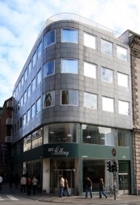
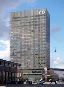
Following the modernist philosophy, Jacobsen concieved buildings such as the Stelling House on Gammeltorv (left picture), or the SAS Royal Hotel (right picture), both in Copenhaguen.

old-square-gammel-torv-gammeltorv-_-6-k-c-3-b-8benhavn_700_0 OLYMPUS DIGITAL CAMERA

He went to design products because of his interest for the Gesamtkunstwerk concept. It concerned the preoccupation of building a place as a whole, every objects matter, one place (architecture, furniture’s, light…) is driven by one full concept, vision.
Jacobsen’s design products are therefore influenced by modernist ideals, but are more precisely a part of the organic modernist movement. This movement gave to Denmark and Scandinavian countries a particular place in modern design. Jacobsen played an important contribution to that.
The philosophy of organic modernism’s main concept is to emphasize on the harmony between human living and the world of nature, so that they are combined in an united, interrelated composition for a better living. Actually, it brings to modernism a humane element to its rationnalism. It’s to create clean, pure lines based on an understanding of classical furniture craftsmanship coupled with careful research into materials, proportions and the requirements of the human body.

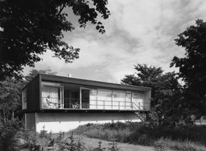
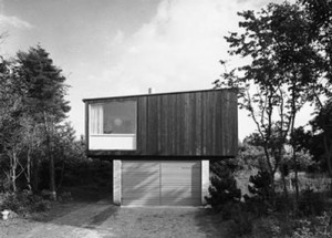
Kokfelt House 1957 Kokfelt House

The Kokfelt House (1957) by Arne Jacobsen is a representation of what organic modernism can be in architecture.

Jacobsen uses craft and “natural” materials to build his design works. Jacobsen combines aesthetic for a better living and adaptation to industrial production (social matter); which made his works a critical and economic success in the 50’s.

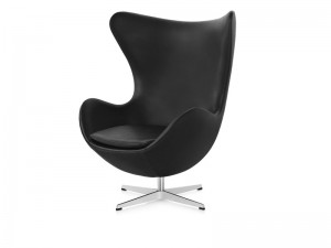
The Egg

            The Egg is a chair designed in 1958 for the Radisson SAS hotel in Copenhagen. It is manufactured by Republic of Fritz Hansen.
The chair answers to the project Jacobsen was commissioned for : designing the whole hotel. He could therefore fully following his interest on the Gesamtkunstwerk concept.
The Egg is considered as a triumph concerning Jacobsen’s design : the organic form of the chair constrats with  the building’s almost exclusively vertical and horizontal surfaces. Jacobsen searched for the perfect shape by first sculpting clay in his own garage. This shape offers to the user a bit of privacy in a public space such as the hall of the hotel. It also can be used in a private place such a home to lounge. The Egg is available in a wide variety of fabric upholstery as well as leather, always combined with a star shaped base in satin polished aluminium.
By combining pure organic form, industrial adaptation, craft (strong foam inner shell underneath the upholstery technique), and conception as a part for a whole; the Egg is an excellent representation of how was design conceived in Scandinavian countries in the 50’s.


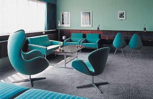
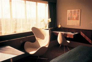
Interior of SAS Royal Hotel Interior of SAS Royal Hotel

        This piece shows a particular vision on human living. A better living combining functionnalism (research of materials), human proportions (requirements of the body) and aesthetic (part of a whole, pure forms). It allows the user to take distance from the flows going through public spaces or even in a private one; to find again a bit of intimacy. In a world where we are constantly solicitated, this chair offers with a cleaned form the possibility to manage to deal with those requests. That doesn’t mean to disconnect, but to get better relation to our environment.

         I wonder if the search for better living through the concept of Gesamtkunstwerk, which was the main preoccupation of Jacobsen, can be found in our daily lives. What happens to interior spaces when they are not conceived by professionals, but by individuals. Can we find the concept of Gesamtkunstwerk in vernacular spaces ? Do the objects, the planning of the space allow the user to enter one full vision of it ?

IS GESAMTKUNSTWERK UNCONSCIOUSLY PRESENT AROUND US ?

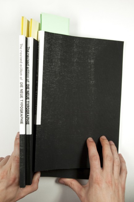
The revised edition of Die Neue Typographie.


Saturday, December 31, 2011

summary

650-MaartenKanters5  As part of the graduation program at the Gerrit Rietveld Academy, we were asked to write a thesis. I conducted a research into the early days of Modernism and Constructivism. One of the books on my list was the English translation of Die Neue Typographie, by Jan Tschichold.
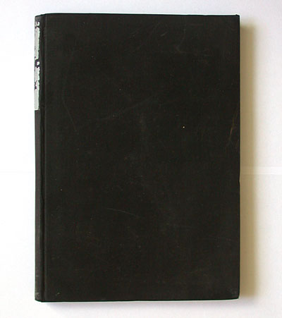
This publication included an introduction by Ruari McLean, translator of the original, German version, who was also a personal friend of Jan Tschichold. On the first page of his foreword, McLean tells us that already in 1967, Tschichold asked him to translate Die Neue Typographie. McLean continues his introduction: “He planned it as a second, revised edition.” McLean states that he translated the greater part of Die Neue Typographie, incorporating all the revisions, but no publisher could be found. For the 1995 edition, McLean together with the University of California Press, made the editorial decision to translate the original text, treating it as a historical document.

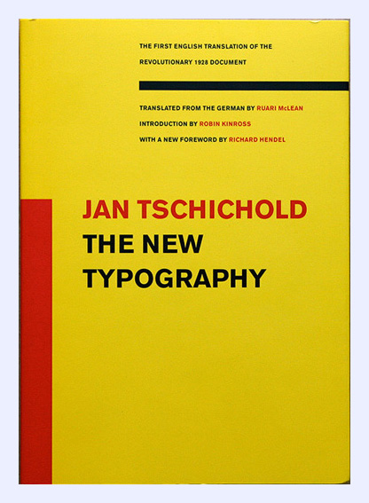
covernew DieNeueTypographie TheNew Typography

original ©1928 "Die Neue Typographie" by Jan Tschichold - first English edition "The New Typography" ©1995

After finishing the introduction, I was curious about the revisions Tschichold made to his original text. McLean tells us in his introduction that after the death of Tschichold, in 1974, he placed the draft of his translation in the St Bride Printing Library. So, the next day I called the library. It took me some weeks, to finally get hold of the document, but these weeks gave the opportunity to research Tschichold’s personal and professional life.
Tschichold transmogrified from a traditional, German trained typographer, into a “true modern designer” (his own words), to finally reform back into his old working method, a classical and traditional approach to typography. Over time, he became his own frenetic antagonist, with Die Neue Typographie in the center.

Tschichold_book-4

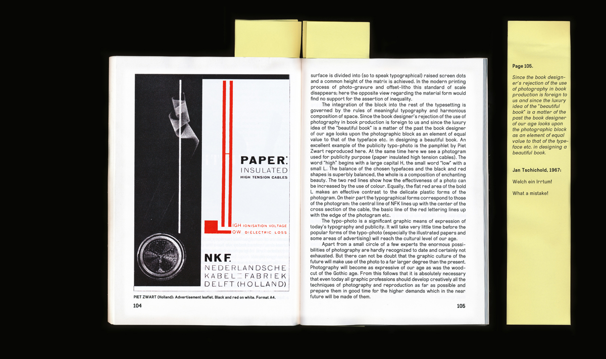
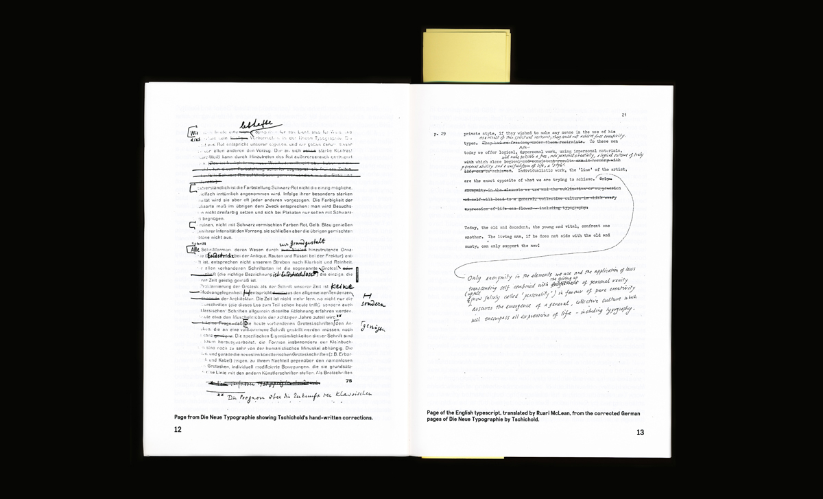
What I found out, is that Tschichold during his life, tried, but repeatedly failed, to publish a revised edition of Die Neue Typographie. Throughout his life – while criticizing himself and others, who were still confederated to Die Neue Typographie movement – he worked on this document, trying to mitigate his rather excessive statements from his younger self. This revised edition of Tschichold was now fragmented in different archives. As an archaeologist I started to recollected these sparse pages and revisions by Tschichold, and incorporated all my findings into a version, as coherent as possible.
While working out the manuscripts by Tschichold, I tried to find out in what physical form, Tschichold wanted to present his revised edition. In correspondence with Piet Zwart, he speaks about presenting it in A4 format, a format he later labeled as: “devils format”. Die Neue Typographie was set in either Aurora Grotesk, or Akzidenz Grotesk. The choice of typeface, was decided by practical circumstances: no other sans serif font was available in an amount large enough, to set a whole book. I took this opportunity to design my own sans serif font, called Takhir. The shapes of Takhir were drawn, to tell a story about Modernism. But, it is too bumptious to appear, as pure, as Modernism would have wanted it to be.

Tschichold_book-2

This whole project resulted in the revised edition of Die Neue Typographie, containing all the revisions I collected in my research. The publication is introduced by a foreword, that I wrote as my thesis [presented as pdf at the end of this post], in which I present the historical background of Die Neue Typographie movement, and the publication by the same name. Beside all the revisions Tschichold made to his text, he made a number of personal comments, which reflected or criticized the content. The combination of these two, are really important for me, because it shows Tschichold’s difficult relationship to Die Neue Typographie. In one hand he rewrites its whole content, but he no longer agrees with its tenor. In the final publication, these personal comments are presented on errata’s, placed on the corresponding page of the content.
The whole publication is set in the typeface Takhir, which was finally created in two weights, both with Italics. Printed digitally in an edition of 50 copies 157 pages on 110 grams silk machine coated paper with a silkscreened cover, for sale at San Serriffe Bookstore [x].

text by Maarten Kanters [graduate student department of Graphic Design 2011] : more www.mrtnkntrs.nl


It appears you don’t have a PDF plugin for this browser.
No biggie… you can click here to
download the PDF file.


Log in
subscribe