"graphic" Tag
NORM formulating new dimensions in design
Monday, March 7, 2011
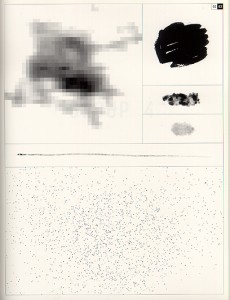
Dimity Bruni and Manuel Krebs,two graphic designers from Switzerland. Both born in 1970 and met in art school, in Biel. They founded NORM in 1999 and created their own typographic language by ignoring existing conventions. NORM is now based in Zurich. They’re well known for their typeface «Simple» which first got used in their book The Things. Later, Ruedi Baur of Integral, Paris, asked them to redesign the typeface for use in the new corporate design of the Cologne-Bonn Airport – this version is named Simple-Airport. 
Bruni and Krebs developed their own typographical brand. They invented their own way of putting the world into categories and they formulated two rules: — the world is divided into two groups: 3d things and 2d things. — anything invisible is not of our concern.
3d things: 3d things consists of physical things that are of material existence. These items should be solid and visible, though not necessarily visible with the eye.
2d things: the 2d category can be put into four different groups based on dimensions. group 1, those which represent something pertaining to a three-dimensional space group 2, those which represent something not pertaining to a three-dimensional space group 3, those which represent nothing group 4, those which are as yet unknown to us
group 1 represents the physical spacial things. It is bound to its own being because we recognize 3d things through its build, size and materiality. When speaking in 2d matter, things lose their necessity of being a certain size, light, color. This is quite a wide range of objects, so NORM has categorized group 1 in sizes, — smaller than human beings, but large enough to be seen with the eye — roughly as large as human beings — bigger than human beings, but also small enough to be seen
group 2 represents the non-spacious, nonphysical things. Things that come down to numbers and letters and abstract ideas like sounds. Letters are the most easy to understand. Letters can also be read as signs. They have a double function, we write them and read them. Letters define their own meaning in a very clear way; while sounds are more difficult to represent, read, and understand. Letters have principles, we have a certain way of making letters and this is why they are so recognizable. Letters are principles. Still, there is much room for playing and sculpting in this field. — when designing a new system of writing, signs should be simple. they should be simple, because it makes them easier to remember, to recognize, and reproduce. — also the signs should be in a small quantity, because it makes them easier to learn — no sign should resemble another, because it will create confusion. so each sign should appear no more than once — it should be possible to align the signs in straight rows. always on a horizontal/vertical grid. this is so we can recognize a text, even when the script is unknown to us. — the characters should be simple graphic forms, recognized, and written easily as possible.
group 3 These things represent nothing. the things indescribable and invisible, so no concern
Your body is a battleground
Monday, December 7, 2009
Thinking of women artists and graphic design leads me to the work of Barbara Kruger. It connects design, feminism, art and references also to my personal story, namely of seeing an exhibition of her work and loving it.

The work of Barbara Kruger can be qualified both as conceptual art and graphic design. She combines black and white photographs with phrases set in vivid colors, juxtaposing imagery and text. Her work addresses the complex interconnection of gender and the marketplace, and criticizes sexism and the circulation of powers within cultures.
I find her work interesting because it is interdisciplinary. She is not bothered by formal qualifications (is it design, is it art, is it politics?), but instead says that she likes to work with words and images. She wants to address her audience directly, and chooses the medium which she finds fitting. This ‘no fuss’ attitude in combination with the content of her work is inspiring.
708.4 Isa 1
EXCAVATION (part 2)
Thursday, March 26, 2009
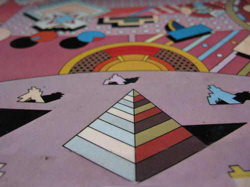
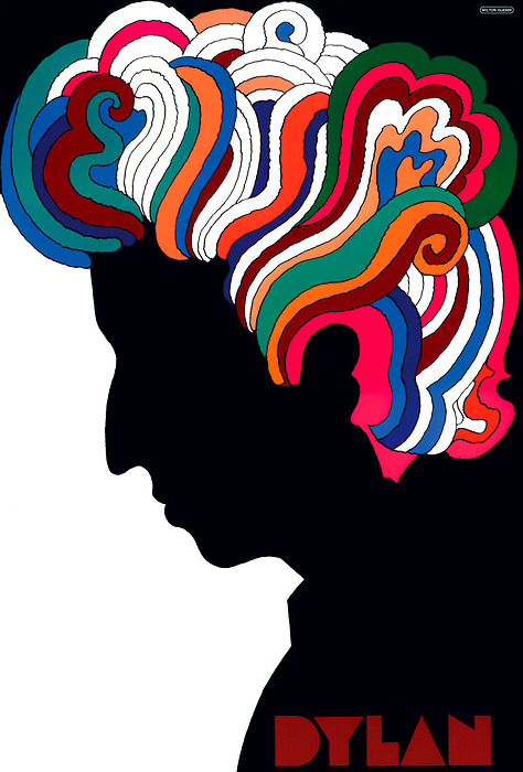
Excavating the library, looking for pyramids, lead me to a late 60´s representation of posters by the graphic design artist Milton Glaser. The choice for this book is solely based on the cover graphics and has no other connection to the first book selected, though it seems that the fascination for pyramids and their monumental quality are shared by many designers regardless of the time or design field.
The size of this book (A3) is in my opinion very well adapted for displaying these incredible hand drawn posters. Every page is a poster and the more you look into them the more you see.
Bob Dylan poster by Milton Glaser 1966.
cat. nr: 754.1
keyword: pyramid


