Skip to Content Skip to Search Go to Top Navigation Go to Side Menu


"personal" Tag


I CAN’T WORK LIKE THIS


Sunday, March 10, 2019

I CAN’T

WORK

LIKE

THIS


      I have chosen an orange book, about the size of a big holiday novel. But with a cover much more animated than a novel.

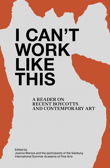
      The title in bold immediately intrigued me: I CAN NOT WORK LIKE THIS. The title is a point of view, an affirmation, rather mysterious, in any case attractive, which challenges us, and that we want to understand by opening the book. Who is it? What work? What prevents who to work? And what does this negation mean? Is it an edgy, or paranoid character?


      The typography of the title and the first pages, is impersonal, an imposing typo: Helvetica. But page after page, we discover a set of typography that become more and more specific and personalFirst a novel writing: The Times New Roman; then the typographic style of a typewriter: ADLER; and finally, handwritten characters.

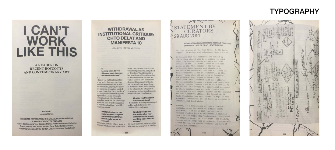
        The paragraphs are changing too. At the beginning, they are inserted seriously and strictly to the right of the pages. Then the paragraphs come to life, and bend in every direction; some follow the form of images; others are divided in the same way as on the pages of an agenda. Each time the titles are put forward, they are imposing, and have an important line before the beginning of the paragraph.

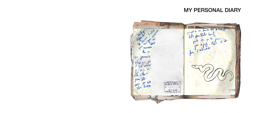
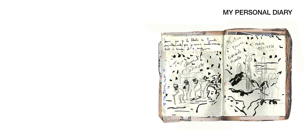
        Unlike typography and paragraph, images retain their homogeneity and conductive line throughout the book. These are the torn paper effects that surround the images, and organize the book as a collage. Some images are not limited to pages, and may overflow and continue on the next page. All images are in black and white. Only the cover has color (orange). These images mix a little all times, and all media. These are both old letters, drawings and photos, but also screen shots of Facebook conversations or emails. This kaleidoscope of images and times makes us lose ourselves in time. There are also many scans of manuscripts, with arrows in all directions, words over-lined or surrounded to follow the reasoning of the creator.

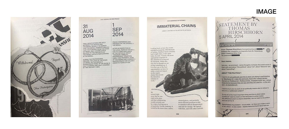
      The spine of the book also deserves a comment, because the drawing on the borders of pages overflows and bleeds from the pages. These are black lines that remind of tearing of the book. This creates a dotted pattern when looking at the book from the side which is also convenient for finding your way in the book, since they indicate a beginning of chapters.


        Everything looks like a patchwork. Looking at the graphic designer’s chart, Krysztof Pyda, you immediately recognize the spirit that has imagined the book. The instagram of the designer is indeed a collection of images, and it is exactly this same idea, this same visual ensemble that one finds in his book. It is a multitude of documents, more or less connected at first sight, but which are connected by arrows, handwritten indications, which gradually make us enter into the intimacy of the creator. That’s why I chose this book: it intrigued me like an intimate diary. Each page is a surprise, each time more personal than the previous one.

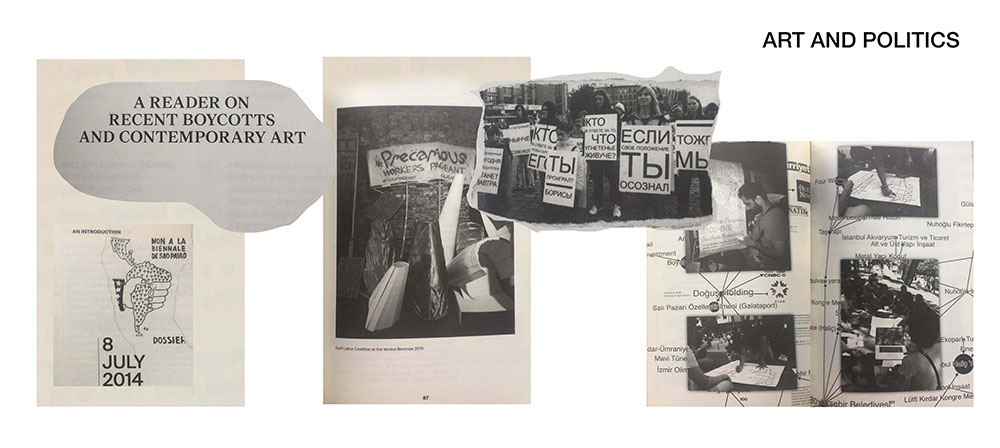
            In deepening a little more, I realized that it was a book whose subject was about art and politics. First, the subtitle clearly tells us: A READER ON RECENT BOYCOTTS AND CONTEMPORARY ART. Then, the purpose is clarified with images mixing political slogans, caricatures, works of art, photos of events, maps of the world. These images are connected to each other by arrows; some parts of the documents are broken. We enter into the imagination of the creator, having the impression of following the path of her research and her thought. The reader does not read a book whose purpose is purely political, but is drawn to the point of view and the vision of the creator. These are not speeches with dates and facts, as we could see in an history book. They are pieces of image, texts, full of documents, where each page expresses, strengthens and defends the general idea and the point of view of its creator.

           This book immediately reminded me of my sketchbooks and research books. I work a lot with collages, snippets of images, and my notebooks are also disparate collections of papers, covered with drawings and handwriting. All the papers I keep in this notebook have for me a story, show something of our generation, even if they are as everyday and innocuous as for example cash receipts or or transport tickets. All in any case are related to the places I cross, to people I met, all remind me of a particular moment. On each page, I play with the composition, an image in the foreground completes that from below.


I CAN NOT WORK LIKE THIS, is a book that I loved to turn the pages, flip, flip, stop, first for visual pleasure, but also to try to understand how it is organized, graphically. The creator really plunges the reader into his most personal research, his thoughts and his points of view, like an intimate diary.

Joanna Warsza : I Can't Work Like This a reader on recent boycots and contemporary art. designer: Krysztof Pyda, Rietveld Library Cat. no: 700.7 war 1

A Poetic Threesome


Friday, May 5, 2017

Words are magnets. Put two random words together, and they will enter in an (unintended) relationship. Of course in some cases it works better than others, in one case the result will be poetic, in the other criticism or humor will enter the stage.

As I was experimenting with this, using the tag words from DesignBlog, I noticed something. While combining the random words, they also started connecting to my surroundings, which were in that situation: the objects in my room.


Atmosphere_1100

Can random words and images enter in a “poetic threesome”?
I decided to do an experiment.

First I thought that maybe I should combine imagery from Google Image with the words, to make everything as random as possible. I tried this, but it didn’t really bring me any further. Of course some nice things happened, but it felt too general to me.

Anita_1100

ArabicArt_1100

I liked the personal, intimate side of my first observation.
I made up two guidelines for myself
:

1. use 26 tagwords from designblog starting with an “a”

2. use personal objects from your direct environment


Asian_1100

I wanted to know what would happen, combining the random with the personal. The personal intertwined twice in the process: combining the random words.
I think I unconsciously made choices according to my own taste. Even though I tried hard to combine the words randomly, I couldn’t help seeing the connections that might happen. In the end, I’m a person, not an algorithm, and I decided to embrace this.

ArtistMind_1100

anxiety_1100

Also, the objects are personal. I chose objects that were personal because I got them from someone important to me, because they were mine for a long time, or because I use them daily.

aboutabsence_1100

I made may own small home-studio and started making the words and the objects literally interact.

Americans_1100

Some interesting things happened:

Affection_1100

– The impersonal words became more personal, and more meaningful, simply because they were combined with my own belongings

Artichoke_1100

adidas_1100

– The objects, that I’d always looked at in one way, became something else, the words created gateways to other meanings

Klaas_1100

 I think also the white background allowed the object to break with their original context and start forming new connections.

Plant_1100

I found myself looking at my plant in a different way this morning.
Normally I barely notice it.

Am I living an automatic life? Or is the plant living an automatic life?

activism_1100

I wonder if there’s a third personal side to this: the connections we make when we see the random combinations. I make specific connections, someone else as well. We all have different imagery in our minds and different associations to the words used.

Vis_1100

What will the objects think of all this?
I don’t think people would like to be put in a random context. I wouldn’t like to be called Amusement or About Absence.

Maybe someone will invent a way to give objects a platform for their opinion. Objects have rights too.
Until that moment, humans will have to give the objects meaning. And I think sometimes it’s good to re-evaluate this meaning.

Why should a fish be food and not amusement?

Can’t avocado’s also be animals?

Why should pepper never be afraid?

And why is Anita no hero when she’s standing in the kitchen all day?


Trophy Cups


Sunday, October 6, 2013

6916281473_cc98cbc543_z-1
Trophy Cups by Vika Mitrichenka

Vika Mitrichenka (1972), is originally from Minsk but she moved to Amsterdam on a tourist visa in 2000, because she was fascinated by the Golden Age painters from Holland, like Johannes Vermeer and Pieter Hoogh. This fascination with old things, is still visible in her works today.

She got accepted into the Gerrit Rietveld Academie, and after that she studied at the Rijksacademie.

This work is dedicated to her father and consists of five small trophies made of porcelain painted in blue, yellow and pink, with some golden details. On each trophy cup there is a small text, and a little sports person is posing on the lid. On the pink one, with a little swimmer kneeling at the top it says:

‘For trying to educate his mother-in-law in understanding art till her last days.’

I like the work, because I think what Mitrichenka is trying to do, is give some credit to the little everyday good deed, that means a lot but rarely gets rewarded. Usually trophies are a symbol of achieving something extraordinary, like running really fast, jumping very high or kicking a ball to the goal. Mitrichenkas trophies are small and detailed, not very flashy but very pretty and knickknacky. They look like something you could find on a shelf at your grandmothers house.

The trophies stand out from a lot of the other things at the exhibition, because they are so over-the-top and shiny. Designers like Rietveld, and Poul Henningsen, work with handy, functional, simple furniture with no decoration. In the exhibition you see a lot of wood, metal, plastic and other strong, long lasting materials. The colors are only black and white or blue, red and yellow.

The trophy cups are multicolored, decorated and detailed. They are made of porcelain, and they are difficult and expensive to produce. Still they are made to reward the normal simple person. 

In 2005, the Frozen Fountain, a design store in Amsterdam gave Mitrichenka an artistic assignment to make a tea service. When she had finished it one of them were immediately purchased by the Stedelijk museum.

I went to the Frozen Fountain to look at some more of Mitrichenkas’ work. One of the first thing I noticed when I got there was the tea set called “Victoria” that she made in 2005. It is a set of 15 pieces, made especially for the Frozen Fountain. 


Grandmothers treasures


At first, the tea set looks like it is made from old pieces of Chinese porcelain, that has been glued together in kind of a clumsy way. Different styles and colors gets mixed up, and sharp edges appear where the pieces has been put together. But when you look closer the set actually looks like it would be nice to use at a tea party. The sugar bowl is made from two different cups, one has a fish printed on it and one with little flowers. The lid is light blue with a colorful pattern, and with a head of an angry, pink gorilla on top of it.


tea cup and saucer with a perch and some parrots


What inspired Mitrichenka to make the tea set was her Russian grandmothers’ Chinese porcelain, which she would never throw away, not even if it was broken. The work is very nostalgic, and it reminds me of my own grandmother, who also used to collect different porcelain tea cups. I remember that I used to take them out of her cabinet and look at them all together. The nice thing about them was that they were all different, and had a little story of their own. One was bought on a holiday in Italy, one was inherited by my great grandmother and another one was from some small flea market in Birkerød where she lives. The porcelain cups would never have given me the same feeling if they all looked the same.

When I walked further into the shop I found some more trophy cups! I was happy! I didn’t know that she had made so many of them! And some of them I thought were even more cute and funny, than the ones in the Stedelijk. They were displayed in a showcase in the back of the store, and most of them looked a bit like try outs, but somehow they seemed more personal, than the ones I had seen before.


"For having said please forgive me if I ever hurt you"

For having said please forgive me if I ever hurt you


"For giving lectures on the history of art to his bedside neighbors in the hospital during his rehabilitation after a heart attack"

"For giving lectures on the history of art to his bedside neighbours in the hospital during his rehabilitation after a heart attack"

This day I already felt a little emotional, so the texts on the cups almost brought a little tear to my eye.

Not all of these trophy cups have a sportsman/woman posing on the lid, but instead a glazed, white roman sculpture. They are put together from a square bottom with the text on, something from a Chinese porcelain set and a little sculpture posing at the top. I like this kind of clumsy way that they are put together. It is not at all ‘tasteful’ or in a stylish design. The texts are not at all pretensions, but very honest and down to earth. One of them had the caption: “For looking in the distance and doing noting”. The theme of the cups is for me again about the intimate memories of home, about the stuff that happens in the everyday life, that is actually really important, but we never really take the time to think about.


Log in
subscribe